Determined Orange
The orange that actually stays orange, reviewed honestly: the one wall it was built for, the light that makes it shout, and what to buy instead if you wanted terracotta.

Jessica has spec'd whites and neutrals for more than 300 rooms and keeps a sample wall of painted drawdowns in her studio. Every color review is checked against real reader rooms in the comments and re-tested when a formula changes. About the testing process →
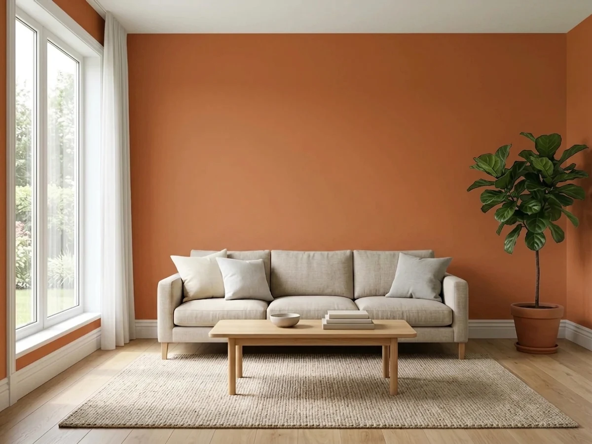
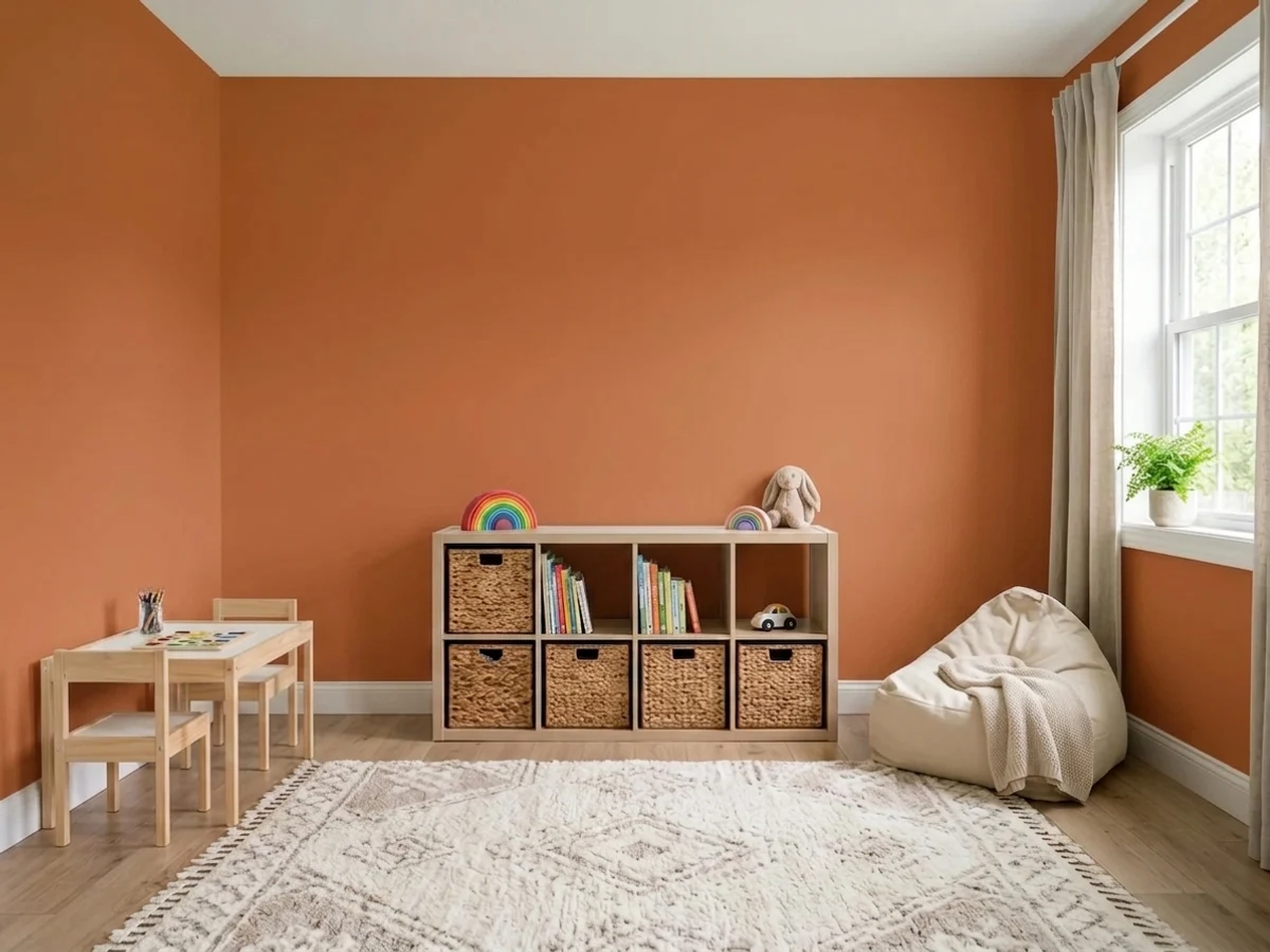
- 1Burnt Cinnamon9
- 2Rookwood Terra Cotta14
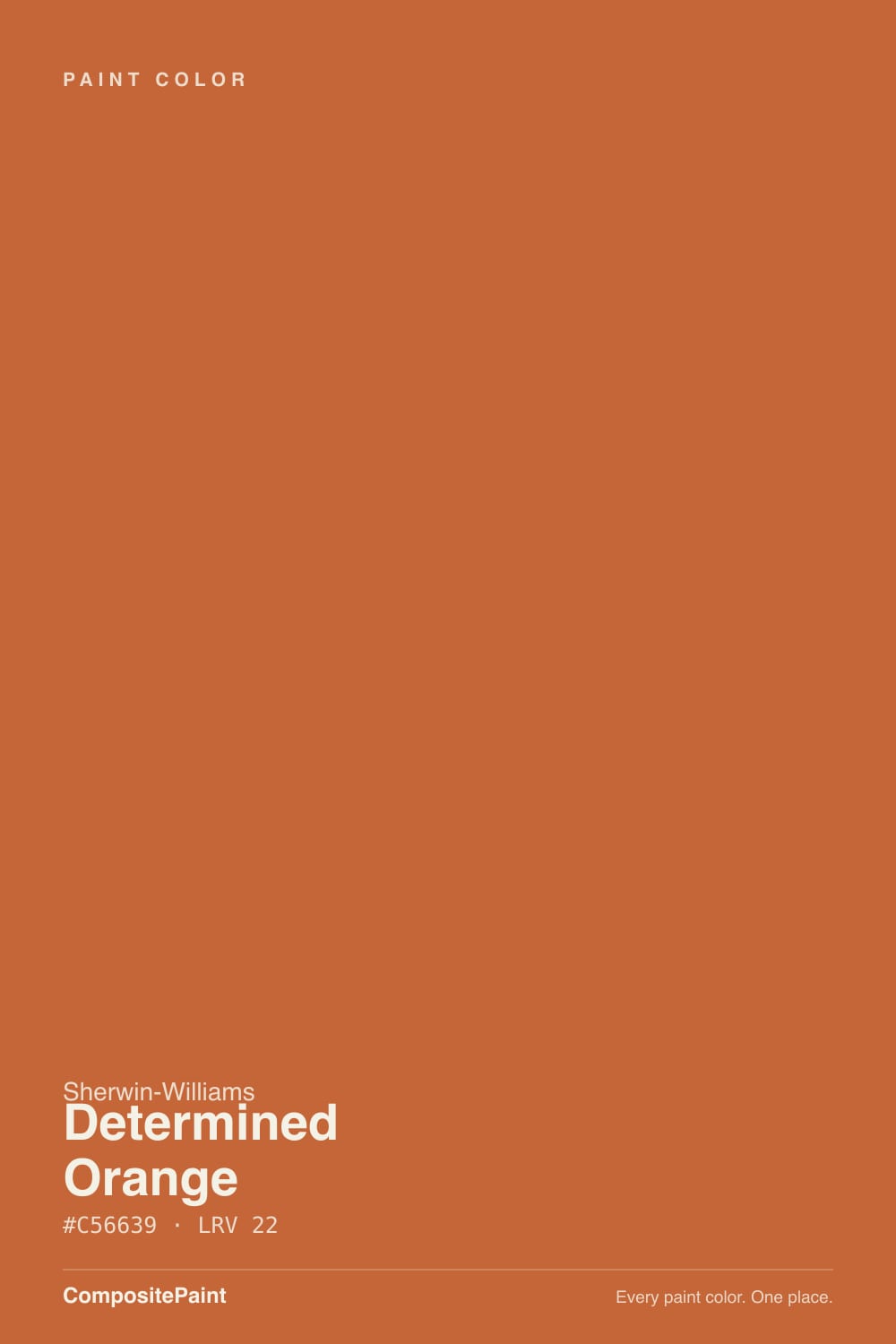
- 3Determined Orange22
- 4Caramelized35
- 5Venetian Plaster42
The Fast Verdict
Determined Orange is what most people expect terracotta to be, and then it isn't. There is very little brown in it and almost no gray, so this is a clean, spiced, medium-deep orange that reads orange in every light instead of quietly turning into a neutral. That is the whole appeal and the whole risk. On one wall, a front door, an island or a studio it looks confident and deliberate; on four walls of a room you go to unwind in, it never stops talking.
One accent wall with warm white around it · front doors and entries · offices, studios, craft rooms and playrooms · kitchen islands and cabinet runs · powder rooms you drench on purpose
You actually wanted a muted terracotta · your floors are honey oak or your fireplace is orange-red brick · you want a calm bedroom or living room · the room only gets flat, cool north light · you will not bother with a tinted primer
- A real orange that stays orange — no muddy brown surprise
- Deep enough at LRV 22 to look expensive, not like a kid's craft paint
- Outstanding on a front door, an island, a powder room or one wall
- Turns amber and spiced under warm evening light
- Rides the desert and terracotta trend without being a copy of every other clay color
- Buyers shopping terracotta are routinely surprised by how orange it is
- Fights honey oak, orange brick and every red-toned wood in the room
- Too active for four walls in a bedroom or main living room
- Orange pigment hides poorly — tinted primer and two finish coats, minimum
What Color Is Determined Orange, Really?
Sherwin-Williams files this under orange rather than red or brown, and for once the filing tells the truth. Most of the colors people shop when they type terracotta are grayed and browned down until they behave like warm neutrals — Cavern Clay is the obvious example. Determined Orange skips that step. It has a red-earth lean that keeps it from being a highway cone, but the orange is clear and unmuddied, which is exactly why the 2026 terracotta round-ups keep flagging it as the bold one in the group and pointing it at accent walls, front doors and studios rather than at whole rooms.
At LRV 22 it is a genuinely deep color: roughly four-fifths of the light that hits it stays in the wall. Two things follow from that. First, a dim room does not get warmer when you paint it this color, it gets darker — the warmth is in the hue, not in the light it gives back. Second, a saturated color at this depth bounces its own hue around the room, so expect a faint orange cast on the white ceiling above it, on trim beside it, and on faces in photos. A 2-inch chip cannot show you any of that. Sample at least a 12-inch square, on two walls, and look at it after dark.
Undertone in one line: orange first, a red-earth note second — never pink, never gold. If your sample looks like brick, that is cool daylight draining the yellow side of it; if it looks close to neon, that is direct midday sun hitting a saturated pigment. Both are the same paint reporting on your room.
Where It Shines
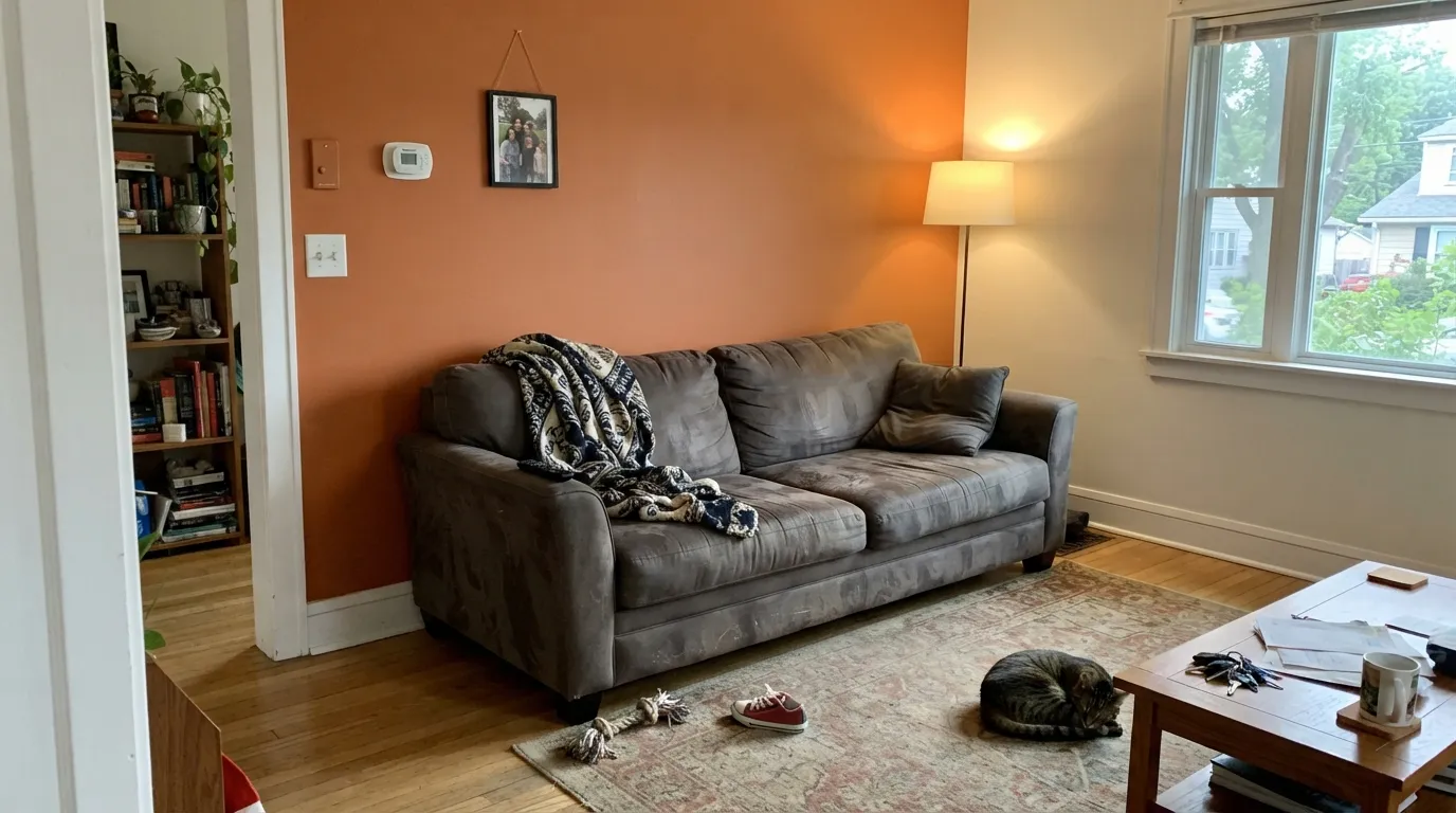
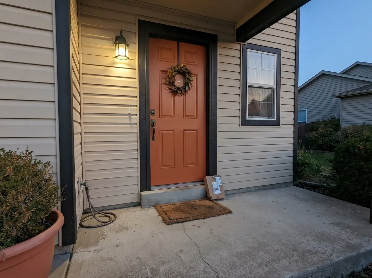
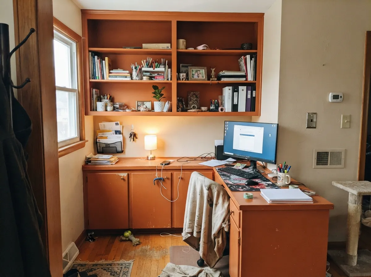
This color is at its best when it is the only loud thing in the room. Give it a warm white or a soft beige on the other three walls, a black or bronze metal, and one wood tone that is not orange, and it reads like a decision rather than an accident. Its second home is anything you can paint in an afternoon and change your mind about later: a front door, a powder room, an island, a bank of studio cabinets. Under warm evening light it deepens into something closer to amber and spice, which is when most owners say it finally looks like the color they bought.
Where It Fails
The bad stories about Determined Orange are unusually consistent, and every one of them is predictable before you open the can. None of them are the paint's fault. If your room matches one, buy a different color — a bigger sample will only tell you the same thing more expensively.
This is the number-one mismatch. Shoppers search terracotta, land on an orange fan deck, and pick the chip that looks richest in the store. On the wall the missing brown and gray show up immediately: it is a real orange, not an earthy clay neutral. If what you pictured was a dusty, sun-baked wall, buy Cavern Clay (LRV 24) or Behr Terra Cotta Urn (LRV 21) instead and keep the mood without the volume.
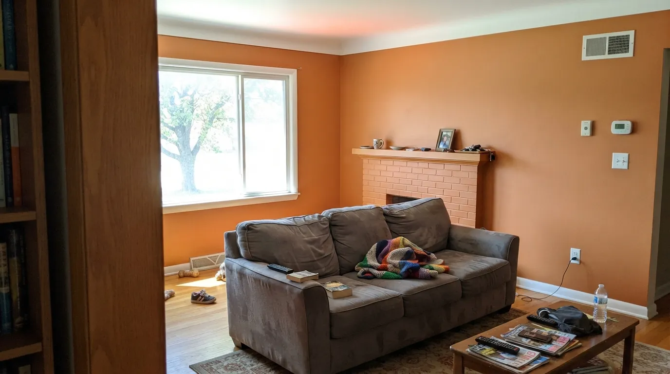
Orange next to orange has nothing to push against. Golden oak floors, an orange-red brick fireplace, cherry cabinets or an orange-stained mantel all pull the same direction, and the room turns into one loud note with no contrast anywhere. This color needs something cool or dark in the room — white oak, walnut, black metal, an olive or navy on a nearby surface, or a big neutral rug — to look intentional.
Bedrooms and main living rooms are where the regret posts come from. At LRV 22 a saturated warm color surrounds you, bounces onto the ceiling and keeps the room feeling active long after you wanted it quiet. Painted on one wall, or on a door or an island, the same color is a pleasure. Full-room drenching only really works in a small room you pass through — a powder room, a coat closet, an entry nook.
Room by Room
The single wall behind a sofa, a bed's headboard or a dining sideboard is what this color was built for. Keep the other three walls a warm white — Alabaster is the natural SW partner — so the orange has room to be loud. Matte hides drywall texture and keeps a saturated color from looking plastic; eggshell if the wall gets touched.
One of the safest ways to own this color. Against beige, greige or white siding with dark trim it gives real curb appeal and reads warm rather than trendy. Satin or semi-gloss, and use an exterior-grade product — saturated oranges and reds fade faster than neutrals on a south- or west-facing door, so plan on a refresh sooner than you would with a navy.
Sherwin-Williams itself points this color at craft rooms and creative spaces, and it earns that. A studio wall, a desk nook, or the back of open shelving in a playroom gets energy without the room going childish. In a playroom keep it to one wall or the built-ins — all four walls plus toys is visual noise, and eggshell wipes crayon off better than matte.
Small rooms with no windows are where drenching a bold color pays off, because nobody stays long enough for it to tire them out. Walls, ceiling and trim in Determined Orange with brass or matte-black fixtures looks like a deliberate jewel box. Use a scrubbable eggshell or satin, and keep the light bulbs warm.
An island or a run of lower cabinets in this color under warm white uppers is genuinely good, especially with butcher block or white oak counters. A whole kitchen of orange cabinets is a bet very few rooms win, and it is a losing one over honey oak floors. Satin urethane-fortified cabinet enamel, sprayed or brushed carefully — orange shows lap marks.
Only as an accent. A headboard wall works; four walls in the room where you sleep or watch TV does not, and that is the most common story behind a repaint. If you want the whole room warm and earthy, drop to Caramelized (LRV 35) or Cavern Clay and leave Determined Orange for the door or the built-ins.
Your Light Is the Risk
Under 2700K bulbs the red-earth side comes forward and the wall deepens toward amber and spice. This is the light that sells the color — turn the lamps on before you judge your sample.
Full south sun maxes out a saturated pigment: the wall reads at its loudest and brightest, and it throws a visible orange cast onto white trim and ceilings. In a bright, sun-flooded room, keep it to a wall the sun does not hit head-on.
Morning east light is the cleanest, most literal read. It quiets down through midday shade, then late west sun flushes it deeper and warmer for an hour — the best it looks all day. A north room skips the whole cycle and holds it a step cooler and more brick-like.
2700K is the right call: it enriches the orange and keeps the room from feeling harsh. Cool 4000K and up strips the warmth and pushes it toward a flat, slightly acidic red-orange — the cheapest fix in this whole review is swapping the bulbs before you swap the paint.
Most complaints about Determined Orange are a light mismatch. Upload a photo of your actual room and see it on your walls — then ask for the same wall in north light or evening lamps before you buy a single sample.
Need It From Another Brand?
Any paint counter can custom-tint Sherwin-Williams SW 6635 directly. If you would rather stay in one brand's own deck, these are the closest stock matches, measured as ΔE2000. Under 2 is a difference you will not see on the wall.
| Brand | Closest color | ΔE | LRV | |
|---|---|---|---|---|
| Behr | Chivalry Copper240D-6 · Behr | 1.9 | 21 | Color page → |
| Benjamin Moore | Fall Harvest2168-10 · Benjamin Moore | 0.6 | 22 | Color page → |
| Valspar | Hot WingsV046-5 · Valspar | 3.2 | 21.4 | Color page → |
| PPG / Glidden | Sesame CrunchPPG1198-7 · PPG / Glidden | 3.2 | 22 | Color page → |
| Glidden | Sesame CrunchPPG1198-7 · Glidden | 2.8 | 22 | Color page → |
| Dutch Boy | Lava Flow209-7DB · Dutch Boy | 0.4 | 22 | Color page → |
Similar Sherwin-Williams Colors
The nearest shades to Determined Orange within Sherwin-Williams's own range, ranked by perceptual color distance — useful when you want the same look a touch lighter, darker, or warmer.
WCAG 2.1: AA is 4.5 : 1 for normal text, 3 : 1 for large text, AAA is 7 : 1.
Determined Orange vs the Colors You're Also Considering
Every Determined Orange sample board has the same rivals on it. The numbers show the real lightness gap — then it comes down to which risk you would rather live with.
Pick this when Cavern Clay looks dusty and you want the color to be unmistakably orange.
Sherwin-Williams SW 7701 · LRV 24Cavern ClayPick this if you wanted actual terracotta — it is the same warmth with brown and gray mixed in, and it can carry a whole room.
Pick this for the cleaner, less red version; Determined Orange stays on the orange side where Fireball tips toward burnt red.
Benjamin Moore 2170-10 · LRV 19Fireball OrangePick this if your painter works in Benjamin Moore — it is the nearest bold orange in that deck, a step deeper and clearly redder.
Determined Orange Coordinating Colors
The rule with a color this saturated is that everything else in the scheme should be quieter than it is. Warm whites and beiges hold the surrounding surface area, one cool color keeps the room from going all-warm, and one warm dark gives the eye somewhere to land. These are the partners that keep showing up in rooms that actually work:
Where a Bold Orange Fits in the Terracotta Decade
The run of clay colors we are still living in started when Sherwin-Williams named Cavern Clay its 2019 Color of the Year and gave the whole industry permission to paint warm again. Everything that followed — the clay pinks, the rusts, the 2026 forecasts full of dusty browns, ochres and desert terracottas — has been a muted version of the same idea. Almost every one of those colors is orange with the volume turned down.
Determined Orange is the same family with the volume left alone. It never had a Color of the Year moment and it has no viral kitchen behind it; it is a standard fan-deck orange that keeps getting pulled into terracotta round-ups precisely because it is the one that did not compromise. That is worth knowing when you shop it: you are not buying the safe version of the trend, you are buying the color the trend was softened away from. Used in the doses this review keeps recommending — a wall, a door, a run of cabinets — it also carries less repaint risk than a full room of any trend clay, because the commitment is one afternoon's work.
Priming, Coats and Sheen: What This Color Actually Takes
Saturated oranges and reds are built on pigments that hide poorly, and this one is no exception. Rolled straight over a white wall the first coat comes out streaky and blotchy, and people panic. The fix is boring and cheap: have the store tint your primer gray, or roughly halfway toward the finish color, then put two finish coats over it. Skipping the primer usually means three coats and a wall that still looks uneven in raking light.
Technique matters more than it does with a neutral. Cut in and roll one wall at a time so the edges stay wet, keep a consistent amount of paint on the roller instead of stretching the last of it, and do not spot-touch a dried saturated wall unless you can feather it — touch-ups flash on colors like this far more visibly than on beige. Keep a labeled quart for later, and remember the exit cost: going back to white over Determined Orange is a primer plus two coats of its own.
For sheen, matte on an accent wall hides drywall texture and stops a strong color from looking like plastic; eggshell is the better call at kid height or in a powder room where the walls get wiped. Cabinets and interior doors want satin in a urethane-fortified cabinet enamel, and a front door wants exterior satin or semi-gloss so it sheds rain and reads crisp from the curb.
Three Ready Palettes Built on Determined Orange
A color is never alone on the wall. These are complete combinations in the 60-30-10 pattern, with the reason each one holds together. Every one opens in the visualizer.
The warm white does the real work: it gives the orange somewhere to stop, and it keeps the room from reading as a themed space. Urbane Bronze is the right dark here because it is warm rather than blue-black, so the contrast lands as depth instead of as a second statement.
Try this palette in your roomA warm beige body and a near-black frame are the setup that lets a bold door be the only surprise on the facade. Iron Ore matters more than it looks — without a dark trim line the orange bleeds into the siding from the street and the door stops reading as a feature.
Try this palette in your roomOrange and olive is the pairing every seventies rec room got wrong by using both at full strength. Here the beige walls hold most of the surface area and the two colors sit at nearly the same depth, so they read as a matched pair of accents rather than a fight.
Try this palette in your roomDetermined Orange FAQ
Is Determined Orange a terracotta color?
Not really — it sits at the bold end of that family. True terracotta paints are orange with brown and gray mixed in so they behave like warm neutrals; Determined Orange leaves most of that out and stays a clear orange with a red-earth lean. It is the right pick when you want people to notice the color, and the wrong one when you wanted a sun-baked clay wall. For that, Cavern Clay is the closer match.
How many coats does it take?
Plan on a gray-tinted primer plus two finish coats. Orange and red pigments are among the weakest hiders in any deck, and rolled straight over white they streak badly — the first coat almost always looks like a mistake. Ask the store to tint the primer roughly halfway toward the color, cut in and roll each wall wet-to-wet, and keep a small can for touch-ups, because saturated colors flash where you dab them later.
What trim white goes with Determined Orange?
A warm white, not a stark one. Alabaster (LRV 82) is the natural Sherwin-Williams partner and keeps the edge soft; Pure White (LRV 84) if you want a cleaner, more graphic line between the wall and the trim. A cold blue-white makes the orange look hotter and cheaper by comparison. Semi-gloss on the trim, matte or eggshell on the wall.
Will it look like a pumpkin or a fast-food restaurant?
It can, and the cause is almost always context rather than the paint. Direct midday sun pushes it to its loudest, and orange next to honey oak, orange brick or a builder-beige carpet has nothing to balance it. The same color beside a warm white, a black metal, white oak or walnut, and a green or navy note reads spiced and expensive. Cheap cool bulbs are the other culprit — swap to 2700K before you judge it.
Is Determined Orange good for a front door?
It is one of its best uses. It is bold enough to be seen from the street and earthy enough not to look like a novelty, and it sits well against beige, greige, white or charcoal siding. Two cautions: use an exterior product in satin or semi-gloss, and accept that saturated oranges fade faster in full sun than dark neutrals do, so a south-facing door will want a refresh coat sooner.
What colors go with Determined Orange?
Warm whites and beiges for the surrounding walls — Alabaster, Natural Linen, Accessible Beige. For contrast, go to the cool side: Naval or a muted olive like Dried Thyme both hold their own against it without competing. For the dark note, use warm darks like Urbane Bronze or a true black rather than blue-grays. The combinations to avoid are pink-beige, mauve and anything else with a rosy cast — they make the orange look dirty.
Have you painted with Determined Orange?
Rate it — one tap helps the next reader decide.
Ask a Question