Invigorate
The saturated orange from Sherwin-Williams' own kids' lookbook, reviewed honestly: the one wall it was built for, the light that turns it rust, and why it takes three coats.

Jessica has spec'd whites and neutrals for more than 300 rooms and keeps a sample wall of painted drawdowns in her studio. Every color review is checked against real reader rooms in the comments and re-tested when a formula changes. About the testing process →
- 1Rookwood Terra Cotta14
- 2Determined Orange22
- 3Invigorate29
- 4Caramelized35
- 5Venetian Plaster42
The Fast Verdict
Invigorate is a red-leaning tangerine — loud, high-chroma, and completely honest about it. Sherwin-Williams puts it in its Playful Kids' Paint Colors lookbook and its tween-room gallery, and that is exactly the job it does best: one wall, one built-in, one door, against a cool neutral that keeps it in its lane. Painted on four walls of a small room it stops being a color and starts being weather. Budget three coats or a gray-tinted primer, because saturated orange pigment hides badly.
Playroom and kids'-room accent walls · tween and teen rooms that need a color with a pulse · entryway doors, lockers and cubbies · a dining room that should feel like a conversation · a front door on a plain facade
You want the room to feel calm · your floors or trim are honey oak or red oak · the room is dim or windowless · you are painting all four walls of a small space · you want one coat and done
- Genuinely energizing — the rare color that makes a room feel alive
- Sherwin-Williams' own pick for kids' and tween spaces, not an internet guess
- Perfect scale for accents: doors, cubbies, built-ins, one wall
- Red lean keeps it warm and grown-up instead of pumpkin-cute
- Cheap to undo — one wall of it is a Saturday, not a renovation
- Overstimulating on four walls, especially in a child's room
- Poor hide — plan on a tinted primer or a third coat
- Fights honey oak, red oak and orange-toned brick
- Goes rusty and heavy in dim rooms, and fades faster than neutrals outdoors
What Color Is Invigorate, Really?
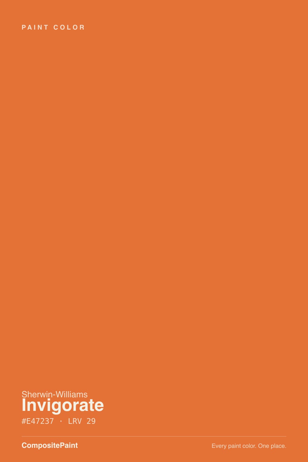
A vivid orange that leans red rather than yellow — persimmon and tangerine, not marigold. Run the numbers on the chip and it sits at the red edge of orange with roughly three-quarters saturation, which is why it reads warmer and deeper than the pumpkin oranges next to it in the fan deck. Sherwin-Williams files it in the orange family and lists it for interior and exterior use, and the neighboring chip, Navel SW 6887, is the yellower, brighter version of the same idea if this one reads too hot on your sample.
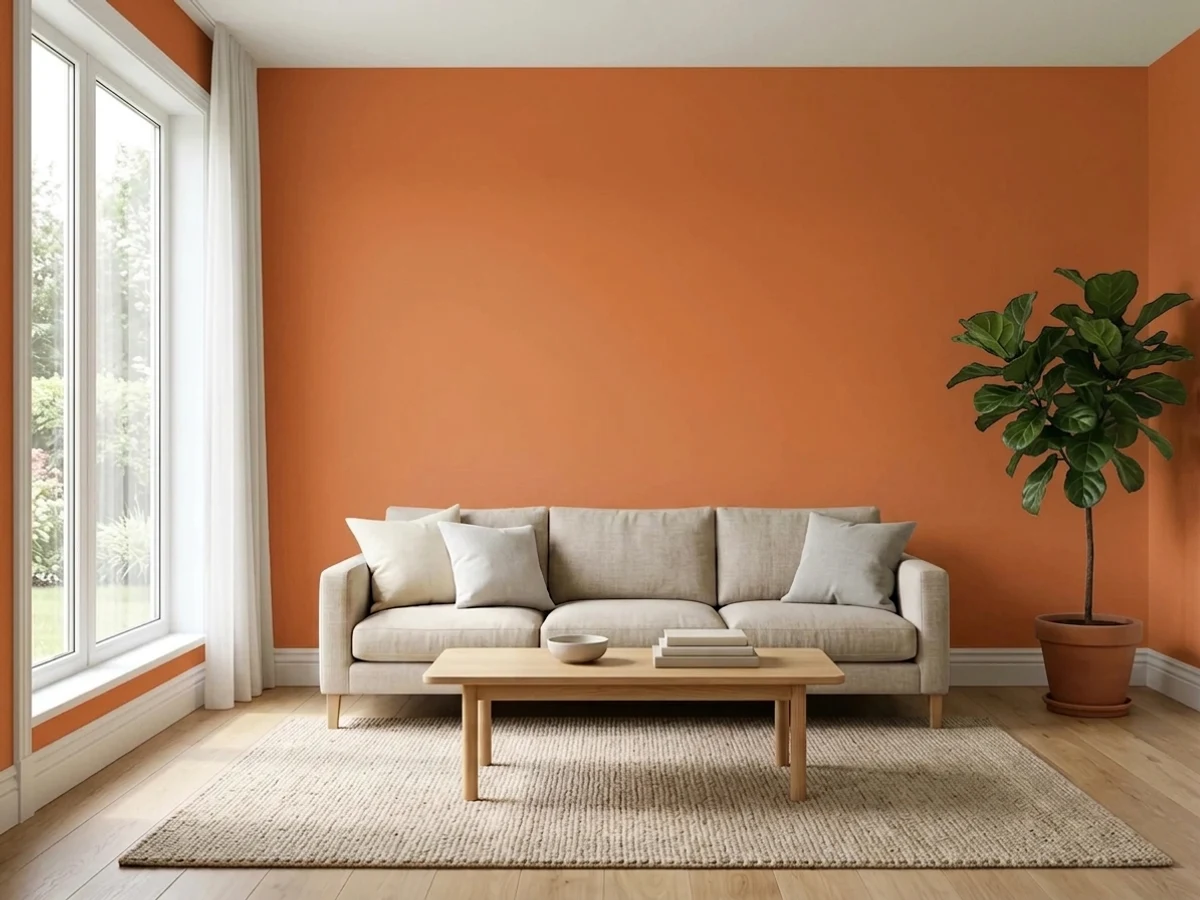
At LRV 29 it is a genuine mid-depth color, not a pastel and not a dark. That number is the part people misjudge: on a chip it looks bright, so buyers assume it will keep a room light. It will not. Four walls of Invigorate absorb about seventy percent of the light hitting them, so a small playroom that felt fine in white will feel noticeably closer and darker, with everything in the room — skin, white shelving, toys — picking up an orange cast from bounce light.
Undertone in one line: red-orange with a golden cast, no brown in it and no pink. If your sample looks rusty, the room is dim and you are seeing the color with the light taken out of it. If it looks like a traffic cone, you are looking at it under cool 4000K LEDs. Both are the same paint reporting on your lighting.
Where It Shines
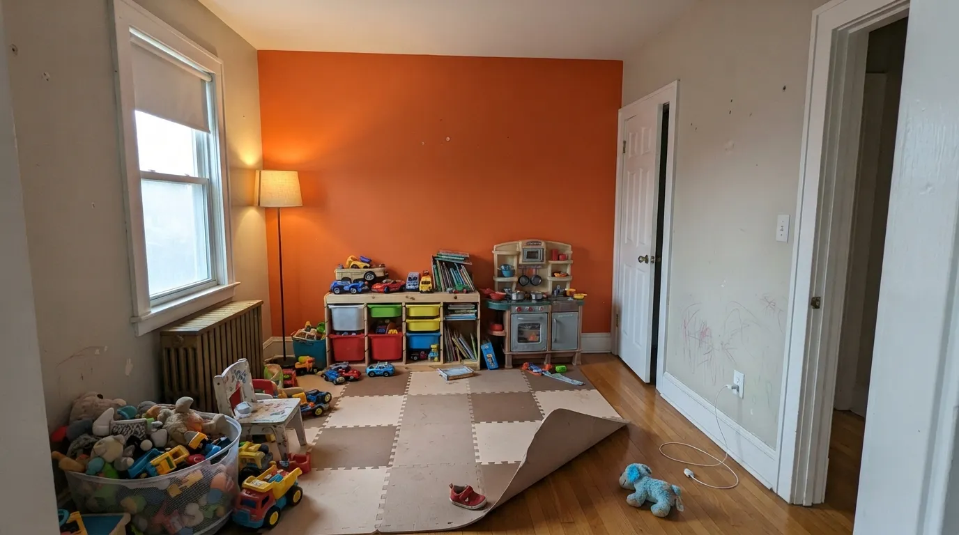
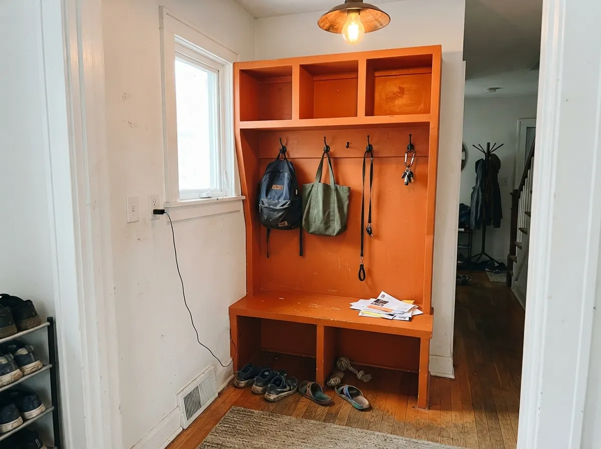
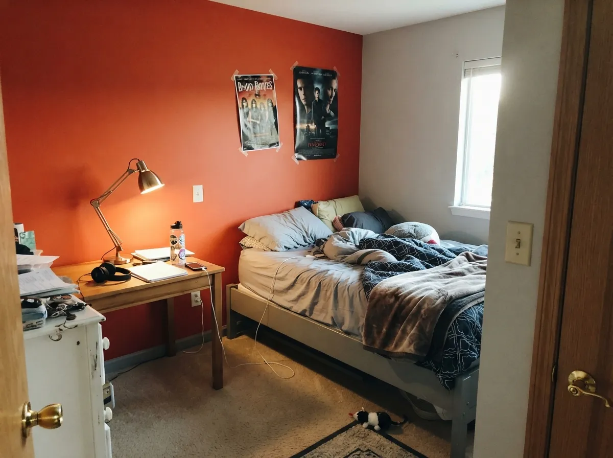
This color is at its best doing one job loudly. Sherwin-Williams itself puts it in the Playful Kids' Paint Colors lookbook alongside quiet neutral backdrops — Repose Gray, Pure White, Dorian Gray, Extra White — and that is the honest formula: quiet walls, one energetic surface. A play nook, a wall of built-in cubbies, the inside face of a front door, a dining-room hutch. In those doses it does something no neutral can: it makes a room feel like somebody lives there on purpose. Give it white trim, black metal, teal or soft blue somewhere in the room, and real daylight, and it looks intentional instead of accidental.
Where It Fails
Almost every regret story about a bright orange follows one of three scripts, and all three are predictable before you open the can. None of them mean the paint is bad — they mean the room, the floors or the primer were wrong for it.
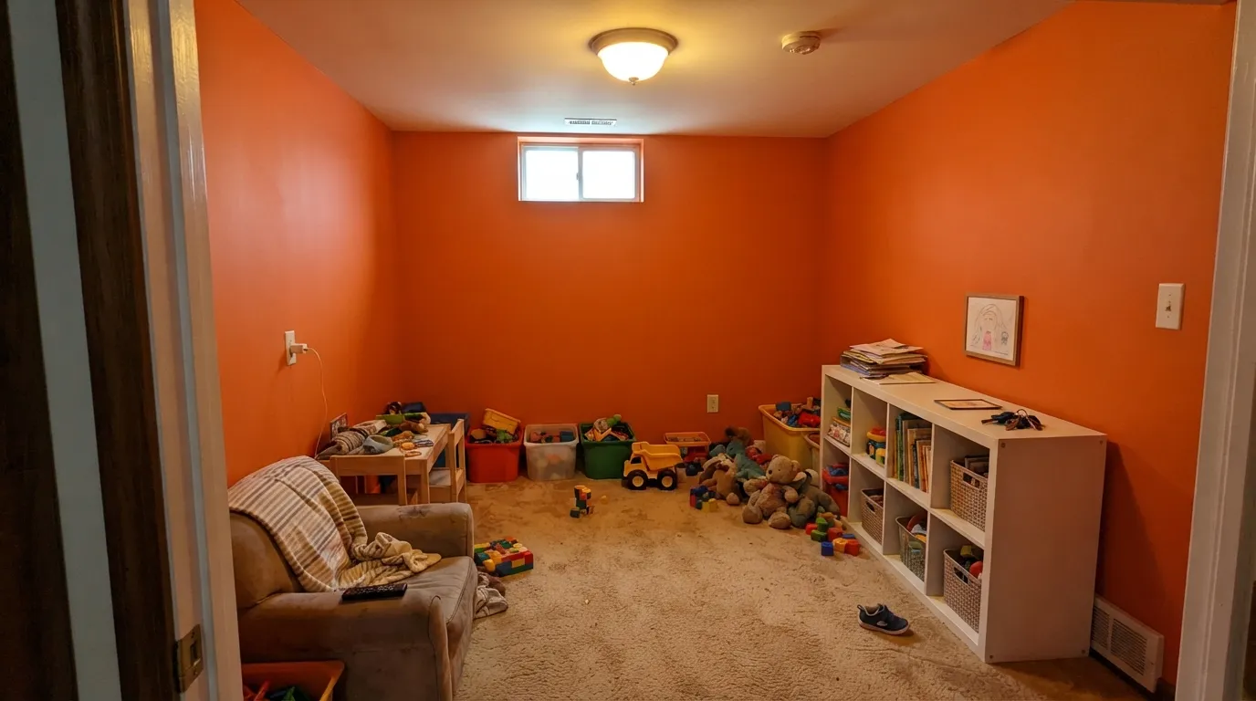
Sherwin-Williams' own designer guidance says an orange wall can act as the artwork in the room — which is another way of saying you only get one. Color-psychology writing on kids' rooms lands in the same place: orange encourages talking and confidence in small doses, and tips into irritable and overstimulated when it surrounds a child. Practical version: at LRV 29 four walls also eat the light. One wall, or a built-in, or the closet doors.
Bright, clean oranges use transparent pigments and hide poorly — Sherwin-Williams sells a gray-tinted basecoat system specifically because about a fifth of its colors need one. Roll this straight over white drywall and you will see roller lap streaks after two coats and reach for a third. Prime in the correct gray shade first, keep a wet edge, and expect touch-ups to flash if you spot-fix instead of cutting a full wall.
This is the clash nobody warns you about, because it is not a fight — it is a family argument. Honey oak floors, orange-stained trim and red oak cabinets are already in the orange family, just muddier, so the wall makes the wood look dirty and the wood makes the wall look cheap. Walnut, espresso, painted white trim, gray-washed LVP and pale white oak all work. Golden oak needs a big rug or a different color.
Room by Room
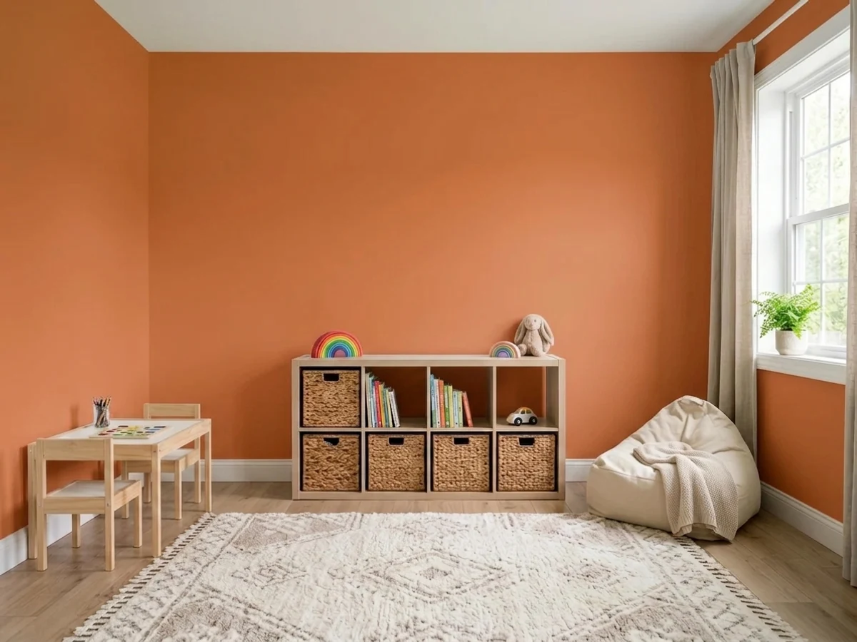
One wall behind the play kitchen or the reading nook, the rest in a cool neutral, is the whole recipe and it is Sherwin-Williams' own. Scrubbable satin, because this is the room where markers happen. Do not drench all four walls: the energy is the point, but at LRV 29 it also swallows the light in a basement or interior playroom.
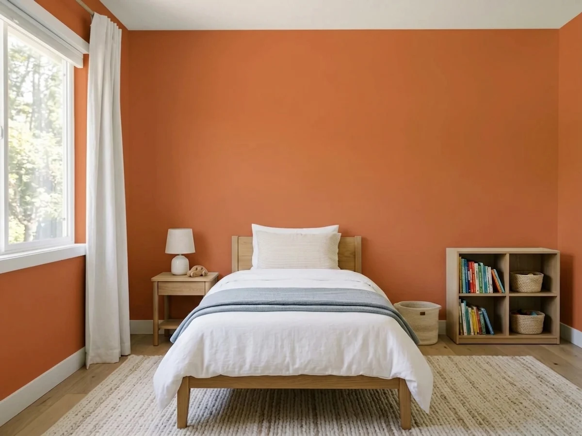
It appears in SW's tween-room inspiration gallery for a reason: it reads bold without reading babyish, which is the exact brief for ages eight to fourteen. Best as a headboard wall, a bookcase back, or closet and desk fronts against gray or white walls. It is also a color a nine-year-old chooses and a twelve-year-old resents, and repainting one wall is a Saturday.
Small, transitional, and nobody sits there for an hour — the perfect place for a color this loud. Painted cubbies or an entry bench in satin Invigorate under white walls looks designed, not impulsive, and it hides less than you would fear because the surfaces are small. Black hooks and hardware, not brass, keep it modern.
Orange is one of the few colors interior designers actively recommend for dining rooms, and this one glows under warm bulbs and candlelight. Use it on one wall or a built-in hutch, keep the rest warm white, and add one dark note — a bronze or near-black window sash — so the room reads composed rather than themed.
A run of orange cabinets is a decade-long commitment in a room you cannot repaint in a weekend, and it argues with almost every warm countertop. A pantry door, an island end panel, or the inside of open shelving in satin is where it earns its place. Never over a red oak or honey oak floor.
On a front door, shutters or a garage-adjacent accent against a white or gray facade it is genuinely great curb appeal. On siding it is too much orange and it fades: highly saturated oranges lean on organic pigments that are less UV-stable than earth-tone oxides, so a south- or west-facing door in a high-sun climate will visibly soften in a few years. Buy the premium exterior line and plan on refreshing the door.
Your Light Is the Risk
A big window with the sun off it — a north or east playroom at midday. The orange stays a clean tangerine with no glare and no rust. This is the light the chip is showing you.
At LRV 29 there is not enough light to give back. Basement playrooms and interior rooms turn it heavy and rust-brown, and the whole room feels smaller. Add real light or pick something lighter.
Late direct sun sets it on fire — for about an hour it goes near-fluorescent and bounces orange onto the ceiling and everyone's face. Morning east light is the calm version of the same wall. Sample at 5pm before committing.
2700K warm bulbs push it deeper and redder, closer to terracotta, and this is when it looks most expensive. Cool 4000K LEDs strip the warmth and leave it looking raw and plasticky. Split the difference at 3000K in kids' rooms so homework light stays usable.
Most complaints about Invigorate are a light mismatch. Upload a photo of your actual room and see it on your walls — then ask for the same wall in north light or evening lamps before you buy a single sample.
Need It From Another Brand?
Any paint counter can custom-tint Sherwin-Williams SW 6886 directly. If you would rather stay in one brand's own deck, these are the closest stock matches, measured as ΔE2000. Under 2 is a difference you will not see on the wall.
| Brand | Closest color | ΔE | LRV | |
|---|---|---|---|---|
| Behr | Tart OrangeHDC-MD-27 · Behr | 1.6 | 31 | Color page → |
| Benjamin Moore | Oriole2169-30 · Benjamin Moore | 5.0 | 29 | Color page → |
| Valspar | Sandy Peppers8001-17G · Valspar | 2.0 | 28 | Color page → |
| PPG / Glidden | Field PoppyPPG1195-7 · PPG / Glidden | 2.6 | 26 | Color page → |
| Glidden | Audrey'S Auburn50YR 16/127 · Glidden | 3.4 | 16 | Color page → |
| Dutch Boy | Summer Treat108-6DB · Dutch Boy | 1.7 | 29 | Color page → |
Similar Sherwin-Williams Colors
The nearest shades to Invigorate within Sherwin-Williams's own range, ranked by perceptual color distance — useful when you want the same look a touch lighter, darker, or warmer.
WCAG 2.1: AA is 4.5 : 1 for normal text, 3 : 1 for large text, AAA is 7 : 1.
Invigorate vs the Colors You're Also Considering
Every Invigorate sample board has the same rivals on it. The numbers show the real lightness gap — then it comes down to which risk you would rather live with.
Pick this when you want the red lean: Invigorate reads warmer and less like a citrus label.
Sherwin-Williams SW 6887 · LRV 35NavelPick this for the brighter, yellower, more classic-orange version — and six more points of LRV, which a small room feels.
Pick this if your painter already works in Sherwin-Williams; there is no design reason to cross the street for this one.
Behr HDC-MD-27 · LRV 31Tart OrangePick this if you are buying at Home Depot — it is close enough in hue and depth that most people could not pick them apart on a wall.
Invigorate Coordinating Colors
The rule for coordinating with a color this loud is simple: everything else in the room gets quieter. Sherwin-Williams' own guidance for orange interiors names three partner categories — whites and creams to balance the heat, charcoal or chocolate for a grounding dark, and teal or soft blue as the complementary accent — and in practice that is exactly what works. These are the partners that keep showing up in rooms that hold together:
Where Sherwin-Williams Actually Puts This Color
Invigorate is not an internet-invented pick. Sherwin-Williams itself lists it in the Playful Kids' Paint Colors lookbook, in a bright section next to June Day and Red Tomato, and it shows up again in the company's tween-bedroom inspiration gallery. Read the same lookbook a second time and the pattern is more useful than the color list: the backdrops SW recommends are all quiet — Repose Gray, Pure White, Dorian Gray, Extra White — and the saturated colors are there to be swapped out as a child's phase changes. That is the intended use, straight from the brand.
The company also lists the color as interior and exterior, which is worth knowing before you buy: it is cleared for doors, shutters and outdoor furniture, not just walls. The honest footnote is fade. Highly chromatic oranges and reds depend on organic pigments that are less UV-stable than the iron-oxide earth tones behind muted terracottas, so a sun-baked south or west door will lose some punch faster than a neutral would. Premium exterior product, and treat it as a color you will freshen.
Invigorate With Wood Tones and Floors
This decision gets made at the floor, not at the paint counter. Walnut, espresso and dark-stained wood are the easiest company — the depth reads as a frame and the orange looks deliberate against it. Pale white oak, gray-washed LVP and light concrete are the second-safest option: cool, low-chroma floors give the eye a rest and let the wall be the only loud thing in the room. Painted white built-ins are better than stained ones next to this color, every time.
The genuine no is anything already orange. Honey oak floors, orange-stained 1990s trim, red oak cabinets and orange-toned brick fireplaces all sit in the same hue family as Invigorate but duller and browner, so they do not contrast and they do not match — they just make each other look wrong. If a golden-oak floor is staying, either put a big neutral rug between it and the wall or drop down to Cavern Clay, which shares the mood while sitting close enough to the wood's own muted tone to get along with it.
Metals are easy: matte black and brushed nickel keep it modern, and unlacquered brass leans it warm and retro in a good way. Polished chrome is the only one that looks cold and accidental against it, and shiny copper hardware disappears into the wall entirely.
Three Ready Palettes Built on Invigorate
A color is never alone on the wall. These are complete combinations in the 60-30-10 pattern, with the reason each one holds together. Every one opens in the visualizer.
This is Sherwin-Williams' own kids'-room formula, not ours: a quiet neutral backdrop that lets the accent color carry the personality. All three colors appear in the same Playful Kids' Paint Colors lookbook. Repose Gray is neutral enough to step back completely behind the orange instead of competing with it, and when the child outgrows the phase you repaint one wall instead of four.
Try this palette in your roomTeal is the partner Sherwin-Williams' own designers name for orange, and at LRV 35 Peacock Blue matches Invigorate's weight so neither one wins. The rule that makes it work: keep the two colors on different planes with white between them. Facing walls in complementary colors vibrate, which is a real effect and an unpleasant one in a narrow entry.
Try this palette in your roomThe cream-and-charcoal frame is what turns a loud orange into a designed room: Greek Villa's warmth meets the orange halfway instead of cutting against it, and Urbane Bronze supplies the one dark note the scheme needs so the eye has somewhere to rest. Under warm bulbs at dinner the orange deepens toward terracotta and the whole thing reads intentional.
Try this palette in your roomInvigorate FAQ
Is Invigorate too bright for a kid's room?
On one wall, no — Sherwin-Williams puts it in its own kids' and tween color collections. On all four walls, usually yes. The color-psychology consensus on orange in children's rooms is consistent: small doses encourage confidence and talking, full immersion tips into overstimulated and irritable. Pair it with a cool neutral on the other walls and you get the good half without the bad.
How many coats does Invigorate need?
Plan on three over white drywall, or two over a correctly gray-tinted primer. Saturated oranges are built on transparent pigments that hide badly, which is exactly why Sherwin-Williams sells a gray-shade basecoat system for its most chromatic colors. Ask the store to tint your primer for this color rather than fighting it with extra finish coats.
What colors go with Invigorate?
White and cream to cool it down, charcoal or bronze for a dark note, and teal or soft blue as the complementary accent — that is Sherwin-Williams' own pairing advice for orange, and it holds up. Avoid putting a strong blue or teal on the wall directly facing the orange one; complementary colors across from each other vibrate.
Does Invigorate work with oak floors?
It depends entirely on the oak. Walnut, espresso, pale white oak and gray-washed LVP are all fine. Honey oak and red oak are the real problem: they are already orange, just muddier, so the wall makes the floor look dirty and the floor makes the wall look cheap. A large neutral rug helps if the floor is staying.
Can I use Invigorate on a front door?
Yes, and it is one of its best uses — a saturated orange door on a white or gray facade reads confident rather than eccentric. Two caveats: buy the premium exterior line, and accept that a color this chromatic relies on organic pigments that are less UV-stable than earth tones, so a south- or west-facing door will soften faster than a neutral. Treat the door as a refresh item, not a twenty-year finish.
What white trim goes with Invigorate?
A clean, slightly warm white — Pure White is the default and it is the trim white Sherwin-Williams itself pairs with this color in the kids' lookbook. Alabaster works if the room already leans warm. A cold blue-white makes the orange look hotter and cheaper by contrast, and a cream trim blurs the edge where you actually want a crisp line.
Have you painted with Invigorate?
Rate it — one tap helps the next reader decide.
Ask a Question