June Day
Sherwin-Williams' playroom yellow, reviewed honestly: the rooms it makes, the light that turns it molten, and why LRV 63 fools almost everyone.

Jessica has spec'd whites and neutrals for more than 300 rooms and keeps a sample wall of painted drawdowns in her studio. Every color review is checked against real reader rooms in the comments and re-tested when a formula changes. About the testing process →
- 1Chilled Wine41
- 2Honey Tea52
- 3June Day63
- 4Banana Cream71
- 5Lemon Chiffon79
The Fast Verdict
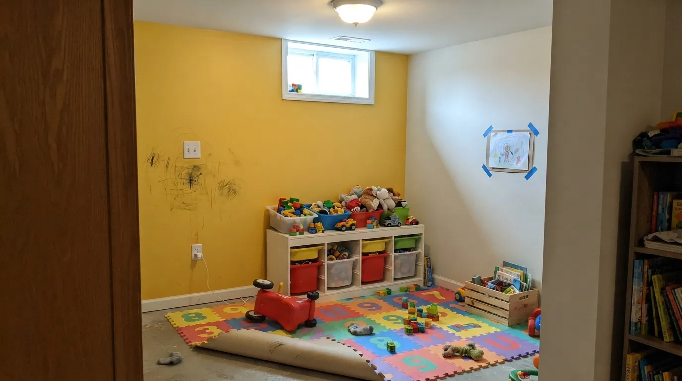
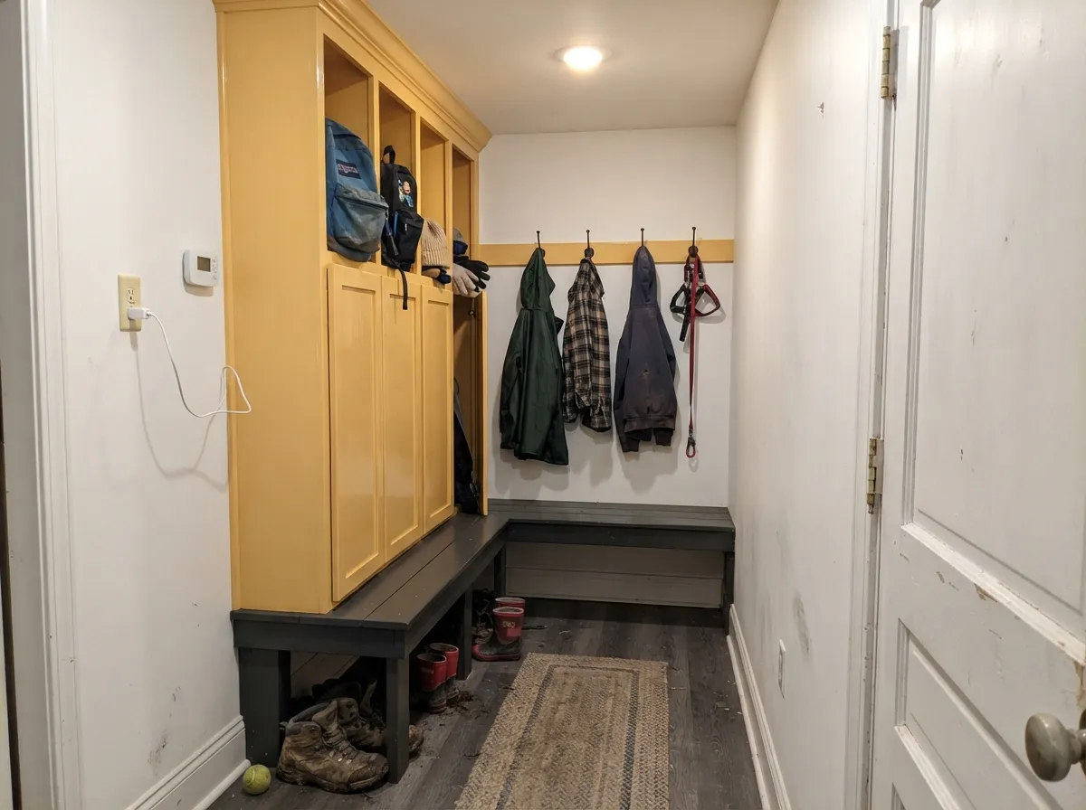
June Day is a real yellow — golden, saturated, unmistakable from the doorway — and that is both the reason to buy it and the reason most people should buy less of it than they plan to. Sherwin-Williams puts it in its own Playful Kids' lookbook, and that is exactly the right pitch: one accent wall, a set of built-ins, a mudroom locker bank. Four walls of it in an afternoon-sun room is a different, much louder experience than the chip suggests.
Playrooms and kids' spaces · one accent wall or a bank of built-ins · windowless mudrooms, laundry rooms and back halls · a kitchen hutch, island or breakfast nook · anyone who wants a color guests actually notice
You want a soft, buttery, barely-there yellow · the room is a nursery or a bedroom meant to calm someone down · you have honey oak floors and orange-stained trim · you are painting four walls in a west-facing room · you only want to do two coats
- A real yellow — it reads yellow from the doorway, not "warm white"
- Sherwin-Williams' own pick for playful kids' spaces, and it delivers there
- Transforms windowless mudrooms, laundries and back halls for one quart
- At LRV 63 it adds color without making the room darker
- Cheap, reversible personality: one accent wall changes a whole room
- Amplifies with surface area — four walls is much louder than the chip
- Bounces gold onto ceilings, trim and anything already warm
- Weak hiding power: three coats and a tinted primer, realistically
- Wrong color for nurseries and bedrooms meant to wind people down
What Color Is June Day, Really?
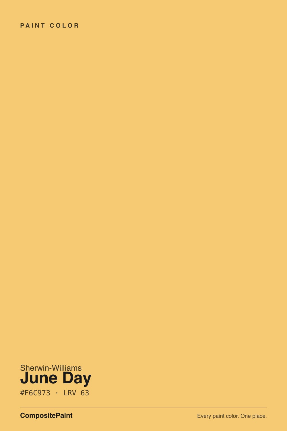
A clean golden yellow — warm, saturated, and honest about it. There is no gray in this color and barely any orange: it sits right in the middle of the yellow family, brighter and more chromatic than the cream-yellows people usually end up with and far short of the acid lemon-green yellows that make a room feel like a highlighter. Sherwin-Williams files it under yellow with no qualifiers, and for once the marketing and the wall agree. It is the color a child draws the sun with.
The number that misleads everyone is LRV 63. That is the same light reflectance as Sea Salt and Edgecomb Gray — two colors nobody has ever called loud. LRV measures how much light a color bounces back, not how much color it carries, and June Day carries a lot. Read the 63 as "this will not darken the room" and nothing more. On saturation it behaves like a much bolder color, and the wall will look noticeably stronger than the fan-deck chip because a chip is four square inches and a wall is a hundred square feet.
Undertone in one line: golden, leaning very slightly toward amber — never green, never mustard. If your sample looks greenish, that is cool daylight or a 4000K bulb draining the warmth out of it. If it looks close to orange, that is west afternoon sun. Both are the same paint telling you the truth about your room.
Where It Shines
This color is built for rooms that are supposed to be fun, and for rooms that have nothing else going for them. Sherwin-Williams puts June Day in its Playful Kids' Paint Colors lookbook, in a grouping called Sunny Delight, and that is genuinely where it does its best work: one wall of a playroom behind the toy shelves, the back of a built-in bookcase, a bank of cubbies. Its quieter second job is utility — a windowless laundry room, a mudroom, a back stairwell. Those rooms have no view to protect and no mood to preserve, so a jolt of yellow is pure profit. Give it a quiet white on the other three walls and something dark to anchor it — a navy door, black hardware, a charcoal counter — and it reads deliberate instead of accidental.
Where It Fails
Almost every regret about June Day comes from one of three places, and all three are predictable before you open the can. None of them mean the paint is bad — they mean the plan was bigger than the color could carry.
Saturated colors gain strength with surface area, and yellow gains the most. The chip in your hand is charming; a hundred square feet of it is a statement. This is the single most common yellow story in every paint forum — people choose the yellow that looks right in their palm and end up with a room that hums. The fix is to choose a step calmer than feels right, or to keep June Day to one wall and put Butter Up (LRV 74) or Friendly Yellow (LRV 76) on the rest.
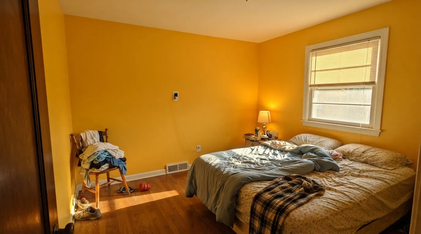
Strong yellow bounces its color onto everything near it. A white ceiling above June Day walls picks up a distinct gold cast, white trim goes cream, and in an already-warm room — honey oak floors, orange-stained doors, 2700K bulbs — the whole envelope tips toward gold and the yellow loses its snap. If your floors are golden oak, this color amplifies them rather than balancing them; a big rug or a cooler-leaning white on the ceiling is the difference between cheerful and jaundiced.
Bright yellows are built on organic pigments with weak hiding power, and they show every roller lap and every patch of primer for longer than any neutral. Plan on three coats over a white or gray wall, and have the store tint your primer a light warm gray or buff — that one step usually saves a whole coat. Skipping it is why people describe yellow rooms as streaky in the corners and around outlets.
Room by Room
This is the assignment Sherwin-Williams itself gives it, and it earns it. One June Day wall behind the shelves, quiet white on the others, satin so crayon wipes off. A whole playroom in it is possible if the room is small and north-facing; in a bright room, one wall is plenty and the rest of the color can come from the toys.
Yellow at this saturation is stimulating, which is exactly what you want over a desk or a play corner and exactly what you do not want above a pillow. Put it on a built-in, a closet door, a bookcase back or the lower half of a wall, and keep the sleeping side of the room calm. That advice comes up in almost every color-psychology guide for kids' rooms, and it is the honest way to use a color this bright.
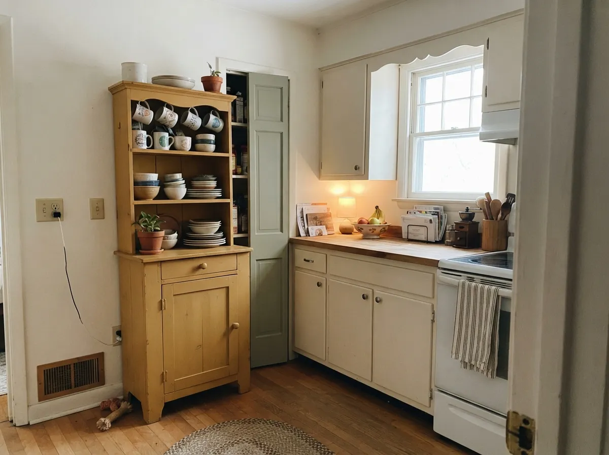
Charming on a hutch, a butler's pantry, an island or the back wall of a breakfast nook, under warm white cabinets. A full kitchen of yellow walls is a much bigger commitment than it looks, especially with warm wood and warm undercabinet lighting all pushing the same direction. Satin, urethane-fortified cabinet enamel if it is going on doors.
The best-value use of this color. These rooms are usually windowless, usually beige, and nobody sits in them long enough to get tired of the yellow. On locker fronts, cubbies or laundry cabinets it makes a dull room feel intentional for the price of a quart. Satin, so it takes wet coats and boot scuffs.
A June Day front door on a white or pale-gray house is a genuinely good look, and the inside face of that door is an easy, low-risk dose of the color in the entry. Full exterior siding is a different question — see the exterior section below. Semi-gloss on the door, and expect the color to read a step brighter outdoors than it did in the store.
Both rooms want the light to go down at the end of the day, and this color does not. Under 2700K lamps it turns amber and keeps working when you want the room to stop. If you want yellow in a sleeping room, drop to Butter Up at LRV 74 or Friendly Yellow at LRV 76 and let it be a warm background instead of a subject.
Your Light Is the Risk
The counterintuitive winner. Cool, even north daylight takes the edge off the saturation and the yellow does the one job a north room needs — it puts warmth back. This is the exposure where June Day can carry more than one wall.
Late direct sun stacks gold on gold and the walls go molten, close to orange, with real glare off anything but a flat sheen. If your room bakes from 3pm on, sample there and look at it at 5pm before you commit — this is where the loudest regrets come from.
An east room gets a genuinely lovely hour at breakfast, then settles down by noon. Midday is the truest read. From mid-afternoon on it climbs steadily warmer and stronger, peaking at golden hour, then drops back the moment the sun is off the glass.
Warm 2700K bulbs push it toward amber and custard — cozy in a den, too much in a room where you want the lights low. Cool 4000K and up drain the gold and leave a flatter, slightly green-lemon yellow. For playrooms and utility rooms, 3000K is the honest middle.
Most complaints about June Day are a light mismatch. Upload a photo of your actual room and see it on your walls — then ask for the same wall in north light or evening lamps before you buy a single sample.
Need It From Another Brand?
Any paint counter can custom-tint Sherwin-Williams SW 6682 directly. If you would rather stay in one brand's own deck, these are the closest stock matches, measured as ΔE2000. Under 2 is a difference you will not see on the wall.
| Brand | Closest color | ΔE | LRV | |
|---|---|---|---|---|
| Behr | Sunday AfternoonT14-19 · Behr | 1.6 | 62 | Color page → |
| Benjamin Moore | Lion Heart306 · Benjamin Moore | 0.9 | 60 | Color page → |
| Valspar | Sweet CornV054-3 · Valspar | 1.7 | 63.2 | Color page → |
| PPG / Glidden | Yukon GoldPPG1209-4 · PPG / Glidden | 1.1 | 61 | Color page → |
| Glidden | Yukon GoldPPG1209-4 · Glidden | 0.8 | 61 | Color page → |
| Dutch Boy | Sweet Bee115-4DB · Dutch Boy | 0.0 | 63 | Color page → |
Similar Sherwin-Williams Colors
The nearest shades to June Day within Sherwin-Williams's own range, ranked by perceptual color distance — useful when you want the same look a touch lighter, darker, or warmer.
WCAG 2.1: AA is 4.5 : 1 for normal text, 3 : 1 for large text, AAA is 7 : 1.
June Day vs the Colors You're Also Considering
Every June Day sample board has the same rivals on it. The numbers show the real lightness gap — then it comes down to which risk you would rather live with.
Pick this when you want the color to actually read as yellow from across the room instead of as a warm cream.
Sherwin-Williams SW 6681 · LRV 74Butter UpPick this if you want yellow you can put on all four walls and still live with — it is the immediately calmer neighbor in the same Sherwin-Williams run.
Pick this when you want sunny rather than honeyed; Bee at LRV 55 gives up some of the brightness for weight.
Sherwin-Williams SW 6683 · LRV 55BeePick this for the deeper, more golden version — closer to the ochre direction the 2026 conversation keeps drifting toward.
Pick this when the yellow needs to survive a bright room; at LRV 79 Lemon Chiffon can wash out in strong daylight, and June Day does not.
Sherwin-Williams SW 6686 · LRV 79Lemon ChiffonPick this if June Day's punch is more than you wanted — same cheer, roughly half the volume.
Pick this when you want a genuine yellow rather than the whisper of one. These two are not competitors; they are different decisions.
Behr ICC-90 · LRV 86Butter YellowPick this if what you actually want is the butter-yellow trend — at LRV 86 it is pale enough to work like a warm white.
June Day Coordinating Colors
The rule for coordinating with June Day: one quiet white to hold the room, one dark to anchor it, and at most one other color with an opinion. Yellow this saturated does not need help being noticed — it needs company that gives it somewhere to stop. These are the partners that keep showing up in rooms that work:
Where June Day Sits on the Sherwin-Williams Yellow Ladder
June Day has three close neighbors by number, and picking between them is the whole decision. Friendly Yellow SW 6680 at LRV 76 and Butter Up SW 6681 at LRV 74 are background yellows — you can put either on four walls and still call the room neutral-ish. June Day at LRV 63 is the step where the color stops being a background and starts being the subject. Bee SW 6683 at LRV 55 keeps the same golden character but trades brightness for weight, which reads more grown-up and more autumnal.
Lemon Chiffon SW 6686 sits off to the side rather than on the same ladder: at LRV 79 it is a paler, softer cheer that can disappear in a bright room. The practical test is simple — paint a large sample board of two candidates, stand it in the actual room, and walk in from the hallway. Yellow decisions are made at the doorway, not at arm's length.
June Day and the Yellow Comeback
Yellow spent the gray decade in exile and came back through fashion. The 2025 version was butter yellow — pale, soft, barely a color at all. Behr's Butter Yellow at LRV 86 is that trend in a can, close enough to a warm white that you can paint a whole house in it, and Sherwin-Williams ran its own cooler take, Icy Lemonade SW 1667 at LRV 80, as a color of the month in June 2025. Heading into 2026 the conversation has been moving the other way, toward deeper ochres and golds that feel more grounded than butter.
June Day is neither of those things, which is oddly its best argument. It is not a trend-pale yellow you can mistake for a neutral, and it is not an ochre trying to be sophisticated — it is just a clear, bright, cheerful yellow of the kind that has been painted in kids' rooms and back doors for a hundred years. Colors like that do not date the way trend shades do, because they were never fashionable enough to become unfashionable.
One honest note on exteriors: a June Day front door on a white or pale-gray house is a classic and a good idea. Full siding is a harder sell. Bright yellow pigments are the ones that fade first in full sun, so an entire house in this color is a maintenance commitment, and outdoors the color reads a clear step brighter than it does inside. Keep it to the door, the shutters or a garden shed and you get all of the personality with none of the repainting.
Three Ready Palettes Built on June Day
A color is never alone on the wall. These are complete combinations in the 60-30-10 pattern, with the reason each one holds together. Every one opens in the visualizer.
Sherwin-Williams groups June Day with Shell White and Red Tomato in its own Playful Kids' lookbook, and the ratio is the reason it works: a quiet, faintly peachy white does the heavy lifting so the yellow stays a jolt rather than a condition. The red is a tenth of the room at most — a door, the inside of the cubbies — and it keeps the scheme from reading like a fast-food counter.
Try this palette in your roomYellow, muted green and a soft white is the oldest cottage-kitchen scheme there is, and it holds up because the green absorbs the yellow's energy instead of competing with it. Alabaster is warm enough that the yellow does not make it look dingy — a stark, cool white in this scheme is what makes yellow rooms read cheap. Keep June Day to one object: the hutch, the island, or the nook, not all three.
Try this palette in your roomMudrooms and laundry rooms usually have no daylight and nothing worth protecting, which makes them the cheapest place to be brave. Pure White is clean enough to keep the yellow from tipping the whole room gold, and one near-black element at LRV 6 gives the eye somewhere to rest — without it, a yellow utility room reads unfinished rather than designed.
Try this palette in your roomJune Day FAQ
Is June Day too bright for a whole room?
In most rooms, yes — and that is not a knock on the color, it is arithmetic. Saturation multiplies with surface area, so four walls read far stronger than the chip. The exceptions are small, windowless rooms and north-facing rooms, where the cooler or dimmer light takes the edge off. Everywhere else, use it on one wall, on built-ins or on cabinetry and let a quiet white carry the rest.
What white goes with June Day?
A soft, quiet white — Shell White or Pure White both work, and Sherwin-Williams pairs it with Shell White in its own kids' lookbook. Avoid creams and warm off-whites next to it: they sit too close in temperature, so the trim reads dirty and the yellow loses its edge. Avoid the coldest bright whites too, which make the yellow look garish by contrast. Semi-gloss on trim, eggshell or satin on walls.
Is June Day good for a nursery?
It is a better playroom color than a nursery color. Color guidance for children's rooms consistently steers bright, saturated yellows toward play areas and away from sleeping areas, because this level of saturation is stimulating by design. If you want yellow over a crib, step up to a much paler one — Butter Up at LRV 74 or Friendly Yellow at LRV 76 — and save June Day for a bookcase, a closet door or the playroom next door.
How many coats does June Day take?
Plan on three, and have the store tint your primer a light warm gray or buff first. Bright yellows lean on pigments with genuinely weak hiding power, so they show lap marks and primer shadows longer than any neutral. The tinted primer is the difference between three good coats and four frustrating ones — it costs nothing extra and it is the step most people skip.
Does June Day look green in some rooms?
It can look slightly greener in cool light — a north window on an overcast day, or 4000K and cooler LED bulbs, both pull warmth out of it and leave a flatter, lemon-leaning yellow. Warm 2700K bulbs do the opposite and push it toward amber. If you want it to look the way it did in the store, 3000K bulbs are the safest middle.
How is June Day different from Butter Up and Bee?
They are immediate neighbors in Sherwin-Williams' own yellow numbering and the LRVs tell the story: Butter Up SW 6681 at 74, June Day SW 6682 at 63, Bee SW 6683 at 55. Butter Up is the background version, June Day is the one that reads clearly as yellow, and Bee trades brightness for a deeper, honeyed weight. If you cannot decide, sample all three on one board — they are close enough on a chip and obviously different on a wall.
Have you painted with June Day?
Rate it — one tap helps the next reader decide.
Ask a Question