Butter Up
The soft yellow everyone pins for a laundry room, reviewed honestly: where it glows, the light that turns it acid, and what to pick instead.

Jessica has spec'd whites and neutrals for more than 300 rooms and keeps a sample wall of painted drawdowns in her studio. Every color review is checked against real reader rooms in the comments and re-tested when a formula changes. About the testing process →
- 1Honey Tea52
- 2Jackfruit62
- 3Butter Up74
- 4Lemon Chiffon79
- 5Frittata86
The Fast Verdict
Butter Up is what people picture when they say butter yellow, and that is exactly the problem and the point. It is not a warm off-white with a hint of something — it is a real, golden, cheerful yellow that will be the first thing anyone notices about the room. In a windowless laundry room or a north-facing back hall it is one of the most useful colors Sherwin-Williams makes. In a west-facing living room at four in the afternoon, it is a lot.
Laundry rooms, mudrooms and windowless utility spaces · kitchen walls above white cabinets · kids' rooms, playrooms and nurseries · dark north-facing rooms that need warmth instead of more gray
You actually wanted a cream or an off-white · the room takes hard south or west sun all afternoon · your bulbs are cool 4000K LEDs and staying that way · your floors and counters run cool gray
- Real cheer in rooms that have no window to give
- Warm without turning beige, greige or muddy
- Small utility rooms — laundry, mudroom, back hall — take it beautifully
- Reads golden butter rather than lemon in cool north light
- Pairs cleanly with white cabinets, navy and muted green
- Far more yellow than the trend photos lead people to expect
- Goes acid and glowing in hard south or west afternoon sun
- Turns faintly green under cool 4000K LEDs and shop lights
- Argues with cool gray floors and blue-gray counters
What Color Is Butter Up, Really?
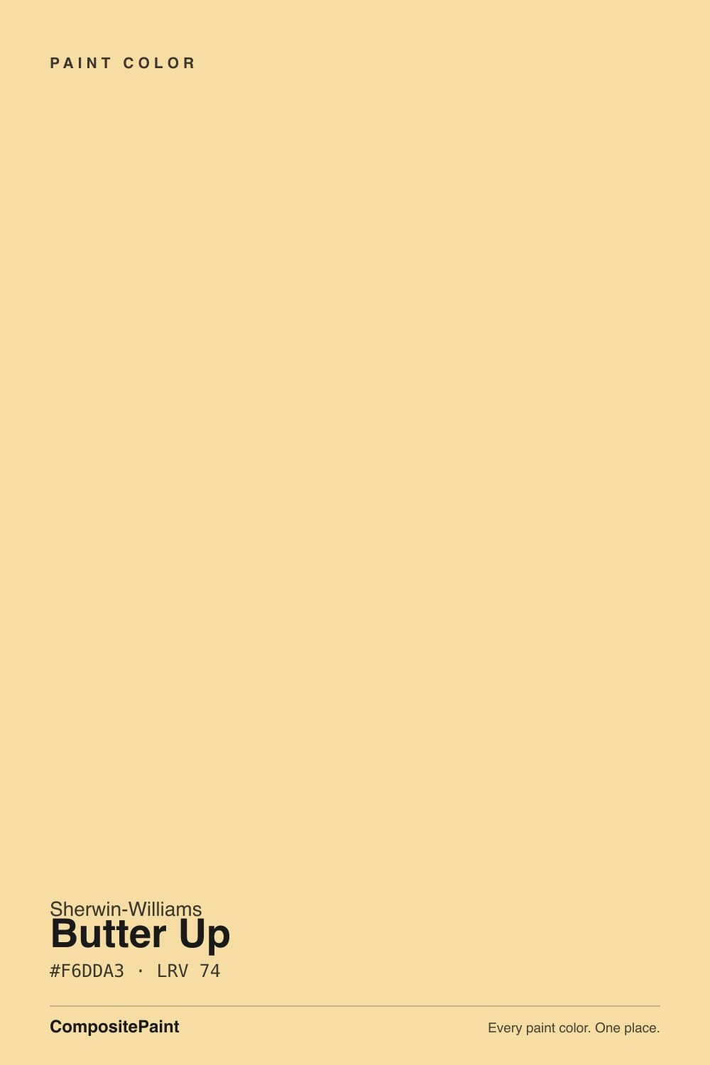
A genuine light yellow with the weight on gold rather than lemon — close to the color of soft butter, which is the rare case of a paint name doing its job. It sits in the middle of Sherwin-Williams' yellow strip, one step deeper than Friendly Yellow (LRV 76) and well above the marigold end at June Day. Nothing about it is trendy or new; it has been in the deck for years and only started getting attention when the butter-yellow moment sent people looking for a chip that actually looks like butter.
The LRV is 74, and that number fools people. Seventy-four sounds like off-white territory — it is the same LRV as Shoji White and White Duck, both of which read as quiet neutrals. The difference is chroma. Those neutrals spend their lightness on nothing; Butter Up spends all of it on color, so the same amount of light comes back at you carrying yellow. Yellow also re-lights a room: sun bounces off the wall and returns yellow, which is why the finished room almost always reads a step stronger than the chip in your hand did.
Undertone in one line: warm golden yellow with a trace of orange — never lemon-green, until cool bulbs put the green there. If your sample looks sickly and a bit lime, check the bulb temperature before you check the paint.
Where It Shines
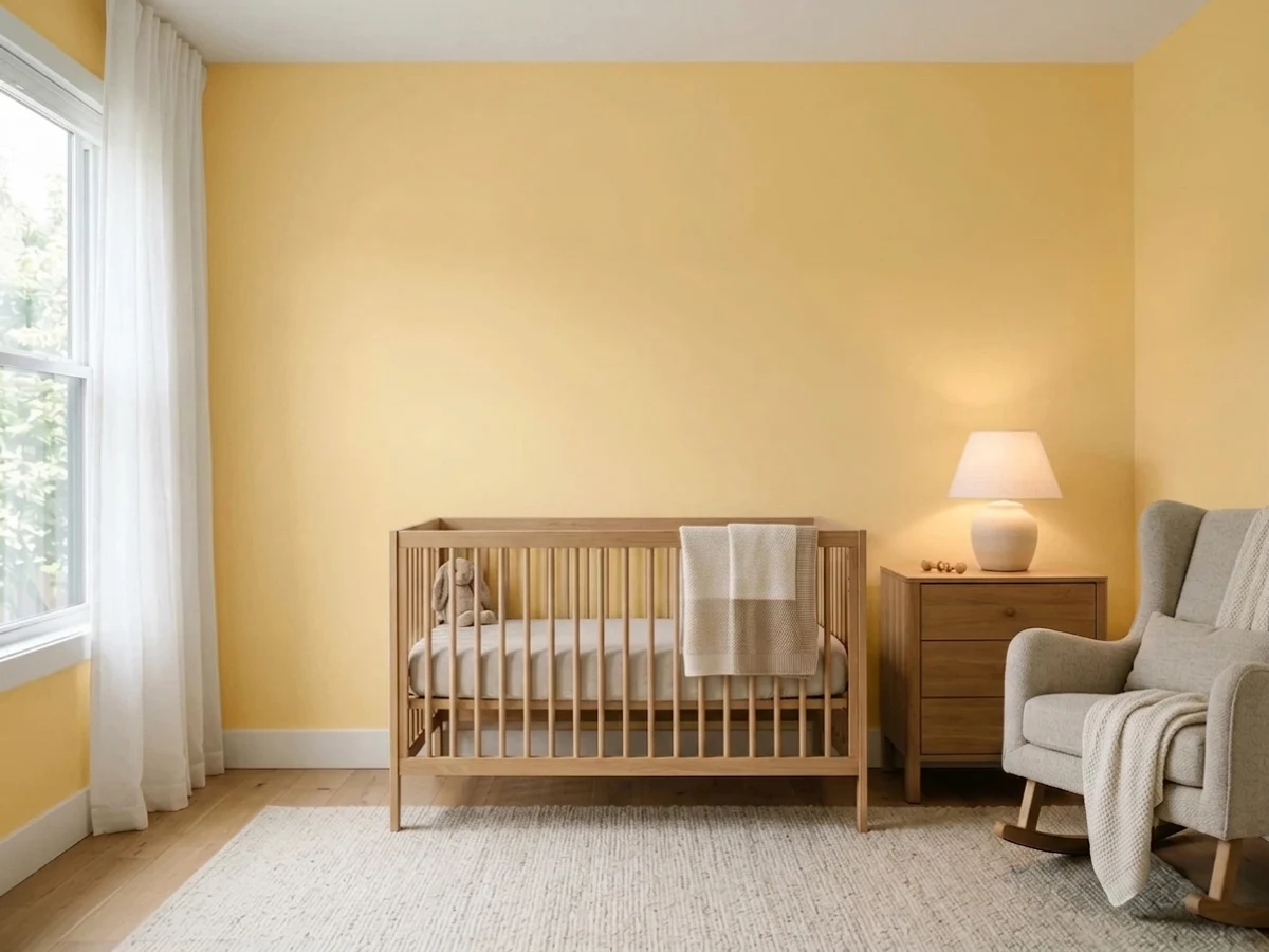
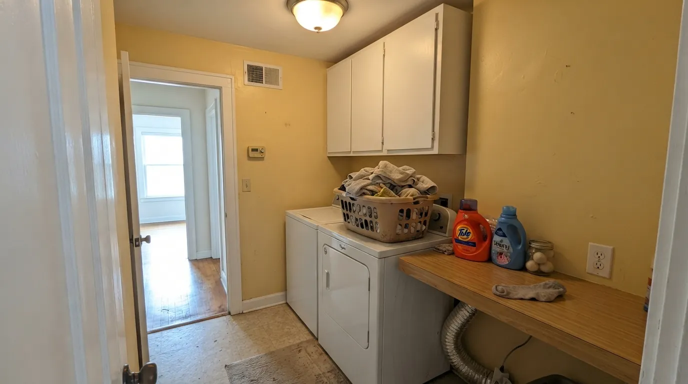
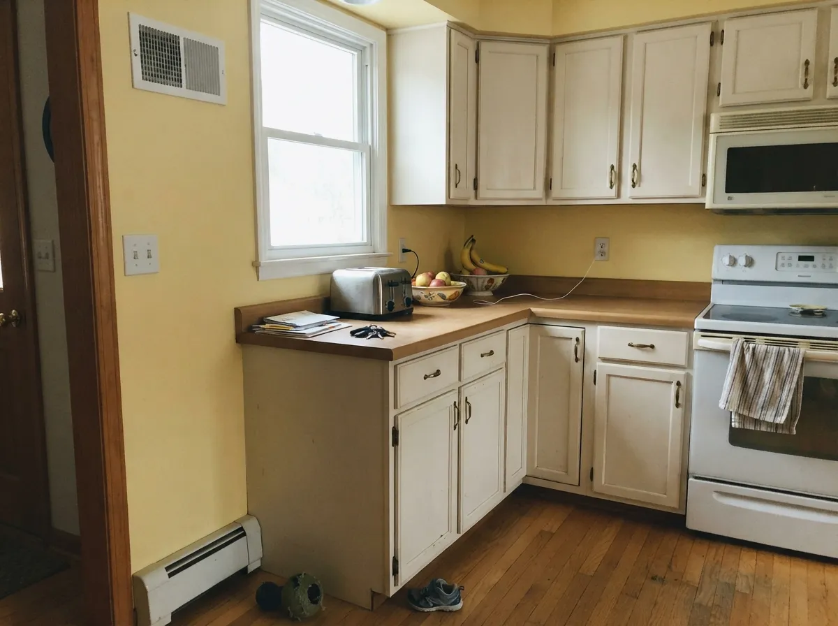
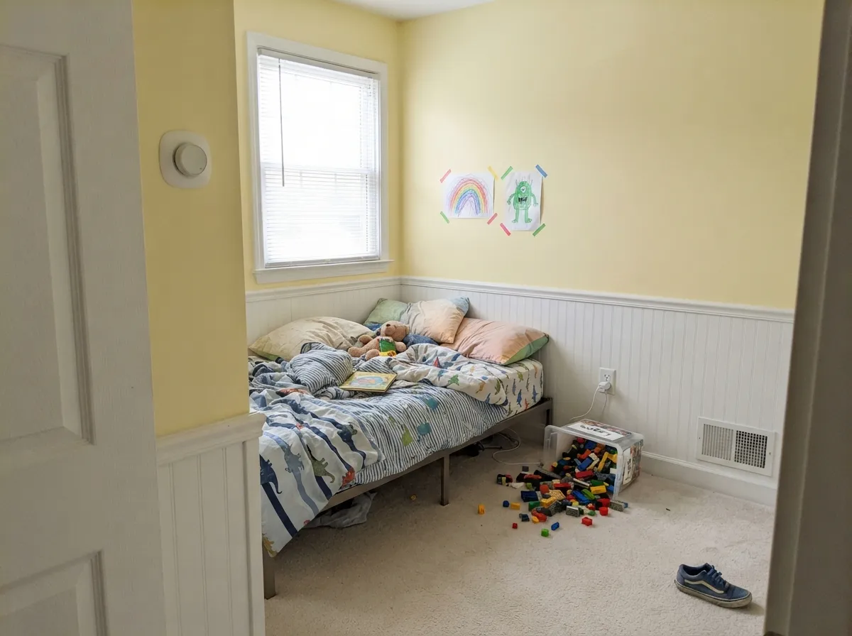
This color is built for the rooms nobody photographs. A windowless laundry room, an interior mudroom, a back hallway with one high window — places where a neutral goes gray and dead and every "safe" greige reads like a storage closet. Butter Up at LRV 74 is bright enough to keep those rooms feeling lit, and warm enough that they feel deliberately cheerful instead of merely painted. Its other home is anywhere white cabinets or white trim can carry the contrast: kitchen walls, kids' rooms, a nursery with white crib and oak floors. Give it warm bulbs, white woodwork and natural wood and it looks like a decision, not an accident.
Where It Fails
The complaints about this color are remarkably consistent, and all three are predictable from your room before you open the can. None of them are the paint's fault — but if one of them describes your room, sampling harder will only confirm it.
The butter-yellow trend sent a lot of people to this chip expecting a barely-there off-white, and Butter Up is not that. On four walls it is unmistakably a color, and it tints every white in the room. If you want the trend without a yellow room, Behr Butter Yellow (LRV 86) is the near-white version of the same idea. If you want warmth with no yellow at all, Shoji White sits at the identical LRV 74 with a fraction of the color in it.
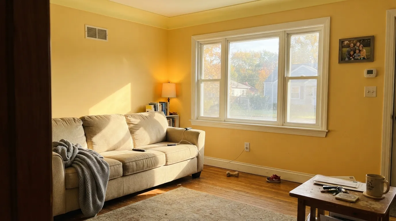
Yellow bounces. In a south or west room the sunlight hits the wall, comes back yellower, hits the opposite wall and does it again — so between roughly three and six o'clock the room can go from butter to acid, and white trim and faces pick up the cast. This is the exact regret behind every "how do I tone down my yellow walls" thread on the home forums. In a sun-blasted room, use it on one wall or in a smaller adjoining space instead.
Shop-light LEDs at 4000K and up — the default in garages, basements and builder laundry rooms — pull the red out of the gold and leave a faintly green, sickly yellow. That is the number-one reason a yellow looks lovely at the store and wrong at home. Cool gray LVP and blue-gray quartz do the same job from below: the floor reads bluer, the wall reads more yellow, and neither one wins. Warm 2700K bulbs are part of this paint job, not an optional extra.
Room by Room
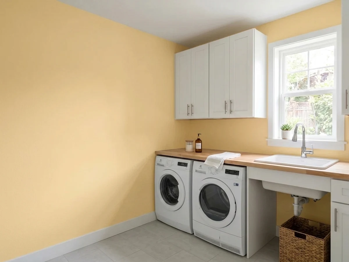
A windowless laundry room is the single strongest case for this color. Neutrals go gray and institutional in there; Butter Up keeps the room feeling lit without a window doing any of the work. White cabinets and white trim keep it from closing in, satin on the walls wipes down around the machines, and 2700K bulbs are non-negotiable — the cool tubes most laundry rooms ship with are what turn yellow green.
On the wall above white or off-white cabinets it is a classic for a reason: the cabinets stay the clean note, the wall does the cheering, and warm wood and brass fall into place. Alabaster or Pure White cabinetry is the natural partner. Yellow cabinets are a much bigger swing — a full kitchen of them reads dated fast, and unlike a wall you cannot repaint them in an afternoon. If you want yellow on cabinetry, keep it to an island or a pantry door.
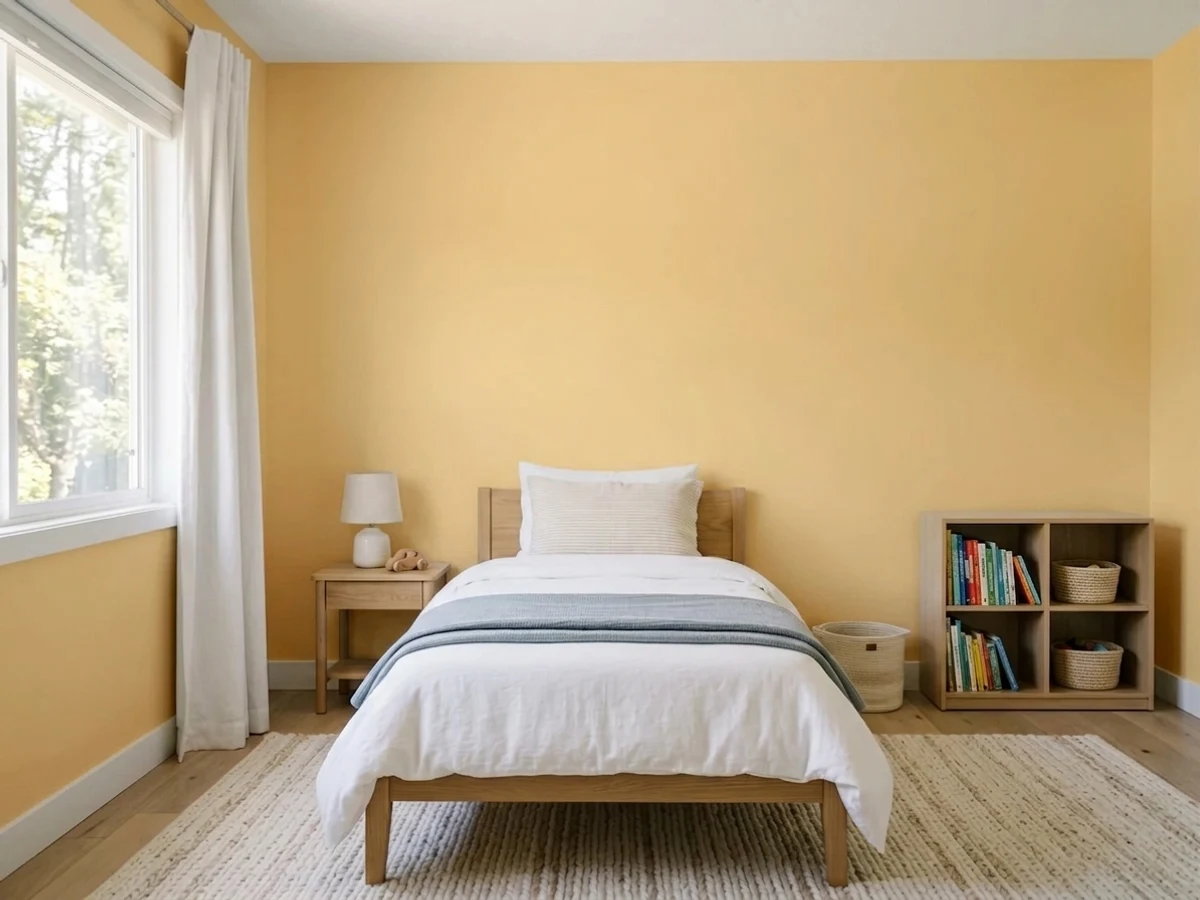
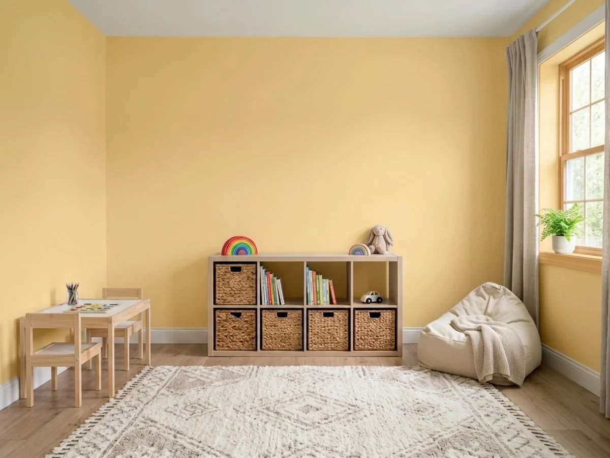
Genuinely good here, and rarer than it should be: it is cheerful without being gendered, and it photographs warm rather than sugary. In a nursery it flatters oak, rattan and white cribs. In a playroom the saturation is a real consideration — four walls of it in a bright room is a lot of stimulation, so many people are happier with one wall plus white, or a lower wainscot in white with Butter Up above.
Dark interior halls and mudrooms are the other place this color solves a problem instead of creating one. There is usually little furniture to argue with it, the light is mostly artificial, and a warm yellow makes a windowless corridor feel intentional. Satin or eggshell, since these are the walls that get scraped by bags and shoulders.
North-facing and shaded: lovely, a warm room instead of a gray one. South or west facing with big glass: this is where the regret stories come from, because the afternoon turns it up loud and there is far more wall area to amplify it. If you love it in a bright living room, put it on the one wall that does not take direct sun and keep the rest a warm white.
In a bathroom the bounce lands on your face in the mirror, and yellow light is not flattering at the sink — a small powder room with dim, warm sconces is the exception, since nobody is doing makeup in there. Outside, full sun pushes it strident and a whole facade in it reads distinctly early-2000s Tuscan. A shaded front door or a garden shed is the honest limit.
Your Light Is the Risk
Cool north daylight is a warm yellow's best friend — it takes the edge off the chroma and leaves the butter. The room that reads gray and flat in every neutral finally reads warm.
Direct afternoon sun bounces off the walls and comes back yellower each time. From about three o'clock the room can glow acid and tint the white trim. One wall in these rooms, not four.
East morning light gives the lightest, freshest read — nearly lemon. Through the afternoon it thickens toward gold, and in the last hour of west sun it can go close to amber. Sample and look at it at both ends of the day.
2700K warm bulbs turn it rich and custardy, which is exactly why it carries a windowless room after dark. Cool 4000K and 5000K LEDs push it faintly green and sickly — change the bulbs before you blame the paint.
Most complaints about Butter Up are a light mismatch. Upload a photo of your actual room and see it on your walls — then ask for the same wall in north light or evening lamps before you buy a single sample.
Need It From Another Brand?
Any paint counter can custom-tint Sherwin-Williams SW 6681 directly. If you would rather stay in one brand's own deck, these are the closest stock matches, measured as ΔE2000. Under 2 is a difference you will not see on the wall.
| Brand | Closest color | ΔE | LRV | |
|---|---|---|---|---|
| Behr | MidsummerBXC-31 · Behr | 2.5 | 73 | Color page → |
| Benjamin Moore | Suntan Yellow2155-50 · Benjamin Moore | 1.8 | 70 | Color page → |
| Valspar | Kelsey's Curls8002-25C · Valspar | 2.2 | 75 | Color page → |
| PPG / Glidden | VisionaryPPG1210-3 · PPG / Glidden | 1.2 | 76 | Color page → |
| Glidden | Jonquil Yellow40YY 71/335 · Glidden | 0.8 | 71 | Color page → |
| Dutch Boy | Simply Yellow115-3DB · Dutch Boy | 0.0 | 74 | Color page → |
Similar Sherwin-Williams Colors
The nearest shades to Butter Up within Sherwin-Williams's own range, ranked by perceptual color distance — useful when you want the same look a touch lighter, darker, or warmer.
WCAG 2.1: AA is 4.5 : 1 for normal text, 3 : 1 for large text, AAA is 7 : 1.
Butter Up vs the Colors You're Also Considering
Every Butter Up sample board has the same rivals on it. The numbers show the real lightness gap — then it comes down to which risk you would rather live with.
Pick this when you want the gold side of yellow: deeper pigment, warmer, closer to actual butter than to citrus.
Sherwin-Williams SW 6686 · LRV 79Lemon ChiffonPick this for the lighter, paler, more lemon-leaning yellow — at LRV 79 it puts less color on the wall, though its own review still calls it a one-wall color.
Pick this when you want people to actually see yellow. Butter Up is the color the trend photos are selling; Behr's is the whisper of it.
Behr ICC-90 · LRV 86Butter YellowPick this if you want the butter-yellow trend without a yellow room — at LRV 86 it is pale enough to pass for a warm white in most light.
Pick this for the cleaner, slightly brighter modern read, or simply because your painter buys Sherwin-Williams. These two are closer than any before-and-after photo will admit.
Benjamin Moore HC-4 · LRV 71Hawthorne YellowPick this for the historic version — practically the same hue a step deeper at LRV 71, and the one that belongs on an older house with real woodwork.
Pick this when the point is the yellow. If you would be disappointed that nobody noticed the wall color, Shoji White is the wrong answer.
Sherwin-Williams SW 7042 · LRV 74Shoji WhitePick this if what you actually wanted was warmth, not yellow — identical LRV 74, a fraction of the color, and it will never take over a room.
Butter Up Coordinating Colors
The rule for coordinating with a golden yellow: give it one clean white, one thing that is genuinely dark, and keep the rest muted. Yellow is loud enough on its own that a second bright color turns the room into a playroom whether you wanted one or not. Clean whites keep the edges sharp, navy and near-black supply the contrast that makes it look designed, and grayed greens are the one color family that softens it without fighting. These are the partners that keep showing up in rooms that work:
Where Butter Up Sits in the Butter-Yellow Trend
Butter yellow was the breakout color of 2025 — it arrived through fashion, spread across furniture and bedding, and by 2026 the design press had started debating whether it had already crested, with several designers saying they are moving toward deeper ochres and green-shaded golds instead. None of that history belongs to Butter Up. It has sat quietly in the Sherwin-Williams yellow strip for years, next to Friendly Yellow above it and June Day below, and it only became a search term when people started hunting for a paint chip that matched the trend photos.
That distinction matters when you shop. Most paint colors marketed under the butter-yellow banner are near-whites — Behr's Butter Yellow sits at LRV 86 and reads as a warm white in half the rooms it goes into. Butter Up is the opposite end of the same idea: an actual yellow at LRV 74 that no one will mistake for an off-white. If the trend is what you are buying, decide first which of those two things you want, because they produce completely different rooms.
The long view is reassuring either way. Soft golden yellows are older than any trend cycle — they were standard in kitchens and back halls for most of the twentieth century, which is why they read nostalgic rather than dated in small utility rooms. A laundry room in Butter Up will not look like a timestamp in five years. A whole open main floor in it might.
Butter Up With Wood, Floors and Counters
Wood is where this color is easiest and hardest at the same time. White oak, natural maple, rattan and light birch are its best company — close enough in warmth to agree, light enough in value that the wall stays the yellow thing in the room. Walnut and espresso are also excellent, because the dark red-brown gives the yellow something to push against. Terracotta tile and unglazed brick both look right with it, which is why it sits so comfortably in older kitchens.
The pairing to watch is honey oak — not because it clashes but because it blurs. Orange-stained oak trim, honey oak cabinets and a golden yellow wall all live in the same narrow band of the color wheel, so the room reads as one continuous wash of warm and nothing has an edge. If your trim is honey oak and staying that way, either paint the trim white or step down to a much paler yellow so the wall and the wood are clearly different values.
Counters and hardware are the easy part. Butcher block, cream quartz and warm granite all work. Cool blue-gray quartz and Carrara-type marble are the ones to sample against, since their cool cast makes the wall look yellower than it did anywhere else in the house. For metals, unlacquered brass and matte black are the natural picks; polished chrome is the only finish that looks slightly out of place, and only next to the wall itself.
Three Ready Palettes Built on Butter Up
A color is never alone on the wall. These are complete combinations in the 60-30-10 pattern, with the reason each one holds together. Every one opens in the visualizer.
The scheme that makes a windowless laundry room work: yellow walls for light that the room cannot supply itself, Pure White above to keep the ceiling line from closing in, and one deep navy note below so the color reads designed rather than default. Navy sits opposite yellow on the wheel, which is why the pair looks crisp instead of busy.
Try this palette in your roomAlabaster is warm enough that the cabinets never look cold against the walls, but light enough at LRV 82 to stay clearly the brighter element. The muted green island keeps the room from tipping fully sweet — green is what stops a yellow kitchen reading like a nursery, and Dried Thyme is grayed enough to do it without shouting.
Try this palette in your roomSplitting the wall keeps the saturation manageable: Extra White at LRV 86 below and on the trim gives the eye somewhere to rest, so the yellow above reads cheerful rather than relentless. Sea Salt is the soft green-blue that makes the pair feel like a real room instead of a theme, and none of the three has to change when the toys do.
Try this palette in your roomButter Up FAQ
Is Butter Up too yellow?
It depends entirely on how much yellow you were expecting. This is a real, saturated yellow, not a cream with a hint of gold — on four walls nobody will call it neutral. In a small windowless room that is precisely the point. In a big south-facing living room it is usually too much, because sunlight bounces off yellow walls and comes back yellower. If your honest answer is that you wanted an off-white, look at Behr Butter Yellow at LRV 86 instead.
What trim white goes with Butter Up?
A clean white, not a warm one. Pure White (LRV 84) is the easy default and Extra White (LRV 86) is the crisper option if you want the trim to snap. Creamy warm whites are the mistake here — they sit too close to the wall color, so the trim looks slightly dirty instead of deliberately different. Semi-gloss on the trim, eggshell or satin on the walls.
Is Butter Up a good laundry room color?
It is one of the best arguments for the color. Laundry rooms are usually small, usually windowless, and usually painted a neutral that goes gray and grim under artificial light. A warm yellow at LRV 74 keeps the room feeling lit and cheerful without a window. Two conditions: white cabinets or white trim so it does not close in, and 2700K warm bulbs — the cool white tubes builders install are exactly what turn yellow walls faintly green.
What is the difference between Butter Up and Friendly Yellow?
They are neighbors on the same Sherwin-Williams strip, and the difference is one step of depth. Friendly Yellow at LRV 76 is slightly lighter and a touch softer; Butter Up at LRV 74 carries a bit more gold. In a bright room the gap is visible side by side and nearly invisible once each is on a wall alone. Pick Friendly Yellow if you want the softest version, Butter Up if you want the color to read clearly as butter.
Will Butter Up work with gray floors?
Cool gray floors are the pairing to test hardest. Blue-leaning gray LVP and blue-gray tile sit near the opposite side of the wheel from a golden yellow, so each exaggerates the other — the floor reads bluer and colder, the wall reads louder and more yellow. Warm gray or greige floors are fine. Oak, white oak, walnut and terracotta are all excellent. If the gray floor is staying, sample a large piece taped right down at floor level before you commit.
Can I paint kitchen cabinets Butter Up?
You can, but keep it to a dose. An island, a pantry door, a small hutch or a laundry-room base cabinet in satin cabinet enamel looks charming and intentional. A full kitchen of yellow cabinets is a much larger bet: it dates faster than a wall color and costs far more to undo. The safer version of the same look is Butter Up on the walls with Alabaster or Pure White cabinets.
Have you painted with Butter Up?
Rate it — one tap helps the next reader decide.
Ask a Question