Sunny Side Up
The egg-yolk yellow painters keep picking for playrooms, reviewed honestly: the rooms it makes, why it is not the butter yellow you saved on your phone, and what it costs to roll.

Jessica has spec'd whites and neutrals for more than 300 rooms and keeps a sample wall of painted drawdowns in her studio. Every color review is checked against real reader rooms in the comments and re-tested when a formula changes. About the testing process →
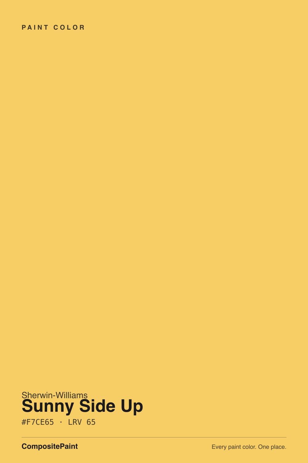
- 1Honey Tea52
- 2Tuscan Sun60
- 3Sunny Side Up65
- 4Banana Cream71
- 5Lemon Chiffon79
The Fast Verdict
Sunny Side Up is a real, saturated yellow — egg yolk, not custard. That is exactly why professional painters keep putting it in playrooms and on doors: it is the rare color a five-year-old can name from across the room. It is also why it goes wrong in a small bedroom, a mirror-lit bathroom, or the hands of anyone who saw a butter-yellow kitchen online and came looking for it. Buy it for accents and play spaces, prime it gray, and it earns its keep.
Playrooms and kid spaces · accent walls, stripes and doors · mudroom lockers and laundry cabinets · dim rooms that need warmth instead of another beige
You actually want butter yellow · the room is small and people look at their own faces in it · it is a bedroom someone has to fall asleep in · you repaint often and hate primer coats
- A genuine, readable yellow — not another color that needs explaining
- The gold lean keeps it from going acid-green in cool light
- Transforms windowless mudrooms, laundries and lockers
- Playroom-proof: energetic, gender-neutral, wipeable in satin
- One quart on a door buys most of the effect with none of the risk
- Not the butter yellow the trend photos are showing you
- Bounces yellow light onto ceilings, trim and faces in small rooms
- Poor hide — plan on a tinted primer or a third coat
- Only sold in Sherwin-Williams' premium Emerald Designer Edition line
What Color Is Sunny Side Up, Really?
A fully saturated golden yellow that leans gold rather than lemon — the color of an egg yolk, which is presumably how it got the name. It comes out of Sherwin-Williams' Emerald Designer Edition, the 200-color line the company launched in 2020, and specifically its Classic + Collected palette, which mixes soft shades with a handful of statement hues. Sunny Side Up is one of the statements. It was never drawn to be a whole-house neutral, and it does not pretend to be one.
LRV 65 makes it sound like a mid-light color, and that number is the single most misleading thing about it. Light reflectance says how much light bounces back; it says nothing about how much color comes with it. At this saturation the light coming off the wall is yellow light, so a Sunny Side Up room tints its own ceiling, its own white trim, and the faces of the people standing in it. In a playroom that reads as sunshine. In a small windowless room it reads as a filter nobody asked for.
Undertone in one line: golden — a yellow pulled slightly toward orange, never green. That gold lean is a genuine advantage, because the clean, greenish yellows are the ones that go sour and acidic in cool light. Sunny Side Up mostly avoids that trap. What it does instead is get louder: warm light deepens it toward mustard, hard sun brightens it toward neon.
Where It Shines
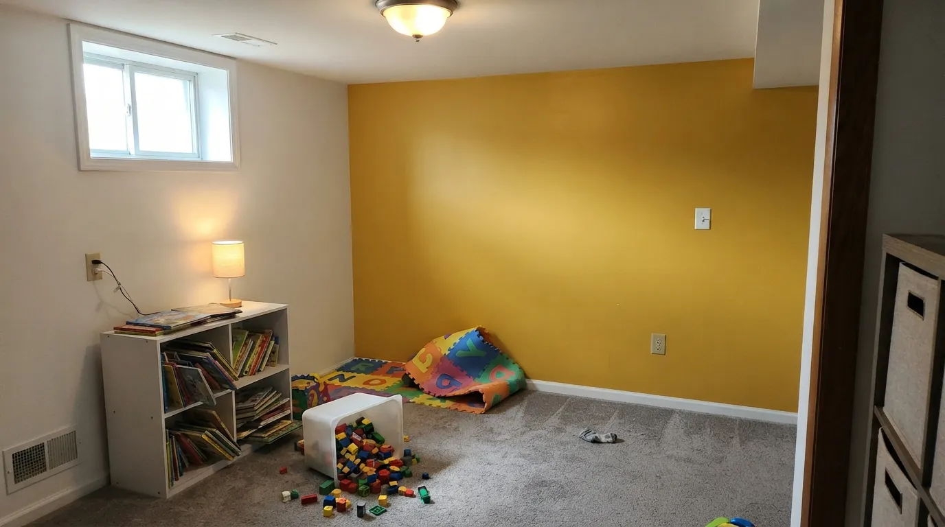
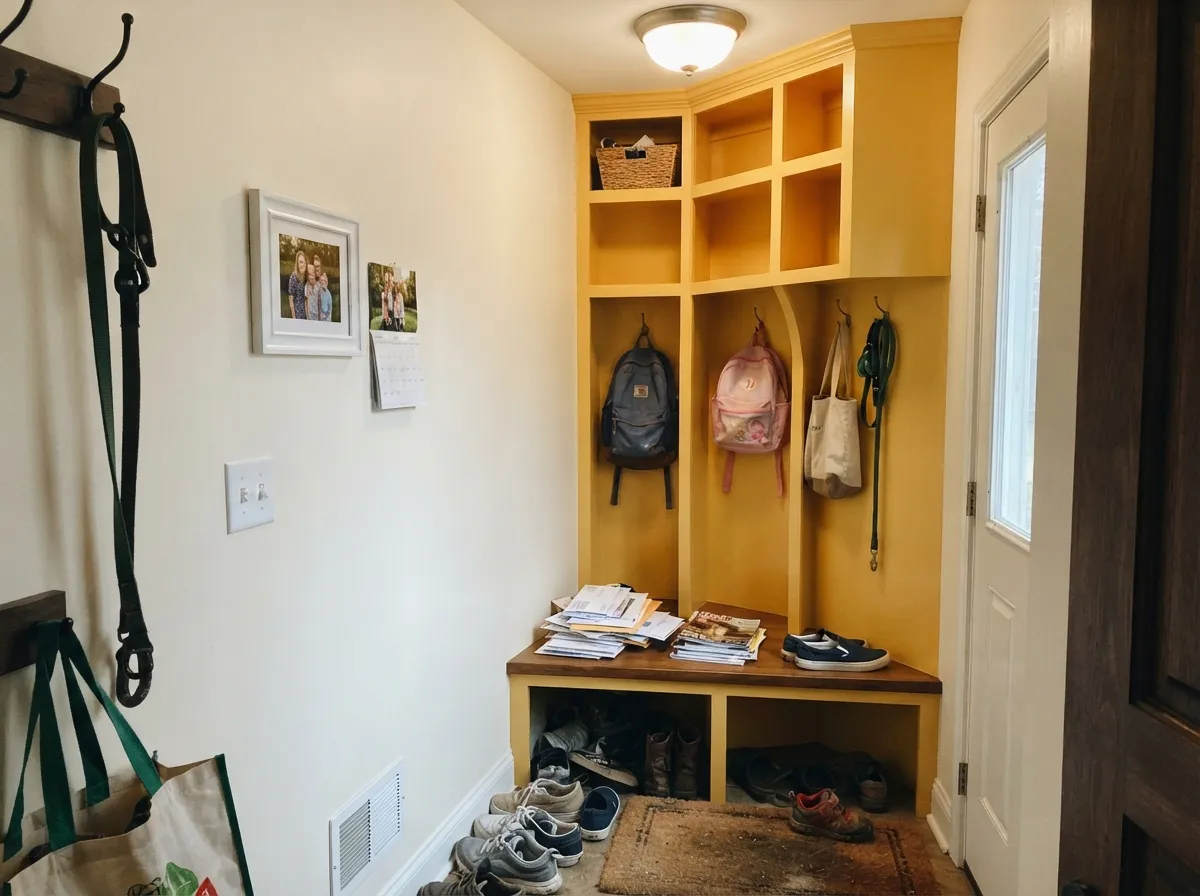
This color has one great room and several great objects. The room is the playroom — it is a recurring pick on professional painters' playroom lists because it works for any kid, reads as energy rather than theme, and photographs like a good mood. The objects are doors, lockers, cubbies, a laundry cabinet run, a stripe across a play wall: places where a strong color does its whole job in a few square feet. Give it white trim, one deep partner like navy or near-black, and a floor that is not already golden, and it looks deliberate instead of loud.
Where It Fails
Three complaints account for almost every bad Sunny Side Up story, and all three are predictable from the chip. Two of them are really the same mistake — buying a statement color for a job that needed a quiet one — and the third is a bill nobody mentions at the paint counter.
The yellow trend of the last two years is soft, creamy, nearly a warm white — the shade people describe as butter, custard, or churned. Sunny Side Up is several steps past it. Hold it next to Behr Butter Yellow (LRV 86, close enough to a white to trim a room) and the gap is obvious. If your inspiration photos are pale kitchen cabinets that look like whipped butter, this is the wrong chip; Lemon Chiffon or a butter-yellow is what you actually saved.
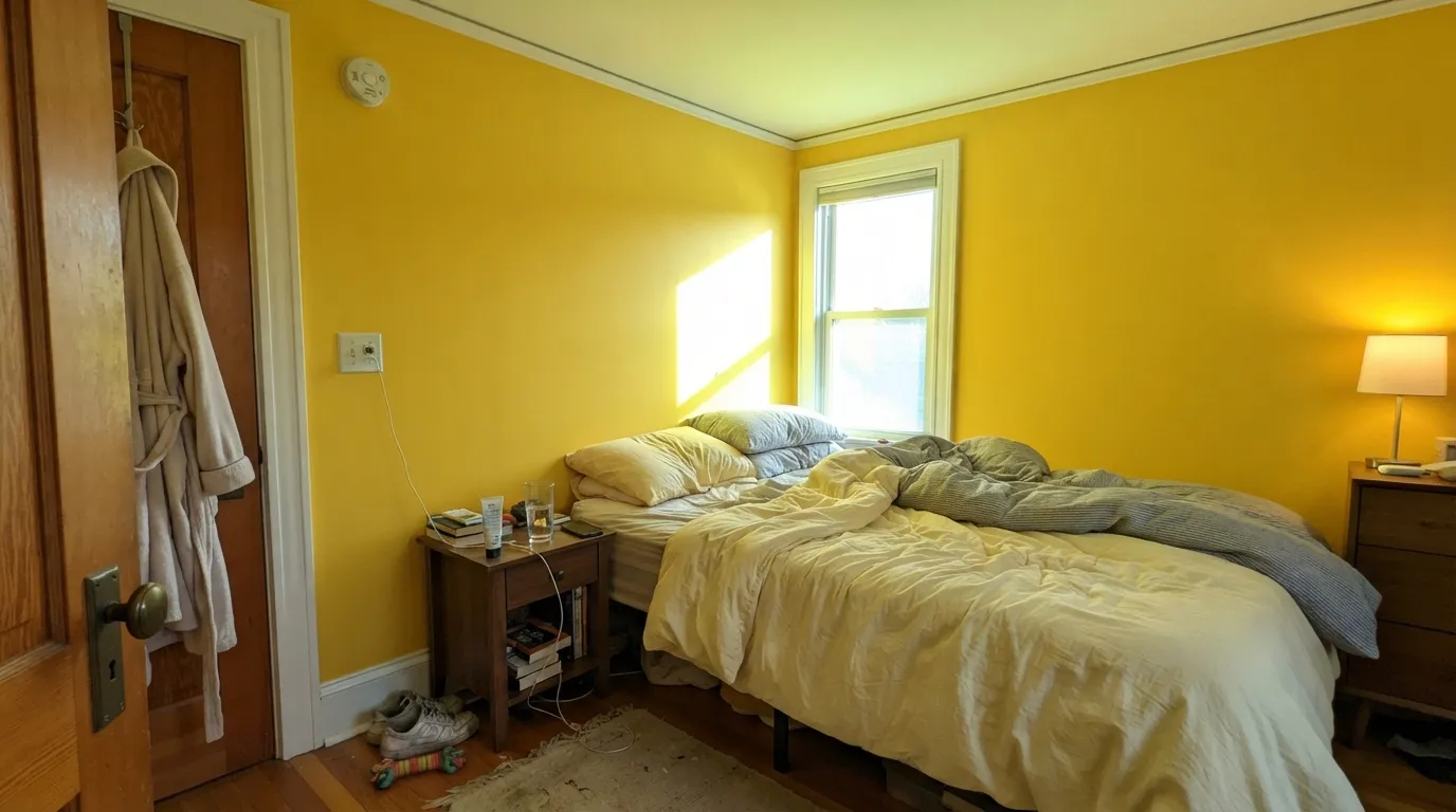
Saturated yellow bounces colored light everywhere it can reach. In a bedroom, a powder room, or any room with a mirror, the wall tints the ceiling faintly green-yellow and makes skin look sallow under it. It is also a stimulating color — the design consensus on sleep spaces is not superstition, it is just what a high-chroma warm hue does to a room you want to wind down in. Give it one wall, a piece of built-in furniture, or a room nobody sleeps in.
Clean bright yellows are the weakest-hiding pigments in any deck — Sherwin-Williams' own coverage guidance puts them in the poor-hiding group, because the muting pigments that give a color hide are exactly what a pure yellow leaves out. Over a white wall with no primer, expect three coats and still see roller streaks in raking light. Prime with a tinted primer first and two coats do it. Budget the same trouble in reverse the day you cover it.
Room by Room
The room this color was built for, and the one professionals keep recommending it for: bright, gender-neutral, and readable to a toddler. One accent wall in satin is the safe version; all four walls works if the trim, ceiling, and most of the furniture stay white. Satin or eggshell so crayon and sticky handprints wipe off.
Great on a headboard wall, a closet door, a bookcase, or a painted stripe. Not great wrapped around a room a child has to fall asleep in, where a saturated warm color keeps working long after the lights are supposed to be out. Pair it with white walls and let the yellow be the fun part rather than the whole environment.
These are the rooms with no view to protect and everything to gain. Lockers, cubbies, a bench, a run of laundry cabinets in gloss: the color does more for a windowless utility room than any greige ever has, and the small square footage keeps the bounce contained. Warm white walls above, near-black hardware.
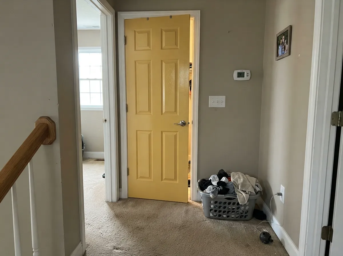
An interior door, a pantry door, or the inside of a front door is the cheapest way to own this color. One quart, one afternoon, reversible. Gloss so it wipes and so the color gains a little depth instead of sitting flat. Outside, ask the store to match it into an exterior door enamel rather than assuming the interior product will do.
Yellow kitchen cabinetry is genuinely back, but the trend colors doing it are the pale ones. Sunny Side Up works as a single island, a hutch, or the back of open shelving, framed by warm white cabinets. On four kitchen walls it fights every warm wood and every yellow-flecked counter in the room.
Adult bedrooms lose to the stimulation problem, living rooms lose to the bounce problem across a big open plan, and powder rooms lose because there is a mirror in them. If you want a warm room in these spaces without the volume, this review's comparison section has three better answers.
Your Light Is the Risk
The surprise: cool, flat north daylight is where this color behaves. It gives a chilly room real warmth, and the grayer light keeps the saturation from shouting.
Full midday sun on a yellow wall reads close to fluorescent, with glare on the sheen and yellow light thrown across the whole room. Sample here or nowhere.
Morning east light is its cleanest, brightest read. By late afternoon west sun pushes it visibly toward amber and orange, closer to a mustard than to a lemon.
Warm 2700K lamps deepen it into honey and mustard, which most people prefer. Cool 4000K LEDs sharpen it and thin out the gold — the version that looks harsh in photos.
Most complaints about Sunny Side Up are a light mismatch. Upload a photo of your actual room and see it on your walls — then ask for the same wall in north light or evening lamps before you buy a single sample.
Need It From Another Brand?
Any paint counter can custom-tint Sherwin-Williams SW 9665 directly. If you would rather stay in one brand's own deck, these are the closest stock matches, measured as ΔE2000. Under 2 is a difference you will not see on the wall.
| Brand | Closest color | ΔE | LRV | |
|---|---|---|---|---|
| Behr | Mellow Yellow320B-6 · Behr | 1.9 | 67 | Color page → |
| Benjamin Moore | Golden Groves313 · Benjamin Moore | 1.8 | 66 | Color page → |
| Valspar | Hive DelightV018-2 · Valspar | 1.5 | 64.9 | Color page → |
| PPG / Glidden | Beach PartyPPG1211-6 · PPG / Glidden | 1.3 | 66 | Color page → |
| Glidden | Beach PartyPPG1211-6 · Glidden | 1.5 | 66 | Color page → |
| Dutch Boy | Honeybee Yellow116-6DB · Dutch Boy | 1.9 | 68 | Color page → |
Similar Sherwin-Williams Colors
The nearest shades to Sunny Side Up within Sherwin-Williams's own range, ranked by perceptual color distance — useful when you want the same look a touch lighter, darker, or warmer.
WCAG 2.1: AA is 4.5 : 1 for normal text, 3 : 1 for large text, AAA is 7 : 1.
Sunny Side Up vs the Colors You're Also Considering
Every Sunny Side Up sample board has the same rivals on it. The numbers show the real lightness gap — then it comes down to which risk you would rather live with.
Pick this when a pale yellow would just read as dirty cream and you want the color to actually register.
Sherwin-Williams SW 6686 · LRV 79Lemon ChiffonPick this when you want yellow that reads soft and creamy — it still has opinions, but at a much lower volume.
Pick this if that one disappears on your walls and you wanted people to notice the color.
Behr ICC-90 · LRV 86Butter YellowPick this if the trend is what you came for — at LRV 86 this is the pale, nearly-white butter shade the kitchen photos are showing.
Sunny Side Up Coordinating Colors
The rule with a saturated yellow is that everything around it should be quiet. Warm whites, warm greiges, one deep partner, and nothing else competing for attention — the moment a second bright color joins in, the room starts to look like a daycare instead of a design. Navy and near-black are the two partners that never fail, because they give the eye somewhere to rest; a soft blue or a muted sage works when you want the scheme to feel calmer than the yellow alone would suggest.
Floors decide more than most people expect. Walnut, white oak, and gray-toned tile all sit well under this color. Orange-toned honey oak is the one honest problem: golden floor plus golden wall is a lot of the same note, and the room reads amber overall instead of yellow-and-neutral. If the honey oak is staying, keep the yellow up on a door or a locker run and let the walls stay white.
How the Butter Yellow Trend Sent Everyone to the Wrong Chip
Yellow came back, but it came back soft. The version filling kitchens and cabinet renovations is a pale, creamy shade — the one people describe as butter or custard, sitting so high on the light scale it can nearly trim a room. Forecasters keep calling it a keeper rather than a fad, and the newer takes on it are drifting even quieter: parchment, oat, sunlit linen. That is the yellow most searches are actually looking for.
Sunny Side Up is a different animal from a different moment. It was drawn for the Emerald Designer Edition's Classic + Collected palette, a group that deliberately mixes gentle shades with a few statement hues, and it is squarely in the statement half. Designers who like it say so plainly — one described it as a bold egg yolk, best on an accent door, a graphic stripe in a playroom, or a happy chest in a mudroom, with a whole room in it being a bit much for her taste. That is a fair summary of the color and a fair summary of this review.
So the honest framing is this: it is not the trend color, and it does not need to be. Saturated yellow has been doing playrooms, doors, and utility spaces for decades without waiting for permission from a forecast, which also means it has very little trend risk left to lose. It was never in fashion enough to fall out of it.
The Coverage Tax on a Bright Yellow
A color's ability to hide what is underneath comes from muted pigments — iron oxides, blacks, the dull stuff. A clean bright yellow leaves most of that out by definition, which is why yellows are the classic poor-hiding colors and why Sherwin-Williams' own coverage guidance groups them that way. On the wall it means the same thing every time: over plain white drywall the first coat looks alarmingly patchy, the second looks nearly right until the afternoon sun rakes across it, and the third is the one you did not budget for.
The fix is a tinted primer. Ask the store to tint the primer toward the finish color — usually a light gray or a pale version of the yellow — and two finish coats will cover cleanly. This matters twice as much over an existing mid-tone or dark wall, where an untinted white primer simply moves the problem one coat later. A quality mohair or microfiber roller cover and a wet edge do the rest, because a poor-hiding color shows lap marks that a greige would forgive.
Plan the exit too. Bright yellow is one of the harder colors to cover later, so when the playroom becomes a teenager's room, budget a gray-tinted primer coat again rather than three coats of white. It is the same lesson in reverse, and it is the reason to keep this color on walls and objects you are happy to repaint one day.
Three Ready Palettes Built on Sunny Side Up
A color is never alone on the wall. These are complete combinations in the 60-30-10 pattern, with the reason each one holds together. Every one opens in the visualizer.
One yellow wall against clean white keeps the light in the room white, so the color reads as a deliberate block instead of a filter over everything. The soft blue on the built-ins is the balance: it cools the scheme just enough that the room still feels calm when the toys are put away.
Try this palette in your roomA soft warm white keeps a windowless room from vibrating next to the yellow, and the near-black bench takes the boot scuffs while giving the scheme a bottom edge. This is the room where a bold color costs the least and does the most.
Try this palette in your roomThe cheapest way to live with a strong color: put the whole house in a warm greige, keep the trim white, and spend the yellow on a single door. Agreeable Gray shares the warm base, so the door reads like a joke the house is in on rather than an argument.
Try this palette in your roomSunny Side Up FAQ
Is Sunny Side Up too bright for a whole room?
For most rooms, yes. It is a fully saturated yellow, and on four walls it tints the light in the room, which shows up on the ceiling, the trim, and everyone's skin. The exceptions are rooms where that is the point: a playroom, a craft room, a mudroom. Everywhere else, give it one wall or one object and you get the same lift with none of the regret.
Is this the butter yellow everyone is posting?
No, and this is the number-one mix-up. Butter yellow is the pale, creamy, almost-white shade that has been running through kitchens for two years. Sunny Side Up is several steps stronger — an egg yolk, not a stick of butter. If the photos you saved are soft yellow cabinets, look at a much paler chip; if those look like dirty cream to you, this is the one you actually wanted.
What white goes with Sunny Side Up?
A soft warm white, not a stark one. Pure White and Alabaster both sit comfortably beside it, keeping the trim clean without the blue-white edge that makes saturated yellow look cheap. Avoid pairing it with a cool bright white — the contrast turns the yellow plasticky and the white slightly blue.
How many coats does it take, and do I need primer?
Prime first. Bright, clean yellows are the weakest-hiding colors made, because hide comes from the muted pigments a pure yellow does not contain. Over white drywall with no primer, three coats is normal and streaks still show in raking light. With a tinted primer underneath, two coats finish it — and it is cheaper than the extra gallon.
Is yellow a bad idea in a kid's bedroom?
You will find the claim that yellow rooms make babies cry repeated everywhere, and there is no solid study behind it. The real issue is simpler and not superstition: a highly saturated warm color is stimulating, which is great for playing and unhelpful at bedtime. Use it on one wall, a door, or furniture in a bedroom, and save the full-room version for the playroom.
Where can I buy it, and can I get it on an exterior door?
It is an Emerald Designer Edition color, so at a Sherwin-Williams store it is sold in that premium line, in flat, eggshell, satin and gloss — expect to pay more per gallon than the standard lines. Like any color, a paint counter can match the formula into other products, so for an exterior door ask them to put it in an exterior enamel rather than assuming the interior paint will hold up outside.
Have you painted with Sunny Side Up?
Rate it — one tap helps the next reader decide.
Ask a Question