Tuscan Sun
The golden ochre behind every early-2000s Tuscan kitchen, reviewed honestly: why the full look dated so fast, where the paint itself still earns its keep, and what to sample instead if you actually want butter yellow.

Jessica has spec'd whites and neutrals for more than 300 rooms and keeps a sample wall of painted drawdowns in her studio. Every color review is checked against real reader rooms in the comments and re-tested when a formula changes. About the testing process →
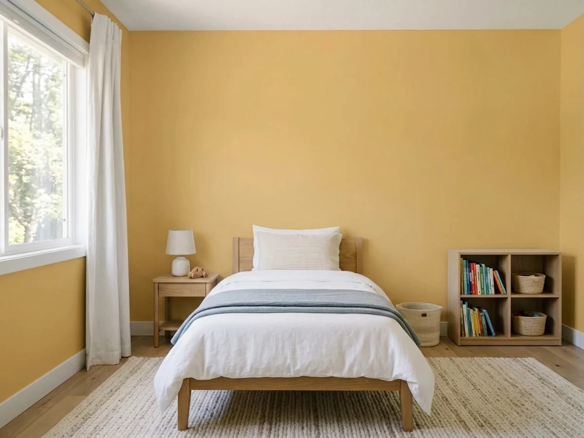
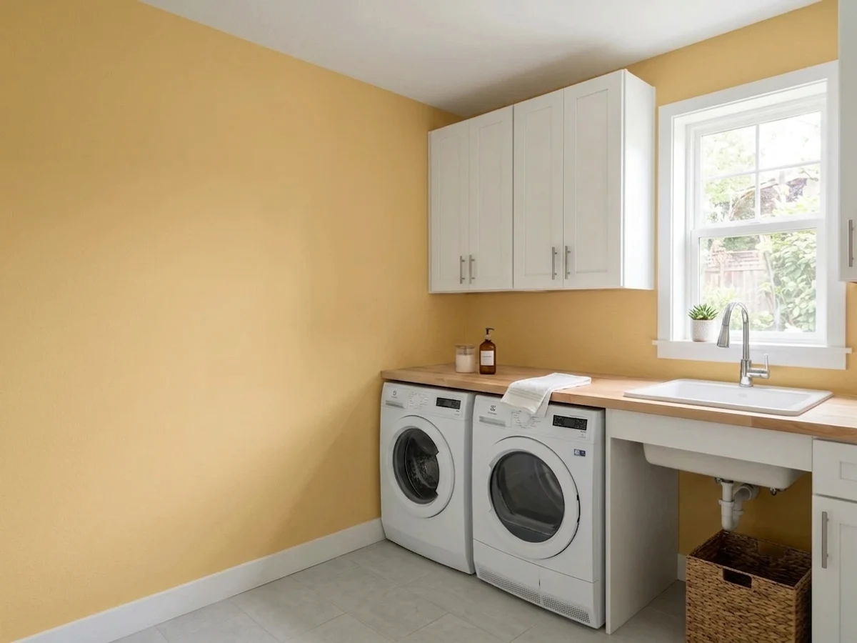
- 1Chilled Wine41
- 2Honey Tea52
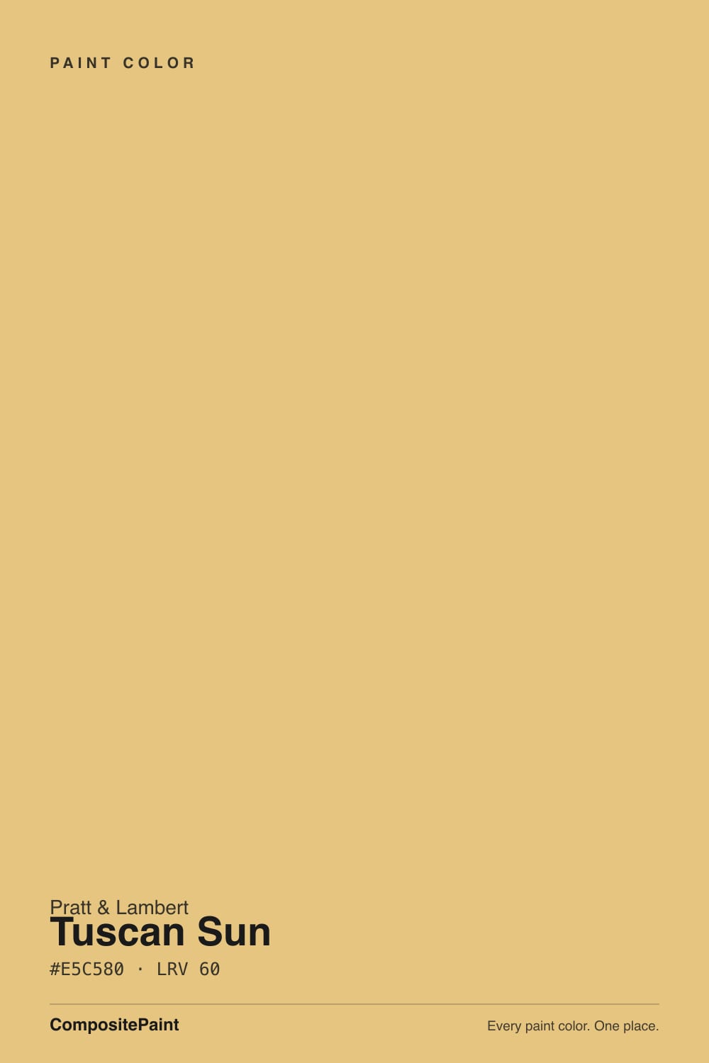
- 3Tuscan Sun60
- 4Banana Cream71
- 5Lemon Chiffon79
The Fast Verdict
Tuscan Sun is a true golden ochre — warm, saturated, unmistakably the color that covered a decade of sponge-finished, wrought-iron kitchens. That reputation is earned, and pretending otherwise would be dishonest.
But strip away the faux-finish walls and terracotta tile, and the paint underneath is a confident, sun-warmed gold that still does real work: a front door, a powder room, a kitchen island, one wall a lamp can reach. Buy it for what it does in a small dose today, not for the villa fantasy it used to sell whole rooms.
Front doors and porch ceilings that want real color · powder rooms and small drenched spaces · kitchen islands or a hutch in an otherwise white kitchen · dining rooms that live under warm lamplight
You actually want the pale, creamy "butter yellow" trend look · your kitchen already runs oak cabinets, terracotta tile and wrought-iron fixtures (the full combination reads instantly dated) · the room only gets cool white LEDs and little daylight · you're painting more than one full room in it
- A true confident gold, not a washed-out pastel
- Holds its saturation in real daylight — LRV 60 without going chalky
- Genuinely elegant on a front door or in a drenched powder room
- Flatters black hardware, wrought iron and warm wood in small doses
- Deep enough to read as intentional, expensive color rather than "just yellow"
- The full-room combination it's known for (oak + terracotta + wrought iron) reads instantly dated
- Goes muddy and mustard under cool LEDs with little daylight
- Louder and more orange than the pale butter-yellow trend shoppers are often searching for
- Thin real-world track record online — sample big before buying, don't trust the chip alone
What Color Is Tuscan Sun, Really?
A true golden ochre, not a pastel. Pratt & Lambert — an upscale New York paint maker founded in 1849 and owned by Sherwin-Williams since 1995 — built Tuscan Sun with real saturation: warm gold with a distinct orange edge, closer in family to a honey or a clover honey than to the pale lemon-cream shades most "yellow" searches turn up. It sits in the same neighborhood as Sherwin-Williams Bee and June Day, both deeper, more confident golds than the washed-out pastels that dominate paint-store yellow walls.
At LRV 60 it reflects a solid majority of the light that hits it, which is exactly why it reads as sunny rather than dark, but it is nowhere near a pale wash — put it beside a true butter-yellow trend color and Tuscan Sun visibly out-saturates it. That depth is the whole appeal on a front door or a small room: it holds its gold color in real daylight instead of thinning out to cream, and it does not disappear the way a paler yellow can from across a street or a hallway.
Undertone in one line: golden yellow with an orange whisper — never a clean lemon, never green-tinted. The name is not incidental marketing: this exact family of warm gold, paired with wrought iron and terracotta, was the signature wall color of early-to-mid-2000s "Tuscan" kitchen remodels, and that history follows the color into every room it's used in today.
Where It Shines
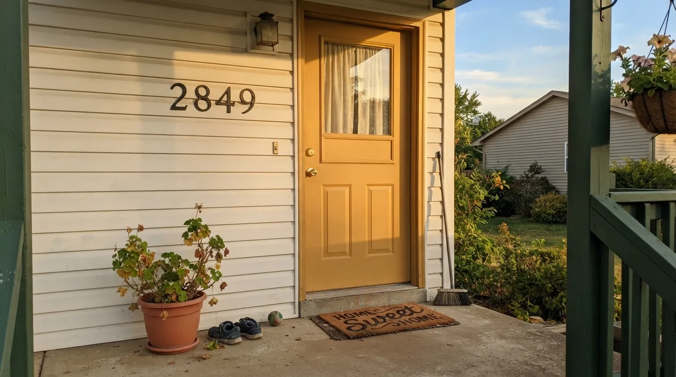
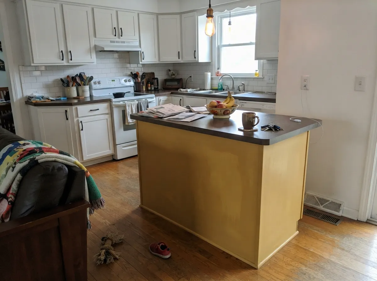
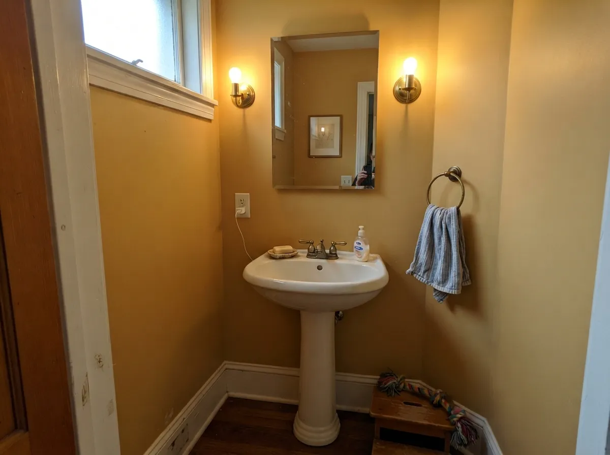
Away from the full villa fantasy, this is a genuinely good confident gold in small doses. A front door under a warm porch light is its best job — the saturation reads as intentional, expensive color rather than a kitchen trend. Powder rooms and other small, lamplit spaces take the depth well because there's no honey-oak floor or terracotta tile in the frame to drag the whole thing back to 2004. On a kitchen island or a single hutch in an otherwise white kitchen, it works as a deliberate accent instead of a theme.
Where It Fails
Almost every regret story with a color like this follows one of three scripts, and they are predictable before the first coat goes on. None of them are really about the paint quality — they're about what the color gets paired with and what light it's asked to perform under.
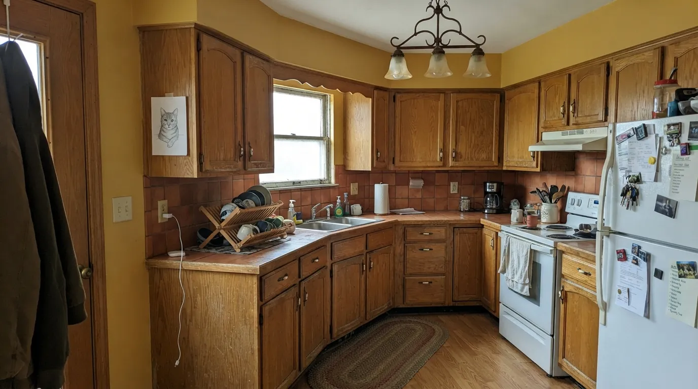
Golden walls, oak cabinets, terracotta tile, a wrought-iron chandelier, maybe a sponge-finish accent — this is the exact combination the color is famous for, and it is also the exact combination that reads dated the fastest today. The paint isn't the problem; the whole-room theme is. Use it as one surface — an island, a hutch, a door — and keep the rest of the kitchen quiet and white.
Golden ochres need warm light to stay golden. Under cool-white LED bulbs with little natural light, Tuscan Sun can go muddy and mustard instead of sunny — readers researching similar warm golds describe exactly this shift. Swap to 2700K bulbs before blaming the paint.
The 2024–2025 pale-yellow trend search traffic pulls a lot of shoppers toward any color with "yellow" or "sun" in the name. Tuscan Sun is not that color — it's deeper, more orange, and more saturated than the pastel butter-yellow look people are picturing. If you want the trend, sample a paler yellow instead; if you want real gold, this is it.
Room by Room
Warm porch light and full daylight both flatter it, and a single golden door reads as a deliberate color choice, not a theme. Semi-gloss for weather and wipe-down; pair with black or wrought-iron hardware.
Small rooms take saturated color well, and there's no honey-oak floor in a half-bath to drag it toward the dated version. Matte or eggshell, warm 2700K sconce.
Genuinely charming as one accent piece in an otherwise white or pale-gray kitchen. The moment it's on all four walls with oak cabinets and terracotta tile, it becomes the exact look this color is trying to live down. Semi-gloss cabinet enamel.
Beautiful under evening lamps with a walnut table and brass fixtures; flatter in a room that gets some real daylight too. A whole dining room in this gold is a bold, specific choice — sample big before committing to all four walls.
Too much saturated gold across a room people sit in all day tips toward heavy rather than cheerful. If the color is calling you, use it on one accent wall, not the whole space.
On stucco with a genuine Tuscan or Spanish-colonial architectural style, it belongs. On a standard colonial or craftsman exterior, it reads like a leftover trend rather than a design decision — this is a case where the architecture has to earn the color, not the other way around.
Your Light Is the Risk
Full golden-hour light makes it glow like honey — the case this color was built for, especially on an exterior door.
No warm daylight and no warm bulbs turns the gold flat and slightly mustard. Test with the actual bulbs you'll use.
Brightest and most golden at the sun hours; quieter and more ochre-toned the rest of the day. Sample on the wall it will actually live on.
2700K bulbs keep it honey-warm and cozy. Cool white LEDs flatten it toward mustard — this is the single easiest fix if the color disappoints.
Most complaints about Tuscan Sun are a light mismatch. Upload a photo of your actual room and see it on your walls — then ask for the same wall in north light or evening lamps before you buy a single sample.
Need It From Another Brand?
Any paint counter can custom-tint Pratt & Lambert 16-7 directly. If you would rather stay in one brand's own deck, these are the closest stock matches, measured as ΔE2000. Under 2 is a difference you will not see on the wall.
| Brand | Closest color | ΔE | LRV | |
|---|---|---|---|---|
| Sherwin-Williams | White RaisinSW 7685 · Sherwin-Williams | 3.5 | 57 | Color page → |
| Behr | Golden ThreadMQ4-13 · Behr | 1.9 | 57 | Color page → |
| Benjamin Moore | Da Vinci's Canvas208 · Benjamin Moore | 2.1 | 56 | Color page → |
| Valspar | Home Brew8002-24C · Valspar | 2.4 | 61 | Color page → |
| PPG / Glidden | Gold BuffPPG1208-4 · PPG / Glidden | 2.3 | 59 | Color page → |
| Glidden | Autumn GlowPPG1106-3 · Glidden | 1.2 | 57 | Color page → |
Contrast and Legibility
WCAG 2.1: AA is 4.5 : 1 for normal text, 3 : 1 for large text, AAA is 7 : 1.
Tuscan Sun vs the Colors You're Also Considering
Every Tuscan Sun sample board has the same rivals on it. The numbers show the real lightness gap — then it comes down to which risk you would rather live with.
Pick this when you want the color to actually read as gold, not as a hesitant beige-yellow.
Farrow & Ball No. 37 · LRV 50HayPick this if you want the same golden family turned down a notch — a quieter, dustier yellow for people who are nervous about commitment.
Pick this for the deeper, more genuinely orange-gold version instead of a pastel.
Sherwin-Williams SW 9665 · LRV 65Sunny Side UpPick this if what you actually want is the pale butter-yellow trend look — this is the color most people picture when they say "butter yellow."
Pratt & Lambert does not offer a close in-line twin to Tuscan Sun, so the real decision is usually about how much color you want. The honest comparisons are with the lighter, softer neutrals people cross-shop when a full gold feels like a lot.
Antique White (1-1), at an LRV of 78, carries the same warm family but far less saturation. It reads as a warm cream rather than a yellow, so choose it if you want the cozy feeling without the walls clearly turning gold. Ancestral (32-29), LRV 73, is similar territory, a quiet warm off-white for people who want warmth to stay in the background.
Statuary (32-14), LRV 65, is closer in lightness to Tuscan Sun but pulls neutral and soft rather than golden. Pick Tuscan Sun when you want unmistakable, sunny color; pick these when you want the warmth to whisper.
Tuscan Sun Coordinating Colors
The rule for coordinating with Tuscan Sun: keep the rest of the room quiet, warm, and light, and let this be the one loud note. It pairs cleanly with warm whites, near-blacks, and its own same-brand siblings — and it fights hardest when it's asked to share a room with too many other saturated warm colors at once. These are the partners that keep it looking deliberate:
The Tuscan-Kitchen Trend: Why This Color Carries Baggage
Tuscan Sun's name is not incidental. In the early-to-mid 2000s, warm golden yellows like this one covered kitchen and dining-room walls across the country as part of a specific, heavily marketed look: faux-finished or sponge-painted walls, oak or cherry cabinets, terracotta tile, wrought-iron light fixtures, and a general aim at recreating an Italian villa inside a suburban tract house. It was everywhere for roughly a decade, and it is exactly the combination home-improvement sites now list first when they explain why a kitchen looks dated.
That history is worth knowing before you buy the color, not to scare you off it, but to be honest about what makes it work now versus what made it fail then. The trend didn't age badly because golden ochre is an ugly color — it aged badly because it was applied as a whole-room theme with three or four other saturated, texture-heavy elements at once. Used the way this review recommends — one surface, clean modern partners, no faux finish — the same gold reads as confident color choice rather than a time capsule.
Tuscan Sun With Wood Tones and Metals
Walnut and other deep, cool-leaning woods are the safest pairing — they don't compete with the gold's warmth the way honey oak does, and the contrast in depth keeps both looking intentional. Pale white oak and gray-washed wood also work well and pull the whole look toward a more current, less "villa" direction. Honey oak is the pairing to think hardest about: it's the wood tone this color is most associated with, and stacking them together is what makes a room read dated fastest.
For metals, matte black and dark bronze read modern and crisp against it; unlacquered or antique brass leans into the warmer, more traditional version of the look. Polished chrome and wrought iron with heavy scrollwork are the two finishes most likely to pull the whole room back toward the exact 2000s reference this color is trying to move past.
Three Ready Palettes Built on Tuscan Sun
A color is never alone on the wall. These are complete combinations in the 60-30-10 pattern, with the reason each one holds together. Every one opens in the visualizer.
A single golden door against a warm white body reads as one deliberate color decision instead of a theme; the near-black shutters give the gold a clean, dark frame so it looks curated, not sponge-painted.
Try this palette in your roomKeeping the walls and cabinets quiet and warm-white is what lets the gold island read as a confident accent rather than a callback to the full 2000s look; Wrought Iron ties in black hardware without adding oak or terracotta to the mix.
Try this palette in your roomA small room is the right scale for this much saturation; White Dove keeps the trim soft rather than stark, and a Cocoa vanity — a same-brand pairing — grounds the room in warm brown instead of the wrought-iron cliché.
Try this palette in your roomTuscan Sun FAQ
Is Tuscan Sun a dated color?
The full look it's famous for — golden walls, oak cabinets, terracotta tile, wrought iron — is a genuine early-2000s signature and reads dated fast. The paint itself, used as one surface (a door, a small room, an island) rather than a theme, does not carry the same baggage. The combination dates it, not the color alone.
Is Tuscan Sun the same as butter yellow?
No. Butter-yellow trend colors are pale and creamy, closer to a soft cream than a true yellow. Tuscan Sun is a real golden ochre with an orange edge and real saturation at LRV 60. If you're chasing the current pastel trend, sample a paler color instead; this one is deeper and more assertive.
What's the undertone?
Golden yellow with a whisper of orange — never a clean lemon, never green-tinted. It's a warm, honey-leaning gold rather than a bright, citrus-clean yellow.
Is it good for a front door?
Yes — this is arguably its best job. Full daylight and warm porch light both flatter the saturation, and a single door reads as a deliberate pop of color rather than a whole-house theme. Use semi-gloss and pair with black or dark bronze hardware.
Does it work with honey oak floors?
It can, but carefully. Honey oak plus this gold plus terracotta tile is the exact 2000s combination that dates a kitchen the fastest. If your floors are already honey oak, use Tuscan Sun in a small dose — an island, a hutch — rather than on the walls, and keep the rest of the room in a quiet white.
What trim color goes with Tuscan Sun?
A clean warm white (White Dove, Swiss Coffee) keeps it soft and traditional; a near-black (Wrought Iron, Iron Ore) gives it a crisper, more modern edge. Avoid a stark cool white trim, which can make the gold look slightly dirty by comparison.
Have you painted with Tuscan Sun?
Rate it — one tap helps the next reader decide.
Ask a Question