Cocoa
The near-black cocoa brown from a brand nobody photographs: where it reads warm, where it goes flat black, and the Benjamin Moore and Sherwin-Williams doubles if your dealer doesn't carry it.

Jessica has spec'd whites and neutrals for more than 300 rooms and keeps a sample wall of painted drawdowns in her studio. Every color review is checked against real reader rooms in the comments and re-tested when a formula changes. About the testing process →

- 1Weathervane2
- 2Cocoa7
- 3Porpoise13
- 4Cavern Clay20
The Fast Verdict
Cocoa is a genuine warm brown at near-black depth — LRV 7, a clear red-orange undertone, no gray in it anywhere — from a brand most people have never heard of. Pratt & Lambert has been made by Sherwin-Williams since 1995 and sold quietly through independent hardware dealers ever since, so this exact formula has almost no owner photos or reviews online. What it does have is a nearly identical formula to two well-documented Benjamin Moore and Sherwin-Williams browns, so you can see the color already painted on someone else's wall even if you can't find one of Cocoa itself.
Front doors · kitchen islands and cabinets under a light perimeter · powder rooms with a real light fixture · a drenched den or home office · exterior shutters and trim
Your room has no real light source · you want four walls in an average-lit living room · you want a true black, not a brown · your dealer doesn't carry Pratt & Lambert and you're not willing to have it color-matched
- A genuine warm cocoa-brown, not a black pretending to be one
- Near-exact chemical twin of well-documented Benjamin Moore and Sherwin-Williams browns, so any dealer can match it
- Reads expensive on a front door or kitchen island without going full black
- LRV 7 hides scuffs and fingerprints better than a painted true black would
- Sold through small independent dealers rather than a big retail chain — a genuinely uncommon pick
- Almost no owner photos or reviews online to check before you buy
- Reads flat and nearly black in any room without real direct light
- Not stocked everywhere — you may need a dealer who carries the Pratt & Lambert formula, or a color match elsewhere
- Four walls in a small, dim room can feel like a hole rather than a brown
What Color Is Cocoa, Really?
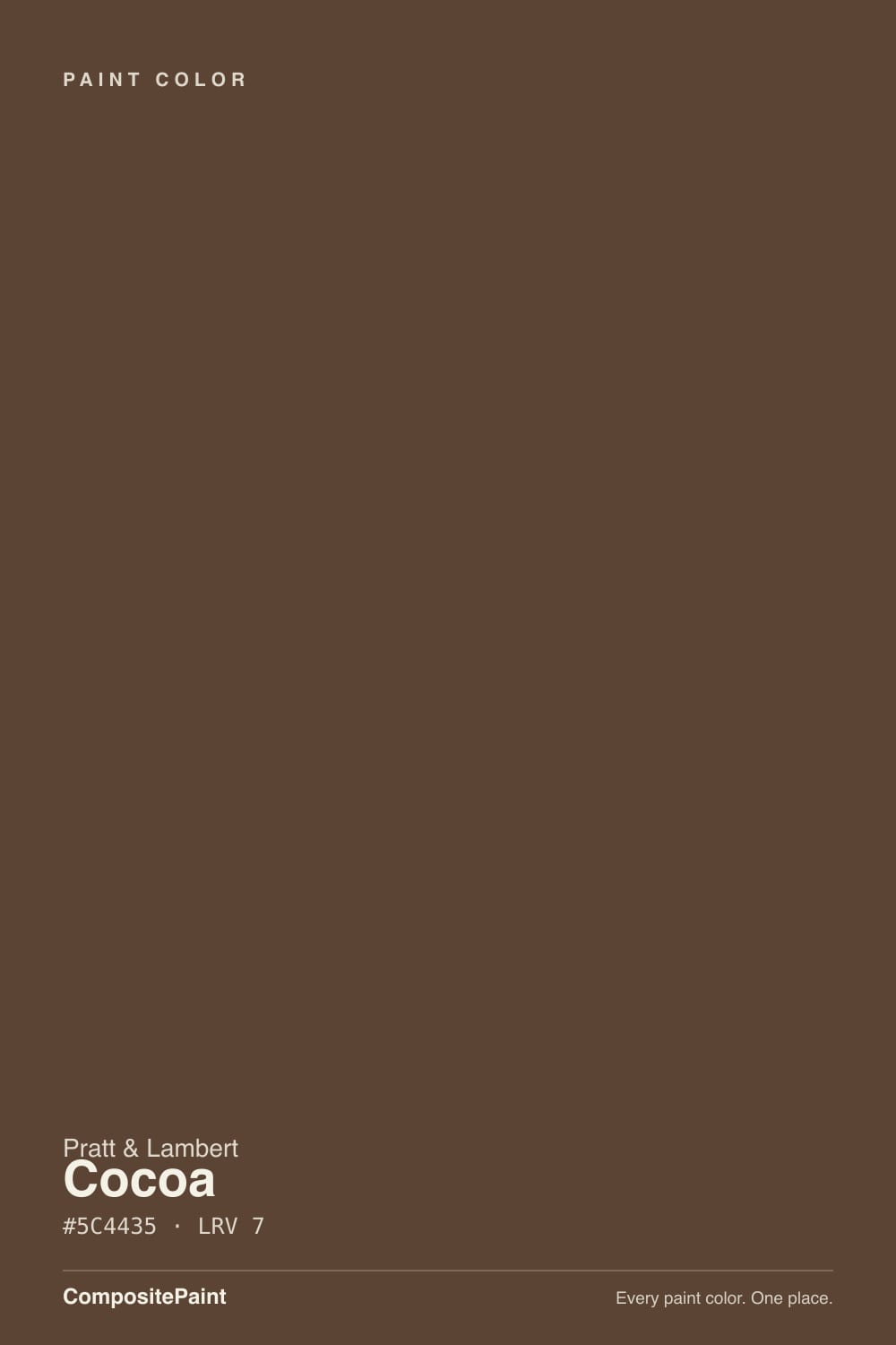
A dark, warm cocoa-brown with a genuine red-orange lean — the numbers back up the name. At hex 5C4435, red sits noticeably ahead of green and blue, the classic signature of a true brown rather than a brown-black or a brown-gray; nothing in the formula pulls it toward mud or ash. It belongs to Pratt & Lambert's core numbered collection, the same "23-" series that produced the brand's 2017 Color of the Year, Leafy Bower — so despite the obscurity, this is a mainline color, not some forgotten back-shelf mixing chip.
At LRV 7 it sits in true near-black territory, one step lighter than most paint decks' reference blacks. That depth is the whole personality: give it real light and the red-brown warmth reads like roasted coffee or dark melted chocolate; starve it of light and it becomes almost indistinguishable from a true black. Nothing about the formula changes between those two states — only how much light the room hands it back.
Undertone in one line: warm red-brown, genuinely cocoa — never gray, never a true black, never orange enough to read as rust. If your sample looks flatter or blacker than the chip, that is the room's light doing the work, not the paint pulling toward a different color.
Where It Shines
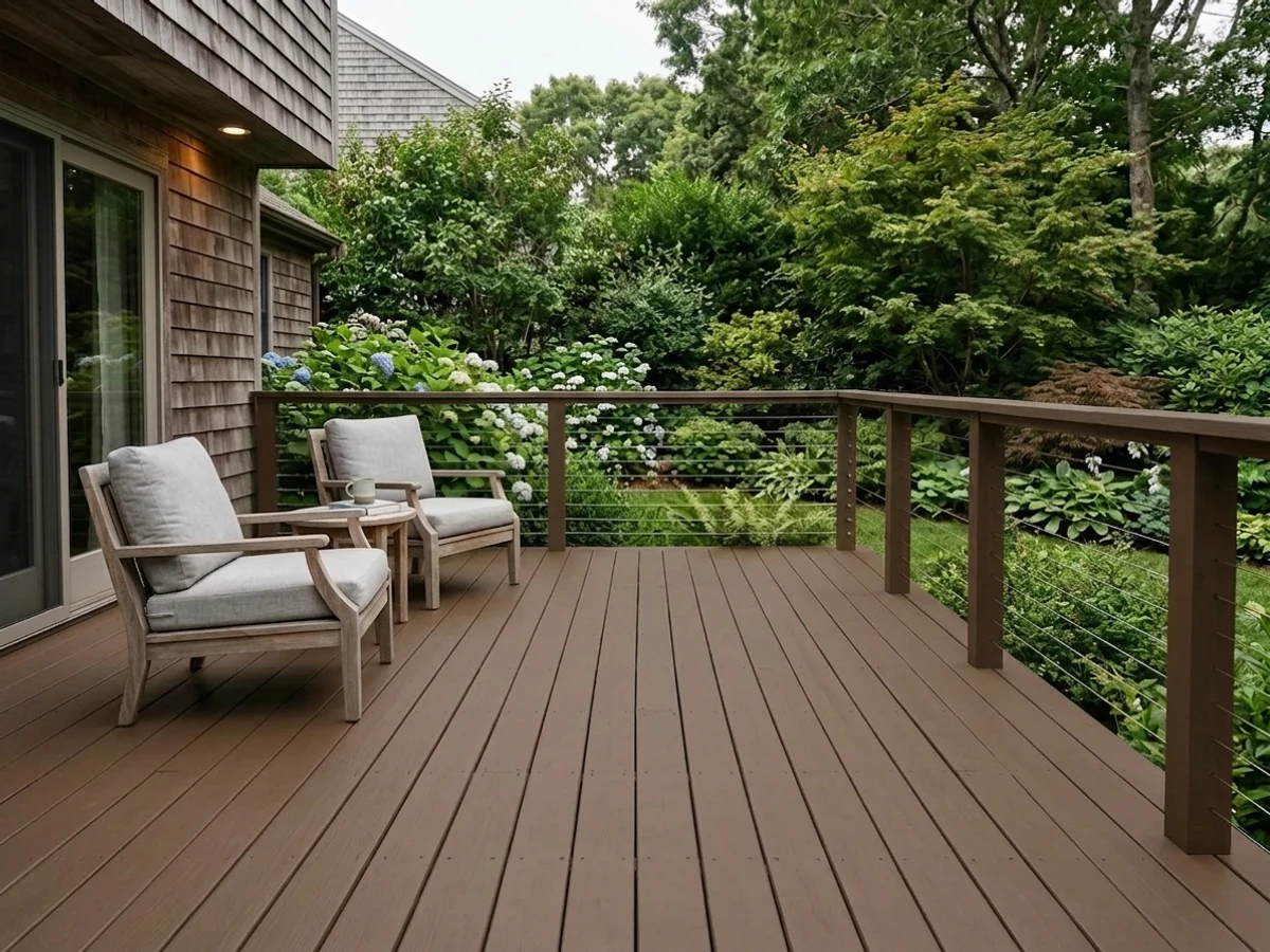
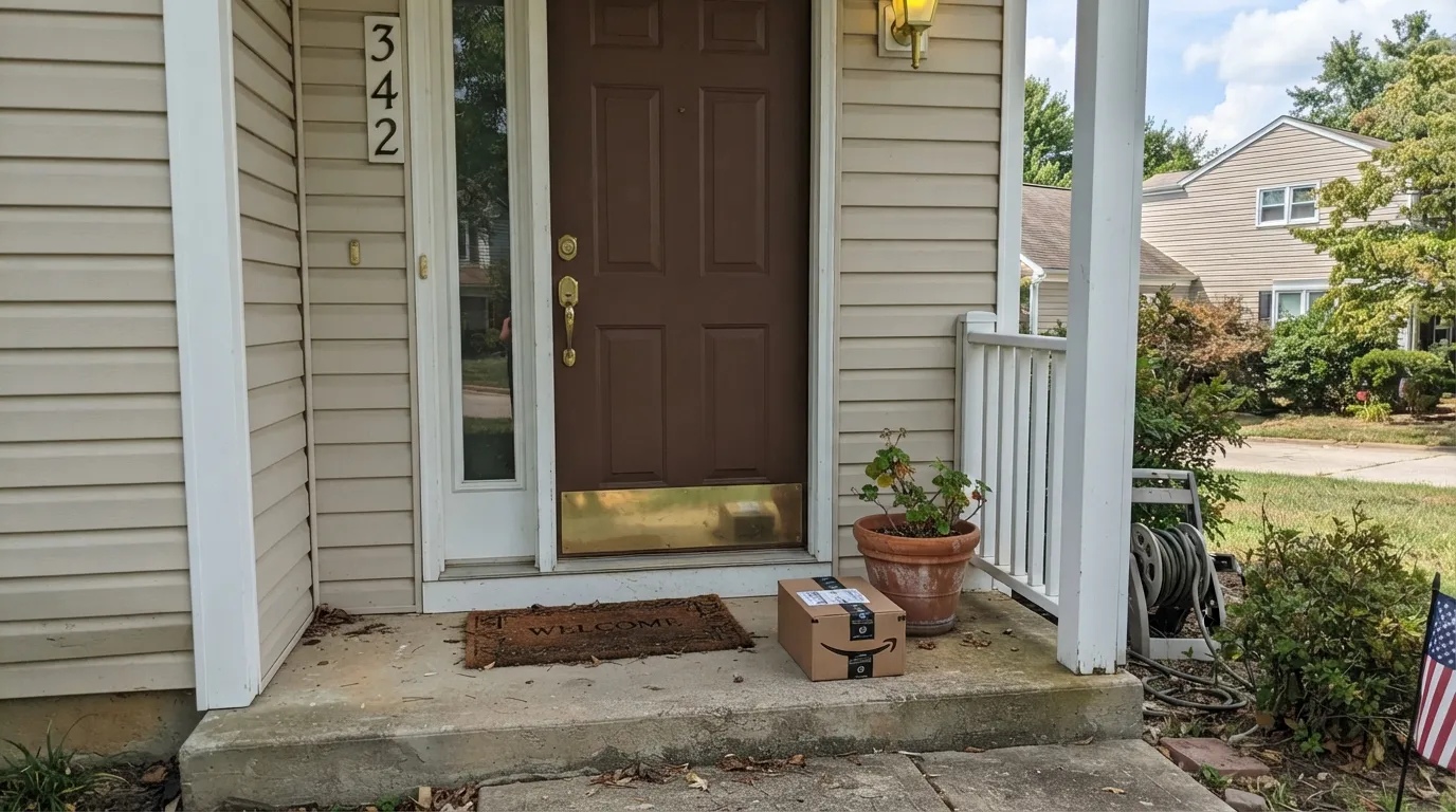
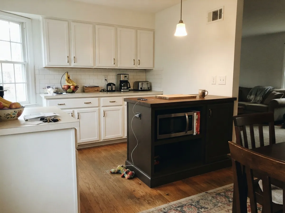
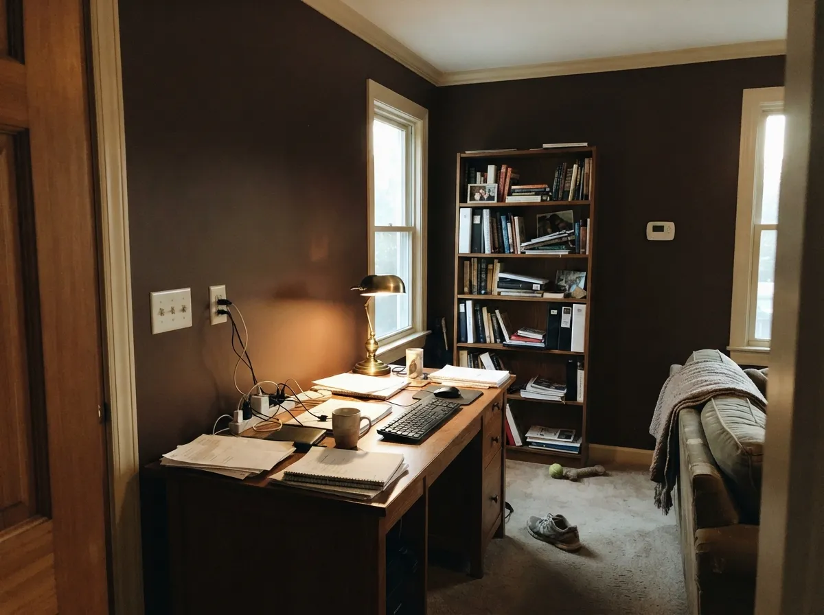
Give it a job with real light behind it — a front door, a kitchen island under bright cabinets, a den with its own lamp — and it earns its name: rich, warm, genuinely brown, the kind of depth that reads like stained wood rather than paint. It is built for accents and single surfaces, not whole rooms, and it rewards a bright neighbor more than almost any color this dark.
Where It Fails
Because almost nobody has posted a real room in this exact formula, the failure modes below come from optics and physics more than from complaint threads — plus one that comes straight from the SKU's own obscurity.
At LRV 7 there is almost nothing left to reflect. In a windowless hallway, a closet, or a north room with no lamps on, the red-brown warmth disappears and the wall reads as a flat, characterless near-black. The color did not change; the light simply had nothing to give it back.
Drenching a small room with no lighter ceiling or trim line to bounce light back stacks the depth up in the corners until the room feels like a hole rather than a color. Keep the ceiling and trim in a warm white — White Dove or Swiss Coffee — or hold Cocoa to one wall or one piece of furniture.
There are effectively no owner photos, Houzz threads or forum posts for this exact 23-11 formula online — a real, verifiable gap for a small dealer brand. Like every dark color, the paper chip reads lighter than the actual wall, and here you have no room photo to sanity-check that jump. Order a real sample — a poster-size print or a peel-and-stick swatch — before committing a whole door or island to it, and lean on the near-twin comparisons below if you want to see the color already painted somewhere.

Room by Room
Semi-gloss Cocoa against a light or mid-tone body color reads like real stained wood rather than painted brown, and it hides everyday scuffs and pollen film better than a painted true black door does. Rain beads off the sheen; brass or matte-black hardware both work.
As an island or lower-cabinet color under white or cream perimeter cabinets, it reads coffee-bar rich rather than heavy. Use a satin cabinet enamel, not the wall formula — cabinets take far more handling than a door ever will.
Small rooms carry this kind of depth well, but a windowless powder room needs an actual sconce or overhead fixture, not borrowed hallway light, or the color goes flat. Pair with a marble or warm-wood vanity top and brass fittings.
Walls, trim and even the ceiling in Cocoa, with only a sheen change between them, turns a small study into something that feels like a lined library. It depends on the room's own lamp doing real work after dark — this is not a color that survives on daylight alone once the sun sets.
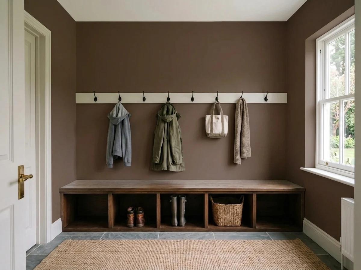
One wall behind a sofa or fireplace, with warm white or cream neighbors, keeps the room from feeling like a cave. Four walls of Cocoa in an average-lit living room asks more of the space than most rooms can give back.
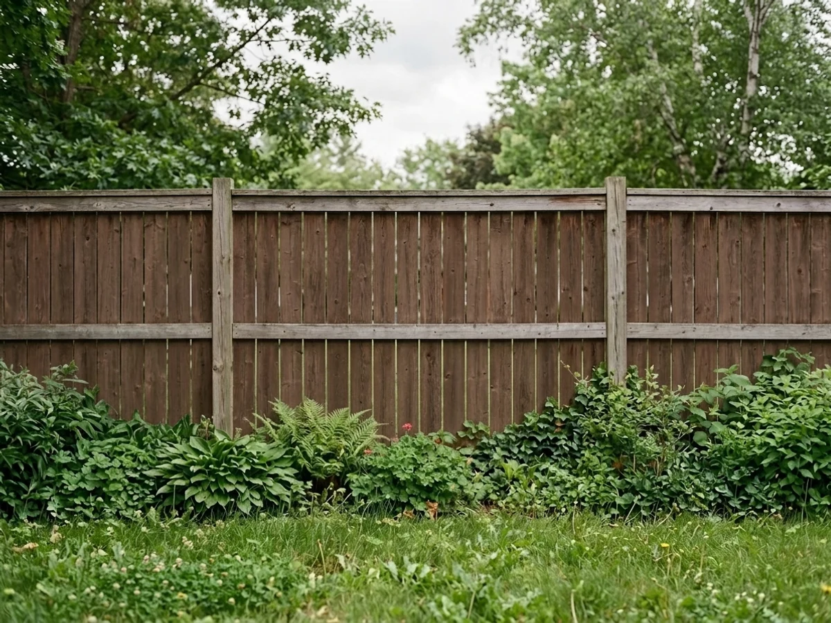
On shutters, a door or trim against a light-colored or brick body, it reads like aged wood. Full siding in Cocoa needs a genuinely sun-drenched lot, or it just reads dark rather than brown from the street.
Your Light Is the Risk
Full sun is what proves this is a brown and not a black — the red-orange comes forward and it reads like dark roasted coffee, not ink.
In a windowless hall or a dim north room, LRV 7 leaves almost nothing to reflect back; the warmth drains out and it reads as a flat near-black smudge.
Warmest and most cocoa-toned at the sun hours, settling toward a quieter near-black the rest of the day — on a front door it reads almost like natural wood grain shifting.
2700K lamps keep the red-brown warmth alive after dark; cool white LEDs flatten it toward gray-black. Under a porch light, warm bulbs matter more than usual here.
Most complaints about Cocoa are a light mismatch. Upload a photo of your actual room and see it on your walls — then ask for the same wall in north light or evening lamps before you buy a single sample.
Need It From Another Brand?
Any paint counter can custom-tint Pratt & Lambert 23-11 directly. If you would rather stay in one brand's own deck, these are the closest stock matches, measured as ΔE2000. Under 2 is a difference you will not see on the wall.
| Brand | Closest color | ΔE | LRV | |
|---|---|---|---|---|
| Sherwin-Williams | Hickory SmokeSW 7027 · Sherwin-Williams | 3.3 | 7 | Color page → |
| Behr | Breakfast Blend280F-7 · Behr | 3.0 | 6 | Color page → |
| Benjamin Moore | Deep Taupe2111-10 · Benjamin Moore | 1.0 | 8 | Color page → |
| Valspar | IncognitoV084-6 · Valspar | 1.7 | 7.3 | Color page → |
| Dutch Boy | Wire Work416-7DB · Dutch Boy | 3.3 | 7 | Color page → |
| HGTV Home by Sherwin-Williams | Well-Bred BrownHGSW 2461 · HGTV Home by Sherwin-Williams | 3.3 | 7 | Color page → |
Contrast and Legibility
WCAG 2.1: AA is 4.5 : 1 for normal text, 3 : 1 for large text, AAA is 7 : 1.
Cocoa vs the Colors You're Also Considering
Every Cocoa sample board has the same rivals on it. The numbers show the real lightness gap — then it comes down to which risk you would rather live with.
Pick this if you already have a Pratt & Lambert dealer relationship, or want the brand fewer people are searching for.
Benjamin Moore 2110-10 · LRV 8TaupePick this if your dealer carries Benjamin Moore instead of Pratt & Lambert — the two formulas sit close enough that nobody will spot the difference on a door.
Pick this for the original — Cocoa reads a touch more red, Van Dyke Brown a touch more neutral.
Sherwin-Williams SW 7041 · LRV 7Van Dyke BrownPick this for the widest possible availability — Sherwin-Williams stores are everywhere, and this is the closest match to Cocoa in both hex and LRV.
The closest relative in the Pratt & Lambert line is Mahogany 21-10 at LRV 5. Both are very dark and warm, but Mahogany is redder and more saturated, reading like stained wood or oxblood, while Cocoa holds more true-brown and a touch more light. Choose Mahogany when you want a red-leaning, almost wine-dark surface, and Cocoa when you want a grounded chocolate that stays clearly brown.
Against Black Lacquer 32-2 at LRV 3, the difference is warmth and depth. Black Lacquer is a near-true black, crisp and cool, best for a modern, high-contrast look. Cocoa gives you a comparable amount of drama with a softer, warmer face that feels older and more organic.
For a green-black alternative, Chalkboard 32-5 at LRV 6 lands in the same dark band but pulls toward deep forest gray instead of brown, better where you want a cooler, earthier dark.
Cocoa Coordinating Colors
The rule for coordinating with Cocoa is the same rule that governs any near-black brown: stay warm, keep a light neighbor nearby for contrast, and let one near-twin brown deepen it rather than compete with it. These are the partners that keep it reading cocoa instead of black:
A Heritage Brown With No Online Track Record
Pratt & Lambert was founded in Buffalo in 1849 and was, for decades, an upscale independent paint brand in its own right. Sherwin-Williams bought it in 1995, and rather than folding it into its own retail stores, P&L has continued to be sold quietly through independent hardware and paint dealers — Ace, Do It Best, and regional shops — never through a P&L-branded storefront of its own. Cocoa 23-11 sits in the brand's core numbered collection, the same "23-" series that produced Leafy Bower, Pratt & Lambert's 2017 Color of the Year, so it is not a forgotten leftover; it is simply a color that never got a marketing push.
The practical effect is real: search for this exact formula and you will find almost no owner photos, no Houzz boards, no Reddit threads to check it against before you buy. That is not a defect in the paint — it behaves exactly like the well-documented browns it sits next to in hex and LRV — but it is a genuine reason to order a real sample rather than trust the chip alone, and to lean on this page's near-twin comparisons if you want to see the color already painted on somebody's wall.
Cocoa With Wood Tones and Floors
Pair it with lighter wood — white oak, ash, maple, a pale butcher block — and the contrast keeps the room from merging into one dark mass, which matters most on an island or a cabinet set sitting above a wood floor.
Against dark walnut or espresso floors and trim, Cocoa can visually disappear into the wood rather than reading as its own color. If the dark floor is staying, add a break — a painted baseboard, a lighter trim reveal, or hold Cocoa to a door or a single accent instead of a full wall next to it.
Three Ready Palettes Built on Cocoa
A color is never alone on the wall. These are complete combinations in the 60-30-10 pattern, with the reason each one holds together. Every one opens in the visualizer.
A warm brown door against a warm white trim and a soft greige body reads like real stained wood, not a paint decision — the classic move for a door that needs to look expensive without going full black.
Try this palette in your roomTwo warm whites keep the room bright while the island carries all the color; brass or matte-black hardware finishes the coffee-bar look Cocoa is built for.
Try this palette in your roomA small study drenched in Cocoa, with cream trim keeping the ceiling from disappearing and a near-black on the built-ins, reads like a lined library — but only works with a lamp doing real work after dark.
Try this palette in your roomCocoa FAQ
Is Pratt & Lambert Cocoa a brown or a black?
Brown — genuinely, with a warm red-orange undertone that shows up the moment it gets real light. But at LRV 7 it is only one step lighter than most true blacks, so in a dim room it can read almost black. Test it in your actual light before deciding.
Where can I get Cocoa 23-11 mixed?
Pratt & Lambert is now made by Sherwin-Williams but sold through independent hardware and paint dealers — Ace and Do It Best locations are the most common — rather than a P&L-branded retail chain. If your local dealer does not stock the formula, most paint counters can match it from the hex code; the comparisons above are the closest ready-made doubles.
What is the closest Benjamin Moore or Sherwin-Williams match?
Benjamin Moore Taupe (2110-10) and Sherwin-Williams Van Dyke Brown (SW 7041) are both close enough in hex and LRV that nobody will see the difference on a painted door. See the comparisons above for the exact numbers.
What trim color goes with Cocoa?
A warm white — White Dove or Swiss Coffee — keeps the edge soft. A bright, cool white will make the brown look muddy by comparison, so stay warm.
Does Cocoa work on a front door?
Yes — it is one of its best jobs. Semi-gloss, against a light or mid-tone body color, reads like real stained wood rather than paint, and it hides everyday scuffs better than a painted true black door does.
Will Cocoa look too dark in my small room?
On four walls with no real light source, yes — it can feel like a hole. It works best as a door, an island, an accent wall, or a small room with its own light fixture doing real work, not as a whole-house wall color.
Have you painted with Cocoa?
Rate it — one tap helps the next reader decide.
Ask a Question