Hay
The most overlooked yellow in the Farrow & Ball archive, reviewed honestly: the light that makes it glow like a sun-bleached hayfield, the light that turns it flat khaki, and what to pick instead.

Jessica has spec'd whites and neutrals for more than 300 rooms and keeps a sample wall of painted drawdowns in her studio. Every color review is checked against real reader rooms in the comments and re-tested when a formula changes. About the testing process →
- 1Dorian Gray39
- 2Mindful Gray48
- 3Hay56
- 4Pale Oak69
- 5Shoji White74
The Fast Verdict
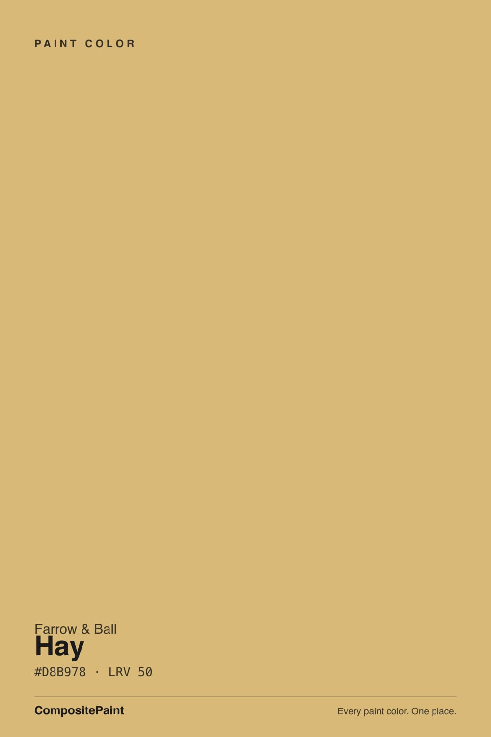
Hay is a Farrow & Ball original — No. 37 in a catalog where the low numbers are the founding shades — and it reads less like a yellow paint and more like a warm, dusty neutral that happens to be built on yellow. The trick is a real green undertone, not the usual gold-orange base most "buttery" yellows use, so it lands as straw and dried grass rather than butter or lemon. Give it real daylight and it glows; starve it of light and the green takes over.
Farmhouse kitchens with brass + wicker + aged wood · mudrooms and entryways that want warmth without a bold color decision · anyone who likes the idea of a Tuscan-kitchen gold but wants it grayed down · rooms that get real, direct daylight for most of the day
Your room runs cool and dim (north light, no lamps) · you want a true buttery-gold yellow, not a grayed one · your trim, tile or counters lean cool grey · you're nervous about any hint of green undertone
- A genuinely warm, dusty straw yellow — not candy-sweet, not a bold statement
- Real Farrow & Ball archive pedigree, not a trend color chasing a moment
- Gorgeous with brass, wicker, rattan and aged wood — built for the farmhouse look
- Green undertone lets it pass as a neutral in rooms that don't want a "color" decision
- LRV 56 holds its color in a bright room without washing out to pale butter
- Goes flat and khaki-drab fast in dim or north-facing rooms
- Not a true buttery-gold — disappoints buyers picturing a classic Tuscan-kitchen yellow
- Clashes with cool grey trim, tile and countertops
- Cool LEDs pull the green forward and can look sickly after dark
What Color Is Hay, Really?
Hay carries a low catalog number — No. 37 — which in the Farrow & Ball system marks it as one of the founding shades of the brand's original archive, not a recent trend color. It's a dusty, warm-neutral yellow, and the detail that separates it from almost every other yellow in this deck is its undertone: green, not the gold-orange base that gives most "butter" and "honey" yellows their sweetness. That green base is what lets Hay pass for a neutral in a room that isn't asking for a statement color — it's the yellow you can put on four walls without anyone immediately clocking it as "the yellow room."
At LRV 56 it sits in the middle of the yellow family: far deeper than the pale butter yellows that hover in the 70s and 80s, but nowhere near the saturated golds and mustards down in the 20s. That mid-depth is what gives it the straw-and-dried-grass read the name promises — enough body to hold color in a bright room, not so much that it turns into a bold accent commitment. Plan on it reading a shade paler and softer on four walls than a small chip suggests, which is true of most F&B mid-tones.
Undertone in one line: green first, warm second — never the orange-gold of a classic butter yellow. If your sample looks properly golden and straw-like, that's real daylight doing its job; if it looks flat, khaki, or faintly olive-drab, that's cool or low light draining the warmth out and leaving the green exposed on its own.
Where It Shines
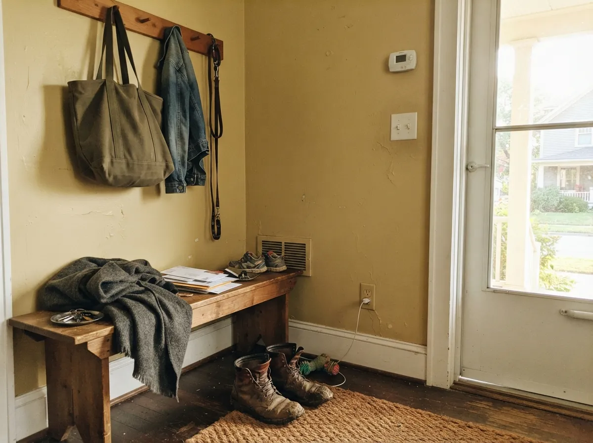
In a room that gets real, direct daylight, Hay does exactly what its name promises: it reads like a sun-bleached hayfield or a dried straw bale, warm and dusty rather than bright and sweet. It's a natural fit for modern-farmhouse and English-cottage styling — brass hardware, wicker baskets, rattan, aged pine and oak all read as intentional against it rather than mismatched. It had a real moment in early 2025 when home blogger Liz Marie Blog used it for a full mudroom-entryway reveal, and that room is a fair preview of the color's best case: a smaller, high-traffic space with warm wood, natural light and layered neutrals rather than a wide-open, north-facing great room.
Where It Fails
Almost every disappointed review of Hay traces back to one of three situations, and all three are predictable before the first coat goes on. None of them are the paint's fault — but if your room matches one, this is not your yellow, and a bigger sample will only confirm it.
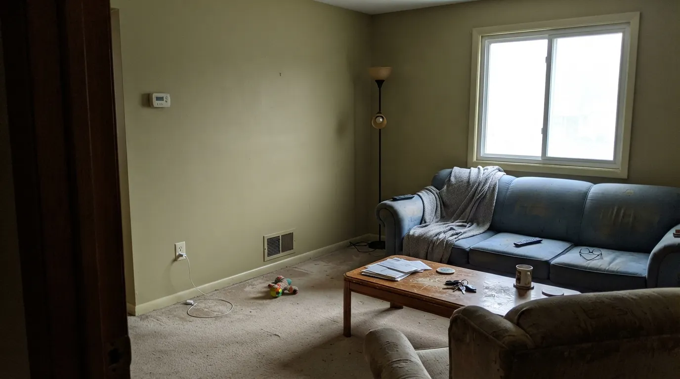
Cool, overcast daylight drains the warmth out of Hay and leaves the green undertone standing alone. Readers describe the result as flat, khaki, or "olive-drab" — not a color anyone chose on purpose. The paint didn't change; the light did. Add warm 2700K lamps or pick a more reliably warm neutral instead.
If the picture in your head is a classic Tuscan-kitchen gold — warm, orange-leaning, unmistakably sunny — Hay will read muted and gray by comparison, because its undertone is green, not gold. That's not a flaw, it's a different color; look at a genuinely gold-based yellow instead if that's the mental image you're chasing.
Cool grey pushes Hay's green forward and makes both surfaces look slightly off — the grey reads dingy, the yellow reads murkier than it should. Hay wants a warm white or cream partner, not a cool one.
Room by Room
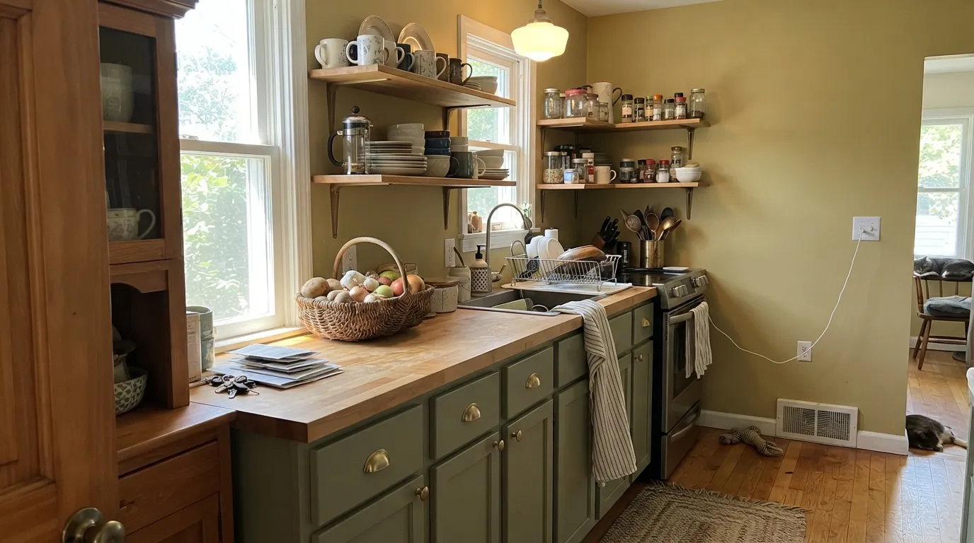
With brass hardware, wicker, butcher block and aged wood it's the modern-farmhouse color of choice. Satin on cabinets wipes clean; pair walls and cabinets with a warm cream trim rather than a stark or cool white.
Small, high-traffic, layered with coat hooks and boots — this is where Hay gets used in real houses, and where it earned its recent attention. Matte or a washable eggshell holds up to scuffs from boots and bags.
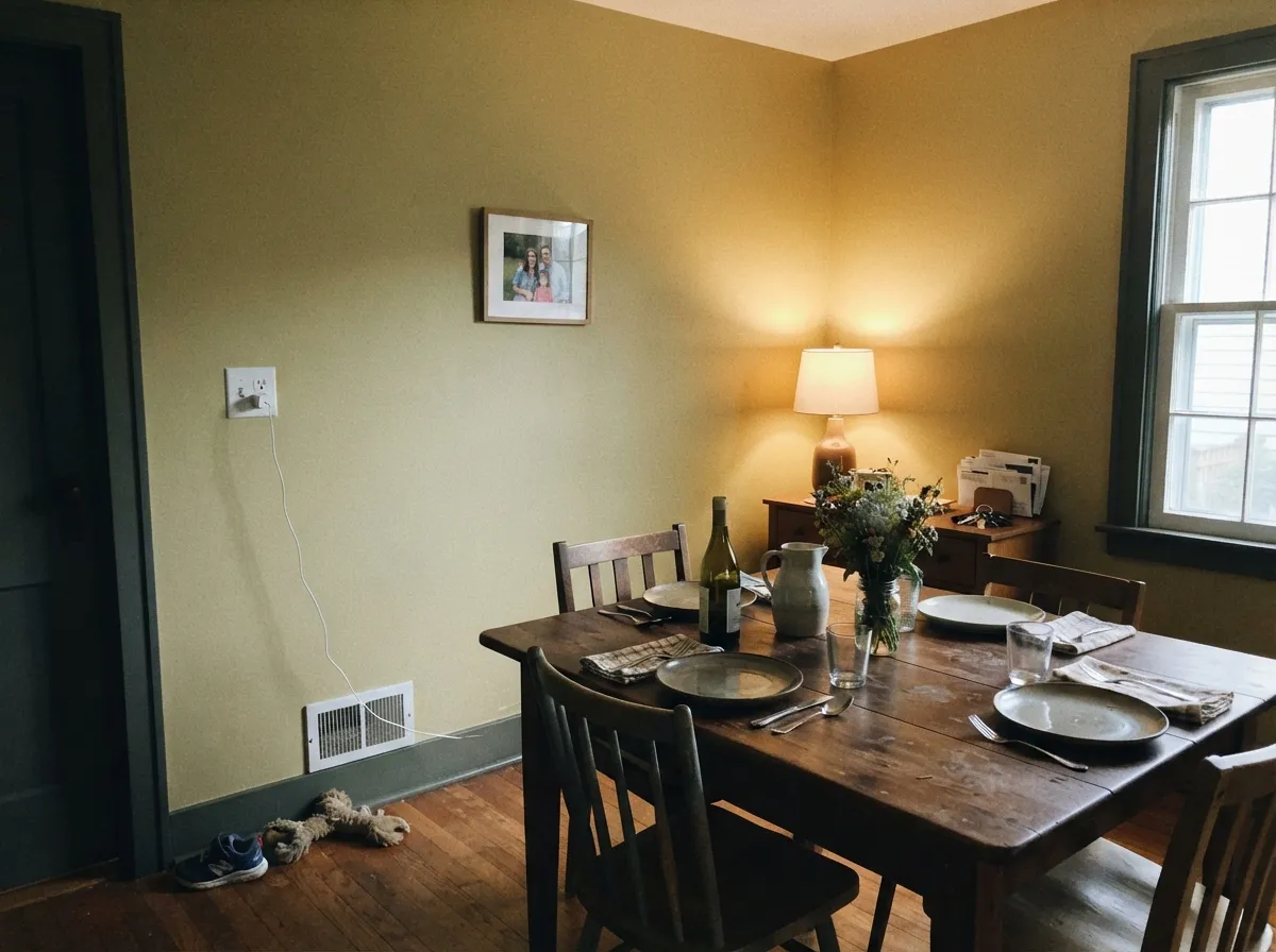
Warm wood table, brass chandelier, daytime light: Hay is genuinely handsome here. At night, keep the bulbs warm — cool overhead LEDs pull the green forward and flatten the mood.
South- or west-facing rooms with real sun handle it well. A dim, north-facing living room is the single most common regret story for this color — test big, and plan on lamps doing real work after dark.
A green-based yellow under cool bedroom lighting can read more sickly than restful, which is the opposite of what most people want in a room they sleep in. It can work as a single accent wall with warm lamps, but it is not the safe whole-room choice a bedroom usually wants.
Yellow-green tones near a mirror have a well-documented tendency to make skin tones look sallow under vanity lighting, which is the last thing anyone wants at the sink. If you love it, use it sparingly with strong warm sconces rather than as the main wall color around a mirror.
Your Light Is the Risk
Real sun on the wall reads exactly like the name: warm, dusty, sun-bleached straw. This is the light the color needs to prove itself.
Cool, flat daylight drains the warmth and leaves a khaki, olive-drab cast. The most common disappointed review starts here.
Warmer and more golden at the sun hours, quieter and greener the rest of the day. The swing is real but most owners read it as the room "breathing," not a flaw.
2700K lamps deepen the gold and calm the green down. Cool white LEDs do the opposite — pull the green forward and can look sickly. Warm bulbs are part of this paint job, not optional.
Most complaints about Hay are a light mismatch. Upload a photo of your actual room and see it on your walls — then ask for the same wall in north light or evening lamps before you buy a single sample.
Need It From Another Brand?
Any paint counter can custom-tint Farrow & Ball No. 37 directly. If you would rather stay in one brand's own deck, these are the closest stock matches, measured as ΔE2000. Under 2 is a difference you will not see on the wall.
| Brand | Closest color | ΔE | LRV | |
|---|---|---|---|---|
| Sherwin-Williams | Pale MossSW 9027 · Sherwin-Williams | 1.0 | 58 | Color page → |
| Behr | Straw BasketUL160-6 · Behr | 0.9 | 57 | Color page → |
| Benjamin Moore | ShortbreadCSP-970 · Benjamin Moore | 1.5 | 56 | Color page → |
| Valspar | Baked Scone3007-8B · Valspar | 2.0 | 58.4 | Color page → |
| PPG / Glidden | True BlondePPG12-12 · PPG / Glidden | 1.8 | 57 | Color page → |
| Glidden | True BlondePPG12-12 · Glidden | 1.8 | 57 | Color page → |
Similar Farrow & Ball Colors
The nearest shades to Hay within Farrow & Ball's own range, ranked by perceptual color distance — useful when you want the same look a touch lighter, darker, or warmer.
WCAG 2.1: AA is 4.5 : 1 for normal text, 3 : 1 for large text, AAA is 7 : 1.
Hay vs the Colors You're Also Considering
Every Hay sample board has the same rivals on it. The numbers show the real lightness gap — then it comes down to which risk you would rather live with.
Pick this when you want the personality of a color that still reads as a neutral from across the room.
Sherwin-Williams SW 6106 · LRV 57Kilim BeigePick this if you actually want a plain beige with zero yellow or green risk — it's built specifically to sit quietly against honey oak.
Pick this for the same weight of color with the gold pulled back and the green let in — quieter, more current, easier to live with long-term.
Pratt & Lambert 16-7 · LRV 60Tuscan SunPick this if the golden, unmistakably-yellow Tuscan-kitchen look is actually what you want, undertone and all.
Pick this when you want the color to read as a warm neutral first and a yellow second.
Benjamin Moore HC-4 · LRV 71Hawthorne YellowPick this for a paler, more confidently yellow color that still needs real light to earn its keep.
Pick this for the warmth French Gray doesn't have; the two share a family resemblance but Hay is unmistakably yellow up close.
Farrow & Ball No. 18 · LRV 42French GrayPick this if you want the same green-based F&B logic with the yellow dropped out entirely — its own undertone is green, not gray.
Hay Coordinating Colors
The rule for coordinating with Hay is simple: stay warm, and don't fight the green. It pairs best with other warm F&B neutrals and creams, takes a near-black or a dark green as its one grounding accent, and argues with anything cool-grey or blue-based. These are the partners that keep showing up in rooms that work:
Hay's Story: A Farrow & Ball Original
Hay's catalog number — No. 37 — places it among the founding shades of Farrow & Ball's archive, long before "greige" or "warm neutral" were marketing categories. The name is literal: dried hay and straw, the dusty warm-gold-going-green color of a cut field, not a bright agricultural yellow. It's the kind of color that sat quietly in the catalog for decades, used mostly by people who already knew the F&B range, while brighter and safer neutrals got the attention.
It had a real, documented moment in early 2025, when home blogger Liz Marie Blog used it for a full mudroom-entryway reveal — a smaller, high-traffic, wood-and-brass space that happens to be close to Hay's actual best case. That's a fair way to think about the color: not a whole-house gamble, but a proven choice for the kind of layered, lived-in room it was named after.
Hay With Wood Tones and Floors
Wood is where Hay does its best work. Oak, pine, wicker and rattan all sit comfortably against it because the color's warmth and green undertone don't compete with wood's usual orange-brown the way a true blue or purple would. Honey oak floors in particular are safer with Hay than with most other yellows, since there's no complementary clash pulling either surface toward an unwanted color.
The floors that need a sample first are cool, gray-washed or ash-toned wood. A cool floor plus Hay's green undertone can tip the whole room toward a muddier, less golden read than a warm oak floor would give you. As always with this color: test a large sample, in the room, in the light you actually live with.
Three Ready Palettes Built on Hay
A color is never alone on the wall. These are complete combinations in the 60-30-10 pattern, with the reason each one holds together. Every one opens in the visualizer.
Two heritage F&B warm neutrals plus one grounding dark: Slipper Satin's cream keeps Hay from tipping khaki, and Off-Black gives the room one true dark note that loves brass hardware.
Try this palette in your roomTwo warm neutrals close enough in value to feel layered rather than matchy — close to the real entryway look that put Hay back on people's radar in early 2025.
Try this palette in your roomGrounding a green-yellow with F&B's own darkest green, instead of a gray, keeps the whole room on one undertone family so it never reads like two separate color decisions.
Try this palette in your roomHay FAQ
Is Hay a yellow or a neutral?
Technically a yellow, but it behaves like a warm neutral in most rooms — that's the whole appeal. The green undertone and mid-depth LRV of 56 keep it from reading as "the yellow room" the way a gold or lemon shade would.
What's the undertone of Farrow & Ball Hay?
Green — not the orange-gold base most butter and honey yellows use. That's the detail that makes it read dusty and grounded rather than sweet, and it's also why it can look flat khaki in the wrong light.
Does Hay work in a north-facing room?
Cautiously at best. Cool, overcast daylight drains the warmth and leaves the green undertone exposed on its own, which reads as dull khaki rather than straw. If the room is north-facing and dim, plan on warm lamps doing real work, or pick a more reliably warm neutral.
What trim white goes with Hay?
A warm cream, not a stark or cool white. Slipper Satin is the natural F&B partner; any warm off-white works. A cool, grey-based white will make Hay's green undertone more obvious and less flattering.
Is Hay good for kitchen cabinets?
Yes — it's a popular cabinet and kitchen-wall choice, especially in modern-farmhouse kitchens with brass and wood. Use a washable satin or eggshell finish and keep the trim warm, not cool.
Does Hay work with honey oak floors?
Generally yes. Because Hay's undertone is green rather than orange, it doesn't fight honey oak the way a true complementary color would — both stay on the warm side of the wheel. Still worth a big sample, since results vary with the exact oak tone and light in the room.
Have you painted with Hay?
Rate it — one tap helps the next reader decide.
Ask a Question