Slipper Satin
Farrow & Ball's most popular quiet neutral, reviewed honestly: the daylight it needs, the grey-green it hides, and what to pick instead.

Jessica has spec'd whites and neutrals for more than 300 rooms and keeps a sample wall of painted drawdowns in her studio. Every color review is checked against real reader rooms in the comments and re-tested when a formula changes. About the testing process →
- 1Agreeable Gray60
- 2Pale Oak69
- 3Slipper Satin75
- 4Dover White83
- 5Moonlit Beach88
The Fast Verdict
Slipper Satin is the color Farrow & Ball reaches for when a client wants "just a nice neutral" and refuses to commit to gray or cream. It is neither, exactly — a warm off-white with a whisper of grey-green worked in, named for the pale silk of a ballet slipper. In real daylight it settles into a soft, chalky warmth that flatters almost everything near it. Take the daylight away and the trick stops working: the same wall can go dull and slightly murky, which is the one honest complaint that follows this color everywhere.
Kitchens and cabinetry in decent daylight · whole-house neutrals paired with F&B's own warm-grey family · hallways and dining rooms that get real sun for part of the day · anyone who wants a quieter, less beige alternative to a standard American warm white
Your room is north-facing and genuinely dim · you want a true, bright white, not a warm neutral · your evenings run on cool LED lighting with no lamps · you need a paint you can buy same-day at a local hardware store
- Genuinely versatile warm neutral — reads sophisticated, not sweet, and never tips icy
- Never carries a cool undertone, so it stays warm even in mixed light
- A go-to kitchen cabinet color that pairs easily with brass and warm wood
- Coordinates natively with Farrow & Ball's own Traditional Neutral family, especially Elephant's Breath
- Sold across every F&B finish, interior and exterior masonry — one color, whole house and front door alike
- Needs real daylight — north-facing or dim rooms read dull and slightly murky
- Cool LED bulbs at night flatten it toward flat grey-green instead of warm
- Not a true white — buyers expecting bright white get a smoky neutral instead
- Farrow & Ball's price and limited stockist network make swatching and touch-ups slower than a domestic big-box brand
What Color Is Slipper Satin, Really?
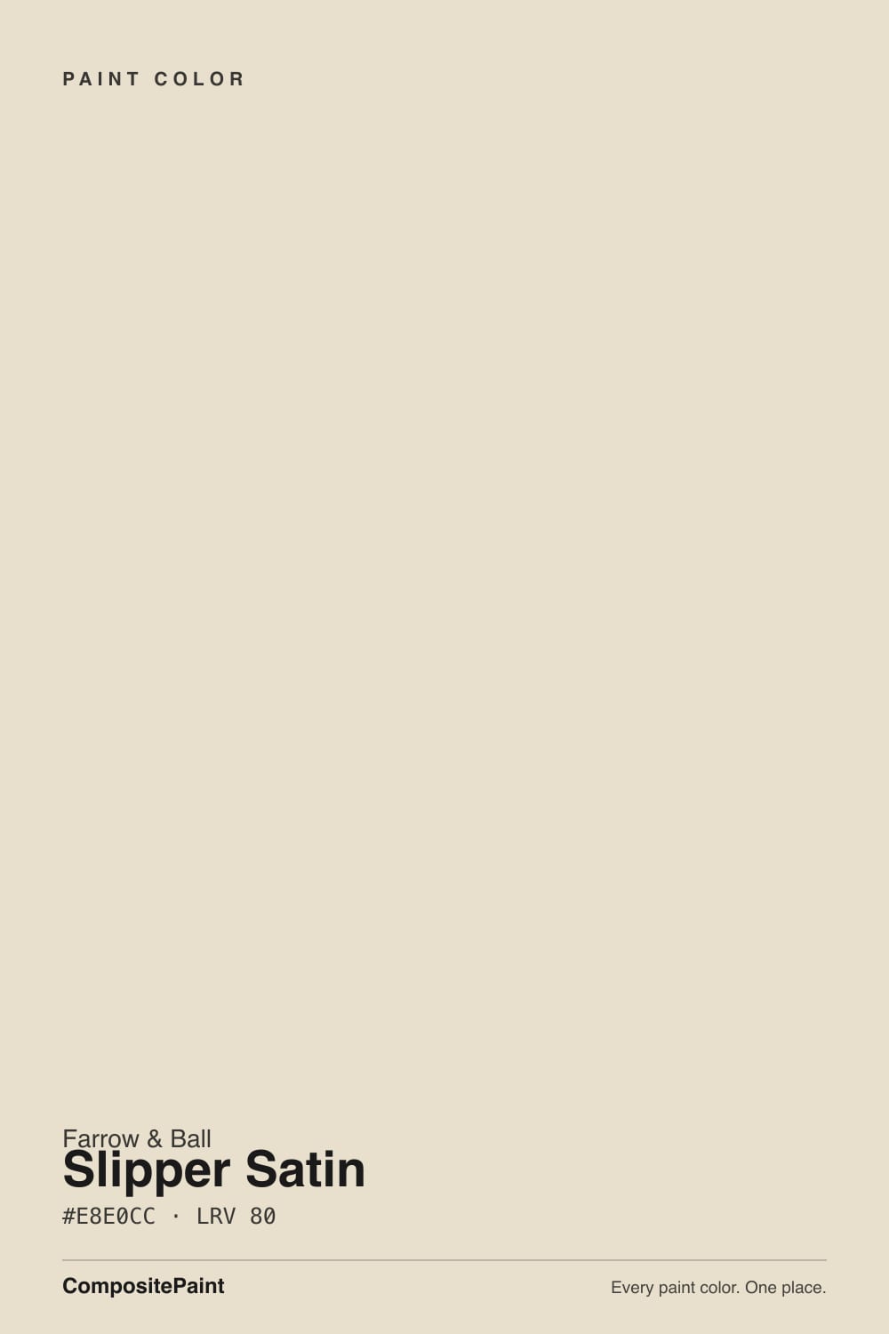
A warm off-white built around a yellow base, then quietly complicated with grey — Farrow & Ball groups it in their Traditional Neutral family alongside the brand's other grey-greens, and that lineage shows on the wall. It is not a clean cream and not a straightforward beige; it sits closer to a pale, warm chalk, with just enough grey-green in the mix that it reads as sophisticated rather than sweet. The name comes from the soft pink-cream silk once used in traditional ballet slippers, which is a fair description of the color's temperature: warm, but never loud.
Our deck lists it at LRV 80, which puts it in the same bright-neutral bracket as White Dove and Swiss Coffee — pale enough to lighten a room, not so pale that it reads as a clinical white. That depth is exactly what lets the color hold its personality: a paler neutral would wash out to nothing in strong sun, but Slipper Satin keeps its warm, slightly smoky character across most lighting conditions, which is the main reason designers keep specifying it decades after it was introduced.
Undertone in one line: warm and grey-green, never blue. Farrow & Ball itself is explicit that this color carries no cool undertone — which is why it reads as a soft, chalky grey to some eyes and a warm cream to others, depending entirely on the light in the room, not on the paint.
Where It Shines
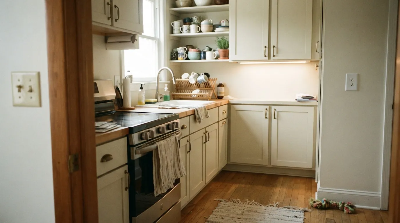
Give it genuine daylight and it does exactly what a good quiet neutral should: recede just enough to let cabinetry, trim details and furniture take the lead, without ever going flat or boring. Kitchens are where it shows up most often — as an alternative to a stark white on cabinetry, it reads restrained and expensive rather than clinical, and it sits comfortably next to brass, warm wood and honed stone. It is also the color Farrow & Ball itself pairs with the rest of its Traditional Neutral family, most often Elephant's Breath, so a Slipper Satin room rarely looks like it is working alone.
Where It Fails
The complaint pattern for Slipper Satin is narrow and consistent, and it almost always traces back to one thing: not enough real light. If your room matches one of these, sample big before you commit — a small chip will not tell you the truth.
Without direct light to activate the warm base, the grey in the mix takes over and the wall reads dull, slightly dirty, and flat — readers describe it as lifeless rather than calm. The paint did not change; the light simply never gave it anything to work with. Test a large sample on the actual wall, at the actual time of day, before painting the room.
Under cold artificial light the color drifts toward a flat grey-green with none of the warmth it shows in daylight — several owners report exactly this shift in the evening. Warm 2700K bulbs fix it in minutes; the paint is not the problem.
Slipper Satin photographs and reads as pale chalk-grey to plenty of buyers, not as white. If you actually want a bright, clean white — for trim contrast, for a gallery wall, for a crisp kitchen — this is the wrong pick and no amount of extra coats will brighten it.
Room by Room
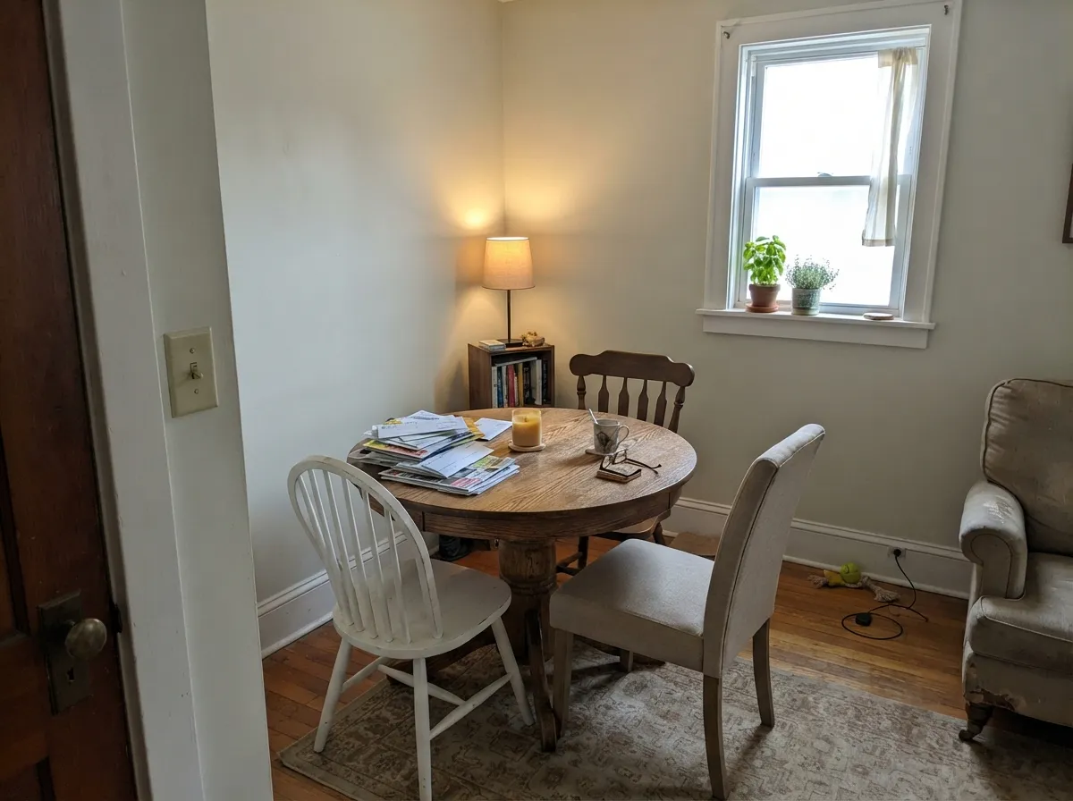
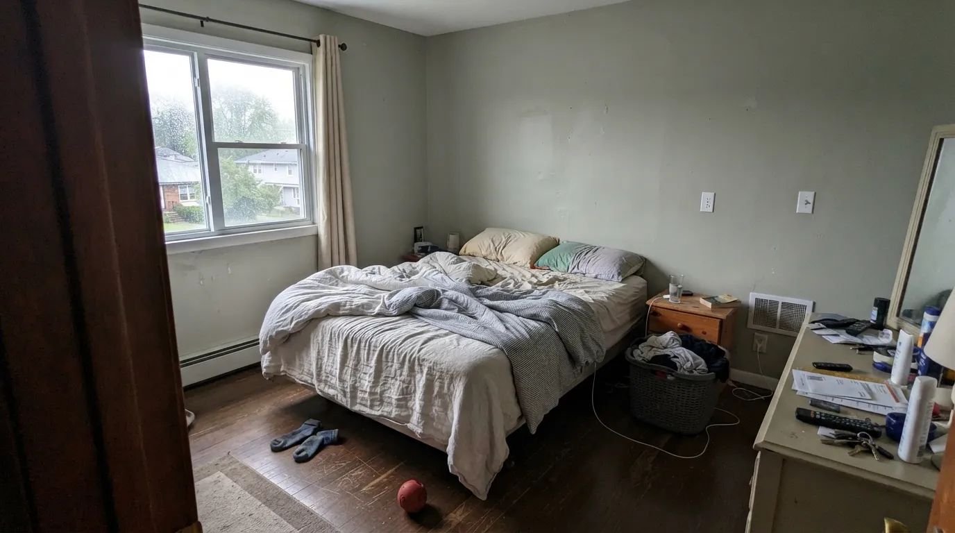
In a room with real sun for part of the day it is a genuinely restful backdrop for wood furniture and art. In a shaded room, expect it to sit flatter and greyer than the sample suggested.
One of the most-used F&B colors on cabinetry for a reason: it reads as a soft, sophisticated ivory rather than a stark white, and it does not fight brass hardware or butcher block. Eggshell or full gloss for durability around handles.
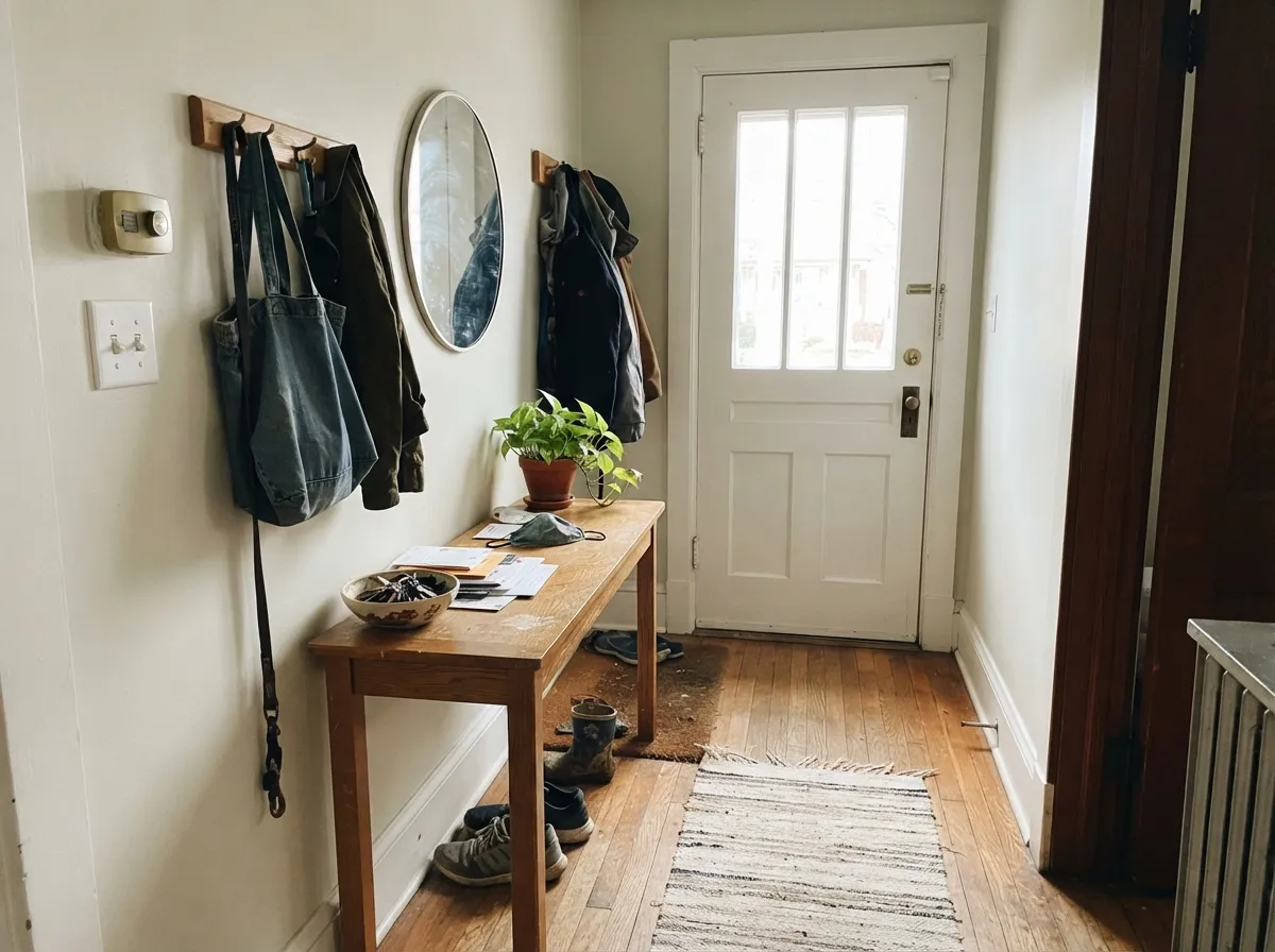
Hallways with a window or a borrowed-light doorway carry it well. A fully internal, windowless hallway is the one place to think twice, since it has nothing to activate the warmth.
It works, especially with warm lamps at night, but a bedroom that stays dim through the day is exactly the situation where readers report the dull, grey-green side of this color rather than the warm side.
A bathroom with a real window and warm fixtures is fine. A small, artificially lit interior bathroom with cool downlights is the least forgiving spot in the house for this particular color.
Farrow & Ball sells Slipper Satin in its Exterior Masonry finish, and full outdoor daylight is the one light source that never runs short — the color reads brighter and cleaner outside than it often does indoors.
Your Light Is the Risk
Real sun settles the grey-green into a warm, chalky neutral — this is the light the color was built to be seen in.
With nothing to activate the warm base, it reads dull and slightly murky rather than calm. Sample big before committing.
Warmer and softer in morning and midday sun, several owners report it drifting cooler and greener by evening — a real, documented shift, not a defect.
2700K warm bulbs keep the chalky warmth going after dark. Cool white LEDs push it toward flat grey-green — swap the bulb before you blame the paint.
Most complaints about Slipper Satin are a light mismatch. Upload a photo of your actual room and see it on your walls — then ask for the same wall in north light or evening lamps before you buy a single sample.
Need It From Another Brand?
Any paint counter can custom-tint Farrow & Ball No. 2004 directly. If you would rather stay in one brand's own deck, these are the closest stock matches, measured as ΔE2000. Under 2 is a difference you will not see on the wall.
| Brand | Closest color | ΔE | LRV | |
|---|---|---|---|---|
| Sherwin-Williams | White DuckSW 7010 · Sherwin-Williams | 0.5 | 74 | Color page → |
| Behr | Sand DriftN310-1 · Behr | 0.5 | 75 | Color page → |
| Benjamin Moore | Muskoka Trail974 · Benjamin Moore | 1.1 | 72 | Color page → |
| Valspar | Totten's Inlet7006-9 · Valspar | 1.5 | 75.2 | Color page → |
| PPG / Glidden | FocusPPG1008-1 · PPG / Glidden | 1.2 | 74 | Color page → |
| Glidden | FocusPPG1008-1 · Glidden | 0.5 | 75 | Color page → |
Similar Farrow & Ball Colors
The nearest shades to Slipper Satin within Farrow & Ball's own range, ranked by perceptual color distance — useful when you want the same look a touch lighter, darker, or warmer.
WCAG 2.1: AA is 4.5 : 1 for normal text, 3 : 1 for large text, AAA is 7 : 1.
Slipper Satin vs the Colors You're Also Considering
Every Slipper Satin sample board has the same rivals on it. The numbers show the real lightness gap — then it comes down to which risk you would rather live with.
Pick this for the quieter, more English, slightly chalkier neutral — Slipper Satin carries more grey, less straightforward cream.
Benjamin Moore OC-17 · LRV 85White DovePick this for an American-market warm white with reliable big-box swatching and a touch less grey-green in the mix.
Pick this when you want the settled, slightly smoky look instead of a clean, simple cream.
Benjamin Moore OC-45 · LRV 84Swiss CoffeePick this for a warmer, more straightforwardly creamy off-white when your room already runs cool.
Farrow's White No. 9812 (LRV 78) is the closest cousin. It is a shade cooler and a hair less golden, so it reads a little crisper on the wall. Choose Farrow's White if Slipper Satin looks too yellow in your light, and Slipper Satin if you want more warmth.
Dimity No. 2008 (LRV 76) sits slightly deeper and carries a clearer pink-taupe undertone. In a north-facing room Dimity can feel more sophisticated and grounded, while Slipper Satin stays lighter and airier.
School House White No. 291 (LRV 73) is the most muted of the three, a green-tinged soft white that looks more vintage and less creamy. It works when you want a quiet, historic feel rather than the openly warm cream of Slipper Satin. All four are close, so a side-by-side board in your own room is the only reliable way to choose.
Slipper Satin Coordinating Colors
Farrow & Ball built Slipper Satin into a family, not a one-off, and it shows: it sits in the brand's Traditional Neutral tonal group alongside its other warm grey-greens, and the brand's own guidance pairs it most often with Elephant's Breath. Outside the F&B lineup, it reads as a slightly greyer, more chalky cousin of the popular American warm whites, so it borrows the same partners those colors use — warm near-blacks, dusty pinks, and deep blues.
The Story Behind the Name
Slipper Satin takes its name from the soft, pale silk once used in traditional ballet slippers — a fair description of the color's warm, muted temperature. Farrow & Ball files it in the Traditional Neutral tonal group, which uses a yellow pigment base to give the color its faint grey-green cast, rather than the straightforward grey or beige bases most other brands use for a neutral this pale.
Unlike a lot of the neutrals currently trending, Slipper Satin is not a new introduction chasing a moment — it has sat in the Farrow & Ball lineup for years as one of the brand's most dependable background colors, the one designers reach for when a client wants a quiet, sophisticated neutral rather than a statement color. Its current popularity is less a trend than the rest of the market finally catching up to a color the brand's regulars already knew.
Slipper Satin With Wood Tones and Floors
Pale oak, whitewashed boards and reclaimed wood all sit comfortably against Slipper Satin — the warmth in the paint meets the warmth in the wood without either one fighting for attention. Walnut and other deep, cool-toned woods work well too, since the grey in the paint keeps the pairing from feeling too sweet.
The one combination worth testing first is a strongly orange, honey-toned oak floor. It is not the kind of hard clash a true grey has with warm wood, but the grey-green in Slipper Satin can look slightly at odds with a very golden floor rather than flattering it the way it flatters paler or cooler wood. As with every light-dependent neutral, paint a large sample and look at it against the actual floor before committing the whole room.
Three Ready Palettes Built on Slipper Satin
A color is never alone on the wall. These are complete combinations in the 60-30-10 pattern, with the reason each one holds together. Every one opens in the visualizer.
This is the classic Farrow & Ball kitchen formula: a warm off-white on the cabinets, dusty plaster-pink walls, and one near-black island for weight. All three share the same chalky, warm base, so nothing in the room fights.
Try this palette in your roomOne warm neutral top to bottom keeps small, older houses feeling calm and larger, with only the sheen change separating walls from trim. Hague Blue on the door supplies the single saturated note the scheme needs.
Try this palette in your roomBancha's khaki-olive depth needs a warm, not cool, partner overhead — Slipper Satin's grey-green warmth sits close enough in family to disappear into the corners, while Pelt on the door adds one quiet, near-black note.
Try this palette in your roomSlipper Satin FAQ
Is Slipper Satin warm or cool?
Warm — Farrow & Ball is explicit that it carries no cool undertone. The grey worked into the mix can make it read as chalky or muted, but it never goes blue or icy the way a true cool neutral does.
Is Slipper Satin an actual white?
No — it is a warm off-white, closer to a pale chalk-grey than a true white. If you want a bright, clean white for trim or a gallery-style wall, this reads noticeably grey-green next to it; that mismatch is behind most of the disappointed reviews.
What is the LRV of Slipper Satin?
Our deck lists it at LRV 80, a genuinely pale, bright neutral — in the same bracket as popular American warm whites like White Dove and Swiss Coffee, not a mid-tone greige.
Does Slipper Satin work in a north-facing room?
It can, but it is the riskiest light for this color. Without direct sun to activate the warm base, the grey-green in the mix takes over and the wall can read dull or slightly dirty. Sample a large piece on the actual wall before committing.
What colors pair with Slipper Satin?
Farrow & Ball's own Traditional Neutral family is the natural match — Elephant's Breath in particular is the brand's own recommended partner. For contrast, Off-Black, Hague Blue and Pelt all read as calm near-blacks against it rather than harsh ones.
Is it good for kitchen cabinets?
Yes — it is one of Farrow & Ball's most-used cabinet colors, reading as a soft, restrained ivory that flatters brass hardware and warm wood counters without the starkness of a bright white. Use eggshell or full gloss for durability.
Have you painted with Slipper Satin?
Rate it — one tap helps the next reader decide.
Ask a Question