Off-Black
Farrow & Ball's original soft black, reviewed honestly: the dining rooms where it turns velvety, the light that flattens it, and the finish choice that gets people in trouble.

Jessica has spec'd whites and neutrals for more than 300 rooms and keeps a sample wall of painted drawdowns in her studio. Every color review is checked against real reader rooms in the comments and re-tested when a formula changes. About the testing process →
- 1Off-Black6
- 2Pewter Green12
- 3Retreat21
The Fast Verdict
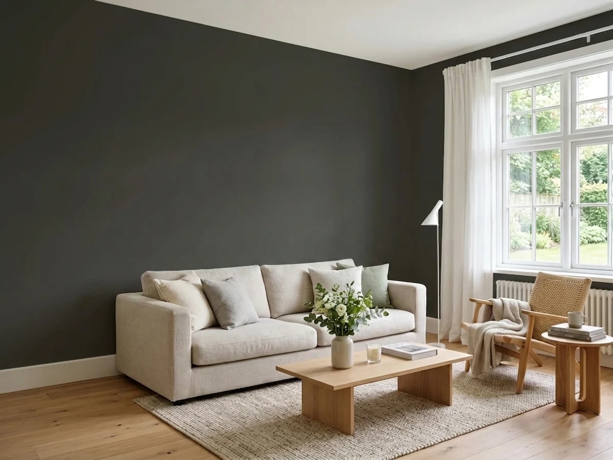
Off-Black is black with the hardness sanded off. It reads as a genuine black in a room, but it carries almost none of the cold blue that makes Railings and Black Blue look like ink, so every color you put beside it — cream, ochre, olive, terracotta, oak — gets treated kindly. That good manners is the whole reason to pay Farrow & Ball money for it.
The catch is depth: at LRV 6 it gives back almost no light, so a dining room with one small window and no lamps turns into a cave, and the chalky Estate Emulsion finish everyone associates with the brand is the wrong product for a room full of chair backs.
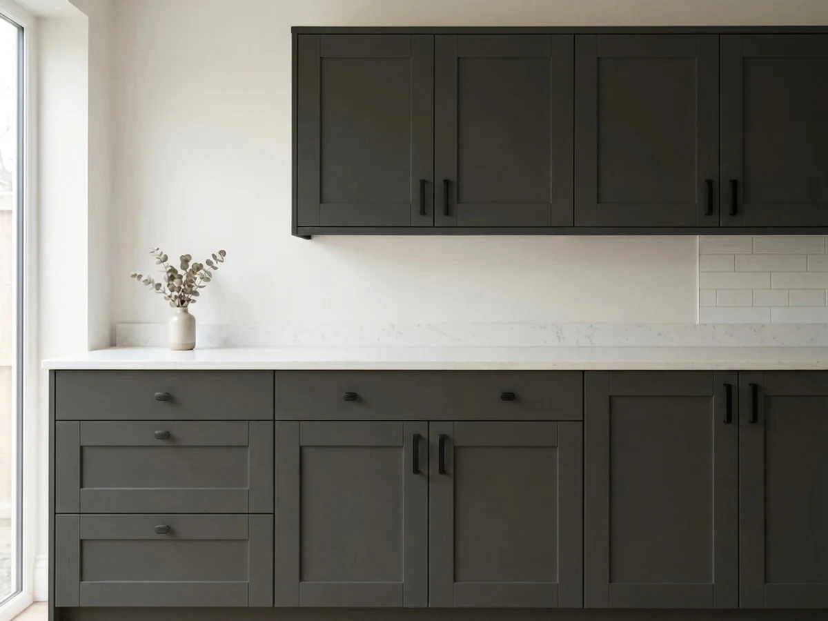
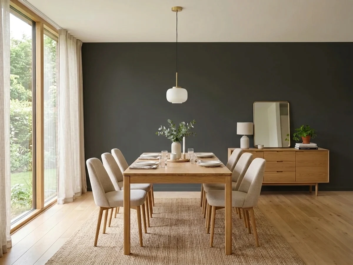
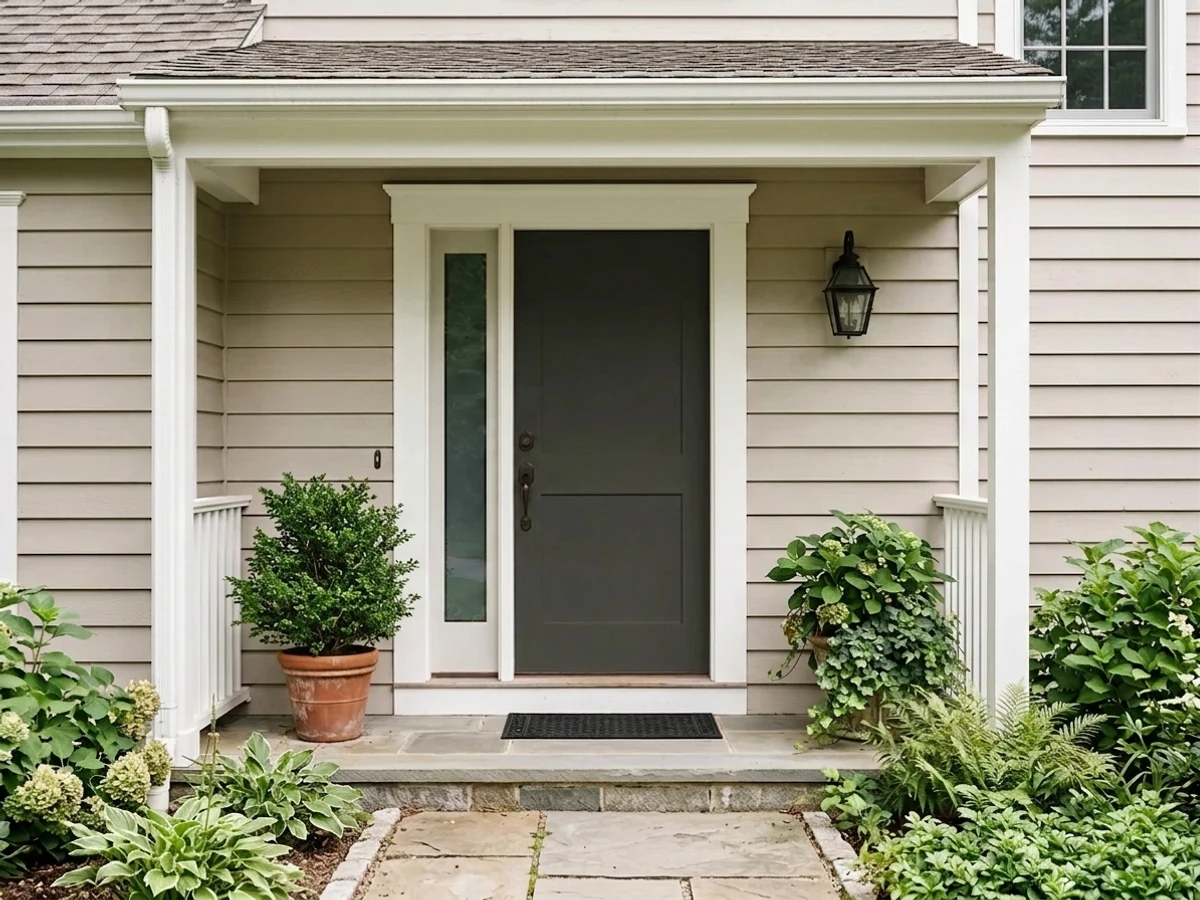
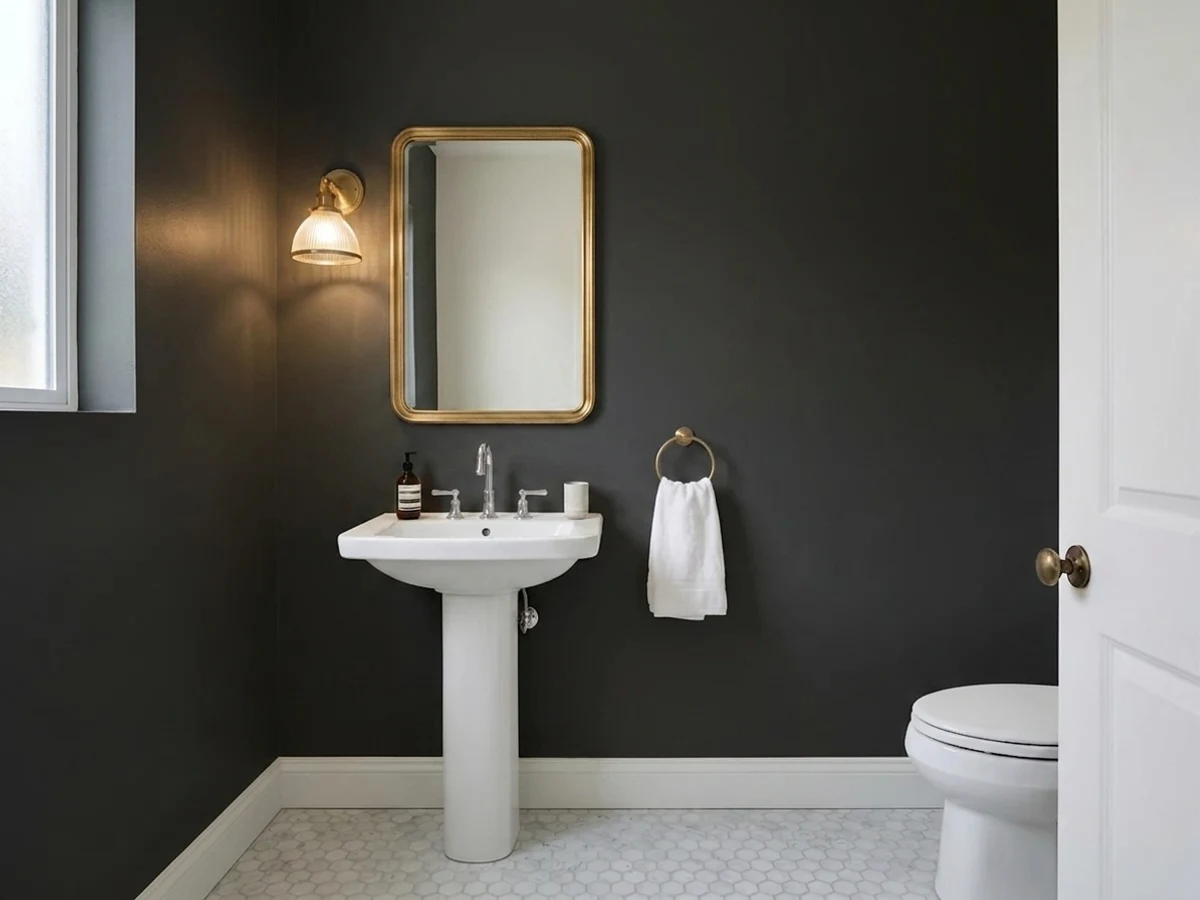
Drenched dining rooms and dark, lamplit rooms · powder rooms · libraries, dens and home offices · kitchen cabinets and islands · front doors, window sashes and joinery in gloss
The room has one small window and you refuse to add lamps · you want a warm brown-black · you want the moody navy-black look (that is Railings) · your budget is a box-store gallon · you need a wipe-hard wall in a busy family room
- Black without the cold blue — every neighbouring color is treated kindly
- Drenched rooms look considered and expensive rather than trendy
- Excellent on cabinets, doors, sashes and exterior joinery in gloss
- Deep enough to be black, soft enough not to look like a hole
- One of the brand's original colors — no trend timestamp on it
- LRV 6 gives back almost nothing; the room's light has to carry it
- Estate Emulsion marks and burnishes — the wrong finish for busy rooms
- Not a warm black; leans faintly cool against golden oak
- Farrow & Ball pricing plus a dark-tinted primer and two coats
What Color Is Off-Black, Really?
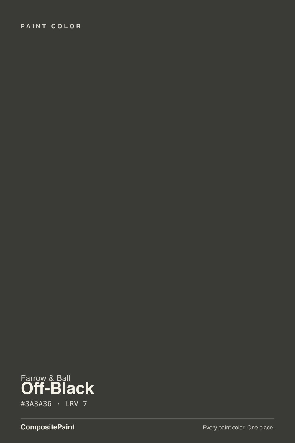
A soft, slightly cool near-black — one of the colors Farrow & Ball started with, sitting on the card next to Off-White with the same plain-spoken name. That age matters more than it sounds. Off-Black was mixed to sit on Georgian and Victorian joinery, where a hard modern jet black would have looked like a mistake, so it was built shallow on pigment tricks and long on softness. Put it beside a true black and you can see the difference immediately: the true black is a hole in the wall, Off-Black is a color.
At LRV 6 on our deck it is deep enough to be black in every practical sense. Nothing about that number is forgiving: a wall in Off-Black absorbs nearly all the light that lands on it, so the room's brightness now depends entirely on the windows, the lamps and the ceiling. This is why the same paint reads expensive and velvety in one house and grim in another — it is not a color that generates atmosphere on its own, it amplifies whatever light you give it.
Undertone in one line: a whisper of blue, far less than Railings or Black Blue, and no brown at all. In strong daylight against a true black you can just see the cool cast; in a lamplit room at night it disappears entirely and the wall reads as plain soft black. If your sample looks navy, your light is cold; if you want the black to look warm and brown, this is the wrong one — that is Black Fox or SW Cracked Pepper territory.
Where It Shines
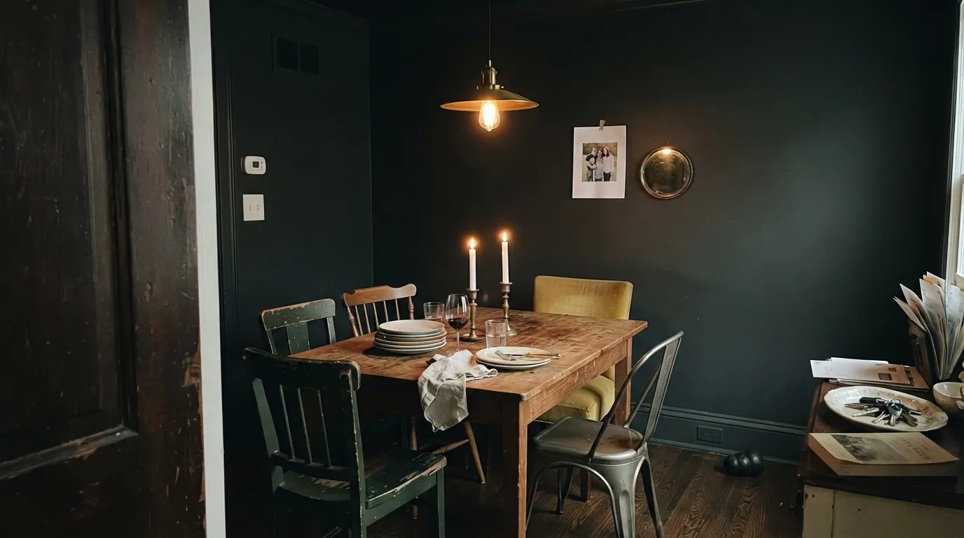
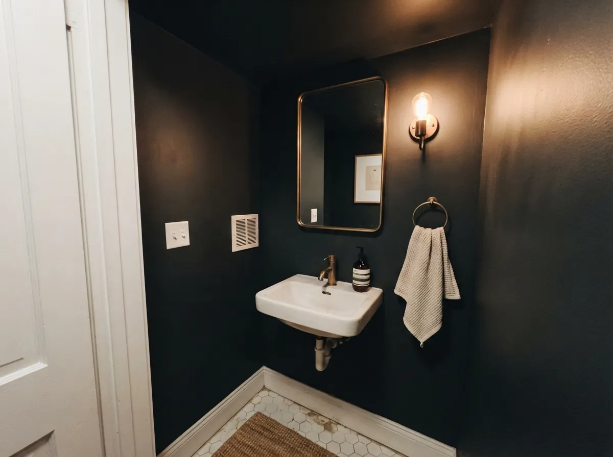
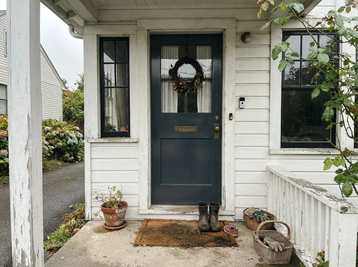
This color is at its best in rooms you use after dark, painted everywhere at once. Drench a dining room — walls, trim, ceiling, the inside of the built-in — and the edges of the room disappear, candles and a low pendant do all the work, and the table becomes the only thing in focus. Its second home is the small commitment: a powder room, a library wall of books, a run of base cabinets, an island. And because it is milder than Farrow & Ball's other blacks, it is the one that lets you put a real color beside it — an ochre chair, an olive door, a terracotta rug — without the black bullying it.
Where It Fails
The complaints about Off-Black are remarkably consistent, and none of them are really about the color mixing. Two are about the room and one is about which can you bought. All three are predictable before you open the paint.
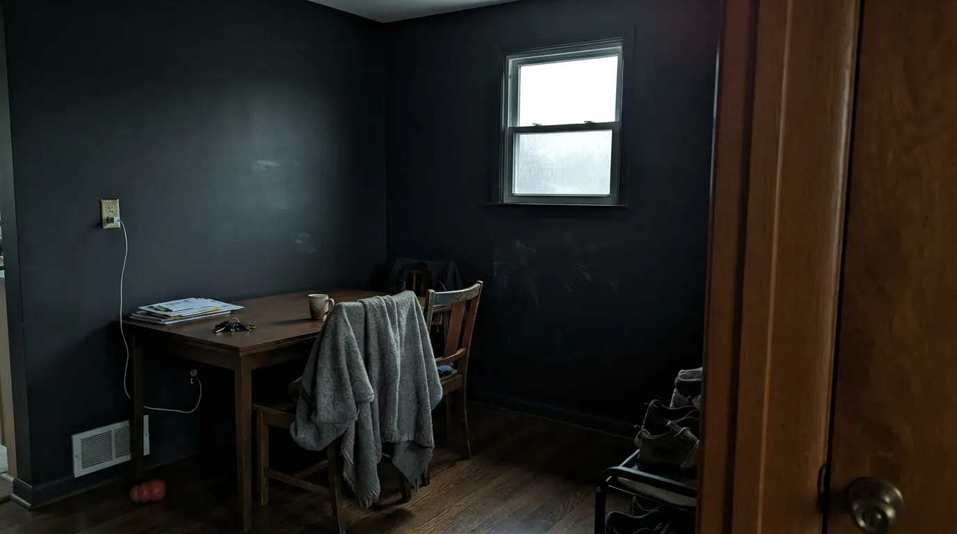
At LRV 6 the walls return almost nothing. In a north-facing room, or any room where the window is small and the sun spends the day on the other side of the house, Off-Black stops looking soft and starts looking flat and closed-in — readers describe it as a cave, not a jewel box. The fix is lighting, not paint: wall sconces, table lamps, a lit pendant over the table. If you are not willing to add light sources, pick a mid-tone dark instead.
This is a finish mistake, not a color mistake, and it is the single most common Farrow & Ball regret. The classic chalky Estate Emulsion marks from almost nothing — a chair back, a shoulder, a fingertip — and wiping a dark matte wall burnishes a shiny patch that is far more visible than the mark was. In a dining room use Modern Emulsion or Dead Flat, both of which are built to be washed. Save Estate Emulsion for a ceiling or a room nobody touches.
Off-Black is the mildest of the Farrow & Ball blacks, but mild is not warm. There is a faint cool cast in it, and against orange-toned honey oak floors or a red-brown leather sofa that cast reads as a slight blue-slate, not as charcoal-brown. If your room's wood is golden and you want the black to feel like it belongs to it, look at Black Fox or SW Cracked Pepper instead — those are genuinely brown-based blacks.
Room by Room
Drench it: walls, trim and ceiling all Off-Black, in a washable flat. With one lit pendant, candles and a warm-wood table, the walls stop being walls and the room reads deliberately theatrical. This is the use Farrow & Ball itself keeps photographing, and it is the one that pays back the price of the paint.
The smallest room in the house is where a near-black costs the least and delivers the most. Four walls plus the ceiling, dead flat, a big mirror, brass or antique-brass fittings and one good sconce. Nobody spends an hour in there, so the darkness never becomes a problem.
Rooms that never see noon are the honest home for a color this deep. Off-Black behind bookshelves makes the spines look sorted rather than cluttered, and a matte black wall is the best background a screen can have. Add task lighting; do not rely on one ceiling fixture.
On cabinetry it is close to ideal, because the mildness that makes it forgiving on walls also stops it from fighting the counter. It sits comfortably under warm white uppers, next to unlacquered brass, and against butcher block. Use an eggshell or gloss cabinet finish — never a wall emulsion on doors and drawer fronts.
Off-Black in a high-gloss exterior finish is one of the most durable-looking door colors there is: the shine gives back the depth the flat version swallows, and the gentler tone keeps a white or cream house from looking hard-edged. Window sashes, porch railings and a garden gate all take it well. Exterior grade only — the interior finishes are not built for weather.
Beautiful in a closed, lamplit sitting room with cream upholstery and dark wood. Risky in an open plan, where an unlit black wall becomes the room's permanent shadow and has to negotiate with every neighbouring surface. If the room is your family's main daytime space, this is a lot to ask of it.
Your Light Is the Risk
2700K lamps and open flame are what this color was made for. The faint blue vanishes, the wall goes velvety, and the room reads warm and enclosed instead of dark.
Cool, weak daylight flattens it into a closed gray-black with no depth left. This is the light behind almost every disappointed review of the color.
Bright morning or low golden-hour sun is the only time the cool cast shows itself; direct light also reveals roller texture and lap marks on a dark matte wall. Midday south sun simply reads it as flat black.
At 2700K it is soft and slightly brown-black. Swap to 4000K daylight LEDs and the blue steps forward, the wall turns slate and the room goes cold. Bulbs are part of this paint job.
Most complaints about Off-Black are a light mismatch. Upload a photo of your actual room and see it on your walls — then ask for the same wall in north light or evening lamps before you buy a single sample.
Need It From Another Brand?
Any paint counter can custom-tint Farrow & Ball No. 57 directly. If you would rather stay in one brand's own deck, these are the closest stock matches, measured as ΔE2000. Under 2 is a difference you will not see on the wall.
| Brand | Closest color | ΔE | LRV | |
|---|---|---|---|---|
| Sherwin-Williams | CyberspaceSW 7076 · Sherwin-Williams | 1.9 | 6 | Color page → |
| Behr | Black BoudoirPPU26-23 · Behr | 0.0 | 6 | Color page → |
| Benjamin Moore | Midnight Oil1631 · Benjamin Moore | 0.8 | 8 | Color page → |
| Valspar | Muskeg Grey4005-2C · Valspar | 0.3 | 6.5 | Color page → |
| PPG / Glidden | OnyxPPG1011-7 · PPG / Glidden | 2.0 | 6 | Color page → |
| Glidden | OnyxPPG1011-7 · Glidden | 2.4 | 6 | Color page → |
Similar Farrow & Ball Colors
The nearest shades to Off-Black within Farrow & Ball's own range, ranked by perceptual color distance — useful when you want the same look a touch lighter, darker, or warmer.
WCAG 2.1: AA is 4.5 : 1 for normal text, 3 : 1 for large text, AAA is 7 : 1.
Off-Black vs the Colors You're Also Considering
Every Off-Black sample board has the same rivals on it. The numbers show the real lightness gap — then it comes down to which risk you would rather live with.
Pick this when you want the black to stay neutral and let the colors around it speak.
Farrow & Ball No. 31 · LRV 6RailingsPick this if you actually want the blue to show — Railings is the black-blue of the pair and the reason so many people describe Farrow & Ball blacks as navy.
Side-by-side comparison →Pick this when a true black would look brutal against old woodwork or warm plaster.
Sherwin-Williams SW 6258 · LRV 3Tricorn BlackPick this for a hard, uncomplicated true black — LRV 3, no softness, exactly what a modern high-contrast scheme wants.
Pick this if you want Farrow & Ball's depth of finish and the flattest matte on the market, and the budget allows it.
Behr PPU18-01 · LRV 5Cracked PepperPick this for the box-store version of this idea at a fraction of the price — it lands within a hair of Off-Black on the chip, with a violet flicker in strong sun.
The obvious comparison is Pitch Black No. 256 (LRV 5). Pitch Black is darker and closer to a true, uncompromising black, while Off-Black is the softer, warmer version. Choose Pitch Black for maximum depth and graphic punch, and Off-Black when you want that near-black look to feel a touch gentler and less severe, which is why it is the more popular trim choice.
Railings No. 31 (LRV 6) is a blue-black rather than a warm one. Next to Off-Black it looks cooler and a shade more like very dark navy, which suits people who want a hint of blue in their black. Off-Black stays more neutral and warm.
Smelt Black No. G18 (LRV 5) is also deeper and reads as a straighter black. If you specifically want the softened, slightly warm near-black, Off-Black is the one to sample.
Off-Black Coordinating Colors
The rule with Off-Black is that it does not need protecting — it is the black that gets along. Warm whites keep the contrast soft, one saturated color on joinery gives the scheme a pulse, and a mid-tone in between stops the jump from white to black looking like a graphic. These are the partners that keep working:
The Finish Decision Costs More Than the Color Decision
Most Off-Black disappointment traces back to the can, not the color card. Farrow & Ball's signature Estate Emulsion is a very flat, chalky wall paint, and on a near-black it is spectacular to look at and miserable to live with in a busy room: a chair back leaves a shiny scuff, a fingertip leaves a print, and rubbing at the mark polishes the spot into something more obvious than the mark. Modern Emulsion and Dead Flat both exist for exactly this problem and both accept washing — those are the dining-room, hallway and kitchen choices. Estate Emulsion belongs on ceilings and in rooms nobody touches.
Plan the cost honestly too. Farrow & Ball sits well above a hundred dollars a gallon in the US, deep colors are a two-coat system at minimum, and the brand's own advice for this one is a dark-tinted primer underneath rather than white — go over white primer and you will be rolling a third and fourth coat chasing an even depth. Add a can of dark primer to the estimate and buy slightly more than the calculator says: patching a dark matte wall later almost never blends invisibly, so having leftover paint from the same batch matters more than usual.
One last practical note: dark flat walls show application more than any light color. Keep a wet edge, roll in one direction, and do not touch up a dried wall with a brush unless you plan to re-roll the whole section.
Off-Black With Wood Tones and Floors
Wood is what decides whether this black looks warm or cold in your room, because the paint itself is close to neutral and simply reflects the company it keeps. Walnut, aged oak, antique pine and any brown-toned leather bring out the softness — this is the pairing that makes the color look like it has been there for a century. Painted floors, dark stone and black slate work too, though then the lighting has to do all the lifting.
The one genuinely awkward partner is orange-toned honey oak — 1990s builder floors, orange-stained oak trim. Against that much orange the faint cool cast in Off-Black steps forward and the black reads slate-blue while the floor reads more orange. A large rug fixes most of it; a warm brown-based black like Black Fox fixes all of it if the floors are staying.
Metals are the easy part. Unlacquered and antique brass are its natural company and are half the reason drenched dark rooms photograph well; bronze and matte black hardware disappear into it politely. Polished chrome and nickel are the only finishes that look cold beside it, which is worth knowing before you order bathroom fittings.
Three Ready Palettes Built on Off-Black
A color is never alone on the wall. These are complete combinations in the 60-30-10 pattern, with the reason each one holds together. Every one opens in the visualizer.
Drenching is what this color is for: one tone on every surface removes the edges of the room so candlelight and the table do the work. Off-Black's mildness is what lets Bancha's olive read as a real color on a door or a built-in instead of dying against the black — a harder, bluer black would flatten it. Cloud White is the handoff to the next room, warm enough that the dark room reads intentional rather than gloomy.
Try this palette in your roomThree clean steps — soft cream, charcoal-greige, near-black — so the dark room reads as the bottom of a ladder rather than a surprise. Chelsea Gray in the middle is what stops Swiss Coffee and Off-Black from looking like a two-tone stencil, and all three are warm enough at night that the house stays of a piece after the lamps go on.
Try this palette in your roomA softened black door and sashes give a white house its outline without the hard cut a true black makes against warm siding — White Dove's warmth and Off-Black's mildness meet in the middle. The old porch-ceiling blue overhead is the one piece of color, and it stays quiet because the black next to it is not competing.
Try this palette in your roomOff-Black FAQ
Is Off-Black actually black, or is it dark gray?
Black. On a chip beside a true black like Tricorn Black (LRV 3) it looks softer and slightly gray, but on four walls at LRV 6 nobody will call it gray. The softness is a quality of the color, not a lack of depth.
Does Off-Black have a blue undertone?
A faint one. It has noticeably less blue than Railings or Black Blue, which is the whole point of the color — it was mixed to sit politely next to other shades. In bright daylight, sampled beside a true black, you can see the cool cast. Under lamps at night it is gone.
Which Farrow & Ball finish should I use in a dining room?
Not the classic chalky Estate Emulsion. Dining-room walls take chair backs and fingertips, and on a dark ultra-matte those marks show and then burnish when you wipe them. Use Modern Emulsion or Dead Flat, both made to be washed; keep the interior gloss finishes for trim and doors.
Is there a cheaper dupe for Off-Black?
Close matches exist — Behr Cracked Pepper lands within a hair of it on the chip, and most brands have a soft near-black in the same neighbourhood. What you do not get for less money is Farrow & Ball's flat, dense finish, which is a real part of why dark rooms in this paint photograph the way they do. If the room is drenched and the walls are the whole design, that finish is what you are paying for; if it is a door or an island, a cheaper black is a completely reasonable call.
What white goes with Off-Black?
A warm one. Cloud White or Swiss Coffee next to it keeps the contrast rich instead of graphic; a bright, cold white beside a soft black makes the black look faded and the white look clinical. If you want the crisp black-and-white look, use a true black rather than fighting this one.
Does Off-Black work on a front door?
It is one of its best uses. In a high-gloss exterior finish the shine restores the depth that a flat black loses outdoors, and the milder tone keeps a cream or white facade from looking hard. Use an exterior-grade product, and expect to prime dark-tinted underneath so the color arrives at full depth in two coats.
Have you painted with Off-Black?
Rate it — one tap helps the next reader decide.
Ask a Question