Studio Green
Farrow & Ball's darkest green, reviewed honestly: the light that turns it forest-green, the light that turns it black, and the rooms where a contained dose beats four walls.

Jessica has spec'd whites and neutrals for more than 300 rooms and keeps a sample wall of painted drawdowns in her studio. Every color review is checked against real reader rooms in the comments and re-tested when a formula changes. About the testing process →
- 1Cordovan Brown0
- 2Studio Green7
The Fast Verdict
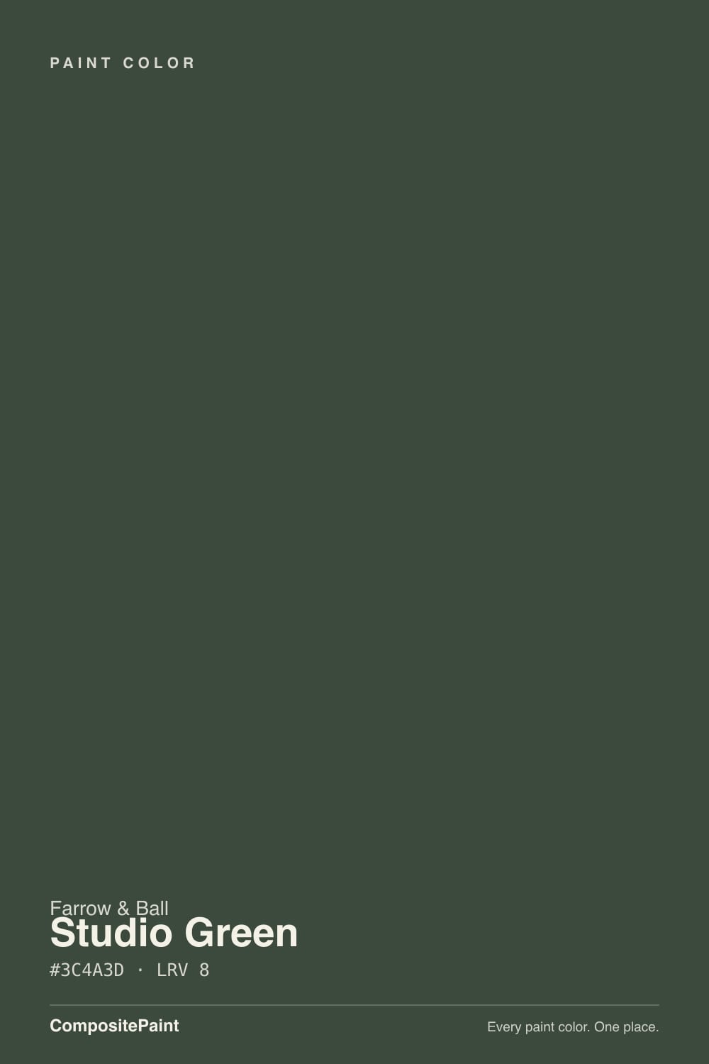
Studio Green is Farrow & Ball's darkest green — a green-black with almost no blue in it, built to shift from near-black in shadow to a rich forest green the moment real daylight hits it. It is not a color people paint four walls of on a whim; it is the color people reach for on a kitchen island, a front door, or a wall of built-in bookshelves, where a contained dose reads sophisticated instead of like a hole in the room. The name is real history: Studio Green is the color of Farrow & Ball's own original studio in Dorset, where the company mixed its very first paints.
Kitchen islands and cabinets · front doors and exterior joinery · powder rooms and other small jewel-box spaces · built-in bookshelves and paneling · anyone who wants the drama of black with a genuine green identity in real daylight
Your only light source is a ceiling fixture · you're painting four walls of a north-facing room · you need the color to read unmistakably green day and night, not just in sun · your floors are strong honey oak
- A genuine green-black with real green showing in daylight, not just a dark neutral wearing a green name
- Modern Eggshell is Farrow & Ball's toughest finish — genuinely durable on cabinets, doors, and floors
- Contained doses (island, door, built-ins) read sophisticated in almost any room
- One of the few true darks that still looks intentional next to warm brass and wood
- Backed by real brand history — it's the color of Farrow & Ball's own original studio, not an invented mood name
- In weak light or under plain ceiling bulbs it drops close to black — some owners never really see the green
- Wall-to-wall in a dim room can feel like the room lost its windows
- Farrow & Ball's finish system (Estate Emulsion, Modern Eggshell) is a learning curve for US painters used to Sherwin/Behr sheens
- Competes with honey-toned oak and gold-warm light rather than complementing it
What Color Is Studio Green, Really?
A green-black with no blue in it — that is the whole character in one line. Where most "near-black greens" are really a dark neutral with a green name, Studio Green carries enough real pigment that Farrow & Ball itself describes it responding "extraordinarily" to light: in shadow or under a ceiling bulb it reads close to charcoal-black, and in strong daylight the same wall shows itself as a deep, smoky forest green. That range is the point of the color, not a flaw — but it means the paint is only ever as green as the light you give it.
At LRV 7 it sits in true near-black territory, close to Benjamin Moore's Essex Green and Wrought Iron and Sherwin-Williams' Roycroft Bronze Green — deep enough that it reflects almost none of the light that hits it, which is exactly why it goes flat in a dim room and comes alive in a bright one. Farrow & Ball's own guidance is to use it in doses where a room is short on daylight: below a picture rail, on built-ins or joinery only, or on a single feature wall, and save the full four walls for rooms that get real sun.
The name is not an invented mood word. It is the actual color of Farrow & Ball's original studio building in Dorset, where the company's earliest paints were mixed — a genuine piece of brand history rather than a marketing story bolted onto a trendy dark green after the fact.
Where It Shines
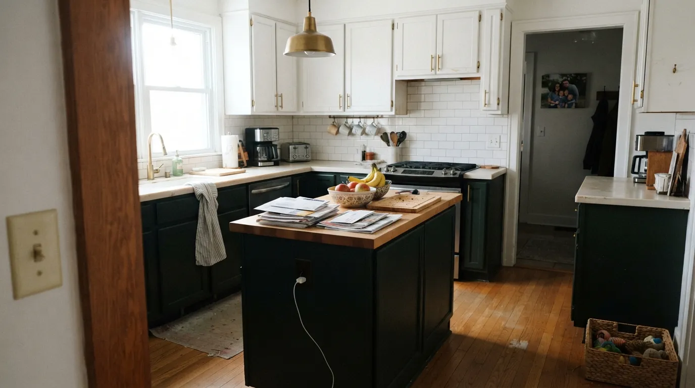
Give it a contained surface and it is one of the most reliably good dark colors either side of the Atlantic. On a kitchen island, a paneled front door, or a wall of built-ins it reads deliberate and expensive rather than overwhelming, because the eye takes in the whole shape at once instead of losing the room's proportions. Modern Eggshell — Farrow & Ball's toughest interior finish — is rated for cabinets and even floors, which is why it shows up as often on joinery and floorboards as it does on walls.
Where It Fails
Almost every disappointed review of Studio Green comes from one of three predictable mismatches. None of them are the paint failing — they are the color being asked to do a job it was never built for.
Farrow & Ball's own advice is blunt about this: a sun-flooded room can carry Studio Green on every wall, but a dim room painted floor-to-ceiling can feel like it lost its windows. If the room only gets indirect or north light, use the color on joinery, below a picture rail, or on one feature wall instead of committing all four.
LRV 7 with no blue undertone means real daylight is doing most of the work. Owner reports genuinely split on this — some insist it never goes fully black even in a dark hallway, others say it drops close to black under nothing but ceiling light. Test a large sample in your actual room, under your actual bulbs, before you commit walls to it.
A saturated green next to orange-leaning oak competes rather than complements — each color makes the other look slightly off. Studio Green sits best with pale white oak, walnut, painted floors, or a neutral floor that isn't fighting for the same attention as the walls.
Room by Room
This is the color's reason for being. Modern Eggshell is tough enough for daily cabinet wear, and on an island or lower cabinets the deep green reads considered rather than heavy. Brass or unlacquered hardware and a lighter countertop keep it from feeling like a cave.
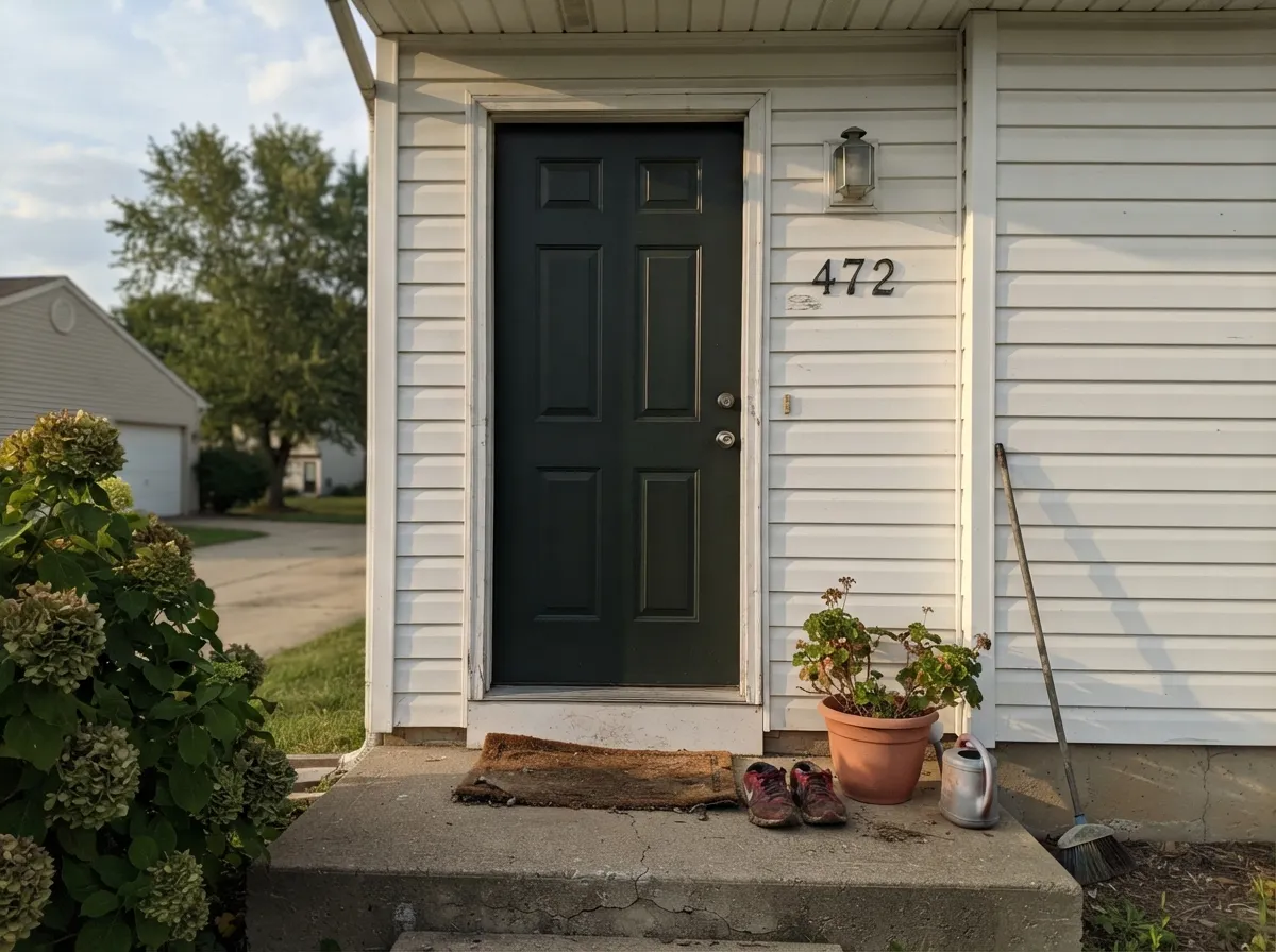
Outdoor light lets the pigment do more of its job. A Studio Green door against a white or pale house body is timeless rather than trend-chasing; keep the surrounding trim crisp so the door has real contrast to sit against.
Below a picture rail, on built-ins, or as a single feature wall it carries real drama without the room losing its light. A north-facing living room painted floor-to-ceiling is the exact situation behind the "too dark" complaints.
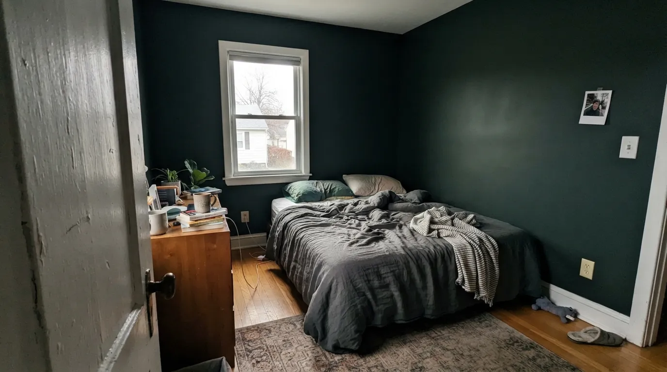
Beautiful as a headboard wall or on paneling in a room with genuine south or west sun and 2700K lamps at night. Skip it in a small north-facing bedroom running on ceiling light alone — it will read as a black box after dark.
Small, enclosed rooms carry deep color exceptionally well. Four walls of Studio Green in a windowless powder room with one sconce and brass fixtures is the kind of small commitment that reads like a design fee.
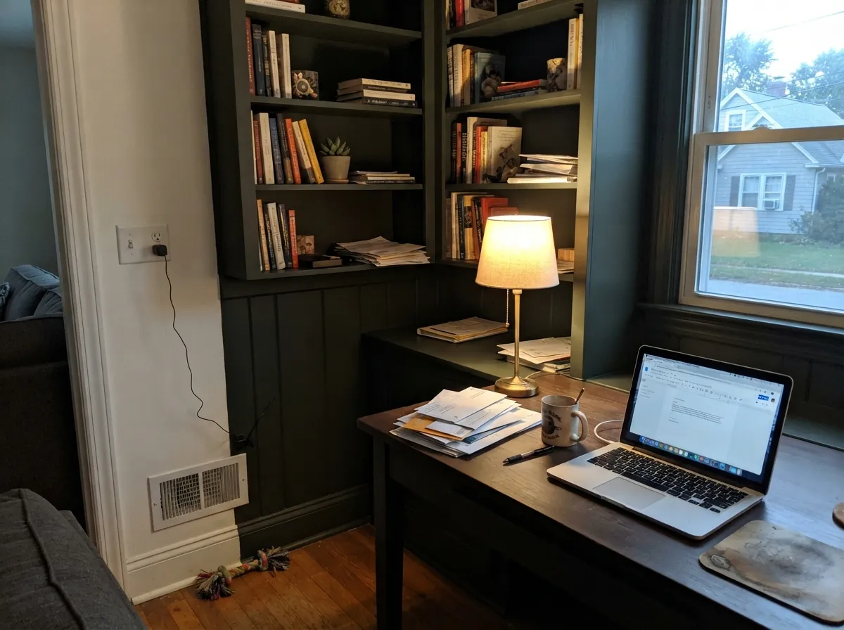
On bookshelves and paneling it reads studious rather than gloomy, especially with a desk lamp doing the work daylight can't. If the room already runs dim, keep the ceiling a lighter color so the space still has a lid, not a lid the same color as the walls.
Your Light Is the Risk
South or west sun is where the forest green actually shows. Farrow & Ball's own line is that the pigment "responds extraordinarily" to real light — this is the light every glowing kitchen photo was shot in.
Without real daylight it drops toward black. Owner reports split on how far — some still call it visibly green in shade, others call it flat black — the room decides, not the paint.
Expect a genuinely different wall at 9am and 3pm: near-charcoal in early shadow, then a clear deep forest green as the sun swings across it.
Warm 2700K lamps keep the green readable after dark. Cool white LEDs or a single bare ceiling fixture push it toward flat black — change the bulb before you consider changing the paint.
Most complaints about Studio Green are a light mismatch. Upload a photo of your actual room and see it on your walls — then ask for the same wall in north light or evening lamps before you buy a single sample.
Need It From Another Brand?
Any paint counter can custom-tint Farrow & Ball No. 93 directly. If you would rather stay in one brand's own deck, these are the closest stock matches, measured as ΔE2000. Under 2 is a difference you will not see on the wall.
| Brand | Closest color | ΔE | LRV | |
|---|---|---|---|---|
| Sherwin-Williams | Rock BottomSW 7062 · Sherwin-Williams | 1.6 | 7 | Color page → |
| Behr | Dominant GrayBXC-17 · Behr | 1.0 | 7 | Color page → |
| Benjamin Moore | Deep River1582 · Benjamin Moore | 2.2 | 8 | Color page → |
| Valspar | Model TV140-6 · Valspar | 1.2 | 6.9 | Color page → |
| PPG / Glidden | Black ForestPPG1012-7 · PPG / Glidden | 4.4 | 7 | Color page → |
| Glidden | Enchanted Forest Green30GY 07/051 · Glidden | 2.9 | 7 | Color page → |
Similar Farrow & Ball Colors
The nearest shades to Studio Green within Farrow & Ball's own range, ranked by perceptual color distance — useful when you want the same look a touch lighter, darker, or warmer.
WCAG 2.1: AA is 4.5 : 1 for normal text, 3 : 1 for large text, AAA is 7 : 1.
Studio Green vs the Colors You're Also Considering
Every Studio Green sample board has the same rivals on it. The numbers show the real lightness gap — then it comes down to which risk you would rather live with.
Pick this when you want people to notice it's actually green up close, in daylight.
Farrow & Ball No. 57 · LRV 7Off-BlackPick this if you want true black-brown with no green identity at all, in any light.
Pick this when you want a dark green that was designed to also work well indoors, not just outside.
Benjamin Moore PM-22 · LRV 4Essex GreenPick this for the American exterior classic — deeper still, and built mainly for shutters and doors outdoors.
Against Carriage Green No. 94 at LRV 7, the two are close, but Carriage Green is a fraction darker and more evenly green-gray, while Studio Green holds a touch more warmth. If you want the greener of the two to read as near-black more consistently, Carriage Green edges ahead; for a little more life in daylight, choose Studio Green.
Duck Green No. W55 at LRV 8 shares the same lightness but sits as a cleaner, more clearly green tone, so it looks more like a dark green and less like a black. Pick Duck Green when you actually want the green to show.
Compared with Sherwin-Williams Pewter Green SW 6208 at LRV 12, the difference is bigger. Pewter Green is noticeably lighter and grayer, a true sage-gray you can use across a whole room, whereas Studio Green is a dark, dramatic accent.
Studio Green Coordinating Colors
The rule for coordinating with Studio Green is simple: give it soft, warm whites to sit against, brass or unlacquered metal for hardware, and keep its neighbors on the warm side rather than the stark-cool side. These are the partners that keep showing up in rooms that work:
Why It's Called Studio Green: A Real Brand-History Color
Most dramatic dark colors get a mood name invented by a marketing team — Studio Green did not need one. It is the color of Farrow & Ball's own original studio building in Dorset, the room where the company's earliest paints were physically mixed. That is a real, checkable piece of company history, not a trend name attached after the fact.
That history is part of why the color reads as timeless rather than of-the-moment: it predates the current wave of black-green kitchens and front doors by decades, and it was in the deck long before dark, moody rooms became a design-magazine staple. Reaching for it now is less about chasing a 2020s trend and more about finally catching up to a color that was there all along.
Studio Green in Kitchens: The Trend Explained
Studio Green's biggest modern audience is kitchens, and specifically islands, cabinets, and kitchen extensions where the color can echo the greenery just outside the window. It has become one of the go-to alternatives to a true black kitchen: designers reach for it when a client wants the same deep, moody drama as black but finds flat black slightly harsh under kitchen lighting — Studio Green gives the same weight with an earthier, more forgiving undertone.
The trend holds together because the color does two jobs at once: on a contained surface like an island it photographs as confidently as true black, but stand in the room in daylight and it reveals itself as unmistakably green — which is exactly the kind of detail that makes a kitchen feel considered rather than merely dark.
Three Ready Palettes Built on Studio Green
A color is never alone on the wall. These are complete combinations in the 60-30-10 pattern, with the reason each one holds together. Every one opens in the visualizer.
The classic contained-dose kitchen: Studio Green stays on the island and lower cabinets where daylight reaches it most, a soft warm white keeps the walls glowing, and White Dove uppers stop the room from feeling top-heavy.
Try this palette in your roomTwo darks that read as one family from the street — the door slightly greener, the shutters slightly blacker — against a plain white body so the entry has somewhere to put its contrast.
Try this palette in your roomA daylight-rich den can carry full walls of Studio Green; a warm greige in the hallway outside gives the eye a soft landing instead of a hard color break, and White Dove trim keeps the transition from feeling abrupt.
Try this palette in your roomStudio Green FAQ
Is Studio Green actually green, or does it just look black?
Both, depending on the light. At LRV 7 with no blue undertone, it reads close to charcoal-black in shadow or under plain ceiling light, and shows itself as a clear, smoky forest green the moment real daylight hits it. Owner reports genuinely disagree on how far it goes toward black in a given room — that is the light doing the disagreeing, not the paint.
What's the story behind the name Studio Green?
It is the actual color of Farrow & Ball's original studio building in Dorset, where the company mixed its very first paints. It is one of the few dark colors on the market whose name is real company history rather than an invented mood word.
Is it good for kitchen cabinets?
One of the best. Modern Eggshell is Farrow & Ball's toughest interior finish, rated for cabinets and even floors. Used on an island or lower cabinets — a contained dose rather than every surface — it reads deliberate and expensive rather than heavy.
Can I use it on a front door?
Yes — it's a genuine classic exterior door color. Pair it with a white or pale house body and keep the surrounding trim crisp so the door has real contrast to sit against; full sun brings out more green than most people expect from a near-black.
What wood tones work with Studio Green?
Pale white oak, walnut, and painted floors are its best partners. Strong honey oak or anything gold-toned competes with it rather than complementing it — the two colors fight for the same attention instead of sitting together.
Should I paint a whole room in it?
Only if the room has real daylight. Farrow & Ball's own advice for dimmer rooms is to use it in doses — below a picture rail, on joinery only, or on a single feature wall — and save full four-wall coverage for rooms that get genuine sun.
Have you painted with Studio Green?
Rate it — one tap helps the next reader decide.
Ask a Question