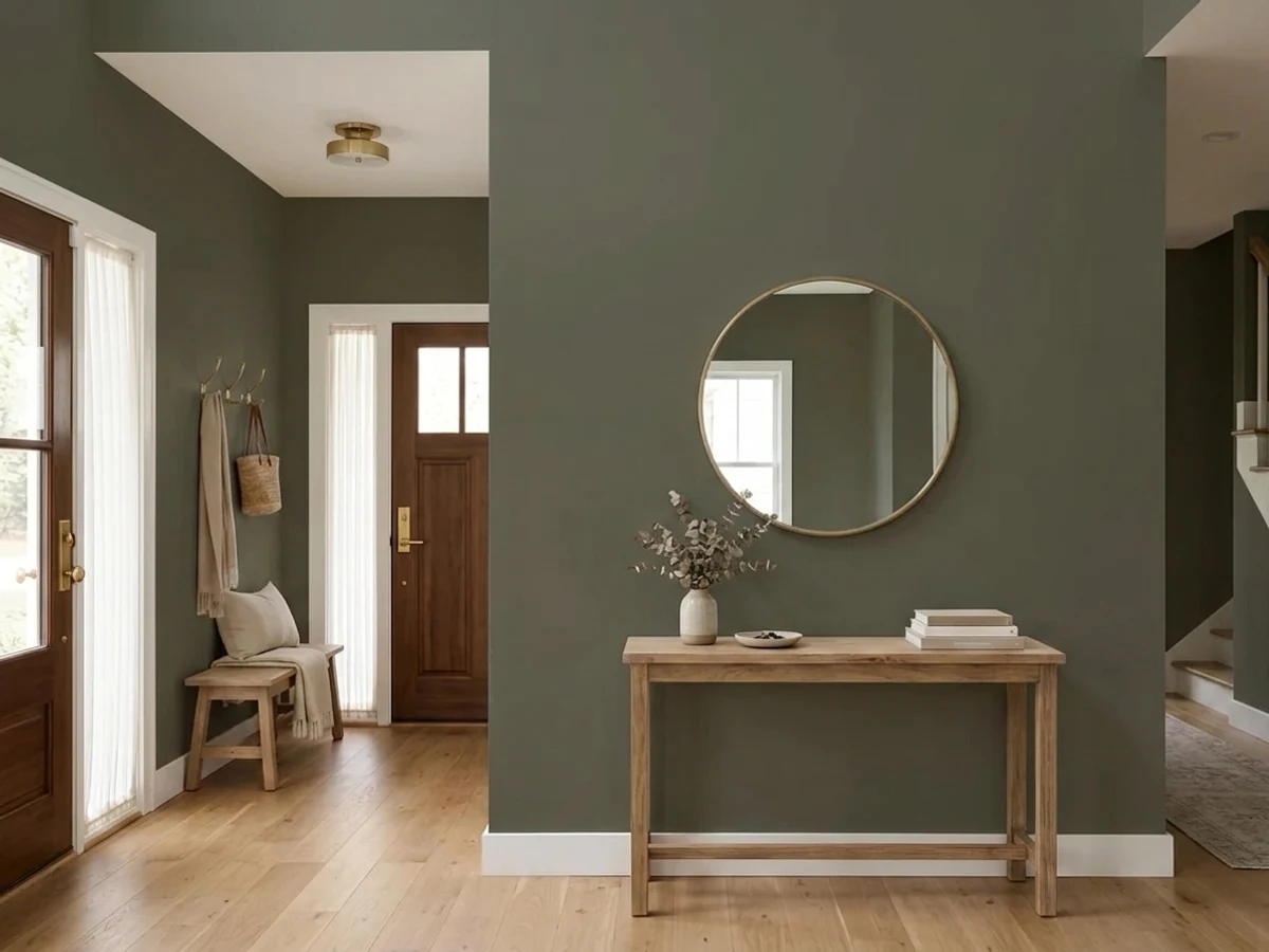
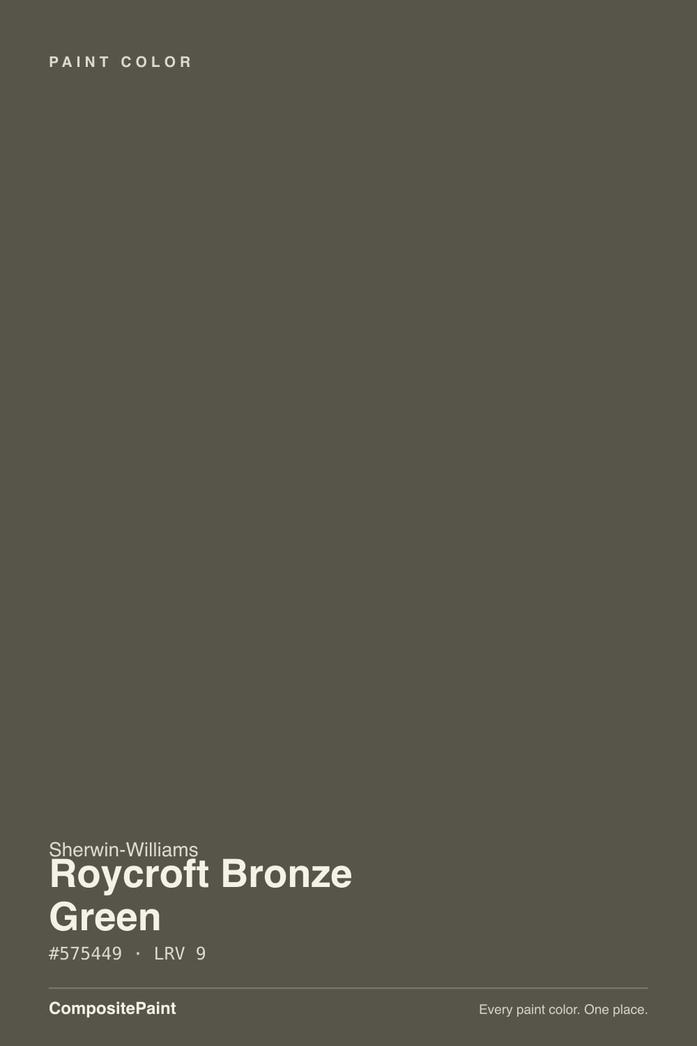
Roycroft Bronze Green
The Arts & Crafts green-bronze from Sherwin-Williams' Historic Color Collection, reviewed honestly: the real daylight it needs, the room where it goes flat, and what to pick instead.

Jessica has spec'd whites and neutrals for more than 300 rooms and keeps a sample wall of painted drawdowns in her studio. Every color review is checked against real reader rooms in the comments and re-tested when a formula changes. About the testing process →
- 1Rookwood Shutter Green4
- 2Roycroft Bronze Green9
- 3Sage Green22
- 4Evergreen Fog30
The Fast Verdict
Roycroft Bronze Green is Sherwin-Williams' answer to the exact green a Craftsman bungalow wants on its trim and front door — not a bright leaf green, but a deep, low-saturation olive that reads more like weathered bronze than paint. It comes from the company's Historic Color Collection, named for the actual Roycroft artisan campus in East Aurora, New York, and restoration-minded owners reach for it specifically because it is period-correct rather than trend-correct.
The catch is honesty about light: at LRV 9 this color has almost nothing to bounce back, and depending on the hour it reads gray, bronze, brown, or straight olive. Give it real daylight and it is one of the best green-browns in any deck; put it in a dim room and you get a flat, cave-like wall and a repaint.
Craftsman + bungalow front doors and exterior trim · south- or west-facing rooms with real windows · kitchen islands under lighter cabinets · restoration projects that want a genuinely period color
your room is north-facing or short on windows · you want a color that reads the same all day · your kitchen is small with only one window · you're not willing to sample a full poster board first
- Genuine Arts & Crafts green-bronze, not a trend color reaching for the look
- Holds real color and texture in true daylight — reads rich, not flat
- Low saturation keeps it from reading as costume-green
- Excellent on a front door, island, or trim detail in doses
- Historic Color Collection pedigree — period-correct for real restoration work
- LRV 9 is genuinely dark — needs real daylight or it goes flat and cave-like
- Undertone shifts with the light: gray, bronze, brown, olive, never settled
- Wrong choice for small, dim, or north-facing rooms
- Cool LED bulbs cancel the warmth that makes it work
What Color Is Roycroft Bronze Green, Really?
Roycroft Bronze Green belongs to Sherwin-Williams' Historic Color Collection, built from real research on preserved buildings — and the name is geography, not marketing. The Roycroft campus in East Aurora, New York, was the Arts & Crafts artisan community founded by publisher Elbert Hubbard in 1895 and is now a National Historic Landmark; Sherwin-Williams built a whole Arts & Crafts palette around it, this color alongside siblings like Roycroft Bottle Green and Roycroft Copper Red. Sherwin-Williams' own preservation guidance for period Craftsman houses often pairs two Roycroft body colors together under a lighter Roycroft trim — this was built to be part of a real historic scheme, not a standalone accent wall.
Undertone in one line: it does not sit still. In cool, overcast light the gray in it dominates and the wall reads like a soft charcoal. In warm afternoon sun the bronze and brown come forward and it looks distinctly metallic-olive. A whisper of yellow sits under both moods, which is what keeps it from ever reading as a true green — it lands closer to olive-bronze than forest green, and that low saturation is exactly what lets it dress a whole Craftsman exterior without turning the house into a costume.
At LRV 9 it reflects almost no light back, and that single number decides everything else about this color. On a sun-hit surface — a south wall, a bright covered porch, a front door that catches afternoon light — the depth reads rich and architectural. In a room that never sees direct sun, LRV 9 has nothing left to bounce around, and the wall goes flat and dark fast. This is not a color to trust from a fan deck; sample a full board and watch it for a whole day before committing a room to it.
Where It Shines
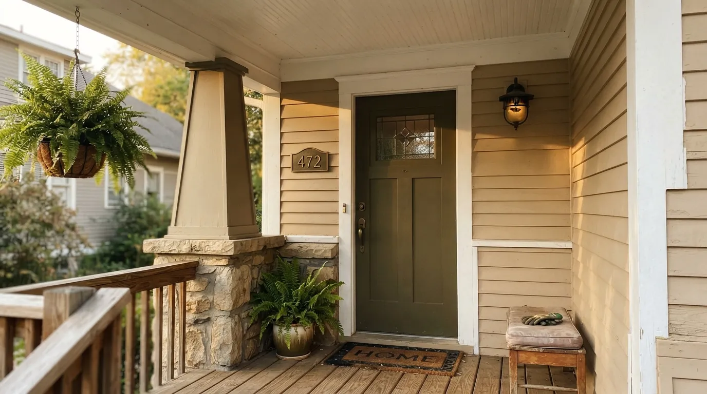
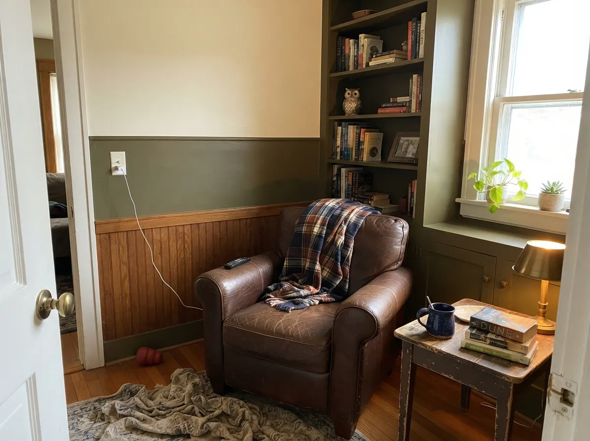
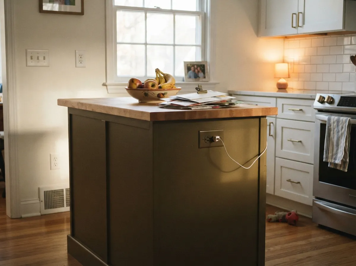
Give it real daylight — a south-facing porch, a sunny den, a west window that catches evening sun — and Roycroft Bronze Green is one of the best-behaved deep greens in any brand's deck. It is a genuine Arts & Crafts classic: on a front door under a covered porch, on a kitchen island beneath white cabinets, on wainscoting below a warm cream wall, it reads intentional and expensive rather than dark for dark's sake. Sherwin-Williams made it a Color of the Month pick in March 2024, and restoration-minded Craftsman owners reach for it specifically because it does not read like a passing trend.
Where It Fails
Almost every regret story about Roycroft Bronze Green comes from one of three predictable situations, and none of them are the paint's fault — but if your room matches one, this is not your color, and a bigger sample will only confirm it.
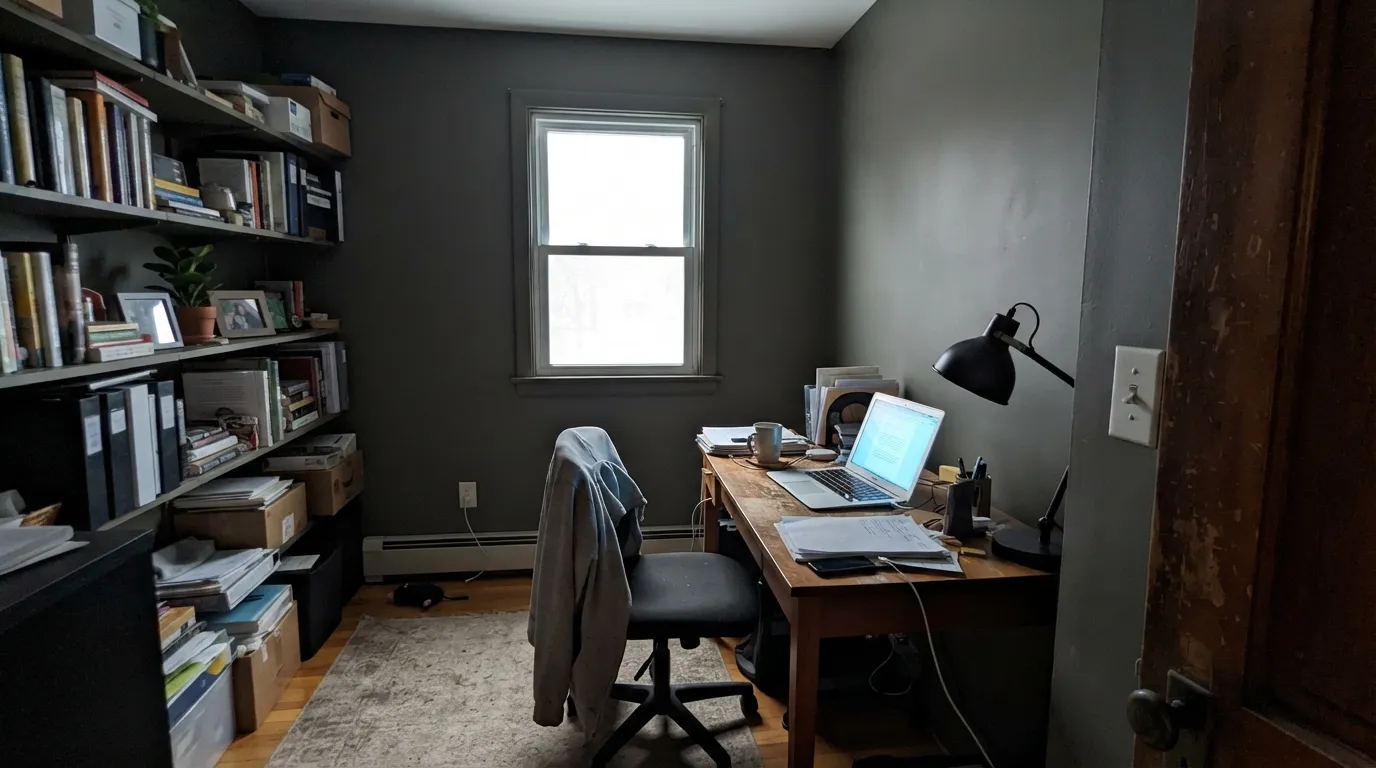
This is the single most common regret, and it follows a predictable pattern: the color looked rich and moody on the chip, then went flat and cave-like on four walls with no window to feed it. LRV 9 needs light to bounce off of; a dim north room has none to spare. If your room is genuinely dim, skip this color entirely — no amount of coats fixes the light it doesn't get.
On a full wall of cabinets in a tight galley kitchen, the depth reads heavy instead of rich, and a small room with limited daylight can end up feeling smaller. It earns its keep as an island or a lower-cabinet run under lighter uppers, not as the only color in a cramped kitchen.
Under 4000K-plus LED light the bronze and brown drop out and the wall reads flat charcoal-gray — the opposite of the warm, weathered look that sells this color in daylight photos. Swap to 2700–3000K bulbs before deciding you don't like it.
Room by Room
Under a covered porch that still gets bounced daylight, this is the color's natural home. Semi-gloss on the door, Pure White or a warm cream on the trim and porch ceiling — the classic Craftsman entry, done period-correct.
As one of two body colors, or as shutters and trim against a warm beige body, it follows Sherwin-Williams' own historic-preservation pairings. Stone or brick foundations and quarter-sawn oak porch details complement it without a fight.
Under white or cream perimeter cabinets, with brass hardware, it reads vintage and deliberate. A full kitchen of it is a bigger bet — reserve the depth for the island or a lower run, not every cabinet in the room.
Wainscoting or built-ins under a warm cream upper wall let the color carry a room without covering every surface. South or west light, leather furniture and walnut shelving are its natural company.
Beautiful with a real window and afternoon sun; the cave-like failure mode above happens fastest in small, enclosed rooms exactly like this one. Test before committing.
A medium-sized bathroom with a real window can carry it well, especially on a vanity or lower half-wall. A small, windowless powder room is the wrong bet for LRV 9.
Your Light Is the Risk
Full sun brings out the whole range — gray, bronze, and olive all show through the day. This is the light the color was made for.
No direct sun means nothing for LRV 9 to bounce off of. The color goes flat, gray, and cave-like — the single most common regret with this paint.
East light is lovely in the morning and goes moody by afternoon; west light is flat in the morning and turns genuinely striking under evening sun. Pick your wall by which half of the day you actually use the room.
2700–3000K bulbs pull the bronze and brown forward. Cool 4000K-plus LEDs flatten it back to charcoal-gray — change the bulb before you blame the paint.
Most complaints about Roycroft Bronze Green are a light mismatch. Upload a photo of your actual room and see it on your walls — then ask for the same wall in north light or evening lamps before you buy a single sample.
Need It From Another Brand?
Any paint counter can custom-tint Sherwin-Williams SW 2846 directly. If you would rather stay in one brand's own deck, these are the closest stock matches, measured as ΔE2000. Under 2 is a difference you will not see on the wall.
| Brand | Closest color | ΔE | LRV | |
|---|---|---|---|---|
| Behr | Potting SoilN360-7 · Behr | 3.4 | 8 | Color page → |
| Benjamin Moore | Tuscany Green2140-20 · Benjamin Moore | 2.2 | 10 | Color page → |
| Valspar | Olive Smudge6001-2C · Valspar | 1.9 | 8.8 | Color page → |
| PPG / Glidden | Cabin FeverPPG1021-7 · PPG / Glidden | 4.3 | 9 | Color page → |
| Glidden | Olive Black50YY 09/101 · Glidden | 2.4 | 9 | Color page → |
| Dutch Boy | Ironside422-7DB · Dutch Boy | 0.0 | 9 | Color page → |
Similar Sherwin-Williams Colors
The nearest shades to Roycroft Bronze Green within Sherwin-Williams's own range, ranked by perceptual color distance — useful when you want the same look a touch lighter, darker, or warmer.
WCAG 2.1: AA is 4.5 : 1 for normal text, 3 : 1 for large text, AAA is 7 : 1.
Roycroft Bronze Green vs the Colors You're Also Considering
Every Roycroft Bronze Green sample board has the same rivals on it. The numbers show the real lightness gap — then it comes down to which risk you would rather live with.
Pick this for the specific Arts & Crafts bronze-olive character and real period pedigree — Pewter Green is calmer and more predictable.
Sherwin-Williams SW 6208 · LRV 12Pewter GreenPick this for an equally good cabinet green without the bronze drift — Pewter Green stays a straight gray-green in every light, though it shares the same dim-room caution.
Pick this when you want the olive-green read specifically — Urbane Bronze stays a warm dark brown even in strong sun.
Sherwin-Williams SW 7048 · LRV 8Urbane BronzePick this if you want the brown side of this mood without any green in it at all — Urbane Bronze reads black in low light, the same caution as this color.
Pick this for the lighter, more chameleon, genuinely Craftsman-pedigreed character; Essex Green is deeper and more purely green.
Benjamin Moore PM-22 · LRV 4Essex GreenPick this for a true, saturated exterior green with none of the bronze drift — the classic shutter-and-door choice, though it reads almost black indoors.
Pick this for real Arts & Crafts pedigree; Kendall Charcoal is a very good dark gray with no craft-history behind the name.
Benjamin Moore HC-166 · LRV 13Kendall CharcoalPick this if you want this mood in gray with zero green risk — the best-behaved dark gray in the BM deck.
Urbane Bronze SW 7048, at #54504A and LRV 8, is the better known neighbor. It is a step darker and grayer, with far less green, so it reads as a warm charcoal where Roycroft Bronze Green reads as a bronze. Thunder Gray SW 7645, at #57534C and LRV 9, sits at the same depth but neutral, useful if the olive cast is the part you do not want. Muddled Basil SW 7745, at #5A5243 and LRV 9, pushes the olive further. Best Bronze SW 6160, at #5D513E and LRV 9, is clearly browner and more golden.
Across brands, Dutch Boy Ironside 422-7DB carries the identical hex, so it is the same color. Diamond Vogel Philosophically Speaking 0578 at LRV 8, Valspar Olive Smudge 6001-2C at LRV 8.8, and Kompozit Grime 0444 at LRV 8 are visually identical in normal room light. Benjamin Moore Tuscany Green 2140-20 and Behr Swiss Brown N210-6 are very close, so sample first.
Roycroft Bronze Green Coordinating Colors
Because the color itself is so dark, the rule for coordinating with it is simple: everything around it should give light back. Warm creams and whites keep a room from tipping into cave territory, and a second deep neutral gives the scheme one more anchor without asking the green to carry the whole load alone. These are the partners that keep showing up in real Craftsman rooms:
The Roycroft Story: What the Name Actually Means
This is not an invented, evocative paint name — Roycroft is a real place. The Roycroft campus in East Aurora, New York, was founded in 1895 by publisher and craftsman Elbert Hubbard as an Arts & Crafts artisan community: printers, furniture makers, metalworkers, and bookbinders working under one roof in the exact aesthetic this color belongs to. The campus is a National Historic Landmark today, and Sherwin-Williams built an entire historic color palette around it, including siblings like Roycroft Bottle Green, Roycroft Copper Red, and a lighter Roycroft trim cream, developed from real paint-scrape research on preserved Arts & Crafts buildings rather than a modern trend board.
That research shows up in how Sherwin-Williams recommends using it: its own preservation guidance for period hipped-roof Craftsman houses pairs two Roycroft body colors together, often finished with a lighter Roycroft trim color. Sherwin-Williams also featured it as a Color of the Month pick in March 2024 — a modest, honest bit of recognition, not an era-defining moment, which fits a color that has quietly served restoration work for decades rather than chasing a viral one.
Roycroft Bronze Green With Wood Tones and Floors
Wood is where this color is most at home, and unlike most dark colors it does not punish honey or golden oak. Quarter-sawn white oak trim and flooring is the specific wood this palette was designed around, and the yellow-brown warmth in golden oak agrees with the bronze undertone instead of fighting it — oak and olive-green paint is one of the oldest, most correct Craftsman pairings there is. Walnut and dark-stained floors push the whole room moodier and more monochrome, which reads intentional in a den or library.
The one floor that argues with it is cool, gray-washed wood or gray LVP: the temperature mismatch is the same story as with every warm dark color, and it reads as an obvious clash rather than a period detail. If the floor is staying gray, this is not the green for that room.
Three Ready Palettes Built on Roycroft Bronze Green
A color is never alone on the wall. These are complete combinations in the 60-30-10 pattern, with the reason each one holds together. Every one opens in the visualizer.
This is the two-body-color-plus-trim pattern Sherwin-Williams' own historic guidance uses on period Craftsman houses: a warm beige body, crisp white trim, and the door carrying the one deep, saturated note. It reads period-correct rather than costume-Craftsman because only one surface goes dark.
Try this palette in your roomKeeping the perimeter light is what lets an LRV 9 island work in a real kitchen — the room still has plenty of daylight to bounce around, and the island reads as a deliberate design move instead of a dark hole. Brass hardware picks up the bronze in the paint directly.
Try this palette in your roomA warm cream upper wall keeps real light in the room so the wainscot never tips into cave territory, while the near-black fireplace gives the scheme one true dark anchor instead of asking the green to do it alone. Walnut shelving and leather finish the Craftsman read.
Try this palette in your roomRoycroft Bronze Green FAQ
Is Roycroft Bronze Green actually green?
Yes, but a very low-saturation one — it reads closer to weathered bronze or dark olive than to a leaf or forest green. That restraint is the point: it is meant to sit on a whole Craftsman exterior without turning the house into a costume, and it can pass for a soft charcoal in cool light.
Will it look too dark in my room?
Depends entirely on your light. At LRV 9 it needs real daylight to read as rich rather than flat — a south or west room with real windows shows it at its best; a north-facing or windowless room turns it cave-like. Sample a full board and watch it through a whole day before painting four walls.
What trim goes with Roycroft Bronze Green?
A clean, warm-leaning white or cream — Pure White or Natural Linen both work. Sherwin-Williams' own historic pairings put a lighter cream trim against the darker body colors in this collection; a stark cool white will look fine too but reads less period-correct.
Is it good for a front door?
It's arguably the color's best single use. Under a covered porch that still gets bounced daylight, the depth reads rich and architectural, and it is exactly the kind of color the Historic Color Collection was built for. Semi-gloss for durability.
Can I use it on kitchen cabinets?
In doses — an island or a lower-cabinet run under lighter uppers works well and reads vintage without overwhelming the room. A full kitchen of it is a bigger bet, and a risky one if the kitchen is small or short on windows.
Does it only work on Craftsman or Arts & Crafts houses?
No — any traditional or transitional home with real light can use it well. But the historic pedigree is real, not marketing, so it earns a particular kind of respect on genuine Craftsman and bungalow restorations where a period-correct color actually matters.
Have you painted with Roycroft Bronze Green?
Rate it — one tap helps the next reader decide.
Ask a Question