All White
Farrow & Ball's only truly pigment-free white, reviewed honestly: where its warmth glows, the cool-light trap that makes it read stark, and what it actually costs to live with.

Jessica has spec'd whites and neutrals for more than 300 rooms and keeps a sample wall of painted drawdowns in her studio. Every color review is checked against real reader rooms in the comments and re-tested when a formula changes. About the testing process →
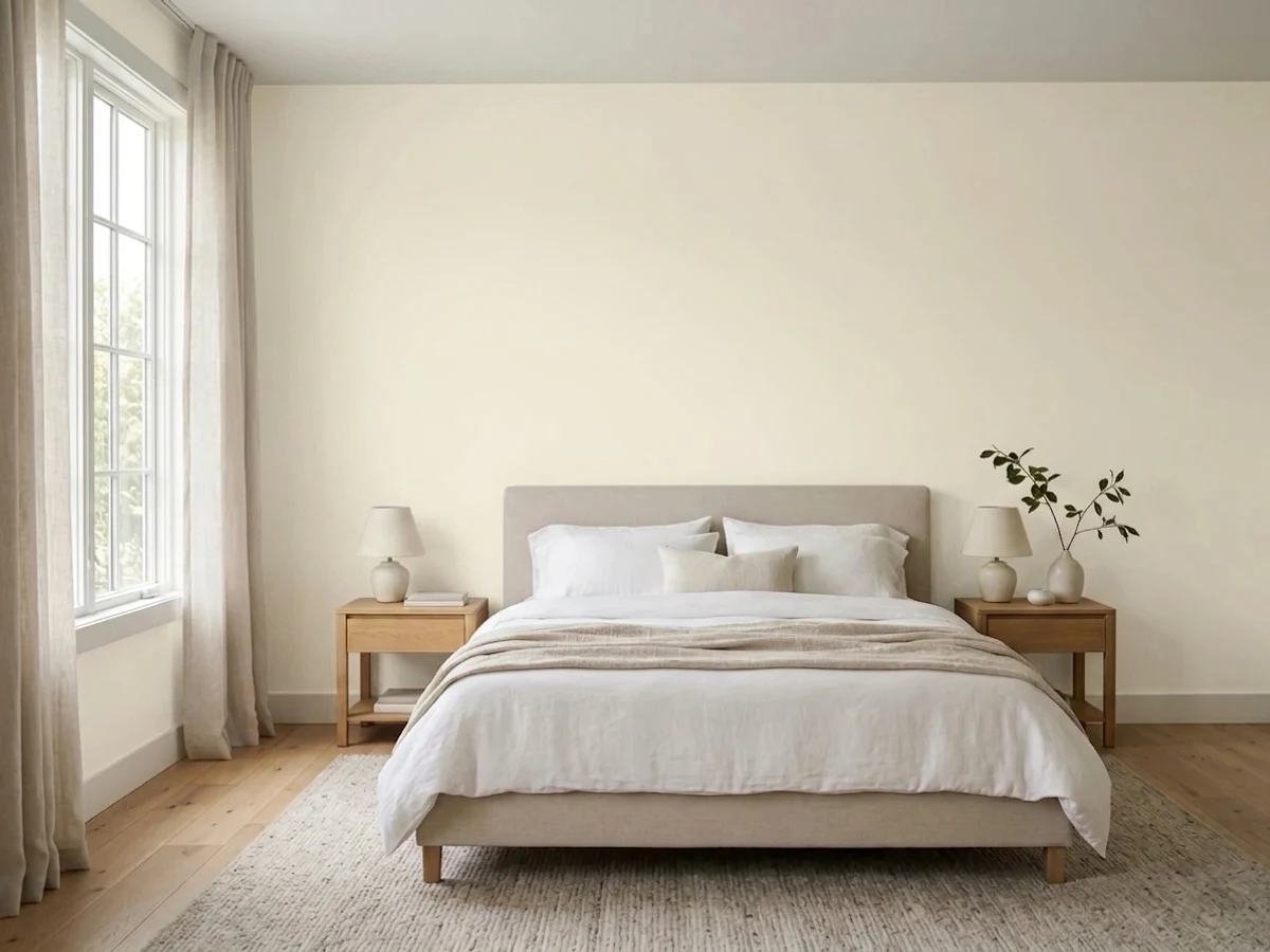

- 1Classic Gray74
- 2Alabaster82
- 3All White92
- 4Ultra Pure White97
The Fast Verdict
All White is the outlier in its own deck: every other Farrow & Ball white is built on a measured drop of color, and this one is mixed from nothing but the base itself — no pigment added. F&B's own line is that this keeps it 'soft and sympathetic' rather than the cold, blue-cast brightness of a trade brilliant white, and against warm oak and brass that holds up. It is not a cream and it is not forgiving of a bare, texture-less room: strip away the natural materials and put it under cool LEDs, and the same white that glows in a Georgian hallway can read flat and clinical in a modern kitchen.
North-facing rooms and hallways that need every bit of daylight bounced back · kitchens and baths with warm wood, brass, or stone · anyone who wants a genuine near-white without a cream lean or a grey lean · small rooms with limited window area that need to feel bigger
You want the single brightest, whitest option, full stop · your room already runs cool (north light, LED bulbs, little natural texture) · you are painting a busy hallway or mudroom and want a scrub-proof finish straight off the shelf · the Farrow & Ball price per can is the deciding factor for a whole house
- The only genuinely pigment-free white in the F&B deck — a true near-white, not a disguised cream or grey
- High LRV (92) that bounces daylight without going cold, unlike most "brilliant" trade whites
- Outstanding against oak, walnut, brass, and linen — the architectural-neutral look designers reach for
- Works as a one-color scheme (walls + trim, sheen change only) for a quiet, expensive-looking room
- F&B's own recommended pairing for north-facing rooms and hallways with limited daylight
- Can read stark or clinical without warm materials nearby — it is not a cure-all bright white
- Estate Emulsion's chalky matte finish marks and scuffs easily on high-traffic walls
- Needs a real primer and two full coats over any existing warm or dark color — sometimes three
- Premium F&B pricing for a color a US big-box near-white can approximate for a fraction of the cost
What Color Is All White, Really?
All White earns its name literally. Farrow & Ball mixes nearly every color in its deck — including its other "whites" — from a base plus a measured drop of pigment; All White is the one shade built with no added pigment at all. That is unusual even within F&B's own range, and it is the whole reason the color exists: a true, undiluted white without the colder blue cast that a standard trade "brilliant white" carries. The company's own description calls it the "softest, most sympathetic" white it makes, and that softness is real — it is warm-leaning rather than neutral, closer in spirit to a quiet off-white than to a stark hospital white.
At an LRV of 92 it is genuinely bright — up there with the brightest whites any brand sells — but it does not behave like a cold bright white on the wall. Compare it to Farrow & Ball's own Strong White (No. 2001, LRV 76), which carries a visible grey undertone: Strong White reads more architectural and structured, while All White stays soft and light-bouncing. That gap is the useful part. In a dim room, All White gives back nearly all the daylight it gets without turning the space sterile the way a blue-based white would.
Undertone in one line: warm-neutral, with no grey and no cream showing through — never blue. If a sample reads cold or clinical on your wall, that is the room's own light (cool LEDs, north exposure, no warm materials nearby) doing the work, not a hidden undertone in the paint.
Where It Shines
This is a designer's white for rooms that need brightness without losing warmth. Give it a north-facing exposure, a hallway running on borrowed light, or a small room that needs to feel bigger, and All White does exactly what F&B built it to do: bounce back daylight while staying soft instead of icy. Its second home is next to natural material — oak floors, brushed or aged brass, linen, jute — where the lack of any added pigment reads as honest and architectural rather than blank. Farrow & Ball itself pairs it with Strong White for an "architectural neutral" scheme, and that combination shows up in showroom after showroom for a reason.
Where It Fails
Almost every complaint about All White traces back to one of three predictable situations, and none of them are really about the paint being a bad white — they are about pairing a pigment-free white with the wrong light or the wrong finish.
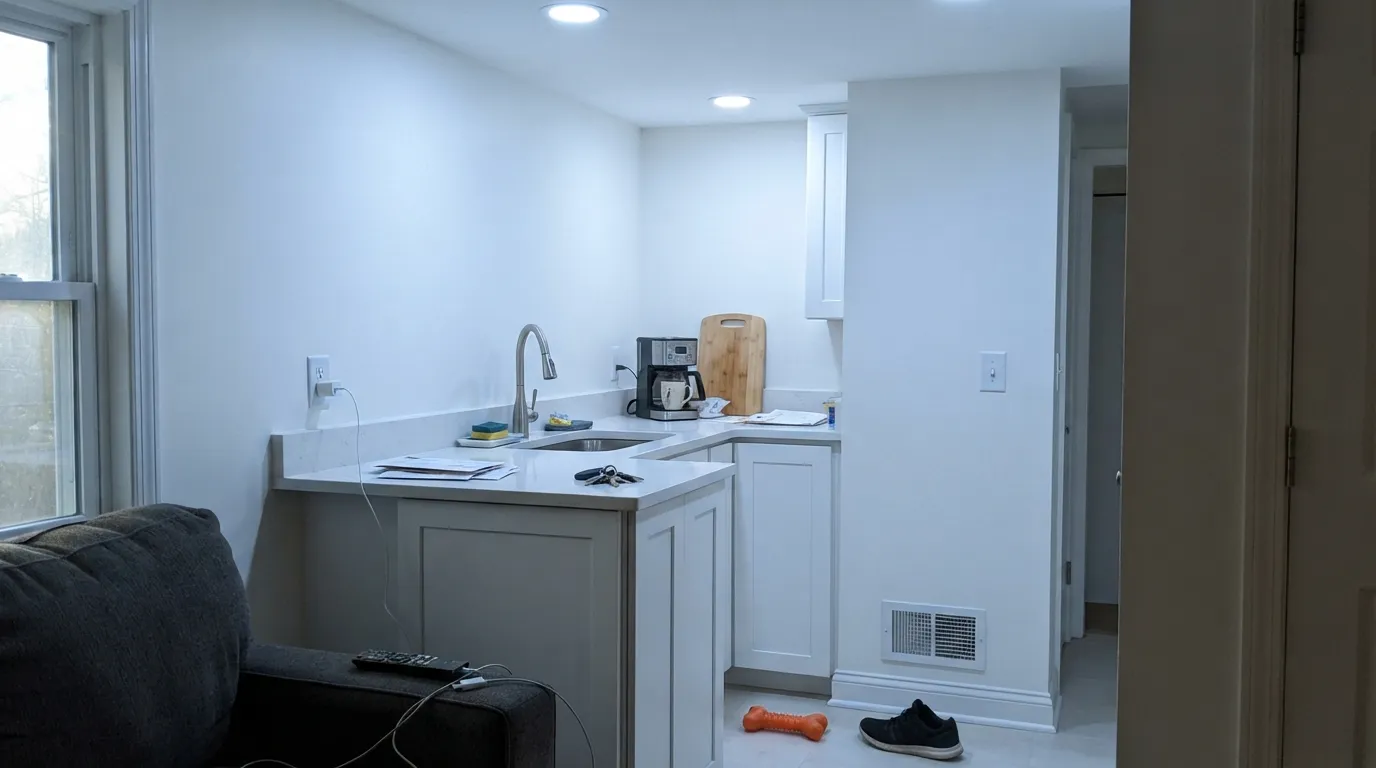
All White was built to avoid a clinical look, but it can still land there if nothing around it is warm — white quartz counters, chrome fixtures, and cool LED bulbs will strip its softness and leave a flat, sterile white. The fix is not a different paint; it is oak, brass, jute, linen — the exact company it was designed to keep.
F&B's flagship matte finish, Estate Emulsion, is famously chalky and soft — beautiful on a feature wall, a magnet for smudges and scuffs on a hallway or kids' room. Readers who repaint high-traffic walls in Estate Emulsion and expect it to wipe clean like a builder-grade eggshell are consistently disappointed. Step up to Modern Emulsion or Dead Flat for anything hands touch.
Because it carries zero added pigment, All White has less hiding power than a tinted white and needs a real primer plus two full coats over anything beige, yellow, or dark — three is not unusual on a saturated wall. Skipping the primer to save money on an already-premium paint is the most common regret in the F&B forums.
Room by Room
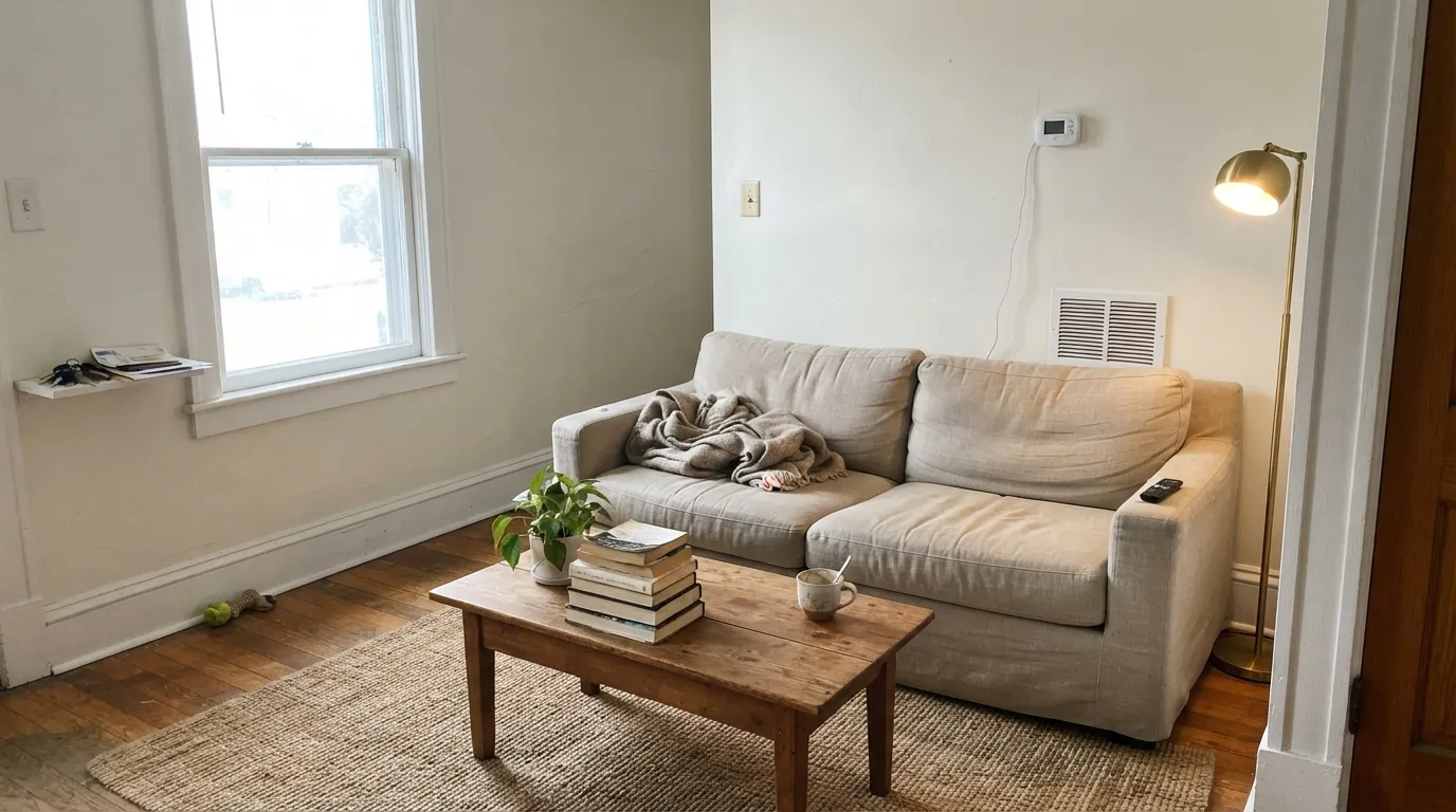
With a real daylight source and any warm furniture — leather, walnut, linen — it reads calm and architectural rather than blank. Matte Estate Emulsion hides wall imperfections beautifully here.
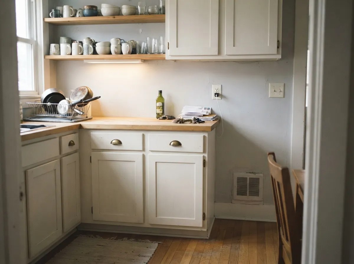
Against oak, butcher block, and brass hardware it looks custom, not cold. Use Estate Eggshell or Modern Eggshell, never the matte wall finish, since cabinets take daily hand contact.
Bright and soft in the morning; under cool LED bedside bulbs it can drift toward flat. Swap to 2700K bulbs and it stays warm after dark.
With warm stone, wood vanities, and brass fittings it is a genuinely luxurious near-white. With cold white quartz and chrome, it can look stark — pick Strong White or add warm towels and wood accessories to soften it.
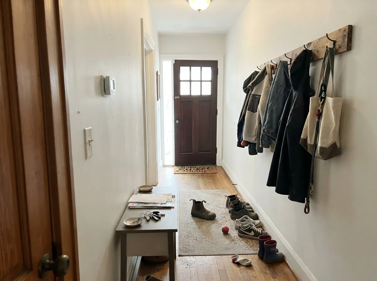
This is the scenario F&B itself recommends it for: a corridor running on borrowed light from other rooms, where a warm-leaning white bounces back what little daylight reaches it instead of going grey.
Modern Eggshell in All White on doors and skirting under a mid-tone wall color (Cornforth White, Elephant's Breath) gives definition without the harshness of a blue-based trim white.
Your Light Is the Risk
This is the light F&B built it for: cool, indirect daylight in a hallway or north-facing room, where the warm base keeps it from tipping blue-grey the way a trade white would.
Strong south sun or cool-white bulbs can wash out its softness and leave a flat, almost sterile white, especially with no warm material nearby to bounce color back.
Warmest at sunrise or sunset hours, quietly neutral the rest of the day. The shift is gentle — most owners barely notice it.
2700K bulbs keep it soft and warm after dark. Cool white LEDs flatten it — this is the single easiest fix for a room that reads "too stark."
Most complaints about All White are a light mismatch. Upload a photo of your actual room and see it on your walls — then ask for the same wall in north light or evening lamps before you buy a single sample.
Need It From Another Brand?
Any paint counter can custom-tint Farrow & Ball No. 2005 directly. If you would rather stay in one brand's own deck, these are the closest stock matches, measured as ΔE2000. Under 2 is a difference you will not see on the wall.
| Brand | Closest color | ΔE | LRV | |
|---|---|---|---|---|
| Sherwin-Williams | UltraWhiteSW 9500 · Sherwin-Williams | 0.8 | 94 | Color page → |
| Behr | Luster WhiteW-B-600 · Behr | 1.0 | 92 | Color page → |
| Benjamin Moore | Chantilly Lace2121-70 · Benjamin Moore | 1.2 | 91 | Color page → |
| Valspar | New ReamV148 · Valspar | 0.5 | 91.6 | Color page → |
| PPG / Glidden | Delicate WhitePPG1001-1 · PPG / Glidden | 1.2 | 88 | Color page → |
| Glidden | Delicate WhitePPG1001-1 · Glidden | 1.0 | 88 | Color page → |
Similar Farrow & Ball Colors
The nearest shades to All White within Farrow & Ball's own range, ranked by perceptual color distance — useful when you want the same look a touch lighter, darker, or warmer.
WCAG 2.1: AA is 4.5 : 1 for normal text, 3 : 1 for large text, AAA is 7 : 1.
All White vs the Colors You're Also Considering
Every All White sample board has the same rivals on it. The numbers show the real lightness gap — then it comes down to which risk you would rather live with.
Pick this for the brighter, purer, more light-bouncing version — Strong White is noticeably deeper and cooler.
Farrow & Ball No. 2001 · LRV 76Strong WhitePick this if you want a visible grey undertone and a more structured, architectural feel — F&B's own pairing partner for All White.
Pick this when you want warmth over grey — All White has almost no grey in it at all.
Farrow & Ball No. 273 · LRV 83WevetPick this for a featherlight grey-white instead of a warm-white — Wevet is the coolest, most delicate white F&B makes.
The closest comparison on this site is Wimborne White (No. 239) at LRV 82. Wimborne carries a warm yellow cast too but is often read as the more traditional, slightly softer of the two; All White at LRV 84 reflects marginally more light and reads a touch cleaner. In a bright room they are close, so sample both side by side.
Among other F&B whites, Farrow's White (No. 9812) at LRV 78 is noticeably deeper and more ivory, a better pick when you want more color on the wall rather than a pale backdrop. James White (No. 2010) at LRV 79 pulls slightly green-gray, which cools the room compared with All White's straightforward cream.
Choose All White when you want the lightest, warmest option; step down to Farrow's White or James White when you want a bit more presence or a cooler lean.
All White Coordinating Colors
The rule for coordinating with All White: lean into natural material and let one other F&B shade carry the depth. It flatters warm greiges and heritage greens, sits comfortably next to a near-black door or trim, and stays legible against its own family members at different depths. These are the partners that show up again and again in real rooms:
The Only Truly Pigment-Free White in the Deck
Farrow & Ball's reputation rests on the idea that there is no such thing as "just white" — nearly every shade in the deck, including colors most brands would sell as a plain trim white, is built from a base plus a specific drop of pigment that gives it a named undertone. All White breaks that pattern on purpose: it is the base itself, sold with nothing added. That makes it the closest thing the brand offers to an undiluted, honest white, and it is why designers reach for it when a project calls for a genuine near-white rather than a white with an agenda.
It is also why All White shows up so often as the quiet member of an "architectural neutral" scheme — paired with Strong White for trim, or used as a one-color wall-and-woodwork wash in period homes that want maximum daylight without a cold, clinical edge. It has no single famous room or viral moment behind it; its reputation is built entirely on being the reliable, undecorated answer when a client just wants white.
All White With Wood Tones and Floors
This is where the color earns its reputation. Oak, walnut, and other warm woods sit comfortably against All White because the paint's own base is warm-leaning rather than blue-based — the wood does not fight it the way it would fight a colder trade white. Brushed or aged brass hardware and linen or jute textiles complete the look F&B itself markets the color around.
The one flooring combination that needs a sample first is cold white or grey-veined stone paired with chrome fixtures — two cool materials on top of a pigment-free white can tip the whole room toward the clinical look All White was built to avoid. Warm wood, brass, or even a single wool rug is usually enough to bring it back.
Three Ready Palettes Built on All White
A color is never alone on the wall. These are complete combinations in the 60-30-10 pattern, with the reason each one holds together. Every one opens in the visualizer.
This is Farrow & Ball's own recommended combination: two whites at slightly different depths give the walls quiet dimension against the trim, and the near-black door supplies the one dark note the scheme needs without a full black's harshness.
Try this palette in your roomAmmonite is the greige that built F&B's American reputation, and it shares All White's warm-neutral lean, so the cabinet-to-wall handoff is seamless. Studio Green on one door gives the room its single deep note; brass hardware and oak open shelving finish the look.
Try this palette in your roomOne color at two sheens is the exact use case All White was built for — a corridor running on borrowed light stays bright instead of grey. Railings on the front door gives the entry a single confident dark note without competing with the hallway's brightness.
Try this palette in your roomAll White FAQ
Is all white actually pigment-free?
Yes, and it is unusual even within Farrow & Ball's own range — most of the brand's colors, including its other whites, are the base plus a measured drop of pigment. All White is mixed with no added pigment at all, which is exactly why it reads soft rather than the cold blue-white of a standard trade paint.
Is All White warm or cool?
Warm-leaning, but only just. It has no grey and no visible cream in it, so it is best described as a true near-white with the coldness taken out. Under cool light or next to cold materials it can still read stark — that is the room, not a hidden undertone.
Does it work in a north-facing room?
This is one of its best jobs. Farrow & Ball itself recommends it for north-facing rooms and hallways running on borrowed light, where its warm base keeps the color from going blue-grey the way a colder white would.
What trim color goes with All White walls?
All White itself in a higher sheen is the classic, near-invisible choice. Strong White is F&B's own suggested pairing if you want a visible step of contrast without introducing a second undertone.
How many coats does All White need?
Plan on two full coats minimum over any existing light color, and prime first over anything dark, warm, or saturated — three finish coats is common there. Because it carries no added pigment, it has less inherent hiding power than a tinted white.
Is Farrow & Ball worth it for a plain white?
That depends on what you are paying for: a genuinely pigment-free formulation, a specific chalky matte finish (Estate Emulsion), and the brand's undertone-free reputation. If none of those matter to you, Chantilly Lace or Alabaster get close to the same look for a fraction of the price and no import wait.
Have you painted with All White?
Rate it — one tap helps the next reader decide.
Ask a Question