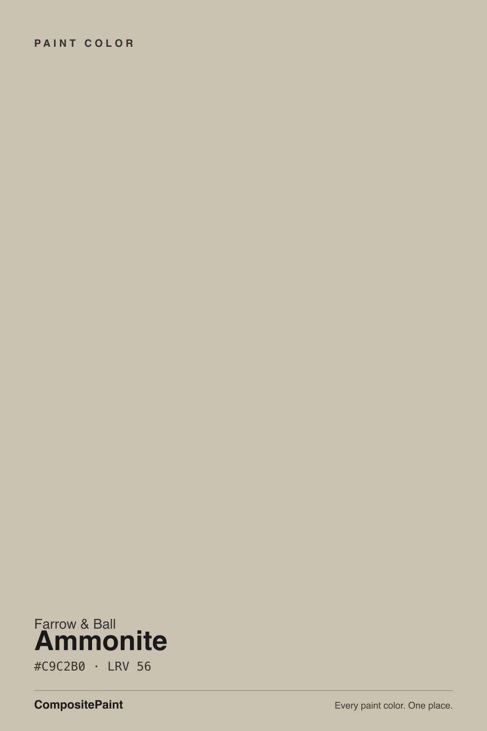
Ammonite
The stone gray that made Farrow & Ball a household name outside Britain, reviewed honestly: the light it needs, the rooms that drift it beige, and what to pick instead.

Jessica has spec'd whites and neutrals for more than 300 rooms and keeps a sample wall of painted drawdowns in her studio. Every color review is checked against real reader rooms in the comments and re-tested when a formula changes. About the testing process →
- 1Stardew43
- 2Palladian Blue60
- 3Ammonite67
- 4Spatial White72
- 5Spring Thaw83
The Fast Verdict
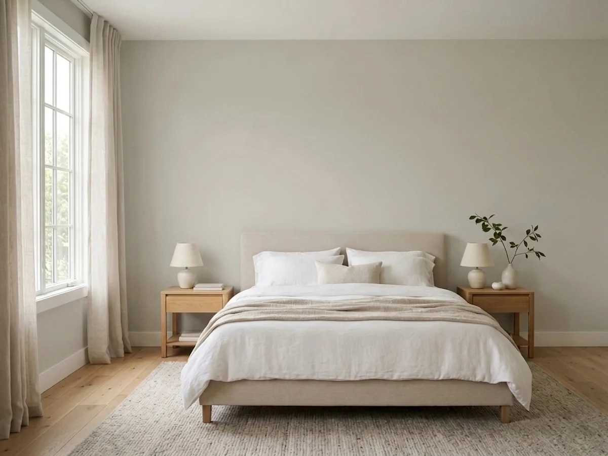
Ammonite is the color that turned Farrow & Ball from "that pricey British paint" into a name American homeowners ask for by memory. It is a light, calibrated stone gray — LRV 67, bright enough to carry a room, warm enough to dodge the icy-blue trap that ruins so many "greiges." Paired with Railings on cabinetry it is one of the most-repeated kitchen schemes on design Pinterest; on its own it is simply a dependable, whole-house neutral that rarely embarrasses you.
Whole-house neutrals — hallway to bedroom to trim · kitchens paired with a near-black island · period homes with natural stone and pale wood · anyone who wants gray without the risk of it going cold
Your room is dim, north-facing and tree-shaded · your furniture and textiles run warm cream and honey · you repaint high-traffic walls often and want a scrubbable finish · you're on a tight paint budget
- A genuinely calibrated stone gray — rarely tips blue, rarely tips beige on its own
- LRV 67 keeps rooms bright while still reading as real color, not white
- The Ammonite-plus-Railings kitchen is a repeated design-blog classic for a reason
- Carries a whole house — hallway to bedroom to trim — without feeling repetitive
- One of the more forgiving Farrow & Ball colors across different light exposures
- Estate Emulsion, F&B's classic matt, marks easily and can't be spot touched-up
- Costs meaningfully more per gallon than a domestic greige, plus ordering hassle
- Goes flat and characterless in a dim, tree-shaded north room
- Warm furnishings pull it toward beige rather than gray
What Color Is Ammonite, Really?
Ammonite is named for the coiled fossils that wash out of the cliffs along the Dorset coast near Farrow & Ball's original workshop, and the name fits: it is a soft, sedimentary gray, closer to weathered stone than to paint-chip gray. The undertone is calibrated warm — not beige-warm, just warm enough to keep the color from reading cold or clinical the way a lot of "true" grays do in real houses. That single calibration decision is most of why it became the brand's best-known export: gray enough to feel current, warm enough to feel livable.
At LRV 67 it sits in the bright half of the deck — close enough to white that in strong daylight some rooms read it as an off-white with a gray cast rather than a gray with a light cast. Put it next to a genuine F&B white like Wevet (LRV 83) or Strong White (LRV 76) and the gray body becomes obvious again; that's exactly how F&B stages it in its own showrooms. On its own, expect a light, quiet, stony neutral, not a statement gray.
Undertone in one line: warm-leaning gray, never blue, rarely beige unless the room around it is warm. Owners who test it in a room full of cream and oatmeal textiles often report it reading warmer than the chip promised — test it against your actual furniture and floor, not just the paint card, before you commit a whole wall.
Where It Shines
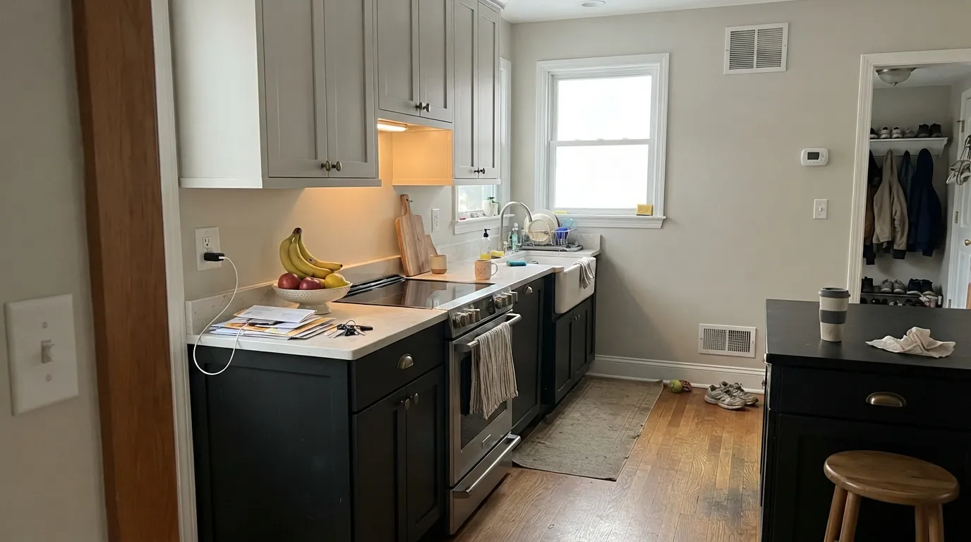
Ammonite does its best work as connective tissue — the neutral that lets a house feel considered without any single room shouting for attention. Kitchens are where it gets famous: Ammonite walls or upper cabinetry with Railings on the island or lower units is one of the most repeated pairings in modern kitchen design, a combination real design studios keep coming back to. It is just as at home carrying a hallway or stairwell from front door to landing, the classic "whole-house neutral" job Farrow & Ball itself markets it for.

Where It Fails
Almost every disappointed review of Ammonite comes down to one of three predictable situations — and two of them are about the room, not the paint.
Ammonite's calibrated warmth needs real light to register. In a north-facing room with mature trees outside or small windows, owners report it coming up "very grey" — flat, characterless, none of the stone warmth that makes it interesting elsewhere. Sample it on the actual wall at different times of day, not on a card near a bright window.
Ammonite's undertone is genuinely subtle, which means it takes its cue from what's around it. Pair it with cream carpet, oatmeal linen and honey-toned wood and several owners describe the walls drifting warmer and beiger than the chip suggested. Keep the room's other textiles closer to neutral or cool if you want the gray to stay gray.
F&B's classic Estate Emulsion has very little polymer binder — it looks beautifully flat but marks and scuffs easily, and it genuinely cannot be spot touched-up; a repair just shows as a slightly different sheen or shade, so the whole wall ends up repainted. Ironic, since the hallway is Ammonite's single most popular room: ask for Modern Emulsion there instead — it's washable and holds up to traffic.
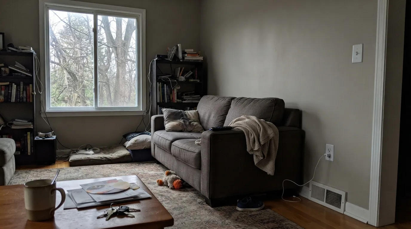
Room by Room
With any window light it is the calm, considered backdrop that lets furniture and art do the talking. Estate Emulsion for the flat, chalky look designers love; skip it if the room takes daily abuse from kids or dogs.
Ammonite walls or upper cabinets with Railings on the island or lower units is a design-blog staple for a reason — the warm stone gray keeps the room light while the near-black anchors it. Full gloss or eggshell on cabinetry, never the chalky matt.
Farrow & Ball's own case-study room for Ammonite: one calm color from front door to landing so the house reads as one considered space instead of a room-by-room decision. Use Modern Emulsion here specifically — hallways take more contact than any other room, and Estate Emulsion will not survive it.
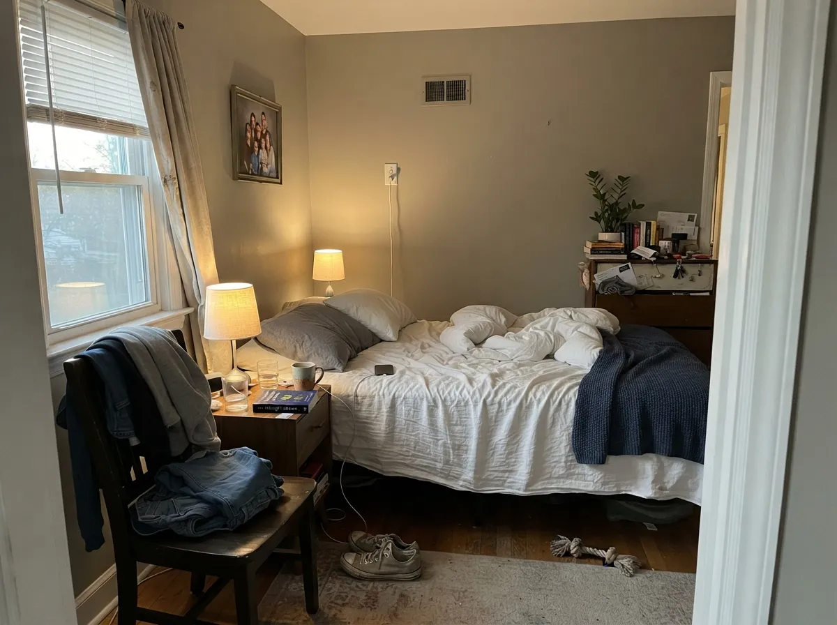
Under 2700K bulbs it turns a soft, stony warmth at night. Pair with white or pale bedding rather than heavy cream if you want it to stay gray rather than drift beige.
The color works — pale stone gray suits tile, brass and marble — but skip Estate Emulsion's chalky matt in a room with moisture and towels brushing the wall. Estate Eggshell is the finish Farrow & Ball recommends for bathrooms.
Full outdoor light reads it brighter and slightly cooler than indoors. Paired with Railings or Off-Black on the door, shutters or trim it is a quiet, expensive-looking exterior scheme that doesn't shout "gray house."
Your Light Is the Risk
Reads its truest calibrated self — a light stone gray, neither warm nor cold, the version the swatch promises.
Without real light it goes flat, grey-on-grey and loses the stone warmth. Owners in heavily shaded rooms describe it as coming up "very grey."
Cool and clean in morning east light, softer and a touch warmer as afternoon west sun arrives — a gentle shift, not a color change.
2700K lamps warm it toward its stone-beige side; cool LEDs keep it crisper and grayer. Pick bulbs based on which side you want to lean.
Most complaints about Ammonite are a light mismatch. Upload a photo of your actual room and see it on your walls — then ask for the same wall in north light or evening lamps before you buy a single sample.
Need It From Another Brand?
Any paint counter can custom-tint Farrow & Ball No. 274 directly. If you would rather stay in one brand's own deck, these are the closest stock matches, measured as ΔE2000. Under 2 is a difference you will not see on the wall.
| Brand | Closest color | ΔE | LRV | |
|---|---|---|---|---|
| Sherwin-Williams | Winter WalkSW 9628 · Sherwin-Williams | 1.0 | 66 | Color page → |
| Behr | DoveHDC-MD-21 · Behr | 1.5 | 67 | Color page → |
| Benjamin Moore | Balboa Mist1549 · Benjamin Moore | 1.5 | 66 | Color page → |
| Valspar | Sandstone Gray7004-18 · Valspar | 1.5 | 66.4 | Color page → |
| PPG / Glidden | Silent SmokePPG1025-2 · PPG / Glidden | 1.0 | 68 | Color page → |
| Glidden | FogPPG1010-2 · Glidden | 1.6 | 68 | Color page → |
Similar Farrow & Ball Colors
The nearest shades to Ammonite within Farrow & Ball's own range, ranked by perceptual color distance — useful when you want the same look a touch lighter, darker, or warmer.
WCAG 2.1: AA is 4.5 : 1 for normal text, 3 : 1 for large text, AAA is 7 : 1.
Ammonite vs the Colors You're Also Considering
Every Ammonite sample board has the same rivals on it. The numbers show the real lightness gap — then it comes down to which risk you would rather live with.
Pick this for the lighter, brighter version of the same restrained stone-gray idea.
Farrow & Ball No. 228 · LRV 60Cornforth WhitePick this if Ammonite tests too pale or washed-out in your room — Cornforth White is one true step deeper, with more visible gray.
Side-by-side comparison →Pick this when you want the gray to stay gray instead of drifting toward mauve in cool light.
Farrow & Ball No. 229 · LRV 52Elephant's BreathPick this for real warmth — Elephant's Breath carries a hint of pink that Ammonite deliberately avoids.
Pick this for the more calibrated, less yellow-leaning version — Agreeable Gray tends to drift warmer in the same room.
Sherwin-Williams SW 7029 · LRV 60Agreeable GrayPick this if you want the same idea from a domestic brand — cheaper, easier to reorder, sold at any Sherwin-Williams.
Ammonite No. 274 at LRV 56 is easy to confuse with its close neighbors, but the differences show on the wall. Cornforth White No. 228 at LRV 60 is lighter and leans cooler and grayer, so it feels more like a soft gray than a stone. If you want more of a true off-white and less warmth, Cornforth is the pick; if you want warmth and a little more depth, choose Ammonite.
Old White No. 4 at LRV 52 is a shade deeper and noticeably greener and more traditional, better suited to period rooms and darker trim. Bone No. 15 at LRV 53 is also deeper and reads more clearly beige and yellow, which makes it feel warmer and older next to the more balanced Ammonite.
Against Strong White No. 2001 at LRV 81, the story is simple: Strong White is a wall-or-trim white, while Ammonite is a full mid-tone color.
Ammonite Coordinating Colors
The rule for coordinating with Ammonite: pick a direction and commit — a cool, grey-based white if you want it to read crisp and current, or a warm accent if you want it to lean into its stone-gray softness. It rarely needs a loud partner; the near-black and pink options below are for the rooms that want one.
The Fossil That Became a Household Name
Ammonite takes its name from the coiled fossils that wash out of the cliffs along the Dorset coast, not far from Farrow & Ball's original Dorset workshop — the same instinct that named Down Pipe after cast-iron guttering. The color itself has quietly become the brand's most exported neutral: it is the Farrow & Ball color American and international buyers ask for by name more often than any of the brand's famous saturated darks.
Part of that is timing — Ammonite rode the greige wave of the 2010s and 2020s without ever feeling as trend-locked as some of its American rivals, because Farrow & Ball calibrated the warmth so carefully. Part of it is simply that it photographs well: it's the neutral behind a long run of design-blog and Pinterest kitchens, most of them wearing it next to Railings.
Ammonite With Wood, Stone and Floors
This is a color built for natural materials. Pale oak, reclaimed and white-washed wood, limestone and honed marble all sit comfortably against it — the stone gray reads as another natural material in the room rather than a paint decision. Black-toned wood, wrought iron and matte brass give it the contrast note it otherwise lacks on its own.
The one floor to sample first is a strong honey or orange-toned builder oak. Ammonite's warm undertone can amplify that orange rather than calm it, and owners have reported the pairing reading more yellow than either material does alone. A large rug, or a floor refinish toward a cooler or more weathered tone, is the usual fix.
Three Ready Palettes Built on Ammonite
A color is never alone on the wall. These are complete combinations in the 60-30-10 pattern, with the reason each one holds together. Every one opens in the visualizer.
This is the pairing that put Ammonite on every kitchen mood board: the warm stone gray keeps most of the room light, Railings' near-black grounds the island, and Wevet's cool trim keeps the edges crisp instead of muddy.
Try this palette in your roomFarrow & Ball's own recommended whole-house flow: one calm neutral from the front door to the landing, a grey-based white for the trim so nothing reads stark, and one near-black note at the door for a bit of drama.
Try this palette in your roomSetting Plaster's dusty pink softens Ammonite's stone gray without turning the room twee — the two share enough warmth to feel deliberate, and Wevet's cool white trim keeps the pairing from tipping into full cottage-core.
Try this palette in your roomAmmonite FAQ
Is Ammonite gray or beige?
Gray, with a warm undertone calibrated so it never goes blue. It can drift toward beige if the room around it is full of warm, cream-toned furnishings — the paint itself stays close to neutral stone gray.
What's the closest American paint to Farrow & Ball Ammonite?
Benjamin Moore Pale Oak (LRV 69) is the closest match by the numbers, though it leans a touch more beige. Sherwin-Williams Agreeable Gray (LRV 60) is a cheaper, easier-to-reorder domestic alternative with a similar idea, if a little warmer in most rooms.
Will Ammonite work in a north-facing room?
Usually — its warm undertone is specifically calibrated to avoid the icy look pure grays get in cool light. The exception is a genuinely dim room with heavy shade or small windows, where it can still go flat; sample it on the actual wall before committing.
What paint finish should I use?
Estate Emulsion for the classic flat, chalky Farrow & Ball look in low-traffic rooms like a formal living room or bedroom. Modern Emulsion for hallways, kitchens and anywhere hands and shoulders touch the wall — it's washable, Estate Emulsion is not. Estate Eggshell for trim, doors and bathrooms.
What trim or door color goes with Ammonite?
Wevet or Strong White for a soft, grey-based white that doesn't compete. Railings or Off-Black for a bolder near-black anchor on doors, stair rails or an island.
Is Farrow & Ball worth the extra cost over Benjamin Moore or Sherwin-Williams?
For this particular color, you're mostly paying for the exact calibration — plenty of domestic greiges get close, none land in quite the same spot. If budget is tight, Pale Oak or Agreeable Gray get you most of the way there for a fraction of the price and a much easier reorder.
Have you painted with Ammonite?
Rate it — one tap helps the next reader decide.
Ask a Question