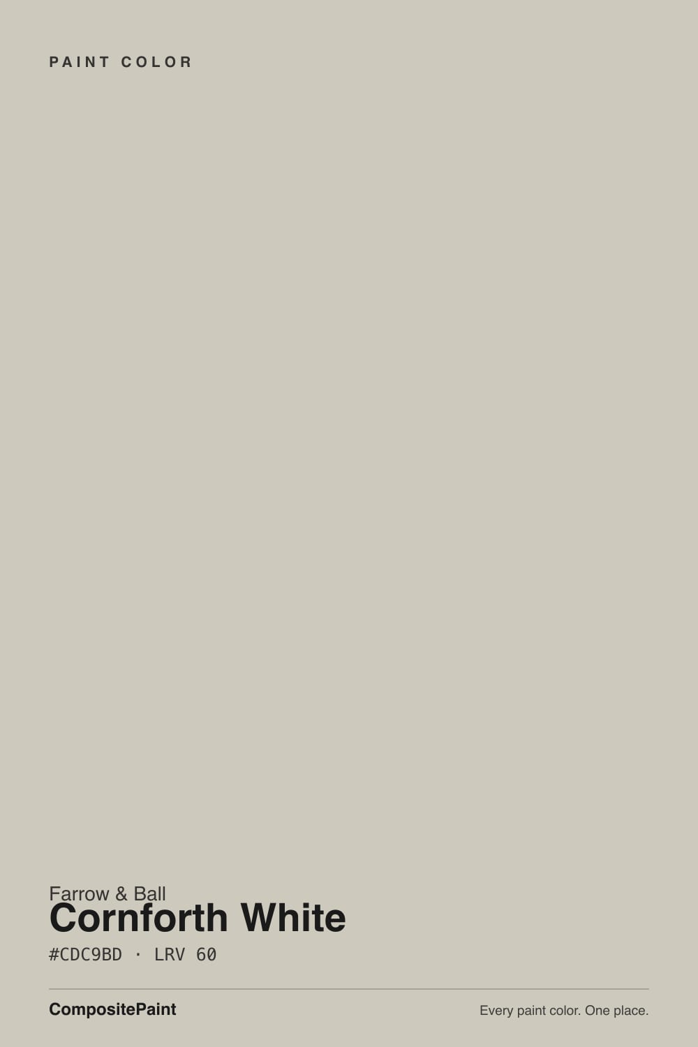
Cornforth White
Farrow & Ball's best-known grey, reviewed honestly: the light that turns it beige, the light that turns it violet, and the exact rooms where the chameleon act pays off.

Jessica has spec'd whites and neutrals for more than 300 rooms and keeps a sample wall of painted drawdowns in her studio. Every color review is checked against real reader rooms in the comments and re-tested when a formula changes. About the testing process →
- 1Mindful Gray48
- 2Revere Pewter55
- 3Cornforth White60
- 4Pale Oak69
- 5Shoji White74
The Fast Verdict
Cornforth White is the color Farrow & Ball reaches for when a client says "not too grey, not too beige." It's a mid-depth neutral built on a grey base with a genuine violet undertone — grounded enough to avoid looking cold, unstable enough to shift with the light in your actual room. In flat daylight it's a proper English grey; in warm evening light it softens toward beige; under a blue-spectrum LED it can flash unmistakably lilac. None of that is a flaw exactly — it's the whole reason designers keep specifying it — but you have to know which version you're buying before the brush goes on the wall.
Kitchens and bathrooms (Modern Emulsion is genuinely washable) · living rooms and hallways with real daylight · layered neutral schemes with other Farrow & Ball greys · anyone who wants "grey with personality" rather than a flat builder gray
You want a true, neutral gray with zero violet · your room runs on cool blue-white LEDs · the space gets minimal daylight · you're chasing a warm greige, not a cool one
- A genuinely chameleon grey — reads calm, considered, and expensive in the right light
- Modern Emulsion finish is built to be washable in kitchens and bathrooms
- Layers beautifully with other Farrow & Ball neutrals for a tonal scheme
- Cool-neutral base that avoids the yellow most American greiges lean into
- Mid-depth LRV works on walls without feeling either stark or heavy
- Genuinely light-reactive — can flash violet or blue-grey under cool LEDs
- Not a true neutral gray; the violet undertone never fully disappears
- Goes flat and cold in dim, north-facing rooms
- Farrow & Ball pricing and US availability are a real commitment compared to big-box greiges
What Color Is Cornforth White, Really?
A soft, mid-depth grey built on a genuine violet undertone — and that undertone is the entire story. Farrow & Ball groups it with a lighter and a deeper cousin as part of its Easy Neutrals, colors designed to sit quietly between white and grey without committing hard to either. Cornforth White is the mid-tone of that family: less pale than a true off-white, less assertive than a full charcoal-grey, and — unlike most greiges on the American market, which lean warm and yellow — genuinely cool-to-neutral, with a lilac cast rather than a beige one.
At LRV 60 it sits in true mid-tone territory: not a light-and-bright wall color, but not a moody deep either. That depth is exactly why it behaves so differently room to room. In good daylight the grey reads clean and calm; in warm late-day light or under an incandescent bulb it can soften and read almost beige; under a cool, blue-spectrum LED — the kind in a lot of modern kitchen downlights — it can flash a visible violet or blue-grey that owners did not expect from the paint chip. None of this is a defect in the paint. It is a genuinely chameleon color, and the chip in the store gives you no warning which version you'll get.
Undertone in one line: grey first, a whisper of violet second — rarely a true beige, never green. If your sample reads distinctly purple, that's cool LED light doing it, not a bad batch; if it reads warm and almost tan, that's incandescent bulbs or late-afternoon sun. Test the actual can, in the actual room, at the actual time of day you'll use it most.
Where It Shines
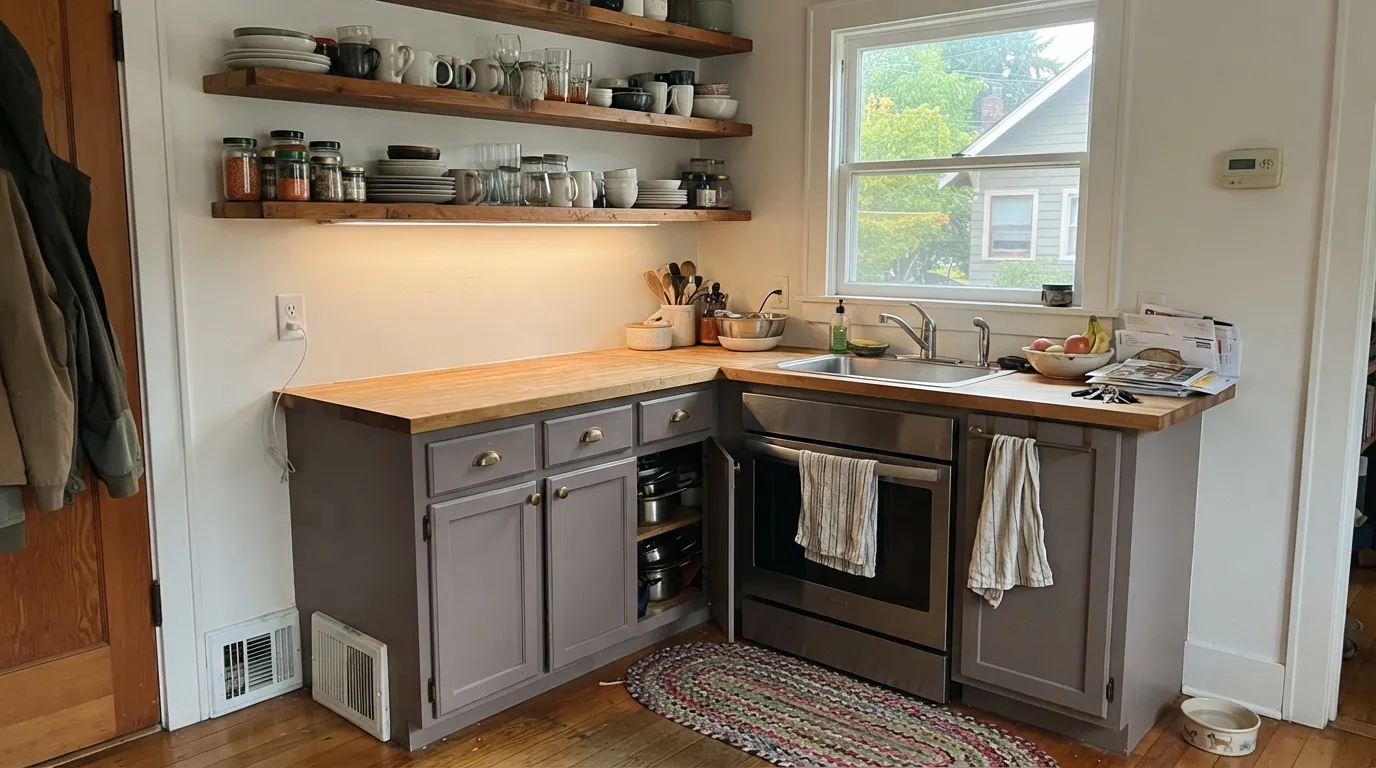
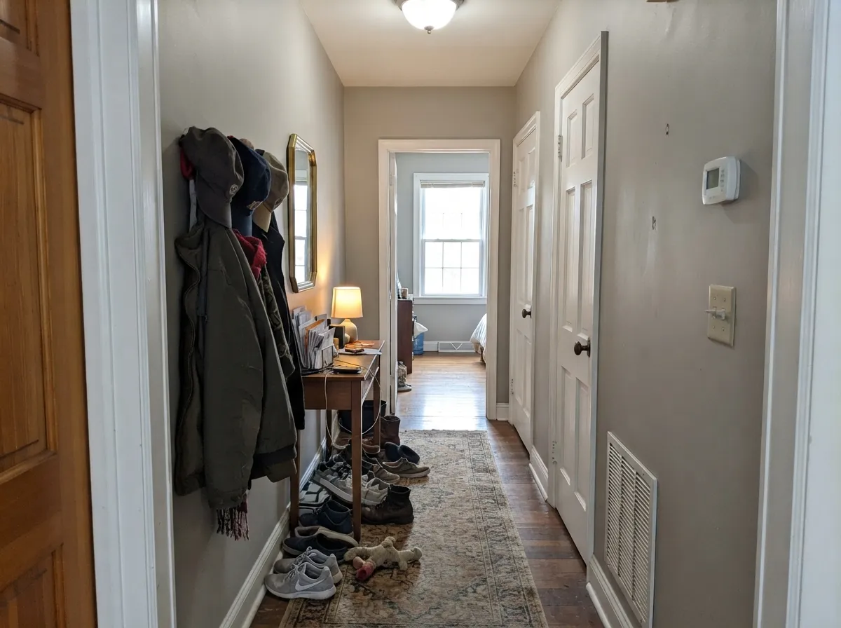
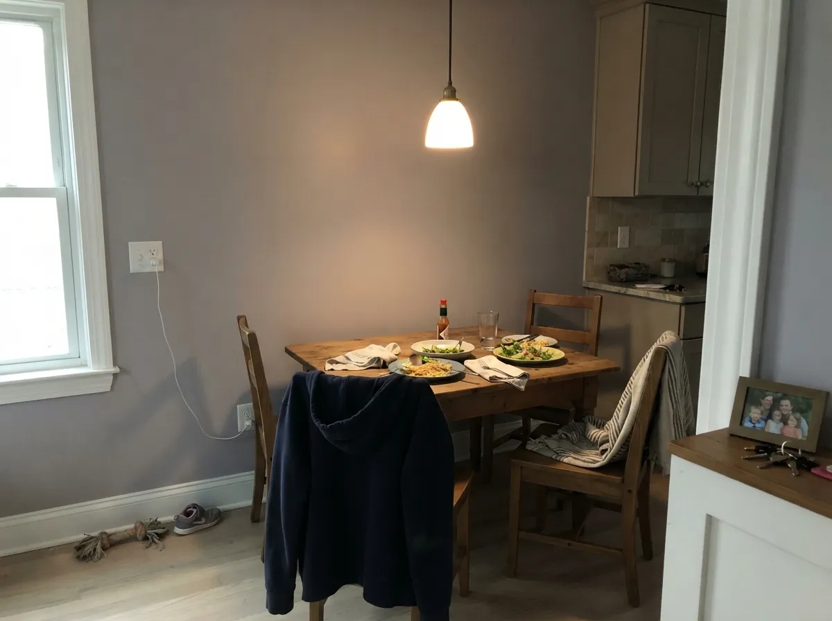
Give it a room with real daylight and it's one of the most useful quiet neutrals a home can wear. It's genuinely at home in kitchens — Farrow & Ball sells it in a washable Modern Emulsion specifically because kitchens and bathrooms need painted walls that survive steam and wiping, and Cornforth White holds up to both while staying soft rather than clinical. It layers beautifully with other members of Farrow & Ball's neutral family, and in a hallway or open living space with genuine window light, it does the job every "safe grey" promises and most fail to deliver: it reads calm and considered rather than cold.
Where It Fails
Almost every disappointed review of Cornforth White comes down to a mismatch between the light in the room and the light the buyer imagined. None of it is really the paint's fault — it is an unusually light-reactive color and it never pretended otherwise — but if your room matches one of these, sample it big before you commit a whole house to it.
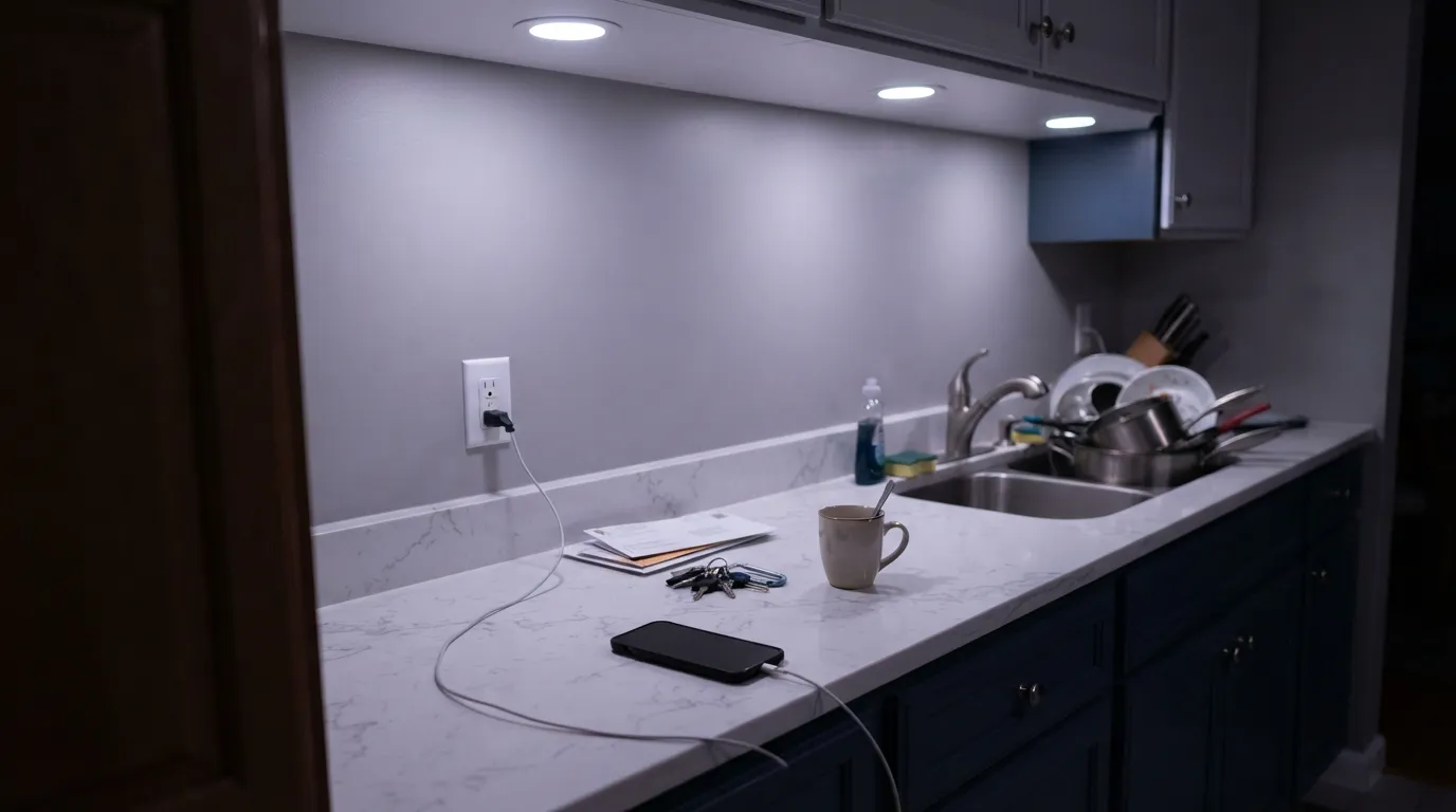
Modern kitchen downlights and many budget "daylight" LEDs sit heavy in the blue end of the spectrum, and that is exactly the light that pulls out Cornforth White's violet undertone hardest — owners report the walls flashing a visible lilac or blue-grey that has nothing to do with a bad can. The fix is bulbs, not paint: swap to warm 2700K–3000K for a true grey read, or accept the violet if you actually like it.
Cornforth White is not that color, and no amount of light will make it that color. The violet is baked in at every depth of daylight; it only gets quieter, never disappears. If a flat, undertone-free gray is the actual goal, look at a true gray instead — the violet reads as personality here, not as a flaw, but it is always present.
Cool northern daylight is already blue-leaning, and stacking that against a grey with a violet base pushes the walls toward flat and slightly cold rather than the soft, hushed neutral the paint promises in better light. It is not unusable here — just noticeably less flattering than in a room that gets real sun.
Room by Room
Farrow & Ball built a washable Modern Emulsion specifically for kitchens and bathrooms, and Cornforth White is one of the colors it's most often recommended in. Against warm wood cabinetry, brass hardware and a marble or butcher-block counter it reads gently grey rather than cold; the washable finish handles steam and everyday wiping without the paint failing first.
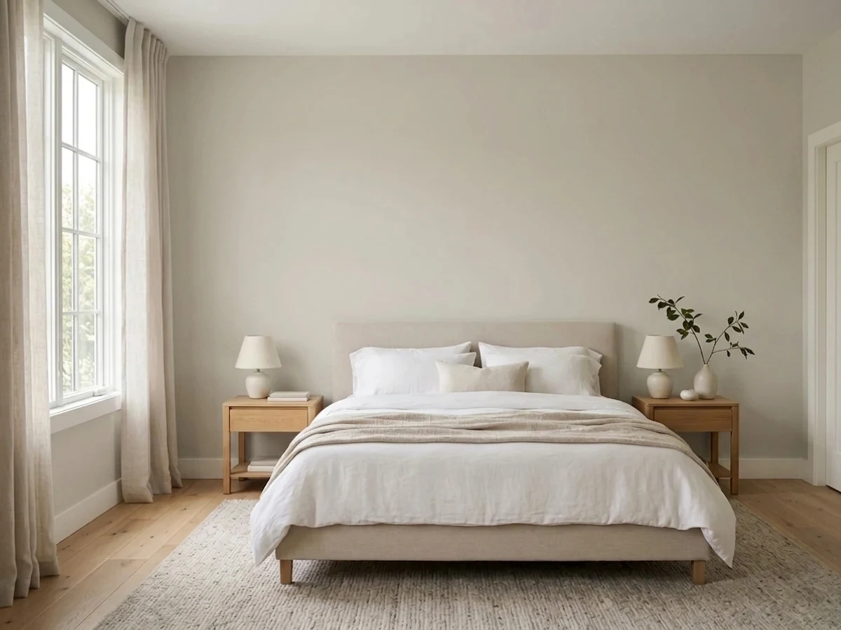
In a room that gets genuine window light it's a calm, considered neutral that flatters both traditional and pared-back furniture. In a dim or heavily north-facing living room, expect a flatter, cooler read — bring in warm lamps to compensate.
Under warm 2700K lamps it softens toward a gentle dove-grey that suits a calm bedroom. Under cool white bulbs or in a north-facing room it can read colder and slightly more violet than most people want to fall asleep next to — test with your actual bedside lighting before committing.
It pairs comfortably with warm stone, wood vanities and brass fittings, and the Modern Emulsion finish is built to survive bathroom humidity. With very cool white tile or chrome fittings, the violet undertone can feel colder than intended.
Its mid-depth grey works well as the connective tissue between rooms of different colors, since it reads as "quiet grey" rather than committing hard to warm or cool. It handles the mixed, inconsistent light of a hallway better than most true grays.
Evening dinner-party light is Cornforth White's flattering hour: warm bulbs and candlelight bring out the soft, hushed side of the color rather than the flash-violet side. Pair with a wood table and brass fixtures for the classic English-country read.
Your Light Is the Risk
Overcast-to-mild daylight plus a warm lamp is where it reads exactly as advertised: a soft, hushed grey with just enough color to feel deliberate.
Modern daylight-rated LED downlights pull the violet undertone forward hardest — the walls can flash a visible lilac that owners did not expect from the chip.
Cooler and greyer in flat morning light, it softens and warms slightly as the light turns golden in the afternoon and evening.
Warm 2700K bulbs bring out the soft, dove-grey side. Cool white bulbs do the opposite — they're the single most common cause of the "it looks purple" complaint.
Most complaints about Cornforth White are a light mismatch. Upload a photo of your actual room and see it on your walls — then ask for the same wall in north light or evening lamps before you buy a single sample.
Need It From Another Brand?
Any paint counter can custom-tint Farrow & Ball No. 228 directly. If you would rather stay in one brand's own deck, these are the closest stock matches, measured as ΔE2000. Under 2 is a difference you will not see on the wall.
| Brand | Closest color | ΔE | LRV | |
|---|---|---|---|---|
| Sherwin-Williams | ConstellationSW 9629 · Sherwin-Williams | 2.0 | 60 | Color page → |
| Behr | Chic GrayPPU26-10 · Behr | 0.6 | 60 | Color page → |
| Benjamin Moore | Nimbus1465 · Benjamin Moore | 0.8 | 59 | Color page → |
| Valspar | Heritage Gray7007-24 · Valspar | 1.4 | 60 | Color page → |
| PPG / Glidden | Cool SlatePPG1002-3 · PPG / Glidden | 0.5 | 60 | Color page → |
| Glidden | Cool SlatePPG1002-3 · Glidden | 0.2 | 61 | Color page → |
Similar Farrow & Ball Colors
The nearest shades to Cornforth White within Farrow & Ball's own range, ranked by perceptual color distance — useful when you want the same look a touch lighter, darker, or warmer.
WCAG 2.1: AA is 4.5 : 1 for normal text, 3 : 1 for large text, AAA is 7 : 1.
Cornforth White vs the Colors You're Also Considering
Every Cornforth White sample board has the same rivals on it. The numbers show the real lightness gap — then it comes down to which risk you would rather live with.
Pick this if you specifically want the Farrow & Ball name and product line, not just the color.
Sherwin-Williams SW 7022 · LRV 57AlpacaPick this if you want the closest American match — Alpaca shares the same violet streak Cornforth White won't hide.
Pick this if you'd rather buy the color that made this behavior famous than its most talked-about American cousin.
Sherwin-Williams SW 7015 · LRV 58Repose GrayPick this if you want a domestic big-box brand with the exact same "flashes lavender in cool light" reputation.
Pick this if the violet is the point, not an accident you're trying to avoid.
Benjamin Moore 859 · LRV 62CollingwoodPick this if you want a true gray that refuses to turn greige — Collingwood holds its neutral line where Cornforth White won't.
Pick this if a cool, quietly violet grey is genuinely what you're after, not a warm greige with a gray name.
Sherwin-Williams SW 7029 · LRV 60Agreeable GrayPick this if you want the warm, yellow-leaning opposite — the safest greige in the US market, with none of the violet risk.
Cornforth White (LRV 60) is closest to Cromarty (No. 285, LRV 60). They share the same brightness, but Cromarty carries a faint green cast where Cornforth White stays on the warm putty side. In a cool north room Cromarty can look softly green, so choose Cornforth White when you want the warmth instead.
Ammonite (No. 274, LRV 56) is the well-known comparison. It is slightly darker and reads a touch more grounded and gray. If you want a little more depth on the walls, Ammonite pulls that way; if you want the room to feel lighter and warmer, Cornforth White wins.
Shadow Gray (No. 9904, LRV 58) is another near match, marginally darker and a hair cooler. The practical takeaway: these colors are close enough that lighting decides the difference, so sample the two or three you are torn between side by side rather than trusting the chip.
Cornforth White Coordinating Colors
The rule for coordinating with Cornforth White is simple: stay in Farrow & Ball's own neutral family and it almost never goes wrong. It layers with warm off-whites for trim, related greiges for adjoining rooms, and one genuinely dark note for contrast. These are the partners that keep showing up together:
Cornforth White in the Kitchen
This is the room Farrow & Ball built a specific product for. Modern Emulsion is the brand's washable finish, developed for walls that need to survive steam, splashes and everyday wiping, and Cornforth White is one of the colors most often recommended in it. Against warm wood cabinetry, brass or unlacquered hardware and a stone or butcher-block counter, it reads as a gentle, considered grey rather than a cold one.
Kitchens that get real daylight will read paler and truer to the chip than kitchens that lean on overhead artificial light, which is exactly where the bulb choice matters most — the wrong cool-white downlight can turn a warm, glowing kitchen wall into a flat lilac-grey by evening.
Why Cornforth White Reads Three Different Ways
Cornforth White sits in a position that's genuinely hard to occupy well: not quite white, not quite grey, not clearly warm or clearly cool. Farrow & Ball built it that way on purpose, grouping it with a lighter and a deeper neutral cousin as part of a family designed to move between white and grey without landing hard on either. That in-between quality is exactly what makes it useful — and exactly what makes it unpredictable if you only ever look at the paint chip under store lighting.
The mechanism is straightforward: it's a grey base carrying a genuine violet undertone. Violet is one of the most light-reactive undertones a neutral can have — it recedes in warm light and comes forward hard under cool, blue-spectrum sources. A beige-based greige mostly just gets warmer or cooler; a violet-based grey can genuinely shift hue. That's the trade you're making with Cornforth White: more personality than a flat gray, more light-dependence than almost anything in the American greige aisle.
Three Ready Palettes Built on Cornforth White
A color is never alone on the wall. These are complete combinations in the 60-30-10 pattern, with the reason each one holds together. Every one opens in the visualizer.
All three share Farrow & Ball's soft, grey-based neutral character, so the handoff between rooms feels like the same house getting quieter rather than a color change. Wevet keeps the trim warm enough that Cornforth White's cooler grey doesn't feel stark against it.
Try this palette in your roomCream walls, grey cabinetry and one near-black note is the classic Farrow & Ball kitchen formula readers keep coming back to — it lets Cornforth White's washable finish do the hard work on cabinetry while the walls stay light and the near-black grounds the room.
Try this palette in your roomA tonal walk from hallway to living space using three related Farrow & Ball neutrals keeps the flow calm without ever feeling matchy — French Gray on a door or run of joinery adds the one deeper note the scheme needs.
Try this palette in your roomCornforth White FAQ
Is Cornforth White warm or cool?
Cool-to-neutral, not warm. It's built on a grey base with a genuine violet undertone rather than the yellow-beige base most American greiges use, so it never tips toward tan the way something like Agreeable Gray can. In warm evening light it can soften and read a touch beige, but its default character is grey, not warm.
Why does Cornforth White look purple in photos?
Because it genuinely can. The violet undertone is real, not a screen or camera artifact, and it comes forward hardest under cool, blue-spectrum LED lighting — the kind common in modern kitchen downlights and cheap "daylight" bulbs. Swap to warm 2700K–3000K bulbs and the same wall will read as a much quieter grey.
Is it good for a kitchen?
Yes — it's one of the colors Farrow & Ball specifically recommends in its washable Modern Emulsion finish, built for kitchens and bathrooms. Against warm wood, butcher block and brass it reads gently grey rather than cold, and the finish is durable enough for everyday wiping.
What's the difference between Cornforth White and Ammonite?
They're close cousins in Farrow & Ball's neutral grouping. Ammonite is described by Farrow & Ball as a naturally understated grey, while Cornforth White carries more visible grey-violet presence and reads as the stronger, more defined color of the two on a wall. If you want the quieter, more retiring version, sample Ammonite; if you want the neutral with more personality, Cornforth White is that color.
What trim white goes with Cornforth White?
A soft, warm off-white works better than a stark bright white — Wevet is a natural pairing, and it keeps the grey from looking harsh next to the trim. A cooler bright white can make Cornforth White read flat by comparison.
Does Cornforth White work in a north-facing room?
It can, but go in with clear eyes. North light is already cool and blue-leaning, and stacking that against a violet-based grey pushes the walls toward flat and slightly cold rather than the soft, hushed read it gives in a sunnier room. If the room gets minimal daylight, sample a large board and view it at the darkest hour of the day before committing a whole room.
Have you painted with Cornforth White?
Rate it — one tap helps the next reader decide.
Ask a Question