French Gray
The most famous "gray" in the Farrow & Ball deck isn't gray at all — reviewed honestly: the green it actually shows, the light that hides it, and what to pick if you truly want gray.

Jessica has spec'd whites and neutrals for more than 300 rooms and keeps a sample wall of painted drawdowns in her studio. Every color review is checked against real reader rooms in the comments and re-tested when a formula changes. About the testing process →
- 1Anonymous20
- 2Fawn Brindle36
- 3French Gray42
- 4Agreeable Gray60
- 5Pale Oak69
The Fast Verdict
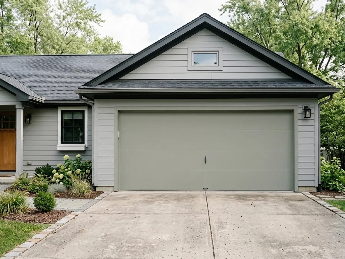
French Gray is one of Farrow & Ball's most-recommended colors, and the name is the one thing about it you should ignore. On the wall it is a soft, chalky green-gray — a sage more than a gray — that shifts from cooler and quieter in the morning to visibly green as afternoon light comes in. At LRV 42 it has real depth and holds its color well, but it is not the flat neutral gray the name promises, and that mismatch between expectation and paint is the single biggest source of disappointment with this color.
Kitchens and cabinets in decent daylight · bedrooms and bathrooms with a real window · hallways and entryways that need one calm color throughout · anyone who actually wants a soft green, not a true gray
You want a true, flat gray with zero green cast · your room is north-facing and genuinely dim · you're pairing it with a stark bright white trim · your floors and hardware are already fighting for attention
- A genuinely complex chalky sage, not a flat tinted gray
- Flatters oak, walnut and pine, and both brass and black hardware
- One of F&B's most popular, longest-running cabinet colors
- Shifts through the day instead of going flat — most owners like the movement
- A real classic with decades of use, not a trend color likely to date fast
- The name promises gray; the paint delivers visible green in good light
- Needs real daylight — north-facing, dim rooms mute it toward flat and murky
- Reads dingy next to a stark, bright white trim
- Farrow & Ball's sample-pot-first process is its own extra step for first-timers
What Color Is French Gray, Really?
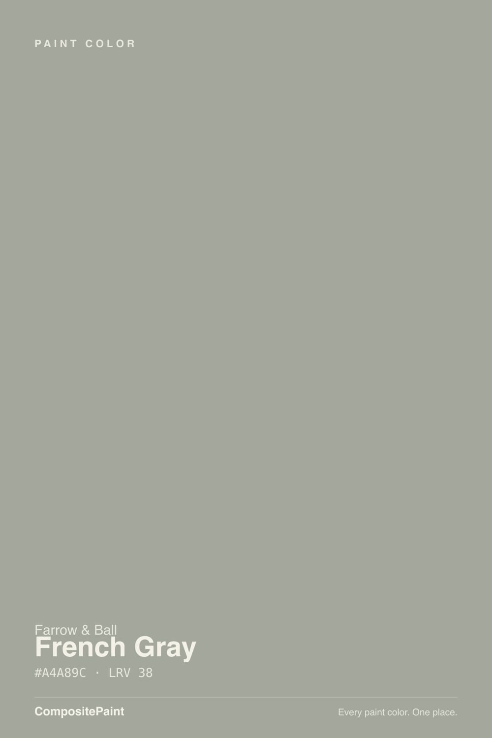
French Gray is one of Farrow & Ball's oldest and most-reached-for colors, and it is built on a lie its own name tells: this is a green-gray, and in real light the green usually wins. Farrow & Ball's chalky, pigment-heavy base gives it a soft, almost powdery depth that flat modern paints don't have — it reads less like "gray with a tint" and more like a genuine, complex sage that happens to lean gray in low light. At LRV 42 it sits solidly in mid-tone territory: not a pale wash, not a moody deep color, but enough depth to hold its own on four walls.
The light behavior is the whole story with this color, and it's consistent across every review that has actually lived with it: morning light reads it cooler and closer to true gray, while afternoon and south-facing light pulls the green forward until it's unmistakable. North-facing rooms keep it muted and quiet all day; south-facing rooms let the sage side come out in full. None of this is a flaw — it's exactly what a genuinely mixed pigment does — but it means the same tin of paint can look like two different colors in two different rooms of the same house.
Undertone in one line: green first, gray second, never blue. If your sample patch looks flat and cool, that's a north window or an overcast day talking, not a different paint; if it looks distinctly sage by 3pm, that's the color being honest about what's actually in the can.
Where It Shines
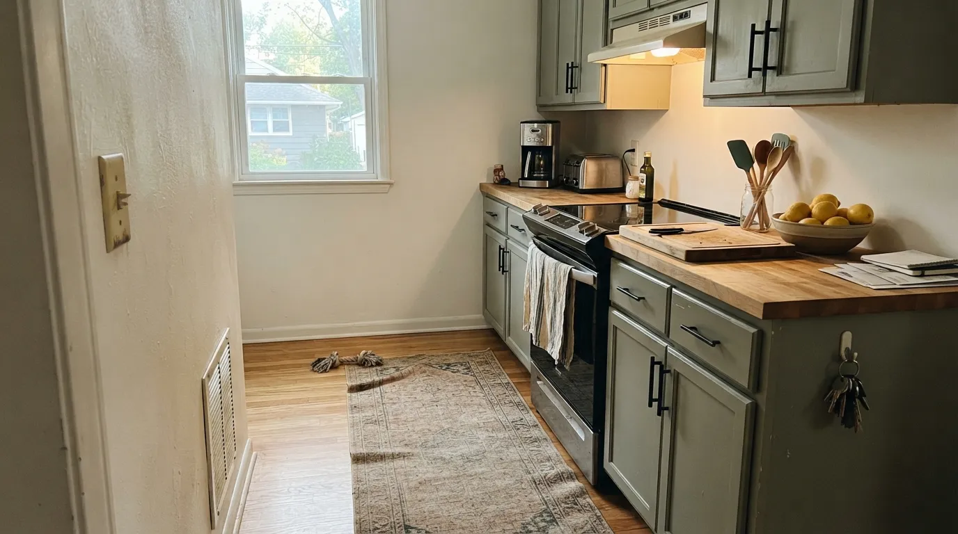
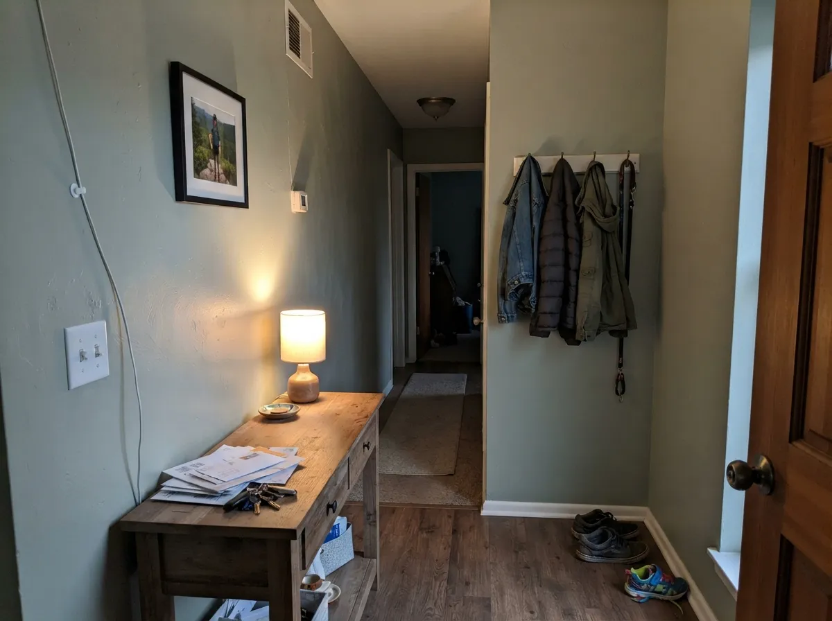
Give it real daylight and it becomes one of the most livable colors in the Farrow & Ball line — calm enough for a whole-house neutral, interesting enough that it never reads boring. Kitchens are where it's most requested: on cabinets, French Gray flatters both brass and matte black hardware, works with oak, walnut and pine, and photographs like a much more expensive custom color than it is. Hallways and entryways benefit the same way White Dove does for warm whites — one consistent color carrying the eye room to room, with a soft off-white trim doing the contrast work instead of a second wall color.
Where It Fails
Almost every disappointed French Gray story traces back to one of three mismatches, and all three are avoidable if you know what the paint actually is before you buy the gallon.
This is the single most common surprise with this color. The chip and the name both suggest a clean, neutral gray; the wall, especially by afternoon, reads as a soft sage. If "gray" in your head means "no visible color," sample a real-sized patch and look at it at 3pm before committing — and if it still reads too green, Sherwin-Williams Light French Gray is the color your brain was actually picturing.
Cool, low daylight mutes the green almost entirely and can leave the wall reading flat and a little murky rather than the intentional, complex sage it is in better light. This isn't unique to French Gray — every mid-tone green-gray in this family behaves the same way — but it's worth knowing before you paint a windowless hallway with it.
French Gray's chalky, muted pigment needs a similarly soft trim to read intentional. Pair it with a builder-grade bright white and the wall can look dingy by comparison — the contrast is too sharp for how quiet this color actually is. A soft off-white like Wevet or Slipper Satin keeps the whole room reading calm instead of mismatched.
Room by Room
In a room that gets genuine afternoon sun it's a quietly sophisticated neutral that flatters wood furniture without competing with it. In a dark, north-facing living room, sample first — you may end up with more gray than green, which some readers actually prefer.
The color designers reach for when a client wants "a green that doesn't scream green." Estate Eggshell on cabinets holds up to daily use, flatters both brass and black hardware, and pairs easily with oak, walnut or butcher block counters.
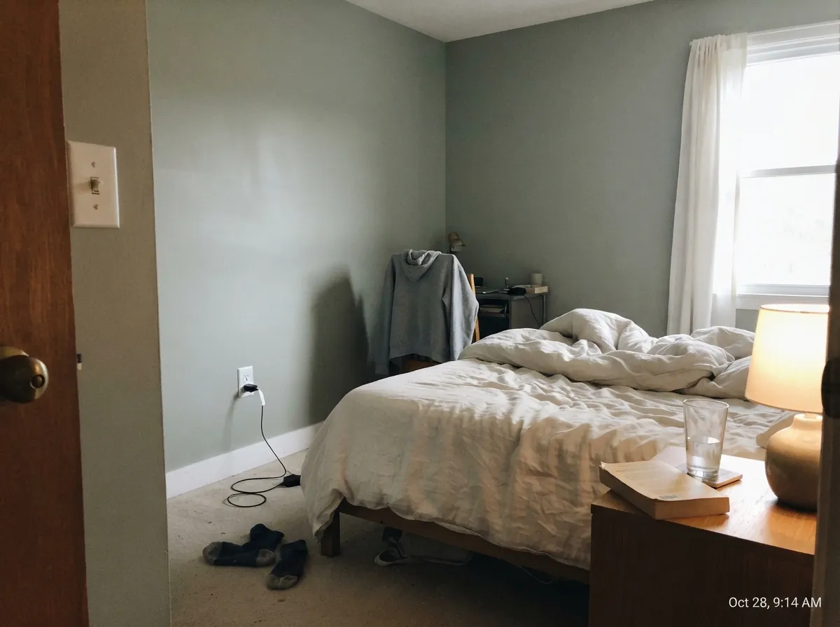
The morning-to-afternoon shift is part of the appeal here — cool and restful when you wake up, warmer and greener by evening. Estate Emulsion matte hides wall texture and keeps the depth soft.
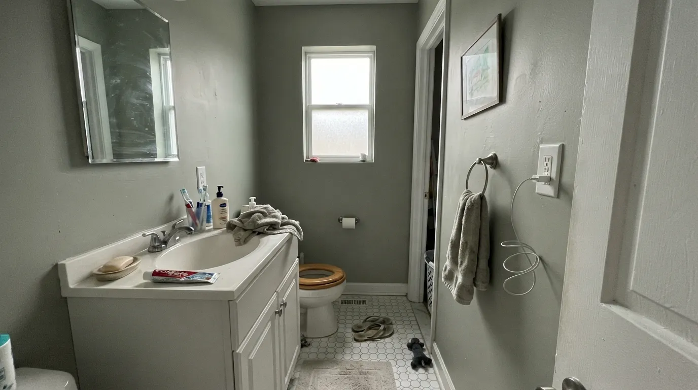
With a real window it's calm and spa-like against white tile or brass fixtures. In a windowless powder room lit only by cool bulbs, it can read flatter and grayer than intended — check your bulb temperature before you paint.
One consistent color from the front door through the hall reads deliberate rather than indecisive, and the shifting light as you move room to room actually works in the color's favor here instead of against it.
Under evening lamplight it settles into a muted, sophisticated green-gray that suits a dinner table well. Skip it if the room is lit mostly by daylight from a north window and you specifically want gray, not green.
Your Light Is the Risk
The green comes forward and the color reads as a genuine, confident sage. This is French Gray at its most honest.
Cool, low daylight mutes the green almost completely and can leave the wall looking flat and slightly murky. Test before committing if this is your only light source.
Mornings read cooler and closer to true gray; by mid-afternoon the sage side is unmistakable. Same paint, two different moods in one day.
Warm 2700K bulbs settle it into a muted, khaki-leaning green-gray — cozy, not gray at all. Cool white LEDs flatten it back toward gray and can look slightly dull.
Most complaints about French Gray are a light mismatch. Upload a photo of your actual room and see it on your walls — then ask for the same wall in north light or evening lamps before you buy a single sample.
Need It From Another Brand?
Any paint counter can custom-tint Farrow & Ball No. 18 directly. If you would rather stay in one brand's own deck, these are the closest stock matches, measured as ΔE2000. Under 2 is a difference you will not see on the wall.
| Brand | Closest color | ΔE | LRV | |
|---|---|---|---|---|
| Sherwin-Williams | Cascade GreenSW 66 · Sherwin-Williams | 2.8 | 43 | Color page → |
| Behr | Desert SandstormBXC-43 · Behr | 2.0 | 43 | Color page → |
| Benjamin Moore | Finnie GrayCW-55 · Benjamin Moore | 3.6 | 42 | Color page → |
| Valspar | Soothing Sage8004-23C · Valspar | 3.4 | 41 | Color page → |
| PPG / Glidden | Photo GrayPPG1029-4 · PPG / Glidden | 1.4 | 41 | Color page → |
| Glidden | Photo GrayPPG1029-4 · Glidden | 1.3 | 41 | Color page → |
Similar Farrow & Ball Colors
The nearest shades to French Gray within Farrow & Ball's own range, ranked by perceptual color distance — useful when you want the same look a touch lighter, darker, or warmer.
WCAG 2.1: AA is 4.5 : 1 for normal text, 3 : 1 for large text, AAA is 7 : 1.
French Gray vs the Colors You're Also Considering
Every French Gray sample board has the same rivals on it. The numbers show the real lightness gap — then it comes down to which risk you would rather live with.
Pick this if you want a color that visibly reads green in daylight, not one that merely implies gray on the label.
Sherwin-Williams SW 55 · LRV 53Light French GrayPick this if you actually want the gray the name promises — it only flashes violet in cool light and settles genuinely gray the rest of the time.
Pick this for the quieter, more gray-leaning version that argues less with a room's other colors.
Sherwin-Williams SW 9130 · LRV 30Evergreen FogPick this for a sage that fully commits to green, especially on cabinets, instead of hedging toward gray in low light.
Pigeon No. 25 (LRV 35) is the closest well-known relative. It is a shade darker and leans a little more blue-green, so it feels moodier and cooler on the wall. Choose French Gray when you want the lighter, softer, more clearly sage version, and Pigeon when you want more depth and a stronger cool note.
Light Gray No. 17 (LRV 38) shares the same lightness but tips warmer and more yellow, reading as a greige rather than a green-gray. If your room has a lot of warm wood or cream and the sage feels too cool, Light Gray is the friendlier match.
Mizzle No. 266 (LRV 38) is very close in both depth and green lean, just marginally softer. It is a near-swap; French Gray tends to hold its sage a touch more assertively in bright light.
French Gray Coordinating Colors
The rule for coordinating with French Gray: keep trim soft, not stark, and let one deeper color carry the contrast the wall itself won't. It pairs easily with warm off-whites, deep near-blacks, and moody blues, and it shares a family resemblance with Farrow & Ball's other historic grays without being interchangeable with them. These are the partners that keep showing up in rooms that work:
Why the Name Confuses Everyone
French Gray takes its name from a 19th-century French decorating tradition, not from being a literal gray — and that gap between name and pigment is the most-repeated observation across every review of this color. It genuinely is a green-gray, built on Farrow & Ball's chalky, pigment-heavy base, and in real daylight the green side reliably wins over the gray side.
It's also easy to confuse with Farrow & Ball's other historic grays if you're shopping the deck by eye. Pigeon (No. 25, LRV 35) sits at a similar depth but is flatter and more purely neutral, with much less of a green shift through the day. Cornforth White (No. 228, LRV 60) is a lighter, warmer greige with far less green in it at all. If you tested a sample and it read "too green," one of those two is probably the color you actually wanted.
French Gray With Wood Tones and Floors
Wood is where this color does its best work. Oak, walnut and pine all sit comfortably against it — the green-gray is muted enough not to fight warm wood tones the way a brighter, more saturated sage would. On cabinets specifically, it's a favorite pairing with butcher-block counters and either brass or matte black hardware, both of which read as intentional rather than accidental next to the soft green.
The one thing to watch is flooring with a strong yellow-orange cast — very golden, heavily orange-toned oak can push the wall's green side harder than a paler or more neutral wood would. It's not a hard clash the way it can be with violet-based colors, but if your floor runs very golden, sample a large patch before committing to a full room.
Three Ready Palettes Built on French Gray
A color is never alone on the wall. These are complete combinations in the 60-30-10 pattern, with the reason each one holds together. Every one opens in the visualizer.
A warm off-white wall keeps the kitchen bright while the cabinets carry the green-gray depth; Off-Black hardware or a painted island grounds the softness instead of letting it wash out.
Try this palette in your roomA soft cream trim keeps the room from feeling cold in low morning light, and Hague Blue on a single door gives the eye one deep, changeable color to land on without fighting the wall for attention.
Try this palette in your roomOne consistent wall color from the entry through the hall reads deliberate rather than indecisive, with a soft (not stark) white keeping the trim from making French Gray look dingy by comparison.
Try this palette in your roomFrench Gray FAQ
Is French Gray actually gray?
Not really — it's a green-gray, and in good daylight the green is the part you notice. The name refers to a 19th-century French decorating tradition, not a literal color description. If you want a color with no visible green, this is the wrong one; look at Sherwin-Williams Light French Gray or Benjamin Moore Revere Pewter instead.
Is French Gray warm or cool?
It sits in between and shifts with the light. Morning and north-facing light read it cooler and closer to true gray; afternoon and south-facing light pull the green side forward. It's never blue-cool and never yellow-warm — the movement is between gray and sage.
Does it work on kitchen cabinets?
Yes — it's one of Farrow & Ball's most requested cabinet colors. Use Estate Eggshell for a durable, wipeable finish. It flatters both brass and matte black hardware and works with oak, walnut or butcher block counters.
What trim color goes with French Gray?
A soft off-white, not a stark bright white. Wevet, Slipper Satin or All White keep the whole room reading calm; a builder-grade bright white creates too much contrast and can make the wall look dingy next to it.
How is French Gray different from Farrow & Ball's Pigeon or Cornforth White?
Pigeon (No. 25, LRV 35) sits at a similar depth but reads flatter and more neutral, with less of the green shift. Cornforth White (No. 228, LRV 60) is much lighter and leans warm-greige rather than sage. French Gray is the greenest and most light-reactive of the three.
Will it look dated in a few years?
Unlikely — this is a long-standing Farrow & Ball classic, not a color tied to a current trend cycle. It carries more light-dependency risk than a flat greige, but far less trend risk than a saturated sage picked purely for the moment.
Have you painted with French Gray?
Rate it — one tap helps the next reader decide.
Ask a Question