Lamp Room Gray
The traditional English mid gray, reviewed honestly: the daylit rooms where it softens, the light that turns it sage, and why it is not the Repose Gray substitute US coverage sold you.

Jessica has spec'd whites and neutrals for more than 300 rooms and keeps a sample wall of painted drawdowns in her studio. Every color review is checked against real reader rooms in the comments and re-tested when a formula changes. About the testing process →
- 1Anonymous20
- 2Dorian Gray39
- 3Lamp Room Gray44
- 4Agreeable Gray60
- 5Pale Oak69
The Fast Verdict
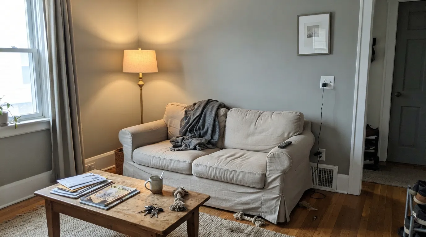
Lamp Room Gray is Farrow & Ball's old-fashioned mid gray — cool, faintly blue-green, and a full step darker than the American light greiges it keeps getting compared to. In a big, daylit room it drops back toward a sooty, lived-in off-white. In a small or north room it densifies and can flash sage. Buy it when you actually want a mid gray. Do not buy it as Repose Gray with a British accent.
Daylit living rooms and bedrooms · kitchen cabinets · large rooms that should feel lived-in, not new · anyone who wants a true mid gray instead of greige
You wanted a light gray · the room faces north and stays dim · the space is small and window-poor · you need a warm greige for resale
- True mid gray — cool, not a greige in disguise
- Softens in large daylight rooms into a lived-in dirty white
- Excellent on kitchen cabinets with wood and brass
- No violet flash — the usual Repose Gray failure is not this color's problem
- Historic F&B staple, not a 2015 trend gray
- Darker than the US light grays it gets compared to
- Sage-green flash in north light and under cool LEDs
- Packs up and looks dirty in small, closed rooms
- Cool enough to fight honey-gold oak
What Color Is Lamp Room Gray, Really?
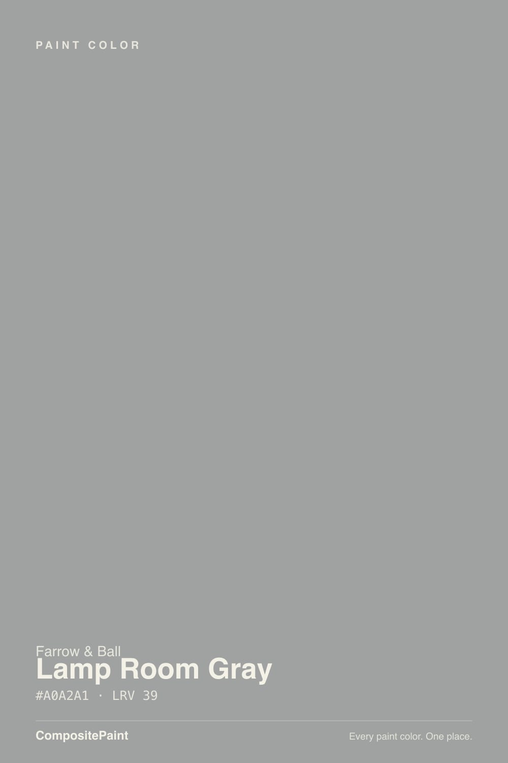
Lamp Room Gray is a cool mid gray with a faint blue-green breath — the color of plaster that has been lived with, not the color of a 2010s greige formula. Farrow & Ball mixed it to match the film old lamp rooms used to wear: white walls stained by soot from trimmed wicks. That origin is why it still sits between dirty white and stone, and why it never quite behaves like Repose Gray, even though US design coverage keeps pairing the two.
At LRV 44 it is a genuine mid-tone, not a light gray. Repose Gray sits at LRV 58 — fourteen points brighter, and a greige besides. That gap is the number-one sampling surprise. Put Lamp Room Gray next to Cornforth White (LRV 60) and it suddenly looks like a committed color; put it next to Down Pipe and it reads as the airy one. Plan for the wall to come out a step deeper and cooler than the card, especially once furniture is in and daylight is cut.
Undertone in one line: cool gray first, a whisper of blue-green second — never violet, never greige. In north light or under cool LEDs the sage shows; in west sun and 2700K lamps a mushroom-taupe warmth comes forward. If your sample looks purple, that is the neighbor wall or the floor talking. If it looks beige, you are seeing the warm light, not a yellow base.
Where It Shines
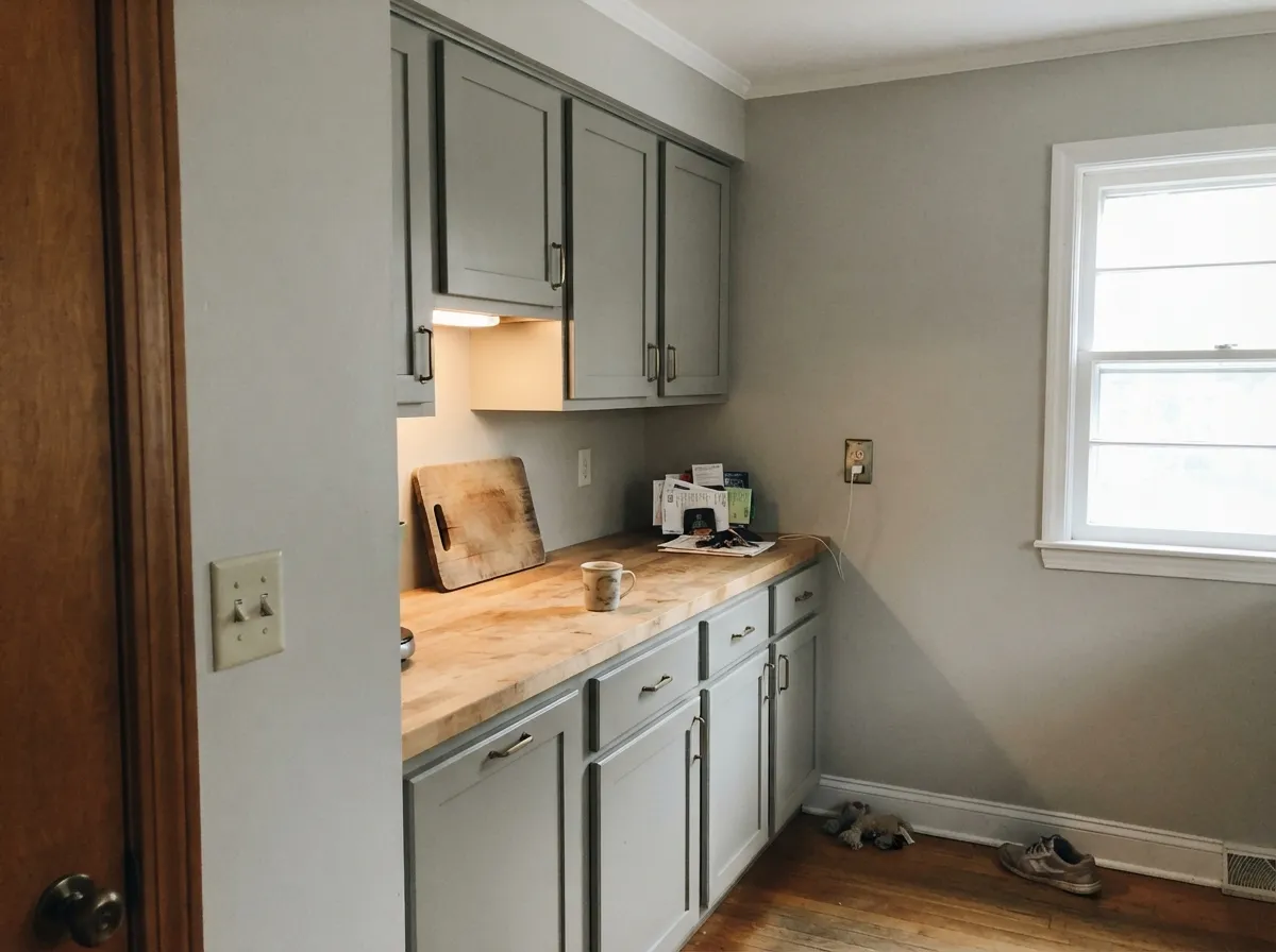
Give it real daylight and room to breathe and it is one of the most convincing mid grays in any deck. Large living rooms and bedrooms are its home: the color softens toward a dirty-white calm that makes oak floors, linen, and unlacquered brass look like they were chosen on purpose. Kitchen cabinets are the second act — satin or eggshell Lamp Room Gray under Strong White walls is a Farrow & Ball kitchen that does not scream for a designer credit. The Washington Post put it on a 2024 shortlist of grays that are not sad; Ptolemy Dean used it on the main bedroom of a Kent rectory. Both reads are the same paint: quiet, slightly sooty, not trendy.
Where It Fails
Almost every regret story about Lamp Room Gray follows one of three scripts, and all three are visible on the sample wall if you look at the right hour. None of them are the paint's fault — but if your room matches one, this is not your gray, and a bigger sample will only confirm it.
US coverage treats this as the Farrow & Ball stand-in for Repose Gray. It is not. Repose Gray is a light greige at LRV 58; Lamp Room Gray is a mid-tone at 44. On a chip in a bright store it looks polite. On four walls it is a committed gray. If airy was the brief, step up to Cornforth White or Ammonite — do not hope this one will lighten up after the furniture arrives.
North daylight strips the mushroom warmth and leaves the blue-green base exposed. Readers describe sage, dingy, even a little institutional. The color did not go green overnight; the light did. Test on the north wall at noon on an overcast day. If that swatch already looks like olive stone, pick a warmer gray or commit to 2700K lamps in every corner.
This gray packs up when the walls are close together. In a large, well-lit room it softens; in a powder room, inner hallway, or basement den it reads a step stronger and a step dirtier than the card. That is useful if you want a jewel-box gray. It is a nasty surprise if you painted the smallest room in the house expecting the living-room version.
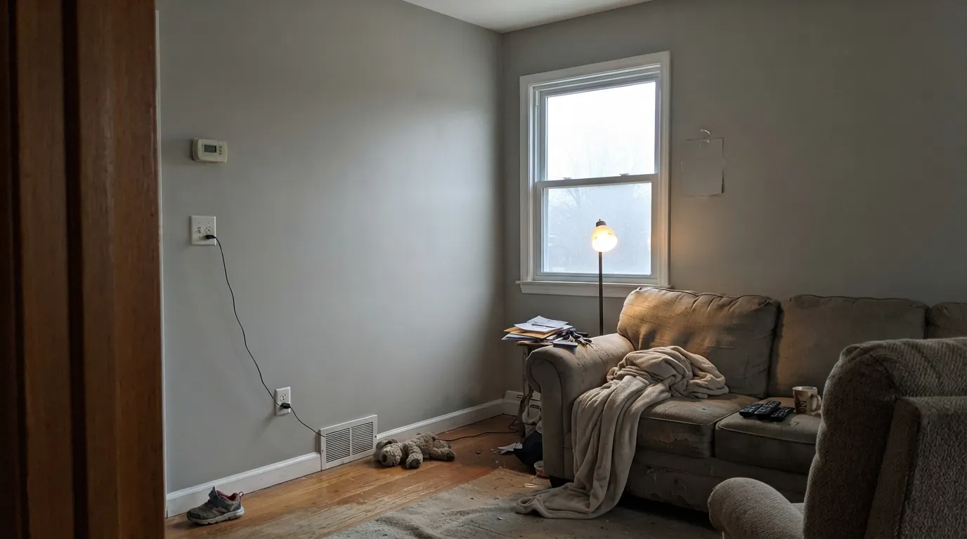
Room by Room
South or west light, a decent window, wood floors: this is the room the color was mixed for. Eggshell or Modern Emulsion; Strong White or Wevet on trim so the gray does not look dirty next to a brighter white. Linen, oak, and a bit of black metal keep it from going hotel.
Lamp Room Gray on cabinets under a paler F&B wall is a workhorse pairing: Strong White or Ammonite on the walls, this gray on the boxes, brass or unlacquered hardware. Eggshell or Full Gloss wipes clean. Whole-kitchen walls in it can work in a large, windowed kitchen; they feel cave-like in a galley with one window.
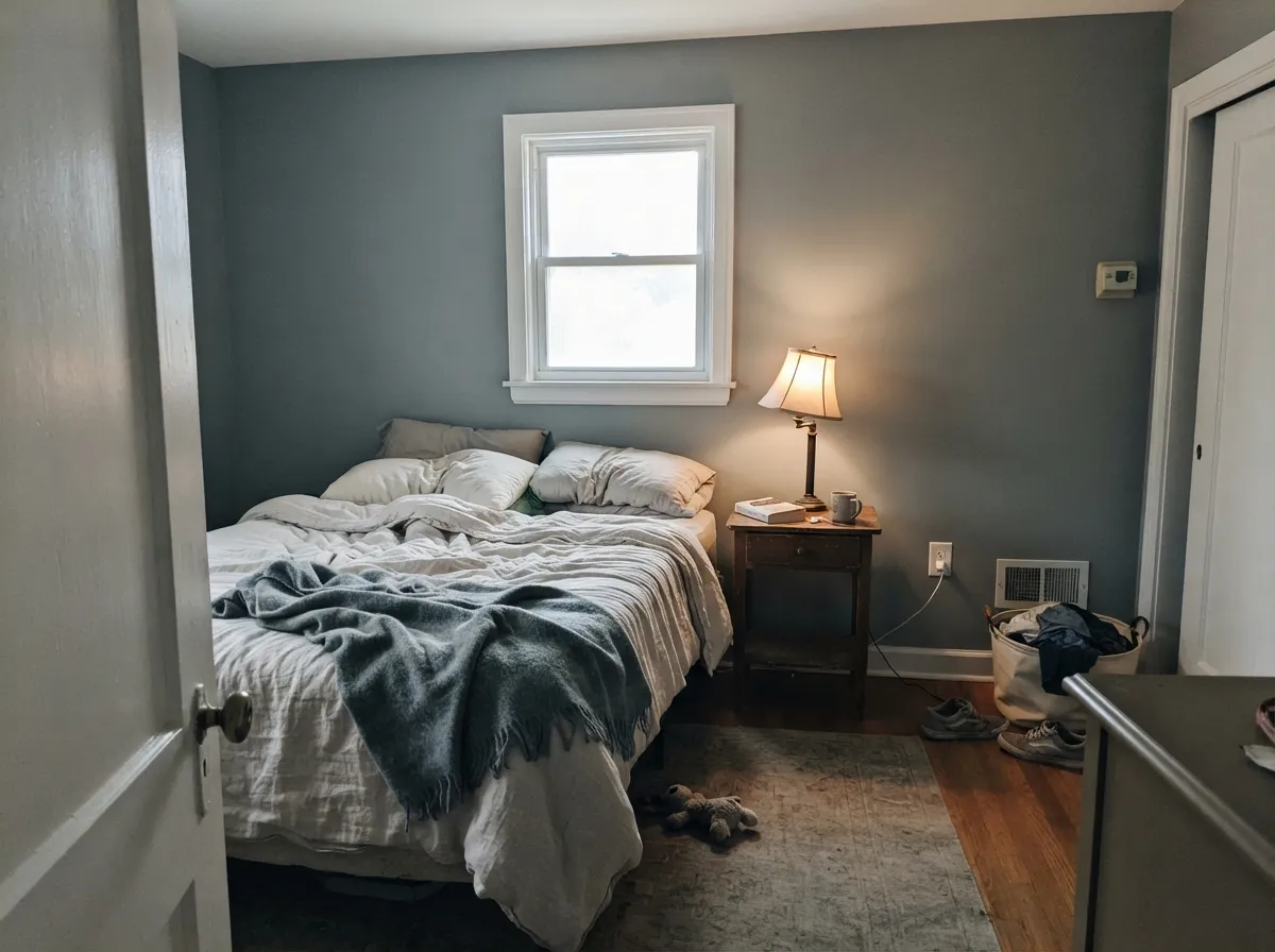
In a daylit bedroom it is restful without going nursery-pale. Matte or Estate Emulsion deepens it a touch; 2700K lamps keep the sage from taking over after dark. A north-facing bedroom with one small window is the skip — it will read heavier and greener than you sampled.
Closed dining rooms with evening lamps are flattering: the gray goes mushroom-warm at dinner and still looks like gray in the morning. Pair with Pointing or Strong White trim and walnut or oak, not orange builder stain.
A mid gray that does not go violet on camera is useful on Zoom walls. Keep the bulbs warm and the trim a grey-based white (Strong White) so the background stays calm instead of dingy.
Small and dim is the exact condition that makes this color densify. A powder room can work as a deliberate, sooty box; an interior hallway or basement rec room usually just looks underlit. Save it for rooms with a window.
Your Light Is the Risk
Full daylight lets the gray soften toward a sooty off-white. This is the honest, lived-in read the color is famous for.
Cool grey daylight exposes the blue-green base. Walls go sage-stone and a little institutional. Sample here first, on an overcast noon.
Gray and slightly green in morning cool light; mushroom-taupe as the sun drops. The shift is real — most owners like it, a few call it beige after 5pm.
2700K lamps pull the taupe forward and keep it from going olive. Cool white LEDs push blue-green — swap the bulbs before you repaint.
Most complaints about Lamp Room Gray are a light mismatch. Upload a photo of your actual room and see it on your walls — then ask for the same wall in north light or evening lamps before you buy a single sample.
Need It From Another Brand?
Any paint counter can custom-tint Farrow & Ball No. 88 directly. If you would rather stay in one brand's own deck, these are the closest stock matches, measured as ΔE2000. Under 2 is a difference you will not see on the wall.
| Brand | Closest color | ΔE | LRV | |
|---|---|---|---|---|
| Sherwin-Williams | AllegorySW 9553 · Sherwin-Williams | 1.3 | 45 | Color page → |
| Behr | Laid Back GrayT17-09 · Behr | 2.1 | 43 | Color page → |
| Benjamin Moore | Stone Harbor2111-50 · Benjamin Moore | 2.7 | 43 | Color page → |
| Valspar | Urban Sunrise4004-1B · Valspar | 1.7 | 45.3 | Color page → |
| PPG / Glidden | MercurialPPG1006-4 · PPG / Glidden | 3.2 | 44 | Color page → |
| Glidden | MercurialPPG1006-4 · Glidden | 3.2 | 44 | Color page → |
Similar Farrow & Ball Colors
The nearest shades to Lamp Room Gray within Farrow & Ball's own range, ranked by perceptual color distance — useful when you want the same look a touch lighter, darker, or warmer.
WCAG 2.1: AA is 4.5 : 1 for normal text, 3 : 1 for large text, AAA is 7 : 1.
Lamp Room Gray vs the Colors You're Also Considering
Every Lamp Room Gray sample board has the same rivals on it. The numbers show the real lightness gap — then it comes down to which risk you would rather live with.
Pick this when you actually want a mid gray with no greige and no lavender — darker, cooler, and more English.
Sherwin-Williams SW 7015 · LRV 58Repose GrayPick this if you want the lighter, greige American default — airier, and the one with the famous violet flash in north light.
Pick this when Cornforth White feels like a pale suggestion and you want the wall to hold a real mid-tone.
Farrow & Ball No. 228 · LRV 60Cornforth WhitePick this if you need the Farrow & Ball gray to stay light — it reads three different colors, but it will not densify the way Lamp Room Gray does.
Pick this when you want the cool gray without the violet, and you are already in the Farrow & Ball system.
Sherwin-Williams SW 55 · LRV 53Light French GrayPick this if you want the truest gray in the Sherwin-Williams deck at a slightly lighter depth — knowing it can flash violet in cool light.
Manor House Gray (No. 265), LRV 35, is the closest neighbor and slightly darker. It carries a touch more depth and cool charcoal character, so it feels a little more serious in the same room. Choose Manor House Gray when you want more contrast against white trim, and Lamp Room Gray when you want a softer, more flexible mid-gray.
Pigeon (No. 25), LRV 34, is darker again and has a clear green-gray character. Where Lamp Room Gray stays neutral, Pigeon commits to a soft, muted green that suits nature-led schemes. If you specifically want green, go Pigeon; if you want a color that stays out of the way, stay with Lamp Room Gray.
Worsted (No. 284), LRV 33, leans warmer and greiger. Side by side, Worsted looks like the warm option and Lamp Room Gray the cooler, cleaner one. Warm-lit rooms often flatter Worsted, while cooler or brighter rooms suit Lamp Room Gray.
Lamp Room Gray Coordinating Colors
The rule for coordinating with Lamp Room Gray: grey-based whites, tonal Farrow & Ball grays, and one darker lead or blue-black — and keep bright gallery whites at arm's length. It likes oak, walnut, linen, and unlacquered brass. These are the partners that keep showing up in rooms that work:
The Lamp-Wick Gray, Not the Repose Gray
The name is documentary, not poetic. Nineteenth-century lamp rooms were finished in white; trimming the wicks left a blue-grey soot film on the plaster, and Farrow & Ball mixed No. 88 to match that dirty white. The Washington Post, putting it on a 2024 list of grays that are not dull, called the result contemplative. Ptolemy Dean used it on the main bedroom of a Kent rectory — a closed, English room, not an open-plan American great room. That is the native habitat.
The US press comparison to Repose Gray is useful only as a warning. Repose Gray is the safe modern greige with one real weakness (violet in cool light). Lamp Room Gray is older, darker, and cooler. It will not give you the airy 2010s open-plan gray. It will give you a mid wall that still reads as gray in a photograph, which is rarer than the chip racks suggest.
Lamp Room Gray With Wood Tones and Floors
Pale oak, white oak, and walnut are the easy yes — the cool gray makes the wood look chosen rather than leftover. Grey-washed floors and sisal are safe. Cream linen and unlacquered brass are the textiles and metals it was waiting for; matte black window hardware is fine.
The honest no is golden: honey oak floors, orange builder stain, yellow-beige carpet. Cool gray pushes those yellows toward pumpkin, and the walls pick up extra sage in the bounce. A large rug can broker a truce in a living room; in a kitchen with honey cabinets already in place, pick a warmer gray or a greige and stop fighting the floor.
Chrome and polished nickel go a little display-kitchen against it. Brass, antique bronze, and unlacquered brass are the better metals — they warm the gray without asking it to become greige.
Three Ready Palettes Built on Lamp Room Gray
A color is never alone on the wall. These are complete combinations in the 60-30-10 pattern, with the reason each one holds together. Every one opens in the visualizer.
A grey-based white keeps Lamp Room Gray from looking dingy the way a brighter white would. Down Pipe on the doors supplies one lead-gray note so the mid walls read deliberate, not leftover builder gray.
Try this palette in your roomAmmonite is the lighter F&B greige, so the cabinets carry the color and the walls stay airy. Pointing on the ceiling keeps the kitchen from going cold — the one warm off-white most Farrow & Ball houses already run.
Try this palette in your roomWevet is the coolest F&B white, so the gray stays gray instead of warming into beige at the trim line. Pigeon, a step deeper and more changeable, gives one quieter plane without leaving the family.
Try this palette in your roomLamp Room Gray FAQ
Is Lamp Room Gray warm or cool?
Cool — a true mid gray with a faint blue-green breath. Warm 2700K bulbs and west sun can pull a mushroom-taupe out of it, which is why some photos look almost beige, but the base is not greige. If you need a warm gray for resale, this is the wrong deck slot.
Is it the Farrow & Ball version of Repose Gray?
Only in magazine shorthand. Repose Gray is a light greige at LRV 58 with a known violet flash in north light. Lamp Room Gray is a mid-tone at LRV 44, cooler, and it goes sage rather than lavender when the light turns on it. If you loved Repose in a sunny house and want the same airiness, look at Cornforth White, not this.
What trim white goes with Lamp Room Gray?
A grey-based white. Strong White is the default — it shares the cool, slightly dirty character so the walls do not look unwashed. Wevet is the cooler, more delicate option. Pointing works if you want a little warmth at the edges. A bright pure white (All White territory) makes this gray look dingy the way any mid-tone does next to a gallery white.
Does it look green?
In north light and under cool LEDs, yes — a sage-stone flash, not a true green like French Gray. In south light it reads as a sooty gray. Sample on the coolest wall in the house at noon; that is the greenest it will ever go, and if you hate that swatch you will hate the room.
Can I use it on kitchen cabinets?
Yes — it is one of the better Farrow & Ball cabinet grays, especially under Ammonite or Strong White walls with brass or unlacquered hardware. Eggshell or Full Gloss. A whole kitchen of these walls only works if the room has real windows; a galley will feel heavier than the chip.
Will it work in a small room?
Usually not the way you hope. Farrow & Ball itself has always warned that this gray is surprisingly strong in smaller rooms and only softens in larger, well-lit ones. A powder room can be a deliberate sooty box. An inner hallway or basement den just looks underlit. Save it for rooms with a window.
Have you painted with Lamp Room Gray?
Rate it — one tap helps the next reader decide.
Ask a Question