Pigeon
Farrow & Ball's best-selling chameleon neutral, reviewed honestly: the light that turns it green, the light that flattens it to blue, and where it actually earns the reputation.

Jessica has spec'd whites and neutrals for more than 300 rooms and keeps a sample wall of painted drawdowns in her studio. Every color review is checked against real reader rooms in the comments and re-tested when a formula changes. About the testing process →
- 1Black Fox7
- 2Pewter Green12
- 3Pigeon34
- 4Stardew43
- 5Sea Salt63
The Fast Verdict
Pigeon is the color people ask for when they want "just a nice gray" and end up with something far more interesting. It is genuinely three colors depending on the room: a soft sage-green in strong daylight, a smoky blue in a dim hallway, and a plain warm gray everywhere in between. That instability is exactly why designers reach for it and exactly why some buyers feel misled — this is not a set-it-and-forget-it neutral.
Kitchen islands and cabinets · boot rooms, mudrooms and entryways · powder rooms and small baths · studies, dens and panelled rooms · front doors · anyone who wants a neutral with more personality than gray but less commitment than green
You want a color that reads the same in every room of the house · your space only gets dim, indirect light · you're painting an entire small kitchen wall-to-wall in it · you need a guaranteed-stable gray for a resale flip
- Genuinely shifts blue, green and gray through the day — never reads flat or boring
- One of Farrow & Ball's most consistently recommended neutrals, with decades of real rooms to check it against
- Proven job on kitchen islands, cabinetry and boot rooms
- Deep enough (LRV 35) to read as a real, considered color rather than a hint of one
- Sold across F&B's full finish range, including gloss for doors and exterior eggshell for trim
- Buyers who want a stable, predictable gray find the shift genuinely frustrating
- Dim, low-daylight rooms flatten it toward a cool, slightly lifeless blue-gray
- A full small kitchen wall-to-wall in it can read heavy rather than characterful
- F&B's traditional formulas often need a careful third coat and cost more than a big-box greige
What Color Is Pigeon, Really?
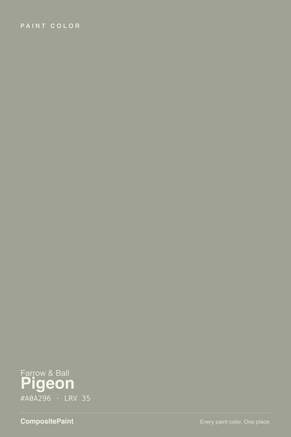
Farrow & Ball's own card files Pigeon as a gray, but the paint on the wall rarely agrees. It's built on a green-gray base with a blue-gray undercurrent, and which one shows depends entirely on the light: strong, indirect daylight pulls the green forward until it reads close to a soft sage; dim corners and north-facing rooms drain that green out and leave a cooler, smokier blue-gray behind. Named for the color of London street pigeons, it has been in the F&B deck for decades and is one of the brand's most consistently recommended neutrals for exactly this reason — it never looks flat.
At LRV 35 it sits solidly in the mid-tone range: light enough to work on walls without swallowing a room, dark enough that it reads as a real, considered color rather than a whisper of one. That depth is also why the shift is so noticeable — a paler green-gray would just look pale in poor light, but Pigeon has enough saturation to visibly change character rather than merely dim.
Undertone in one line: green first in good light, blue first in low light, plain warm gray in between — never yellow, never truly neutral. If a sample looks flat and lifeless, that's a light problem, not a paint problem; move it to a wall that actually catches daylight before judging it.
Where It Shines
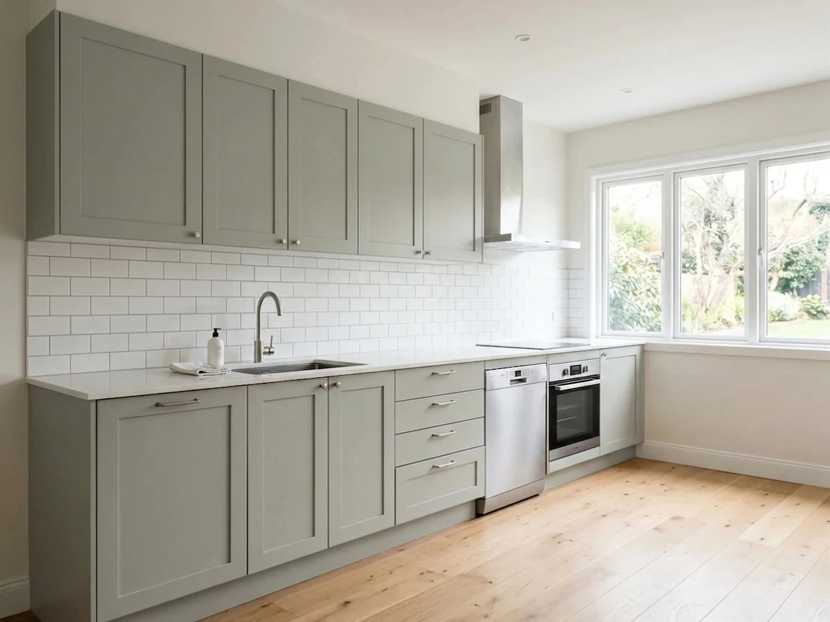
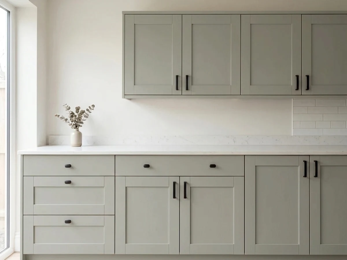
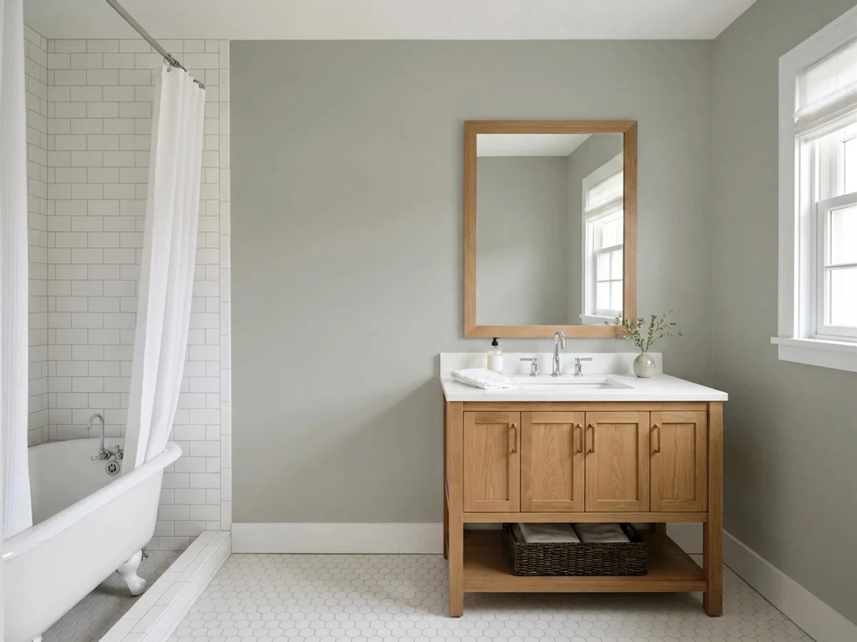
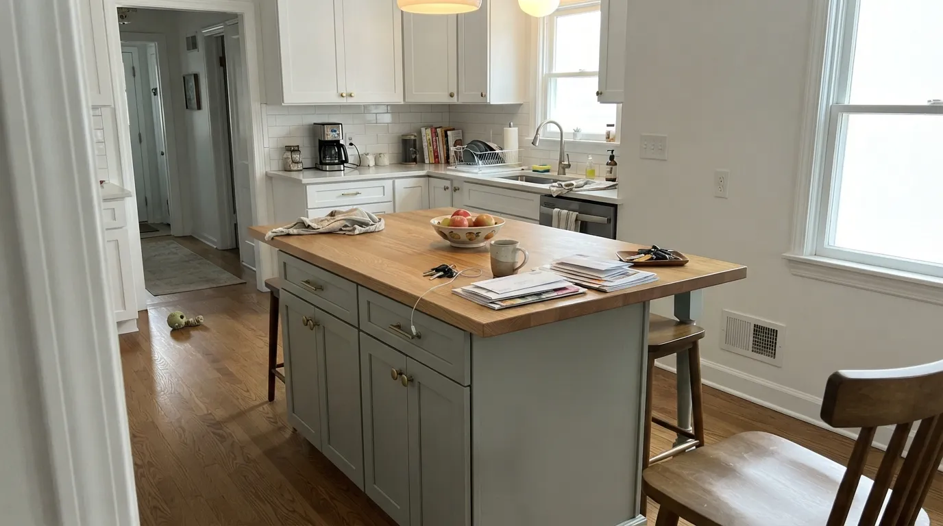
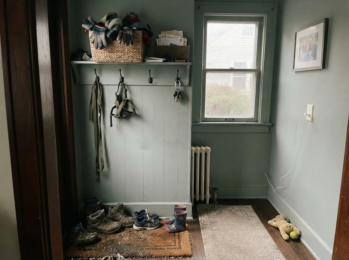
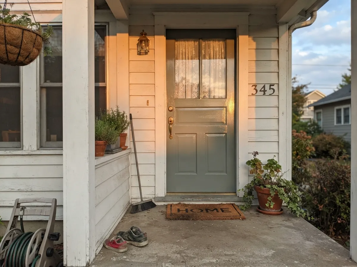
Give it real, indirect daylight and company it was built for — oak, brass, aged wood, painted panelling — and Pigeon looks expensive without trying. It has become the default answer for kitchen islands and cabinetry runs that want more depth than a builder greige, and it's a genuine F&B signature in boot rooms, cloakrooms and mudrooms, the slightly darker utility spaces where a stark white would feel clinical and a bold color would feel wrong. On a front door in full gloss, it reads as a considered blue-gray rather than a generic "greige door."
Where It Fails
Almost every disappointed Pigeon story traces back to one of three setups, and all three show up before the first coat dries. None of them are the paint failing — they're the paint being asked to do a job it was never suited for.
Pigeon is not that. It is a genuine chameleon, and buyers who need one fixed color — for a resale flip, for matching an existing scheme exactly — get frustrated when it reads green in the afternoon and blue by evening lamp. If a true, non-shifting gray is the goal, Benjamin Moore Gull Wing Gray holds its line in almost any light; Pigeon does not, on purpose.
Take away the light that makes the green come forward and Pigeon flattens into a cool, slightly lifeless blue-gray — readers describe it as "muddy" or "just meh" in north-facing rooms with small windows. The color needs daylight to do its trick; without it, it just sits there.
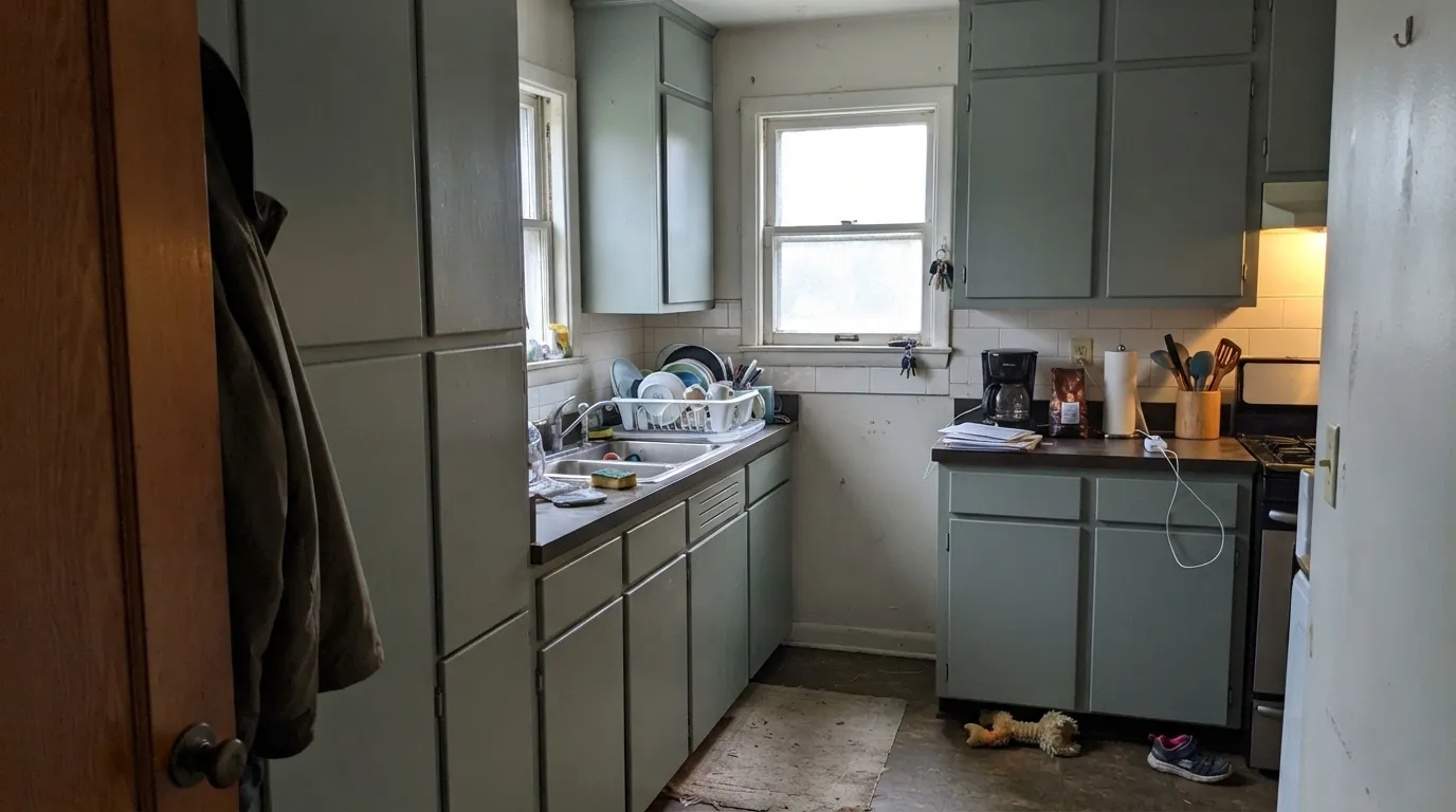
Owners on Houzz specifically flag this: a full run of Pigeon cabinets in a small kitchen can read heavy and dark rather than characterful. It reads best carrying the island or the lower cabinets while a lighter partner — All White, Cornforth White — keeps the perimeter and upper cabinets airy.
Room by Room
Best on an island or a run of lower cabinets with a lighter perimeter; a full wall-to-wall kitchen in it can feel heavy in a small room. Brass and oak both flatter it. Satin or a urethane-fortified cabinet enamel for durability.
This is the room type Pigeon was practically built for: a slightly darker, more forgiving utility space where scuffs are inevitable and a stark white would show every one. Panelling and coat hooks in it look considered, not gloomy.
A powder room is small enough to take a color this changeable without the shift becoming distracting — you catch it as an interesting detail rather than an inconsistency. Marble or brass fittings both work with it.
Low, warm evening light and dark wood shelving are its best company; this is where the smoky blue-gray side reads deliberate and library-like rather than dim.
Farrow & Ball sells it in Full Gloss for doors and Exterior Eggshell for wood and metal specifically for this use. Outdoors in full sun it reads more clearly blue-gray and less green than it does indoors.
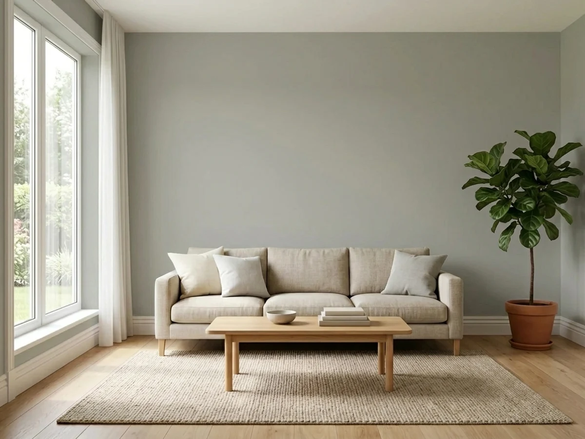
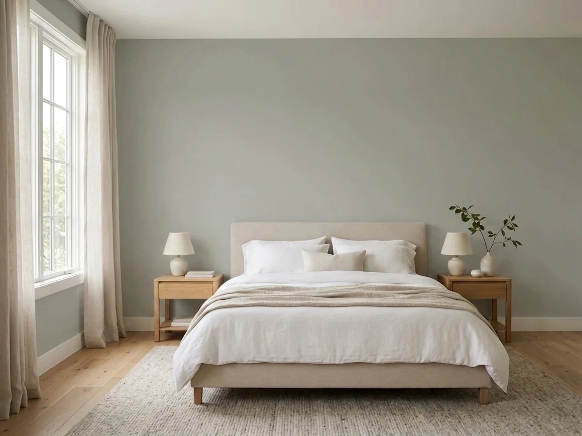
Works if the room gets genuine indirect sun through most of the day; in a dim living room or a north bedroom it will read flatter and colder than the swatch promised. Pair with a lighter, warmer neutral on trim to keep the room from feeling heavy.
Your Light Is the Risk
The green comes forward and the color reads soft, sage-leaning and alive. This is the light Pigeon was built for.
The green drains out and it flattens toward a cool, slightly lifeless blue-gray. Readers call it "muddy" here. Test before committing a dark room to it.
Bluer in morning shade, greener at midday, plain warm gray in between. Most owners come to like the movement rather than fight it.
2700K lamps pull it toward a smoky, blue-leaning gray. Cool LEDs flatten it further and cancel the green almost entirely — swap bulbs before you swap paint.
Most complaints about Pigeon are a light mismatch. Upload a photo of your actual room and see it on your walls — then ask for the same wall in north light or evening lamps before you buy a single sample.
Need It From Another Brand?
Any paint counter can custom-tint Farrow & Ball No. 25 directly. If you would rather stay in one brand's own deck, these are the closest stock matches, measured as ΔE2000. Under 2 is a difference you will not see on the wall.
| Brand | Closest color | ΔE | LRV | |
|---|---|---|---|---|
| Sherwin-Williams | Acacia HazeSW 9132 · Sherwin-Williams | 1.1 | 32 | Color page → |
| Behr | Natures GiftN410-4 · Behr | 2.4 | 35 | Color page → |
| Benjamin Moore | Heather Gray2139-40 · Benjamin Moore | 1.4 | 34 | Color page → |
| Valspar | Secret RetreatT687 · Valspar | 2.2 | 32.9 | Color page → |
| PPG / Glidden | Steel CurtainPPG0994-5 · PPG / Glidden | 3.2 | 34 | Color page → |
| Glidden | Steel CurtainPPG0994-5 · Glidden | 3.0 | 34 | Color page → |
Similar Farrow & Ball Colors
The nearest shades to Pigeon within Farrow & Ball's own range, ranked by perceptual color distance — useful when you want the same look a touch lighter, darker, or warmer.
WCAG 2.1: AA is 4.5 : 1 for normal text, 3 : 1 for large text, AAA is 7 : 1.
Pigeon vs the Colors You're Also Considering
Every Pigeon sample board has the same rivals on it. The numbers show the real lightness gap — then it comes down to which risk you would rather live with.
Pick this for the color that keeps moving between blue, green and gray instead of settling on one.
Sherwin-Williams SW 9130 · LRV 30Evergreen FogPick this if you want the green committed and stable — Evergreen Fog stays sage in far more lighting than Pigeon does.
Pick this for the lighter, more livable, wall-friendly version of the same lead-gray family.
Farrow & Ball No. 26 · LRV 11Down PipePick this for the same F&B blue-gray family, several shades darker and more dramatic — a good trim or accent partner for Pigeon itself.
French Gray (No. 18), LRV 38, is Pigeon's closest cousin on this site and slightly lighter. French Gray reads a touch cleaner and cooler; Pigeon carries a bit more warmth and depth, so choose French Gray when you want the same green-gray feel but airier, and Pigeon when you want joinery to feel more grounded.
Manor House Gray (No. 265), LRV 35, sits at the same lightness but is a more purely neutral gray with far less green. If you find Pigeon reads too sage in your light, Manor House Gray gives you the same mid-tone weight without the color lean.
Lichen (No. 19), LRV 34, goes the other direction: it is a clearly greener, more olive version at almost the same LRV. Pick Lichen when you actually want the room to read green, and Pigeon when you want the green to stay quiet and gray.
Pigeon Coordinating Colors
The rule for coordinating with Pigeon: keep the partners either much lighter or much darker, and let Pigeon itself carry the mid-tone. Farrow & Ball's own off-whites are the easiest match because they share the same slightly grayed base; a near-black in the same family gives the scheme one grounding note without introducing a second shifting color.
Why Pigeon Won't Sit Still
Pigeon has been in the Farrow & Ball deck for decades and named, plainly, for the color of London street pigeons — a color that itself reads different depending on where the bird is standing. That's not a coincidence; it's the whole design intent. F&B builds many of its neutrals with more raw pigment complexity than a standard commercial gray, which is what lets a color shift genuinely between undertones instead of just dimming in low light.
That complexity is why Pigeon shows up so often on designer mood boards for boot rooms, kitchen islands and panelled studies: rooms where the paint is meant to be looked at, not just clocked as "the gray one." It's also why it does not suit a use case where predictability is the whole point — matching an existing scheme exactly, or a resale flip where every buyer needs to read it the same way.
Pigeon With Wood Tones and Metals
Oak — pale or honey — and aged or unlacquered brass are its best company; both are warm enough to counter the cooler blue side and let the green come through. Walnut and dark stained wood push it toward the moodier, more Down-Pipe-adjacent read, which works well in a study but can feel heavy in a small kitchen.
Polished chrome and stainless steel are the one combination to sample carefully — they emphasize the blue-gray side and can leave the room feeling colder than intended, especially without much daylight. If your kitchen is running mostly steel appliances and cool countertops, test a large sample under your actual lighting before committing an island to it.
Three Ready Palettes Built on Pigeon
A color is never alone on the wall. These are complete combinations in the 60-30-10 pattern, with the reason each one holds together. Every one opens in the visualizer.
This is the F&B trio boot rooms and mudrooms keep coming back to: Pigeon on the walls reads calm and utilitarian, Wevet keeps the trim from going stark, and Studio Green on the door supplies the one near-black note the scheme needs without another shifting color to manage.
Try this palette in your roomAnswers the exact Houzz worry directly: keep Pigeon on the island alone, let Cornforth White and Ammonite carry the walls and perimeter cabinets, and the kitchen stays light while the island gets all the color and none of the heaviness a full run would risk.
Try this palette in your roomTwo depths of the same blue-gray family plus a warm greige ceiling keeps a panelled den layered instead of matchy — Down Pipe grounds the built-ins, Elephant's Breath overhead stops the room from feeling like a box.
Try this palette in your roomPigeon FAQ
Is Pigeon gray, green or blue?
All three, depending on the room. Farrow & Ball files it as a gray, but strong indirect daylight pulls green forward and dim or north-facing rooms push it toward a smoky blue. It genuinely shifts more than most neutrals — that's the whole appeal for people who like it, and the whole complaint for people who wanted one fixed color.
Is Pigeon good for kitchen cabinets?
Yes, and it's one of F&B's most-asked-about cabinet colors — but the safest version puts it on an island or lower cabinets only, with a lighter color on the walls and upper cabinets. A full small kitchen wall-to-wall in Pigeon can read dark rather than characterful; owners on Houzz say exactly this.
What's the difference between Pigeon and French Gray?
They're close cousins in the same F&B family. French Gray reads more saturated and more clearly green-gray; Pigeon is the lighter, bluer, more changeable sibling. If you want the color to hold its green more consistently, French Gray is the safer pick.
Does Pigeon work on a front door?
Yes — Farrow & Ball sells it in Full Gloss specifically for doors and Exterior Eggshell for other wood and metal trim. Outdoors in full sun it reads more clearly blue-gray than the green-leaning version you might see indoors.
Will Pigeon look too dark in a small room?
At LRV 35 it's a genuine mid-tone, not a deep color, but in a small room with limited daylight it can feel heavier than the paint chip suggests. Boot rooms, powder rooms and studies — the small, slightly darker spaces it was built for — handle this well; a small bedroom with one small window is the riskier bet.
How many coats does Pigeon need?
Plan for at least two, and F&B's traditional water-based formulas sometimes want a careful third for full, even coverage, especially over a lighter existing color. Budget the extra coat and the extra cost against a domestic-brand greige before comparing prices.
Have you painted with Pigeon?
Rate it — one tap helps the next reader decide.
Ask a Question