Down Pipe
Farrow & Ball's original lead-gray, reviewed honestly: the blue that shows up in every light, the front doors and islands it was born for, and the one thing about it that surprises almost everyone.

Jessica has spec'd whites and neutrals for more than 300 rooms and keeps a sample wall of painted drawdowns in her studio. Every color review is checked against real reader rooms in the comments and re-tested when a formula changes. About the testing process →
- 1Urbane Bronze8
- 2Down Pipe13
- 3Retreat21
- 4Stardew43
The Fast Verdict
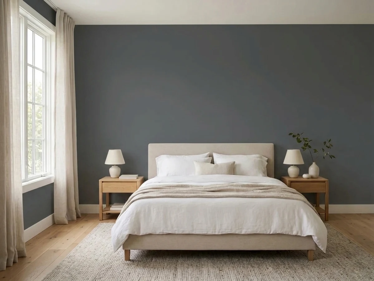
Down Pipe is the gray that made moody, not-quite-black paint a design-world habit — a genuine lead-gray with a cool blue undercurrent, dark enough to anchor a room without going full black. Under warm light it reads rich and considered; under cold light it flattens toward institutional steel. The single most common surprise: people expect it to look black, and on the wall it is unmistakably, beautifully gray-blue instead.
Kitchen islands and cabinetry · front doors in full gloss · hallways, stairwells and entries that want drama · home offices and dens as a backdrop for art · anyone who wants the mood of black without committing to black
You actually want a true black · your room runs cold north light with no warm lamps · your floors and trim are honey oak or golden pine · you're on a tight budget — Farrow & Ball is a premium-priced can
- The original lead-gray that made moody, not-quite-black paint mainstream
- Genuinely dark (LRV 13) without the starkness of true black
- Kitchen islands and front doors both look considered and expensive in it
- Full Gloss is one of the most requested finishes for doors in the whole F&B range
- Enough blue undertone to feel like a real color, not just "dark gray"
- Not actually black — a common and predictable disappointment for buyers expecting near-black
- Cold light or cool LEDs flatten it toward institutional steel-gray
- Fights honey oak, golden pine and other warm wood tones
- Farrow & Ball pricing and limited retail availability make it a bigger commitment than a US-brand equivalent
What Color Is Down Pipe, Really?
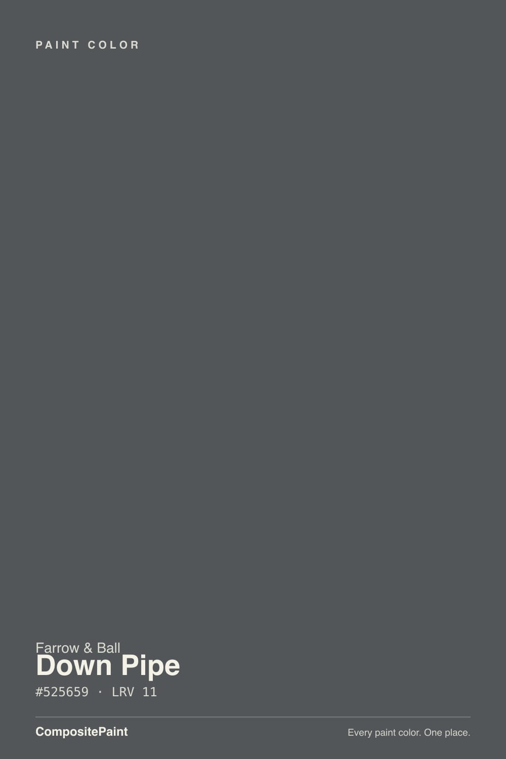
Down Pipe takes its name literally — Farrow & Ball built it as the grey once used to paint metal guttering and downpipes on the outside of British houses, a utilitarian color meant to blend into brick and disappear. Brought indoors, it became one of the brand's most enduring darks: a genuine lead-gray with a cool blue undercurrent running through it, not a warmed-up charcoal and not a true black.
At LRV 13 it is a legitimately dark color — dark enough to anchor a room on its own — but it is not the near-black many buyers expect from the swatch. That gap between reputation and reality is Down Pipe's most common surprise: next to Farrow & Ball's actual near-blacks, Railings (No. 31, LRV 6) and Off-Black (No. 57, LRV 7), Down Pipe reads noticeably lighter and unmistakably blue. Buyers hunting for pure black end up disappointed; buyers who wanted a sophisticated dark gray-blue end up converts.
Undertone in one line: blue-gray, cool, and it moves with the light — in low or artificial light it settles into a moody charcoal, and in strong daylight the blue steps forward enough that some rooms read distinctly steel or teal-tinged. That range is a feature for people who like a color with atmosphere; it's a liability if you were hoping for something that reads the same at every hour.
Where It Shines
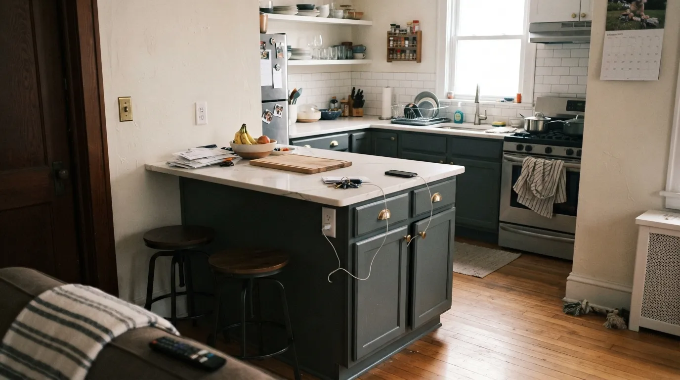
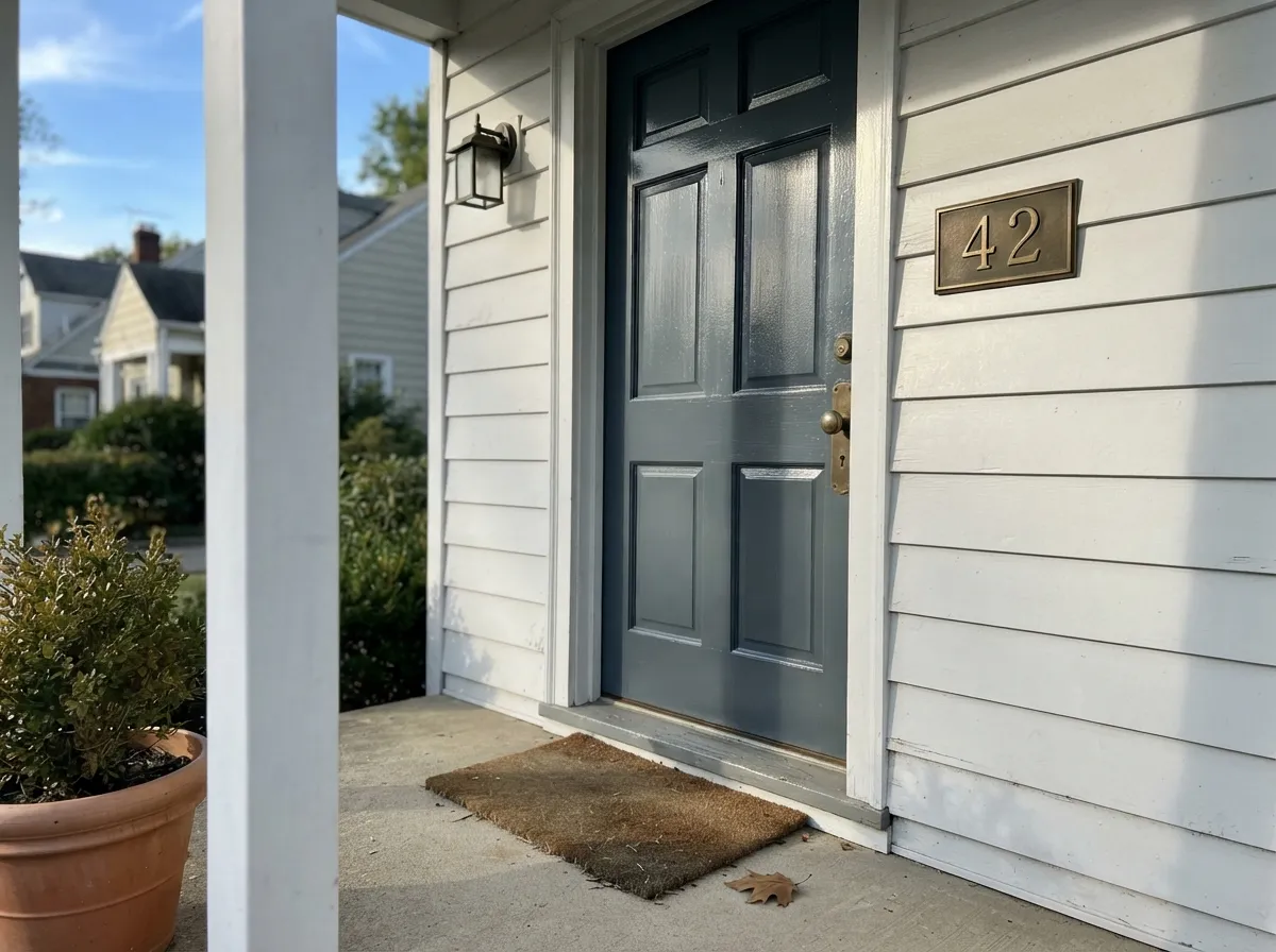
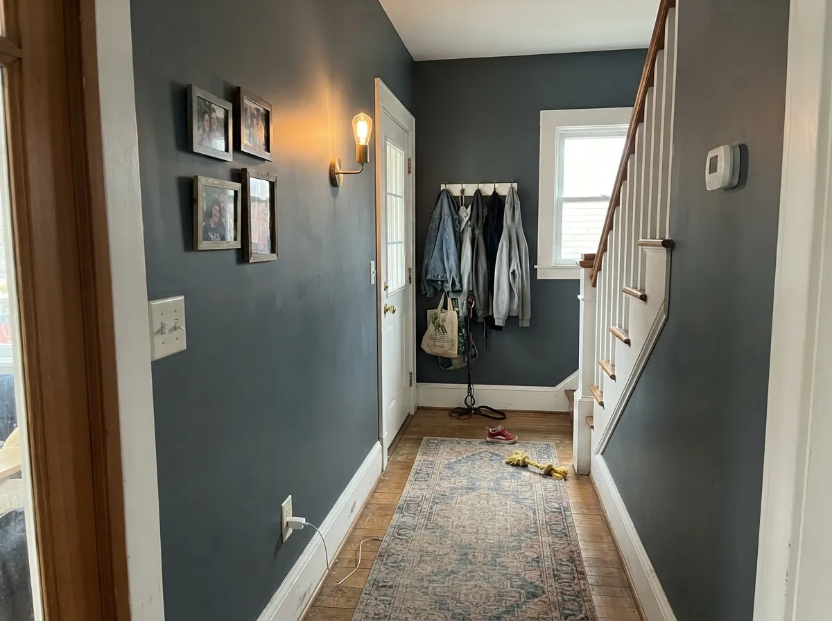
Give it a warm light source and a considered white trim and Down Pipe is one of the most dependable dark neutrals in any deck. It built its reputation on two jobs: a kitchen island under white marble or quartz, and a front door in full gloss — both are still where it earns its keep. Hallways and home offices are its other natural home, dark enough to make a dramatic, gallery-like backdrop without needing a second bold color in the room.
Where It Fails
Almost every regret story about Down Pipe traces back to one of three mismatches, and all three are avoidable before you open the can.
On the swatch it can pass for near-black. On four walls or a full door, the blue is unmistakable and it reads noticeably lighter than a true black — at LRV 13 it's a genuine lead-gray, not a black. If black is the actual goal, Farrow & Ball's own Railings or Off-Black are the real near-blacks in the range; Down Pipe will always look like it's holding something back.
Without warm light to counter it, the blue comes forward and the color flattens toward an institutional steel-gray instead of the rich, moody lead everyone falls for in photos. This is a light problem, not a paint problem — south or west exposure, or 2700K bulbs after dark, bring the warmth back.
Down Pipe is a cool color, and yellow-orange wood is its opposite. Golden oak floors or original stripped-pine trim fight it — the wood looks more orange, the paint looks more blue-gray, and neither side wins. White oak, walnut, gray-washed floors and black or painted trim are the friendlier match.
Room by Room
Down Pipe on an island under white marble or quartz, with brass or polished nickel hardware, is one of its most-photographed uses and for good reason: the cool lead-gray reads expensive against a cool white counter. Satin or semi-gloss cabinet enamel; expect Down Pipe to look bluer here than on a sample chip under kitchen LEDs.
This is arguably Down Pipe's best-known job, especially in Full Gloss. It reads dramatic without the starkness of pure black, and it holds up well against brick, white siding, or painted render. Full gloss shows every brushstroke, so plan on a sprayed or very carefully rolled finish.
Farrow & Ball itself pitches Down Pipe for dramatic entrances, and it earns the pitch: transitional spaces can carry more darkness than rooms you sit in. Add a warm wall sconce or pendant — hallways are exactly the dim, low-natural-light spaces where this color needs help to stay moody instead of flat.
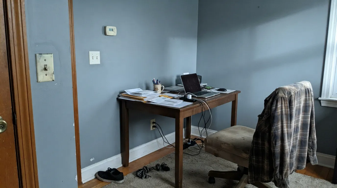
Deep, quiet and matte, it's built to recede behind bookshelves, framed art and dark wood furniture rather than compete with them. One of the calmer, more grown-up dark-wall choices for a room you actually work in.
In a south- or west-facing room with warm lamps it's genuinely restful — a dark, cocooning color without the starkness of black. Skip it in a north-facing bedroom with cool white bulbs; that's the exact combination that turns it flat and cold instead of moody.
Beautiful as a single wall or a snug, closed room; harder in an open floor plan where it has to negotiate with kitchen wood tones and whatever the next room is wearing. Not a confident whole-room pick here — sample big before committing an open-plan wall to it.
Your Light Is the Risk
South or west sun, or 2700K bulbs after dark, bring the lead-gray warmth forward and keep the blue from reading cold. This is the light the color photographs best in.
Without warmth to counter it, the blue takes over and Down Pipe flattens into a steely, almost institutional gray. Fine if you wanted something cooler; disappointing if you wanted the famous moody lead look.
Low or artificial light settles it into a soft charcoal; strong daylight pushes the blue forward enough that some rooms read distinctly steel or faintly teal by midday. Sample it at both ends before committing a whole room.
2700K warm bulbs deepen it toward near-black at night — the effect most people are chasing. Cool white LEDs do the opposite: they exaggerate the blue and can make it look almost cold-toned after dark.
Most complaints about Down Pipe are a light mismatch. Upload a photo of your actual room and see it on your walls — then ask for the same wall in north light or evening lamps before you buy a single sample.
Need It From Another Brand?
Any paint counter can custom-tint Farrow & Ball No. 26 directly. If you would rather stay in one brand's own deck, these are the closest stock matches, measured as ΔE2000. Under 2 is a difference you will not see on the wall.
| Brand | Closest color | ΔE | LRV | |
|---|---|---|---|---|
| Sherwin-Williams | Roycroft PewterSW 2848 · Sherwin-Williams | 0.7 | 13 | Color page → |
| Behr | CorditeHDC-MD-28 · Behr | 1.4 | 13 | Color page → |
| Benjamin Moore | City ShadowCSP-60 · Benjamin Moore | 1.5 | 13 | Color page → |
| Valspar | Ocean Storm4004-2B · Valspar | 1.2 | 13.3 | Color page → |
| PPG / Glidden | Lava GrayPPG1038-6 · PPG / Glidden | 4.8 | 13 | Color page → |
| Glidden | Deepest Valley Green30GY 13/045 · Glidden | 2.3 | 13 | Color page → |
Similar Farrow & Ball Colors
The nearest shades to Down Pipe within Farrow & Ball's own range, ranked by perceptual color distance — useful when you want the same look a touch lighter, darker, or warmer.
WCAG 2.1: AA is 4.5 : 1 for normal text, 3 : 1 for large text, AAA is 7 : 1.
Down Pipe vs the Colors You're Also Considering
Every Down Pipe sample board has the same rivals on it. The numbers show the real lightness gap — then it comes down to which risk you would rather live with.
Pick this for the lighter lead-gray that still reads moody without tipping into black.
Farrow & Ball No. 31 · LRV 6RailingsPick this if you want the true near-black cousin — Railings only shows its blue in direct sun, otherwise reads black.
Pick this for the cooler, bluer lead-gray — Kendall Charcoal leans warmer and browner by comparison.
Benjamin Moore HC-166 · LRV 13Kendall CharcoalPick this if you want the same dark, dependable mood from a US-mixed can, at a fraction of the price and wait.
Side-by-side comparison →Against Hopper Head (No. 305) at LRV 9, Down Pipe is marginally lighter and slightly cooler; Hopper Head reads a touch deeper and flatter, so choose it when you want the darkest option and Down Pipe when you want a hint more life. Tar (No. CC1), also LRV 9, is a more truly neutral black-gray with no blue lean at all, which makes it the pick if you want to avoid any cool cast.
Compared with Benjamin Moore Kendall Charcoal (HC-166) at LRV 13, Down Pipe is darker and cooler. Kendall Charcoal carries a warmer, slightly greige undertone and reflects a bit more light, so it feels more forgiving in dim rooms. Reach for Kendall Charcoal in low-light spaces where you want warmth, and Down Pipe where you want a cooler, moodier charcoal with more drama.
Down Pipe Coordinating Colors
The rule for coordinating with Down Pipe is simple: stay cool and quiet. A true or crisp white trim lets it be the star; a near-black in the same family gives it a deeper accent without competing; a lighter blue-gray carries the mood into the next room. These are the partners that keep showing up in rooms that work:
Down Pipe's Story: From Guttering Color to Design-World Staple
Farrow & Ball traces Down Pipe's name to the practical grey once used to paint metal guttering and downpipes on the outside of British houses — utilitarian, exterior, meant to disappear against brick. The brand brought it indoors, and it became one of the most enduring darks in the whole range: a genuine lead-gray with a cool blue undercurrent, sitting in the gap between an ordinary charcoal and a true black.
That gap is exactly why it built a following. A full-black door or cabinet can feel severe; Down Pipe reads considered instead — dark enough to anchor a room, blue enough to avoid feeling like a hole in the wall. It became one of the go-to choices for kitchen islands and front doors, and it remains one of the reasons Farrow & Ball built its reputation on grays that read as real colors, not just an absence of color.
Down Pipe With Wood Tones, Metal and Trim
Cool undertones decide the pairing rules here. White oak, walnut and other muted or gray-washed woods sit easily against Down Pipe's blue-lead cast; the two temperatures agree. Golden honey oak and orange-toned pine are the mismatch — warm yellow-orange pushes against the cool gray and both sides look worse for it, the same clash any true blue-gray runs into.
Metals are forgiving here: polished nickel and chrome actually flatter it, and brass or unlacquered brass still works if the room has enough white or wood to keep things from going cold. Black hardware disappears into it entirely, which is either the point or a reason to pick a lighter pull instead.
On trim, the safest move is a considered off-white rather than a stark or a warm one — that's the logic behind the coordinating whites above. A bright, cold white trim can make Down Pipe read almost ordinary-gray by contrast; a warm cream trim can push it faintly purple-blue by contrast. A quiet, true white keeps the wall the star.
Three Ready Palettes Built on Down Pipe
A color is never alone on the wall. These are complete combinations in the 60-30-10 pattern, with the reason each one holds together. Every one opens in the visualizer.
A crisp, cool-neutral white keeps the kitchen bright while the island carries all the color; Railings on the window frames gives one near-black note so the room reads deliberate rather than accidental. Brass or polished nickel hardware finishes it.
Try this palette in your roomA crisp white body and near-black shutters are the classic frame; the door in genuine gloss Down Pipe reads softer and more considered than an all-black door while still giving the house its dark, dramatic focal point.
Try this palette in your roomA genuinely neutral trim white keeps the connecting rooms quiet so the hallway can carry the drama; Grays Harbor in the next room continues the blue-gray mood without repeating the exact same can.
Try this palette in your roomDown Pipe FAQ
Is Down Pipe black or gray?
Gray — a genuine dark lead-gray with a cool blue undercurrent, not black. At LRV 13 it's legitimately dark, but next to Farrow & Ball's actual near-blacks (Railings, Off-Black) it reads noticeably lighter and clearly blue. This mismatch between expectation and reality is the single most common surprise buyers report.
What's the difference between Down Pipe and Railings?
Railings (No. 31) is darker and blacker, with its blue undertone only showing up in strong direct sun; Down Pipe is a step lighter and shows its blue-gray character in ordinary light, especially indoors under lamps. If you want something that reads as black most of the time, pick Railings. If you want a color that reads as a considered dark gray-blue, pick Down Pipe.
Does Down Pipe work on a front door?
Yes — it's one of the color's most famous uses, especially in Farrow & Ball's Full Gloss finish. It gives a dramatic, dark door without the flatness of true black, and it holds up well against brick, white siding or painted render.
Is it good for a kitchen island or cabinets?
Very. It's one of Down Pipe's signature jobs — under white marble or quartz, with brass or polished nickel hardware, the cool lead-gray reads custom and expensive. Use a proper satin or semi-gloss cabinet enamel, not a wall paint, for durability.
What white goes with Down Pipe?
A quiet, true white rather than a stark cold one or a warm cream. A crisp cool-neutral like Chantilly Lace, or a genuinely no-opinion neutral white like Benjamin Moore White, both let the blue-gray be the star without pushing it toward purple (a warm cream trim) or flattening it further (a very cold trim white).
Will Down Pipe look too blue in my room?
It can, if the room runs cold — north light, cool white LED bulbs, or both. That combination pushes the blue forward and drains the warmth that makes the color read rich rather than flat. Warm 2700K bulbs and any south or west exposure keep it in its best, moodiest register.
Have you painted with Down Pipe?
Rate it — one tap helps the next reader decide.
Ask a Question