Inchyra Blue
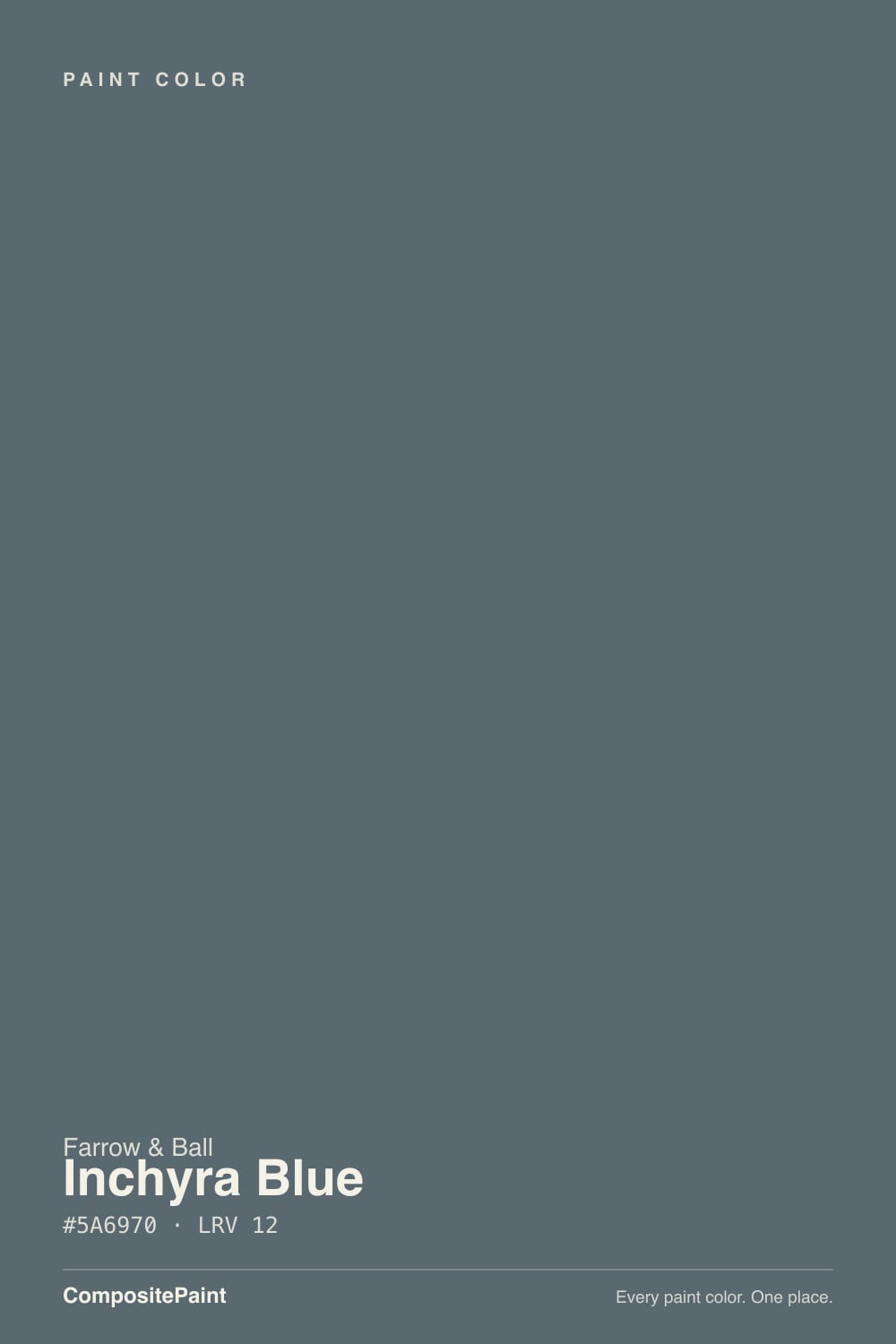
The Farrow & Ball blue-green everyone paints their kitchen island in, reviewed honestly: where it turns teal, the light that turns it charcoal, and what to pick instead.

Jessica has spec'd whites and neutrals for more than 300 rooms and keeps a sample wall of painted drawdowns in her studio. Every color review is checked against real reader rooms in the comments and re-tested when a formula changes. About the testing process →
- 1Salamander6
- 2Inchyra Blue13
- 3Adirondack Blue22
- 4Van Courtland Blue31
The Fast Verdict
Inchyra Blue is Farrow & Ball's most-quoted proof that one paint can be blue, green, and gray in the same day. At LRV 12 it is a deep, layered slate that pulls teal-green in direct daylight and slate-charcoal under lamps or on a cloudy afternoon — matched from the weathered byre doors of a Georgian house in Scotland, and it has become the go-to when someone wants "moody blue-green" for a kitchen island, a front door, or a snug den. It is not a color you pick for consistency; you pick it for the mood, and the mood is genuinely gorgeous.
Kitchen islands and cabinetry · front doors and exterior joinery · snug dens and studies · anyone chasing the blue-green moody look without going full black
You want one predictable color, not three · your room runs on cool LED light with no daylight · you're nervous about undertone shifts · you want a true, stable navy
- Genuinely complex color — reads blue, green, and charcoal depending on the light, never flat or boring
- Deep enough (LRV 12) to hide scuffs on cabinets, doors, and high-traffic trim
- Real pedigree — matched from an actual historic house, not an invented trend name
- Flatters brass, walnut, and marble in kitchens, dens, and powder rooms
- A genuine alternative to flat black or plain navy for anyone bored of both
- Not a stable, one-note color — expect it to look different in every room and every hour
- Goes flat, cold charcoal under cool LEDs with no daylight
- Clashes with honey oak and warm golden wood tones
- Farrow & Ball pricing and fewer sheen options than mainstream brands
What Color Is Inchyra Blue, Really?
Inchyra Blue is named after Inchyra House, a Georgian estate in Perthshire, Scotland, and Farrow & Ball says the color was matched straight from the doors of the house's old byre — the stone barn at the foot of the hill, weathered to a deep blue-gray by generations of Scottish light and rain. That backstory explains the color better than any swatch: it is not a clean, single-note navy. It is a blue-gray base with a genuine amount of green worked into the pigment, the kind of layered mixing Farrow & Ball is known for, so the color reads differently depending on what's hitting it — daylight pulls the green toward teal, warm lamps push it back toward slate-charcoal.
At LRV 12 it sits in true deep-color territory — close to Down Pipe (LRV 11) and just a shade lighter than Hague Blue (LRV 6) — dark enough that it can read almost black in a dim corner and clearly saturated blue-green the moment real light hits it. Because the pigment is layered rather than a simple tint, that swing is more dramatic than most: reviewers and designers describe the same wall as navy in the morning, teal at noon, and near-charcoal by lamplight, and all three descriptions are honest.
Undertone in one line: blue-gray first, green pulled forward by daylight, never a clean navy. If your sample looks flat charcoal, that's cool or low light doing its job; if it looks turquoise, that's strong sun finding the green — both are the paint being consistent with itself, not a bad batch.
Where It Shines
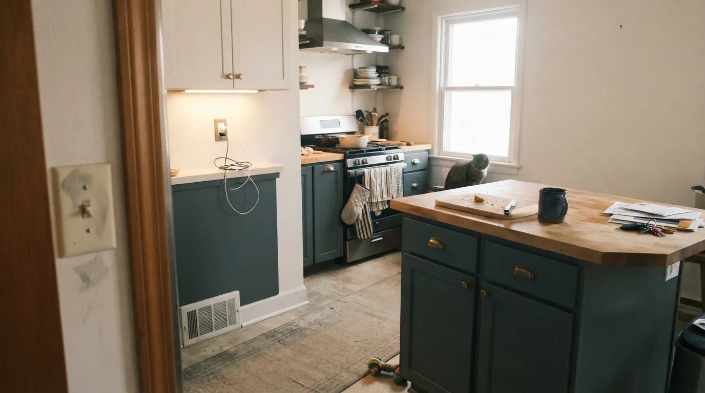
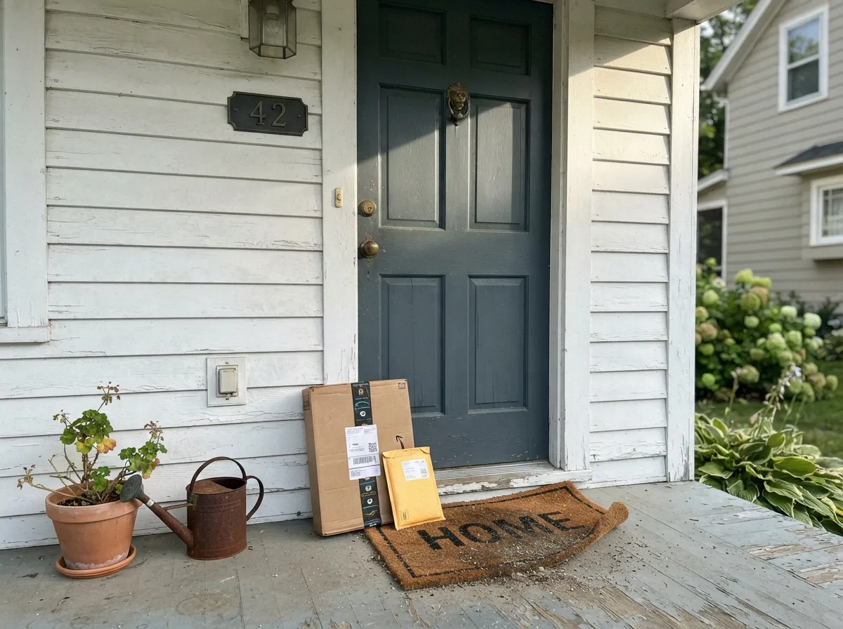
Give it a kitchen island, a front door, or a lamplit den and Inchyra Blue is one of the most-requested colors in the Farrow & Ball catalog for a reason. On cabinetry it reads like a designer custom mix — moodier than navy, less committed than black — and outside it is exactly the color the house it's named after wears on its own doors. Brass, walnut, and warm white keep it grounded; candlelight and lamps are where it turns genuinely beautiful.
Where It Fails
Almost every disappointed review of Inchyra Blue comes down to one of three mismatches, and each one is predictable before the first coat goes on. None of them are the paint's fault — they're a buyer expecting one color and a light-dependent pigment delivering three.
Blue-green sits close to orange on the color wheel, so warm honey-toned oak pulls hard against Inchyra Blue — the floor reads more orange, the walls read more teal, and neither side settles down. Walnut, white oak, or painted floors are a much calmer match.
Under flat cool-white LEDs with no natural light, the green pigment goes quiet and the wall reads as a dull, slightly cold charcoal-gray — buyers who wanted "moody blue" report a room that just looks dim. The fix is 2700K bulbs, not more coats.
Inchyra Blue is not built to sit still. A wall that reads crisp navy at 10am can look distinctly teal by 2pm and near-charcoal at night. If you need the color to look the same in every photo, this is the wrong pick — try Hale Navy or Van Deusen Blue instead.
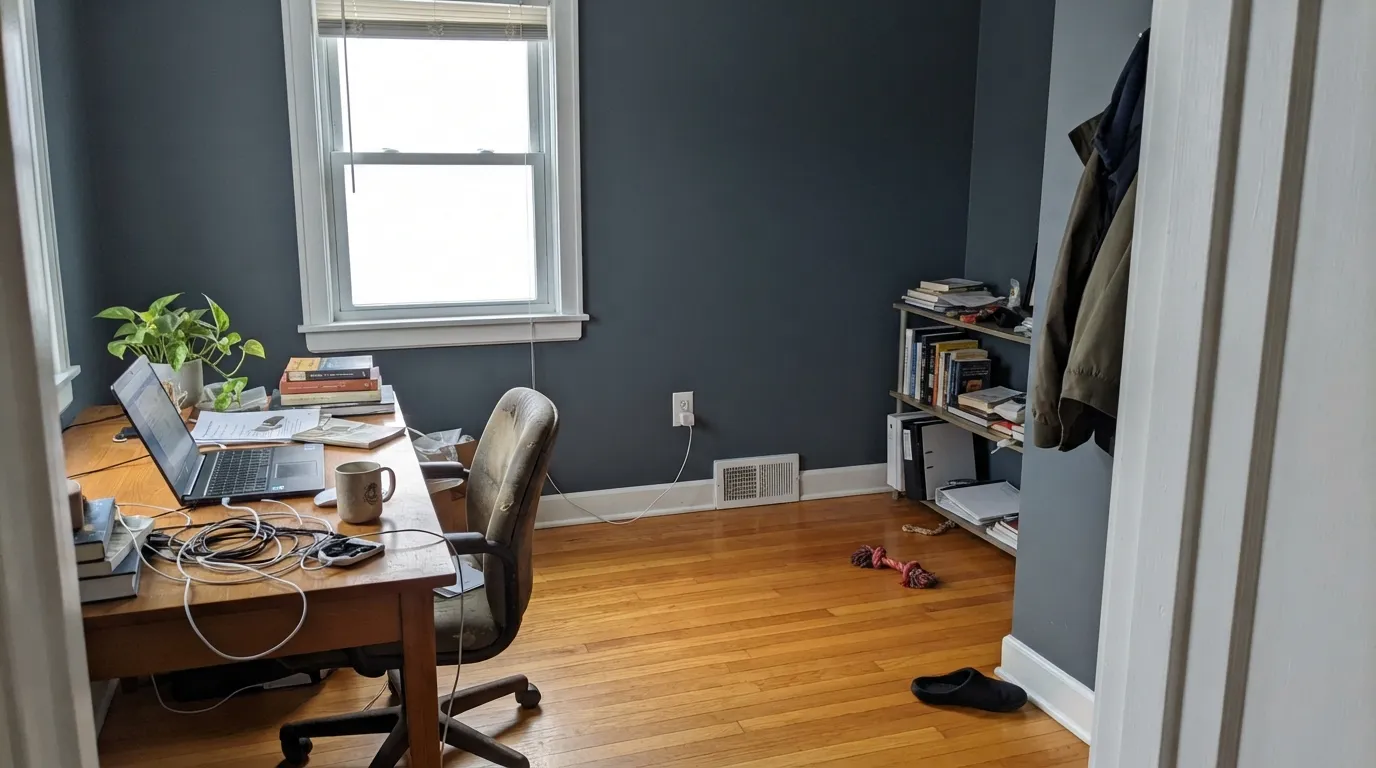
Room by Room
Cabinets and islands are where Inchyra Blue earns its reputation: brass hardware, butcher block, and marble all sit beautifully against it, and the depth hides everyday scuffs a paler color would show. Estate Eggshell for durability.
This is, quite literally, the color on Inchyra House's own byre doors, and it translates: full sun reads it more saturated and teal than indoors, and it holds up beautifully against warm stone, brick, or a crisp white facade. Full Gloss or Exterior Eggshell for weather resistance.
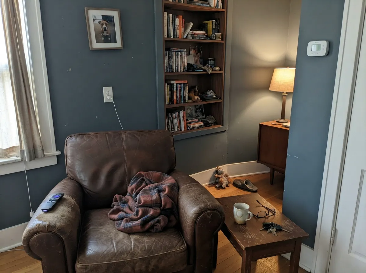
Low, warm light is this color's best friend, and a closed-off room that runs on lamps rather than daylight lets the blue-green sit dark and rich all day. Leather, walnut shelving, and brass reading lamps are its natural company.
Under candlelight and warm bulbs it goes genuinely moody and flattering, the reason it shows up in so many dinner-party dining rooms. In flat daylight it reads more utilitarian gray-blue — fine, just less dramatic than the photo that sold you on it.
A single vanity or a fully drenched powder room lets a nervous buyer try the color without repainting a whole house, and small rooms take the depth well. Pair with brass fittings and a marble or warm-white counter.
It can be a beautiful, cocooning bedroom color, but only if the room gets genuine daylight during the day; in a dim or north-facing bedroom it goes flat and cold rather than moody. Test a large sample before committing a whole room.
Your Light Is the Risk
Sun brings the green pigment forward and the wall reads a rich, saturated blue-green teal — the color at its most alive.
Flat cool-white light kills the green and leaves a dull, slightly cold charcoal-gray. Warm the bulbs before blaming the paint.
Morning cool blue, midday teal-green, evening near-charcoal — this color visibly changes more than most, and that's the whole appeal for fans.
2700K bulbs pull it toward a rich, moody slate blue-green; cool LED bulbs flatten it toward plain gray. Bulb choice matters as much as wall color here.
Most complaints about Inchyra Blue are a light mismatch. Upload a photo of your actual room and see it on your walls — then ask for the same wall in north light or evening lamps before you buy a single sample.
Need It From Another Brand?
Any paint counter can custom-tint Farrow & Ball No. 289 directly. If you would rather stay in one brand's own deck, these are the closest stock matches, measured as ΔE2000. Under 2 is a difference you will not see on the wall.
| Brand | Closest color | ΔE | LRV | |
|---|---|---|---|---|
| Sherwin-Williams | Mountain PassSW 9655 · Sherwin-Williams | 1.5 | 14 | Color page → |
| Behr | Whale GrayN470-6 · Behr | 1.6 | 13 | Color page → |
| Benjamin Moore | Powell GrayCW-665 · Benjamin Moore | 4.2 | 13 | Color page → |
| Valspar | Relaxed Navy5001-2B · Valspar | 1.4 | 13 | Color page → |
| PPG / Glidden | Juniper BerryPPG1145-6 · PPG / Glidden | 2.5 | 14 | Color page → |
| Glidden | Juniper BerryPPG1145-6 · Glidden | 2.3 | 14 | Color page → |
Similar Farrow & Ball Colors
The nearest shades to Inchyra Blue within Farrow & Ball's own range, ranked by perceptual color distance — useful when you want the same look a touch lighter, darker, or warmer.
WCAG 2.1: AA is 4.5 : 1 for normal text, 3 : 1 for large text, AAA is 7 : 1.
Inchyra Blue vs the Colors You're Also Considering
Every Inchyra Blue sample board has the same rivals on it. The numbers show the real lightness gap — then it comes down to which risk you would rather live with.
Pick this for the version with more gray and green pulled into it — Hague Blue leans teal-navy throughout, Inchyra Blue visits more moods.
Farrow & Ball No. 30 · LRV 6Hague BluePick this if you want the same aged-blue depth but a color that stays teal-navy all day — Inchyra Blue swings further into green and gray.
Pick this when you want the color to visibly lean blue-green, not gray.
Farrow & Ball No. 26 · LRV 11Down PipePick this for a true lead-gray with only a whisper of blue — the calmer, more neutral choice at almost the same depth.
Pick this for the color with more personality — Hale Navy stays navy, Inchyra Blue tells three different stories depending on the hour.
Benjamin Moore HC-154 · LRV 6Hale NavyPick this if you want an honest, one-note navy that doesn't flirt with green — the safe pick when "moody blue" is the whole brief.
Pick this for the deeper, more complex color — Van Deusen Blue is a straightforward blue, Inchyra Blue is a mood.
Benjamin Moore HC-156 · LRV 11Van Deusen BluePick this for a lighter, more classic blue with far less green-gray drama — an easier sell to a partner who's nervous about "teal."
Down Pipe (No. 26), at LRV 13, is the obvious neighbor. It is a straighter dark gray with far less blue, so it reads more architectural and less colorful. Choose Down Pipe when you want moody without any question of blue; choose Inchyra Blue when you want that shifting blue-green character.
Coppice Blue (No. G9), at LRV 12, is the same darkness but leans more clearly teal and blue. It is the pick if you want the blue to be obvious rather than half-hidden inside a gray.
Mere Green (No. 219), at LRV 15, is slightly lighter and tips further toward green. In a room where you want more of a deep sea-green than a blue-gray, Mere Green does that job, while Inchyra Blue keeps a more balanced, harder-to-name result that sits between the two.
Inchyra Blue Coordinating Colors
The rule for coordinating with Inchyra Blue is to keep everything else calm and warm-neutral, since the paint itself is already doing the complicated work. Warm whites, soft near-blacks, a pale chameleon cousin, and one deeper tonal accent are the partners that keep showing up in rooms that work:
The Inchyra House Story
Farrow & Ball named the color for Inchyra House, a Georgian estate near Perth in Scotland, and the specific inspiration was the old stone byre at the bottom of the property's hill — its doors painted a deep, weathered blue-gray that had faded and mellowed under decades of Scottish weather. Farrow & Ball's color developers matched that exact aged tone, which is why the color carries more complexity than a shade invented on a screen: it holds the green of old lichen and copper alongside the blue-gray of stone and sky.
That real-world origin is also why it behaves the way it does on a wall. It was never meant to be a flat, consistent color — Scottish light changes constantly, and the paint was matched to a surface that had already spent decades living through that changing light. Buyers who understand that going in tend to love the color; buyers expecting a stable, catalog-flat navy are the ones who write disappointed reviews.
Inchyra Blue on Exterior Doors and Trim
Outside is arguably where Inchyra Blue makes the most sense, since it's matched from an actual exterior surface. Against a white, cream, or warm stone facade it reads as a confident, sophisticated blue-green rather than a plain dark door color, and full sun brings out more of the teal than most buyers expect from the in-store chip. Brass or aged-bronze hardware is the classic finishing touch.
The one caution that applies to any dark exterior color applies here too: deep pigment absorbs more heat than pale paint, which can accelerate wear on wood doors and trim in full, unshaded sun. Farrow & Ball's Full Gloss and Exterior Eggshell formulas are built to handle it, but a door that bakes in afternoon sun all day will need more frequent maintenance than a pale one, regardless of brand.
Three Ready Palettes Built on Inchyra Blue
A color is never alone on the wall. These are complete combinations in the 60-30-10 pattern, with the reason each one holds together. Every one opens in the visualizer.
White Dove keeps the kitchen bright enough for the cabinets to read as color rather than gloom, and it shares just enough warmth to flatter the green in Inchyra Blue instead of fighting it. Wrought Iron ties in as hardware and trim without adding a second loud color.
Try this palette in your roomA pale warm-white body lets the door do all the talking, and full sun brings out the teal in Inchyra Blue against the crisp white siding. Kendall Charcoal on shutters and trim keeps the facade from feeling like two competing statements.
Try this palette in your roomBorrowed Light is Farrow & Ball's pale, chameleon blue-gray, so the ceiling and trim shift in sympathy with the walls instead of fighting them for the room's mood. Cinnamon Slate brings warmth back in through furniture and leather, which keeps a fully saturated room from reading cold.
Try this palette in your roomInchyra Blue FAQ
Is Inchyra Blue blue, green, or gray?
All three, depending on the light — that's the whole character of the color. Farrow & Ball built it as a blue-gray with real green pigment mixed in, so daylight pulls it toward teal, cool light pushes it toward charcoal-gray, and warm lamps land it somewhere in between. If you need a color that looks the same in every photo, this isn't it.
Is Inchyra Blue too dark for a small room?
At LRV 12 it is genuinely deep — closer to Hague Blue and Down Pipe than to a light-medium blue — but small, well-lit rooms like powder rooms and vanities actually take deep color well and can look intentional and rich rather than cramped. A small room with poor light is the combination to avoid.
What's the difference between Inchyra Blue and Hague Blue?
Hague Blue is the more committed teal-navy — it moves through the day but always reads as a blue. Inchyra Blue swings further, visiting genuine green and gray territory along with the blue. Want more drama and less predictability: Inchyra Blue. Want blue that stays blue: Hague Blue.
Does it work on a front door?
Yes — it's practically the color's origin story, matched from the doors of the historic house it's named after. Expect full sun to read it more saturated and teal than the chip suggests, and pair it with a crisp white or warm stone facade for contrast.
What sheen should I use?
Farrow & Ball's own system: Estate Emulsion (matte) for walls, Estate Eggshell for trim and cabinets that need to wipe clean, and Full Gloss or Exterior Eggshell for front doors and exterior joinery. Skip flat finishes on anything that gets touched.
Does it work with oak floors?
Depends on the oak. Walnut, espresso, and pale white oak are excellent partners. Honey-toned golden oak is the real clash — it sits close to this color's complement on the wheel, so the floor reads more orange and the walls read more teal, and both sides lose. A rug helps; a different floor helps more.
Have you painted with Inchyra Blue?
Rate it — one tap helps the next reader decide.
Ask a Question