Borrowed Light
Farrow & Ball's best-known pale blue, reviewed honestly: the light that makes it glow sky-blue, the light that turns it slate-gray, and what to pair it with instead of a warm white.

Jessica has spec'd whites and neutrals for more than 300 rooms and keeps a sample wall of painted drawdowns in her studio. Every color review is checked against real reader rooms in the comments and re-tested when a formula changes. About the testing process →
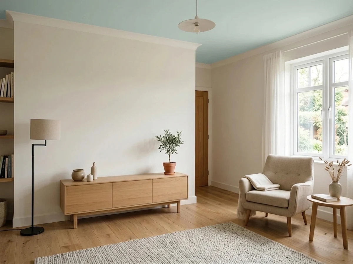
- 1Stardew43
- 2Sea Salt63
- 3Borrowed Light69
- 4Spring Thaw83
The Fast Verdict
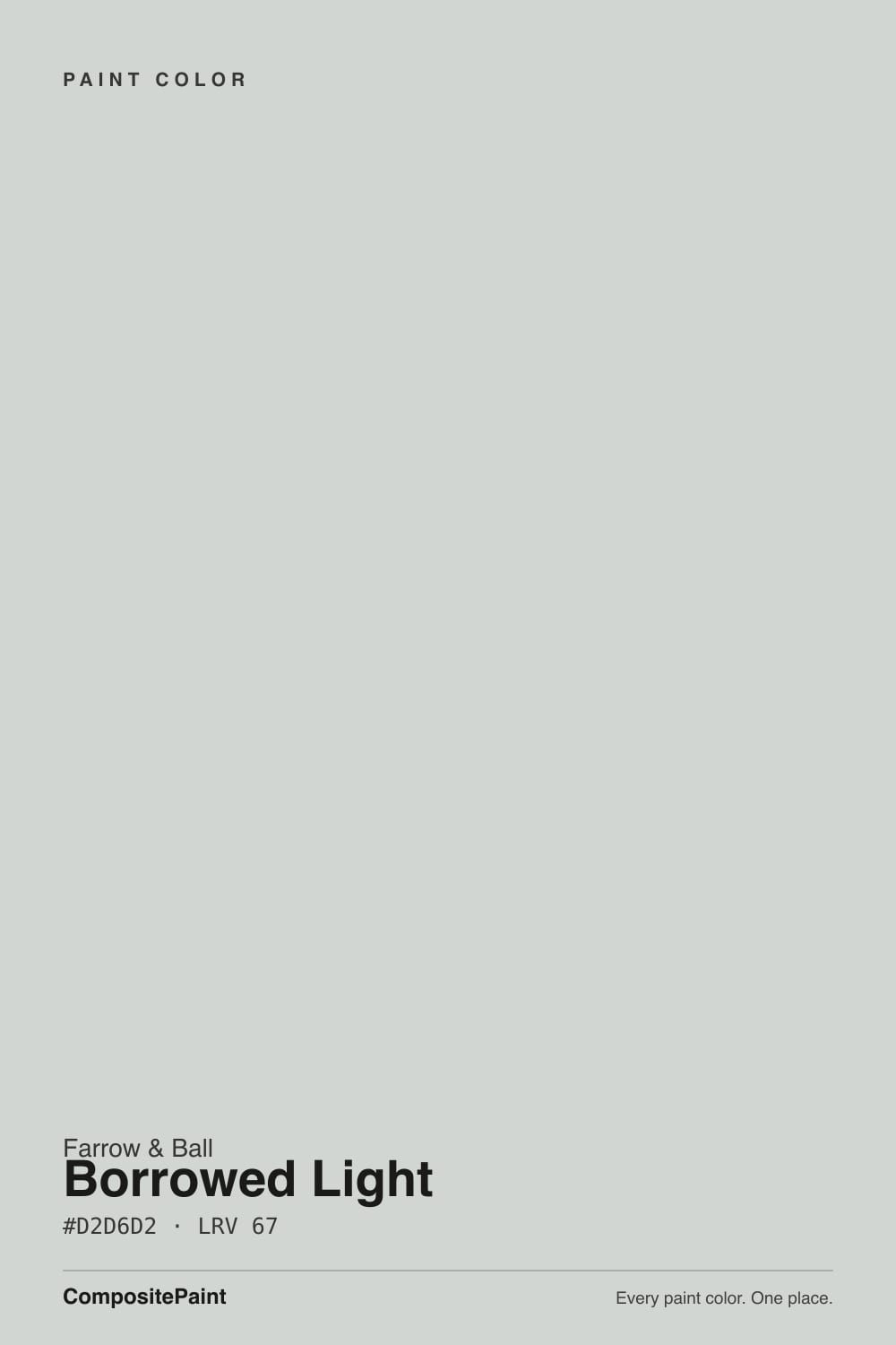
Borrowed Light is the color most people mean when they say "the Farrow & Ball blue" — a soft, cool gray-blue with a whisper of green that never quite settles into either box. Give it real daylight and it reads as a genuinely cheerful pale sky-blue; take the daylight away and the blue drains out, leaving something closer to flat slate. It is not the neutral gray a lot of buyers hope for, and it is not a color that hides its mood — but in the rooms it was built for, nothing in the mass-market decks quite matches it.
Bedrooms and nurseries that want a calm, grown-up blue, not a baby-blue cliché · kitchen islands and cabinets played against white counters and black hardware · powder rooms, hallways, and stairwells with any real daylight to work with · anyone trying Farrow & Ball for the first time who wants the brand's signature color
Your room is dim, north-facing, and short on warm lamps · your floors are honey oak or golden pine · you actually want a true gray, not a blue · you are not ready for F&B's price and coverage compared to a big-box gallon
- A genuinely versatile pale blue-gray — cheerful in daylight, calm rather than sugary in dimmer light
- Skips the baby-blue cliché in nurseries and kids' rooms without going cold
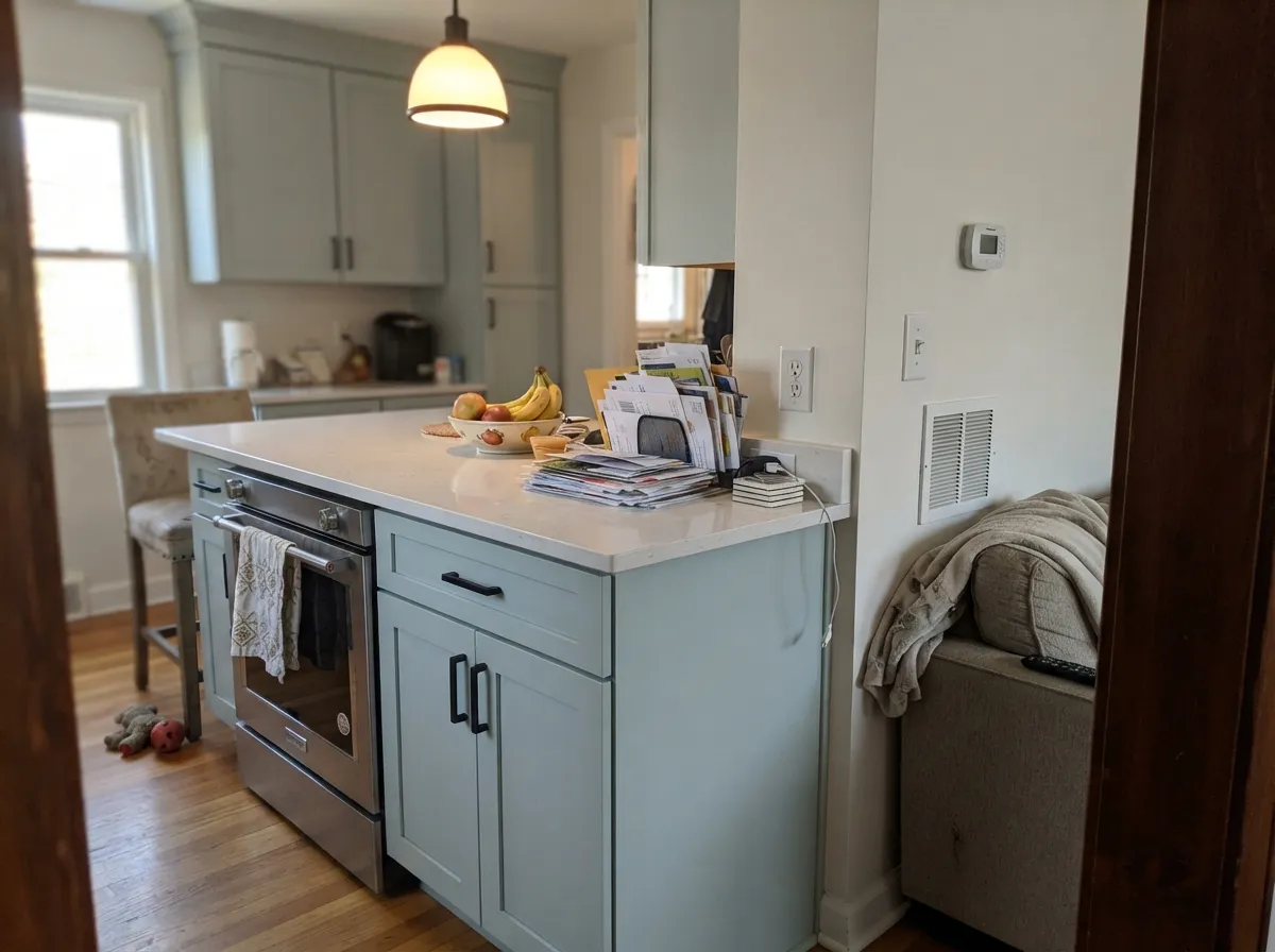
- A favorite graphic kitchen-island color against white counters and black hardware
- Cool undertone stays composed — never drifts pink or yellow the way many pale colors do
- A small dose (vanity, island, one door) reads custom without repainting a whole house
- Reads clearly blue, not gray, on four walls — the single most common letdown
- Cool north light with no warm lamps turns it flat, cold slate-gray
- Clashes with honey oak, golden pine, and warm creamy trim
- Farrow & Ball pricing and coverage are a real step up from a big-box gallon
What Color Is Borrowed Light, Really?
Borrowed Light takes its name from an architectural term: a "borrowed light" is a window or glazed opening — often a fanlight over an interior door — that shares daylight from a bright room into a windowless one next door, a common feature of the Georgian and Victorian townhouses Farrow & Ball's palette grew up in. The name is the whole idea of the color: a pale blue built to carry a sense of daylight into rooms that do not get much of their own. It has become one of the brand's most recognized shades, and often the first F&B color an American buyer tries when they want the label's signature pale blue without committing to a fully saturated one.
Our deck lists it at LRV 69, which puts it well down from a true off-white but still solidly in the pale range — enough body that the color reads clearly on four walls without slipping into pastel or feeling like a decorating cliché. In a photo, especially a well-lit one, it can look close to a barely-there gray-white; standing in the actual room, the blue asserts itself almost immediately, and it asserts itself harder the whiter the trim next to it.
Undertone in one line: cool gray with a whisper of green woven through it, never pink, never a true saturated navy-blue. In real daylight — east or south exposure especially — the green stays quiet and the blue comes forward, reading distinctly and cheerfully sky-colored. Take the daylight away, or surround it with warm lamplight and golden wood, and the color grays down toward something closer to slate.
Where It Shines
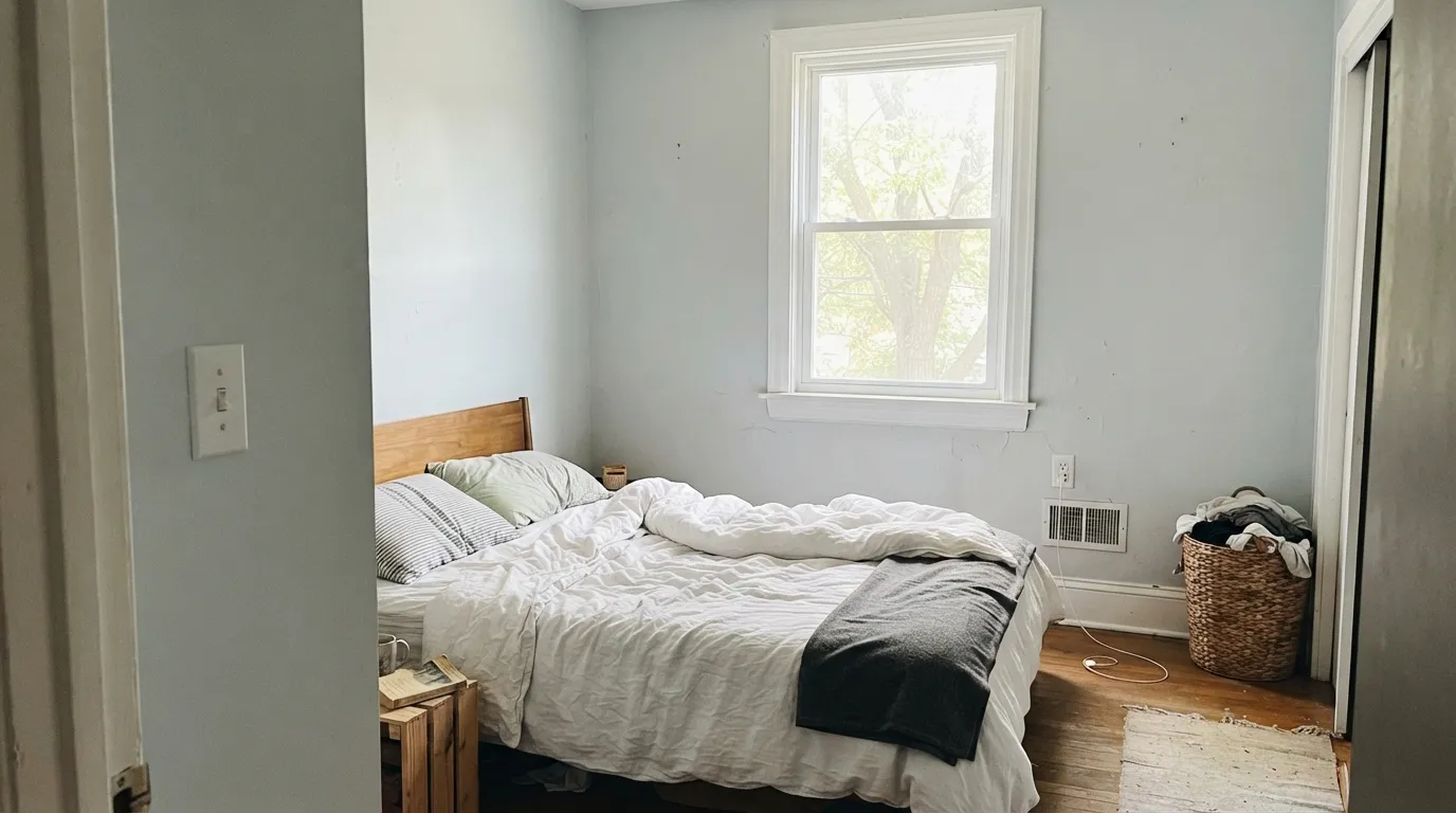
This is a color built around real daylight, and it repays you for giving it some. In a room with genuine sun, especially through a decent-sized window, it reads as a true, bright, cheerful pale blue — not washed out, not pastel-sweet. Its second home is the graphic pairing: against a crisp white counter or a black-hardware kitchen island, the pale blue-gray does real work instead of disappearing. And true to its name, it is one of the few pale colors that copes reasonably well in transitional spaces — hallways, stairwells, small windowless rooms — that borrow whatever light they can get from elsewhere in the house.
Where It Fails
Almost every disappointed review of Borrowed Light traces back to one of three situations, and all three are predictable before the first coat goes on. None of them are the paint's fault — but if your room matches one, this is not your color, and a bigger sample will only confirm it.
On a paint strip, in a photo, or in a dim room it is easy to read this as a barely-there gray-white. On four walls in real light the blue is unmistakable — reviewers who bought it hoping for "gray with a little something" are consistently surprised by how clearly it commits to blue. If gray is genuinely the goal, look at Sherwin-Williams Sea Salt instead: it drifts toward a more neutral gray-green and never insists on blue the way this one does.
Orange is blue's complement, so golden wood floors or warm creamy trim push both sides harder — the floor reads more orange, the wall reads more insistently blue, and neither one wins. This color wants pale or white oak, painted floorboards, or a dark stain; a big rug helps if the golden floor is staying.
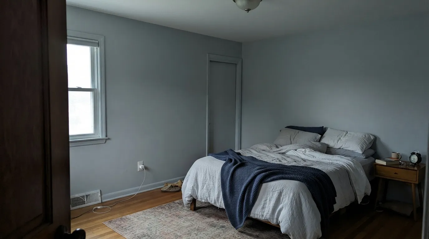
Cool north daylight strips out what little warmth the color has and leaves a flat, cold slate-gray that reads underlit rather than intentional. Farrow & Ball's own lighting guidance actually steers true north-facing rooms toward warmer whites rather than pale blues, and it shows: without a warm bulb or two doing the work at night, this is the wrong pick for a lightless room. Pairing it with a stark white trim in that same dim room only sharpens the problem — the wall can start to look unfinished next to the trim rather than intentionally pale.
Room by Room
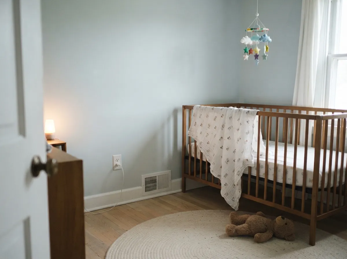
A calm, grown-up alternative to the usual pastel nursery blue. With white bedding and a warm lamp for evenings it reads composed rather than cold; matte finish hides wall texture and keeps the color from looking flat under overhead light.
One of the more common uses for this color, and it earns it: soft enough to be restful, blue enough to skip the sugary baby-pastel look. Pair with a navy or white trim rather than warm cream, which fights the cool undertone.
Modern Eggshell holds up to daily knocks and wipes clean, and the graphic pairing — pale blue-gray island, white counters, black hardware — is a favorite for a reason. Skip it with honey oak floors; it is genuinely excellent against white oak, painted floors, or dark stain.
Modern Emulsion is the durable, wipeable option for a bathroom's humidity. It reads spa-calm against white tile and fixtures; cool gray or blue-gray stone is a natural friend, warm butter-toned tile is the one real clash.
True to the name, this is one of the few pale colors that holds up reasonably well in a transitional space borrowing light from elsewhere in the house — a stairwell with a skylight, a hall lit mainly by open doors. It will still read grayer here than in a room with its own window.
Lovely in a room with real daylight of its own. Riskier in an open plan, where it has to negotiate with whatever warm wood tones or beige walls sit in the adjoining kitchen or dining area — pick a genuinely cool-toned neighbor, not a creamy one.
Your Light Is the Risk
Real sun reads this as a true, cheerful pale blue — the color the name is describing. This is the light to sample it in first.
Cool, low light strips out the warmth and leaves a flat slate-gray that reads underlit rather than intentional.
Brightest and bluest at midday; softer and grayer as the light fades toward evening. The shift is real but gentle, not a color change.
2700K warm bulbs keep it composed rather than cold. Cool white LEDs push it toward the flat, slate-gray read — swap the bulbs before you second-guess the paint.
Most complaints about Borrowed Light are a light mismatch. Upload a photo of your actual room and see it on your walls — then ask for the same wall in north light or evening lamps before you buy a single sample.
Need It From Another Brand?
Any paint counter can custom-tint Farrow & Ball No. 235 directly. If you would rather stay in one brand's own deck, these are the closest stock matches, measured as ΔE2000. Under 2 is a difference you will not see on the wall.
| Brand | Closest color | ΔE | LRV | |
|---|---|---|---|---|
| Sherwin-Williams | Hinting BlueSW 6519 · Sherwin-Williams | 1.5 | 68 | Color page → |
| Behr | Silver Screen770E-2 · Behr | 1.5 | 69 | Color page → |
| Benjamin Moore | Blue Lace1625 · Benjamin Moore | 0.6 | 66 | Color page → |
| Valspar | Rising Tide4008-3A · Valspar | 0.5 | 69.3 | Color page → |
| PPG / Glidden | Sea FrostPPG1037-1 · PPG / Glidden | 0.9 | 70 | Color page → |
| Glidden | TinselPPG1012-3 · Glidden | 1.1 | 68 | Color page → |
Similar Farrow & Ball Colors
The nearest shades to Borrowed Light within Farrow & Ball's own range, ranked by perceptual color distance — useful when you want the same look a touch lighter, darker, or warmer.
WCAG 2.1: AA is 4.5 : 1 for normal text, 3 : 1 for large text, AAA is 7 : 1.
Borrowed Light vs the Colors You're Also Considering
Every Borrowed Light sample board has the same rivals on it. The numbers show the real lightness gap — then it comes down to which risk you would rather live with.
Pick this for the paler, cooler, more architectural version of the same calm, with no green cast to manage.
Benjamin Moore HC-144 · LRV 53Palladian BluePick this if you want more green in the mix — Palladian leans toward spa-teal where Borrowed Light stays closer to a true blue-gray.
Pick this when you actually want the blue to commit — Sea Salt drifts more neutral gray-green depending on the room.
Sherwin-Williams SW 6204 · LRV 63Sea SaltPick this if your painter works in Sherwin-Williams and you want a similar soft, chameleon read at a close depth.
Pale Powder No. 204 at LRV 69 is Borrowed Light's closest relative and the one people confuse it with. Pale Powder carries a clearer green in it, so it reads more like a soft sage-tinged blue, while Borrowed Light stays cooler and cleaner. Choose Pale Powder if you want a hint of green; choose Borrowed Light if you want it to stay closer to sky and gray.
Dimpse No. 277 at LRV 66 is a purer cool gray with almost none of the blue. In the same room, Borrowed Light will look faintly blue next to it, and Dimpse will read as the safe, quiet gray.
Ammonite No. 274 at LRV 67 goes the other direction entirely, a warm greige with no cool cast. Put them side by side and Borrowed Light looks cool while Ammonite looks soft and warm, which is the practical difference when matching to warm floors or cool tile.
Borrowed Light Coordinating Colors
The rule for coordinating with Borrowed Light: stay cool. Crisp whites, black or navy for graphic contrast, and other tonal blue-greens all work with it; warm creamy whites and golden wood tend to fight it. These are the partners that keep showing up in rooms that work:
The Story Behind the Name
A "borrowed light" is an old architectural term: a window or glazed opening — often a fanlight set above an interior door — that shares daylight from a bright room into a windowless one next door. Georgian and Victorian townhouses, the very buildings Farrow & Ball's historic palette grew out of, relied on exactly this trick to get natural light into deep, narrow interior rooms. The color is named for that quality of light — soft, indirect, slightly cool — rather than for any single object or landscape.
It has since become one of the brand's most recognized shades and, for a lot of American buyers, the first Farrow & Ball color they try: pale enough to feel low-risk, distinctive enough to still look like a considered choice rather than a big-box off-white. That reputation is well earned, but it also means the color arrives with expectations — buyers hoping for the brand's famous restraint sometimes forget that "pale" is not the same as "neutral," and the blue shows up regardless.
Borrowed Light With Wood Tones and Floors
This decision gets made at the floor, not the paint store. Pale or white oak, painted floorboards, and dark or black-stained wood are all excellent partners — the cool blue-gray reads clean and architectural against any of them, and a black-stained floor pushes the whole room toward the graphic, English-townhouse look the color is known for.
Golden or honey oak is the one genuine clash. Orange sits opposite blue on the color wheel, so a warm floor and this wall exaggerate each other: the floor reads more orange, the wall reads more insistently blue, and no amount of extra coats fixes that relationship. If the golden floor is staying, a large rug between it and the paint does more good than any amount of sampling.
Three Ready Palettes Built on Borrowed Light
A color is never alone on the wall. These are complete combinations in the 60-30-10 pattern, with the reason each one holds together. Every one opens in the visualizer.
A cool, crisp white trim keeps the pale blue reading intentional rather than washed-out, and the navy door supplies one grown-up dark note so the room never tips into pastel-nursery territory.
Try this palette in your roomThe graphic pairing designers keep coming back to: a pale blue-gray island between a soft white wall and one near-black door reads custom without needing a single accent color beyond it.
Try this palette in your roomTwo depths of the same cool blue-green family read as deliberate tonal layering rather than a mismatch, and the near-white trim keeps the small room from feeling closed in.
Try this palette in your roomBorrowed Light FAQ
is borrowed light gray or blue?
Blue — quietly, but on four walls it is unmistakable. In a dim room or a photo it can pass for a barely-there gray-white, and our deck lists it at a pale LRV 69, but standing in real daylight the blue reads clearly and cheerfully. If you actually want gray, this color will disappoint you the same way it disappoints a lot of first-time F&B buyers.
what's the difference between borrowed light and skylight?
Skylight is Farrow & Ball's grayer, more muted cousin — less reflective, with more visible gray in the mix, especially side by side. Borrowed Light is the brighter, more clearly blue version of the same family; if you want airy and cheerful, Borrowed Light is the pick, and if you want something quieter and closer to gray, look toward the muted end of the family instead.
is it good for kitchen cabinets?
Yes, and it is a genuinely popular choice — Modern Eggshell is the brand's toughest interior finish and holds up to daily kitchen use. Designers reach for it as a backdrop that works against both light and dark counters. The one real caution is golden wood: honey oak floors or warm butter-toned trim fight the cool undertone, while white oak, painted floors, and black hardware are its natural company.
is it good for a nursery or kids' room?
It is one of the more common uses for this exact color. It reads as a calm, slightly grown-up blue rather than a sugary pastel, and it pairs well with a navy or crisp white trim. Keep the wood tones in the room pale or white oak rather than golden — the same complement clash that hits kitchens applies here too.
what trim or wall white goes with borrowed light?
A cool, crisp white — something in the Chantilly Lace or White Diamond family — keeps the pale blue reading intentional. A warm, creamy trim white fights the cool undertone and can make the wall look slightly gray and unfinished by comparison; save the creamy whites for a different color.
does it work in a north-facing room?
It copes better than many pale blues in low-light rooms, but it is not immune to cool light — a true north room with no warm lamps will pull the color toward a flat, cold slate-gray rather than the cheerful sky-blue it reads elsewhere. If the room is genuinely dim, sample it there first and plan on 2700K bulbs; if you want the truest, brightest read, give it a room with real daylight of its own.
Have you painted with Borrowed Light?
Rate it — one tap helps the next reader decide.
Ask a Question