Hinting Blue
The palest, least-talked-about blue in the Sherwin-Williams deck, reviewed honestly: why the brand files it as purple, where it actually earns its keep, and what to pick instead.

Jessica has spec'd whites and neutrals for more than 300 rooms and keeps a sample wall of painted drawdowns in her studio. Every color review is checked against real reader rooms in the comments and re-tested when a formula changes. About the testing process →
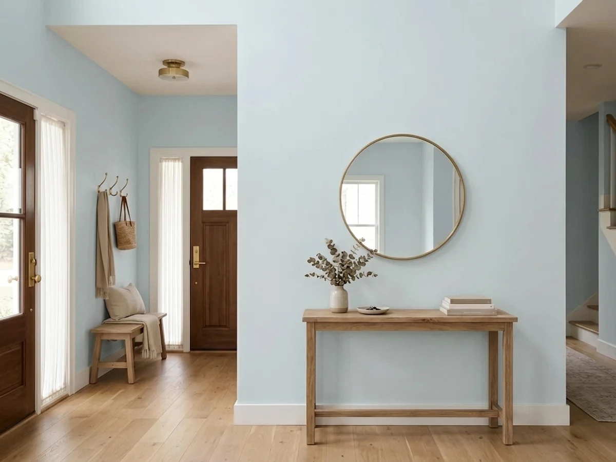
- 1Stardew43
- 2Sea Salt63
- 3Hinting Blue68
- 4Spring Thaw83
The Fast Verdict
Hinting Blue is barely a blue at all — Sherwin-Williams' own site files it under Purple, and at LRV 68 it reads more like a cool-tinted almost-white than a wall color with a name. That is not a knock. It is the whole appeal: a whisper of cold blue for rooms built around calm rather than color, with zero yellow to muddy the effect and just enough depth to avoid disappearing outright.
Home offices and reading nooks that want calm, not drama · bathrooms and powder rooms going for spa-quiet · a nursery or bedroom accent wall, not the whole room · anyone who wants "a hint of blue," not a blue statement
You want a real, visible blue from across the room · your floors are honey oak or golden pine · the room only gets cool LED light with no daylight · you're chasing a color with an internet following (this one has almost none)
- A genuine whisper of cool blue that never turns saturated or loud
- Zero yellow undertone means it never clashes with white trim, chrome, or cool stone
- Deep enough (LRV 68) to hold color, pale enough to keep a small room feeling open
- Built for Sherwin-Williams' Living Well Collection — genuinely low-drama by design
- Reads as considered restraint on an accent wall or vanity, not an unfinished choice
- So pale it can read as plain off-white from across the room
- No yellow to fall back on — warm lamps can mute it, never warm it
- Fights honey oak and any golden-toned wood
- Almost no real-world track record online to check against your own room
What Color Is Hinting Blue, Really?
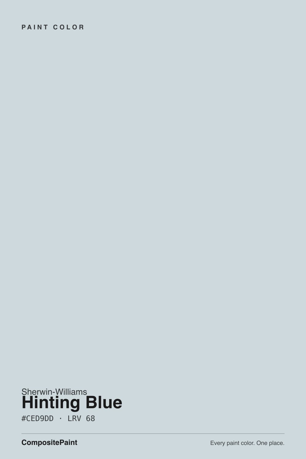
The name promises blue. Sherwin-Williams' own website disagrees: search their color-family pages and Hinting Blue SW 6519 turns up filed under Purple, sitting next to Magical, Scanda, Thistle and Expressive Plum — not among the blues at all. That filing quirk is not a mistake; it is the whole personality of the color in one fact. At LRV 68 and a hex of #CED9DD, it is a cool, faint tint balanced right on the line between blue and gray, close enough to purple's cast that Sherwin-Williams' own hue-sorting called it that way.
The undertone is genuinely cool with zero yellow in it — the thing that separates it from every warm blue in the deck. That matters more than it sounds: a warm off-white can be pushed cozier by a 2700K lamp because it already has yellow to amplify. Hinting Blue has none, so warm bulbs can only mute the blue toward gray, never turn it cream. It sits in Sherwin-Williams' Living Well Collection, the brand's set of colors built around low-arousal, nervous-system-calm rooms — bathrooms, offices, bedrooms — and the flat, undramatic character is by design, not an accident of a forgotten deck slot.
It is also, honestly, obscure. It has never been a Color of the Year, never had a viral bedroom moment, and turns up on only a handful of paint blogs rather than a wall of Pinterest boards. That is the trade-off with a color this quiet: almost no real-world track record to draw on, good or bad, and no crowd of buyers who already know how it behaves in their kind of room.
Where It Shines
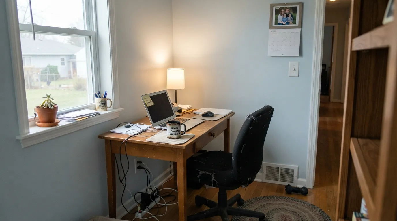
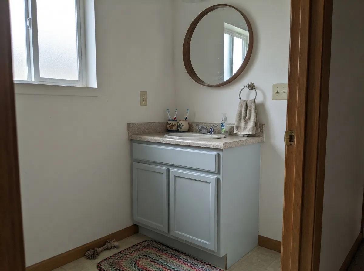
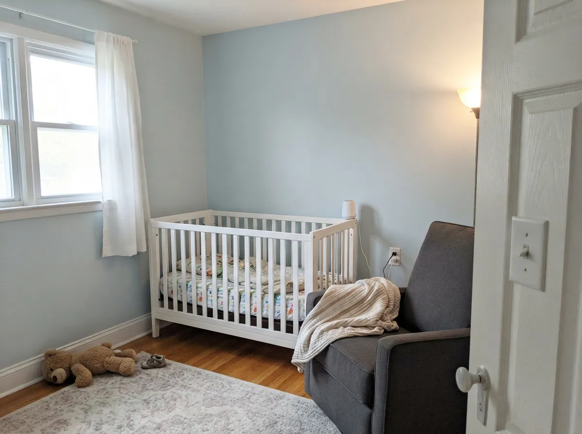
Give it a bright, indirect daylight room and a job that wants zero drama — a home office, a bathroom, a hallway — and Hinting Blue does exactly what the Living Well name promises: it recedes instead of performing. On a small accent, a nursery wall or a powder-room vanity, the barely-there blue reads as intentional restraint rather than an unfinished color choice, and a soft warm-white trim (Sherwin-Williams pairs it with Shell White) keeps the whole thing from tipping icy.
Where It Fails
There is not much of a public record of Hinting Blue going wrong — it simply has not been painted, discussed, or photographed enough for that. What follows are the failure modes the color's own numbers predict, the same ones every pale, zero-yellow blue-gray runs into:
Yellow-orange sits opposite blue on the wheel, and Hinting Blue has no yellow of its own to compromise with. Against golden wood the wall goes colder and the floor goes more orange by contrast — both sides lose. Pale white oak, walnut, or a painted floor are safer company.
At LRV 68 this is one of the palest colors carrying the word "blue" in any deck. From across a room, or on a phone screen, it can read as plain off-white, and only up close does the cool cast show. If you want a wall that reads unmistakably blue, this is the wrong depth — look at Windy Blue instead.
With zero yellow undertone, nothing about this color can be warmed. In a room that never sees daylight and runs on cool bulbs, it flattens into a slightly icy, colorless gray — not ugly, just cold, and warm 2700K lamps only get it partway back.
Room by Room
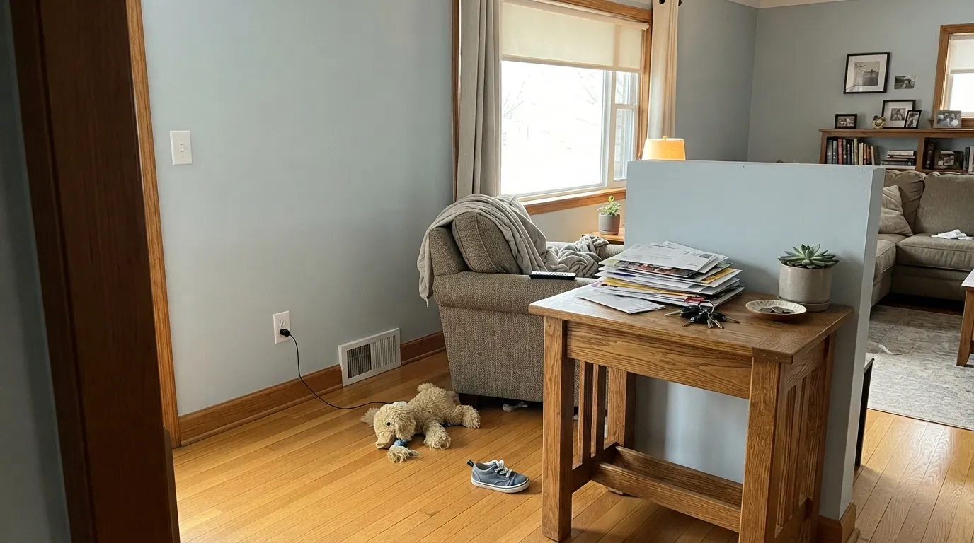
The Living Well pairing it was built for: enough color to feel considered, not enough to distract on a video call. Eggshell finish, and a soft warm-white trim (Shell White) keeps the room from tipping cold.
On four walls or just a vanity, it reads calm rather than clinical, especially against a white or marble-look counter. Satin on a vanity for wipe-down durability; matte or eggshell on walls.
Best as one wall behind the headboard or crib, not four walls of a room you're trying to make feel cozy. The total lack of warmth in the undertone works against you at full coverage in a room meant for rest.
In the utility rooms nobody stares at for long, its near-white restraint is exactly the point: enough personality to not be builder-white, not enough to clash with whatever gets stored against the wall.
It shows up here less than almost any other pale blue-gray in the deck. With warm cabinetry or golden floors it fights; with white cabinets and cool stone it can work, but Sea Salt and Glacier Blue both have a longer, better-documented kitchen track record.
There is no real-world exterior data for this color — no siding photos, no weathering reports. Given how little warmth it has to survive full sun and years of UV, this is not the color to gamble a whole house on; pick a color with an exterior track record instead.
Your Light Is the Risk
North or east daylight without direct sun shows it at its palest, cleanest cool blue-gray — the read Sherwin-Williams built the Living Well line around.
With no daylight and no warmth in the bulbs, it flattens into a slightly icy, colorless gray. Not broken, just cold — add a lamp before you decide you hate it.
Sherwin-Williams notes it reads lighter in strong natural light and takes on a more definite blue as the room grows dimmer — the opposite drift of most pale colors.
2700K lamps mute the blue toward soft gray, since there is no yellow for them to catch. Cool LEDs sharpen the icy cast instead. Neither warms it the way a cream white would warm.
Most complaints about Hinting Blue are a light mismatch. Upload a photo of your actual room and see it on your walls — then ask for the same wall in north light or evening lamps before you buy a single sample.
Need It From Another Brand?
Any paint counter can custom-tint Sherwin-Williams SW 6519 directly. If you would rather stay in one brand's own deck, these are the closest stock matches, measured as ΔE2000. Under 2 is a difference you will not see on the wall.
| Brand | Closest color | ΔE | LRV | |
|---|---|---|---|---|
| Behr | Manhattan Mist760E-2 · Behr | 1.1 | 69 | Color page → |
| Benjamin Moore | Blue Lace1625 · Benjamin Moore | 1.7 | 66 | Color page → |
| Valspar | Sunday Sky8004-36A · Valspar | 1.0 | 68 | Color page → |
| PPG / Glidden | ZenPPG1040-1 · PPG / Glidden | 1.2 | 68 | Color page → |
| Glidden | ZenPPG1040-1 · Glidden | 0.8 | 68 | Color page → |
| Dutch Boy | Dreamy Blue338-1DB · Dutch Boy | 2.3 | 67 | Color page → |
Similar Sherwin-Williams Colors
The nearest shades to Hinting Blue within Sherwin-Williams's own range, ranked by perceptual color distance — useful when you want the same look a touch lighter, darker, or warmer.
WCAG 2.1: AA is 4.5 : 1 for normal text, 3 : 1 for large text, AAA is 7 : 1.
Hinting Blue vs the Colors You're Also Considering
Every Hinting Blue sample board has the same rivals on it. The numbers show the real lightness gap — then it comes down to which risk you would rather live with.
Pick this for the cleaner, more purely cool-blue version with zero green in it.
Sherwin-Williams SW 6204 · LRV 63Sea SaltPick this if you want the green side of this family — Sea Salt is the same quiet weight with a coastal-green lean instead of blue.
Pick this to stay in the Sherwin-Williams deck, or for the slightly deeper, slightly cooler read.
Benjamin Moore 1653 · LRV 70Glacier BluePick this if your painter works in Benjamin Moore — it is the same near-white spa blue, one shade paler.
Moonmist SW 9144 shares the same LRV 68 at hex #C9D9E0. It carries slightly more blue and slightly less red, so it reads a touch cooler and cleaner. Icelandic SW 6526 at LRV 67 and Little Boy Blu SW 9054 at LRV 67 are both a shade deeper, with Little Boy Blu leaning greener.
Olympus White SW 6253 at LRV 68 and hex #D4D8D7 is the near-neutral in the group; choose it if the blue in Hinting Blue turns out to be more than you wanted. Rhythmic Blue SW 6806 at LRV 69 goes the other way, clearly bluer.
Across brands, HGTV Home by Sherwin-Williams Teensey Bubbles HGSW 2387 shares the exact hex #CED9DD and LRV 68. Glidden Zen PPG1040-1 at LRV 68, Valspar Sunday Sky 8004-36A at LRV 68, Behr Manhattan Mist 760E-2 at LRV 69, Farrow and Ball Borrowed Light No. 235 at LRV 69, and Benjamin Moore Blue Lace 1625 at LRV 66 are all visually identical in normal room light. Clare Nairobi Blue PNT100-LT-36 at LRV 67 is close but visibly different side by side.
Hinting Blue Coordinating Colors
The safe rule with Hinting Blue is about wood, not whites: honey-toned wood fights it, but the trim white can go either way. Sherwin-Williams' own pairing leans on Shell White's warmth to keep the cool wall from feeling icy, and a true cool white or true gray works just as well if you want a crisper contrast instead. These are the partners that show up again and again:
Why Sherwin-Williams Files Hinting Blue Under Purple
Every retailer buckets its colors into families, and most of the time the bucket matches the name. Hinting Blue is the exception: on Sherwin-Williams' own site, this color sits in the Purple family, filed next to Magical, Scanda, Thistle and Expressive Plum — not among the blues at all. It is less a labeling mistake than an honest admission about where the color actually sits: at this little saturation and this pale a value, the line between "blue-gray" and "gray-violet" gets genuinely blurry, and whatever hue-sorting Sherwin-Williams runs on its own deck called this one purple.
For a buyer, the practical read matters more than the label: in a room with real daylight, this reads as a cool, quiet blue-gray, not violet. But the filing quirk is a useful warning about the color's whole personality — it never fully commits to being anything. That is by design; it belongs to Sherwin-Williams' Living Well Collection, colors chosen specifically to be calm rather than definite. It also explains why Hinting Blue has almost no online footprint: undecided colors don't go viral.
Hinting Blue With Wood Tones and Metals
Wood pairing here is simple because the color has no yellow to negotiate with: pale white oak, ash, birch, and painted or whitewashed floors all sit comfortably next to Hinting Blue, and gray-washed wood is close to a perfect match. Walnut and espresso work too, in small doses, as a dark grounding note against all the pale cool color.
The floor to watch is honey oak, golden pine, or anything with an orange-tan cast — Hinting Blue has nothing warm in it to meet that halfway, so the two fight rather than blend. Metals follow the same cool logic: brushed nickel, chrome and matte black all read clean against it, while unlacquered brass — which loves a warm white — can look slightly out of place here. If brass is non-negotiable, keep it to small hardware rather than a big fixture.
Three Ready Palettes Built on Hinting Blue
A color is never alone on the wall. These are complete combinations in the 60-30-10 pattern, with the reason each one holds together. Every one opens in the visualizer.
Shell White keeps the trim warm enough that the room never tips cold, and one piece of furniture in Peppercorn gives the eye somewhere to land in a room built to otherwise disappear.
Try this palette in your roomAlabaster's warmth keeps a small room from feeling cold while the vanity carries the color; Cast Iron on the mirror frame is the one dark note that makes the palette read finished instead of unplanned.
Try this palette in your roomToque White keeps three walls soft and warm-neutral so the fourth, in Hinting Blue, reads as a deliberate decision rather than a stray blue. Felted Wool on the furniture ties the cool accent back to something warm.
Try this palette in your roomHinting Blue FAQ
Is Hinting Blue actually blue?
Barely, and Sherwin-Williams' own website agrees — search their site and this color is filed under Purple, not Blue, alongside colors like Magical and Thistle. On the wall it reads as a cool, faint blue-gray, closer to an almost-white than to a proper blue accent wall.
How light is Hinting Blue really?
At LRV 68 it sits on the pale side of mid-range — noticeably deeper than a true off-white like Shell White (LRV 83), but pale enough that from across a room it can look plain white until you get close.
What trim white goes with Hinting Blue?
Shell White is Sherwin-Williams' own coordinating pick, and the logic works: it is a soft, warm white, and that warmth balances the cool blue instead of doubling down on it. A true cool white also works if you want a crisper, more clinical contrast — either direction reads fine, since the wall itself has no yellow to argue with.
Does it work with honey oak or golden wood floors?
Not well. Golden wood sits opposite blue on the color wheel, so the wall reads colder and the floor reads more orange when they're side by side. Pale oak, walnut, or a painted floor are safer partners.
Is it good for a nursery?
Yes, used as one accent wall rather than all four — the calm, undramatic character Sherwin-Williams built into its Living Well Collection is exactly what a nursery wants, but at full coverage the total lack of warmth can read cold for a room meant to feel cozy.
Will it look too icy or cold?
In a dim room with only cool LED bulbs, yes — it has zero yellow undertone to fall back on, so nothing warms it up. Add daylight or a warm 2700K lamp and the icy read softens considerably.
Have you painted with Hinting Blue?
Rate it — one tap helps the next reader decide.
Ask a Question