Glacier Blue
Benjamin Moore's palest spa blue, reviewed honestly: the daylight where it reads true sky blue, the dim room where it fades to gray, and what to pair it with.

Jessica has spec'd whites and neutrals for more than 300 rooms and keeps a sample wall of painted drawdowns in her studio. Every color review is checked against real reader rooms in the comments and re-tested when a formula changes. About the testing process →
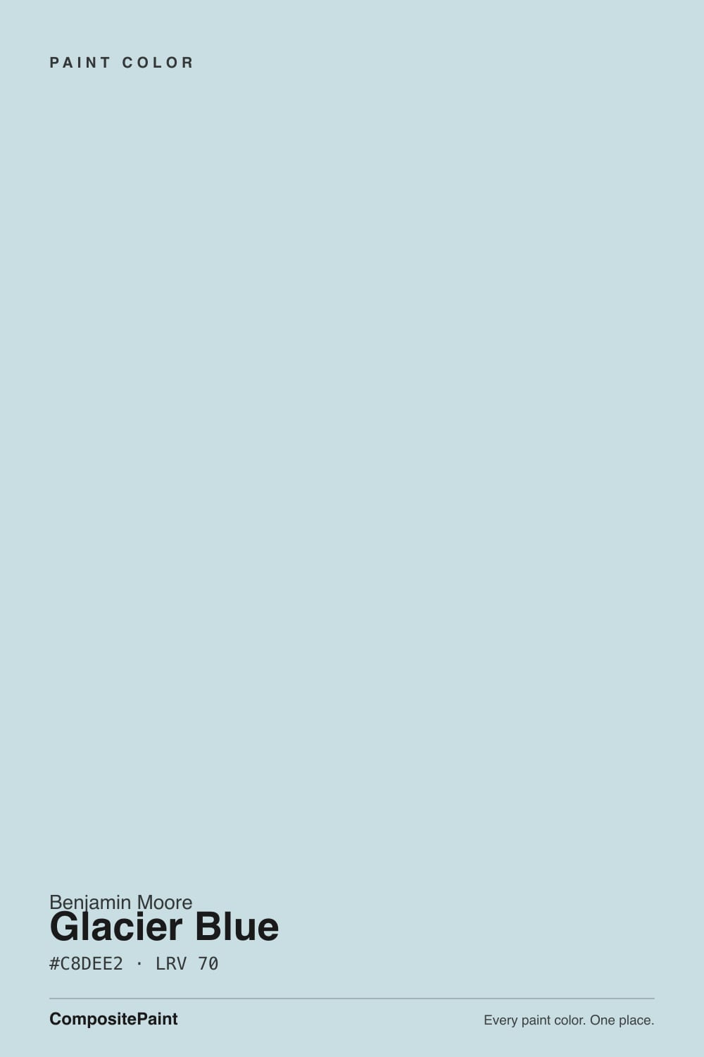
- 1Stardew43
- 2Sea Salt63
- 3Glacier Blue70
- 4Spring Thaw83
The Fast Verdict
Glacier Blue is what happens when a spa blue gets diluted almost to nothing: a whisper of blue-green sitting on a near-white base. At LRV 70 it barely reads as a color next to a true white — and that restraint is the whole appeal. It cools a room without ever raising its voice. The tradeoff is honesty: take away real daylight and the blue can thin out to almost nothing, leaving a flat pale gray that disappoints anyone who bought it hoping for a wall that reads unmistakably blue.
Bathrooms and powder rooms with cool metal fixtures · nurseries and calm bedrooms · a painted ceiling that still keeps the room feeling light · anyone who wants a hint of blue without committing to an actual blue wall
Your room runs dim or north-facing with few windows · you want a wall that reads clearly blue from across the room · your floors or trim lean warm honey oak or golden beige · you already want the stronger, more saturated look of Palladian Blue
- The palest, gentlest blue in the BM deck — reads more like a tinted white than a committed color
- Cool metals (nickel, chrome, unlacquered brass) look genuinely elegant against it
- Works as a ceiling color without visually lowering the room, unlike a true mid-tone blue
- A calmer, quieter alternative to Palladian Blue for readers who find that color too green or too strong
- Subtle enough that it will not date the way a bold, saturated blue eventually does
- Fades to nearly plain gray in dim or north-facing rooms — the blue can vanish entirely
- Fights warm honey oak floors and golden beige trim, going muddy instead of icy
- Too faint for anyone who wants a wall that reads clearly "blue" from across the room
- Cool LED bulbs at night push it toward clinical rather than cozy
What Color Is Glacier Blue, Really?
Glacier Blue is a pale, desaturated blue-green that leans more blue than green — cooler and quieter than Benjamin Moore's better-known spa color, Palladian Blue, and considerably lighter. Where Palladian Blue (LRV 53) commits to a real spa-green cast, Glacier Blue sits almost two full steps lighter at LRV 70, closer in weight to a tinted white than to a wall color you'd call "blue" on sight. It is the gentlest member of a small family of BM blue-grays that also includes Boothbay Gray and Quiet Moments — all built on the same cool, watery premise, just at very different depths.
At LRV 70 it sits in the same lightness band as near-white colors like Silver Satin (LRV 75) rather than with true mid-tone spa blues. That matters practically: it will not darken a room the way Palladian Blue or Boothbay Gray can, which is exactly why it works on ceilings and in small windowless bathrooms where a stronger color would feel heavy. The flip side is that its color signal is faint to begin with, so anything that mutes it further — dim light, warm bulbs, a warm-toned neighbor color — can push it past "subtle" into "just looks off-white."
Undertone in one line: blue-green, blue-leaning, never warm. If your sample looks flatly gray with no hint of blue at all, that is dim or artificial light draining an already-faint color, not a defect in the paint; if it looks distinctly teal or green, that is usually a warm bulb or a green-leaning neighbor color pulling it the other way.
Where It Shines
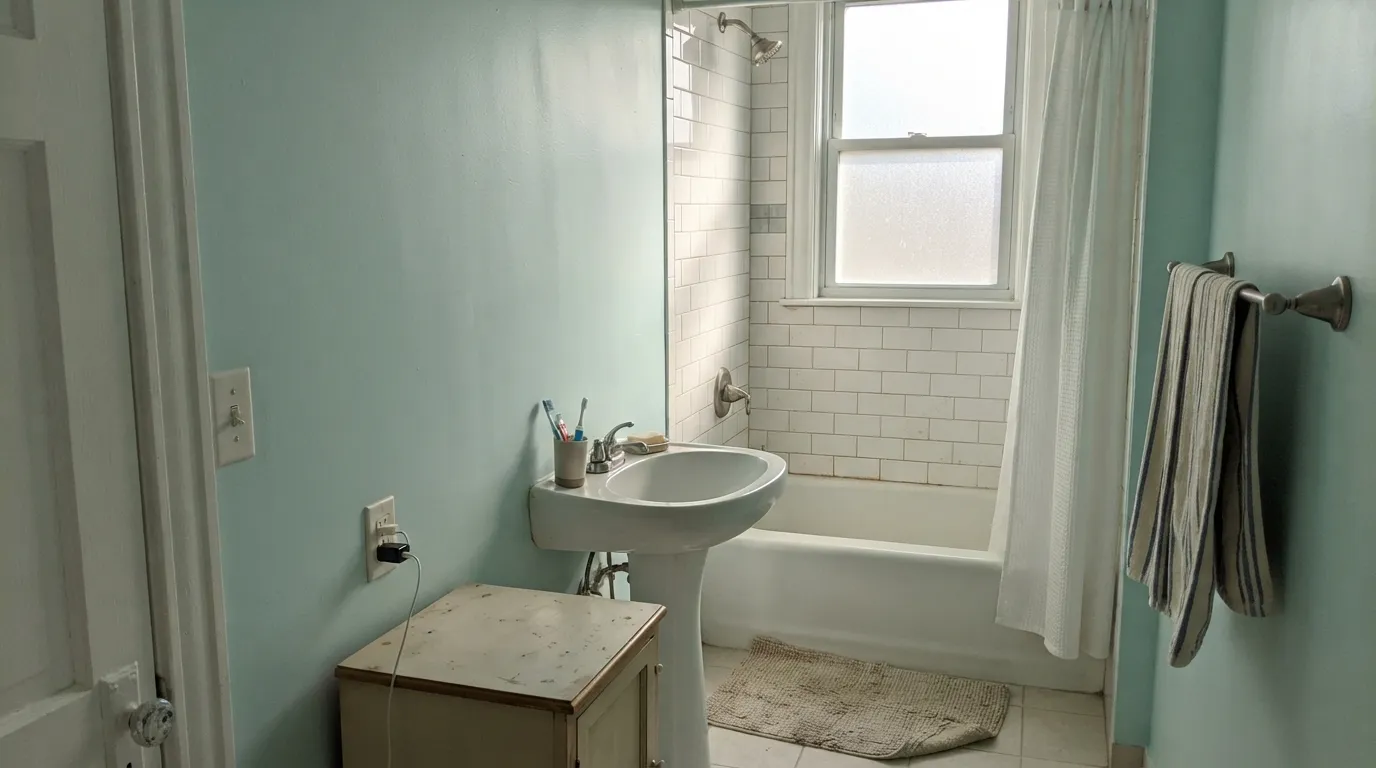
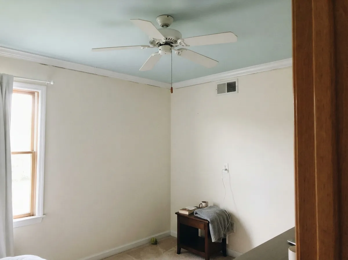
Give it real daylight and it earns its name: a clean, icy sky blue that feels like light itself has a faint color to it. Bathrooms are its best room — white subway tile, nickel or chrome fixtures, and morning light bring out exactly the cool, clean feeling the color is named for. Ceilings are its quiet second job: because it is so close in lightness to a plain white ceiling, painting it Glacier Blue instead adds a soft lift of color overhead without the visual weight a mid-tone color would bring, the same trick decorators use with a much subtler hand than a true "haint blue" porch ceiling.
Where It Fails
Almost every disappointed review of Glacier Blue follows one of three scripts, and all three trace back to the same root cause: this is a genuinely faint color, and faint colors have less room for error than bold ones. None of them are the paint's fault — but if your room matches one, sampling a bigger swatch will only confirm the problem, not fix it.
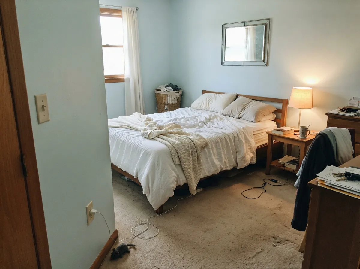
Glacier Blue does not have much color to give up before it stops looking like a color at all. In flat, cool north light or an overcast day, the blue-green thins out almost completely and the wall reads as a plain, slightly cold pale gray. Readers who picked it hoping for a visible spa blue call it "invisible" or "just looks white." The fix is daylight, not more coats — this needs a room with real south or east sun, or it needs to be a deliberate near-white choice instead.
This is a cool color built on very little pigment, so it has almost no ability to fight a warm neighbor. Golden oak trim, honey hardwood floors, or beige carpet all pull it toward a washed-out, slightly muddy gray instead of the clean icy blue on the chip. Pale white oak, driftwood tones, or a cool gray floor let it read true; a warm honey floor is the single most common reason it disappoints in real rooms.
Cool-temperature bulbs push an already-cool color further cold, and at this depth that reads clinical rather than cozy — closer to a hospital corridor than a spa. It is not that the color turns ugly; it is that a faint blue under a blue-white bulb loses the soft, warm-adjacent quality that makes it feel calming during the day. Swap to 2700K warm bulbs before deciding the color is wrong.
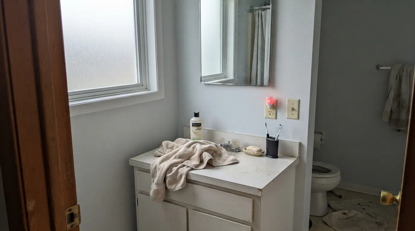
Room by Room
White subway tile, nickel or chrome fixtures, and any real window turn this into the clean spa-blue effect the name promises. Eggshell or satin for wipeability; avoid warm brass unless you want the contrast.
Soft enough to be genuinely restful, not babyish, if the room gets real light during the day. Pair with White Dove trim and warm 2700K lamps for evening; skip it in a north-facing nursery that stays dim most of the day.
Because it sits so close to white in lightness, painting the ceiling Glacier Blue instead of flat white adds a whisper of color overhead without lowering the room the way a true mid-tone ceiling color would. Flat sheen, and keep the walls a true white or a near-white for the contrast to register at all.
Works well on a single wall behind open shelving or on a small breakfast-nook bench where white cabinetry and cool metal fixtures carry the rest of the room. A full kitchen of cabinets in this color risks looking under-committed rather than intentional — Palladian Blue or Boothbay Gray read more decisively on cabinetry.
In a bright, south-facing open plan it can work as a quiet wash of color that never competes with furniture or art. In anything less than strong daylight it tends to read as an indecisive off-white, which is the complaint behind most of its lower reviews in open-plan homes.
Full outdoor sun and weathering wash out already-faint colors faster than interior light does, and Glacier Blue has little pigment reserve to lose. It can work on a shaded porch ceiling in the classic pale "haint blue" tradition, but as body color on siding it tends to read as a dingy off-white rather than a deliberate pale blue.
Your Light Is the Risk
Real sun brings out a clean, icy sky blue — the color at its most honest and most flattering.
The already-faint blue-green thins toward plain pale gray. If your room is dim most of the day, test big before committing.
Crisper and bluer at midday sun, softer and grayer as light fades toward evening — a gentle drift, not a dramatic one.
2700K warm bulbs keep it soft and livable at night. Cool white LEDs push it clinical — swap the bulbs before you swap the paint.
Most complaints about Glacier Blue are a light mismatch. Upload a photo of your actual room and see it on your walls — then ask for the same wall in north light or evening lamps before you buy a single sample.
Need It From Another Brand?
Any paint counter can custom-tint Benjamin Moore 1653 directly. If you would rather stay in one brand's own deck, these are the closest stock matches, measured as ΔE2000. Under 2 is a difference you will not see on the wall.
| Brand | Closest color | ΔE | LRV | |
|---|---|---|---|---|
| Sherwin-Williams | Open AirSW 6491 · Sherwin-Williams | 1.8 | 70 | Color page → |
| Behr | Beach FoamS450-1 · Behr | 1.6 | 72 | Color page → |
| Valspar | Barest Hint of BlueT633 · Valspar | 1.4 | 70 | Color page → |
| PPG / Glidden | EmbellishmentPPG1151-2 · PPG / Glidden | 1.0 | 70 | Color page → |
| Glidden | EmbellishmentPPG1151-2 · Glidden | 1.0 | 70 | Color page → |
| Dutch Boy | Relaxing Rain334-2DB · Dutch Boy | 1.8 | 70 | Color page → |
Similar Benjamin Moore Colors
The nearest shades to Glacier Blue within Benjamin Moore's own range, ranked by perceptual color distance — useful when you want the same look a touch lighter, darker, or warmer.
WCAG 2.1: AA is 4.5 : 1 for normal text, 3 : 1 for large text, AAA is 7 : 1.
Glacier Blue vs the Colors You're Also Considering
Every Glacier Blue sample board has the same rivals on it. The numbers show the real lightness gap — then it comes down to which risk you would rather live with.
Pick this if Palladian Blue's green cast feels too strong — Glacier Blue is the same family, diluted and bluer.
Benjamin Moore HC-144 · LRV 53Palladian BluePick this if you want it to actually read as blue-green in every light, not just bright daylight — Palladian Blue carries real color depth Glacier Blue doesn't have.
Pick this for the palest possible version of this look — Glacier Blue is lighter and leans more blue than green.
Benjamin Moore 1563 · LRV 50Quiet MomentsPick this for a slightly deeper, greener cousin with more visible color in the same low-key family.
Polar Sky 1674 and CC-790 at #CBDDE2 and LRV 69 to 70 is the nearest neighbor and reads a shade grayer. Breath of Fresh Air 806 at #C9DDE5 and LRV 69 has more blue in the last channel and looks slightly more like a sky blue. Blue Haze 1667 at #CBDCDF and Summer Shower 2135-60 at #CEDDDF, both LRV 69, are the muted options that trade some of the aqua for gray. Blue Allure 771 at #C0DFE7 and LRV 70 is the boldest and clearly more turquoise.
Across brands, PPG Embellishment PPG1151-2 at LRV 70 with a deltaE of 0.99 is a true match, and Glidden lists the same color at deltaE 1.04. Valspar Barest Hint of Blue T633 at LRV 70, deltaE 1.41, and Sherwin-Williams Open Air SW 6491 at LRV 70, deltaE 1.76, are visually identical in normal room light. Behr Peek A Blue T17-04 at LRV 71, deltaE 3.06, is very close but worth sampling. Farrow and Ball Borrowed Light No. 235 at LRV 69, deltaE 4.64, is close but visibly different side by side.
Glacier Blue Coordinating Colors
The rule for coordinating with Glacier Blue: keep everything cool or true-neutral, and let something else in the room carry the actual color weight — this paint is too faint to anchor a scheme on its own. It pairs cleanly with crisp and warm whites alike on trim, borrows real depth from its darker blue-gray relatives, and takes a confident navy accent well. These are the partners that keep it from reading indecisive:
Where Glacier Blue Sits in BM's Blue-Green Family
Benjamin Moore's deck holds a small cluster of cool, watery blue-grays that all share the same premise: a blue-green tint over a mostly-neutral base. Boothbay Gray (HC-165, LRV 36) and Quiet Moments (1563, LRV 50) sit at real mid-tone depth, and Palladian Blue (HC-144, LRV 53) is the most famous of the group — a genuine spa color that most readers already recognize by name. Glacier Blue is the palest of all of them by a wide margin, sitting at LRV 70, closer in weight to a near-white like Silver Satin than to any of its own relatives.
That makes it less a showpiece color and more an entry point: the version to reach for when a client wants "just a hint" of blue rather than a committed spa palette. It has none of Palladian Blue's name recognition, and this review found no evidence of a Color of the Year moment or a viral design-blog run for it — it is an honest, quieter member of the family, useful for exactly the restrained job it does well rather than for making a statement.
Glacier Blue With Wood Tones and Metals
Wood decides this pairing more than the paint does. Pale white oak, driftwood-gray floors, and whitewashed wood all sit comfortably beside Glacier Blue because neither side is fighting for warmth. Walnut and espresso tones are safe too — dark enough that the contrast reads intentional rather than washed out.
Golden or honey-toned oak is the one real mismatch. Because Glacier Blue carries so little pigment to begin with, it has almost nothing to push back with against a warm floor, and the result tends to look muddy on the wall and slightly gray on the floor rather than a clean pairing. If a honey floor is staying put, a cool gray or white rug between the two surfaces does more good here than it would for a stronger color.
On metals, cool wins: nickel, chrome, and matte black all read clean and deliberate. Aged or unlacquered brass softens the coolness without fighting it. Bright polished brass and warm gold fixtures are the one metal finish that consistently looks out of place against it.
Three Ready Palettes Built on Glacier Blue
A color is never alone on the wall. These are complete combinations in the 60-30-10 pattern, with the reason each one holds together. Every one opens in the visualizer.
Chantilly Lace's crisp cool white keeps Glacier Blue from washing out the way a warmer trim white would, and a Boothbay Gray vanity supplies the real color depth the walls are too pale to carry alone — nickel hardware ties the whole room together.
Try this palette in your roomWhite Dove's warmth on the walls gives the Glacier Blue ceiling something to contrast against — without a warmer wall color, the ceiling reads too close to plain white to register at all. Silver Satin ties in on trim without competing.
Try this palette in your roomHale Navy gives the room the one genuinely dark, confident note that Glacier Blue alone can't provide, and because both colors share the same cool blue family, the pairing reads deliberate rather than mismatched. White Dove trim keeps the edges soft.
Try this palette in your roomGlacier Blue FAQ
Is Glacier Blue really blue, or does it just look gray?
Both, depending on your light. In real daylight it reads as a genuine pale blue-green. In a dim or north-facing room it can thin out to something that looks like plain pale gray. It is one of the palest colors in Benjamin Moore's blue family, so it has less color to lose before it stops reading as "blue" at all — sample a large piece on your actual wall before committing.
How is it different from Palladian Blue?
Palladian Blue is deeper (LRV 53) and leans more green — a real, decisive spa color. Glacier Blue is lighter (LRV 70) and leans more blue, more diluted, closer to a tinted white. Pick Palladian Blue if you want the color to register clearly in any light; pick Glacier Blue if you want just a hint of blue and nothing louder.
Does it work with warm wood floors?
Only with caution. Pale white oak, driftwood, and cool gray-toned floors let it read true and icy. Warm honey oak or golden-stained floors pull it toward a washed-out, muddy gray instead — this is the single most common regret with the color. Test a large sample directly above your actual floor.
Is it a good ceiling color?
Yes, and it is one of its best uses. Because it sits so close in lightness to a plain white ceiling, it adds a whisper of color overhead without visually lowering the room. It needs a slightly warmer or more saturated wall color underneath it, or the contrast disappears and the ceiling just looks like an off-white.
What metals and fixtures go best with it?
Nickel and chrome look genuinely elegant against it — cool metal matches the cool undertone. Unlacquered or aged brass works too and softens the coolness slightly. Bright polished brass and warm gold fixtures tend to fight it rather than complement it.
Will Glacier Blue go out of style?
It carries relatively little repaint risk. Because it is so pale and desaturated, it behaves more like a quiet near-white than a trend color, so it will not date the way a bold, saturated blue eventually does. The tradeoff is the same one that runs through this whole review: it is a safe, low-commitment color specifically because it barely commits to being blue in the first place.
Have you painted with Glacier Blue?
Rate it — one tap helps the next reader decide.
Ask a Question