Breath of Fresh Air
Benjamin Moore's 2014 Color of the Year, reviewed honestly: the soft spa blue that flatters white cabinets and nurseries, the flat gray it turns into without real daylight, and what to pick instead.

Jessica has spec'd whites and neutrals for more than 300 rooms and keeps a sample wall of painted drawdowns in her studio. Every color review is checked against real reader rooms in the comments and re-tested when a formula changes. About the testing process →
- 1Stardew43
- 2Sea Salt63
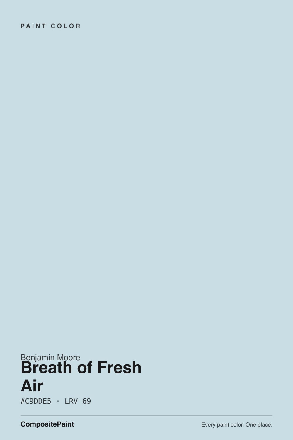
- 3Breath of Fresh Air69
- 4Spring Thaw83
The Fast Verdict
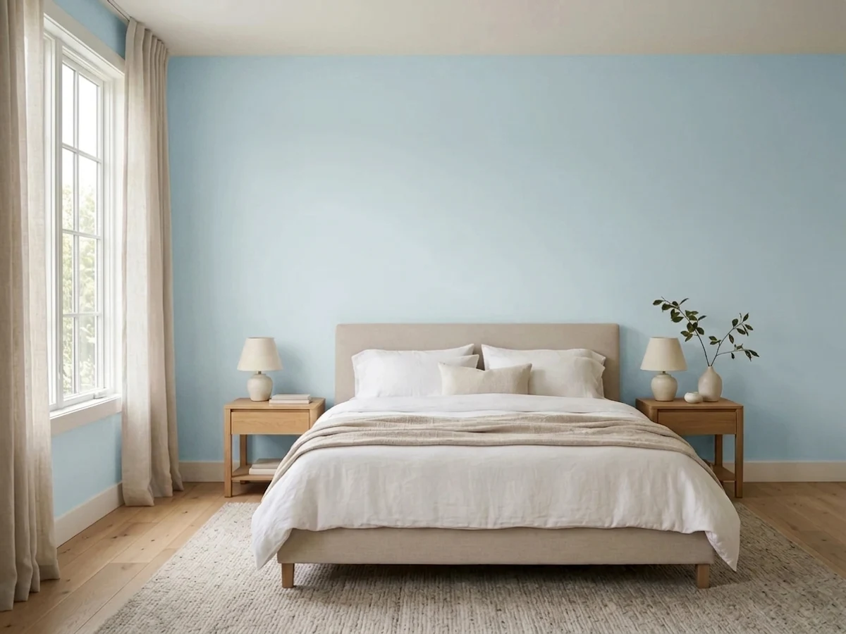
Breath of Fresh Air is a decade-plus-old veteran, not a new trend: Benjamin Moore's 2014 Color of the Year, and it earned the title by being the rare pale blue that reads as calm rather than babyish. At LRV 69 it barely raises its voice — a whisper of blue-green over what is almost a white. Give it real daylight and white trim and it is one of the easiest spa colors in the deck; take the daylight away and it can slide into a flat, slightly dingy gray that some owners genuinely regret.
Kitchens with white cabinets · bathrooms and powder rooms · nurseries that need to grow past baby blue · whole-house trim that wants a whisper of color · anyone who wants blue without committing to blue
Your room is dim and north-facing with no lamp plan · you want a true saturated teal or blue, not a tint · your wood tones run honey-gold and traditional · you're chasing a fresh 2026 trend, not a proven veteran
- A proven decade-plus veteran, not a fad — Benjamin Moore's 2014 Color of the Year
- Reads as calm blue-green, not baby blue, so it grows with a nursery
- Kitchen and bath default: flatters white cabinets, brass, and chrome alike
- High LRV keeps rooms bright while still adding a real note of color
- Grayed-down base means it won't date the way a purer trend blue would
- Goes flat and can read dingy gray in dim north light
- Too subtle for buyers expecting the saturated blue on the fan-deck chip
- Fights honey oak and warm golden wood tones
- Needs a real lighting plan — daylight or warm lamps — to hold its color
What Color Is Breath of Fresh Air, Really?
A grayed sky-blue with the faintest wash of green — soft enough that our own deck files it in the neutral-gray bucket rather than a true blue family, and that ambiguity is the whole point. It's the same restrained trick as the rest of Benjamin Moore's pale spa lineup (Glacier Blue, Ocean Air): start with a clear color, then gray it down until it reads as a feeling more than a hue. What sets Breath of Fresh Air apart from its quieter siblings is a résumé: Benjamin Moore named it 2014 Color of the Year, and unlike most Color-of-the-Year picks that get retired to old Pinterest boards, this one has stayed in steady rotation for kitchens and nurseries ever since — proof the grayed-down base kept it from dating the way a purer trend blue would have.
At LRV 69 it reflects most of the light that hits it, and next to a true white trim the gap is visible but small — closer to White Dove's quiet presence than to a saturated accent wall. That subtlety is exactly what surprises first-time buyers: the fan-deck chip looks like a confident spa blue, and the painted wall in ordinary daylight can read more like a tinted white that only commits to color when the light is generous. It's a real, well-documented complaint pattern to plan for, not a paint defect.
Undertone in one line: blue-green with a cool gray base — never truly warm, never truly saturated. In good daylight the blue leads; in flat, cool, or artificial light the green and gray step forward and the color can look almost colorless, even slightly dingy, to eyes expecting the brighter blue from the sample chip. That is the light doing its job, not the paint failing — but it means this is not a color to buy from a fan deck alone.
Where It Shines
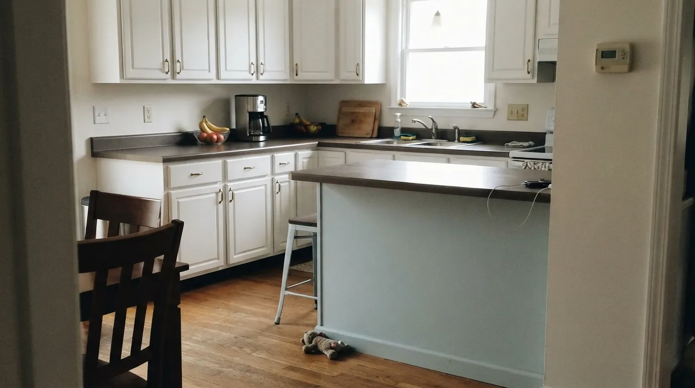
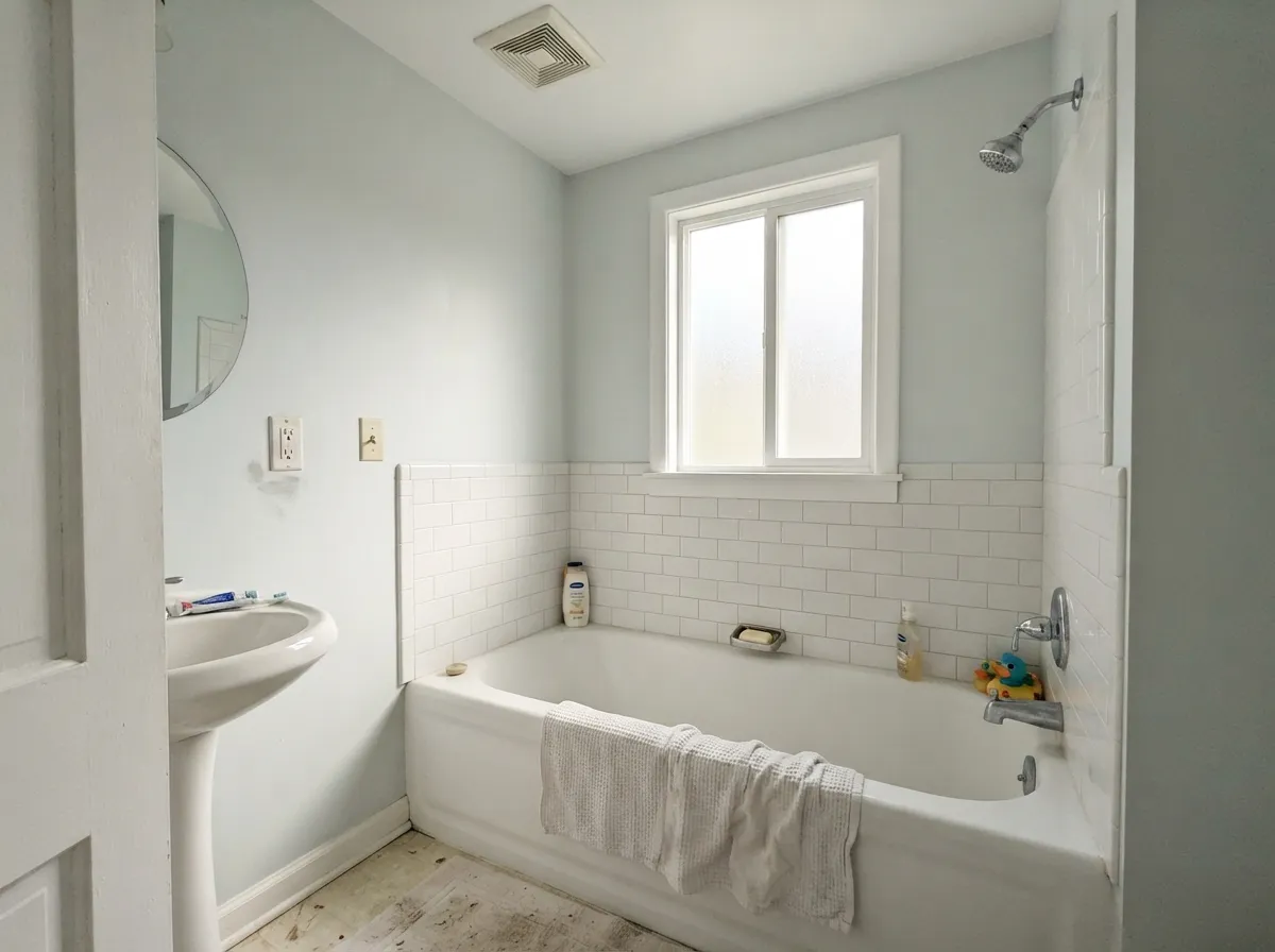
Give it real daylight, a white trim, and a light hand with cool metals and it is one of the easiest colors in the deck to live with. It made its reputation in kitchens — white cabinets with a Breath of Fresh Air island was a signature look the year it won Color of the Year, and it still reads fresh today. It does the same quiet trick in bathrooms and nurseries, where a saturated teal would feel like too much commitment but plain white feels unfinished.
Where It Fails
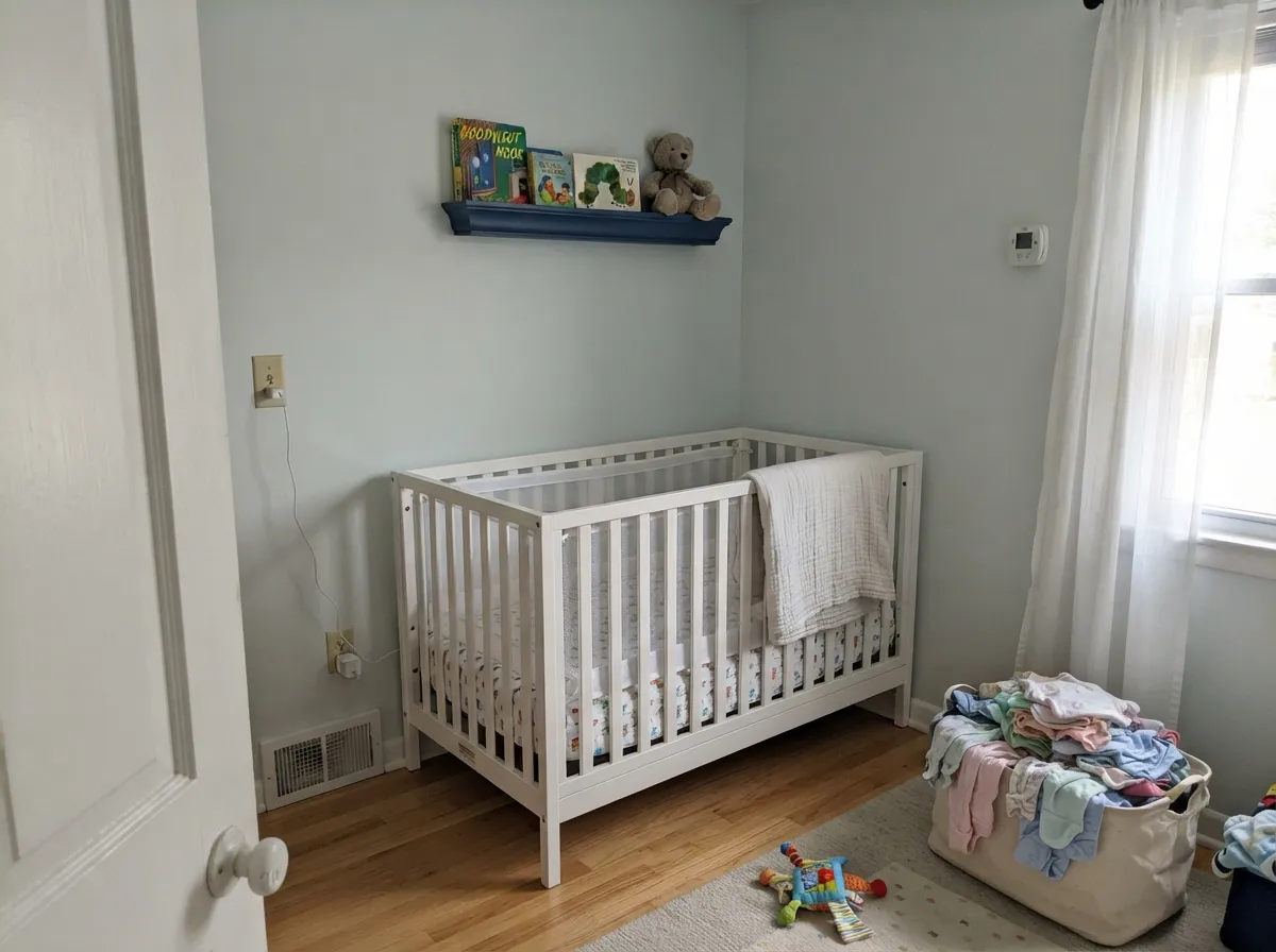
Almost every regret story about Breath of Fresh Air comes from one of three situations, and all three are predictable before the first coat. None of them are the paint's fault — but if your room matches one, this is not your color, and a bigger sample will only confirm it.
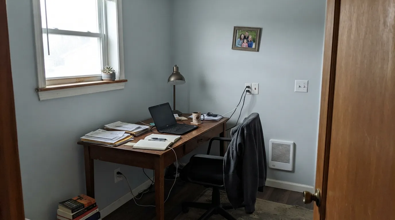
This is the single most common complaint: painted in a room without much daylight, the blue-green washes out and the wall can read as a flat, dingy off-white rather than the color on the chip — some owners have described the result as having 'no color at all.' Cool north light is the culprit, not the paint. Add warm 2700K lamps or move this color to a brighter room.
It's a genuinely cool color, and honey oak floors, oak trim and warm builder-beige carpet fight it — the wood looks more orange, the walls look grayer and colder, and neither side wins. It wants white oak, walnut, or painted trim, not gold.
At LRV 69 this is much closer to a tinted white than to a statement teal. Buyers who sample a small chip and picture a bold spa-blue accent wall are often disappointed by how quiet it reads across four full walls — if you want that bolder version, look at a deeper sibling like Palladian Blue instead.
Room by Room
White cabinets with a Breath of Fresh Air island or walls is the pairing that made it Color of the Year, and it still holds up. Brass or nickel pulls both work. Satin on cabinets, eggshell on walls.
A real spa feel without fully committing to teal. Pairs cleanly with white subway tile and either chrome or brass fixtures. Watch for a windowless bath under cool LEDs — add a warm sconce.
Grayed down enough that it reads as a real color choice, not pastel baby blue, so it can carry the room from nursery into a big-kid space with a navy or orange accent swapped in later.
Calm and airy in a bright room. If the room faces north and stays dim, plan on warm lamps at night or size up to a warmer color instead.
Works well on its own, but in an open plan it has to negotiate with whatever wood tones and colors sit in the adjoining rooms. Keep the wood cool-neutral to gray, not honey-gold.
Too pale for a full exterior statement in most climates; it earns its keep on a front door, shutters, or a covered porch ceiling paired with white trim rather than four full walls.
Your Light Is the Risk
Real daylight and a white trim is where it earns its Color-of-the-Year reputation — a soft, clean spa blue all day.
Cool, flat daylight drains the blue and can leave a dingy, colorless gray — the complaint behind most bad reviews.
Blue leads at the sun hours, quieter gray-green the rest of the day. Expect real movement, not a flaw.
2700K lamps keep it soft and blue-leaning; cool LEDs push it toward flat gray — swap the bulb before you swap the paint.
Most complaints about Breath of Fresh Air are a light mismatch. Upload a photo of your actual room and see it on your walls — then ask for the same wall in north light or evening lamps before you buy a single sample.
Need It From Another Brand?
Any paint counter can custom-tint Benjamin Moore 806 directly. If you would rather stay in one brand's own deck, these are the closest stock matches, measured as ΔE2000. Under 2 is a difference you will not see on the wall.
| Brand | Closest color | ΔE | LRV | |
|---|---|---|---|---|
| Sherwin-Williams | Rhythmic BlueSW 6806 · Sherwin-Williams | 2.4 | 69 | Color page → |
| Behr | Blue Me AwayM510-1 · Behr | 1.6 | 69 | Color page → |
| Valspar | IcyV108-1 · Valspar | 1.4 | 68.9 | Color page → |
| PPG / Glidden | Duck's Egg BluePPG1239-2 · PPG / Glidden | 0.8 | 71 | Color page → |
| Glidden | Dartmoor MistPPG1154-3 · Glidden | 1.7 | 70 | Color page → |
| Dutch Boy | Ethereal Morn140-2DB · Dutch Boy | 2.0 | 70 | Color page → |
Similar Benjamin Moore Colors
The nearest shades to Breath of Fresh Air within Benjamin Moore's own range, ranked by perceptual color distance — useful when you want the same look a touch lighter, darker, or warmer.
WCAG 2.1: AA is 4.5 : 1 for normal text, 3 : 1 for large text, AAA is 7 : 1.
Breath of Fresh Air vs the Colors You're Also Considering
Every Breath of Fresh Air sample board has the same rivals on it. The numbers show the real lightness gap — then it comes down to which risk you would rather live with.
Pick this for the track record — a decade of real kitchens and nurseries behind the name.
Benjamin Moore 1653 · LRV 70Glacier BluePick this if you want the same soft spa blue without the Color-of-the-Year name recognition — it's nearly the same paint at nearly the same LRV.
Pick this when you want the blue-green to actually register as a color, not just a tint.
Benjamin Moore 2123-50 · LRV 73Ocean AirPick this if even this feels like too much color — Ocean Air is paler still, closer to an off-white with a blue-green whisper.
Polar Sky, listed as both 1674 and CC-790 at #CBDDE2 and LRV 69 to 70, is the closest neighbor. It holds slightly less blue, so it reads a shade calmer and greener. Glacier Blue 1653 at #C8DEE2 and LRV 70 goes further that way and starts to feel like a soft aqua. Blue Haze 1667 at #CBDCDF and LRV 69 and Summer Shower 2135-60 at #CEDDDF and LRV 69 are the grayed versions, better if you found Breath of Fresh Air too clean. Sheer Bliss CSP-545 at #D0DDE5 and LRV 71 is the lightest of the set.
Across brands, PPG Duck's Egg Blue PPG1239-2 at deltaE 0.76 is effectively the same color, and Valspar Icy V108-1 at 1.37 and Behr Waterfall HDC-CT-16B at 1.72 are visually identical in normal room light. Sherwin-Williams Rhythmic Blue SW 6806 at 2.4 is very close but sample it first. Dunn-Edwards Shark DE5771 at 2.76 sits at LRV 64, noticeably darker on a wall. Farrow & Ball Borrowed Light No. 235 at 4.45 is close but visibly different side by side, grayer and less blue.
Breath of Fresh Air Coordinating Colors
The rule for coordinating with Breath of Fresh Air: cool and crisp wins, warm and golden loses. It pairs happily with true whites, deeper members of its own spa-blue family, and one confident dark accent — and it argues with anything yellow-gold. These are the partners that keep showing up in rooms that work:
The 2014 Color of the Year, a Decade Later
Benjamin Moore named Breath of Fresh Air its Color of the Year for 2014, back when the broader trend was moving away from the taupe-heavy neutrals of the 2000s toward softer, calmer color. Most Color-of-the-Year picks get a season of magazine spreads and then quietly retire to old mood boards; this one didn't. Because the base is grayed down rather than saturated, it never looked as bold or trend-dated as some of its louder 2014-era peers, and that restraint is exactly why it's still a working kitchen and nursery color today instead of a color people associate with a specific year.
That track record is worth something a brand-new trend color can't offer: real reviews, a real complaint pattern, and real proof of how it ages across different daylight and bulbs — most of what fills the fails section above comes from a decade of owners living with it, not a launch-week marketing push.
Breath of Fresh Air With Wood Tones and Floors
White oak, gray-washed floors, and walnut are the easy partners — all read cool or neutral enough to let the blue-green stay calm rather than fighting for temperature. Cream or gray rugs are safe; a deep navy rug adds the one confident dark note the room usually wants.
Honey oak and orange-toned builder trim are the real risk (see the fails section above) — the two colors sit at odds on the color wheel and each side reads worse next to the other. Metals are flexible: brushed nickel and chrome feel true to the color's cool spa lineage, and brass still works as long as the rest of the room leans warm enough to balance it.
Three Ready Palettes Built on Breath of Fresh Air
A color is never alone on the wall. These are complete combinations in the 60-30-10 pattern, with the reason each one holds together. Every one opens in the visualizer.
White Dove cabinets keep the kitchen warm while Breath of Fresh Air adds the calm blue-green that made this pairing famous in 2014; Hale Navy grounds it with one dark note without turning the room cold.
Try this palette in your roomChantilly Lace's crisp cool white keeps the small room bright, Breath of Fresh Air carries the spa mood across the walls, and a deeper Palladian Blue vanity adds one confidently saturated note.
Try this palette in your roomReal daylight and a white trim keep the walls reading calm blue-green rather than dingy; a navy accent lets the room mature from nursery to big-kid space without repainting the main walls.
Try this palette in your roomBreath of Fresh Air FAQ
Is Breath of Fresh Air blue or gray?
Both, depending on the light — that's the honest answer. It's a grayed blue-green at heart, and in real daylight the blue leads clearly. In flat, cool, or dim light the gray base steps forward and it can read as a barely-there off-white. If you need it to read as blue on demand, it needs a bright room.
Is it too babyish for a nursery?
No — that's exactly the reputation it built. The grayed-down base keeps it from reading as pastel baby blue, so it works in a nursery without screaming 'baby's room,' and it can carry into a toddler or big-kid space with a navy or orange accent instead of a full repaint.
Does it work with honey oak floors?
Not well. It's a cool color, and warm honey-gold oak pulls in the opposite direction — the floor reads more orange, the walls read colder and grayer. White oak, gray-washed floors, or walnut are much better partners.
What trim white goes with Breath of Fresh Air walls?
White Dove for a warmer, softer edge; Chantilly Lace if you want a crisper, cooler contrast that matches the paint's own cool lean. Either works — pick based on how warm the rest of the room's finishes are.
Is a 2014 Color of the Year still a safe choice in 2026?
Yes, and its age is the point in its favor. Louder, more saturated trend colors from the same era have dated; this one's grayed-down base kept it from ever looking like a trend in the first place, which is why it's still a working kitchen and nursery color more than a decade later instead of a color people associate with a specific year.
Can I use it on kitchen cabinets?
Yes — it's a common cabinet or island color, usually paired with white perimeter cabinets, brass or nickel hardware, and a white or light stone counter. Use a satin urethane-fortified cabinet enamel for durability.
Have you painted with Breath of Fresh Air?
Rate it — one tap helps the next reader decide.
Ask a Question