Ocean Air
Benjamin Moore's palest blue-green, reviewed honestly: the small rooms it was built to open up, the light that flattens it to gray, and what to pick instead.

Jessica has spec'd whites and neutrals for more than 300 rooms and keeps a sample wall of painted drawdowns in her studio. Every color review is checked against real reader rooms in the comments and re-tested when a formula changes. About the testing process →
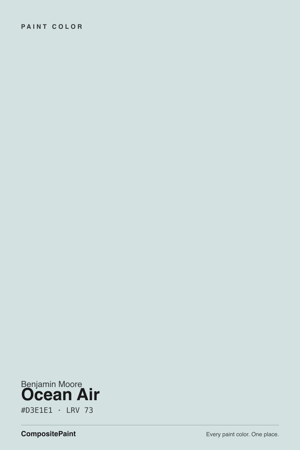
- 1Heirloom Shade63
- 2Titanium68
- 3Ocean Air73
- 4Alabaster82
- 5Chantilly Lace91
The Fast Verdict
Ocean Air is what happens when a blue-green gets grayed down almost to its vanishing point. At LRV 73 it sits at the very top of the light range — closer in brightness to a soft off-white than to any of the true "spa blue" colors in the deck — and it carries just enough gray-green cast to read as color without ever reading as a statement. That is exactly why design blogs reach for it in small bathrooms: it barely registers as a hue from across the room, which is the trick that makes tight spaces feel bigger.
Small bathrooms and powder rooms · rooms with chrome, nickel or brushed-nickel fixtures · nurseries and bedrooms that need calm without going babyish · anyone who wants color on the wall without committing to an actual color
You want it to read as a clear, saturated blue-green · your fixtures are black or oil-rubbed bronze · your room is dim and north-facing with no lamps · you were hoping for something as pigmented as Palladian Blue or a true teal
- Genuinely calming blue-green that avoids the babyish or coastal-cliché trap
- Light enough (LRV 73) to make small bathrooms and powder rooms feel bigger
- Reads as color without ever fighting the rest of the room for attention
- Pairs cleanly with chrome and nickel fixtures and white wainscoting
- Low commitment — easy to live with, easy to repaint if you change your mind
- So pale it can nearly vanish into an off-white in a bright, large room
- Goes flat and colorless in dim, north-facing light
- Black or bronze hardware fights the low-contrast trick that makes it work
- Warm gold light or honey wood pushes it minty green instead of blue
What Color Is Ocean Air, Really?
Ocean Air is a blue-green built almost entirely out of restraint. Benjamin Moore positions it as a calming, go-to blue-green, and the undertone is real — there is a genuine cool green-blue cast in the paint, not an accident of the chip — but it arrives with so much gray mixed in and so little saturation that the color reads more like a mood than a hue. It sits in Benjamin Moore's Color Preview blue-green lineup alongside deeper, more assertive cousins like Caribbean Teal and Mediterranean Teal; Ocean Air is the family's whisper, not its statement.
The number that explains everything about this color is the LRV: 73. That is only a few points below Benjamin Moore's own off-white workhorses, and it means Ocean Air reflects most of the light that hits it. On the wall it behaves less like "a blue-green room" and more like a slightly tinted off-white room — which is precisely why design-blog roundups of colors that make small rooms look bigger keep landing on it. A saturated teal would shrink a small bathroom by asserting itself; Ocean Air barely asserts anything.
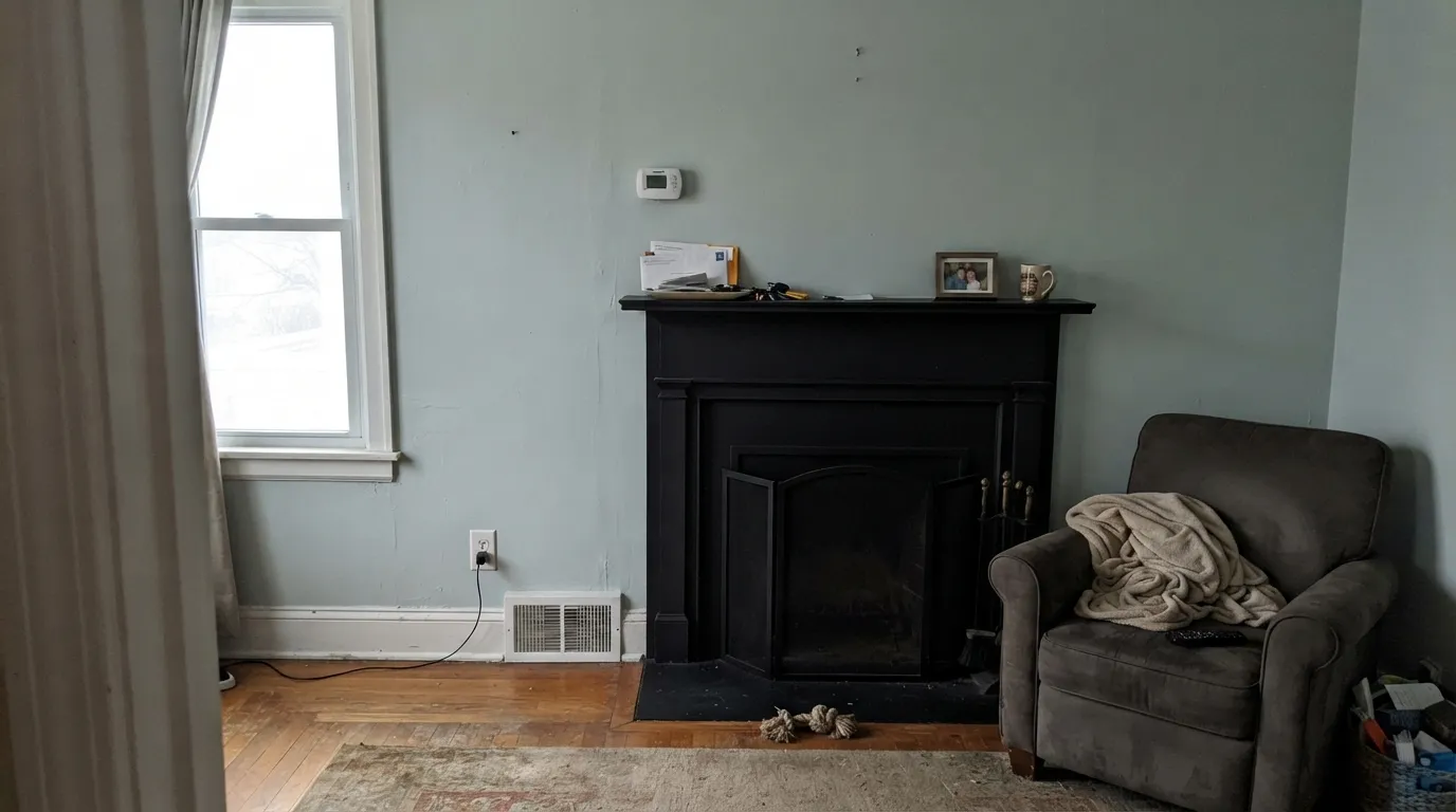
Undertone in one line: blue-green with gray underneath and a touch of green for balance — never a true aqua, never fully neutral gray. If your sample looks minty or seafoam-green, warm afternoon light or yellow-toned trim is pulling the green forward. If it looks flat and colorless, a dim or north-facing room is draining it toward plain gray.
Where It Shines
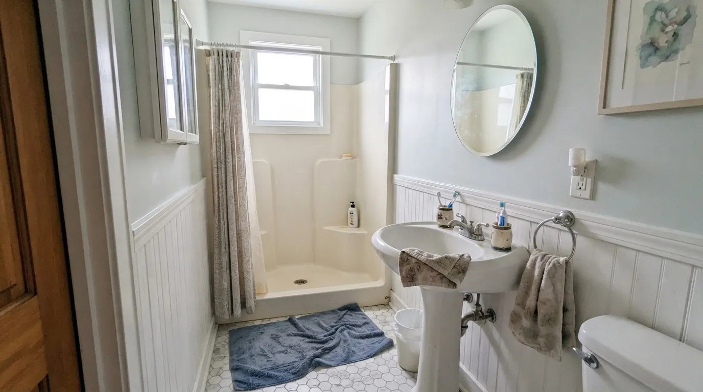
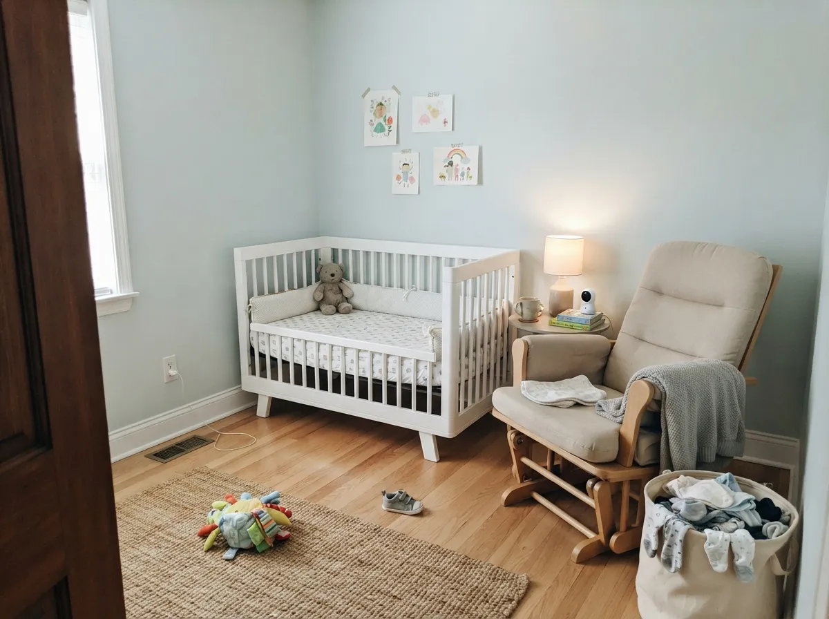
Give it a small room, real daylight, and low-contrast metal fixtures and it does exactly what it was built to do. The classic use is a small bathroom or powder room — pedestal sink, white wainscoting, chrome or nickel hardware — where the pale blue-green keeps the walls feeling continuous instead of chopped up by a strong color or high-contrast trim. It is also a genuinely good nursery and bedroom color for the same reason: calm without tipping into the coastal-cliché or the sugary pastel that a lot of light blue-greens land on.
Where It Fails
Almost every disappointed story about Ocean Air comes down to fighting its core trait — it is a very light, very quiet color — instead of working with it. None of these are the paint's fault, but if your room matches one, this is not your color.
The small-room trick this color is known for depends on low contrast: chrome or nickel hardware sits close in value to the wall and lets the room read as one continuous space. Swap in black faucets and hinges and you get the opposite effect — hard, dark shapes breaking up a pale wall, which makes the same small bathroom feel busier and smaller, not bigger.
At LRV 73 this is one of the lightest colors in the blue-green family, and across a large, bright room it can nearly disappear into an off-white — some buyers open the can expecting a spa blue and get something closer to a tinted white. If you want the statement version of this family, look at a deeper sibling like Palladian Blue or Beach Glass instead.
Gold-leaning light and yellow-orange wood tones push the green side forward and can tip Ocean Air toward minty or seafoam rather than blue. Keep trim and casing cool-neutral — Chantilly Lace or Cloud White, not a creamy warm white — to keep the blue side of the undertone in charge.
Room by Room
The signature use: a small bath or powder room with a pedestal sink and white wainscoting, chrome or nickel fixtures, and Ocean Air on the remaining wall. The low contrast between wall and hardware is what makes the room read bigger than it is.
Calm without reading as a theme-park pastel. Works as a gender-neutral nursery color and holds up in a primary bedroom paired with cream bedding and light wood furniture. Needs real daylight or warm lamps to avoid going flat.
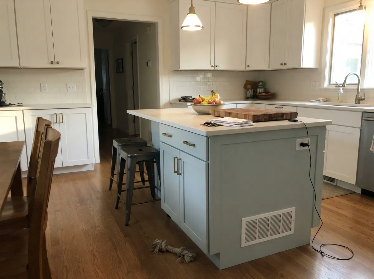
On an island or a run of cabinets against white walls it reads as a soft, unexpected alternative to plain white — especially with brass hardware. A full kitchen of Ocean Air walls with cool-white quartz can wash out; give it a warmer counter or wood accent to hold its own.
In a bright room it stays a quiet, believable blue-green backdrop for warm wood furniture. In a dim or north-facing room it can go flat and colorless fast — this is not the color for a windowless den.
Same logic as the full bathroom, scaled down: a powder room is small enough that even a color this quiet reads as a deliberate choice, and low-risk enough that repainting later is a weekend job, not a renovation.
Because it sits so close to an off-white, full sun can wash it out almost entirely on a large exterior wall. It reads better in a shaded, protected spot — a covered porch ceiling or a north-facing front door — than as a full body color; test a large sample outside before committing.
Your Light Is the Risk
A window with diffused light — the classic small-bathroom setup — is where the blue-green reads clean and calm without washing out.
Cool, low daylight drains what little saturation it has, leaving flat, nearly colorless gray. Add warm lamps or skip this room.
Cooler and clearly blue-green at sun hours, quieter and closer to off-white the rest of the day. The shift is gentle, not dramatic.
2700K bulbs pull it warmer and softer, almost greige at night. Cool white LEDs keep the blue-green but flatten it — test both before wiring the fixture.
Most complaints about Ocean Air are a light mismatch. Upload a photo of your actual room and see it on your walls — then ask for the same wall in north light or evening lamps before you buy a single sample.
Need It From Another Brand?
Any paint counter can custom-tint Benjamin Moore 2123-50 directly. If you would rather stay in one brand's own deck, these are the closest stock matches, measured as ΔE2000. Under 2 is a difference you will not see on the wall.
| Brand | Closest color | ΔE | LRV | |
|---|---|---|---|---|
| Sherwin-Williams | Mountain AirSW 6224 · Sherwin-Williams | 2.4 | 73 | Color page → |
| Behr | EraMQ3-56 · Behr | 2.4 | 74 | Color page → |
| Valspar | Cool Tide8004-35A · Valspar | 2.1 | 73 | Color page → |
| PPG / Glidden | Pistachio CreamPPG1148-2 · PPG / Glidden | 0.4 | 73 | Color page → |
| Glidden | Pristine PetalPPG1034-3 · Glidden | 0.8 | 73 | Color page → |
| Dutch Boy | Baby Powder429-1DB · Dutch Boy | 1.7 | 76 | Color page → |
Similar Benjamin Moore Colors
The nearest shades to Ocean Air within Benjamin Moore's own range, ranked by perceptual color distance — useful when you want the same look a touch lighter, darker, or warmer.
WCAG 2.1: AA is 4.5 : 1 for normal text, 3 : 1 for large text, AAA is 7 : 1.
Ocean Air vs the Colors You're Also Considering
Every Ocean Air sample board has the same rivals on it. The numbers show the real lightness gap — then it comes down to which risk you would rather live with.
Pick this for the paler, more blue-leaning version that reads closer to an off-white.
Sherwin-Williams SW 6204 · LRV 63Sea SaltPick this if you work in Sherwin-Williams — it is the same idea a shade deeper and greener, and needs agreeable light to look its best.
Pick this if Palladian Blue feels like too much color for the room.
Benjamin Moore HC-144 · LRV 53Palladian BluePick this if you actually want a spa-blue statement — it holds its color far more assertively at a much lower LRV.
Within Benjamin Moore, Iceberg 2122-50 at #D6E0E0 and LRV 73 is a hair grayer, Polar Ice 1660 at #D4E2E4 and LRV 74 leans slightly bluer, and Ewing Blue CW-585 at #D0E2E0 and LRV 73 pushes a touch greener. Glass Slipper 1632 at #D4DEDD and LRV 70 is the deepest of the group and reads a little quieter on a wall. Blue Veil 875 at #D9E0E1 and LRV 74 is the softest and closest to a plain white.
Across brands, PPG Pistachio Cream PPG1148-2 at LRV 73 is 0.39 away in color difference and Glidden Pristine Petal PPG1034-3 at LRV 73 is 0.82, which makes both the same color in practice. Behr Double Click N530-2 at LRV 72 is 1.43 and Dutch Boy Baby Powder 429-1DB at LRV 76 is 1.68, so both are visually identical in normal room light.
Sherwin-Williams Mountain Air SW 6224 at LRV 73 is 2.35 and Clare Headspace at LRV 74 is 2.42: very close, but sample first. Dunn-Edwards Cold Water DE6316 at 3.49 is close and still visibly different side by side.
Ocean Air Coordinating Colors
The rule for coordinating with Ocean Air is simple: stay light, stay cool-to-neutral, and save any real darkness for a single accent. It pairs cleanly with warm-but-not-creamy whites, quiet light grays, and one grounded dark for contrast — these are the partners that keep showing up in rooms that work:
The Story Behind Ocean Air: The Quietest Member of a Loud Family
Ocean Air has never been a Color of the Year and has no famous room or viral moment attached to it — and that is a fair, honest description of where it sits in Benjamin Moore's deck. It belongs to the brand's blue-green Color Preview lineup, sitting alongside far more saturated names like Caribbean Teal and Mediterranean Teal. Where those colors commit fully to teal, Ocean Air is the family member that got grayed down and lightened until it barely counts as color at all.
That restraint is exactly why interior-design blogs reach for it in a very specific, recurring role: small-room roundups that recommend pale, low-saturation colors as a trick for making tight bathrooms and powder rooms feel larger. The logic holds up under the numbers — at LRV 73, Ocean Air sits only a handful of points below Benjamin Moore's dedicated off-white workhorses, which is why it reads as "barely a color" from across a room even though it carries a real, cool blue-green undertone up close.
Ocean Air With Wood Tones and Metal Finishes
Metal finish matters more than wood tone with this color, because the effect it is known for — making a small room feel bigger — depends on contrast, not on the specific hue. Chrome, nickel and brushed nickel sit close in value to the pale wall and keep the room reading as one continuous surface. Black or oil-rubbed bronze fixtures do the opposite: their high contrast against a pale wall breaks the room into visual pieces and works against the exact trick this color is chosen for. Unlacquered brass sits in between and generally reads warm and pleasant against it.
For wood, pale white oak, driftwood and light ash keep the whole room in the same quiet register and are the safest match. Honey oak and other yellow-orange wood tones are the one real risk: they push warm gold light into the room, and that warmth pulls Ocean Air's undertone toward minty green rather than the cooler blue-green it shows in neutral light. It is not a hard clash, but it is a visible shift worth sampling first.
Three Ready Palettes Built on Ocean Air
A color is never alone on the wall. These are complete combinations in the 60-30-10 pattern, with the reason each one holds together. Every one opens in the visualizer.
Chantilly Lace wainscoting keeps the low-contrast trick intact — a crisp but not stark white next to the pale blue-green — while Gray Owl on the vanity ties the room together without introducing a second competing hue. Chrome or nickel hardware finishes the look.
Try this palette in your roomCloud White's warmth keeps the room from feeling clinical, and Chelsea Gray on a single piece of furniture gives the palette one grounded, non-pastel note so it does not read as a themed baby room.
Try this palette in your roomWhite Dove walls let the island carry the only real color in the room, brass or unlacquered hardware warms the cool undertone, and Kendall Charcoal on one accent element supplies the dark note the light palette needs without overpowering it.
Try this palette in your roomOcean Air FAQ
Is ocean air blue or green?
Both, in very small doses. Benjamin Moore calls it a blue-green, and there is a real cool cast in the paint — but at LRV 73 it is grayed and lightened so far that most people describe it as a soft, barely-there color rather than a clear blue or a clear green. Warm light nudges it green; cool light nudges it toward plain gray.
Does it really make a small bathroom look bigger?
That is the color's known specialty, and the mechanism is real: at LRV 73 it is close in brightness to an off-white, so it does not visually shrink the walls the way a saturated color would. The effect depends on keeping fixtures low-contrast — chrome or nickel, not black — so the room reads as one continuous surface.
What trim white goes with ocean air?
A cool-to-neutral white, not a creamy warm one. Chantilly Lace or Cloud White both work; a warm cream trim pulls the green side of the undertone forward and can make the walls read minty instead of blue-green.
Does it look gray in low light?
Yes, and this is its most common surprise. In a dim or north-facing room with no lamps, Ocean Air can drain almost entirely to a flat, colorless gray. It needs real daylight or warm bulbs to hold onto its blue-green character.
Should I use black or chrome fixtures with it?
Chrome, nickel or brushed nickel. Black or oil-rubbed bronze hardware creates the high contrast that undoes the color's main trick — the low-contrast pairing is specifically what makes small rooms painted in Ocean Air feel more open.
Is it a good nursery color?
Yes — it reads as calm rather than themed, works for any gender, and pairs easily with cream, light wood and soft grays. Give the room real daylight or warm lamps so it does not go flat, and keep the trim on the cool-neutral side of white.
Have you painted with Ocean Air?
Rate it — one tap helps the next reader decide.
Ask a Question