Passive
One of Sherwin-Williams' best-selling cool grays, reviewed honestly: the light that turns it blue, the light that flashes it violet, and what to pick instead.

Jessica has spec'd whites and neutrals for more than 300 rooms and keeps a sample wall of painted drawdowns in her studio. Every color review is checked against real reader rooms in the comments and re-tested when a formula changes. About the testing process →
- 1Stardew43
- 2Quietude48
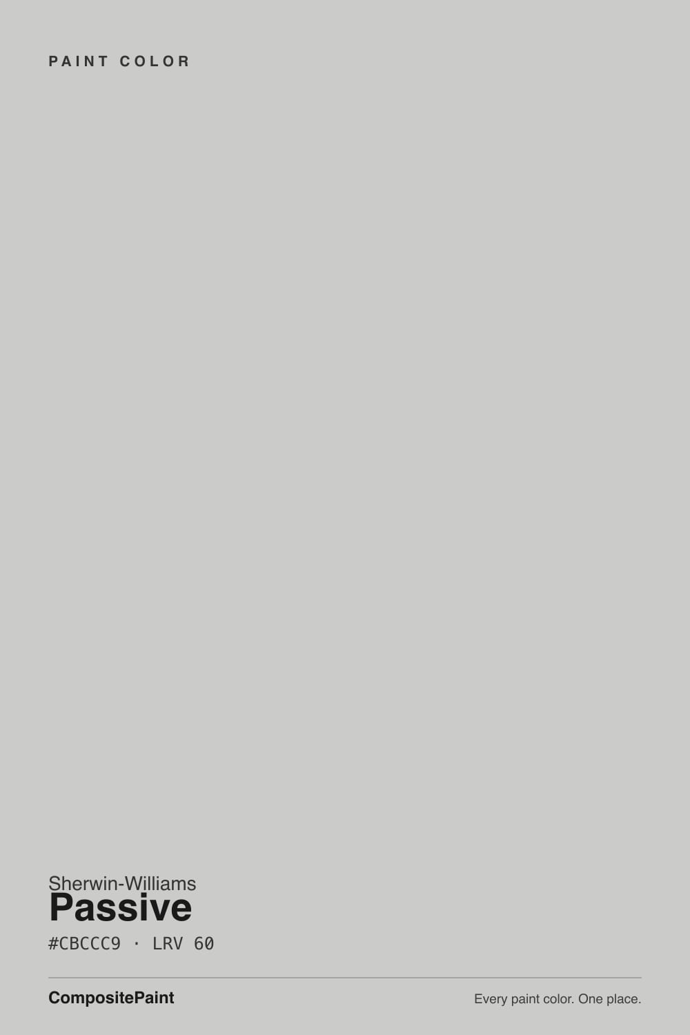
- 3Passive60
- 4Gray Owl65
- 5Glass Slipper70
The Fast Verdict
Passive is what you reach for when you tried a warm greige and it still looked beige. It is a genuine cool gray — blue first, a whisper of violet second — with the same LRV 60 as Agreeable Gray and none of that color's warmth. In a bright room it stays calm and true; in a dim or north-facing one, the blue-violet stops being subtle. It has become one of Sherwin-Williams' best-selling colors doing exactly this one job well.
Bright rooms with real daylight · bedrooms and bathrooms that want calm over cozy · pairing with cool whites, chrome, and gray-toned stone · anyone who wants an actual gray, not another greige
Your room is dim or north-facing without warm lamps · your floors and cabinets lean honey-warm · you want cream or beige warmth · you're pairing it with a warm off-white trim
- A genuinely cool gray at LRV 60 — no greige, no beige creep
- One of Sherwin-Williams' best-selling colors, and it earns the popularity in the right room
- Reads crisp and calm next to cool whites, chrome, and gray-veined stone
- Holds its gray outdoors better than most light grays, instead of drifting warm in the sun
- A true bedroom and bathroom color — cool without feeling clinical
- The blue-violet undertone is real, not imagined — it shows hardest in dim or north light
- Clashes with honey oak, golden wood cabinets, and warm off-white trim
- Needs warm 2700K bulbs at night or it reads flat and cold
- Strong direct sun on an exterior can wash it toward near-white by midday
What Color Is Passive, Really?
Passive is Sherwin-Williams' answer to a specific complaint: every popular "gray" on the market kept turning out to be beige in disguise. Filed in the brand's Neutral family, on the wall it reads as an honest cool gray with a blue undertone and a violet edge — the opposite lean from the greige wave (Agreeable Gray, Accessible Beige) that dominated the decade before it. Passive shares Agreeable Gray's exact LRV 60, and that pairing is the clearest proof of how much undertone matters: identical light reflectance, completely different temperature on the wall. Passive has landed in Sherwin-Williams' top-selling colors for exactly that reason — it is the honest gray people kept asking their painter for.
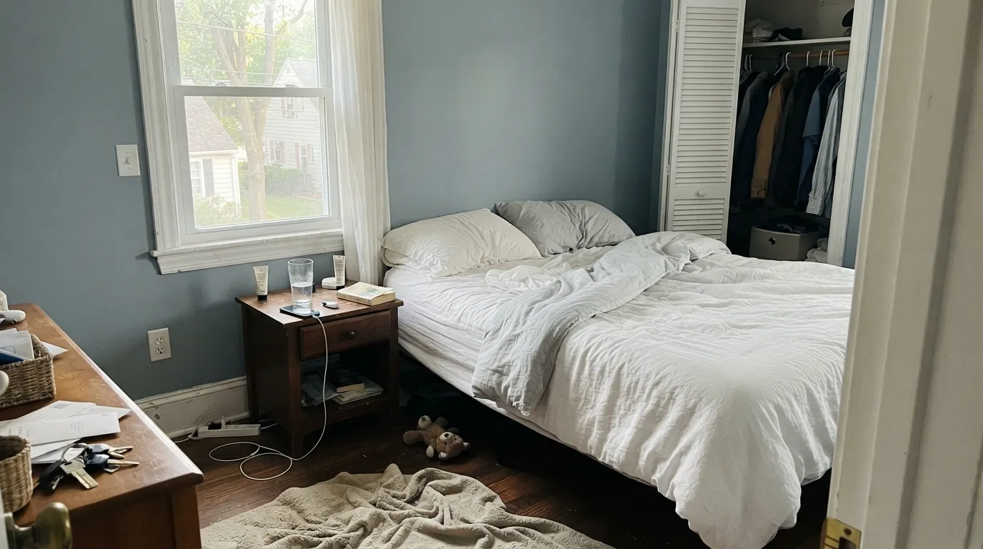
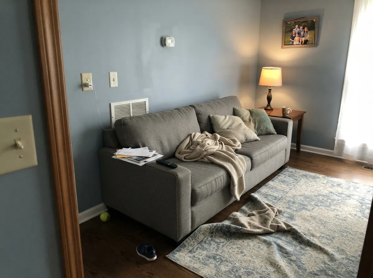
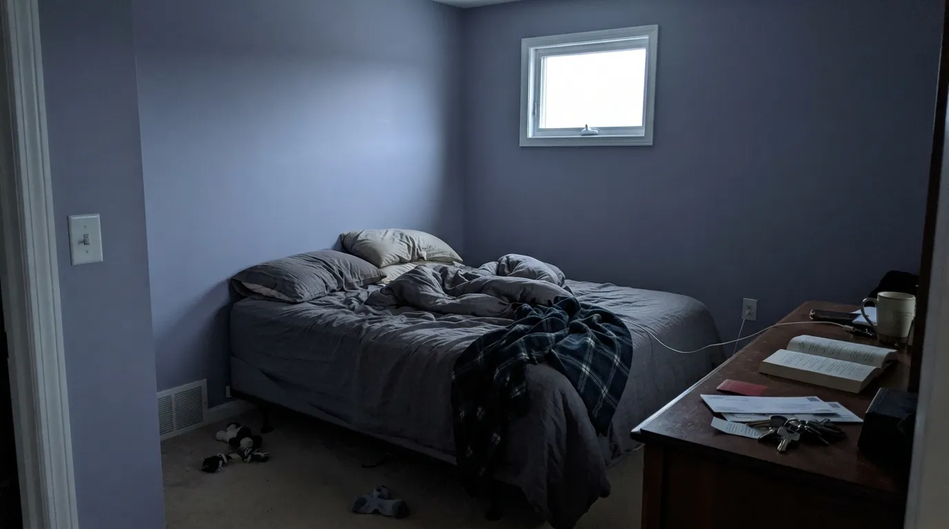
The undertone is not subtle once the light stops cooperating. In dim or north-facing rooms, reviewers describe it going flat and distinctly blue-violet, occasionally cold enough to read "baby blue" straight out of the can before it dries down. In west-facing rooms it shifts through the day: cooler and more blue in the morning, then warming toward a faint violet-purple as evening light comes in low. In a room with strong, even daylight — especially true south exposure — it settles into the calm, true gray the color is famous for. This is a color whose personality is decided by your windows, not by the chip.
Undertone in one line: blue first, a whisper of violet second — never warm. If your sample reads flat and chilly, that is a dim or north room, not a bad batch; if it flashes purple in the evening, that is honest west light doing its job.
Where It Shines
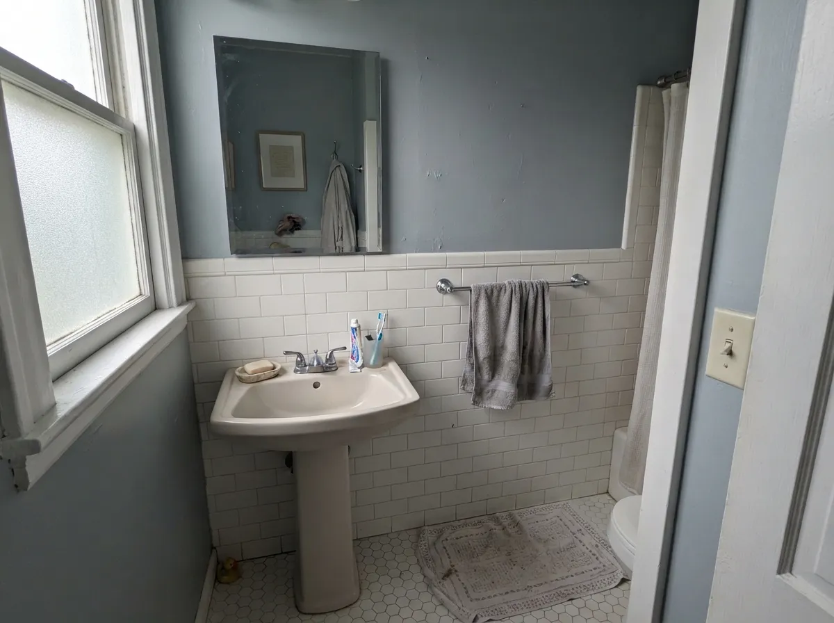
Give Passive a room with real daylight and it is the cool gray people picture when they say "I just want gray, not beige." It is at its calmest in bedrooms and bathrooms — the two rooms reviewers reach for it most — where the cool tone reads restful rather than cold, especially against white or blue-gray tile, chrome or nickel fixtures, and quartz with a gray vein rather than a gold one. It also holds up on exteriors better than most light grays, staying a genuine gray instead of drifting into greige the moment the sun hits it.
Where It Fails
Almost every disappointed review of Passive comes from one of three predictable situations, and none of them are the paint misbehaving — they are the paint being an honest cool color in the wrong conditions.
Cool, indirect light has nothing warm to balance the blue-violet, so the color goes flat and noticeably cold — the exact "it looked baby blue on my walls" complaint that shows up again and again. Test the actual sample in that room before committing, and plan on warm 2700K bulbs if you go ahead.
Pair Passive with a creamy trim white like Swiss Coffee or Alabaster and the mismatch is obvious immediately — the wall reads cool and slightly gray-blue while the trim reads yellow by comparison, and neither color looks its best. Keep the trim cool: Pure White or Extra White, not a warm off-white.
Golden, orange-leaning wood is the one material that fights this color hardest — the cool gray makes the wood look more orange, and the warm wood makes the wall look flatter and colder. Passive wants white oak, gray-washed wood, or a neutral floor; over honey oak, a warm greige like Agreeable Gray will get along with the room far better.
Room by Room
The most common reason people buy this color, and it earns it: cool and calm in daylight, quiet at night under warm bulbs. Eggshell on walls, and keep the trim on the cool side (Pure White) rather than a creamy off-white.
A near-default spa gray with white or blue-gray tile, marble-look quartz, and chrome or brushed nickel. With warm brass fixtures and creamy tile it can read a step colder than intended — sample it against your actual tile first.
Beautiful in a bright, south- or east-facing room with cool whites and gray upholstery. In a dim living room, especially north-facing, it loses its calm and turns flat and blue — this is the room where the light matters most.
Excellent against white or gray quartz, stainless, and painted cool-toned cabinets. Against warm wood cabinetry or honey-toned counters, the mismatch shows fast — pick a warm greige instead if your kitchen already leans warm.
One of the better light grays outdoors because it stays gray in full sun rather than drifting warm; pair it with a darker trim (Iron Ore, black) for contrast, or white trim for a classic look. Very strong direct sun can still wash it toward near-white by midday — expect that on the sunniest elevation.
This is the one situation the color does not forgive. Without warm supplemental light, north exposure pulls the blue-violet forward until the room reads cold rather than calm. If you cannot add warm lamps, sample first or choose a warmer gray.
Your Light Is the Risk
Strong, even daylight keeps it a calm, true gray all day — the closest the wall gets to the chip in the store.
Indirect, cool light has nothing warm to balance it — the blue-violet comes forward and the room reads flat and cold. Sample first.
Cool and distinctly blue in the morning, then a faint violet-purple flash as low evening light comes through. Most people notice; many like it.
2700K lamps warm it just enough to soften the blue. Cool LEDs push it icier and flatter — change the bulb before you consider repainting.
Most complaints about Passive are a light mismatch. Upload a photo of your actual room and see it on your walls — then ask for the same wall in north light or evening lamps before you buy a single sample.
Need It From Another Brand?
Any paint counter can custom-tint Sherwin-Williams SW 7064 directly. If you would rather stay in one brand's own deck, these are the closest stock matches, measured as ΔE2000. Under 2 is a difference you will not see on the wall.
| Brand | Closest color | ΔE | LRV | |
|---|---|---|---|---|
| Behr | Mexican SilverQE-49 · Behr | 1.0 | 60 | Color page → |
| Benjamin Moore | PerspectiveCSP-5 · Benjamin Moore | 0.5 | 60 | Color page → |
| Valspar | Bay Waves4008-1A · Valspar | 0.8 | 61.3 | Color page → |
| PPG / Glidden | Steely GazePPG0996-2 · PPG / Glidden | 1.3 | 60 | Color page → |
| Glidden | Steely GazePPG0996-2 · Glidden | 1.3 | 60 | Color page → |
| Dutch Boy | Moon Beam438-2DB · Dutch Boy | 0.0 | 60 | Color page → |
Similar Sherwin-Williams Colors
The nearest shades to Passive within Sherwin-Williams's own range, ranked by perceptual color distance — useful when you want the same look a touch lighter, darker, or warmer.
WCAG 2.1: AA is 4.5 : 1 for normal text, 3 : 1 for large text, AAA is 7 : 1.
Passive vs the Colors You're Also Considering
Every Passive sample board has the same rivals on it. The numbers show the real lightness gap — then it comes down to which risk you would rather live with.
Pick this when you want an actual cool gray, not a warm gray dressed up in gray's name.
Sherwin-Williams SW 7015 · LRV 58Repose GrayPick this if you want warmth without losing the gray feel — Repose Gray stays inviting where Passive stays cool.
Side-by-side comparison →Pick this for the cool version of the same lightness — Agreeable Gray leans beige the moment the light softens.
Sherwin-Williams SW 7029 · LRV 60Agreeable GrayPick this for a warm greige at the exact same LRV — the safer whole-house pick if your rooms run dim or your wood is honey-toned.
The pairing people compare most is Repose Gray SW 7015 at #CCC9C0 and LRV 58. Repose Gray is two points darker and carries a visible warm greige cast, so it feels softer and safer in cool rooms. Passive at #CBCCC9 and LRV 60 is lighter and genuinely neutral, which reads cleaner but can go blue in north light. That is the trade.
Within the brand, Evening Shadow SW 7662 at #C9CCCD and LRV 60 is the cooler version of the same idea, and Grayish SW 6001 at #CFCAC7 and LRV 60 is the warmer one. Zircon SW 7667 at LRV 59 is a hair darker and quieter.
Across brands, Dutch Boy Moon Beam 438-2DB and HGTV Home by Sherwin-Williams Passive HGSW 1487 are both deltaE 0. Benjamin Moore Perspective CSP-5 at deltaE 0.53, Valspar Bay Waves 4008-1A at deltaE 0.78, and Behr Mexican Silver QE-49 at deltaE 1.04 are visually identical in normal room light. Farrow and Ball Cornforth White No. 228 at deltaE 2.8 is very close, so sample first.
Passive Coordinating Colors
The rule for coordinating with Passive is the mirror image of the White Dove rule: stay on the cool side. It flatters cool whites, chrome and nickel, blue-gray stone, and other members of the cool-gray family — and it argues with cream trim, brass-heavy warm rooms, and anything golden. These are the partners that keep it looking intentional rather than accidental:
Passive's Reputation: A Quiet Bestseller, Not a Trend Color
Passive has no Color of the Year moment and no viral design-blog spike behind it — it built its reputation the slow way, by being the color people finally reached for after a decade of warm greiges that all secretly read beige. It sits in Sherwin-Williams' Neutral family alongside colors like Agreeable Gray and Repose Gray, but it is the one in that group that actually behaves like a gray in average light, which is precisely the gap it fills.
That honest positioning is also the whole review: this is not a famous, dramatic color, and it does not need to be. It is a dependable cool gray with one real condition attached — give it real light, and it delivers exactly what its name promises.
Passive With Wood Tones and Floors
Cool grays and warm wood are natural rivals, and Passive is no exception. White oak, gray-washed floors, whitewashed wood, and driftwood-toned furniture all sit comfortably with it because they share the same cool-neutral lean. Walnut and dark espresso also work, since depth of color matters more than warmth once the wood is dark enough to read as a near-black accent rather than a warm surface.
The wood to avoid is honey oak, golden pine, or any orange-leaning trim. That combination is the most common regret with this color: the gray pulls the wood toward orange, and the wood pulls the wall toward cold, and neither side wins. If the warm floor is staying put, a warm greige like Agreeable Gray will get along with the room far better than Passive will.
Metals follow the same logic: chrome, brushed nickel, and matte black read effortless next to it, while polished brass needs a genuinely warm room around it to avoid looking like it wandered in from a different palette.
Three Ready Palettes Built on Passive
A color is never alone on the wall. These are complete combinations in the 60-30-10 pattern, with the reason each one holds together. Every one opens in the visualizer.
Cool whites keep the whole room in the same temperature family, so nothing fights Passive's blue-violet lean. Iron Ore supplies one confident dark note without introducing any warmth to argue with the walls.
Try this palette in your roomNaval and Passive share the same cool-blue family at two very different depths, so the accent wall reads deliberate rather than random. Extra White keeps trim crisp instead of creamy, which is what this pairing needs.
Try this palette in your roomTwo close cool grays at nearly the same depth let the vanity separate from the wall on finish alone, not a jarring color jump. Pure White trim keeps the small room bright without adding any warmth to fight the grays.
Try this palette in your roomPassive FAQ
Is Passive gray, blue, or purple?
Gray with a real blue undertone, and a violet edge that shows up in specific light. In a bright, evenly lit room it reads as a calm true gray. In a dim or north-facing room it leans distinctly blue, sometimes described as flat or cold. In west-facing rooms it can flash violet-purple as evening light comes in low. All three are the same paint reacting honestly to different light — not different batches.
Is SW Passive a popular color?
Yes — it is one of Sherwin-Williams' best-selling colors, particularly for bedrooms and bathrooms. It has not had a Color of the Year moment or a viral design-blog spike; its popularity is quieter than that, built on being the honest gray people reach for after the greige trend left them wanting an actual gray.
Does Passive work in a north-facing room?
Carefully. North light is cool and indirect, which pulls the blue-violet forward with nothing warm to balance it, and reviewers consistently report it reading flat or cold in that exposure. Plan on warm 2700K lamps if you go ahead, and sample the actual wall before committing to the whole room.
Passive vs Repose Gray vs Agreeable Gray — how do I choose?
Temperature is the whole decision. Passive is the coolest of the three, a genuine blue-gray. Repose Gray sits in the middle — gray-leaning but with enough warmth to stay inviting in average light. Agreeable Gray, at the identical LRV 60 to Passive, is a warm greige that reads closer to beige than to gray once the light softens. Pick Passive only if you actually want cool.
Is Passive good for an exterior?
Yes, and it is a better exterior choice than most light grays because it tends to stay gray in full sun instead of drifting warm. The one thing to expect: on a very sunny elevation, strong direct light can wash it toward near-white by midday. Dark trim (Iron Ore or black) gives it the most contrast; white trim keeps it classic.
What trim white goes with Passive?
A cool white — Pure White or Extra White — not a warm off-white. Pair Passive with a creamy trim color like Swiss Coffee and the two fight visibly: the wall reads cool-gray, the trim reads yellow, and the whole room looks mismatched rather than layered.
Have you painted with Passive?
Rate it — one tap helps the next reader decide.
Ask a Question