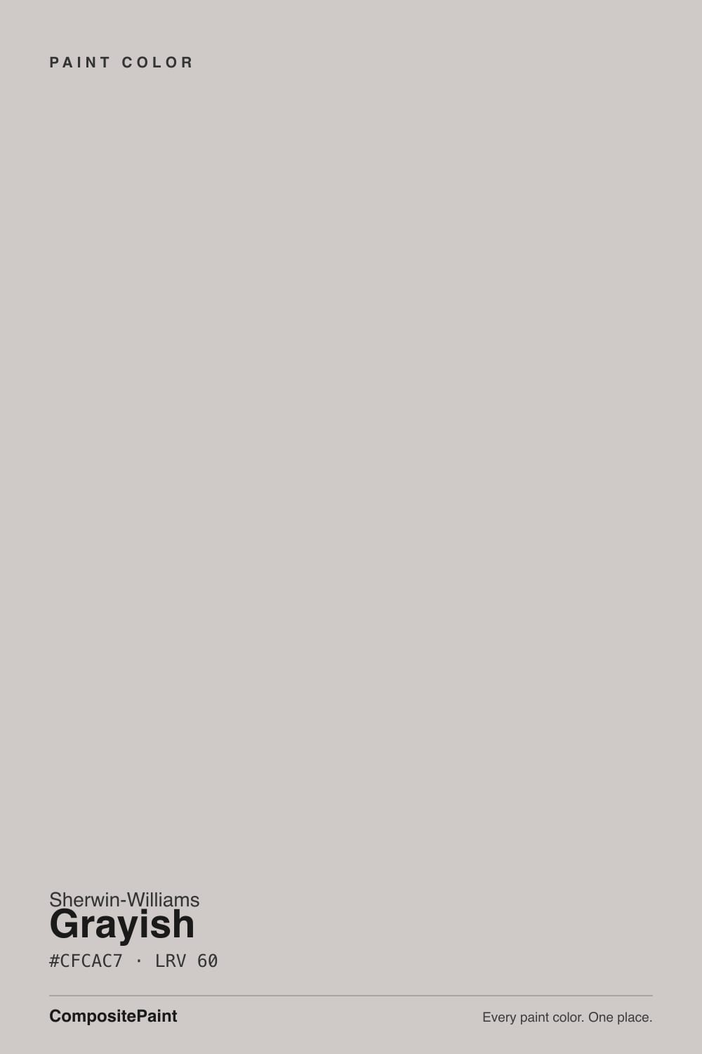
Grayish
SW 6001 · #CFCAC7 · LRV 60 — warm red-orange tone, light — bounces daylight without going clinical.
- 1Stardew43
- 2Quietude48
- 3Grayish60
- 4Gray Owl65
- 5Glass Slipper70
What Color Is Grayish, Really?
Grayish SW 6001 is a light warm gray. Its hex is #CFCAC7 and its LRV is 60, which puts it in the light band, so it bounces plenty of daylight around a room without going bright white or clinical. The undertone is a warm red-orange lean, sitting at a hue of 22 degrees with only about 8 percent saturation. That is enough warmth to soften the gray, not enough to read as a color in its own right.
People pick Grayish when they want a gray that does not feel cold. At LRV 60 it holds walls together across an open plan, and the warm lean lets it sit beside wood floors, tan stone, and cream trim without clashing. It reads as a quiet backdrop rather than a decision, which is what most people want from a whole-home neutral.
The catch is that same warmth. Hue 22 is in the red-orange part of the wheel, so in strong afternoon sun or under warm bulbs Grayish can pick up a faint pink or mauve cast, especially in a room with warm flooring. In flat north light it can go the other way and look plain, almost putty. Paint a large sample and check it at midday and again at night before you commit.
Grayish is built on a warm red-orange base. The hue reads at 22 degrees, the same part of the wheel as clay and terracotta, but the saturation is only around 8 percent, so what lands on the wall is a soft dusty gray with warmth underneath rather than a colored wall. On a small chip that warmth often disappears and the color just looks gray. Across a full wall it comes back.
Neighbors decide how much of it you notice. Next to Passive SW 7064, which has no strong undertone, Grayish looks warmer and slightly pink. Next to a true beige it flips and looks cooler and grayer. Against blue-gray tile or a stark white it can tip toward mauve.
Hold your sample against the flooring, the counter, and the trim white at the same time. That three-way check tells you far more about the undertone than the chip ever will.
Best Rooms and Uses for Grayish
An LRV of 60 makes Grayish a whole-home wall color. It is light enough for hallways, stairwells, and small bathrooms that need light back, and steady enough to run through a connected kitchen and living area without fighting either room. Bedrooms take it well, because the warmth keeps it restful instead of chilly.
It is a wall color first. At 60 it is too dark to serve as a trim or ceiling white, so put a brighter white on the millwork rather than painting everything one tone.
On cabinets it can work for a soft, low-contrast kitchen, particularly with wood counters and brass or bronze hardware, as long as you accept that you are choosing a warm gray and not a crisp one. Outside it behaves as a light body color for siding, with darker shutters and a deeper front door carrying the contrast.
How Lighting Changes Grayish
At LRV 60 Grayish reflects a good share of the light it gets, so it rarely goes dim, but the source steers the undertone. North-facing rooms get cool, flat daylight, which cancels most of the red-orange warmth and leaves a calm, slightly putty gray. That is usually the safest room for it.
South and west rooms do the opposite. Direct afternoon sun pushes the warmth forward, so the sunlit wall can read taupe or faintly pink while the shaded wall stays gray. East rooms warm up in the morning and settle by afternoon.
Bulbs matter as much as windows. Warm 2700K lamps amplify the red-orange lean and can tip the color toward mauve at night. Neutral bulbs near 3500K to 4000K hold it closer to gray. Look at your sample board on every wall of the room, at midday and after dark, before you buy gallons.
Most complaints about Grayish are a light mismatch. Upload a photo of your actual room and see it on your walls — then ask for the same wall in north light or evening lamps before you buy a single sample.
Need It From Another Brand?
Any paint counter can custom-tint Sherwin-Williams SW 6001 directly. If you would rather stay in one brand's own deck, these are the closest stock matches, measured as ΔE2000. Under 2 is a difference you will not see on the wall.
| Brand | Closest color | ΔE | LRV | |
|---|---|---|---|---|
| Behr | Mexican SilverQE-49 · Behr | 2.3 | 60 | Color page → |
| Benjamin Moore | Cement Gray2112-60 · Benjamin Moore | 2.0 | 60 | Color page → |
| Valspar | Windy City8005-12B · Valspar | 1.3 | 59 | Color page → |
| PPG / Glidden | Cool SlatePPG1002-3 · PPG / Glidden | 1.8 | 60 | Color page → |
| Glidden | Steely GazePPG0996-2 · Glidden | 2.0 | 60 | Color page → |
| Dutch Boy | Silvered Pearl446-2DB · Dutch Boy | 1.3 | 59 | Color page → |
Similar Sherwin-Williams Colors
The nearest shades to Grayish within Sherwin-Williams's own range, ranked by perceptual color distance — useful when you want the same look a touch lighter, darker, or warmer.
WCAG 2.1: AA is 4.5 : 1 for normal text, 3 : 1 for large text, AAA is 7 : 1.
Grayish vs Similar Colors
Inside the Sherwin-Williams deck, Destiny SW 6274 and Minute Mauve SW 7078 both land on #CFC9C8 at LRV 59, a step cooler and a shade pinker than Grayish at #CFCAC7. Mercurial SW 9550 at #D1CCC6 and LRV 61 is slightly lighter with more yellow in it. Passive SW 7064 shares the LRV 60 but carries no strong undertone, so it is the pick when the warmth is the part that worries you.
Across brands, HGTV Home by Sherwin-Williams lists the same color as Grayish HGSW 2447 at deltaE 0. Portola Paints High Cliff at deltaE 1.18, Valspar Windy City 8005-12B at deltaE 1.33, and Benjamin Moore Cement Gray 2112-60 at deltaE 1.97 are all visually identical in normal room light. Behr Mexican Silver QE-49 at deltaE 2.29 and Farrow & Ball Cornforth White No. 228 at deltaE 2.32 are very close, but sample first, because a side-by-side wall may show the gap.
Colors That Go With Grayish
Trim is the first decision. Grayish sits at LRV 60, so a clean white on the trim supplies the contrast the walls will not provide on their own. A warm white keeps the red-orange lean looking deliberate. A cooler white sharpens the room but can make the walls look pinker by comparison, so sample both against the same wall.
For an adjacent room or a second tone, stay inside the same light band. Mercurial SW 9550 at LRV 61 is a hair lighter and holds a little more yellow. Zircon SW 7667 at LRV 59 is a touch quieter. Passive SW 7064 at LRV 60 gives you the same lightness with the warmth taken out, which is useful when one room faces south and the next faces north.
Warm oak and walnut floors flatter it, as do brass, bronze, and matte black hardware. Polished chrome and blue-gray stone tend to pull the walls toward mauve.
Coordinated palette
Generated by hue-rotating #CFCAC7 in HSL space. Pair Grayish with one accent and one neutral — the swatches below are starting points, not final picks.
Grayish FAQ
Is Grayish warm or cool?
Grayish is a warm gray. Its undertone is a warm red-orange lean at a hue of 22 degrees, though the saturation is only about 8 percent, so the warmth stays subtle. In cool north light it can read almost neutral, while warm afternoon sun brings the red-orange side forward.
What LRV is Grayish?
Grayish has an LRV of 60. LRV runs from 0 for black to 100 for pure white, so 60 puts it in the light range. It reflects enough light to keep a room open and airy without acting like a white, which is why it works as a whole-home wall neutral.
Does Grayish look pink?
It can. The undertone is a warm red-orange at hue 22, so in direct afternoon sun or under 2700K bulbs Grayish may show a faint pink or mauve cast, particularly against cool white trim. In cooler north light that lean is mostly cancelled and the color reads as a soft putty gray.
Does Grayish work in a dark room?
Yes, and it is one of its better uses. At LRV 60 it gives back a good share of what light the room gets, and the warm red-orange undertone keeps a low-light space from feeling cold. Expect it to look quieter and flatter there than it does on the chip.
What white trim goes with Grayish?
Any clean white a good deal brighter than LRV 60 will read as trim rather than blending into the wall. A warm white makes the red-orange undertone look intentional and cozy. A cooler white gives a sharper edge but can make the walls appear pinker, so put both on the same wall before deciding.
Is Grayish good for cabinets or exteriors?
It can do both, with limits. On cabinets it gives a soft, low-contrast kitchen that suits wood counters and brass hardware, but it is a warm gray rather than a crisp one. Outside, its LRV of 60 makes it a light siding color that needs darker shutters or a deep front door for contrast.
Have you painted with Grayish?
Rate it — one tap helps the next reader decide.
Ask a Question