Cement Gray
The mid-tone gray with almost no undertone of its own, reviewed honestly: where that makes it the easiest neutral in the house, and where it leaves the wall cold.

Jessica has spec'd whites and neutrals for more than 300 rooms and keeps a sample wall of painted drawdowns in her studio. Every color review is checked against real reader rooms in the comments and re-tested when a formula changes. About the testing process →
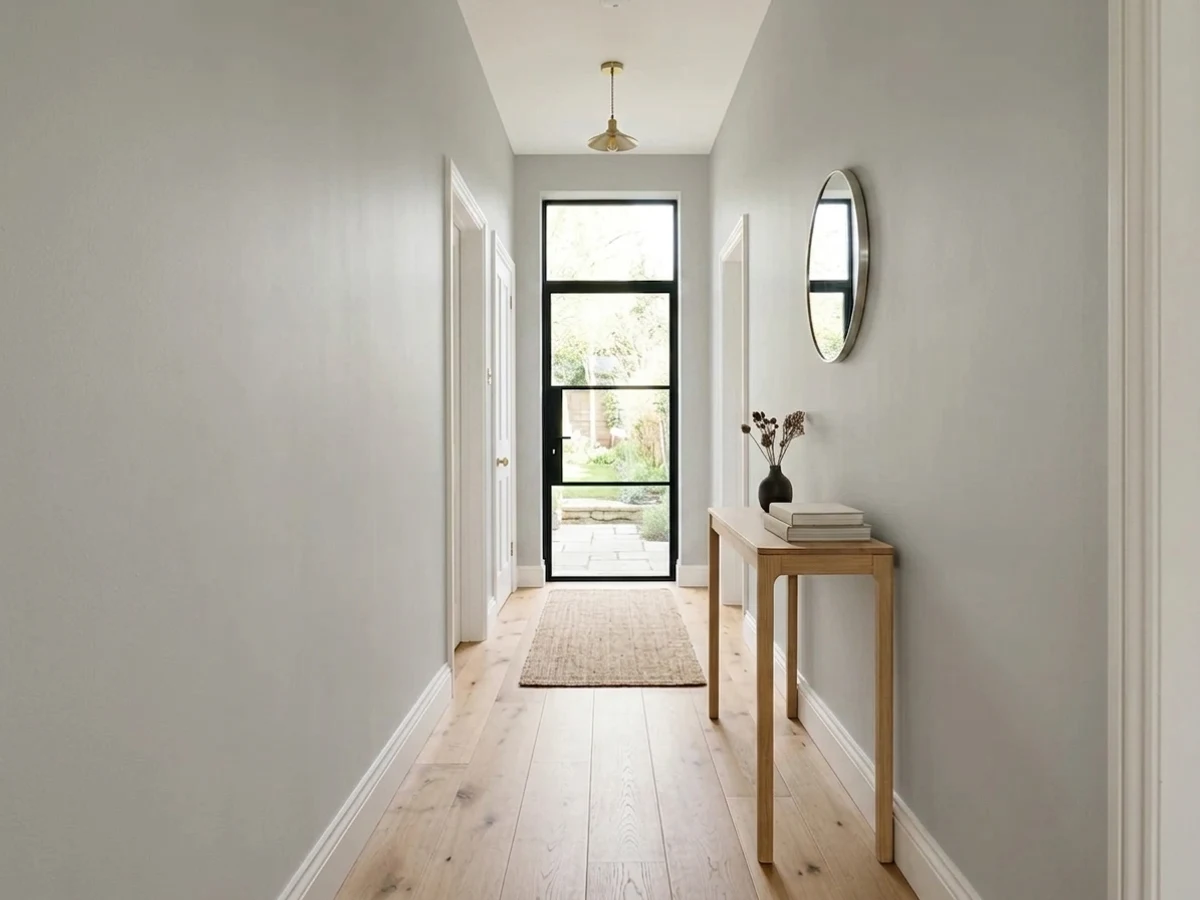
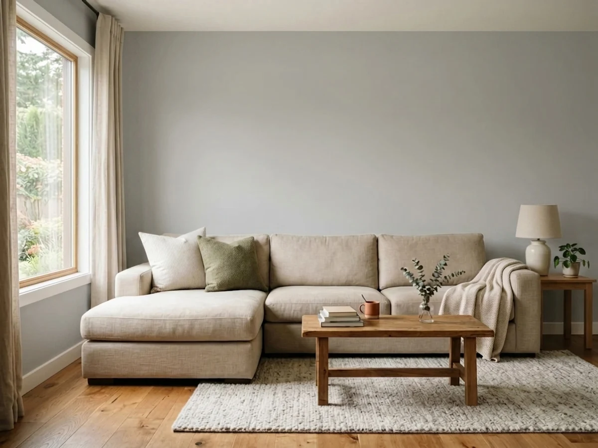
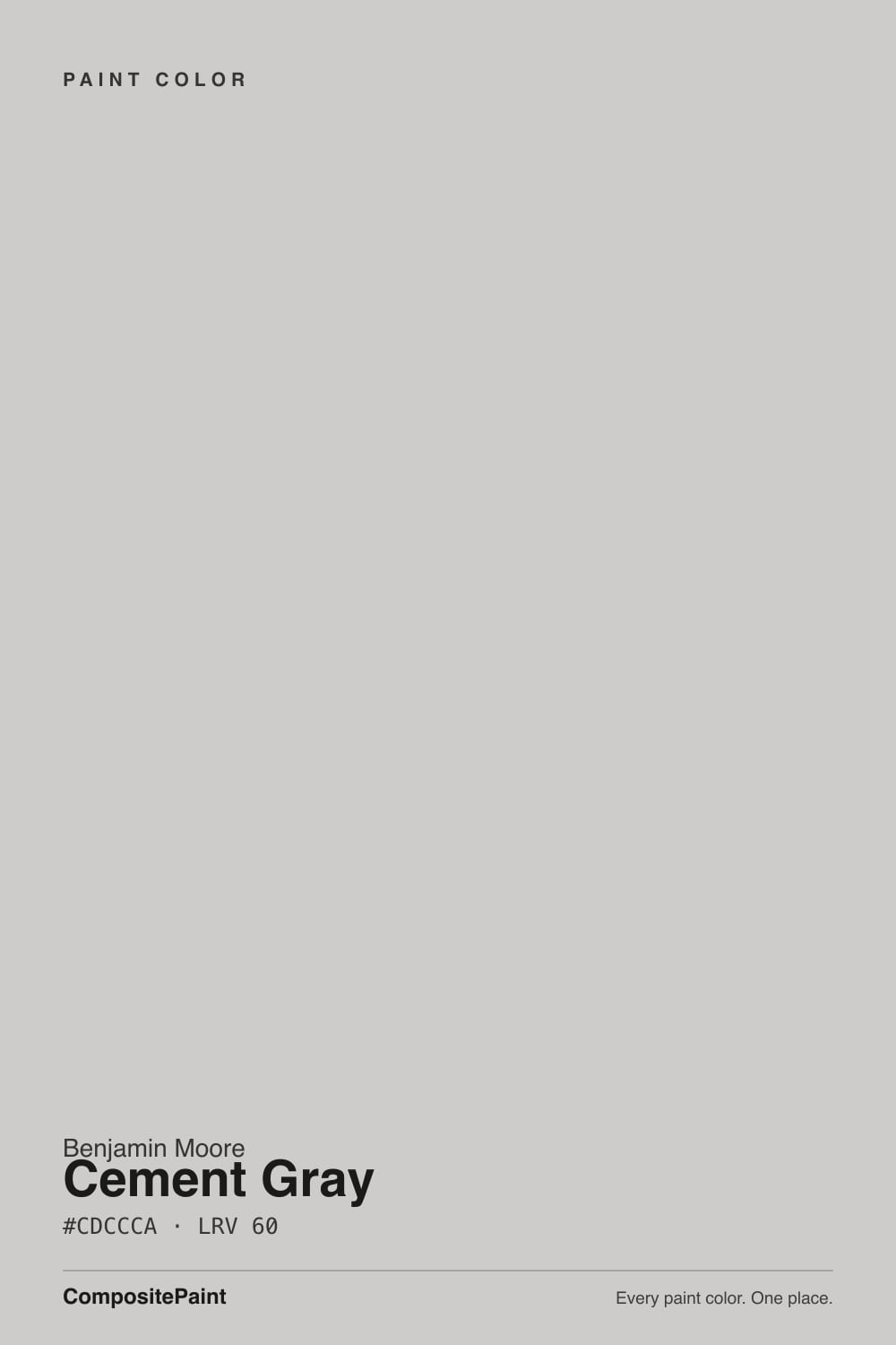
- 1Stardew43
- 2Quietude48
- 3Cement Gray60
- 4Gray Owl65
- 5Glass Slipper70
The Fast Verdict
Cement Gray is gray with the drama removed. Benjamin Moore calls it a cool gray, and that is fair, but the more useful description is that it is nearly colorless — the red, green and blue in it sit within a couple of points of each other, which is about as close to a true neutral as a paint deck gets. On a wall with real daylight it reads as the gray people think they are buying when they buy gray: clean, mid-tone, no green flash, no pink surprise. In dim or cold light that same emptiness turns on you and the wall goes flat with a faint lilac cast. Buy it for the light, not for the chip.
Family rooms and living rooms with real afternoon light · modern kitchens with stainless, white oak and matte black · offices and hallways that need a neutral that never argues · anyone burned by a gray that turned green, blue or pink
Your room is dim and north-facing · you want gray with warmth in it · your floors are honey oak or golden-beige carpet · the house runs on 4000K LED bulbs
- As close to a true neutral gray as the BM deck gets — no green or pink surprise
- LRV 60 is the sweet spot: visible from across the room, still bright
- Flows between rooms without temperature clashes
- Excellent on cabinets in Advance — concrete gray without the blue
- Hides scuffs and handprints far better than a light gray
- Goes flat with a faint lilac cast in dim or cool light
- No warmth at all — reads cold against honey oak and beige
- Borrows an undertone from whatever is next to it, so chips mislead
- Genuinely plain: it adds nothing to a room that needs help
What Color Is Cement Gray, Really?
A light-to-mid gray built almost without an undertone. Most colors sold as gray are secretly something else — greige, blue-gray, green-gray — and that hidden lean is what makes people repaint. Cement Gray is the rare one that mostly is what the name says. Benjamin Moore files it in Color Preview and describes it in one line as a cool gray that merges easily into any style of architecture, which is unusually honest marketing: this color has no personality to sell.
At LRV 60 it sits exactly where a whole-house gray wants to sit. That is bright enough to keep a family room from feeling closed in, dark enough that you can actually see the color from across the room — the complaint people make about paler grays like Classic Gray (LRV 74), which vanish into the trim in a bright room. It is also the depth where scuffs and handprints stop broadcasting, which matters in the rooms this color is best in.
Undertone in one line: essentially none, with the faintest cool violet lean that only shows in cold light. That is why the reviews you find online contradict each other — one designer calls it stormy and slightly purple, another calls it faintly taupe, a third swears it flashes green. They are all describing the same paint in different rooms. A color with nearly no undertone of its own borrows one from whatever sits next to it.
Where It Shines
It is at its best in the big daytime rooms of a house that already has enough going on — a family room with a busy sectional, a gallery wall, kids' things everywhere. Cement Gray gives those rooms a clean mid-tone backdrop that does not add another opinion. Its second strength is cross-room flow: because it leans nowhere in particular, it hands off to a green room, a navy room or a warm-wood kitchen without any of the awkward temperature clashes a greige creates. And on cabinets in Advance satin it does the modern-concrete look without the blue that most gray cabinet colors bring.
Where It Fails
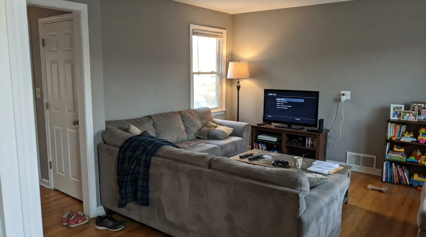
Every real regret story about this color comes from one of three situations, and all three are visible before you open the can. None of them are the paint's fault — but if your room matches one, sampling harder will only confirm it.
This is the one that produces the bad photos. With no warmth of its own to fall back on, the color has nothing left when the light goes cold: the wall reads flat, slightly lilac, a little dirty — the exact look people mean by "sad gray." Warm 2700K bulbs claw most of it back. If the room is dim and you will not change the bulbs, buy a greige instead.
A lot of people shopping for gray actually want greige and do not know it yet. Cement Gray gives you zero warmth — next to honey oak floors, golden-beige carpet or a cream sofa it reads cold and slightly blue by comparison, and the room can feel unfinished rather than calm. Repose Gray (LRV 58) is the same depth with the warmth added back.
Because the color is nearly neutral, everything around it pushes it somewhere. Next to a sage sofa it looks faintly green; next to beige carpet it looks violet; next to blue-gray quartz it looks blue. This is the reason a small chip lies about this color more than most. Sample a big swatch on the actual wall, next to the actual floor and the actual furniture, and look at it at 9am, 3pm and 9pm.
Room by Room
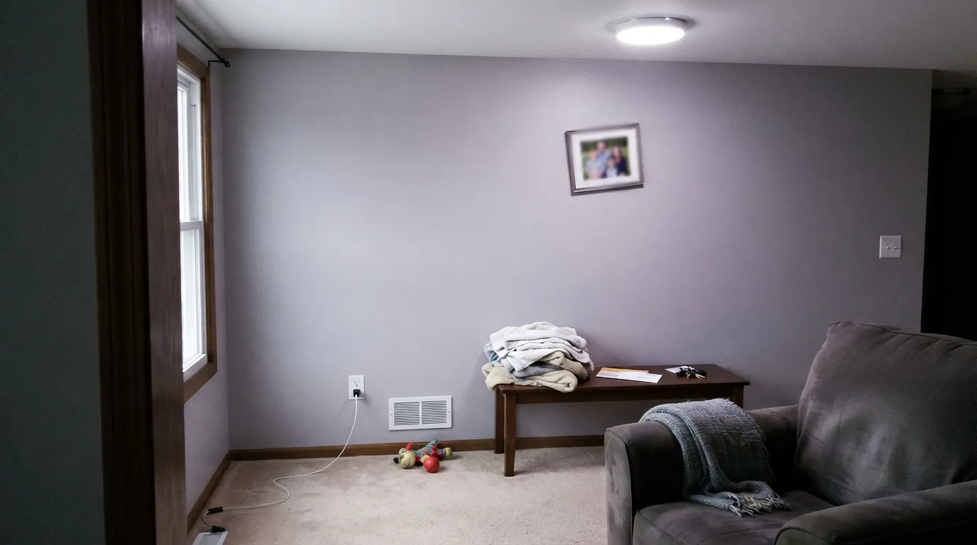
The room this color was built for: a mid-tone neutral that hides fingerprints, does not fight a TV wall, and lets a busy, lived-in space look calm rather than styled. Eggshell on the walls. It needs real daylight or good lamps — a windowless basement family room is the one version to avoid.
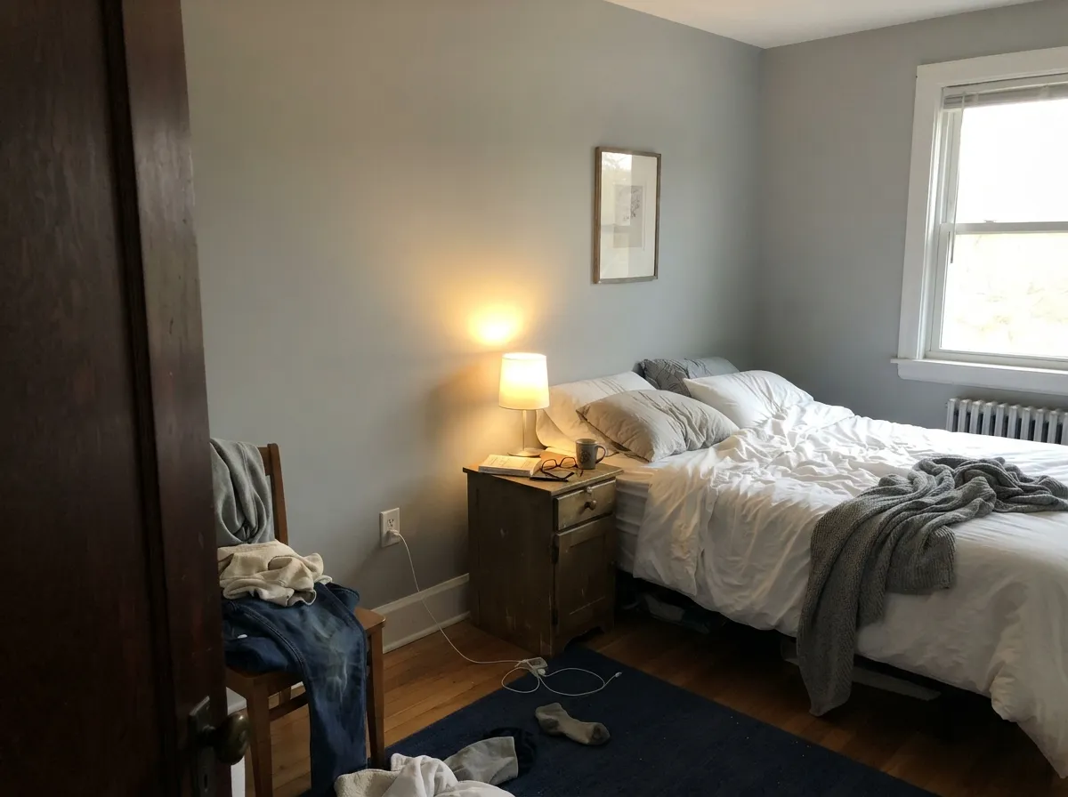
Quiet and modern, and at LRV 60 it stays restful instead of going cave-like. Matte finish, and put the warmth into the room rather than the wall: 2700K bulbs, cream or white bedding, a wood nightstand. On cool LEDs it turns clinical after dark.
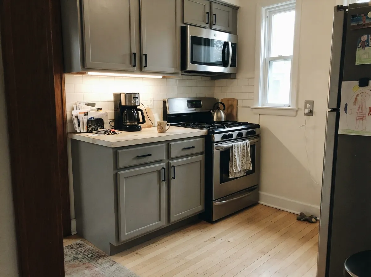
As walls it is a clean backdrop for white or wood cabinets. On the cabinets themselves — Benjamin Moore sells it in Advance, their cabinet and trim enamel — it gives the concrete-gray look without the blue cast most gray cabinet colors have. Satin. Pair with stainless, matte black or chrome; brass needs a warm floor to make sense.
One of the better office grays. It is dark enough to cut monitor glare, neutral enough that it does not tint video-call skin tones the way a green- or blue-gray does, and it takes shelving and black hardware well. Eggshell.
The practical reason to choose it. A no-lean gray hands off to whatever the next room is doing without a temperature argument, so an open main floor stays coherent even when the adjacent rooms are not neutral. Hallways with no windows need a light at the end or the color flattens.
In a bathroom with a window it is crisp and spa-plain. In a windowless bath or a basement running cool LEDs it is the failure case above — flat and faintly lilac. Fix the lighting first, then decide, and expect to test a large sample under the actual fixtures.
Your Light Is the Risk
Warm afternoon sun is exactly the counterweight this cool gray needs. It reads as a clean, honest mid-tone gray all day.
Cool gray daylight has nothing to warm it. The wall flattens and the faint violet lean comes forward. Test here first.
Cooler and crisper in the morning, softer and a touch warmer at golden hour. The swing is small — smaller than most grays.
2700K lamps steady it and take the chill off. 4000K LEDs push it grayer, colder and slightly lilac. Bulbs are part of this paint job.
Most complaints about Cement Gray are a light mismatch. Upload a photo of your actual room and see it on your walls — then ask for the same wall in north light or evening lamps before you buy a single sample.
Need It From Another Brand?
Any paint counter can custom-tint Benjamin Moore 2112-60 directly. If you would rather stay in one brand's own deck, these are the closest stock matches, measured as ΔE2000. Under 2 is a difference you will not see on the wall.
| Brand | Closest color | ΔE | LRV | |
|---|---|---|---|---|
| Sherwin-Williams | PassiveSW 7064 · Sherwin-Williams | 1.3 | 60 | Color page → |
| Behr | Mexican SilverQE-49 · Behr | 1.1 | 60 | Color page → |
| Valspar | Bay Waves4008-1A · Valspar | 1.6 | 61.3 | Color page → |
| PPG / Glidden | Steely GazePPG0996-2 · PPG / Glidden | 0.2 | 60 | Color page → |
| Glidden | Steely GazePPG0996-2 · Glidden | 0.0 | 60 | Color page → |
| Dutch Boy | Moon Beam438-2DB · Dutch Boy | 1.3 | 60 | Color page → |
Similar Benjamin Moore Colors
The nearest shades to Cement Gray within Benjamin Moore's own range, ranked by perceptual color distance — useful when you want the same look a touch lighter, darker, or warmer.
WCAG 2.1: AA is 4.5 : 1 for normal text, 3 : 1 for large text, AAA is 7 : 1.
Cement Gray vs the Colors You're Also Considering
Every Cement Gray sample board has the same rivals on it. The numbers show the real lightness gap — then it comes down to which risk you would rather live with.
Pick this when you want the flattest, quietest version and nothing to notice.
Benjamin Moore HC-170 · LRV 59Stonington GrayPick this if you want the same depth with a little more color in it — it holds its gray character more visibly on the wall.
Pick this if you want a gray that stays put — Gray Owl changes its mind between green and blue depending on the room.
Benjamin Moore OC-52 · LRV 65Gray OwlPick this for a lighter, airier gray in a room that needs the bounce.
Cement Gray Coordinating Colors
The rule with a no-lean gray is the opposite of the rule with a greige: you are not matching an undertone, you are deciding which one to lend it. Pair it with cool, clean whites and true grays and it stays crisp and modern. Pair it with a warm white and the whole room softens. Benjamin Moore's own coordinating list for this color reaches for White (OC-151) and Cloud Cover, and both hold up in real rooms. These are the partners worth sampling:
Why a Gray With No Undertone Is the Hardest One to Sample
Search this color and you will find flatly contradictory reviews: one says it flashes green in bright light, one says it has a cool purple cast, one says it carries a hint of warm taupe. It is tempting to assume somebody is wrong. Nobody is. When a color is built almost without an undertone — and this one is close, its red, green and blue values sitting within a few points of each other — there is no built-in bias to override what the room is doing. So the room wins. Green sofa, green walls. Beige carpet, violet walls. Blue-gray counters, blue walls.
That is a real strength once you know it: it is why this gray flows between rooms that do not match each other, and why it does not fight a busy family room. It is also why a 2-inch chip under paint-store fluorescents tells you nothing useful. Paint a large sample board, hold it flat against the wall next to the floor and the furniture, and check it three times — mid-morning, mid-afternoon and at night with the lamps on. With most colors that is good advice. With this one it is the only way to know what you are buying.
Cement Gray With Wood Tones, Floors and Metals
The floor decides more here than the paint does. Pale white oak, gray-washed wood, gray LVP, polished concrete and cool porcelain tile are all natural company — the wall stays a clean neutral and the room reads modern. Walnut and dark-stained floors work too, and the contrast does the color a favor: a deep warm floor gives the eye something to push against so the wall does not read empty.
The honest no is golden. Orange-leaning honey oak floors, oak trim from the 1990s and yellow-beige carpet all sit opposite this gray in temperature, and the trade goes badly both ways: the floor looks more orange, the wall looks colder and slightly violet. A large rug helps in a family room. If the honey oak is staying wall to wall, take the greige route instead — Repose Gray at LRV 58 gives you the same depth with the warmth built in.
Metals are easy: stainless, chrome, brushed nickel and matte black all read correctly against it. Brass and unlacquered brass are not wrong, but they need a warm floor or warm textiles in the room, or the brass ends up looking like the only warm thing in the photo.
Three Ready Palettes Built on Cement Gray
A color is never alone on the wall. These are complete combinations in the 60-30-10 pattern, with the reason each one holds together. Every one opens in the visualizer.
Benjamin Moore's own coordinating list puts White (OC-151) with this color, and the logic is sound: a white with no lean of its own keeps the wall reading as true gray instead of borrowing warmth from the trim. Hale Navy supplies the single dark note a flat neutral room needs so it does not read as a rental.
Try this palette in your roomThree rungs of the same quiet ladder — LRV 80, 60 and 13 — so the kitchen gets contrast without a color scheme. Cloud Cover is another of BM's listed partners for this gray. White oak floors and stainless finish it; leave the warmth to the wood.
Try this palette in your roomThis is the version for people who like the gray but not the chill. White Dove is a warm white, and putting it on the trim and ceiling wraps the cool wall in something softer — the room warms up at night without the wall color changing. Chelsea Gray's greige depth keeps the scheme from going all-cold.
Try this palette in your roomCement Gray FAQ
Is Cement Gray warm or cool?
Cool — but only just. Benjamin Moore's own one-line description calls it a cool gray, and on a wall it has no warmth to give back: no beige, no taupe, no cream. It is not icy either. Think of it as neutral with a cool tilt, which is why it looks clean in daylight and chilly in a dark room.
Does Cement Gray look purple?
It can, faintly, and it is the one undertone worth testing for. The lean is very slight — designers who review it describe it as stormy rather than obviously violet — and you will mostly see it in cool north light, under 4000K LEDs, or next to beige carpet and warm-toned floors. In south or west daylight almost nobody sees purple.
What trim white goes with Cement Gray?
Two good answers. For the modern look, a crisp white — Chantilly Lace (LRV 92) — keeps the wall reading clean and gray. For the safest match, Benjamin Moore White (OC-151) is BM's own listed partner and has no lean of its own, so it never pushes the wall warm or cool. Use White Dove only if you want the room warmer overall, and accept that the contrast will read softer.
Is Cement Gray a good family room color?
It is one of its best uses. At LRV 60 it is dark enough to read as an actual color from across a big room, light enough not to close the space in, and forgiving about scuffs and hands on the wall by the sofa. The requirement is light: a family room with west or south windows, or good warm lamps, gets the calm version. A dim basement family room gets the flat version.
Can I use it on kitchen cabinets?
Yes, and it is one of the better gray cabinet colors precisely because it is so neutral — most gray cabinet paints go blue under LED under-cabinet lighting, and this one mostly does not. Benjamin Moore sells it in Advance, their waterborne alkyd cabinet and trim enamel, in satin. Pair with stainless, matte black or chrome hardware and a wood floor.
Does Cement Gray work on exteriors?
It can, with a caveat: full sun washes a light-mid gray out badly, so a body color that looks right on the sample board often reads a step paler and blander on the house. If you want this gray outside, go up a step in depth or commit to strong dark trim — Kendall Charcoal or Wrought Iron — to give the facade something to push against. Interior is where it earns its keep.
Have you painted with Cement Gray?
Rate it — one tap helps the next reader decide.
Ask a Question