Cloud Cover
A quiet, gray-leaning neutral most people find by accident, reviewed honestly: where it disappears beautifully, the light that makes it go cold, and what to pick instead.

Jessica has spec'd whites and neutrals for more than 300 rooms and keeps a sample wall of painted drawdowns in her studio. Every color review is checked against real reader rooms in the comments and re-tested when a formula changes. About the testing process →
- 1First Star69
- 2Classic Gray74
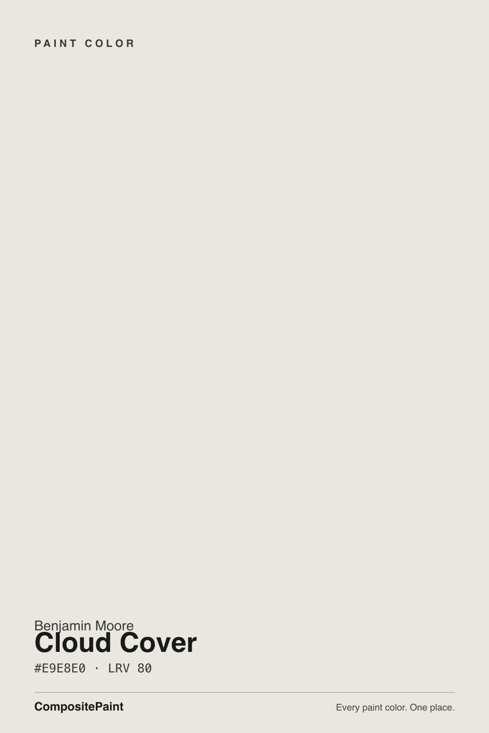
- 3Cloud Cover80
- 4Swiss Coffee85
- 5Chantilly Lace91
The Fast Verdict
Cloud Cover is what happens when Benjamin Moore builds a color to have almost no opinion. It is lighter and grayer than Classic Gray, cooler and less committed than White Dove, and famous for absolutely nothing — no Color of the Year run, no viral kitchen, just a quiet warm-neutral gray that colorists reach for when a client can't decide between "white" and "gray." It has real light-dependence and it will not carry a room on personality, but as a whole-house backdrop it does exactly the job it was built for.
Whole-house walls when white feels too stark and greige feels too beige · open floor plans that need one color to run through several rooms · trim and hallways that should recede · anyone torn between a warm white and a true gray
You want a color with a name and a following · your room is dim and north-facing with no warm bulbs · you want the walls to be a real color decision, not a quiet one · your fixed finishes already run cool and gray
- A genuinely quiet, whole-house neutral — not obviously white, gray, or beige
- Light enough (LRV 80) to keep small or dim rooms from feeling closed in
- Flatters warm wood, brass, and matte black without a fight
- Reads calm and current without chasing a trend that will date it
- A versatile trim option for buyers who find brighter whites too stark
- Quiet enough that some buyers call it boring or forgettable next to louder samples
- Goes flat and slightly cold in a dim, north-facing room without warm light
- Can pick up a faint green-gray cast under cool LED or fluorescent bulbs
- Sits in the shadow of louder deck-mates (White Dove, Classic Gray) that get recommended first
What Color Is Cloud Cover, Really?
Cloud Cover is a warm-neutral gray so subdued it barely announces itself as gray at all. Pull the formula apart and the reason is obvious: the red and green channels sit almost identical, with blue only a few points lower — the numbers of a color built to have no strong opinion. Benjamin Moore files it under SKU 855 in the Off-White Collection, a numbered fan deck built specifically around whites and near-whites, one slot below Silver Satin (856), a far better-known sibling. Cloud Cover has none of White Dove's fame or Classic Gray's stronger identity — it is, honestly, a color most people find by sampling their way past louder names, not by searching for it.
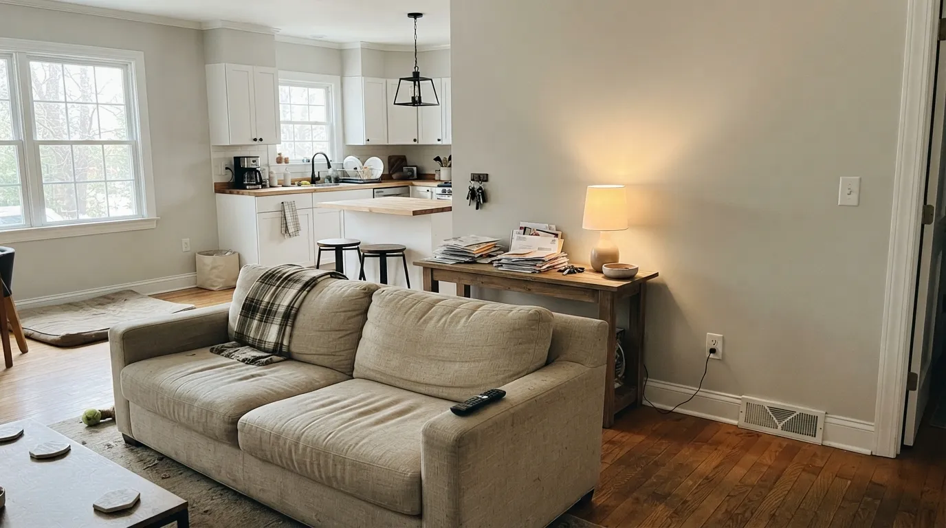
At LRV 80 it sits in the crowded middle of the deck: lighter and grayer than Classic Gray (LRV 74), a step cooler and less committed than White Dove (LRV 85). That in-between position is the whole appeal — it reads as "a nice light color" rather than forcing a choice between warm and cool, white and gray. On a wall it holds just enough tone to soften a stark-white room without ever becoming a color a guest would comment on.
Undertone in one line: a barely-there warm gray, never distinctly beige, never distinctly blue. If your sample looks flat and slightly cold, that is a dim or north-facing room draining the little warmth it has — not a flaw in the paint. If it looks faintly green under your kitchen's overhead lights, that is a cool LED bulb doing it; swapping to a 2700K bulb usually settles it back to neutral.
Where It Shines
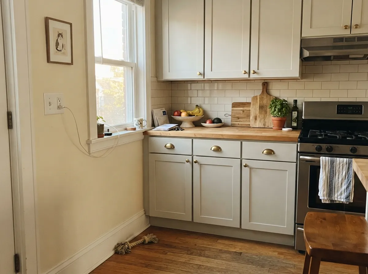
Give it real daylight and it does exactly the job a whole-house neutral is supposed to do: recede. It is at its best running through an open floor plan — living room into kitchen into hallway — where a louder color would eventually clash with itself from room to room. Paired with warm wood, brass, and black metal fixtures it reads current and deliberate without ever feeling decorated, which is exactly why colorists reach for it when a client is torn between "white" and "gray" and can't commit to either.
Where It Fails
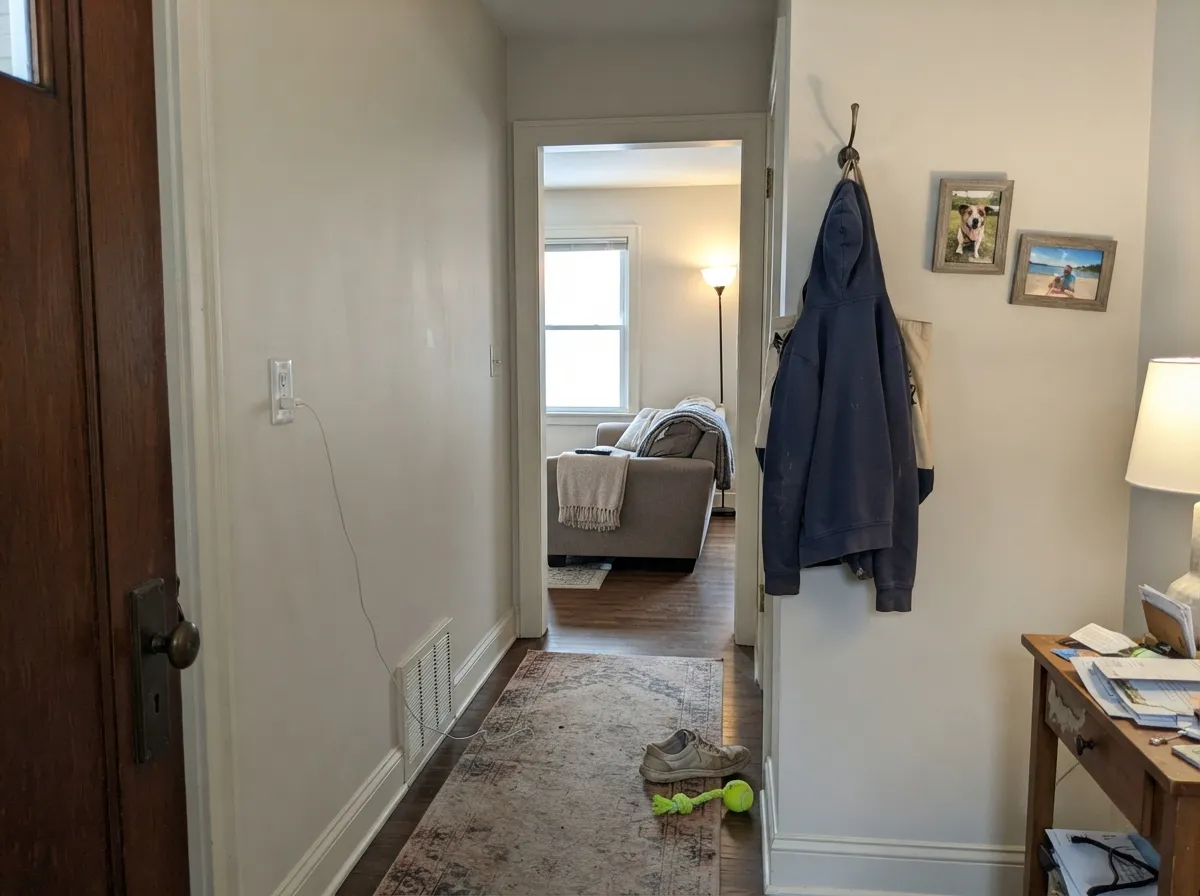
Almost every disappointed review of Cloud Cover comes down to one of three situations, and all three are predictable before the first coat. None of them are the paint failing — Cloud Cover simply has very little pigment to fall back on when the room or the light works against it.
Cloud Cover starts with almost no warmth to spare, so cool north daylight strips out what little it has and leaves a flat, slightly institutional gray. Readers describe it as "cold" or "nothing." Add warm 2700K lamps, or pick White Dove instead if the room truly has no good light.
The color's warmth is faint enough that cold-temperature bulbs can push it toward a pale green-gray, especially in kitchens and bathrooms with overhead fixtures. This is the classic near-neutral complaint, and it is a bulb problem, not a paint problem — swap to warm-white LEDs before repainting.
Next to louder samples — a true greige, a true gray, a saturated color — Cloud Cover can look like indecision rather than a choice. If you want guests to notice the wall color, this is not that color; it is built to be noticed only when it is missing.
Room by Room
A light neutral calm enough to run through an entire open floor plan without visual fatigue, never landing hard on "white," "gray," or "beige." Eggshell on walls, White Dove or Cloud Cover itself on trim in semi-gloss.
On cabinets it reads soft and current, especially with brass or matte-black pulls and a wood island. It does not fight warm butcher block or honey-toned counters the way a truer gray would. Satin cabinet enamel.
Restful under any real daylight; without 2700K bulbs at night it can go a shade cold and flat. Matte or eggshell, and keep bedding warm-toned rather than stark white.
With warm-veined marble or wood vanities it is effortless. With cool blue-grey tile the two can look slightly mismatched — sample both together under the room's actual lighting before committing.
Semi-gloss Cloud Cover trim under a deeper wall color reads soft and current instead of the harder edge a brighter white gives. A good pick for buyers who find White Dove too creamy and pure whites too stark.
In full sun it reads a clean, light gray-neutral; on the shaded side of the house it can go noticeably cooler and flatter than the sunny side. Pair with black or charcoal trim for a modern read, and sample both elevations before committing.
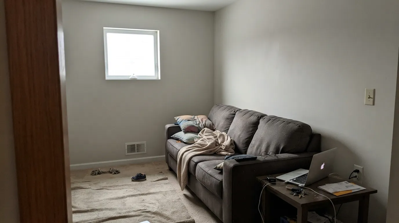
Your Light Is the Risk
The truest read: a calm, barely-warm gray-neutral, with just enough tone to flatter wood and metal without ever going cream or beige.
Cool, dim north daylight drains what little warmth it has and leaves a flat, slightly institutional gray. Test first if this is your only light.
A gentle warm-up during low sun hours, settling back to a quiet neutral by midday. The shift is subtle, not a new color.
2700K lamps bring out a soft, putty-toned warmth. Cool LEDs or fluorescents can push it toward a faint green-gray — change the bulb, not the paint.
Most complaints about Cloud Cover are a light mismatch. Upload a photo of your actual room and see it on your walls — then ask for the same wall in north light or evening lamps before you buy a single sample.
Need It From Another Brand?
Any paint counter can custom-tint Benjamin Moore 855 directly. If you would rather stay in one brand's own deck, these are the closest stock matches, measured as ΔE2000. Under 2 is a difference you will not see on the wall.
| Brand | Closest color | ΔE | LRV | |
|---|---|---|---|---|
| Sherwin-Williams | Green GlimpseSW 9676 · Sherwin-Williams | 1.9 | 82 | Color page → |
| Behr | Wedding Cake WhiteHDC-NT-10G · Behr | 1.0 | 80 | Color page → |
| Valspar | Snowed In6004-1A · Valspar | 0.8 | 80.4 | Color page → |
| PPG / Glidden | Garlic ClovePPG18-09 · PPG / Glidden | 1.4 | 81 | Color page → |
| Glidden | PegasusPPG1010-1 · Glidden | 1.5 | 81 | Color page → |
| Dutch Boy | Tender Cloud023W · Dutch Boy | 1.0 | 80 | Color page → |
Similar Benjamin Moore Colors
The nearest shades to Cloud Cover within Benjamin Moore's own range, ranked by perceptual color distance — useful when you want the same look a touch lighter, darker, or warmer.
WCAG 2.1: AA is 4.5 : 1 for normal text, 3 : 1 for large text, AAA is 7 : 1.
Cloud Cover vs the Colors You're Also Considering
Every Cloud Cover sample board has the same rivals on it. The numbers show the real lightness gap — then it comes down to which risk you would rather live with.
Pick this when you want the grayer, cooler-headed version of the same idea, and a little more light (LRV 80 vs 75).
Benjamin Moore 856 · LRV 75Silver SatinPick this if you want the same quiet near-white one notch warmer and creamier — its own undertone reads softer, and it's the Off-White Collection sibling right next to Cloud Cover in the deck.
Pick this when White Dove's cream reads too warm and you want the gray side of neutral instead.
Benjamin Moore OC-17 · LRV 85White DovePick this for the deck's warmest, most popular off-white instead — creamier and more forgiving in a dim room than Cloud Cover will ever be.
Pick this to keep the room light and just faintly tinted, not obviously gray on the wall.
Benjamin Moore OC-23 · LRV 74Classic GrayPick this if you want a color that commits to gray more clearly — Classic Gray reads truer gray in the light Cloud Cover just barely hints at.
Pick this for the lighter (LRV 80 vs 58), warmer-blooded version with less risk of a cool-light color flash.
Sherwin-Williams SW 7015 · LRV 58Repose GrayPick this if your painter works in Sherwin-Williams — a similarly quiet light gray, though it can flash lavender in cool north light where Cloud Cover just goes flat.
Cloud Cover's real competition is inside its own deck. Paper Doll CSP-485 at #E8E9E1, Winter White OC-21 at #E7E9E2, and White Wisp OC-54 at #E6E8E1 all sit at or near LRV 80 within a couple of hex points. The differences come down to a slight green or gray shift that only shows on a large sample, so pick by chip comparison rather than by description.
Across brands, Diamond Vogel Mystic Fog 0019 at LRV 80 and Dunn-Edwards Chalky DEC793 both fall under a difference of 0.5, essentially the same color. Valspar Snowed In 6004-1A at LRV 80.4, Behr Wedding Cake White HDC-NT-10G at LRV 80, and Dutch Boy Tender Cloud 023W are all around 1 or under, so they are visually identical in normal room light.
Farrow and Ball Au Lait No. CB9 at LRV 80 and Sherwin-Williams Green Glimpse SW 9676 at LRV 82 are close enough to swap in most rooms. Portola Paints Ellie is close but visibly different side by side.
Cloud Cover Coordinating Colors
The rule with Cloud Cover is to let it stay quiet: pair it with a genuinely warm white or a genuinely true gray and let that partner carry the temperature statement, rather than fighting Cloud Cover's own barely-there undertone. It layers easily with its Off-White Collection sibling Silver Satin, holds its own against deeper true grays, and takes a near-black accent well. These are the partners that keep showing up in rooms that work:
Where Cloud Cover Sits in Benjamin Moore's Off-White Collection
Cloud Cover carries the number 855 from Benjamin Moore's Off-White Collection — a numbered fan deck built specifically around whites and near-whites — sitting one slot below Silver Satin (856), a much better-known member of the same family. It has never had a Color of the Year run, a viral renovation, or a celebrity kitchen behind it. This is a genuinely quiet color that most homeowners find by sampling their way past White Dove and Classic Gray, not by searching for it by name.
That obscurity is not a flaw. It means Cloud Cover carries none of White Dove's "everyone already used this" fatigue, and none of Classic Gray's stronger personality to negotiate around. It is, honestly, a workhorse: the color a colorist reaches for when a client wants "something quiet" and does not want to choose between a dozen near-identical chips.
Cloud Cover With Wood Tones and Floors
Warm wood is where this color earns its keep. Honey oak, walnut, and butcher block all sit comfortably against Cloud Cover because its own undertone is warm enough to meet them halfway — it does not fight orange-leaning floors the way a true blue-gray would.
The one flooring that deserves a sample first is cool gray LVP or gray-washed wood. Two cool-leaning neutrals next to each other can read flat and a little institutional rather than calm — a warm rug or a brass fixture usually fixes it, but test a large sample above the actual floor before committing to the whole room.
Three Ready Palettes Built on Cloud Cover
A color is never alone on the wall. These are complete combinations in the 60-30-10 pattern, with the reason each one holds together. Every one opens in the visualizer.
Cloud Cover is quieter and grayer than the White Dove trim next to it, so the wall recedes and the trim reads crisp without a jarring bright-white edge. Kendall Charcoal on the door supplies the one dark, confident note the palette needs.
Try this palette in your roomTwo whispers of the same warm-gray family on walls and cabinets keep the kitchen from feeling decorated, while Iron Ore on the island — a true near-black — gives the room the one committed dark note it needs. Brass or matte-black hardware both read well against this pairing.
Try this palette in your roomStonington Gray is the true gray Cloud Cover only hints at, so the accent wall reads like a deliberate deepening of the same room rather than a clashing color. White Dove trim keeps the warmth in check without letting the room tip toward beige.
Try this palette in your roomCloud Cover FAQ
Is Cloud Cover warm or cool?
Neither, strongly — that is the point. The red and green channels in its formula are almost identical and blue sits just a touch lower, which reads as a faint warm-gray rather than a clear beige or blue-gray. In warm light it leans soft and putty-toned; in cool light it goes flat and neutral. It never turns distinctly yellow or distinctly blue.
Is Cloud Cover more gray or more greige?
Gray-leaning, but only barely — it sits between the two categories on purpose. Next to a true greige it looks grayer; next to a true gray like Stonington Gray it looks a hair warmer. That in-between quality is exactly what makes it a safe whole-house pick, and exactly what makes it hard to describe to a painter over the phone.
What trim white goes with Cloud Cover?
White Dove is the easy match — warm enough to keep the pairing soft, without fighting Cloud Cover's cooler lean. A bright white like Chantilly Lace works too if you want more contrast, but test it first; on a dim wall the brighter trim can make Cloud Cover look slightly tired by comparison.
Is it good for kitchen cabinets?
Yes, especially with warm wood, brass, or matte black hardware. It is quieter than white cabinets and less committal than a full greige or gray, which makes it a safe pick if you are not ready to commit to a colored kitchen. Use a satin cabinet enamel.
How does Cloud Cover compare to White Dove or Classic Gray?
White Dove is the warmer, creamier, more famous choice — pick it if you want cream. Classic Gray is deeper and more clearly gray — pick it if you want the wall to read as a real color decision. Cloud Cover sits quietly between both, lighter than Classic Gray and grayer than White Dove, which is why it gets picked by people who can't choose between the other two.
Does it work on an exterior?
Yes, as a modern, understated light neutral, especially with black or charcoal trim. Walk the whole house with a sample first — the shaded side reads noticeably cooler and flatter than the sunny side, more so than with a warmer white like White Dove.
Have you painted with Cloud Cover?
Rate it — one tap helps the next reader decide.
Ask a Question