Sherwin-Williams Repose GrayvsSherwin-Williams Passive
Why this comparison: Passive is SW’s cooler gray, Repose adds warmth — the classic warm-vs-cool light gray decision. Repose Gray and Passive are very close (ΔE 3.2). The difference shows up most in side-by-side comparison and under specific light.

Built from our full reviews of both colors — same measured data, same real-room photos. About the testing process →
The Numbers
LRV is essentially equal (58 vs 60) — both reflect light the same.
What Each Color Really Is
A light greige built on a violet base. That last part is the whole story. Most warm grays get their softness from yellow or brown pigment; Repose Gray gets a good share of its from a whisper of purple, with a faint green thread underneath it. In warm light the purple reads as "soft" and "not cold," which is exactly the effect people are after. Take the warm light away and the same pigment reads as what it is. Nothing about the mix changes room to room — only what the light lets you see.
At LRV 58 it sits almost exactly where Agreeable Gray does at 60, so the two are not a light-versus-dark decision — they are a temperature decision. Repose leans slightly cool and clean; Agreeable leans slightly tan. That two-point gap also tells you something people miss: 58 is mid-light, not pale. It is a real, visible color on the wall, roughly halfway between a white ceiling and a mid-tone gray sofa, and it will read as gray from across the room rather than disappearing like an off-white.
Passive is Sherwin-Williams' answer to a specific complaint: every popular "gray" on the market kept turning out to be beige in disguise. Filed in the brand's Neutral family, on the wall it reads as an honest cool gray with a blue undertone and a violet edge — the opposite lean from the greige wave (Agreeable Gray, Accessible Beige) that dominated the decade before it. Passive shares Agreeable Gray's exact LRV 60, and that pairing is the clearest proof of how much undertone matters: identical light reflectance, completely different temperature on the wall. Passive has landed in Sherwin-Williams' top-selling colors for exactly that reason — it is the honest gray people kept asking their painter for.
The undertone is not subtle once the light stops cooperating. In dim or north-facing rooms, reviewers describe it going flat and distinctly blue-violet, occasionally cold enough to read "baby blue" straight out of the can before it dries down. In west-facing rooms it shifts through the day: cooler and more blue in the morning, then warming toward a faint violet-purple as evening light comes in low. In a room with strong, even daylight — especially true south exposure — it settles into the calm, true gray the color is famous for. This is a color whose personality is decided by your windows, not by the chip.
Specs Side by Side
| Spec | Repose Gray | Passive |
|---|---|---|
| Brand | Sherwin-Williams | Sherwin-Williams |
| SKU | SW 7015 | SW 7064 |
| Hex | #CCC9C0 | #CBCCC9 |
| RGB | 204, 201, 192 | 203, 204, 201 |
| LRV | 58 | 60 |
| Undertone | red-orange / warm | true neutral |
| Family | Neutral | Gray |
How Light Changes Them
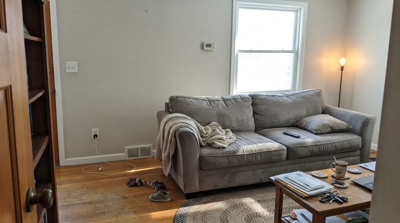
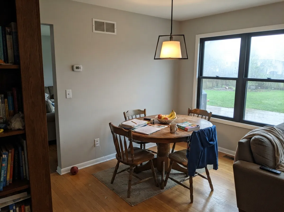
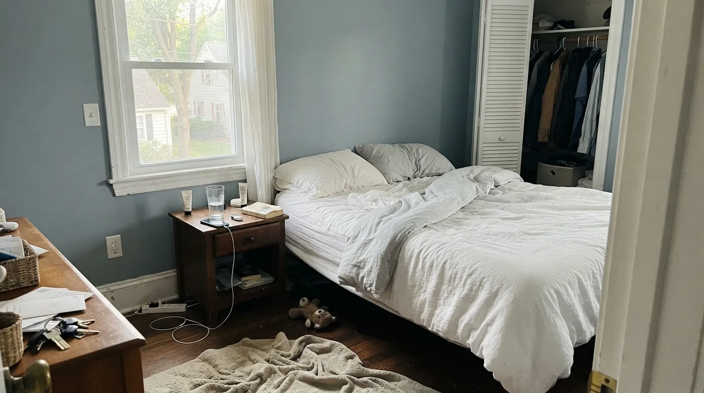
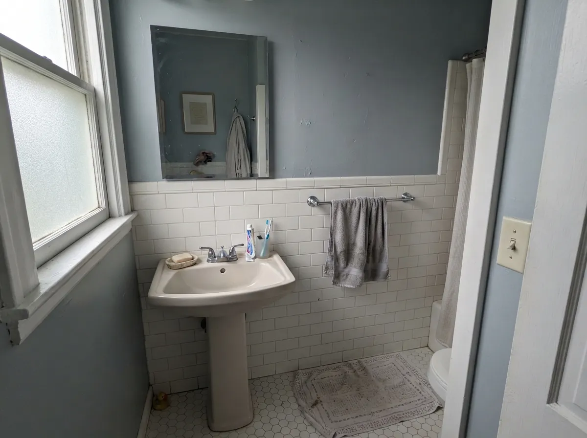
Warm daylight all day keeps the greige balanced and soft. This is the room it was made for.
Cool light kills the warmth and the violet base surfaces. Expect lavender or baby blue. Sample large, or go warmer.
4000K LEDs push it blue-gray and lifeless after dark. Swap to 2700K bulbs before you blame the paint — it usually fixes it outright.
West windows at 4pm bleach it close to an off-white. Fine on a big wall, disappointing if you wanted visible gray.
Strong, even daylight keeps it a calm, true gray all day — the closest the wall gets to the chip in the store.
Indirect, cool light has nothing warm to balance it — the blue-violet comes forward and the room reads flat and cold. Sample first.
Cool and distinctly blue in the morning, then a faint violet-purple flash as low evening light comes through. Most people notice; many like it.
2700K lamps warm it just enough to soften the blue. Cool LEDs push it icier and flatter — change the bulb before you consider repainting.
Both Colors in Real Rooms
Photos from our full reviews — the same rooms and captions, so you can judge each color where it actually lives, not on a chip.
When to Pick Which
South- and west-facing living rooms · open-plan main floors that need one calm neutral · walls beside warm wood, brass, or matte black · anyone who found Agreeable Gray too beige
Your room faces north and stays dim · your cabinets or counters are cream, ivory, or champagne · your bulbs are 4000K daylight LEDs · you want a gray that reads clearly gray, not greige
Bright rooms with real daylight · bedrooms and bathrooms that want calm over cozy · pairing with cool whites, chrome, and gray-toned stone · anyone who wants an actual gray, not another greige
Your room is dim or north-facing without warm lamps · your floors and cabinets lean honey-warm · you want cream or beige warmth · you're pairing it with a warm off-white trim
No comparison page can see your light. Upload one photo of your room and try both colors on the same walls, seconds apart.
Repose Gray vs Passive FAQ
Which is lighter, Repose Gray or Passive?
They are practically the same lightness — LRV 58 vs 60. Neither will make the room brighter than the other.
Which is warmer, Repose Gray or Passive?
Repose Gray is the warmer of the two (red-orange / warm); Passive reads true neutral.
How similar are Repose Gray and Passive?
Repose Gray and Passive are very close (ΔE 3.2). The difference shows up most in side-by-side comparison and under specific light. The only reliable test is seeing both in your own room and light — a side-by-side on a screen or chip flattens the difference.
Can I use Repose Gray and Passive together in one house?
Not in the same room, and be careful in the same house. At ΔE 3.2 they are so close that two walls in each will read as a tinting mistake, not a design choice. Pick one, or keep them on different floors where they are never seen together.
Ask a Question