Shell White
Sherwin-Williams' peach-toned off-white, reviewed honestly: the real undertone behind the Alabaster comparisons, the farmhouse exteriors it was built for, and the shaded wall that makes it look dated.

Jessica has spec'd whites and neutrals for more than 300 rooms and keeps a sample wall of painted drawdowns in her studio. Every color review is checked against real reader rooms in the comments and re-tested when a formula changes. About the testing process →
- 1Agreeable Gray60
- 2Pale Oak69
- 3Shell White83
- 4Moonlit Beach88
- 5Crème Fraiche93
The Fast Verdict
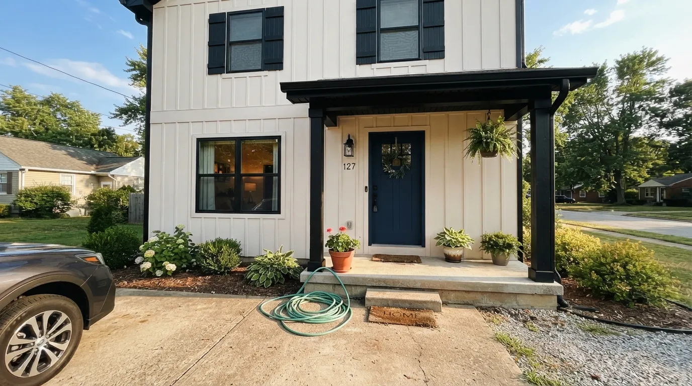
Shell White reads as Alabaster's quiet cousin at a glance — same brand, LRV within a point of each other — but the resemblance stops at the numbers. Sherwin-Williams' own description calls out a real peach undertone that Alabaster doesn't carry, and it shows: in bright, direct light Shell White washes toward a clean warm white, but in shade or over textured siding the peach comes forward and the color gets noticeably cozier, sometimes distinctly orange-adjacent. It was SW's Color of the Month back in October 2018 and has quietly become a farmhouse-exterior favorite ever since — less of an interior wall color, more of a siding color that occasionally does interior duty.
Exterior siding on farmhouse, modern-farmhouse and mid-century homes · pairing with black shutters, copper fixtures, brick or stucco · warm interior rooms with real daylight · anyone who wants a warm white with a genuine peach flush, not just plain cream
Your exterior wall sits in heavy shade most of the day · you want a crisp, unmistakably "white" white · your fixed finishes are cool grey stone or blue-toned tile · you're comparing it to Alabaster hoping for a near-identical result
- Real peach warmth gives farmhouse and mid-century exteriors genuine character, not just another beige
- Proven exterior color — pairs cleanly with black shutters, copper fixtures, brick and stucco
- Was Sherwin-Williams' Color of the Month (October 2018) — a vetted pick, not an obscure back-catalog number
- LRV 83 hides everyday scuffs on interior trim and cabinets
- Washes out to a clean, bright warm white in strong direct sun
- Peach undertone reads too warm for buyers who actually want a crisp, "true white" white
- Shade and textured surfaces intensify the peach — can look dated or slightly orange
- Sun-facing and shaded elevations of the same house can look like two different colors
- Far less name recognition than Alabaster — fewer real-room photos to sample against
What Color Is Shell White, Really?
Shell White is a warm off-white built on a cream base with a real peach undertone — Sherwin-Williams' own materials describe it that way, and it is the trait that actually separates it from Alabaster (SW 7008), the color it gets compared to constantly. Alabaster leans cooler and greyer; Shell White leans distinctly toward peach and yellow-beige. Same brand, adjacent LRVs, genuinely different temperature on the wall. It had its own moment in the spotlight, too — Sherwin-Williams named it Color of the Month for October 2018 — and has since become a recurring pick for farmhouse and modern-farmhouse exteriors rather than a famous interior wall color.
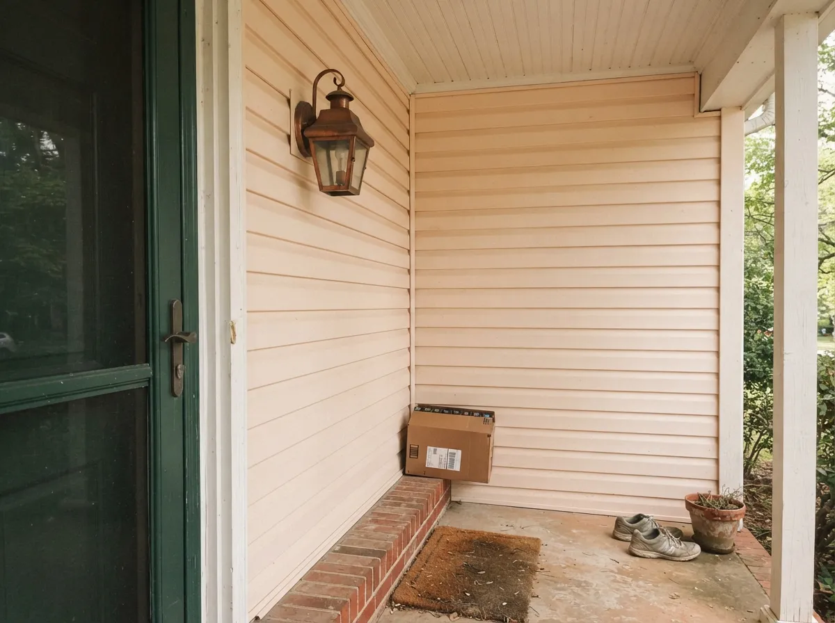
At LRV 83 it reflects most of the light that hits it, but how much peach you actually see depends heavily on light and texture. Full, direct sun washes the undertone out, and the siding reads as a bright, clean warm white. Shade — a north-facing elevation, an overcast day, a covered porch — lets the peach come forward, and textured surfaces like stucco or popcorn ceilings add micro-shadows that deepen it further into a richer, earthier cream. It is one paint that can genuinely look like two different colors on two sides of the same house.
Undertone in one line: warm cream with a real peach flush, plus a yellow-beige base — not a subtle, arguable warmth, an acknowledged one. If your sample looks close to a plain bright white, that's direct sun washing it out; if it looks a little orange or dated, that's shade and texture pulling the peach forward. Sample it on the actual wall, in the actual light, before you commit — this is not a color to pick from a fan deck alone.
Where It Shines
Its real home is the outside of a house. Against black shutters and trim, copper light fixtures, brick, or textured stucco, the peach undertone reads as warmth and character instead of an accident — it's the recipe behind most of the farmhouse and mid-century exterior photos this color shows up in. Indoors it does a respectable job in rooms with real daylight and warm wood, but it is doing there what a dozen other SW whites also do; outside, the peach gives it an identity none of them share.
Where It Fails
Almost every complaint about Shell White traces back to one of three predictable situations — and unlike a generic warm white, two of them are specifically about that peach undertone showing up where nobody expected it.
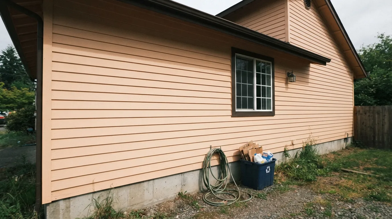
This is where the peach comes forward hardest, especially over textured stucco or heavy siding profiles — homeowners who sampled the color on a sunny south wall report the shaded side of the house looking noticeably more orange, sometimes dated. Walk the whole exterior with a sample before ordering paint, not just the elevation that gets the most sun.
Sherwin-Williams' own materials flag this as the main caution: the peach reads as too warm for buyers who want a stark, gallery-white result. If "crisp" and "not creamy" are your actual goals, Pure White is the safer pick.
Pair Shell White siding or walls with a cooler trim like Pure White and the trim wins the temperature argument — Shell White starts to look dingy by comparison. Keep the trim in the same warm family, or use Shell White itself on both.
Room by Room
Farmhouse, modern-farmhouse and mid-century homes all take to it well, especially with black shutters, a saturated front door, or copper fixtures. Sample both the sunny and shaded elevations first — the color shifts more outdoors than most whites do.
With south or east sun it's a calm, unremarkable-in-the-best-way backdrop for wood furniture. Eggshell on the walls, same color in semi-gloss on trim if you want a one-color room.
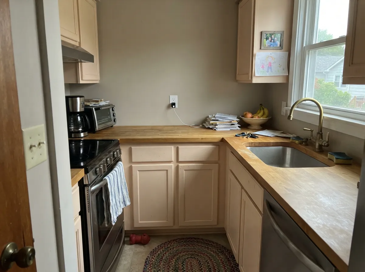
It flatters brass and butcher block the way most warm whites do. If your countertops or backsplash already lean grey rather than warm, Alabaster's cooler base will fight them less than Shell White's peach will.
Under 2700K lamps the peach comes forward gently at night, cozy rather than orange. A north-facing bedroom that stays dim all day will show more peach by day than most people expect from a "white."
With warm stone, wood vanities and brass it's quietly handsome. With cool grey marble or blue-toned tile, the peach undertone will read as a mismatch rather than a complement — pick a more neutral white instead.
It can trim a mid-tone wall the way any soft warm white does, but if the wall color has any grey in it, a cooler trim white like Pure White will read cleaner than Shell White's peach base.
Your Light Is the Risk
The peach reads as a soft warm glow without tipping orange — the most flattering, most photographed version of this color.
The peach undertone comes forward hardest here, especially over textured stucco. This is the light behind most "it looked more orange than the chip" complaints.
On one house, the sunny elevation can wash out to a plain warm white while the shaded side stays visibly peachy. Walk the whole exterior with a sample before ordering paint.
2700K bulbs pull the peach forward indoors, cozy rather than orange. Cool LEDs mute it toward a flatter, less distinctive off-white.
Most complaints about Shell White are a light mismatch. Upload a photo of your actual room and see it on your walls — then ask for the same wall in north light or evening lamps before you buy a single sample.
Need It From Another Brand?
Any paint counter can custom-tint Sherwin-Williams SW 8917 directly. If you would rather stay in one brand's own deck, these are the closest stock matches, measured as ΔE2000. Under 2 is a difference you will not see on the wall.
| Brand | Closest color | ΔE | LRV | |
|---|---|---|---|---|
| Behr | Salt CrystalQE-25 · Behr | 0.5 | 83 | Color page → |
| Benjamin Moore | Swiss CoffeeOC-45 · Benjamin Moore | 1.5 | 82 | Color page → |
| Valspar | Polar White7003-16 · Valspar | 1.1 | 83.7 | Color page → |
| PPG / Glidden | Vanilla MilkshakePPG1015-1 · PPG / Glidden | 0.5 | 83 | Color page → |
| Glidden | Parchment White60YY 83/062 · Glidden | 0.0 | 83 | Color page → |
| Dutch Boy | Whispered White019W · Dutch Boy | 0.8 | 83 | Color page → |
Similar Sherwin-Williams Colors
The nearest shades to Shell White within Sherwin-Williams's own range, ranked by perceptual color distance — useful when you want the same look a touch lighter, darker, or warmer.
WCAG 2.1: AA is 4.5 : 1 for normal text, 3 : 1 for large text, AAA is 7 : 1.
Shell White vs the Colors You're Also Considering
Every Shell White sample board has the same rivals on it. The numbers show the real lightness gap — then it comes down to which risk you would rather live with.
Pick this if you want real warmth with personality — Alabaster's grey base can look flat against brick, copper and wood the way Shell White doesn't.
Sherwin-Williams SW 7008 · LRV 82AlabasterPick this if you want the cooler, greyer SW white with the much bigger following — Alabaster skips the peach and reads more neutral, more modern.
Pick this when you want the wall and trim to stay in the same warm family instead of contrasting.
Sherwin-Williams SW 7005 · LRV 84Pure WhitePick this for a crisp, no-undertone trim white that won't fight Shell White's peach when they share a wall.
Pick this when the peach flush is the actual point — White Dove is safer but noticeably flatter against brick, copper and stucco.
Benjamin Moore OC-17 · LRV 85White DovePick this if your painter works in Benjamin Moore and you want warmth without any peach — White Dove's undertone is a muted grey-yellow, calmer and safer.
Alabaster SW 7008 at LRV 82 is the closest neighbor, one point deeper, with warmth that leans a little more yellow where Shell White leans slightly pink-tan. Greek Villa SW 7551 at LRV 84 is a hair lighter and reads a touch cleaner. Cotton SW 9581 at LRV 83 sits at the same lightness with a marginally cooler cast, and Dover White SW 6385 at LRV 83 pulls a little more yellow. These are sampling decisions, not obvious differences.
Across brands, Glidden Parchment White 60YY 83/062 at deltaE 0 and Behr Salt Crystal QE-25 at deltaE 0.5 will match on the wall. Benjamin Moore Swiss Coffee OC-45 at LRV 82 and deltaE 1.49, and Valspar Polar White 7003-16 at LRV 83.7 and deltaE 1.14, are visually identical in normal room light. Farrow & Ball Snow White No. W1 at LRV 82 and deltaE 2.08 is very close, so sample it first.
Shell White Coordinating Colors
The rule for coordinating with Shell White: lean into the warmth instead of fighting it, and reserve anything cool or blue-grey for a different part of the house. It pairs cleanly with black and near-black accents, deep navy, warm greiges, and muted sage — the same partner list that shows up again and again in the farmhouse and mid-century exteriors it's known for.
Shell White vs. Alabaster: Same Brand, Different Temperature
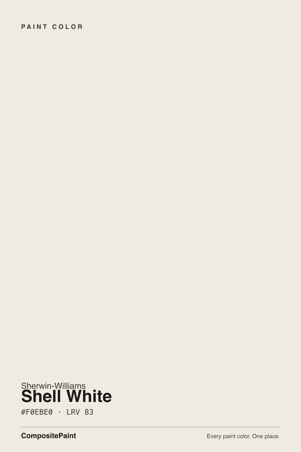
The comparison is everywhere online, and the numbers explain why: Alabaster (SW 7008) sits at LRV 82, hex #EDEAE0. Shell White (SW 8917) sits one point brighter at LRV 83, hex #F0EBE0. Close enough that a spec sheet alone might suggest they're interchangeable — but the undertone tells a different story. Alabaster carries a cooler, greyer base that reads calm and modern; Shell White carries a documented peach undertone that reads distinctly warmer, especially in shade or against warm materials like brick and copper.
What that means in practice: if your Alabaster sample looked slightly grey or flat, Shell White will genuinely fix that — it is the warmer, more characterful option, not just a renamed twin. But if you picked Alabaster specifically because it reads clean and neutral, Shell White will surprise you, particularly outdoors, particularly in shade. They solve different problems even though the fan deck makes them look like the same solution.
Shell White on Exteriors: The Farmhouse Favorite
This is where Shell White actually built its reputation. It shows up again and again on farmhouse, modern-farmhouse and mid-century exteriors, almost always with black shutters and trim, a saturated front door, or copper light fixtures and hardware — pairings that keep the peach reading as warmth rather than an accident. It earned an official nod from Sherwin-Williams too: the brand named it Color of the Month for October 2018, real if modest recognition rather than an obscure catalog number nobody picks.
The behavior to plan around is the light shift. Full, direct sun washes the peach out and the siding reads as a clean, bright warm white — the version most listing photos show. Shade tells a different story: on a north-facing elevation, under a covered porch, or over textured stucco, the peach comes forward and the color deepens toward a richer, occasionally orange-adjacent cream. Sample both sides of the house before ordering paint; the two elevations genuinely will not match as closely as the chip suggests.
Three Ready Palettes Built on Shell White
A color is never alone on the wall. These are complete combinations in the 60-30-10 pattern, with the reason each one holds together. Every one opens in the visualizer.
This is the pairing behind most of the farmhouse and modern-farmhouse photos Shell White shows up in: black shutters and trim keep the peach from reading orange, and a navy door supplies one confident color note instead of competing with the siding's warmth.
Try this palette in your roomNatural Choice and Shell White share the same warm cream base, so the wall-to-cabinet handoff is seamless; Revere Pewter grounds the island and loves brass hardware.
Try this palette in your roomA cooler, crisper trim white keeps Shell White's peach from reading dingy indoors instead of complementary, and one muted sage door gives the room a second, quieter color note instead of another off-white.
Try this palette in your roomShell White FAQ
Is Shell White the same as Alabaster?
No, even though they get compared constantly. Both are Sherwin-Williams whites within a point of each other on LRV (82 vs. 83), but Alabaster leans cooler and greyer while Shell White carries a real peach undertone — Sherwin-Williams' own description says so. Painted side by side, most people would notice the temperature difference, especially outdoors.
Is Shell White warm or cool?
Warm, with a genuine peach flush rather than a subtle, arguable one. Direct sun washes that peach toward a plain bright white; shade and textured surfaces bring it forward, sometimes toward orange. It is never a cool or grey-leaning white.
Is Shell White good for exteriors?
Yes — this is its strongest, most-documented use, especially on farmhouse and modern-farmhouse homes with black shutters, brick, or stucco. The one caution: sample the shaded side of the house, not just the sunny elevation, since the peach shows up more in shade and over textured siding.
What trim color goes with Shell White?
Shell White itself, in semi-gloss, is the safest match if you want the wall and trim to stay in the same warm family. Pure White is the better pick if you want a crisper, cooler trim that contrasts on purpose rather than fighting the wall's peach undertone.
Was Shell White ever a featured Sherwin-Williams color?
Yes — Sherwin-Williams named it Color of the Month for October 2018. It never reached Alabaster's level of fame, but it wasn't picked at random; it earned a real, if modest, moment in the brand's own spotlight.
Does it work on kitchen cabinets?
It can, and it flatters brass and butcher block the way most warm whites do. Check it against your countertops first: if they lean grey rather than warm, Alabaster's cooler base will fight them less than Shell White's peach undertone will.
Have you painted with Shell White?
Rate it — one tap helps the next reader decide.
Ask a Question