Farrow & Ball Cornforth WhitevsFarrow & Ball Ammonite
Farrow and Ball sells both as quiet contemporary grays, and shops treat them as interchangeable. They are not. Ammonite is lighter and warm-leaning; Cornforth White is deeper, cooler, and carries a lilac thread that shows up in the wrong light.

Built from our full reviews of both colors — same measured data, same real-room photos. About the testing process →
The Numbers
Ammonite is slightly lighter (LRV 67 vs 60, 7-point delta).
The Real Difference on a Wall
Ammonite is the softer, more forgiving of the two. It is a gentle gray with just enough warmth in it to sit beside oak, cream and limestone without turning cold, and it does not have a strong opinion to expose. Cornforth White is a real step deeper and clearly cooler, and underneath it there is a violet-lilac lean. On the card that lilac is invisible. On a wall, in the wrong light, it is the entire story — this is where the complaints about a gray going purple come from.
The finish makes both of them behave differently than a big-box paint would. Farrow and Ball's flat Estate Emulsion has almost no sheen, so it absorbs light rather than bouncing it, and both colors read a shade deeper and chalkier than the sample card promised. Cornforth White feels this most. In good south or west sun it settles into a proper warm-cool gray, then by late afternoon and under LED bulbs it slides mauve. Ammonite is the steadier one — it warms up in sun and quiets down at dusk without ever changing character.
They also want different company. Ammonite goes with warm oak floors, brass, cream millwork and natural linen, and it is the one that survives a room with mixed old furniture. Cornforth White wants cool materials to agree with it: marble, nickel, blue-grays, cool limestone. Put Cornforth against a bright modern white trim and it can look dingy and purple-gray by comparison, which is why it is usually paired with a Farrow and Ball white rather than a hardware-store one.
Cornforth White is the one to watch. In north light, at dusk, and under cool LED bulbs it shows a lilac-mauve cast that reads as a gray gone purple. Ammonite has no violet in it to expose; at worst it drifts very slightly green-beige in strong afternoon sun.
What Each Color Really Is
A soft, mid-depth grey built on a genuine violet undertone — and that undertone is the entire story. Farrow & Ball groups it with a lighter and a deeper cousin as part of its Easy Neutrals, colors designed to sit quietly between white and grey without committing hard to either. Cornforth White is the mid-tone of that family: less pale than a true off-white, less assertive than a full charcoal-grey, and — unlike most greiges on the American market, which lean warm and yellow — genuinely cool-to-neutral, with a lilac cast rather than a beige one.
At LRV 60 it sits in true mid-tone territory: not a light-and-bright wall color, but not a moody deep either. That depth is exactly why it behaves so differently room to room. In good daylight the grey reads clean and calm; in warm late-day light or under an incandescent bulb it can soften and read almost beige; under a cool, blue-spectrum LED — the kind in a lot of modern kitchen downlights — it can flash a visible violet or blue-grey that owners did not expect from the paint chip. None of this is a defect in the paint. It is a genuinely chameleon color, and the chip in the store gives you no warning which version you'll get.
Ammonite is named for the coiled fossils that wash out of the cliffs along the Dorset coast near Farrow & Ball's original workshop, and the name fits: it is a soft, sedimentary gray, closer to weathered stone than to paint-chip gray. The undertone is calibrated warm — not beige-warm, just warm enough to keep the color from reading cold or clinical the way a lot of "true" grays do in real houses. That single calibration decision is most of why it became the brand's best-known export: gray enough to feel current, warm enough to feel livable.
At LRV 67 it sits in the bright half of the deck — close enough to white that in strong daylight some rooms read it as an off-white with a gray cast rather than a gray with a light cast. Put it next to a genuine F&B white like Wevet (LRV 83) or Strong White (LRV 76) and the gray body becomes obvious again; that's exactly how F&B stages it in its own showrooms. On its own, expect a light, quiet, stony neutral, not a statement gray.
Specs Side by Side
| Spec | Cornforth White | Ammonite |
|---|---|---|
| Brand | Farrow & Ball | Farrow & Ball |
| SKU | No. 228 | No. 274 |
| Hex | #CFCBC4 | #D8D6CF |
| RGB | 207, 203, 196 | 216, 214, 207 |
| LRV | 60 | 67 |
| Undertone | red-orange / warm | yellow / warm |
| Family | Neutral | Gray |
How Light Changes Them
Overcast-to-mild daylight plus a warm lamp is where it reads exactly as advertised: a soft, hushed grey with just enough color to feel deliberate.
Modern daylight-rated LED downlights pull the violet undertone forward hardest — the walls can flash a visible lilac that owners did not expect from the chip.
Cooler and greyer in flat morning light, it softens and warms slightly as the light turns golden in the afternoon and evening.
Warm 2700K bulbs bring out the soft, dove-grey side. Cool white bulbs do the opposite — they're the single most common cause of the "it looks purple" complaint.
Reads its truest calibrated self — a light stone gray, neither warm nor cold, the version the swatch promises.
Without real light it goes flat, grey-on-grey and loses the stone warmth. Owners in heavily shaded rooms describe it as coming up "very grey."
Cool and clean in morning east light, softer and a touch warmer as afternoon west sun arrives — a gentle shift, not a color change.
2700K lamps warm it toward its stone-beige side; cool LEDs keep it crisper and grayer. Pick bulbs based on which side you want to lean.
Both Colors in Real Rooms
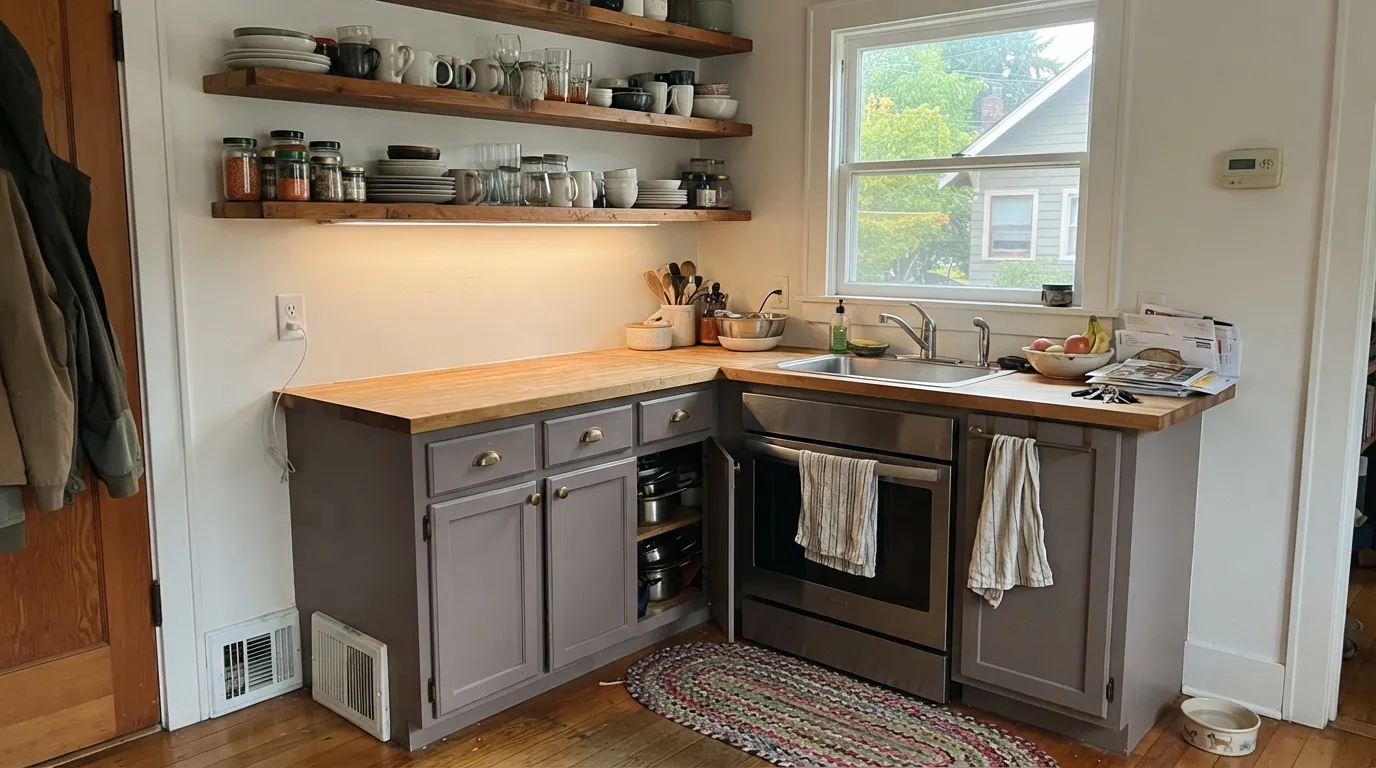
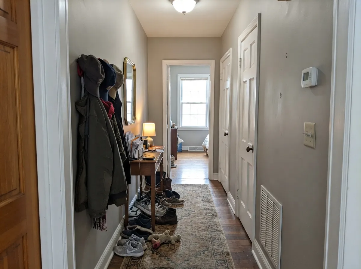
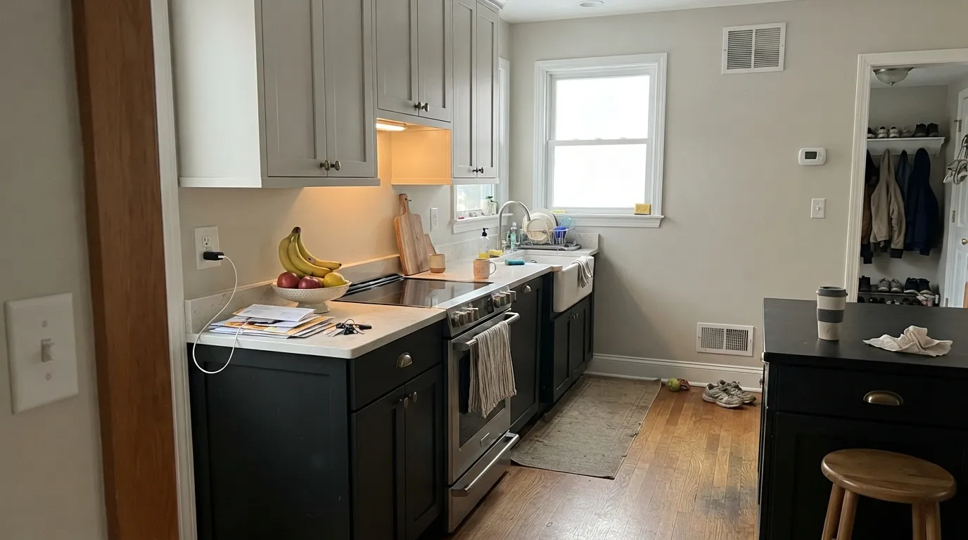
Photos from our full reviews — the same rooms and captions, so you can judge each color where it actually lives, not on a chip.

When to Pick Which
Choose Cornforth White if the room gets good south or west daylight and your fixed finishes are cool — marble, nickel, pale stone. It gives you more depth and stays a gray rather than sliding toward greige, which matters if you want the walls to have some weight. Skip it if the room faces north or is lit mostly by lamps.
Choose Ammonite if the room is north-facing, dim, or full of warm wood, or if you want one soft gray to run through the whole house. It is lighter, kinder in poor light, and it never surprises you with a second undertone. Skip it only if you specifically wanted a cooler, more serious gray.
No comparison page can see your light. Upload one photo of your room and try both colors on the same walls, seconds apart.
Cornforth White vs Ammonite FAQ
Which one is right for a north-facing room?
Ammonite, without much debate. Cornforth White does two bad things in north light at once: it shows its lilac side, and because it is deeper it reads far darker and flatter than people expect from the card. If you love Cornforth and the room faces north, at least paint a large sample board and look at it at 4pm and at 9pm before you commit.
Which trim white goes with each?
Ammonite takes All White for a clean edge or Wimborne White if you want the room warmer. Cornforth White is usually paired with Strong White, which shares its cool character, or All White. Avoid a warm cream white with Cornforth — the contrast pushes the wall further toward mauve.
Can I use either on kitchen cabinets?
Yes, but not in Estate Emulsion, which is a wall paint. Use Modern Eggshell or Estate Eggshell, or have the color matched into a proper cabinet enamel if the kitchen gets hard use. Ammonite cabinets read as a soft warm gray next to wood counters; Cornforth cabinets need cool counters and cool metals or they look flat.
Which one works as a whole-house color?
Ammonite. It has the light level and the temperament to carry hallways, landings, bedrooms and a dim bath without falling apart. Cornforth White is better used as a room color in the spaces that earn it — a bright living room, a dining room, a good south-facing bedroom.
How do they change at night?
Under warm 2700K lamps Ammonite goes cozy and slightly greige, which most people like better than the daytime version. Cornforth White under the same lamps goes mauve, and under cool white LEDs it goes flat and lilac at the same time. If you are set on Cornforth, buy warm bulbs at the same time as the paint.
Ask a Question