Sherwin-Williams Pewter GreenvsFarrow & Ball Studio Green
Both get called dark green, and only one of them really is. Pewter Green SW 6208 is a gray that leans green; Studio Green No.93 is a near-black forest green that only shows its color when light hits it.

Built from our full reviews of both colors — same measured data, same real-room photos. About the testing process →
The Numbers
Pewter Green is slightly lighter (LRV 12 vs 7, 5-point delta).
The Real Difference on a Wall
Pewter Green is the quiet one on purpose. The gray does most of the talking, and the green is a direction rather than a statement — put it on a wall by itself and half your guests will call it gray. That restraint is exactly why it has survived five years of being on every kitchen island in America. Studio Green is the opposite kind of color. It is a genuine deep forest green sitting on an almost-black base, so it reads black in shadow and then opens into a rich bottle green the moment sun or a picture light reaches it. You are choosing between a color that stays calm and a color with two faces.
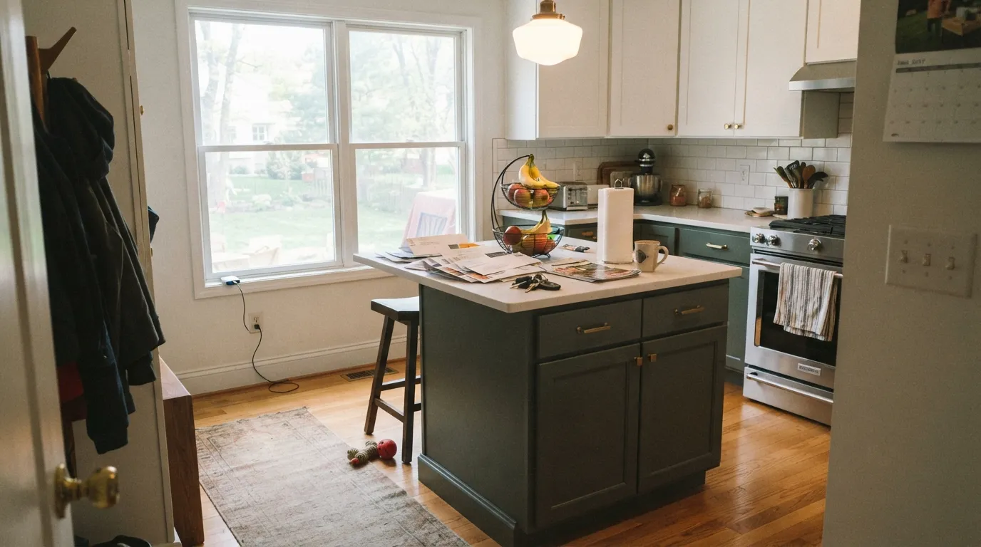
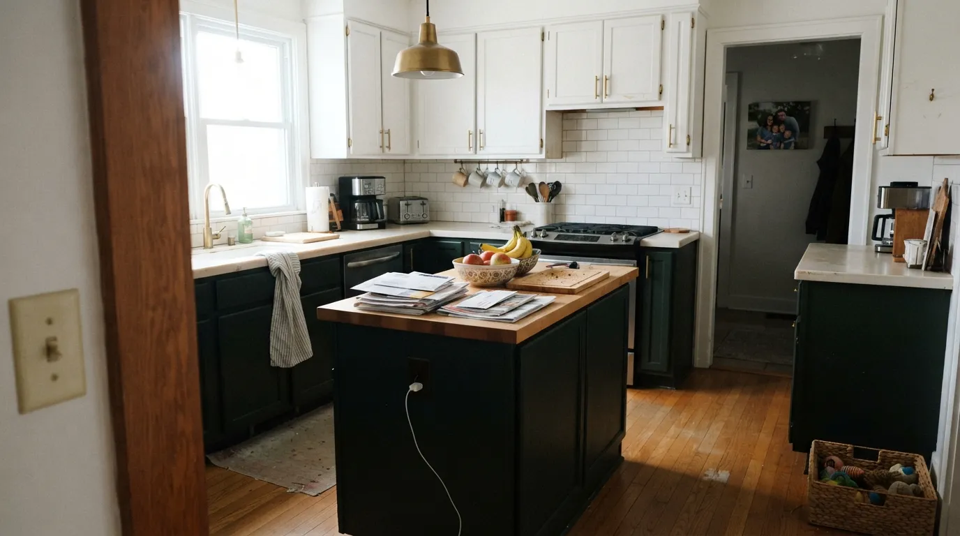
Depth and finish widen the gap. Studio Green is a real step darker, and Farrow and Ball's flat finishes absorb light instead of returning it, so on four walls of a dim room it stops being green at all. On joinery in Modern Eggshell it is velvety and looks like money. Pewter Green is dark but not that dark — in a room with one decent window it still holds its green, and it takes daily kitchen abuse better because you can put it in a real urethane cabinet enamel. Pewter Green also swings more than people expect: cool north light beside white cabinets pushes it blue-sage, and 2700K bulbs push it soft olive.
They also keep different company. Pewter Green is effortless with brass, white oak, butcher block and warm quartz, which is the standard modern kitchen and why it works with no thought. Studio Green wants older, heavier materials — unlacquered brass, dark stone, panelled walls, a proper dining room. And there is the practical side nobody mentions in the pretty photos: Pewter Green is stocked at every Sherwin-Williams store and easy to touch up, while Studio Green is boutique pricing in boutique finishes, and touch-ups on a flat this deep show every time.
Pewter Green is the one that changes hue: bright north light next to white pushes it toward blue-sage, and warm bulbs pull it olive. Studio Green does not flash a different color so much as vanish — in low light it stops reading as green at all and simply looks black.
What Each Color Really Is
A dark gray-green where the gray does most of the talking. Saturation sits around four percent, which in plain terms means the green is a direction, not a statement — put a chip of Pewter Green next to a true charcoal and the green appears immediately; put it on a wall by itself and most visitors will call it gray. What surprises people is that it swings in two directions, not one. In bright rooms with white cabinets around it, it cools off and can read almost blue-sage. Under warm bulbs and next to oak, the same paint goes soft and olive. Both are the real color; neither is a mistake in the can.
At LRV 12 it returns about twelve percent of the light in the room, and that number decides everything about how it behaves. Set it beside Evergreen Fog (SW 9130) at LRV 30 and the difference is not "a bit darker" — Evergreen Fog is a paint you can put on four walls of an average room and still see the room. Pewter Green is a paint that eats light and gives back depth. That is a trade, and it is a good one on a cabinet run or a small bathroom, where the darkness reads as intentional. Across a big dim room it just reads as dark.
A green-black with no blue in it — that is the whole character in one line. Where most "near-black greens" are really a dark neutral with a green name, Studio Green carries enough real pigment that Farrow & Ball itself describes it responding "extraordinarily" to light: in shadow or under a ceiling bulb it reads close to charcoal-black, and in strong daylight the same wall shows itself as a deep, smoky forest green. That range is the point of the color, not a flaw — but it means the paint is only ever as green as the light you give it.
At LRV 7 it sits in true near-black territory, close to Benjamin Moore's Essex Green and Wrought Iron and Sherwin-Williams' Roycroft Bronze Green — deep enough that it reflects almost none of the light that hits it, which is exactly why it goes flat in a dim room and comes alive in a bright one. Farrow & Ball's own guidance is to use it in doses where a room is short on daylight: below a picture rail, on built-ins or joinery only, or on a single feature wall, and save the full four walls for rooms that get real sun.
Specs Side by Side
| Spec | Pewter Green | Studio Green |
|---|---|---|
| Brand | Sherwin-Williams | Farrow & Ball |
| SKU | SW 6208 | No. 93 |
| Hex | #5E6259 | #464D4A |
| RGB | 94, 98, 89 | 70, 77, 74 |
| LRV | 12 | 7 |
| Undertone | true neutral | true neutral |
| Family | Gray | Black |
How Light Changes Them
The green finally shows and the color reads rich instead of gray. Its best case.
Grays down and drifts slightly blue. Fine on cabinets, tricky on four walls.
2700K bulbs push it warm and olive — flattering. Cool LEDs make it hard and flat.
With no daylight there is nothing to reflect. It stops reading as a color. Go lighter.
South or west sun is where the forest green actually shows. Farrow & Ball's own line is that the pigment "responds extraordinarily" to real light — this is the light every glowing kitchen photo was shot in.
Without real daylight it drops toward black. Owner reports split on how far — some still call it visibly green in shade, others call it flat black — the room decides, not the paint.
Expect a genuinely different wall at 9am and 3pm: near-charcoal in early shadow, then a clear deep forest green as the sun swings across it.
Warm 2700K lamps keep the green readable after dark. Cool white LEDs or a single bare ceiling fixture push it toward flat black — change the bulb before you consider changing the paint.
Both Colors in Real Rooms
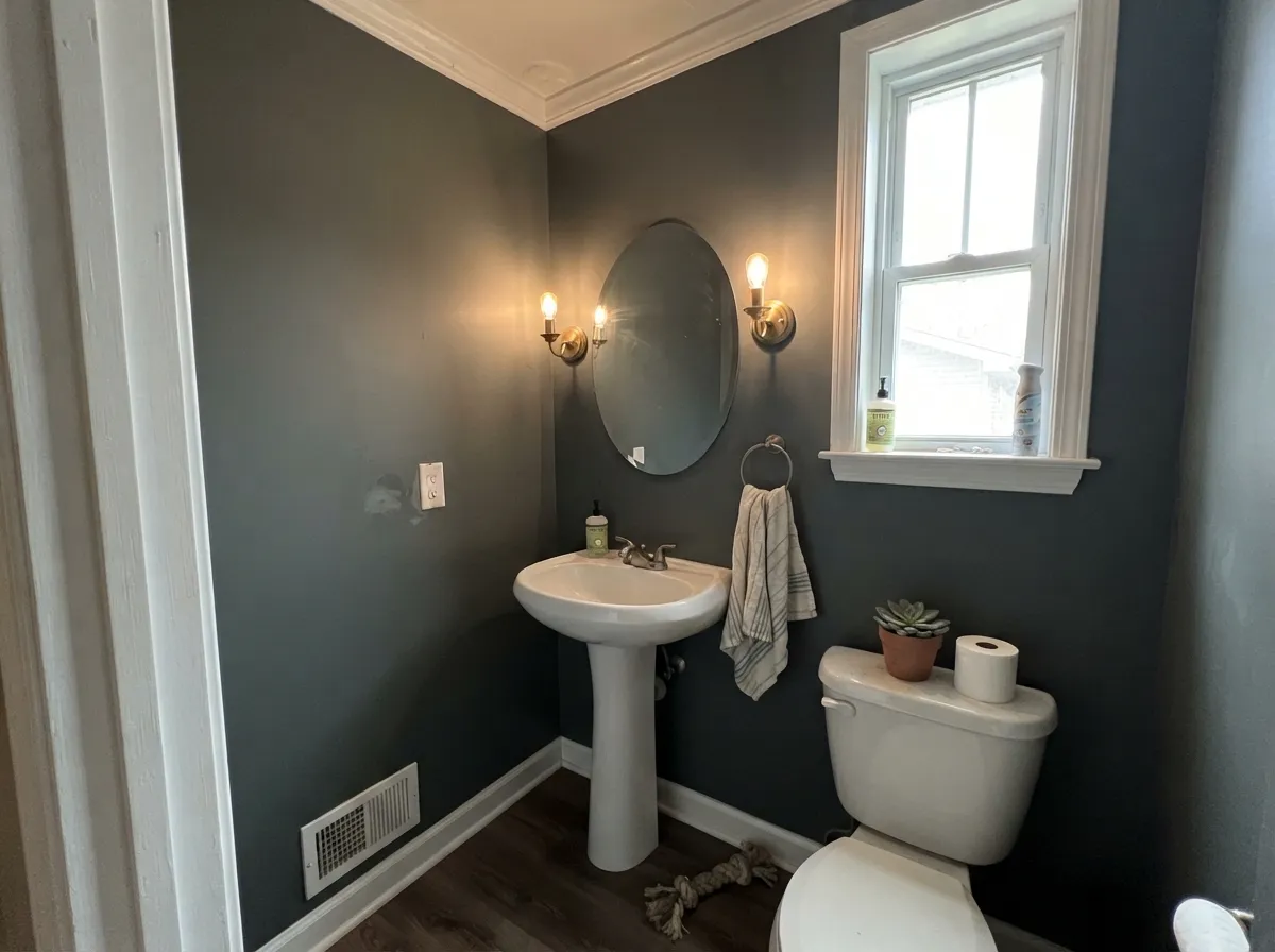
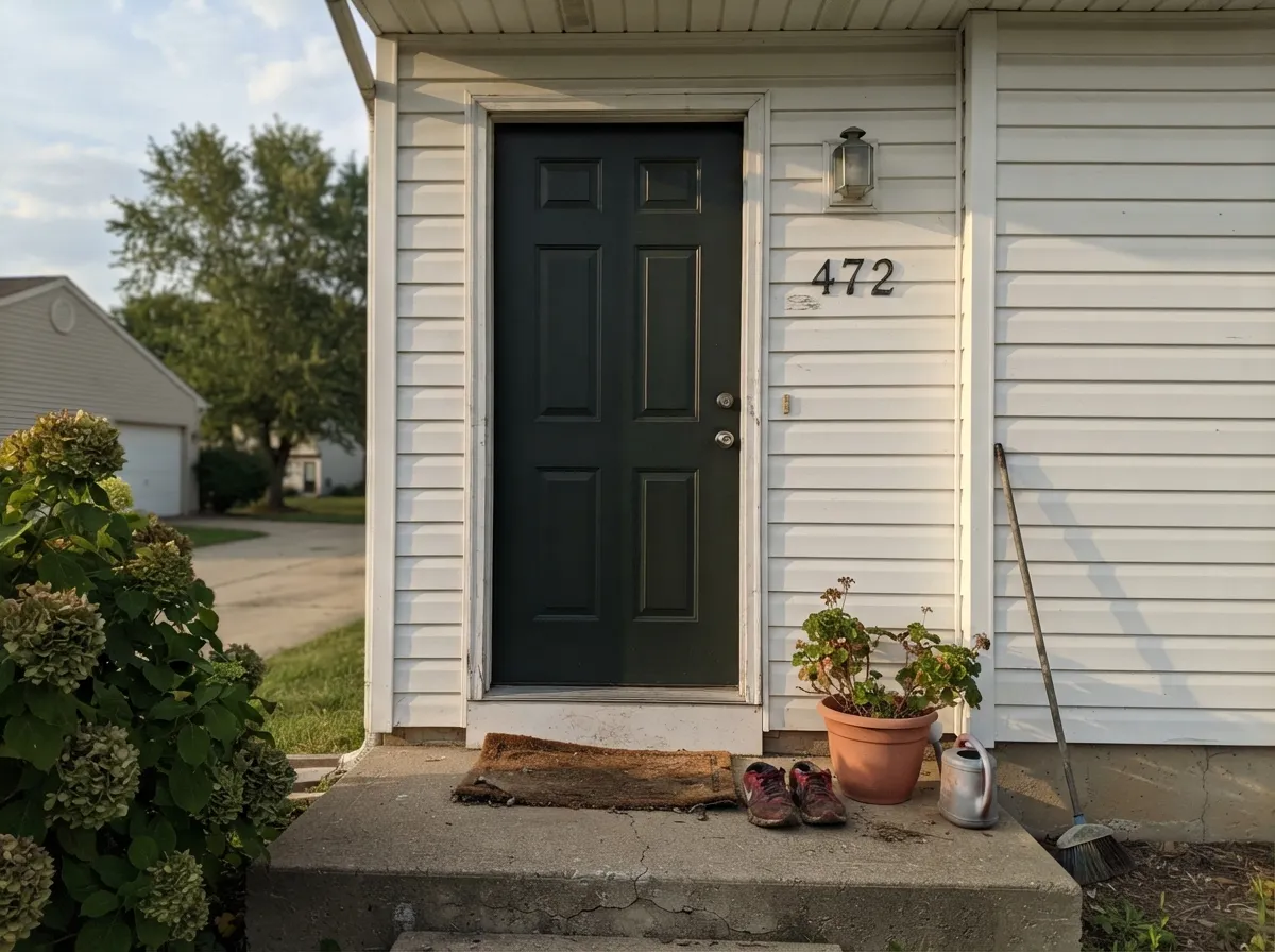
Photos from our full reviews — the same rooms and captions, so you can judge each color where it actually lives, not on a chip.
When to Pick Which
Choose Pewter Green if you want depth without announcing a green kitchen, and you need the color to be easy to buy, match and repair for years. It is the safer choice on an island, lower cabinets, built-ins and a whole exterior, and it takes brass and oak with no styling required. Skip it if you actually wanted people to see green.
Choose Studio Green if you want a real dark green with drama and you are willing to light the room for it — good daylight, or lamps and picture lights you actually turn on. It is superb in a small jewel-box room, a study, or on traditional panelling and joinery. Skip it if the room has no window and one ceiling fixture, because you will have painted it black.
No comparison page can see your light. Upload one photo of your room and try both colors on the same walls, seconds apart.
Pewter Green vs Studio Green FAQ
Which one works in a north-facing or windowless room?
Neither is safe in a truly windowless room, but Studio Green fails harder — it collapses straight to black. In bright north light Pewter Green survives, though it drifts cool and blue-sage next to white. For a powder room or pantry with no window, step lighter to Retreat SW 6207 rather than forcing either of these, or commit to a jewel box and light it properly with warm bulbs.
Which is better for kitchen cabinets?
Pewter Green, for a kitchen that gets used. It goes into a urethane-fortified cabinet enamel that survives grease, cleaning and knuckles, and any Sherwin-Williams store can remake it in five years. Studio Green cabinets in Modern Eggshell look extraordinary but are less forgiving of touch-ups. In a small kitchen keep either color on the island and lowers only.
Can I use either on an exterior?
Pewter Green is one of the strongest dark exteriors Sherwin-Williams makes and handles a whole body, shutters and door. Studio Green is best kept to a front door, shutters or a garden room — it is superb at that scale and expensive at house scale. On a sunny elevation Studio Green lifts and shows more green than it does in your entry hall.
What trim white goes with each?
Pure White SW 7005 or Alabaster SW 7008 with Pewter Green, depending on whether you want the crisp version or the warm one. Studio Green is happiest with All White for a clean modern edge or Wimborne White for a traditional room. A stark blue-white beside Studio Green makes the green look colder than it is.
Can I just have Studio Green matched at Sherwin-Williams?
Any store will match it, and the mix will be close on hue. What you will not get is the finish, and with a color this dark the finish is half the effect — Farrow and Ball's flat looks velvety and deep, while a standard eggshell match reads lighter and shinier. Also do not expect Pewter Green to serve as a substitute; it is meaningfully lighter and much grayer.
Ask a Question