Bancha
The mid-century olive designers keep reaching for, reviewed honestly: the light it needs, the rooms it flatters, and the two things nobody warns you about.

Jessica has spec'd whites and neutrals for more than 300 rooms and keeps a sample wall of painted drawdowns in her studio. Every color review is checked against real reader rooms in the comments and re-tested when a formula changes. About the testing process →
- 1Black Emerald1
- 2Essex Green6
- 3Bancha14
- 4Sage Green22
- 5Evergreen Fog30
The Fast Verdict
Bancha is the olive designers reach for when a client wants color but not a spectacle: a deep tea-leaf green with enough yellow to stay warm and enough gray to stop it looking like a uniform. In real daylight it is quietly gorgeous — sober, soft, expensive-looking. At LRV 14 it is also genuinely dark, and that is the entire decision. Give it a window and two lamps and it glows olive all evening. Put it in a small north room with half-closed blinds and it turns into a brown-black you will repaint.
Family rooms and dens with one good window · kitchen lowers, islands and built-ins · dining rooms and studies you use after dark · front doors and garden joinery · anyone who wants strong color that still behaves like a neutral
The room is small, north-facing and lamp-free · you actually wanted a sage · your trim and floors are golden 1990s oak · toddlers and dogs live on those walls and you want flat paint · you need it done in two coats over a pale wall
- A real olive — warm and yellow-based, not another gray-green sage
- Deep enough to make a TV wall, island or bookcase read custom
- Flatters walnut, teak, cream, leather, rattan and brass with no effort
- Sober rather than loud: strong color that still calms the room down
- One of the few interior greens that is equally good on a front door
- LRV 14 — it takes light from the room and hands very little back
- Goes brown-black and joyless in a dim north room
- Deep pigment over a pale wall usually means primer plus two coats
- Farrow & Ball pricing, and the prettiest wall finish is the least washable
What Color Is Bancha, Really?
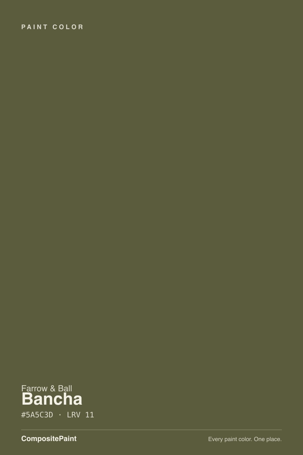
A deep olive built on yellow, not on blue. Farrow & Ball added it in 2018 in a group of nine new colours — the brand's first new palette since 2016, with nine older shades retired to keep the card at 132 — and pitched it as a darker take on Olive, a shade from its own archive. The name comes from bancha, the everyday Japanese green tea brewed from later-harvest leaves, and the reference is more literal than it sounds: the color sits exactly where brewed green tea sits, halfway between green and brown, with the yellow doing most of the work. On the Farrow & Ball card this is the mid-century-modern corner, closer to a 1958 kitchen than to an English drawing room.
At LRV 14 this is a dark color, and the number matters far more than the swatch. Roughly eleven percent of the light landing on the wall comes back out; the rest stays in the paint. In a bright room that trade is the whole point — walls go matte and soft, and furniture, art and wood pop off them. In a dim room it is a tax you pay every hour of the day. Plan for the wall to land a step deeper and browner than the little card at the store, because a chip is lit from all sides and a wall is lit from one.
Undertone in one line: yellow-green, warm, lightly grayed — never the blue-green of a sage. If your sample reads brown, that is warm lamplight or a warm floor bouncing into it. If it reads army surplus, that is cool light draining the yellow out. Both are the same paint being honest about your room.
Where It Shines
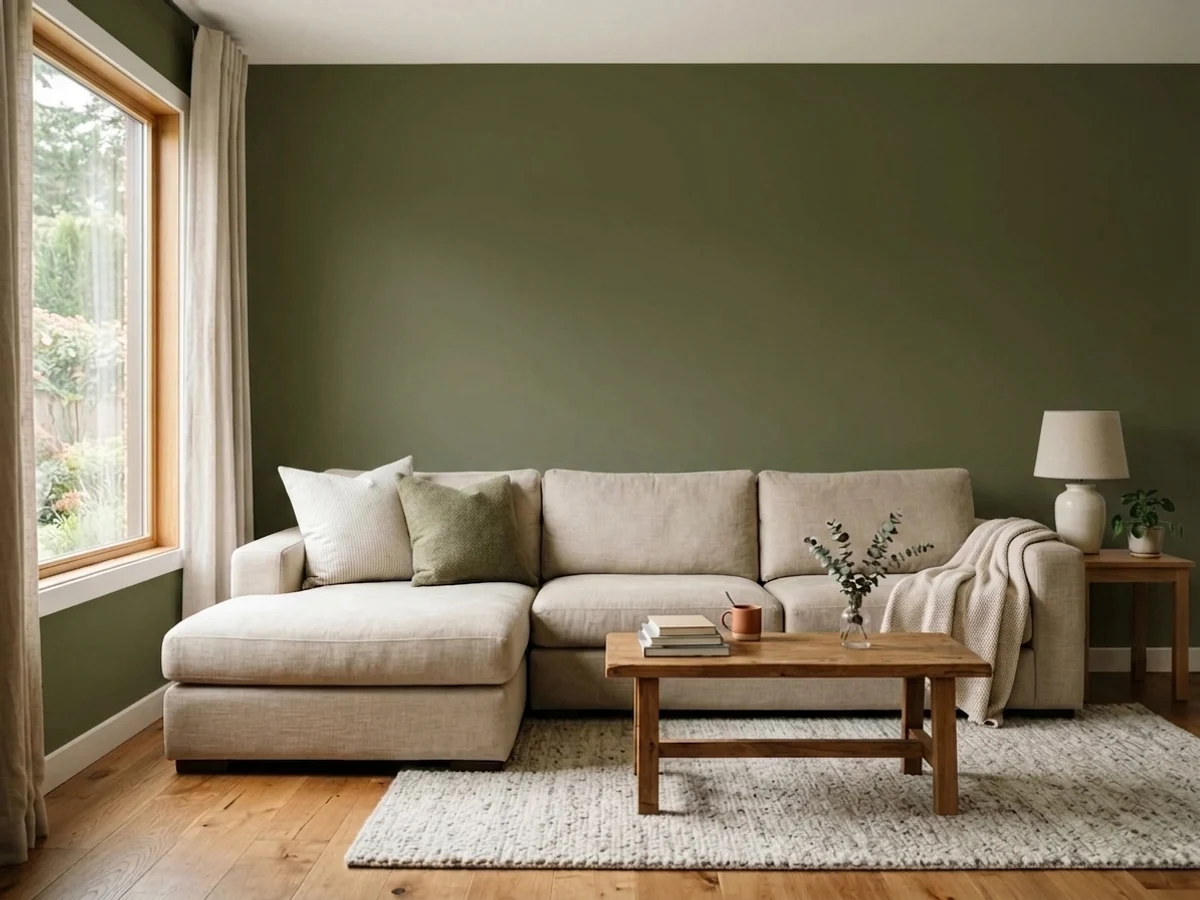
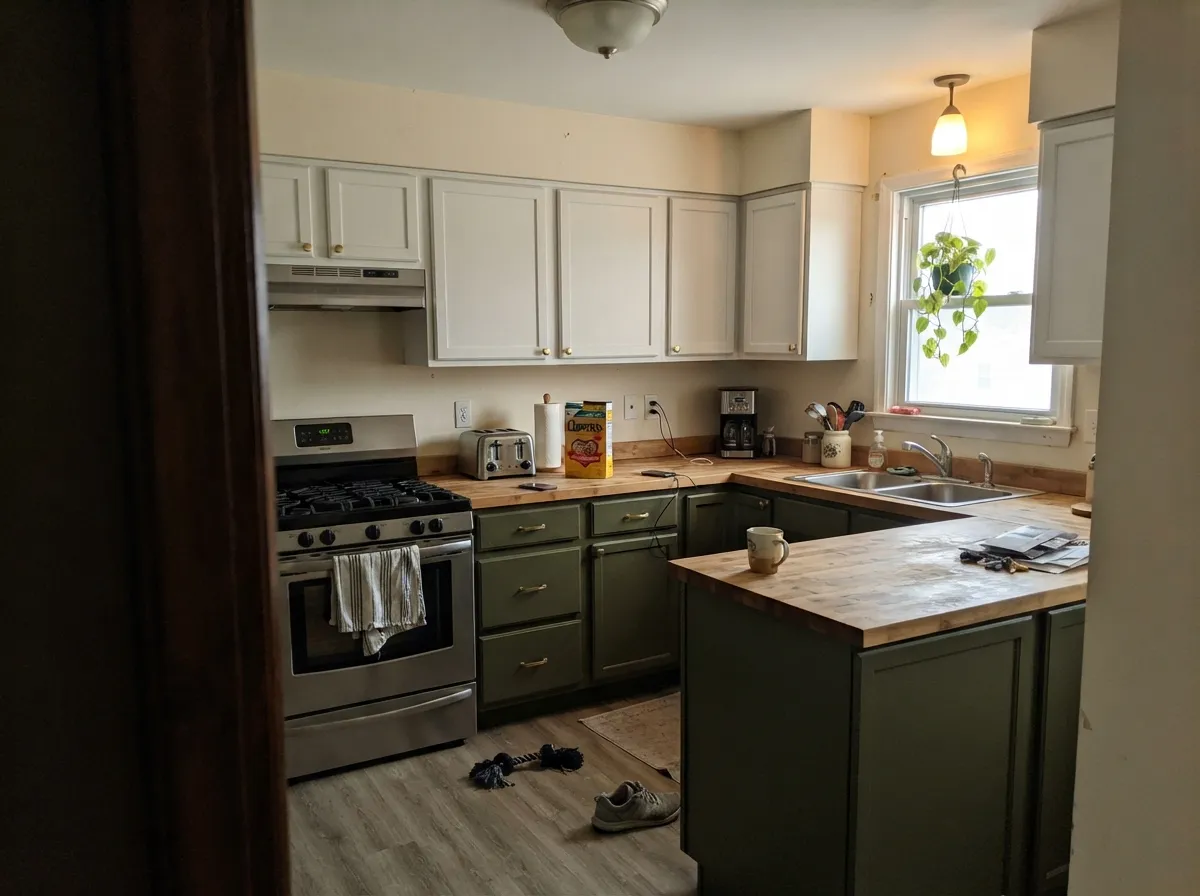
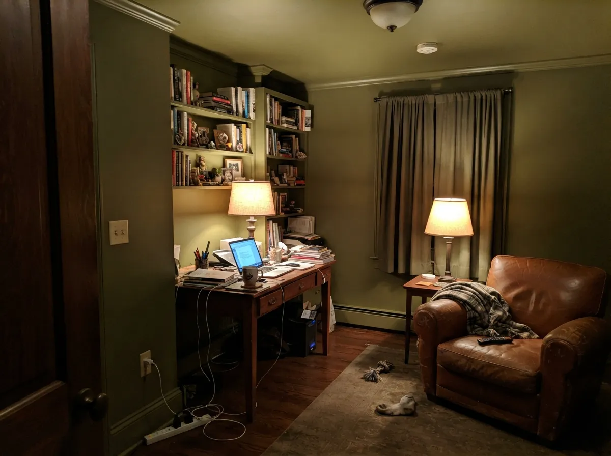
Bancha is at its best in a room with one decent window and a lot of warm material in it: wood, cream, leather, brass, rattan, wool. Family rooms and dens are its home turf — dark enough to make a television wall disappear, warm enough that the room still feels friendly at nine at night with two lamps on. Its second job is cabinetry: on kitchen lowers, an island, a bar or a bank of built-ins, olive reads custom in a way gray never managed. And unlike most interior greens it is just as convincing outside, on a front door or a garden gate.
Where It Fails
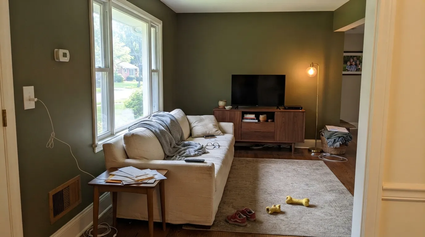
Nearly every complaint about Bancha comes from one of three places, and all three are predictable before you open the tin. None of them are the paint being bad — but if your room matches one, sampling harder will only confirm it.
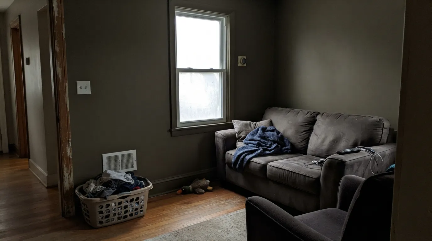
At LRV 14 the color has no reserves. In a small north-facing lounge on a gray afternoon it stops reading olive and starts reading brown-black, and the corners go further. The Houzz threads about Bancha in north-facing rooms are all circling this exact worry, and it is a fair one. The fix is not another coat, it is light: lamps at eye level rather than one ceiling fitting, a mirror opposite the window, warm bulbs. If you will not add the lamps, buy the lighter olive — BM Tate Olive at LRV 22 gives you the same family with twice the light back.
Plenty of people arrive here after looking at SW Evergreen Fog (LRV 30) or BM October Mist (LRV 39) and never register that Bancha is roughly three times darker and much more yellow. A sage recedes and behaves like a neutral you can ignore. Bancha is a decision the whole room has to agree with: floors, sofa, curtains and art all have to be chosen next to it, not before it.
Two separate, very real complaints. First, deep Farrow & Ball colours going over a pale wall want the dark-tone primer under them; decorators who skip it report patchy, streaky second coats and end up buying a third tin of expensive paint. Second, the classic flat wall finish is the prettiest thing about this color and the least washable — in a family room with toddlers and a dog, fingerprints and chair-back scuffs show on a dark flat wall, and touch-ups flash. Put the washable emulsion on the walls that get touched and keep the flat for the ones that do not.
Room by Room
This is where the color earns its reputation. Olive this deep swallows a black television, makes a cream sofa look deliberate and turns a bookcase wall into architecture. It needs one real window and at least two lamps; with those it is calm rather than cave-like. Use the washable finish behind the sofa and around light switches.
Bancha on lower cabinets or an island under warm white uppers is the safest way to buy this color, and the most flattering: brass or unlacquered bronze pulls, butcher block or a warm stone top, and it reads like a bespoke kitchen. Modern Eggshell is the finish that survives door fronts and knuckle marks. A full kitchen of olive cabinets works too, but only with a bright window.
Rooms you mostly use after dark are where drenching pays off: walls, trim and ceiling all in Bancha, separated only by sheen. Under lamplight the yellow warms up and the room feels like a private club rather than a dark box. This is also the best use for a small interior room with no window worth saving.
Deep olive is genuinely restful behind a bed, and it flatters linen, cream and walnut. But a bedroom is usually the dimmest room in the house, and at LRV 14 that is the one condition Bancha cannot fix by itself. Two bedside lamps at 2700K, flat finish, warm white trim — or step to a lighter olive and sleep easier.
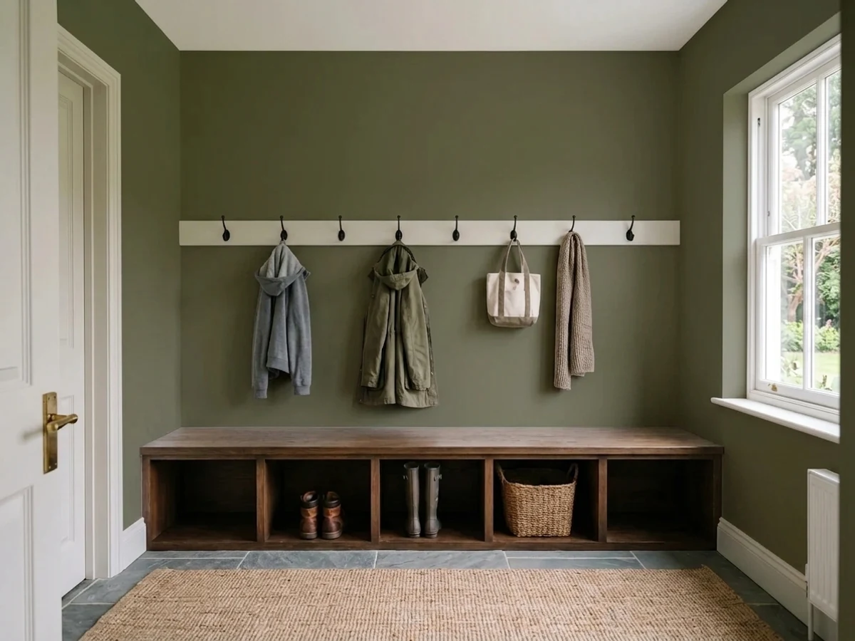
One of the most useful jobs it does. A dark olive mudroom hides boot marks, dog hair and wet coats the way no pale neutral can, and a hallway painted this deep makes the rooms opening off it feel brighter by comparison. Washable finish, not flat, and keep a warm white on the doors so the corridor still reads as a route rather than a tunnel.
Farrow & Ball sells Bancha in an exterior finish, and it is one of the better door greens: on a cream, brick or pale stone house it reads heritage rather than trendy, and full sun brings the yellow forward so it never looks black from the street. It also works on gates, window frames and garden joinery. A whole house in it is a bigger bet than most people want to make.
Your Light Is the Risk
A south or west room with real sun on the walls is where the yellow comes forward and Bancha reads unmistakably olive, soft and warm. This is the light the color was designed around — and the light that makes LRV 14 feel like a choice rather than a cost.
Cool, flat north light pulls the yellow out and leaves a heavy gray-brown; on an overcast day the corners of the room read almost black. It is the single most common regret with this color, and no extra coat fixes it.
East morning light is cooler and shows the gray in it, so the room looks its most serious before lunch. As the sun swings west it warms steadily, and for the last hour of daylight the walls go almost bronze-olive. Sample the wall at both ends of the day, not at noon.
Warm 2700K bulbs are effectively part of this paint job: they push it brown-olive and cozy, which is how the color earns its evening reputation. Cool 4000K and above strips the warmth and leaves an army-green cast. One overhead fixture flattens it either way — lamps at eye level are what make a dark olive room feel lit rather than dim.
Most complaints about Bancha are a light mismatch. Upload a photo of your actual room and see it on your walls — then ask for the same wall in north light or evening lamps before you buy a single sample.
Need It From Another Brand?
Any paint counter can custom-tint Farrow & Ball No. 298 directly. If you would rather stay in one brand's own deck, these are the closest stock matches, measured as ΔE2000. Under 2 is a difference you will not see on the wall.
| Brand | Closest color | ΔE | LRV | |
|---|---|---|---|---|
| Sherwin-Williams | OakmossSW 6180 · Sherwin-Williams | 1.7 | 13 | Color page → |
| Behr | Coconut Husk730D-6 · Behr | 0.5 | 13 | Color page → |
| Benjamin Moore | Alligator Alley441 · Benjamin Moore | 3.8 | 15 | Color page → |
| Valspar | Fresh CilantroV059-6 · Valspar | 1.3 | 13.3 | Color page → |
| PPG / Glidden | Olive OrchardPPG11-08 · PPG / Glidden | 3.0 | 14 | Color page → |
| Glidden | Rustling LeavesPPG1123-7 · Glidden | 1.5 | 15 | Color page → |
Similar Farrow & Ball Colors
The nearest shades to Bancha within Farrow & Ball's own range, ranked by perceptual color distance — useful when you want the same look a touch lighter, darker, or warmer.
WCAG 2.1: AA is 4.5 : 1 for normal text, 3 : 1 for large text, AAA is 7 : 1.
Bancha vs the Colors You're Also Considering
Every Bancha sample board has the same rivals on it. The numbers show the real lightness gap — then it comes down to which risk you would rather live with.
Pick this for the warmer, browner, more sober version of the same idea, and for Farrow & Ball's finishes on cabinets and doors.
Sherwin-Williams SW 6180 · LRV 13OakmossPick this if you want the same mossy olive at paint-store prices — it is the closest easy substitute, two points lighter and a shade greener.
Pick this when you want the yellow left in the color — Dark Olive plays it safe, Bancha commits.
Benjamin Moore 2140-30 · LRV 14Dark OlivePick this if you want the olive slightly grayed down and a little easier to live with in average light.
Bancha Coordinating Colors
The rule with Bancha is simple: keep everything next to it warm. Creams, clay pinks, soft blushes and real browns make the olive look earthy and deliberate; cold blue-whites and gray-blues make the same paint look like army surplus. These are the partners that keep turning up in rooms that work.
Where Bancha Came From: A 2018 Newcomer With Archive Pedigree
Bancha is not an old Farrow & Ball colour, though it is often assumed to be. It arrived in 2018 in a group of nine new shades — the brand's first new palette in two years — alongside names that became far more famous, including a muted boudoir pink and a workwear blue. Nine older colours were retired at the same time to keep the card at its usual 132, which tells you how deliberately this one was chosen: it was added because the palette was short of a strong, warm, mid-century green, and it displaced something to get in.
Its pedigree is genuine even if its number is recent. The brief was a darker version of Olive, a colour from the company's own archive, and the tea-leaf name points at where it landed: green filtered through brown, quiet rather than fresh. That timing turned out to be lucky. Bancha arrived just as the long gray decade was ending and warm, earthy, slightly retro greens were about to take over — which is why a 2018 colour now reads as the default olive in so many designer family rooms.
The practical footnote: because it is a current colour rather than an archive one, it is stocked in the full finish range, including exterior products. That matters more than it sounds — plenty of beloved F&B greens are archive-only and harder to get in the finish you actually need.
Bancha With Wood Tones, Floors and Metals
This color was made for warm wood. Walnut, teak and mid-century oiled woods are its best company — the same brown-red depth that sits inside the olive itself, so the room reads tonal instead of contrasty. Natural white oak and rattan are the lighter version of the same idea and keep a family room from going heavy. Leather in tan or cognac is close to a cheat code with it.
Two real cautions. Golden 1990s honey oak — floors, trim, kitchen cabinets — is the one wood tone that fights: the orange in the finish drags the olive toward a dull khaki and the floor looks more orange in return. A large rug helps; wall-to-wall honey oak plus olive walls does not. The other is cool gray-toned flooring, the blue-gray plank look in particular: it drains the warmth out of the green from below and leaves the walls looking military. If that is your floor, a gray-green like Pewter Green will sit on it far more comfortably.
Metals are the easy part. Unlacquered brass, antique bronze and matte black all look intentional against it, and brass in particular is what makes olive cabinetry read expensive. Polished chrome is the only common finish that feels borrowed from a different room. For stone, warm quartzites, soapstone and butcher block all work; cold white marble with gray veining is the one pairing that makes the green look flat.
Three Ready Palettes Built on Bancha
A color is never alone on the wall. These are complete combinations in the 60-30-10 pattern, with the reason each one holds together. Every one opens in the visualizer.
Farrow & Ball's own steer for this color is soft pinks and warm browns, and Redend Point is the clay-pink that does that job in an American deck — enough red in it to warm the olive without turning the room into a color scheme. Shoji White matters here: a warm off-white trim keeps the olive looking earthy, where a bright white trim would snap it toward military.
Try this palette in your roomThe classic split: dark below, light above, so the kitchen keeps its light at eye level and the olive stays a base rather than a mood. Alabaster is soft enough not to look like a different project next to the green, and Natural Cream on the walls wraps the whole thing in warmth — with brass pulls and a warm counter this is the version of olive that photographs the way people hope.
Try this palette in your roomDrenching a small dark room in one color removes the edges, so it reads intentional instead of cramped. Benjamin Moore's Taupe is a genuine deep brown despite the name, and olive plus brown is the oldest reliable pairing in this family — it gives the room a second dark without introducing black. White Dove in the hallway is the handoff that makes the study feel like a decision rather than an accident.
Try this palette in your roomBancha FAQ
Is Bancha too dark for a living room?
It depends entirely on the windows. In a family room with one good-sized window and a couple of lamps it is dark in the pleasant way — enveloping, calm, easy to sit in at night. In a small north-facing lounge with a single window and one ceiling light it is too dark, and the color goes brown rather than olive. The honest test is to paint a large sample board and look at it at four in the afternoon on an overcast day, not at midday.
What white should I use with Bancha?
A warm, soft one. Shoji White or Natural Cream next to it keeps the olive earthy and intentional. A bright, blue-leaning white makes the green look like a uniform by contrast, which is the most common way this color gets ruined. If you want higher contrast without going cold, White Dove is the safe stop — warm, but still clearly white.
Does Bancha work in a north-facing room?
Only if you are willing to light it. North light is cool and flat, and it pulls the yellow straight out of an olive, leaving a heavy gray-brown that most people describe as gloomy. If the room is north-facing but big and bright, add warm 2700K lamps and it can be beautiful. If it is north-facing, small and dim, take the lighter olive instead — this is the one situation where the deck has a better answer.
Is Bancha green or brown?
Green, with a brown personality. The pigment is a yellow-based olive, so in strong daylight it is unambiguously green, and under warm bulbs or against a warm floor it drifts toward a brown-olive. It never reads as a clean, leafy green and it never reads as a true brown — the in-between is the point of the color, and it is why it sits with walnut, leather and cream so easily.
Can I use Bancha on kitchen cabinets?
Yes, and it is arguably the lowest-risk way to use it. Olive lowers with warm white uppers gives you the color without darkening the room, and Modern Eggshell is the finish built for door fronts and knuckle marks. Brass, bronze and matte black hardware all work; chrome is the only one that leans cold against it. Prime properly — dark colors over factory-white doors are exactly where thin coats show.
Is there a cheaper dupe for Bancha?
SW Oakmoss (LRV 13) is the closest easy substitute, a touch lighter and greener, and BM Dark Olive (LRV 14) is the grayer, safer version. Both get you to the same olive neighborhood for a fraction of the tin price. What they do not copy is the finish — the flat, chalky surface is a real part of why Farrow & Ball rooms photograph the way they do, and a standard matte will not read the same. If the walls are the whole point of the room, that difference is the thing you are paying for.
Have you painted with Bancha?
Rate it — one tap helps the next reader decide.
Ask a Question