Dark Olive
The grayed olive people paint their study, their island, and their front door — reviewed honestly, including the light that kills it.

Jessica has spec'd whites and neutrals for more than 300 rooms and keeps a sample wall of painted drawdowns in her studio. Every color review is checked against real reader rooms in the comments and re-tested when a formula changes. About the testing process →
- 1Black Emerald1
- 2Essex Green6
- 3Dark Olive14
- 4Sage Green22
- 5Evergreen Fog30
The Fast Verdict
Dark Olive is the color you pick when you want a room to feel enclosed and old, not bright and new. It is a deep olive with most of the green grayed out, so it behaves like a warm dark neutral that happens to lean green — which is why it sits so easily with brass, leather, oak, and worn rugs. At LRV 14 it takes light away rather than giving any back, and that is the whole decision: in a sunny room it looks like olive, in a dim north room it goes flat gray-brown. Get the light right and it is one of the most livable dark colors Benjamin Moore makes.
Studies, libraries and panelled dining rooms · kitchen islands and vanities with brass · windowless powder rooms · exterior body color on a wooded lot
The room faces north and has one small window · you want the space to feel bigger · your counters are cool gray marble · your walls are patched and wavy
- Depth without the hard edge of black or navy
- Reads old and settled — sits with antiques, rugs, and art instead of fighting them
- Flatters brass, aged bronze, leather, oak, and walnut
- One of the better dark cabinet colors: hides fingerprints and knuckle marks
- Works indoors and out, and on a wooded lot it is a genuinely good body color
- At LRV 14 it takes light away and gives none back — small rooms go cave
- The green vanishes in north light and leaves a flat gray-brown
- Shows roller lap marks, patched drywall, and touch-ups more than a light color
- Argues with cool gray marble, chrome, and stark blue-white trim
What Color Is Dark Olive, Really?
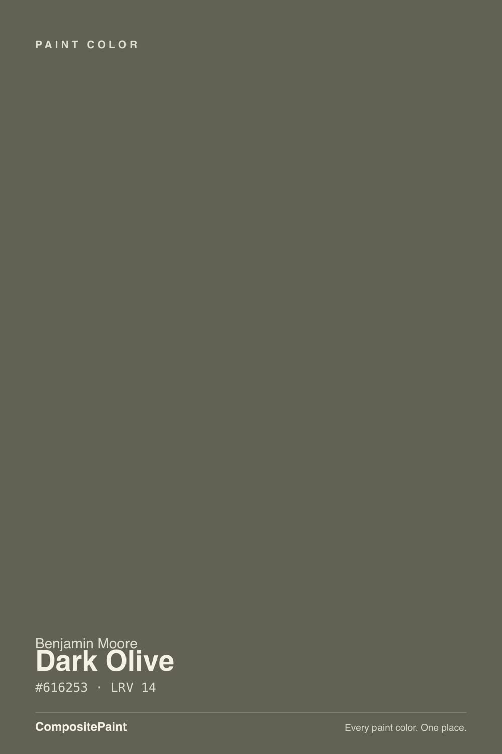
A deep olive that has been grayed almost flat. The hue is genuinely yellow-green, but there is so little chroma left that on a two-inch chip most people read it as dark gray-brown and assume the name is wrong. Roll it on a full wall and the green comes back — the eye needs the area to see it. That gap between chip and wall is the single most common surprise with this color, and it is why sampling on a big board matters more here than with a mid-tone paint.
LRV 14 puts it firmly in the dark band, but not in the near-black band. Next to Sherwin-Williams Pewter Green at LRV 12 it reads a touch lighter and noticeably browner; next to Benjamin Moore Mohegan Sage 2138-30 at LRV 11 it looks almost open. In plain terms: it absorbs most of the light that reaches it, gives back very little, and will make any room feel smaller and closer. That is usually the point — just be sure it is the point for you.
Undertone in one line: warm yellow-green, grayed nearly to the floor — never blue, never a true forest green. If your sample looks brown, the light is cool. If it looks properly olive, the light is warm. Both are the same paint.
Where It Shines
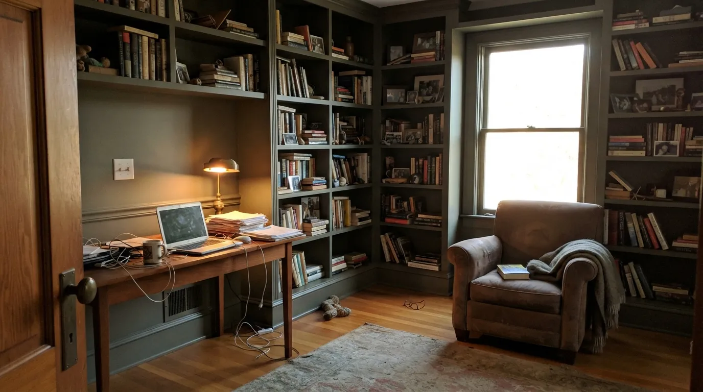
It is at its best in the rooms you want to feel closed in: a study with books and a lamp, a panelled dining room, an island under warm pendants. Give it afternoon sun or 2700K bulbs and the olive reads as olive, with the brown warmth underneath doing the work that makes brass, walnut, and leather look expensive.
Where It Fails
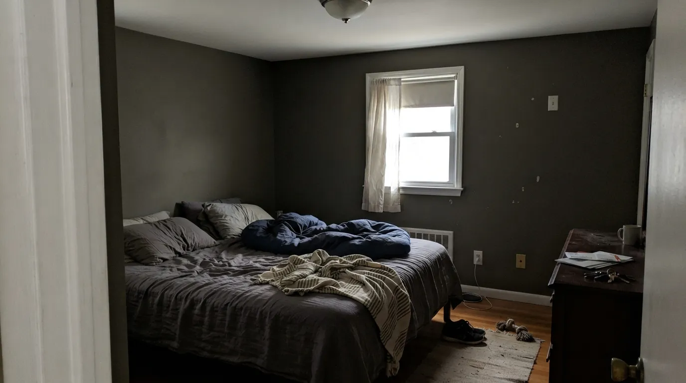
The one-star stories about Dark Olive are all the same three stories, and every one of them is predictable before you open the can. The paint is not failing — the light or the neighbor color is. If your room matches one of these, pick something else now rather than after two coats.
North light is cool and indirect, and there is not enough chroma in this color to survive it. The green drains out and you are left with a flat gray-brown that people describe as an old army blanket. If you want olive in a north room, go lighter and warmer with Benjamin Moore Tate Olive HC-112, or keep the depth and pick a green with more actual green in it, Sherwin-Williams Rosemary SW 6187.
A cold, blue-leaning white like Chantilly Lace 2121-70 next to an LRV 14 olive makes the wall look grayer, harder, and slightly dirty. The contrast line becomes the loudest thing in the room. Use a warm white — Benjamin Moore Swiss Coffee OC-45 — or paint the trim in Dark Olive itself, which is how it looks most settled.
Carrara-type marble and blue-gray quartz sit at the opposite temperature, and they push Dark Olive toward mud and brown instead of green. It is the most common cabinet regret with this color. With cool stone, switch to Sherwin-Williams Pewter Green SW 6208 — its blue-green side meets the counter halfway.
Room by Room
Walls, trim, and bookcases all in Dark Olive, eggshell on the walls and semi-gloss on the woodwork, is the version that looks designed rather than dark. Add one warm lamp at desk height; the color needs a light source at night. Ceiling in Swiss Coffee OC-45 if you want a lid, or the same olive if you want a cocoon.
Wainscoting and shadow lines give a dark flat color something to do, so panelled dining rooms take it better than plain drywall. Warm white trim in Swiss Coffee OC-45 keeps it earthy. Candles and 2700K bulbs; under cool overhead light the room goes drab fast.
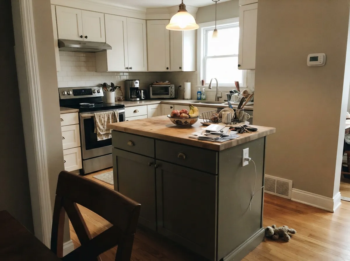
On an island or a lower run it grounds a kitchen without the hard edge of black, and it hides fingerprints better than a true dark green does. Satin in a cabinet-grade enamel. Perimeter in White Dove OC-17, walls in Edgecomb Gray HC-173, hardware in unlacquered or aged brass.
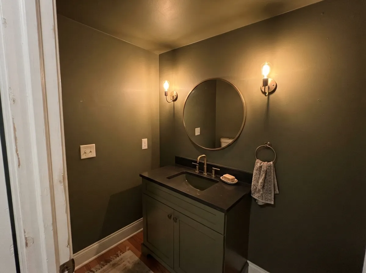
Windowless rooms are where dark colors are free, because there is no daylight to lose. Walls, ceiling, and trim all Dark Olive, warm sconces at face height, brass fixtures. This is the lowest-risk way to try the color in a whole house.
It reads cozy and cave-like at night under warm bulbs, which some people want and some people hate by month three. Two lamps minimum, and skip it entirely if the bedroom is small and faces north. Bedding in cream rather than bright white.
On a house surrounded by trees it disappears into the landscape in the best way, and full sun brings the olive out far more than interior light does. Trim in White Dove OC-17, front door or shutters in Wrought Iron 2124-10. Expect it to fade slightly faster than a light body color on the south elevation.
Your Light Is the Risk
Warm daylight lifts the yellow and the olive finally looks like olive. This is the room it was made for.
Cool indirect light strips the green out and leaves gray-brown. Sample here before you commit anything.
2700K lamps make it leather and moss. 4000K LEDs make it drab and heavy — change bulbs, not paint.
No daylight means nothing to lose. Powder rooms and interior halls are where dark olive is easiest.
Most complaints about Dark Olive are a light mismatch. Upload a photo of your actual room and see it on your walls — then ask for the same wall in north light or evening lamps before you buy a single sample.
Need It From Another Brand?
Any paint counter can custom-tint Benjamin Moore 2140-30 directly. If you would rather stay in one brand's own deck, these are the closest stock matches, measured as ΔE2000. Under 2 is a difference you will not see on the wall.
| Brand | Closest color | ΔE | LRV | |
|---|---|---|---|---|
| Sherwin-Williams | Pewter GreenSW 6208 · Sherwin-Williams | 3.0 | 12 | Color page → |
| Behr | Mountain OliveN350-7A · Behr | 2.2 | 12 | Color page → |
| Valspar | ArchitectT700 · Valspar | 1.6 | 12.3 | Color page → |
| PPG / Glidden | Plunge PoolPPG1029-7 · PPG / Glidden | 1.6 | 13 | Color page → |
| Glidden | Bronzed Ivy50YY 12/095 · Glidden | 3.9 | 12 | Color page → |
| HGTV Home by Sherwin-Williams | Woodland LichenHGSW 3282 · HGTV Home by Sherwin-Williams | 3.0 | 12 | Color page → |
Similar Benjamin Moore Colors
The nearest shades to Dark Olive within Benjamin Moore's own range, ranked by perceptual color distance — useful when you want the same look a touch lighter, darker, or warmer.
WCAG 2.1: AA is 4.5 : 1 for normal text, 3 : 1 for large text, AAA is 7 : 1.
Dark Olive vs the Colors You're Also Considering
Every Dark Olive sample board has the same rivals on it. The numbers show the real lightness gap — then it comes down to which risk you would rather live with.
Pick this in a dim room — those three LRV points genuinely matter.
Benjamin Moore 2138-30 · LRV 11Mohegan SagePick this when you want it darker and a shade greener.
Pick this either one — on a wall they are the same color.
Benjamin Moore 1498 · LRV 14Forest FloorPick this if you want the CC-570 version, which reads a step deeper.
Within the brand the neighbors are all darker or greener by a small margin. Forest Floor 1498 at #626451 and LRV 14 is effectively the same color, while the CC-570 version of Forest Floor is listed at LRV 12 and reads a step deeper. Jade Romanesque 476 at #61644F and LRV 12 has slightly more green. Mohegan Sage 2138-30 at #5F5E50 and Backwoods 469 at #586251, both LRV 11, are darker again, which matters in a dim room.
Across brands the field is crowded. Rodda Green Tea CA167 at #626254 has a deltaE of 0.76, close enough to call a true match. Diamond Vogel Monogram 0424 at 1.24, Dunn-Edwards English Forest DE6280 at 1.39, PPG Plunge Pool PPG1029-7 at 1.56, and Valspar Architect T700 at 1.64 are all visually identical in normal room light. Behr Mountain Olive N350-7A at 2.24 and Sherwin-Williams Pewter Green SW 6208 at 3.03 are very close but worth sampling. Farrow and Ball Cardamom No. CB5 at 4.61 is close but visibly different side by side.
Dark Olive Coordinating Colors
The rule with Dark Olive is to stay warm. Warm whites, warm greiges, and soft gray-greens all keep the olive earthy; cool blue-whites and true grays make it look drab and slightly dirty. These are the partners that come up again and again on real projects, including Benjamin Moore's own listed pairings for the color:
Dark Olive on Cabinets and Islands
Cabinetry is where this color earns its keep, and it is the use people are happiest with a year later. On an island, a butler's pantry, a mudroom bench run, or a bathroom vanity, it delivers the weight of black without black's hardness, and the brown sitting under the green means it never looks like a trend color. Use a cabinet-grade enamel in satin, and expect the color to look noticeably greener on a full door than it did on the sample chip.
The counter decides everything. Warm quartz with beige or brown movement, soapstone, honed granite, butcher block, and terracotta all flatter it. Cool white marble and blue-gray quartz push it toward mud, and that is the complaint you see most often from people who wish they had sampled against the stone instead of against the wall. Hardware in aged or unlacquered brass, perimeter cabinets in a warm white, and one warm wood element in the room — open shelves, a stool, a floor — is the combination that consistently works.
The Olive Ladder: Lighter and Darker
If Dark Olive is close but not right, the fix is almost always up or down the same ladder rather than sideways into a different green. Two steps lighter, Tate Olive HC-112 keeps the same earthy character while giving a dim room a fighting chance, and Camouflage 2143-40 is the lighter, tanner version people use when they want olive on a whole floor rather than one room.
Going the other way, Mohegan Sage 2138-30 and Backwoods 469 are both a few LRV points darker and slightly greener — worth it in a bright room, punishing in a dark one. Salamander 2050-10 is the end of the road, a green so dark it reads black in most light, for anyone who wanted drama and found Dark Olive too polite.
Three Ready Palettes Built on Dark Olive
A color is never alone on the wall. These are complete combinations in the 60-30-10 pattern, with the reason each one holds together. Every one opens in the visualizer.
Dark Olive takes the 60 percent, a warm white trim gives the eye somewhere to rest, and the soft gray-green ceiling keeps the lid from reading as a bright hole overhead. All three share the same grayed-green base, so nothing in the room argues.
Try this palette in your roomThe olive island is the one dark note, so it becomes the anchor without darkening the whole kitchen. White Dove and Edgecomb Gray are both warm-based, which keeps the perimeter friendly to the olive instead of chilling it the way a cool white would.
Try this palette in your roomFull sun brings out olive that interior light hides, so the body color reads richer outside than on the chip. White Dove trim keeps the warmth, and the near-black door supplies the one sharp note the facade needs.
Try this palette in your roomDark Olive FAQ
Will Dark Olive make a small room feel smaller?
Yes, and there is no way around it at LRV 14. The useful question is whether you want that. In a study, a powder room, or a den, smaller means cozier and it works. In a small bedroom with one north window, it just means dark.
Why does it look brown on my chip but green on the wall?
Because the color is heavily grayed, and a small sample does not give your eye enough area to register what little green is there. Paint two coats on a large poster board and lean it against the wall, and the olive shows up. Judging this color from a fan deck chip is the fastest way to be wrong about it.
Is it a good kitchen cabinet color?
One of the better dark ones. It grounds an island, loves brass and unlacquered hardware, and hides knuckle marks better than a saturated green. The one thing to check is the counter: warm quartz, soapstone, and butcher block are perfect, cool gray marble is a fight.
Dark Olive or Pewter Green for cabinets?
Dark Olive is warmer and browner, Pewter Green SW 6208 is cooler with more blue in the green. Pick Dark Olive with oak, brass, and warm stone. Pick Pewter Green with gray marble, chrome, or cooler daylight.
How many coats does it need?
Two over a similar mid-tone, but ask for a gray-tinted primer if you are covering white or a light color. Deep-base paints have less hiding pigment, and going straight over white usually means three coats. Prime once and save yourself a gallon.
What sheen hides the wall best?
Eggshell on walls, and matte only if the drywall is genuinely flat. Dark colors broadcast roller lap marks, patch rings, and every wave in the surface, so anything shinier than eggshell will show the wall rather than the paint. Trim in semi-gloss, cabinets in satin.
Can I paint the ceiling Dark Olive too?
In a small room, yes, and it usually looks better than a white ceiling over dark walls, because the hard line at the top disappears. Use flat. In a room with any real ceiling height, a warm white or a soft gray-green like Sea Haze 2137-50 keeps it from feeling like a lid.
Have you painted with Dark Olive?
Rate it — one tap helps the next reader decide.
Ask a Question