Mountain Olive
Behr's December 2023 Color of the Month, reviewed honestly: the kitchens and doors where this dark olive glows, the dim rooms where it goes flat, and what to pick instead.

Jessica has spec'd whites and neutrals for more than 300 rooms and keeps a sample wall of painted drawdowns in her studio. Every color review is checked against real reader rooms in the comments and re-tested when a formula changes. About the testing process →
- 1Black Emerald1
- 2Essex Green6
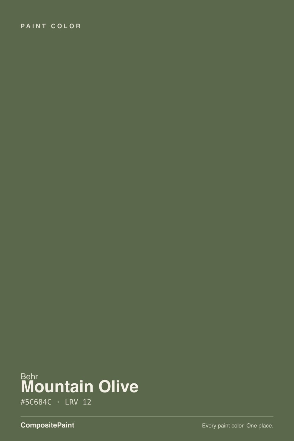
- 3Mountain Olive12
- 4Sage Green22
- 5Evergreen Fog30
The Fast Verdict
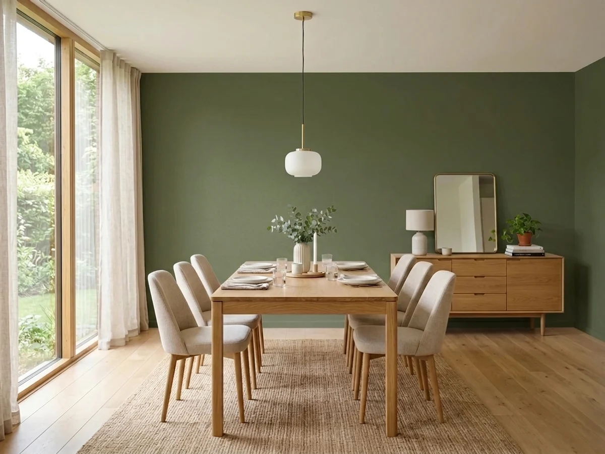
Mountain Olive is a genuinely dark, warm olive green with a dusty brown undertone underneath — not a trend guess, but Behr's own December 2023 Color of the Month, styled in the brand's photography on kitchen cabinets, front doors and dining-room walls. Give it real daylight, brass hardware and warm wood and it looks custom and expensive. Give it a dim room and cool overhead light and it sinks toward near-black before the green ever shows up.
Kitchen cabinets and islands with marble + brass · front doors and exterior trim in real daylight · dining rooms and dens with warm wood · Mediterranean and modern-farmhouse looks
Your room runs on cool LEDs with little natural light · you want a clean, gray-leaning green rather than warm olive-brown · you're painting a small windowless room · you won't sample a large swatch before committing a whole kitchen
- Genuine design credibility — Behr's own December 2023 Color of the Month, not just a trend guess
- Warm, earthy olive that photographs beautifully against marble, brass and wood
- Deep enough (LRV 12) to hold its color without washing out in bright rooms
- Documented real use on cabinets, front doors and dining rooms in Behr's own styling
- Reads sophisticated with the right materials, not trendy-and-temporary
- At LRV 12, dim rooms and cool artificial light can push it toward near-black
- North-facing rooms lose the warm brown undertone and read flatter, cooler green
- Without brass, marble or warm wood nearby, it can read plain olive-drab instead of rich
- A big commitment to sample — a small chip barely hints at how dark it goes on four walls
What Color Is Mountain Olive, Really?
A dark, dusty olive green with a warm brown undertone underneath — Behr's own description calls it a nod to the earth's array of verdant hues, and the brand named it Color of the Month for December 2023. That is a real credential, not marketing fluff: Behr picks roughly a dozen of these a year out of a deck of more than 3,000 colors, and Mountain Olive earned the slot on the strength of documented use on cabinets, front doors and accent walls in the brand's own styling photography. It also turns up in Behr's modern-farmhouse and cabinet-paint guides, which says the color has staying power beyond one seasonal push.
At LRV 12 it is genuinely dark — closer in depth to Sherwin-Williams Rosemary and Pewter Green than to any pastel sage. That depth is the whole deal: in strong daylight the warm olive comes forward and the color reads rich and grounded; in weak or artificial light it can sink toward near-black before the green registers at all. Expect the wall to look darker and less obviously green than the paint chip promised — every color this deep does that, and Mountain Olive is no exception.
Undertone in one line: warm olive with a dusty brown-gray base — never a clean, cool green, never true black. If your sample reads flat and gray with a cool edge, that is north light stripping the warmth out; if it reads almost black, that is a room that needs more daylight or warmer bulbs than it currently has.
Where It Shines
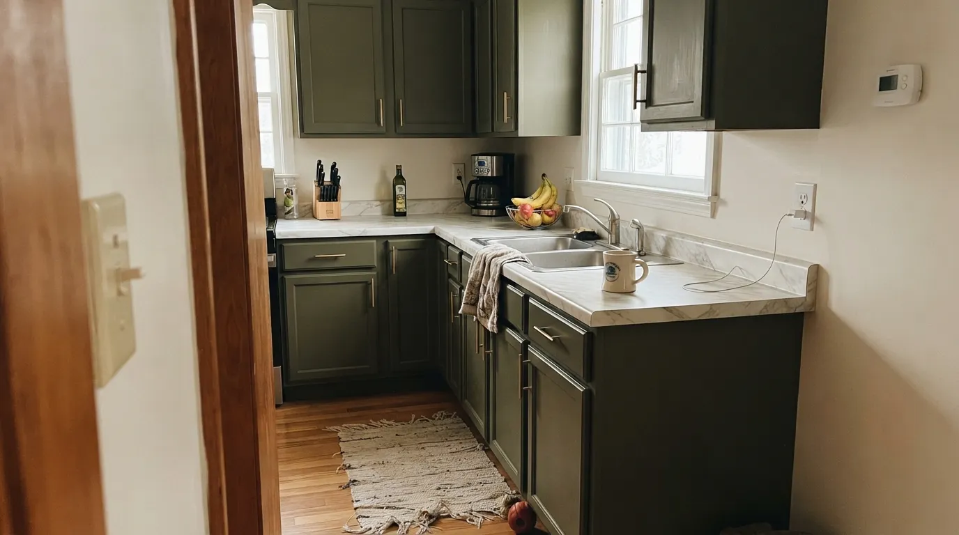
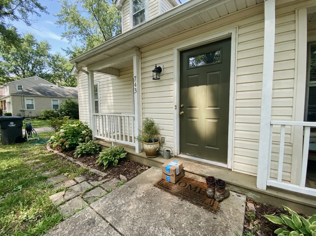
Give it real daylight, warm wood and a little shine — brass hardware, marble, a glossed door — and Mountain Olive looks expensive. Behr's own styling photos put it on kitchen cabinets against marble and butcher block, and on front doors paired with a creamy white body color; both are genuine, documented strengths, not just marketing angles. It also does real work as a whole-room color in dining rooms and dens that get consistent daylight, where the depth reads cozy and enveloping rather than cave-like.
Where It Fails
Almost every disappointed review of a dark olive like this follows one of three scripts, and Mountain Olive is no exception. None of them are the paint's fault — but if your room matches one, sample it big before you commit a whole kitchen or a whole wall.
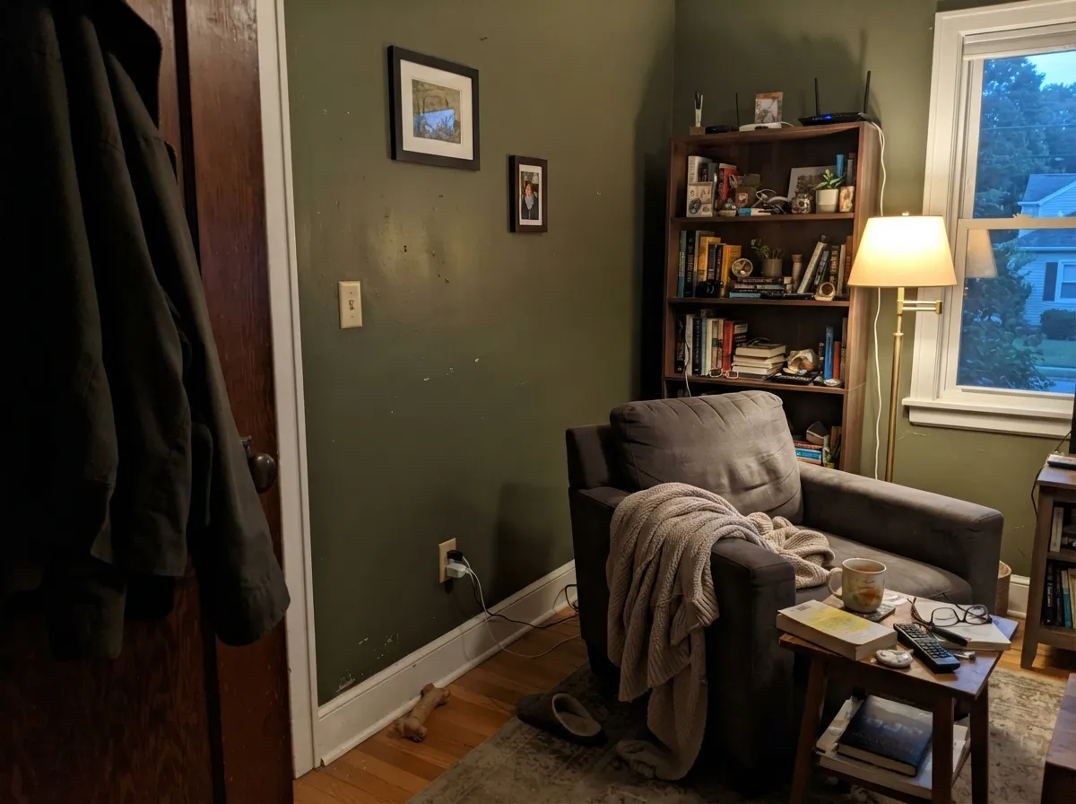
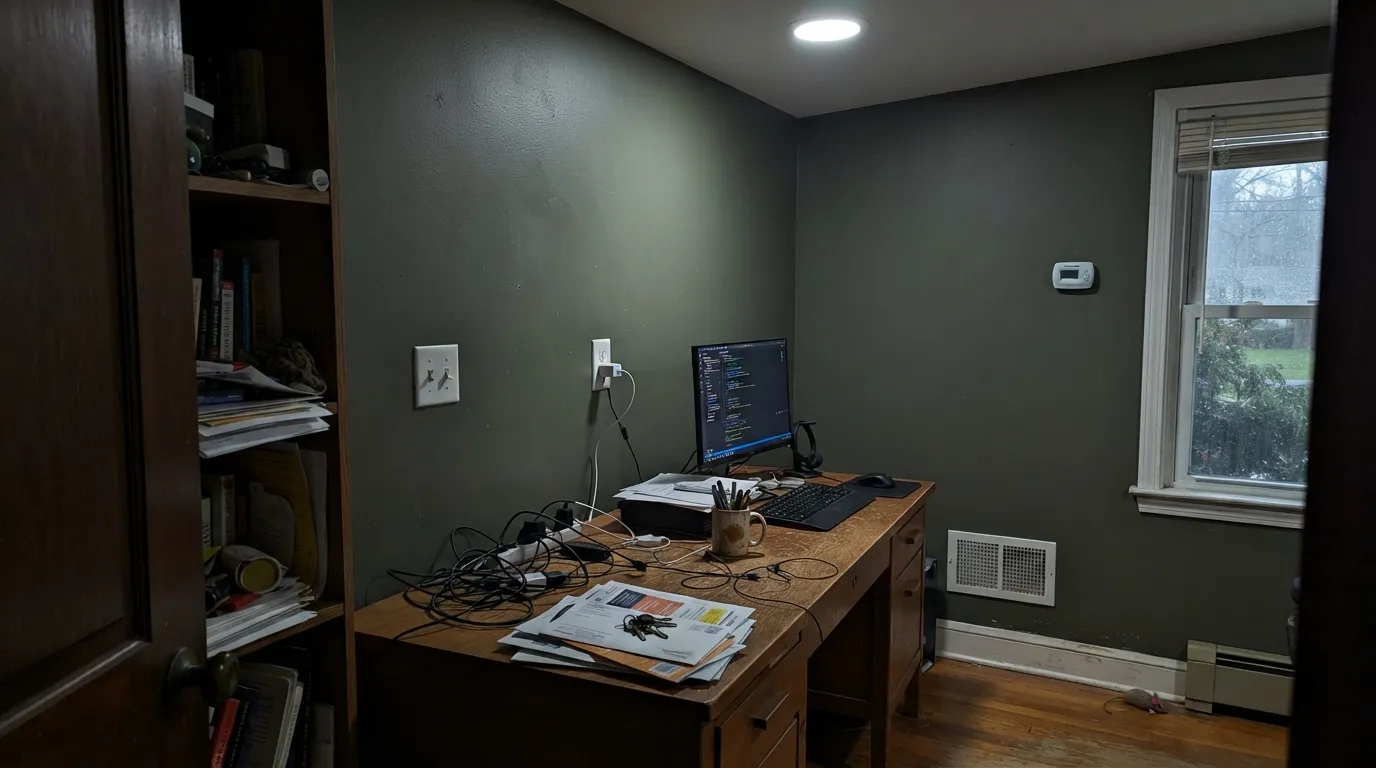
At LRV 12, Mountain Olive is already absorbing most of the light that hits it. In a room with small windows, no south or west exposure, or only overhead can lights, the olive drops out and you're left staring at a wall that reads nearly black. Test a large sample in the actual room, at the actual time of day you'll use it, before painting more than one wall.
Cool north daylight strips the warmth out the same way it does on every dark olive and sage in the deck: the brown undertone fades and what's left is a flatter, cooler gray-green. It isn't a defect — it's the same light behavior nearly every dark green shows — but it means a north bedroom will look noticeably different from the sunlit kitchen in Behr's own photos.
Styled the way Behr styles it — brass, marble, warm wood, a glossy sheen — Mountain Olive reads rich and deliberate. Under flat contractor lighting with builder-grade fixtures and nothing warm nearby, the same paint reads plain olive-drab, closer to army green than the moody sophistication in the styling photos. This color depends on its company more than most.
Room by Room
Behr's own photography puts Mountain Olive here for a reason: against marble, butcher block and brass hardware it looks custom, not trendy. Use a cabinet-rated semi-gloss or Behr's dedicated cabinet enamel for the wipe-clean durability a kitchen needs.
Behr has styled it as a front-door color against a creamy white body (Weathered White) — a real published pairing, not a guess. It reads confident without the risk of a true black door, and full outdoor sun brings out the warmth better than most interior rooms ever will.
Featured in Behr's own modern-farmhouse styling as a dining-room wall color, and it earns the spot: over dinner, under warm bulbs, the color turns genuinely cozy. Skip it in a windowless dining nook with only overhead cans.
Low, warm evening light is this color's best friend, which makes it a natural for rooms used mostly after dark. Walnut shelving and brass lamp light get the effect Behr's own styling leans on.
On a vanity under a warm stone top it's a weekend project that looks custom. A full bathroom works too, if the room gets real daylight or the lighting plan includes warm sconces — a windowless powder room with cool overhead light is the one bathroom situation to avoid.
An accent wall or a run of built-ins lets you test the depth before committing the whole room. A full living room works only with strong, consistent daylight; open-plan spaces that borrow light from a kitchen or hallway tend to disappoint.
Your Light Is the Risk
Full daylight brings the warm brown undertone forward and the olive reads rich, not muddy — the light Behr's own styling photos were shot in.
Cool north exposure strips the warmth and leaves a flatter, cooler gray-green. Sample here before committing a whole room.
Morning light keeps it cooler and quieter; by afternoon the warmth builds. The shift is gradual, not dramatic — most owners describe the room as 'waking up' by midday.
Warm 2700K bulbs deepen it into a muted, almost velvety green at night; cool white LEDs flatten it and can push it gray. Swap the bulbs before you swap the paint.
Most complaints about Mountain Olive are a light mismatch. Upload a photo of your actual room and see it on your walls — then ask for the same wall in north light or evening lamps before you buy a single sample.
Need It From Another Brand?
Any paint counter can custom-tint Behr N350-7A directly. If you would rather stay in one brand's own deck, these are the closest stock matches, measured as ΔE2000. Under 2 is a difference you will not see on the wall.
| Brand | Closest color | ΔE | LRV | |
|---|---|---|---|---|
| Sherwin-Williams | Cast IronSW 6202 · Sherwin-Williams | 4.4 | 12 | Color page → |
| Benjamin Moore | Forest Floor1498 · Benjamin Moore | 1.6 | 14 | Color page → |
| Valspar | ArchitectT700 · Valspar | 3.0 | 12.3 | Color page → |
| PPG / Glidden | Plunge PoolPPG1029-7 · PPG / Glidden | 2.6 | 13 | Color page → |
| Glidden | Winning TicketPPG1127-6 · Glidden | 2.2 | 13 | Color page → |
| Dutch Boy | Tuscan Olive324-7DB · Dutch Boy | 3.9 | 13 | Color page → |
Similar Behr Colors
The nearest shades to Mountain Olive within Behr's own range, ranked by perceptual color distance — useful when you want the same look a touch lighter, darker, or warmer.
WCAG 2.1: AA is 4.5 : 1 for normal text, 3 : 1 for large text, AAA is 7 : 1.
Mountain Olive vs the Colors You're Also Considering
Every Mountain Olive sample board has the same rivals on it. The numbers show the real lightness gap — then it comes down to which risk you would rather live with.
Pick this for the warmer, more olive-brown lean of the two — Rosemary sits slightly bluer in the same shadows.
Sherwin-Williams SW 6187 · LRV 12RosemaryPick this if your painter works in Sherwin-Williams — nearly the same depth and mood, a touch cooler and greener.
Pick this for the deeper, more clearly green version of the mood — Dark Olive leans more brown-gray by comparison.
Benjamin Moore 2140-30 · LRV 14Dark OlivePick this if you want the same idea in the Benjamin Moore deck — a touch lighter and grayer, with the same need for real light.
Pick this for the warmer, more olive-forward version — Pewter Green reads more gray-green on the same wall.
Sherwin-Williams SW 6208 · LRV 12Pewter GreenPick this for cabinets specifically — it's the deck's other go-to dark green for kitchens, cooler and grayer than Mountain Olive's warmth.
Pick this once you know you want the full depth — Cushing Green is the safer, lighter cousin, not the same statement.
Benjamin Moore HC-125 · LRV 18Cushing GreenPick this for an easier commitment — same grayed-olive family, six points brighter and more forgiving in a dim room.
Inside the Behr deck, Sandwashed Driftwood 770D-6 (#5E654C, LRV 12) is the closest, slightly less green and a bit browner. Gladiator Gray N370-6 (#5B6A54, LRV 13) reads greener and a touch lighter despite its name. Toasted Walnut 720D-6 (#61644C, LRV 12) pulls further toward yellow-brown, and Amazon Jungle PPU9-24 (#686748, LRV 13) is the most clearly olive of the set.
Across brands, Dunn-Edwards Hinterland DET509 at deltaE 1.69 is visually identical in normal room light, though its LRV of 14 makes it read a shade lighter on a big wall. Kompozit and Hirshfield's Mother Nature 0746 (deltaE 2.04) and Dutch Boy Tuscan Olive 324-7DB (deltaE 2.82) are very close, so sample first.
Benjamin Moore Peale Green HC-121 (deltaE 3.2), Sherwin-Williams Oakmoss SW 6180 (deltaE 3.84), and Farrow and Ball Minster Green No. 224 (deltaE 3.84) are close but visibly different side by side, with Minster Green reading cooler and Oakmoss reading more yellow.
Mountain Olive Coordinating Colors
The rule for coordinating with Mountain Olive: warm whites, one true dark neutral, and materials with some shine — brass, marble, glossed wood. It's a color that depends on its company; styled well it reads custom, styled plain it reads flat. These are the partners that show up in Behr's own photography and in the palettes above:
Why Behr Made This December's Color of the Month
Behr picks one color a month from its full deck of more than 3,000 to feature in styling photography, cabinet guides and seasonal collections — a real curatorial credential, even if it doesn't carry the weight of an industry-wide Color of the Year. Mountain Olive earned its December 2023 slot on the strength of exactly the uses documented above: kitchen cabinets against marble and brass, a front door paired with Weathered White siding, and a dining room in Behr's modern-farmhouse styling guide.
What that credential does and doesn't tell you: it confirms the color photographs well and holds up across several real applications, which is more than most paint-chip colors can claim. It doesn't mean every room will love it — the same dark, light-hungry character that makes it look rich in a styled photo is exactly what makes it disappoint in a dim room. Treat the Color of the Month badge as a reason to sample it seriously, not a reason to skip the sample.
Mountain Olive With Wood Tones and Metals
Warm wood is this color's natural partner: walnut, butcher block, rattan and bamboo all sit comfortably against the olive because they share its warm, earthy register. Unlacquered brass and aged bronze hardware are the confirmed favorites in Behr's own styling — the slight shine picks up light the matte paint doesn't reflect on its own, which matters even more on a color this dark.
Honey oak floors are a genuine gray area rather than a clear win or a clash: the warmth in both generally reads harmonious, but two strongly warm, busy elements in the same room can start to compete for attention. A large area rug or a run of trim in a warm white gives the eye a place to rest. Pale or white oak, walnut and darker stained floors are the safer bets if you want the olive to stay the star.
Three Ready Palettes Built on Mountain Olive
A color is never alone on the wall. These are complete combinations in the 60-30-10 pattern, with the reason each one holds together. Every one opens in the visualizer.
This is Behr's own published pairing, not a guess — Weathered White keeps the body of the house soft and warm while the olive door supplies the color story; Wrought Iron on shutters or a lantern adds one true dark note without competing with the green.
Try this palette in your roomCream walls keep the room bright enough to carry a dark cabinet color; the near-black island is the classic two-tone kitchen move, and both play well against the marble and brass Behr's own cabinet photography leans on.
Try this palette in your roomWarm white trim keeps the dark walls from feeling like a cave; the terracotta accent nods to the sun-baked, Mediterranean mood Behr's own styling associates with this color, without repainting a second wall.
Try this palette in your roomMountain Olive FAQ
Is Mountain Olive a real Behr Color of the Month, or is that made up?
It's real — Behr named it Color of the Month for December 2023, part of the brand's own monthly picks from a deck of more than 3,000 colors. It's also featured in Behr's modern-farmhouse styling guide and cabinet-paint guides, so the design credibility is genuine, not a marketing invention.
Is Mountain Olive warm or cool?
Warm. It's a dark olive with a brown undertone underneath, not a true green or a blue-leaning green. In cool north light it can look flatter and grayer, but it never turns blue — that's the light talking, not the paint.
Will it look black in my room?
At LRV 12 it's genuinely dark, and in a dim room or under cool artificial light it can read close to black until the light catches it. Strong daylight or warm 2700K bulbs are what bring the green forward — sample it in your specific room before you trust the chip.
Is it good for kitchen cabinets?
Yes — it's one of the color's proven strengths. Behr's own photography features it on cabinets against marble and butcher block, and the depth hides fingerprints and scuffs better than a lighter color would. Use a cabinet-rated semi-gloss or Behr's dedicated cabinet enamel for durability.
What white goes with Mountain Olive?
A creamy, warm white. Behr's own published pairing uses Weathered White on exterior siding with a Mountain Olive door. Indoors, a similarly warm off-white on trim keeps the dark color from feeling stark; a cold, blue-white will make the olive look muddier by contrast.
Does it work as an exterior color?
Front doors and accents, confidently — that's a documented Behr use. A full exterior in Mountain Olive is a bigger bet: full sun brings out the warmth well, but check how the color reads on the shaded side of the house before committing all four walls.
Have you painted with Mountain Olive?
Rate it — one tap helps the next reader decide.
Ask a Question