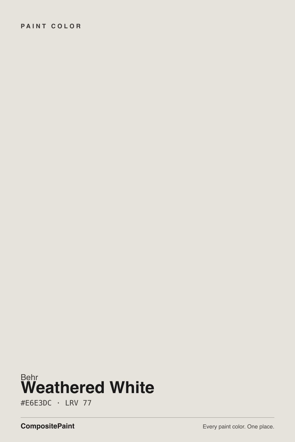
Weathered White
Behr's aged farmhouse white, reviewed honestly: the muted gray-beige it actually is, the light that flattens it, and what to pick instead.

Jessica has spec'd whites and neutrals for more than 300 rooms and keeps a sample wall of painted drawdowns in her studio. Every color review is checked against real reader rooms in the comments and re-tested when a formula changes. About the testing process →
- 1Heirloom Shade63
- 2First Star69
- 3Weathered White77
- 4Alabaster82
- 5Chantilly Lace91
The Fast Verdict
Weathered White is Behr's answer to the whitewashed, lived-in white farmhouse decorators keep asking for — not a crisp gallery white, but a foggy warm gray-beige that looks like it has already been in the room a while. Behr sells this exact color across furniture chalk paint, cabinet enamel and whole-house lines at once, which tells you exactly what it is for: cabinets, trim and painted furniture more than a stand-alone wall color. It is quiet, dependable, and has never had a marketing moment — which is honestly its whole appeal.
Farmhouse and vintage-style kitchen cabinets · furniture refinishing and chalk-paint flips · trim and doors under a warm neutral wall · whole-house walls with real daylight and warm wood
You want a bright, true white · your room is cool and north-facing · you're chasing a crisp modern-white look · you might grab the wrong Weathered White product line for the job
- Genuinely looks weathered and aged rather than fresh-from-the-can white
- Sold across cabinet, trim, furniture and wall product lines — one color, several jobs
- Flatters light oak, brass and worn linen — the whole farmhouse material set
- Quiet and dependable, never fights a room the way a stronger undertone would
- The chalk-paint version is genuinely popular with furniture flippers
- Reads flat, dull gray in cool or north-facing rooms — it has little undertone left to fall back on
- Too muted for anyone who actually wants a bright, true white
- Multiple product lines under one color name invite buying the wrong finish
- Almost no exterior track record — an interior-only color in practice
What Color Is Weathered White, Really?
The name is the whole pitch: this is a white built to look like it has already weathered a few seasons, not one fresh out of the can. Behr describes it with a medium warm-yellow undertone, but that undertone is so grayed and muted — Behr rates the saturation at just 21% — that on the wall it reads as a soft, foggy warm gray rather than cream or beige. It is telling that Home Depot sells this exact color across Behr's furniture Chalk Decorative Paint, its Cabinet & Trim Enamel, and its whole-house Dynasty and Premium Plus lines all at once — Weathered White was built to go onto cabinets, trim and furniture as much as onto four walls, and the farmhouse and vintage-flip crowd has quietly adopted it for exactly that.
At LRV 77 it sits in soft-white territory: clearly lighter than a beige, clearly duller than a true white. That number lines up with the paint itself — our own deck and one independent color database agree at 76–77, though a different online database mismatches it at LRV 89, which reads like a database error rather than a real second version of the color. The RGB values (230, 227, 220) are almost neutral, with only a 10-point gap between the reddest and bluest channels — one of the smallest gaps of any near-white in this deck, which is exactly why it behaves like a chameleon: warm light and warm bulbs pull a faint cream forward, cool daylight flattens it toward plain gray.
Undertone in one line: warm gray-beige, muted almost to neutral — never a strong yellow, never pink, never blue. If it reads distinctly cream on your wall, that is warm afternoon sun or a 2700K bulb doing the work; if it reads flat gray, that is cool daylight exposing how little color is actually left in this paint.
Where It Shines
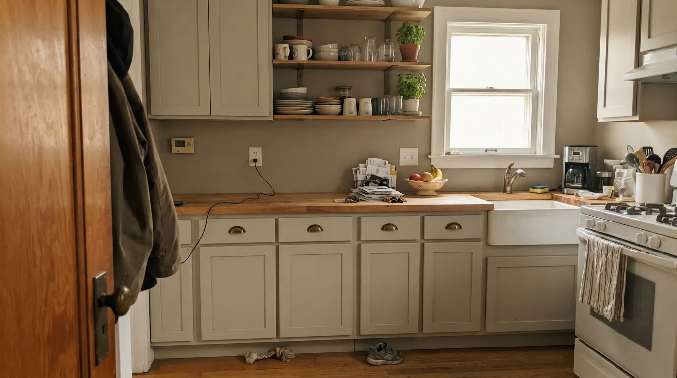
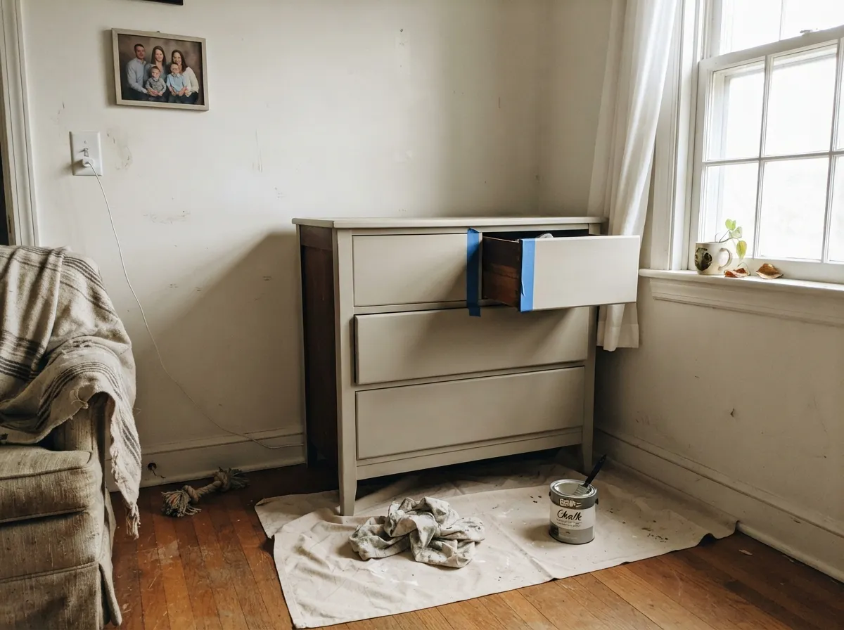
Give it a farmhouse kitchen, a piece of furniture headed for a chalk-paint flip, or trim under a warm neutral wall, and Weathered White does exactly the job its name promises. It flatters light oak, worn linen and brushed brass — the whole modern-farmhouse material list — without throwing the stark contrast a true white would at a room built around soft, aged textures. On cabinets and furniture it is genuinely one of Behr's most useful colors, precisely because nobody is trying to make it famous.
Where It Fails
Almost every disappointed review of Weathered White comes from one of three mismatches, and all three are avoidable before the first coat.
This color has almost no undertone left to lose — it is already muted down to 21% saturation — so cool daylight has nothing warm to fall back on. In a dim north room it reads flat, plain gray instead of the soft foggy warmth it shows in better light.
At LRV 77 this reads soft and grayed, never crisp — put it next to a true white like Behr Polar Bear (LRV 86) and Weathered White looks dingy by comparison, not because it failed but because it was never trying to be that bright. If the goal is a clean, modern white, pick Polar Bear or Ultra Pure White instead.
Home Depot sells this exact color as a furniture Chalk Decorative Paint, a Cabinet & Trim Enamel, and a standard interior wall paint, and reviewers occasionally mix them up — a chalk finish on a wall reads matte and slightly powdery, not the smooth eggshell most people expect. Check the product line on the can, not just the color chip, before you buy.
Room by Room
The color it was practically built for. On shaker or beadboard cabinets with brass or matte-black hardware it gives the whitewashed, lived-in farmhouse look without a chalky texture — use the Cabinet & Trim Enamel line, not the furniture chalk paint, for a durable, wipeable finish.
Real reviewers use the chalk-paint version specifically for dressers, side tables and headboards headed for a distressed or waxed finish. Coverage over dark existing furniture can take three coats — budget for it.
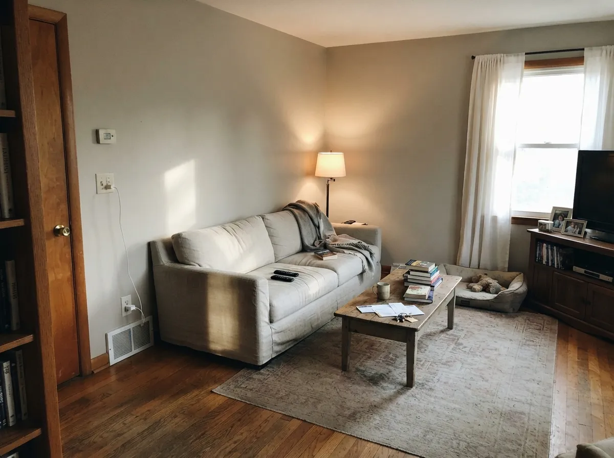
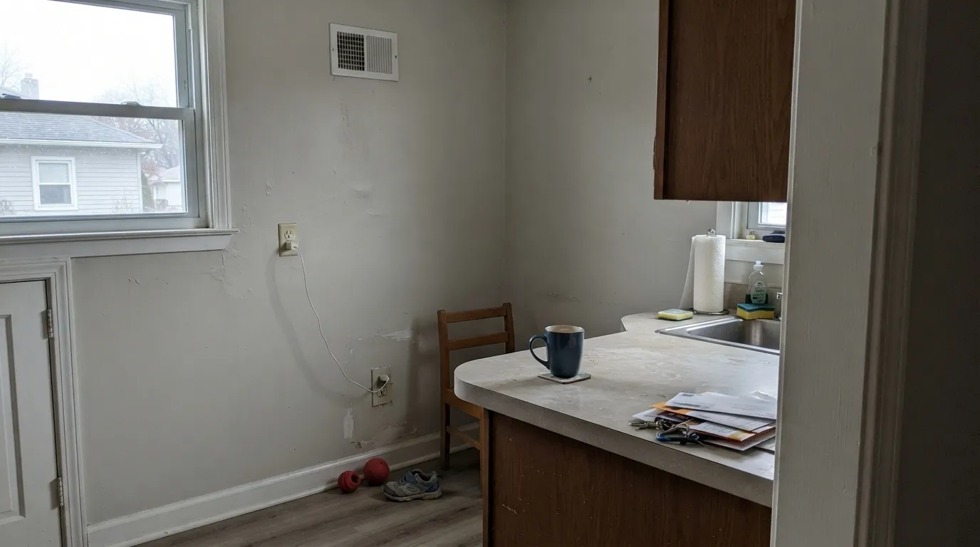
In a bright room with oak floors it reads as a soft, settled warm gray, and it shows up often in real project photos of living rooms. Skip it if the room runs dim or north-facing.
The single most-photographed room for this color in real project galleries. Warm lamps at night pull out the cream; keep bulbs at 2700K to get the effect the color is named for.
Under a warm greige or beige wall, semi-gloss Weathered White trim softens the line the way a true white would sharpen it. Under a cooler gray wall it can look slightly muddy next to the cooler color — test first.
We found almost no exterior project photos or reviews for this color; it is marketed and used almost entirely indoors. If you want a weathered farmhouse exterior white, look at a color with real exterior history instead.
Your Light Is the Risk
West or south sun in a warm-toned room pulls a faint cream forward and the gray softens toward whitewashed driftwood — the color at its most flattering.
Cool, flat daylight strips out what little warmth this muted color has and leaves plain, slightly dull gray. Sample it before committing a whole kitchen.
Cool in the morning, close to neutral at midday, warmer by late afternoon. The shift is gentle because the color starts so muted, but it is there — east rooms show it coolest.
2700K lamps bring out the faint cream and make cabinets look genuinely warm at night; cool white LEDs flatten it back toward gray. Bulb choice matters more with this color than with a stronger white.
Most complaints about Weathered White are a light mismatch. Upload a photo of your actual room and see it on your walls — then ask for the same wall in north light or evening lamps before you buy a single sample.
Need It From Another Brand?
Any paint counter can custom-tint Behr HDC-NT-21 directly. If you would rather stay in one brand's own deck, these are the closest stock matches, measured as ΔE2000. Under 2 is a difference you will not see on the wall.
| Brand | Closest color | ΔE | LRV | |
|---|---|---|---|---|
| Sherwin-Williams | Toque WhiteSW 7003 · Sherwin-Williams | 1.0 | 76 | Color page → |
| Benjamin Moore | Calm2111-70 · Benjamin Moore | 1.0 | 76 | Color page → |
| Valspar | Barley8007-12F · Valspar | 0.5 | 77 | Color page → |
| PPG / Glidden | Mountain GrayPPG1021-1 · PPG / Glidden | 1.0 | 76 | Color page → |
| Glidden | Mountain GrayPPG1021-1 · Glidden | 1.0 | 77 | Color page → |
| Dutch Boy | Moon Pie406-1DB · Dutch Boy | 1.0 | 75 | Color page → |
Similar Behr Colors
The nearest shades to Weathered White within Behr's own range, ranked by perceptual color distance — useful when you want the same look a touch lighter, darker, or warmer.
WCAG 2.1: AA is 4.5 : 1 for normal text, 3 : 1 for large text, AAA is 7 : 1.
Weathered White vs the Colors You're Also Considering
Every Weathered White sample board has the same rivals on it. The numbers show the real lightness gap — then it comes down to which risk you would rather live with.
Pick this if Swiss Coffee's warmth feels too creamy and you want the muted, grayed-down version instead.
Behr 12 · LRV 80Swiss CoffeePick this if you want the cream to actually show — Swiss Coffee is warmer and less gray.
Pick this for the softer, aged look Polar Bear doesn't have.
Behr 75 · LRV 86Polar BearPick this for a crisper, brighter everyday white — Polar Bear is Behr's dependable answer when you actually want white to look white.
Pick this if you specifically want Behr's farmhouse positioning and cross-line availability on cabinets and furniture.
Benjamin Moore OC-141 · LRV 76China WhitePick this if your painter works in Benjamin Moore — it is nearly the same muted, exposure-sensitive near-white.
White Pepper PPU24-13 shares the same LRV 77, and its hex #E6E4DB holds a fraction more green and less blue, so it reads very slightly cooler and less pink. Quiet On The Set MQ3-04 and Polished UL200-11, both at LRV 76, are a shade deeper and flatter. White Opal UL250-13, also LRV 76, trades some of the yellow for a faint violet, which makes it the better pick if Weathered White looks too beige to you.
Across brands the field is crowded. Valspar Barley 8007-12F sits at deltaE 0.51 and Farrow and Ball Strong White No. 2001 at 0.64, both close enough to be the same color on a wall. Sherwin-Williams Toque White SW 7003 and Benjamin Moore Calm 2111-70 are each at deltaE 0.98, visually identical in normal room light. Backdrop Jane BD-JA is the outlier at deltaE 2.6 and LRV 86, clearly brighter, so sample it first.
Weathered White Coordinating Colors
The rule for coordinating with Weathered White: keep everything soft and warm-neutral, and let one genuinely dark color do the contrast work. It sits happily next to warm greiges, muted sage greens and brushed brass, and it needs a near-black or deep charcoal somewhere in the room or the whole palette can feel washed out. These are the partners that keep showing up in real farmhouse rooms:
Why "Weathered" Fits This White
Behr didn't pick this name loosely. Weathered White is sold across Behr's Chalk Decorative Paint (built for distressing furniture), its Cabinet & Trim Enamel, and its standard Dynasty and Premium Plus wall lines — one color, deliberately offered in the finishes that furniture flippers, cabinet painters and whole-house painters each actually need. That cross-line availability is a strong tell: this was built as a farmhouse-and-vintage-flip color first, a wall color second.
It hasn't had a viral moment and it isn't a Color of the Year pick — real project photos skew toward bedrooms and cabinets, not statement walls, and most of what's written about it online is practical color-matching data rather than designer praise. That's not a knock. It's an honest, useful color doing a specific job well, without needing a marketing push to earn its place in the Behr deck.
Weathered White With Wood Tones and Floors
Light oak is its best match — real project photos and color research agree on this specifically, and it makes sense: a pale, gently warm wood floor gives Weathered White's muted undertone something to lean on without fighting it. Whitewashed or driftwood-finish wood is even better, since the two textures share the same "aged on purpose" logic.
Dark or heavily red-toned wood — cherry, mahogany, dark walnut — is the pairing to test carefully; the contrast can make the paint look chalky and the wood look dated rather than rich. If your floors or cabinetry lean that direction, sample a large board before committing the whole kitchen.
Three Ready Palettes Built on Weathered White
A color is never alone on the wall. These are complete combinations in the 60-30-10 pattern, with the reason each one holds together. Every one opens in the visualizer.
A same-brand palette that keeps the aged farmhouse mood consistent: Silver Drop's shifting greige gives the walls texture without competing, and Cracked Pepper on the island supplies the one dark anchor the scheme needs.
Try this palette in your roomLayering two near-whites with one warm beige note is what keeps a chalk-paint flip looking vintage instead of just pale — Whipped Cream stays brighter on the walls so the furniture piece reads as the aged, weathered object in the room.
Try this palette in your roomWeathered White's muted warmth softens Agreeable Gray's cool edge better than a stark white trim would — the same one-step-softer trim logic that works for any warm greige, with the near-black door as the one crisp note.
Try this palette in your roomWeathered White FAQ
Is Weathered White actually white, or is it gray?
Neither, exactly — it's a warm gray-beige so muted (Behr rates the saturation at 21%) that it reads as a soft, foggy off-white in good light and plain gray in cool light. If you want a color that unmistakably reads white on the wall, this isn't it; Behr Polar Bear or Ultra Pure White are.
What is Weathered White best used for?
Cabinets, trim, doors and furniture more than whole-house walls — Behr sells it across a furniture chalk paint, a cabinet enamel and standard wall lines all under the same name, which tells you where it earns its keep.
Does Weathered White work in a north-facing room?
Carefully. It has very little undertone to fall back on once the light goes cool, so a dim north room will read it as flat, plain gray rather than the soft weathered warmth it shows elsewhere. Sample it in your actual room before committing.
What's the difference between Weathered White and Behr Swiss Coffee?
Swiss Coffee is warmer and more clearly creamy; Weathered White is grayer and more muted — closer to whitewashed wood than to cream. If your sample of one looks too warm, the other is usually the fix.
Can I use the chalk paint version on my walls?
You can, but know what you're buying: the Chalk Decorative Paint line gives a matte, slightly powdery finish meant for furniture distressing, not the smooth eggshell most people expect on drywall. For walls, buy the standard interior or Dynasty line in this color instead.
What trim color goes with Weathered White cabinets?
Weathered White itself in semi-gloss is the simplest answer — same logic as any one-color kitchen. If you want contrast, a warm greige like Behr Silver Drop or Roman Plaster on the walls keeps the palette in the same family instead of fighting it.
Have you painted with Weathered White?
Rate it — one tap helps the next reader decide.
Ask a Question