Calm
The off-white everyone calls soft and serene, reviewed honestly — including the lavender cast that shows up in north-facing rooms and under cool bulbs.

Jessica has spec'd whites and neutrals for more than 300 rooms and keeps a sample wall of painted drawdowns in her studio. Every color review is checked against real reader rooms in the comments and re-tested when a formula changes. About the testing process →
- 1Heirloom Shade63
- 2First Star69
- 3Calm76
- 4Alabaster82
- 5Chantilly Lace91
The Fast Verdict
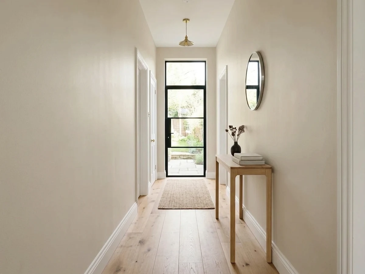
Calm is the off-white people reach for when a true white feels clinical and a beige feels heavy. In south and west light it does exactly what the name says: quiet, soft, barely there.
The catch is that it is a shape-shifter — in cool north daylight and under 4000K bulbs a gray-violet cast steps forward, and that lavender flash is behind almost every complaint about this color. Sample it on two walls, look at it in the afternoon and again after dark, before you give it a whole house.
South- and west-facing rooms · bedrooms and bathrooms that want quiet, not cream · cabinets and millwork under warm lamps · rooms with gray stone, chrome or black metal
Your main rooms face north and stay dim · you run 4000K daylight LEDs everywhere · you actually want a warm cream · a hint of lavender would bother you
- Very light at LRV 78 without the hard glare of a bright white
- Genuinely restful in south and west light — the name is earned
- Sits well with cool materials: gray stone, chrome, black metal
- Reads as soft old paint on cabinets and millwork, not factory white
- Hides minor wall flaws better than a brighter, flatter white
- Turns lavender-gray in north light and under 4000K bulbs
- Fussy about which white you trim it with
- Goes dingy and mauve next to cream or beige partners
- Not the warm cream most people expect from looking at the chip
What Color Is Calm, Really?
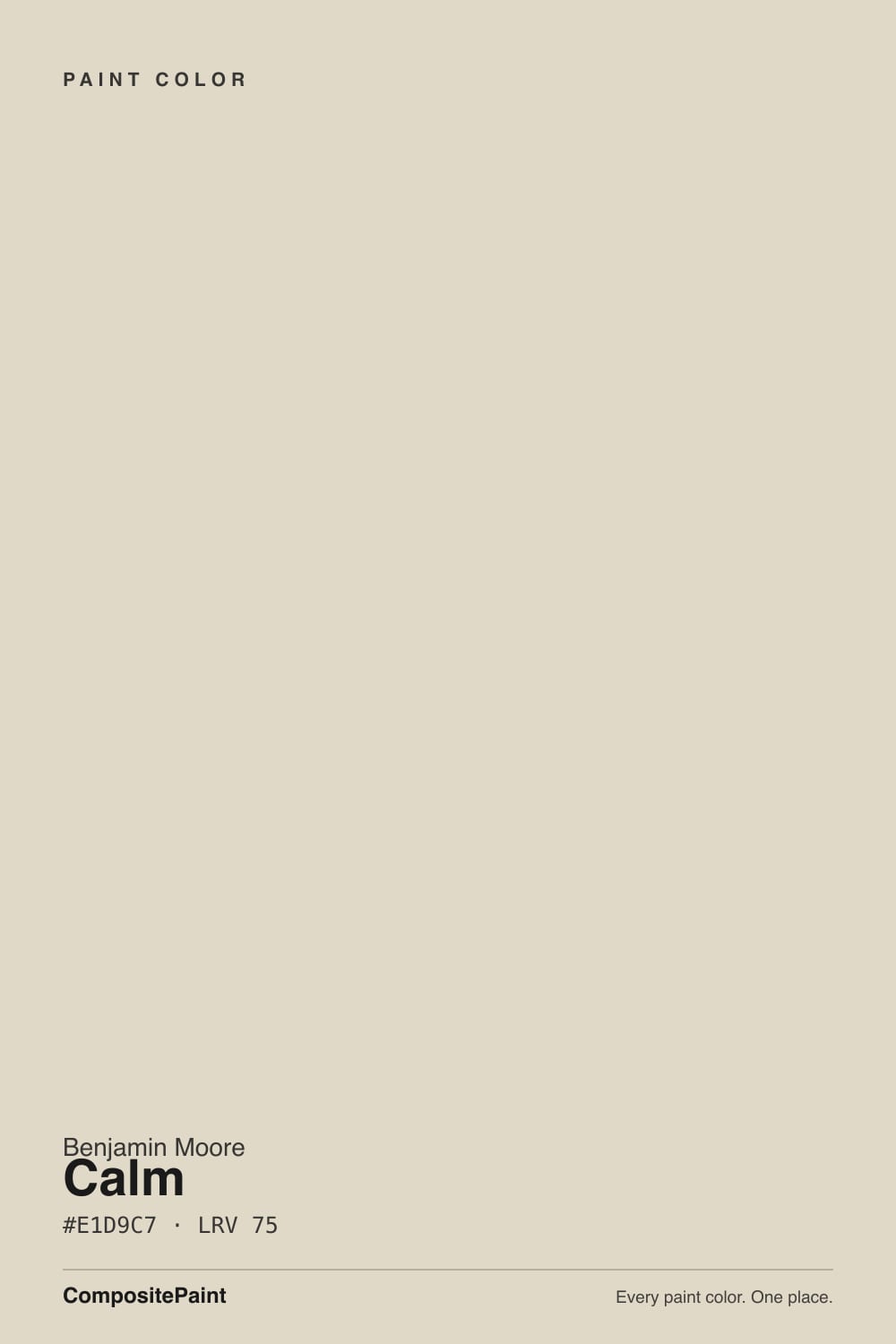
Calm is a very light off-white — light enough that most people call it white until it is up on a wall. The base is warm, on the cream side of neutral rather than the gray side. What makes it interesting, and what makes it argued about, is how little color strength is holding that warmth in place. Near-whites this pale take their reading from the room, and the reading people report over and over for Calm is not cream at all: it is a soft gray with a violet lean. That is the honest headline. On the chip it looks like a quiet warm white. On a north-facing wall it can look faintly lavender.
At LRV 78 it bounces back most of the light that reaches it, so it brightens small and dim rooms — but it is clearly not a bright white. Put it beside White Dove OC-17 at LRV 83 and the gap is obvious: White Dove reads creamy and open, Calm reads softer, grayer, a step back. That eight-point difference is the useful part. Calm still shows corners, still lets shadows land, still gives a room shape, where a brighter white flattens everything into glare. It is a near-white with a body to it.
Undertone in one line: a warm base carried at very low strength, which reads gentle cream in warm light and soft violet-gray in cool light. If your sample looks lavender on the wall, that is Calm being Calm — not your primer, not your painter, not the bulb being broken.
Where It Shines
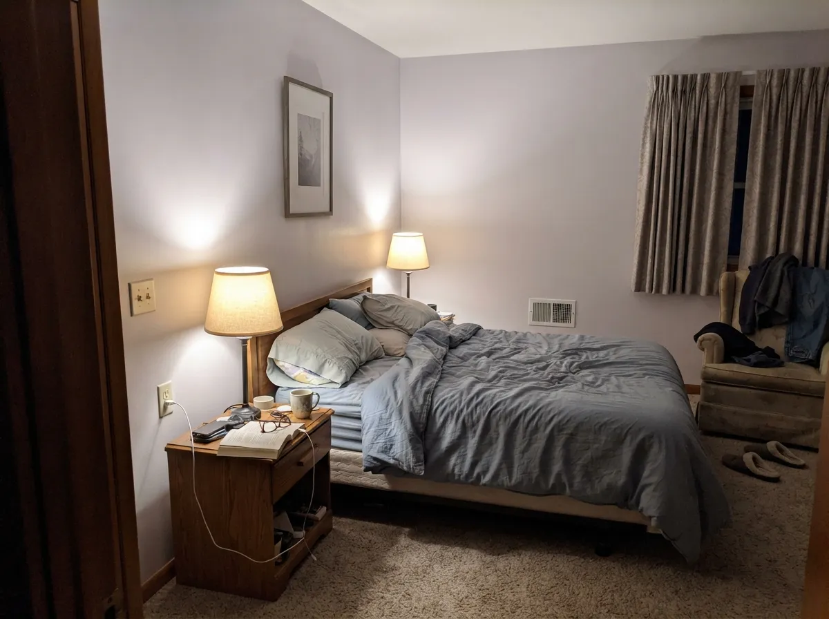
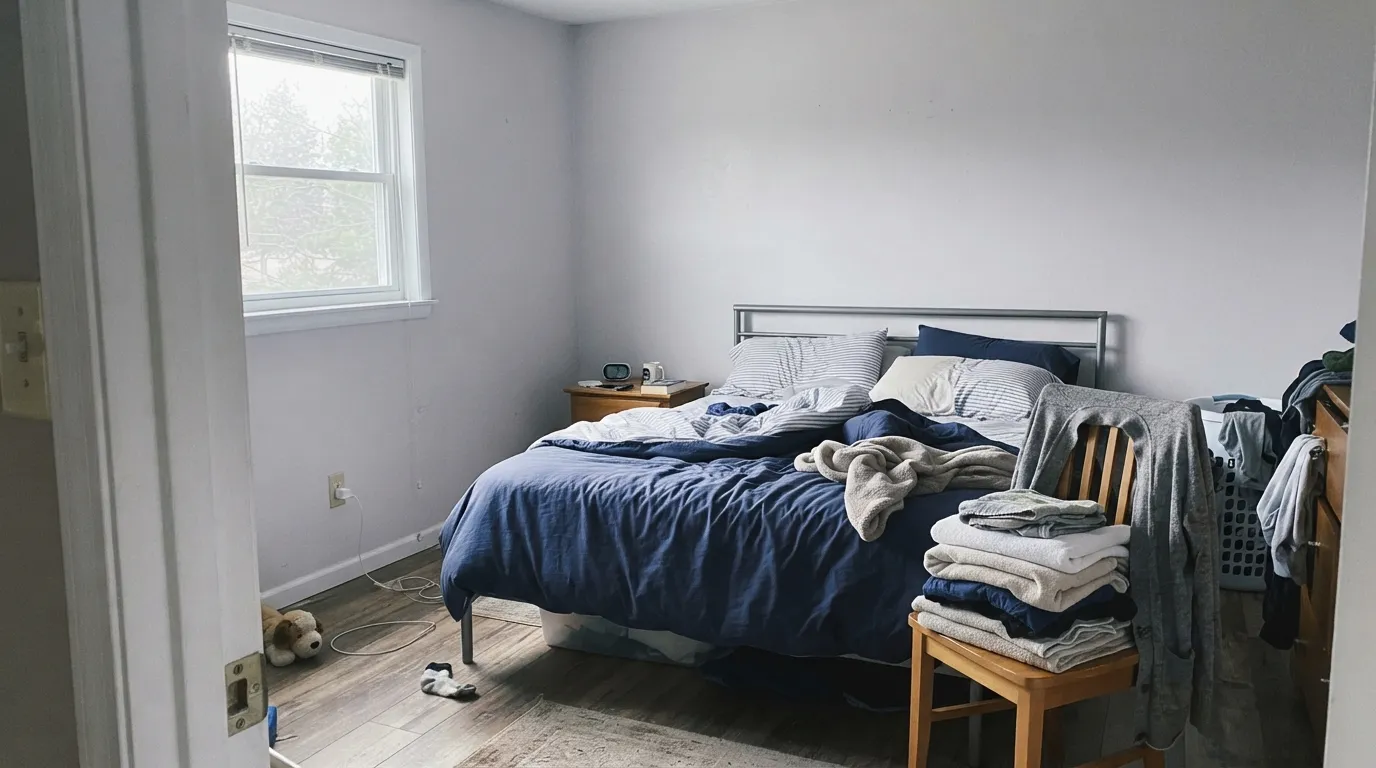
Give it afternoon sun or warm lamps and Calm is genuinely lovely — restful without being sweet, light without being loud. Bedrooms are its home ground, and it is quietly excellent on cabinets and millwork, where the low warmth reads as soft old paint instead of factory white.
Where It Fails
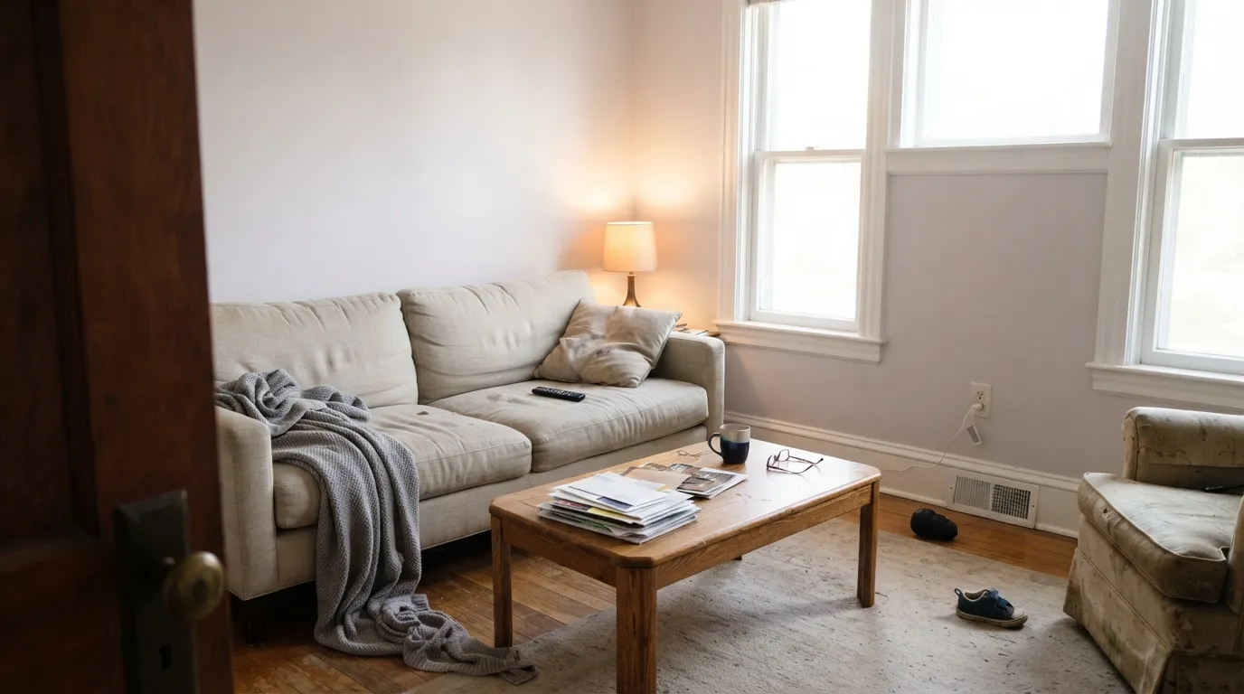
Nearly every bad review of Calm is the same story with a different room attached: the violet showed up. All three situations below are predictable, and none of them get better with another coat.
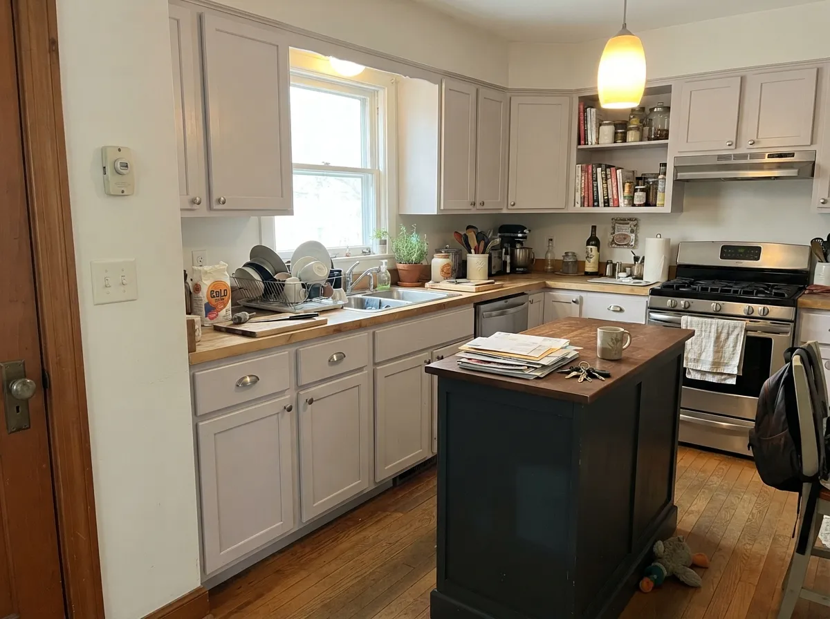
Cool, flat north daylight pulls the little warmth out and leaves the gray-violet exposed. People describe the result as dingy, chilly, or straight-up lavender. If your main rooms face north, use Benjamin Moore White Dove OC-17 or Swiss Coffee OC-45 instead — both hold their warmth in cold light.
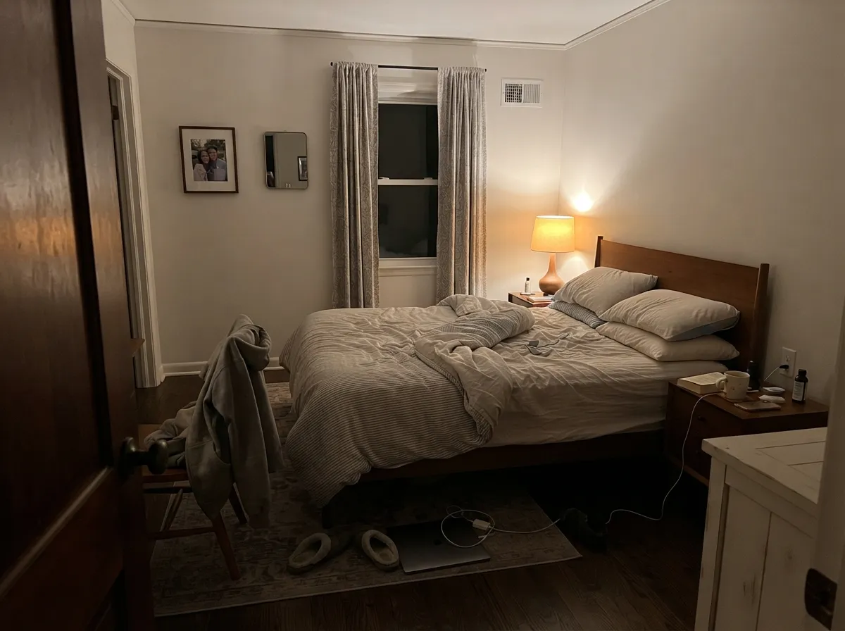
Cool bulbs do at night what north windows do by day, and the violet comes forward hardest after dark, when you are actually in the room. Try 2700K bulbs first — that alone fixes it for most people. If you cannot change the lighting, Benjamin Moore Classic Gray OC-23 stays plainer under cool light.
Calm is fussy about which white it stands next to. Against a cream like Swiss Coffee OC-45 or Navajo White OC-95, the warm partner wins and Calm turns mauve and grubby by comparison. Trim it with a clean white — Chantilly Lace OC-65 — or move the walls to Wind's Breath OC-24 if you want the cream trim.
Room by Room
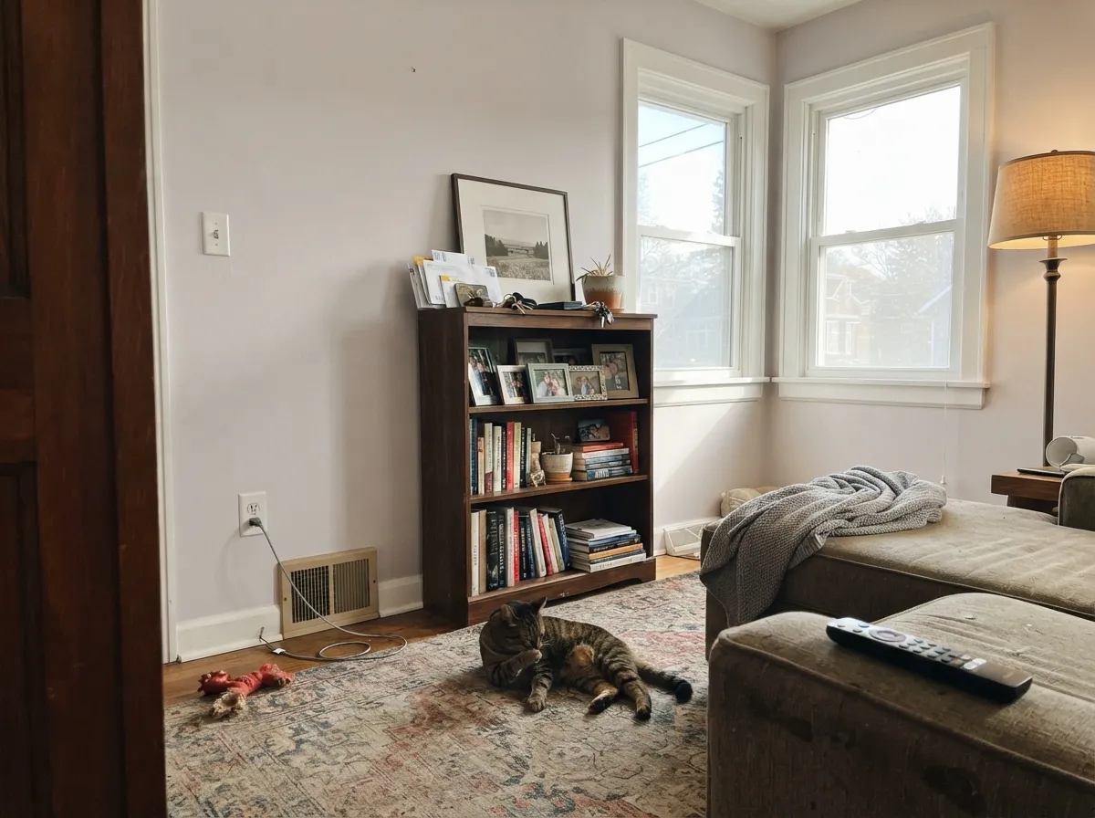
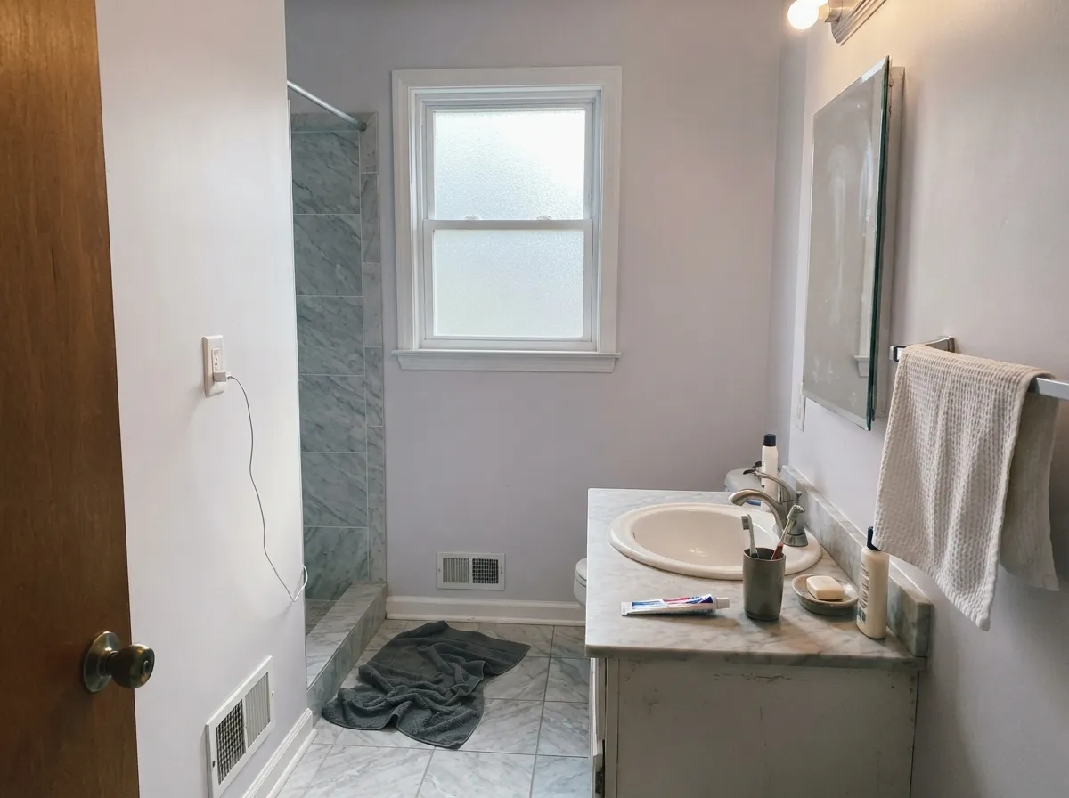
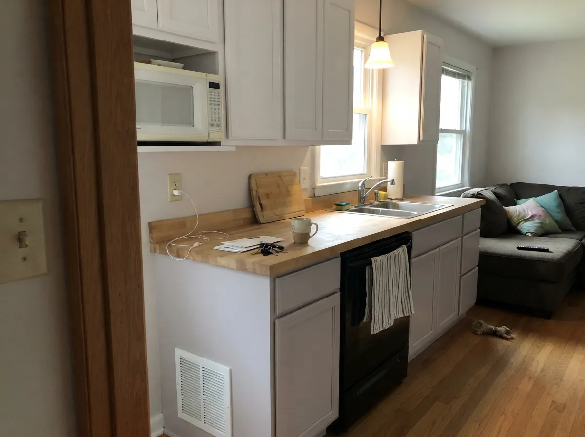
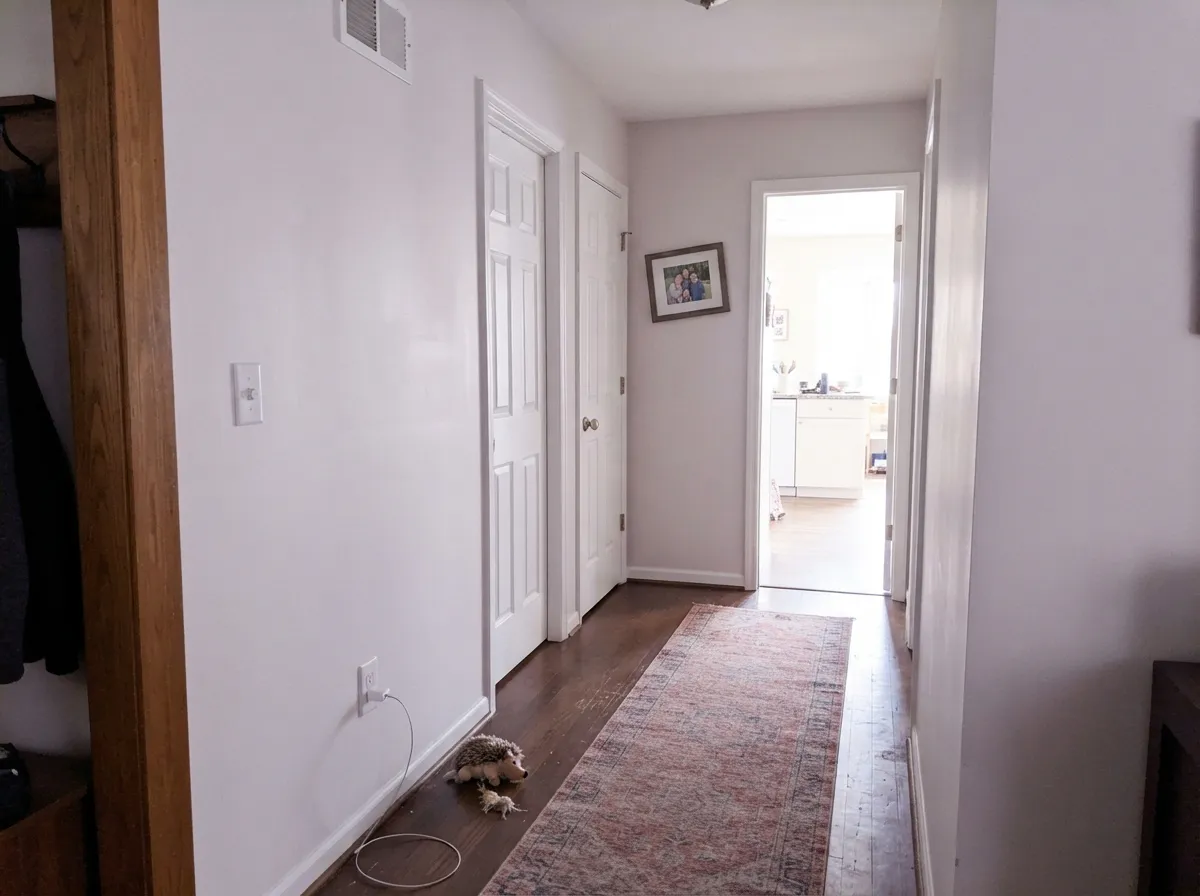
Your Light Is the Risk
Warm sun holds the cream side up and the violet stays out of sight. Safe here.
Cool daylight drains the warmth and the gray-violet steps forward. Flat, chilly, sometimes clearly lavender.
Soft and pretty during the sun hours, gray and quiet after. Two colors in one day.
2700K lamps: soft, creamy, calm. 4000K LEDs: lavender flash. Change bulbs before changing paint.
Most complaints about Calm are a light mismatch. Upload a photo of your actual room and see it on your walls — then ask for the same wall in north light or evening lamps before you buy a single sample.
Need It From Another Brand?
Any paint counter can custom-tint Benjamin Moore 2111-70 directly. If you would rather stay in one brand's own deck, these are the closest stock matches, measured as ΔE2000. Under 2 is a difference you will not see on the wall.
| Brand | Closest color | ΔE | LRV | |
|---|---|---|---|---|
| Sherwin-Williams | Spare WhiteSW 6203 · Sherwin-Williams | 1.6 | 77 | Color page → |
| Behr | Fading FogPR-W07 · Behr | 1.3 | 78 | Color page → |
| Valspar | Whisper SoftlyV162 · Valspar | 0.6 | 78.2 | Color page → |
| PPG / Glidden | Willow SpringsPPG1007-1 · PPG / Glidden | 0.2 | 78 | Color page → |
| Glidden | Arctic CottonPPG1002-2 · Glidden | 0.8 | 77 | Color page → |
| Dutch Boy | Tender Cloud023W · Dutch Boy | 1.5 | 80 | Color page → |
Similar Benjamin Moore Colors
The nearest shades to Calm within Benjamin Moore's own range, ranked by perceptual color distance — useful when you want the same look a touch lighter, darker, or warmer.
WCAG 2.1: AA is 4.5 : 1 for normal text, 3 : 1 for large text, AAA is 7 : 1.
Calm vs the Colors You're Also Considering
Every Calm sample board has the same rivals on it. The numbers show the real lightness gap — then it comes down to which risk you would rather live with.
Pick this for the softer, quieter of the two near-whites.
Benjamin Moore OC-23 · LRV 74Classic GrayPick this for a plainer greige that behaves better in cool light.
Pick this when White Dove reads too creamy against gray stone.
Benjamin Moore OC-17 · LRV 85White DovePick this for a brighter, warmer, far more forgiving white.
Wind's Breath OC-24 at LRV 71 is the closest sibling and the usual alternative. It is slightly darker and grayer at #DFDBCD, so it reads more like a soft greige while Calm at #E1D9C7 stays clearly cream. Pick Wind's Breath if the yellow in Calm worries you.
Overcast OC-43 at LRV 69 and Natural Elements 1515 at LRV 70 share the hex #DEDBC7, a touch deeper and less golden. White Sand OC-10 at LRV 69 is the closest in character at #E0D8C6, just a little less reflective.
Across brands, Sherwin-Williams Warm Winter SW 9506 at deltaE 0.4, PPG Antique White PPG1024-2 at 0.55, and Kompozit and Hirshfield's White Elephant 0223 at 0.59 are effectively the same color. Dunn-Edwards Instant Classic DET672 at 0.79 and Valspar Bare Market T670 at 0.94 are the same story. Behr Chartreuse Frost MQ3-17 at 1.11 and Farrow and Ball Blanc de Treillage No. G1 at 1.25 are visually identical in normal room light. Dutch Boy Sheridan White 415-1DB at 2.61 is very close, but sample first.
Calm Coordinating Colors
The rule with Calm is the opposite of the rule with most off-whites: keep its partners clean or cool, not warm. Crisp whites, charcoals, gray-blues and muted greens all make it read soft and deliberate. Creams, beiges and yellow-based whites do the damage — next to them Calm looks dirty and the violet jumps out. These are the partners worth sampling:
Calm on Cabinets and Millwork
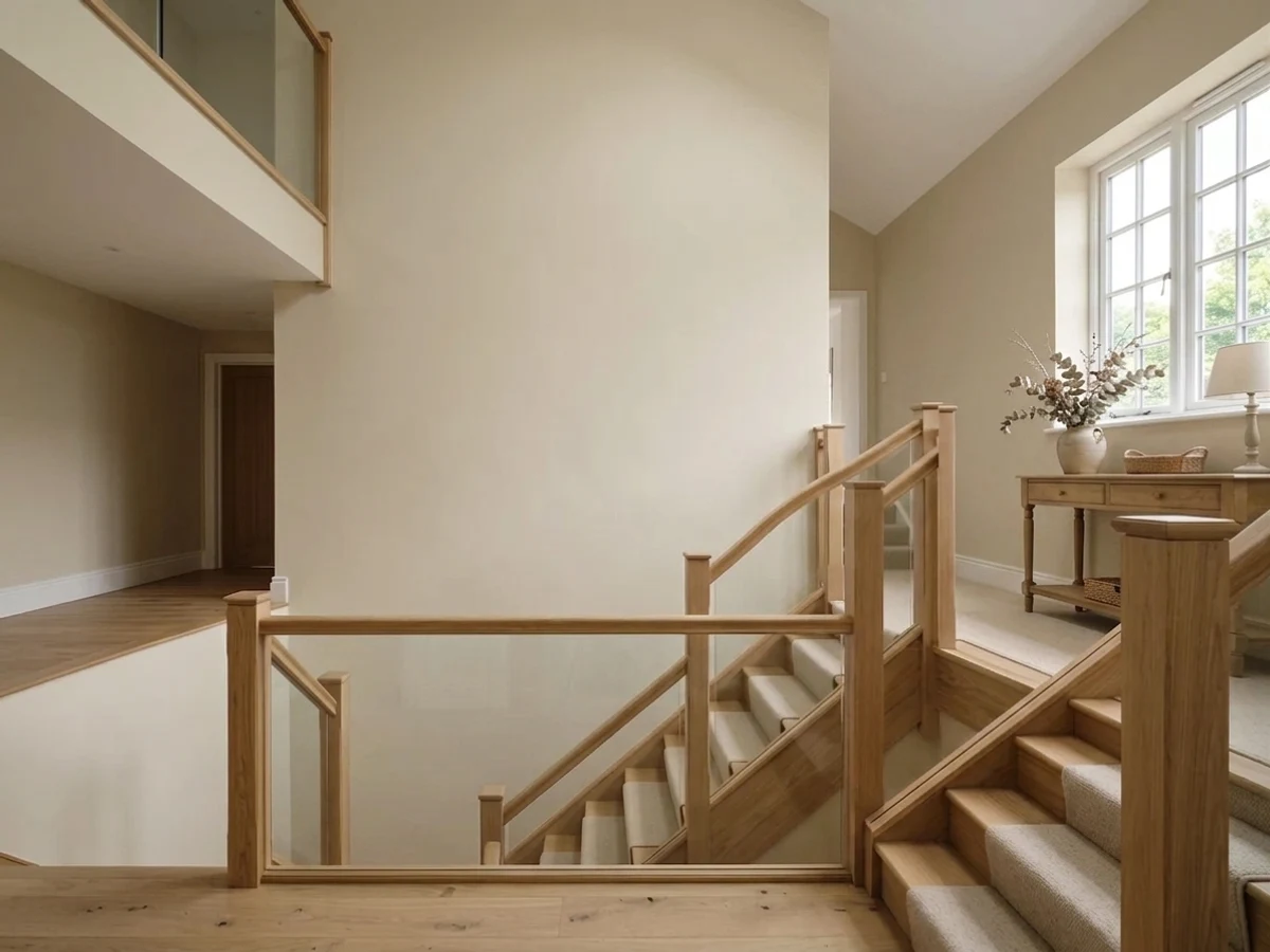
Cabinets are where Calm quietly outperforms its reputation. Painted doors catch light on the flat panel and shade on the rail, so a color with a little body shows the joinery instead of flattening it — and at LRV 78 Calm has exactly that much body. The finish reads as soft, slightly aged paint rather than the plastic brightness of a builder white, which is why it suits shaker fronts, panelled rooms, built-in bookcases and old stair balustrades.
Two things decide whether it works. First, the counters: neutral quartz, gray marble and honed stone all flatter it, while beige granite and warm travertine will drag the violet into the open. Second, the lighting under the uppers — most under-cabinet LED strips ship at 4000K or higher, and that is the exact light that turns Calm lavender at the sink. Spec 2700K to 3000K strips and the problem never appears. Use a urethane-fortified cabinet enamel in satin; it wipes clean around handles and does not yellow the way older oil enamels did.
Where Calm Sits in Benjamin Moore's Off-White Ladder
Benjamin Moore's off-white range is crowded, and Calm's neighbours are close enough that people order three samples and still cannot decide. The short version: White Dove OC-17 is the brightest and warmest of the group and the safest choice for a dim house. Wind's Breath OC-24 is the warm, softly greige one, the pick when you want no chance of violet. Silver Satin OC-26 is the cleaner gray with almost no color in it. Paper White OC-55 leans cooler and slightly green. Pale Oak OC-20 drops down into taupe territory and is a genuine wall color rather than a near-white.
Calm's spot in that lineup is specific: pale, quiet, faintly cool-leaning, and the only one of the group that carries a violet risk. That is not automatically a fault — it is precisely what makes it look right next to gray stone, chrome, black window frames and cool-toned art, where the warmer options in the ladder look yellow. Choose it on purpose, for a room with warm light and cool materials, and it is very good. Choose it as a safe default white for a whole house you have not tested, and it is the wrong tool.
Three Ready Palettes Built on Calm
A color is never alone on the wall. These are complete combinations in the 60-30-10 pattern, with the reason each one holds together. Every one opens in the visualizer.
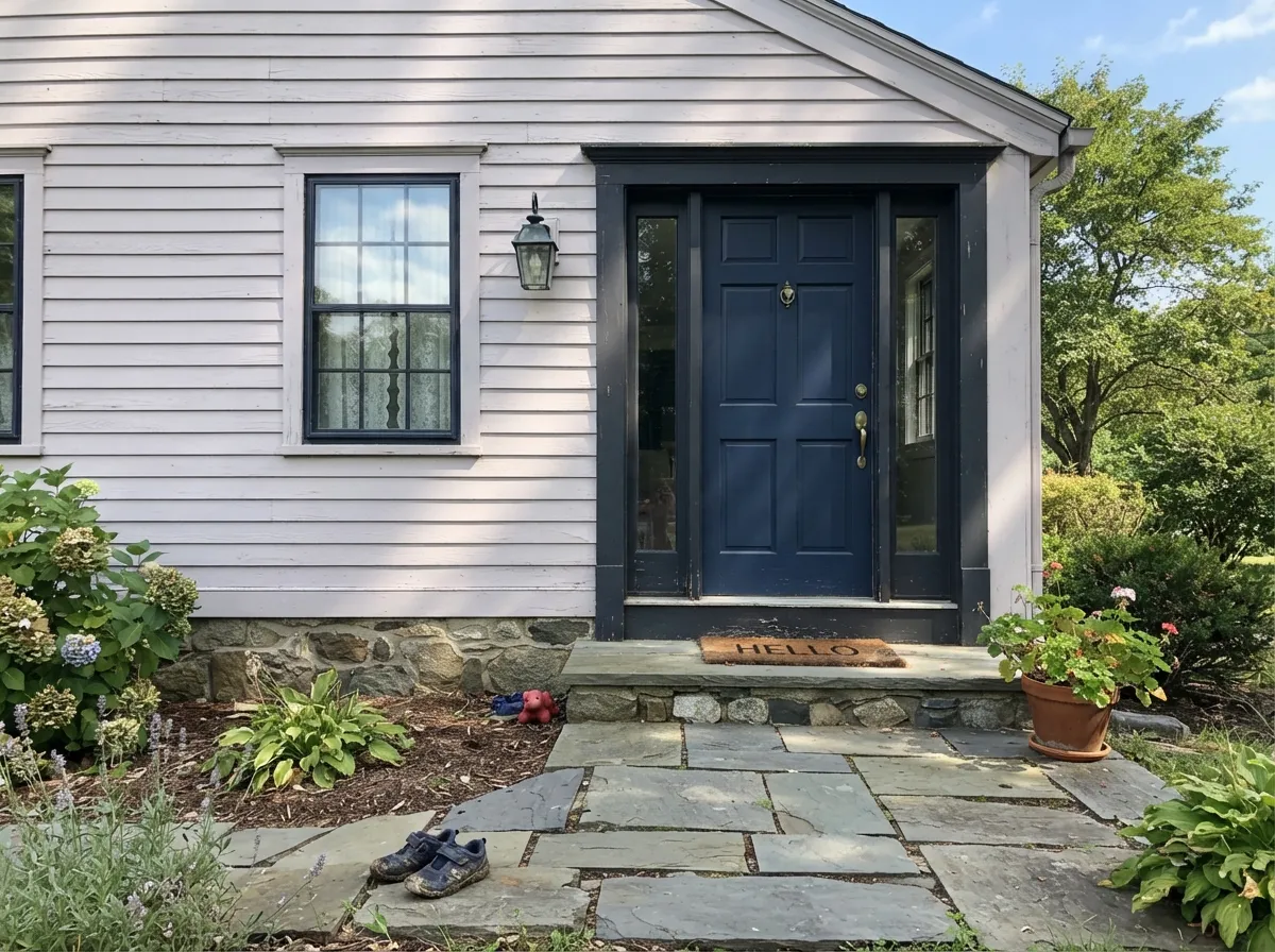
Chantilly Lace is the clean white Calm needs — it makes the walls read soft instead of dingy, which a cream trim never manages. The navy door gives the whole pale scheme one dark anchor so it does not float.
Try this palette in your roomSimply White is bright and clean enough to separate from the walls without turning them mauve, so the cabinets read as cabinets. Kendall Charcoal on the island supplies the 10 percent dark note and stops the kitchen from washing out at noon.
Try this palette in your roomOxford White is a neutral white that stays out of the argument, giving Calm clean edges without the cream problem. Cushing Green is the one 10 percent color that flatters a violet-leaning gray instead of exposing it — green and violet sit opposite each other and cancel the flash.
Try this palette in your roomCalm FAQ
Does Benjamin Moore Calm look purple?
In some rooms, yes. It is the single most common thing people say about this color. Cool north daylight and 4000K bulbs pull a gray-violet cast forward, and on a big wall that reads as lavender. In south or west light, or under 2700K lamps, it stays a soft neutral and nobody sees purple.
Is Calm warm or cool?
The base is warm, but it is carried so lightly that the room decides. In warm light Calm behaves like a gentle cream. In cool light it behaves like a soft gray with a violet lean. Treat it as a near-neutral that swings, not as a dependable warm white.
Calm or Classic Gray — which should I use?
Classic Gray OC-23 is the safer pick if your light runs cool; it stays a plainer greige where Calm goes violet. Calm is the softer, quieter of the two in warm light and looks better against gray stone and chrome. In a north-facing house, choose Classic Gray.
What trim white goes with Calm?
A clean white, not a cream. Chantilly Lace OC-65 is the standard answer and it works — the crispness makes Calm read soft rather than grubby. Oxford White CC-30 is the slightly less stark option. Do not trim it in Swiss Coffee OC-45 or any yellow-based white; that is the pairing that makes Calm look mauve.
Is Calm good for kitchen cabinets?
Yes, and it is one of its better uses. On doors it reads like soft aged paint instead of a factory finish, which suits shaker and traditional kitchens. Use a urethane-fortified cabinet enamel in satin. Keep the counters and backsplash neutral or cool — beige stone will pull the violet out.
Will Calm work in a north-facing room?
Only if you control the lighting. North light is exactly the condition that exposes the violet, so plan on 2700K bulbs and warm materials, and test a large sample on the darkest wall for a full day. If the room is also dim, skip it and use White Dove OC-17 or Swiss Coffee OC-45.
Does Calm work on exteriors?
It does. Full sun overwhelms the violet, so outside Calm behaves like a clean, soft white body color next to stone, brick and natural wood. Pair it with Kendall Charcoal HC-166 or Wrought Iron 2124-10 trim and a dark door. Check the shaded north elevation before you buy the paint, because that side reads a step grayer.
Have you painted with Calm?
Rate it — one tap helps the next reader decide.
Ask a Question