Wind's Breath
The off-white that is also a greige, reviewed honestly: the light it needs, the trim white that makes it look dingy, and what to pick instead.

Jessica has spec'd whites and neutrals for more than 300 rooms and keeps a sample wall of painted drawdowns in her studio. Every color review is checked against real reader rooms in the comments and re-tested when a formula changes. About the testing process →
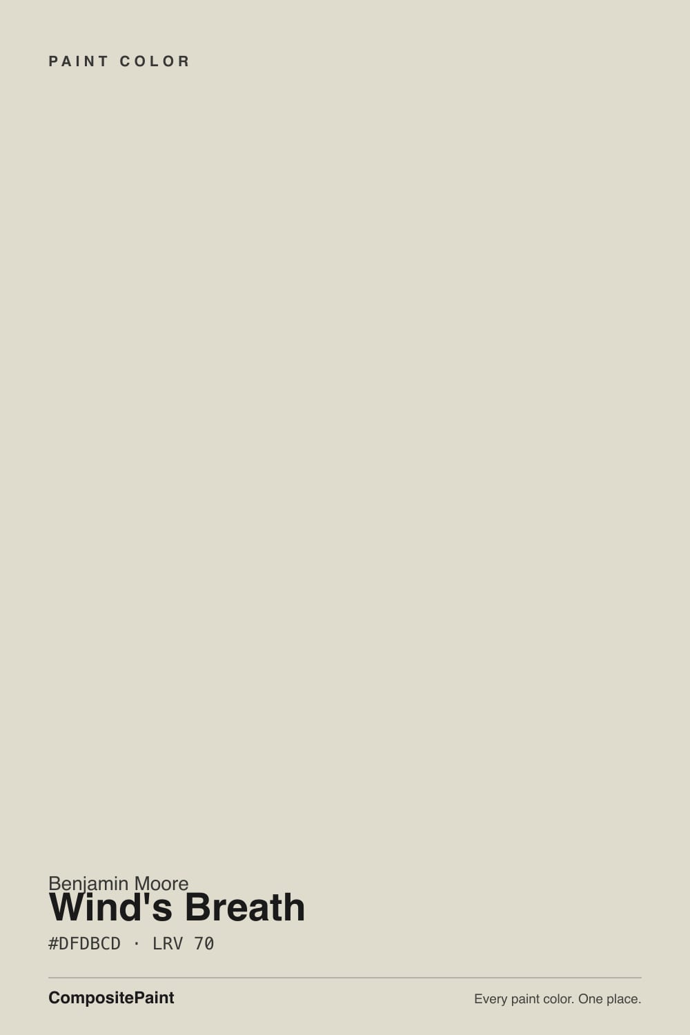
- 1Revere Pewter55
- 2Agreeable Gray60
- 3Wind's Breath70
- 4Pearly White77
- 5Dover White83
The Fast Verdict
Wind's Breath is the neutral that refuses to pick a side. It is part cream, part taupe, part gray, and at LRV 70 it sits exactly on the line between an off-white and a light greige — which is why the same gallon looks like a soft white in one house and a warm gray in the next. Give it steady, indirect daylight and it is one of the easiest colors Benjamin Moore makes. Give it a dark corner and a cold bulb and it turns dingy fast.
Rooms with real but indirect daylight · small and windowless spaces you want soft instead of stark · closets, dressing rooms and laundry rooms · kitchen cabinets with warm wood and brass · anyone who finds gray cold and beige too yellow
The room is dim and runs on cool white LEDs · your trim is a creamy white · you want a greige you can actually see across a bright room · you are painting a house exterior with warm stone or a brown roof
- Sits between off-white and greige, so it works with mixed finishes
- Warm without any buttery yellow
- Small and windowless rooms feel bigger and softer in it
- Excellent on cabinets and closet built-ins — hides scuffs a white shows
- Light enough (LRV 70) to keep a low-ceilinged room open
- Goes flat and dingy in dark rooms and under cool LEDs
- Creamy white trim makes the walls look dirty
- Washes out to a plain off-white in strong sun
- Green undertone can surface outdoors against stone and shingles
What Color Is Wind's Breath, Really?
A warm neutral with no committed undertone — a hybrid of cream, tan and soft gray that Benjamin Moore files in its Off-White collection and describes as having warm gray undertones. That non-commitment is the whole product. Most light neutrals declare themselves: beige is yellow, greige is gray-brown, off-white is white with a hint of something. Wind's Breath keeps all three in play, so it slides into rooms with mixed finishes — warm floors, cool counters, whatever the previous owner chose — without arguing with any of them. It is the color designers hand a client who says gray felt cold and beige felt dated.
At LRV 70 it lands right on the boundary between an off-white and a light neutral, and that number explains most of the confusion people have with it. In a bright room it behaves like an off-white and you barely see the taupe. In medium light it shows its body and reads as a genuine warm greige. Line it up against its neighbors and the spread is small but real: Classic Gray at LRV 74 reads noticeably whiter and cooler, Pale Oak at 67 reads a step deeper and grayer. Wind's Breath sits between them and borrows from both.
Undertone in one line: warm gray-taupe, with a faint green tell in daylight and a faint pink-violet flash under warm bulbs — never buttery yellow. Both of those hints are subtle, and both are real. If your sample looks slightly green next to a cream cabinet, that is the color being honest, not your eyes.
Where It Shines
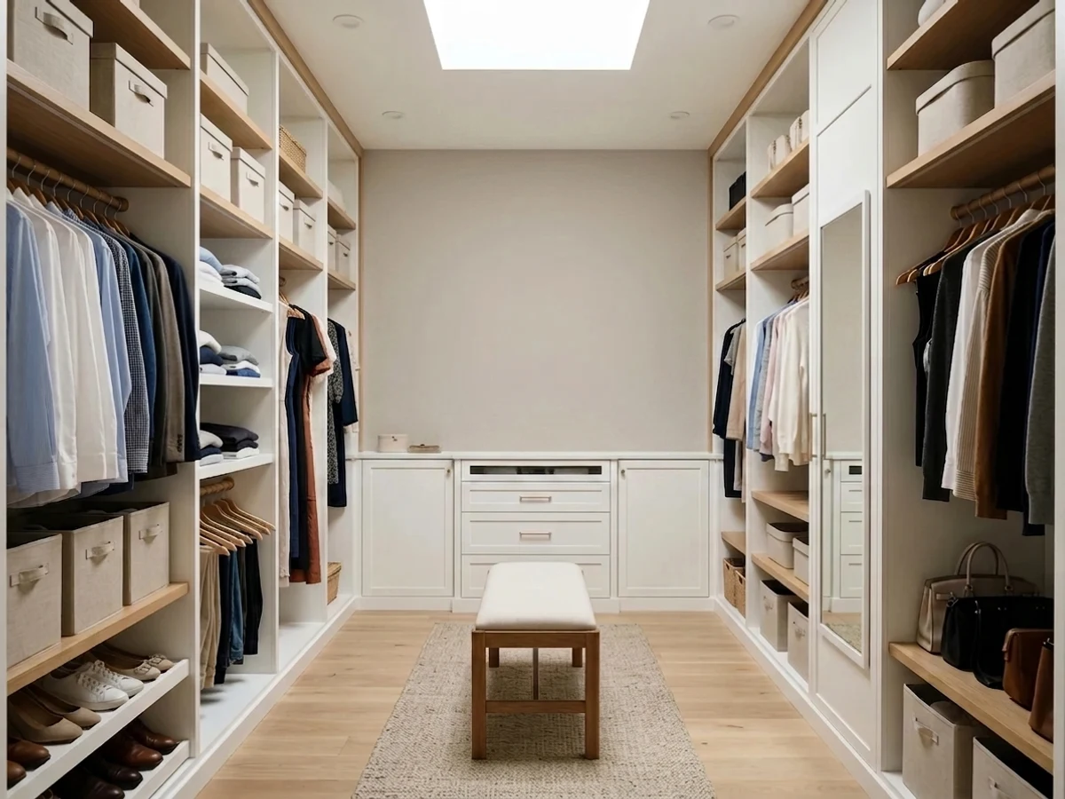
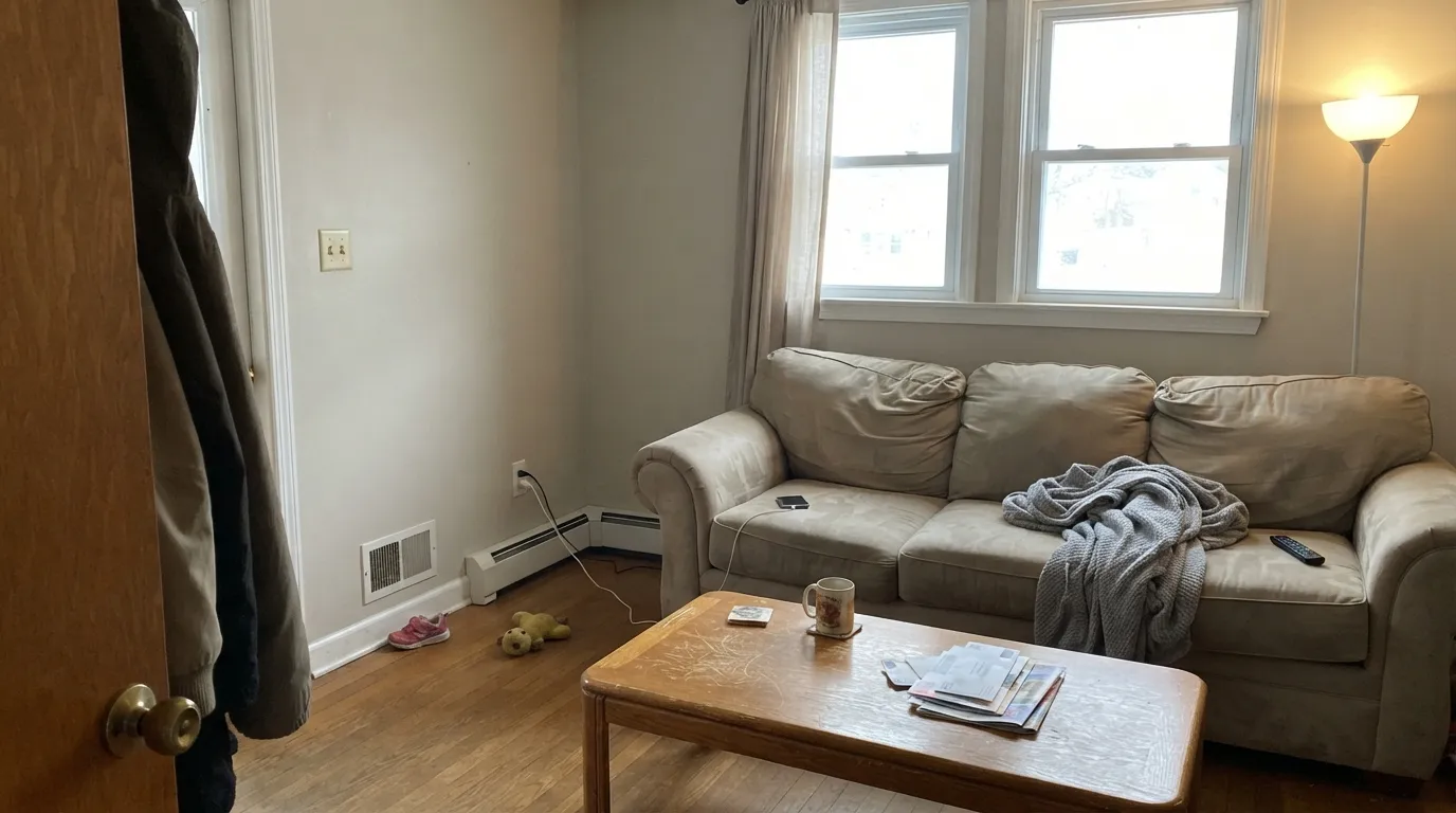
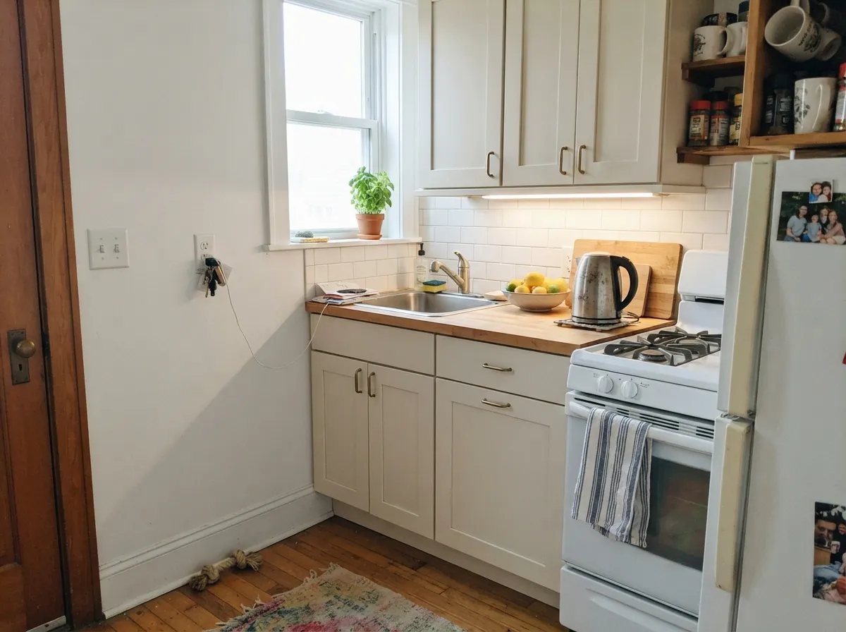
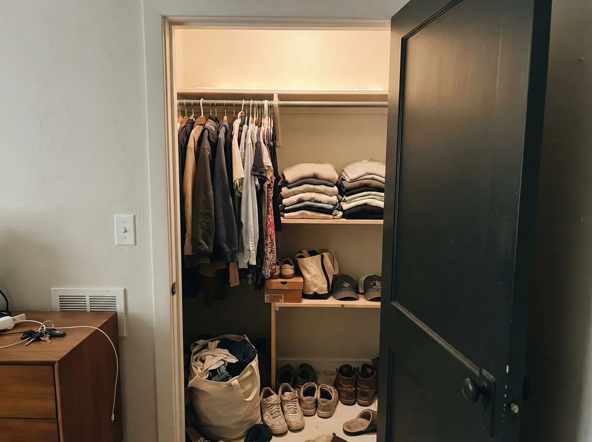
The sweet spot is a room with real daylight that is not blasting sun — the ordinary side-lit living room, the bedroom with one good window, the kitchen with a window over the sink. In that light it does the thing people buy it for: the walls read soft and warm, the corners stay clean instead of muddy, and nothing in the room has to match it. Its second talent is small spaces. Closets, dressing rooms, laundry rooms and little bathrooms feel bigger in it than in a mid-tone neutral and warmer than in a builder white, and at LRV 70 it hides handprints and shelf scuffs that a bright white would broadcast.
Where It Fails
Nearly every disappointed review of Wind's Breath traces back to one of three situations, and all three are visible before the first coat dries. None of them are the paint's fault — but if your room matches one, sampling a bigger patch will only confirm it.
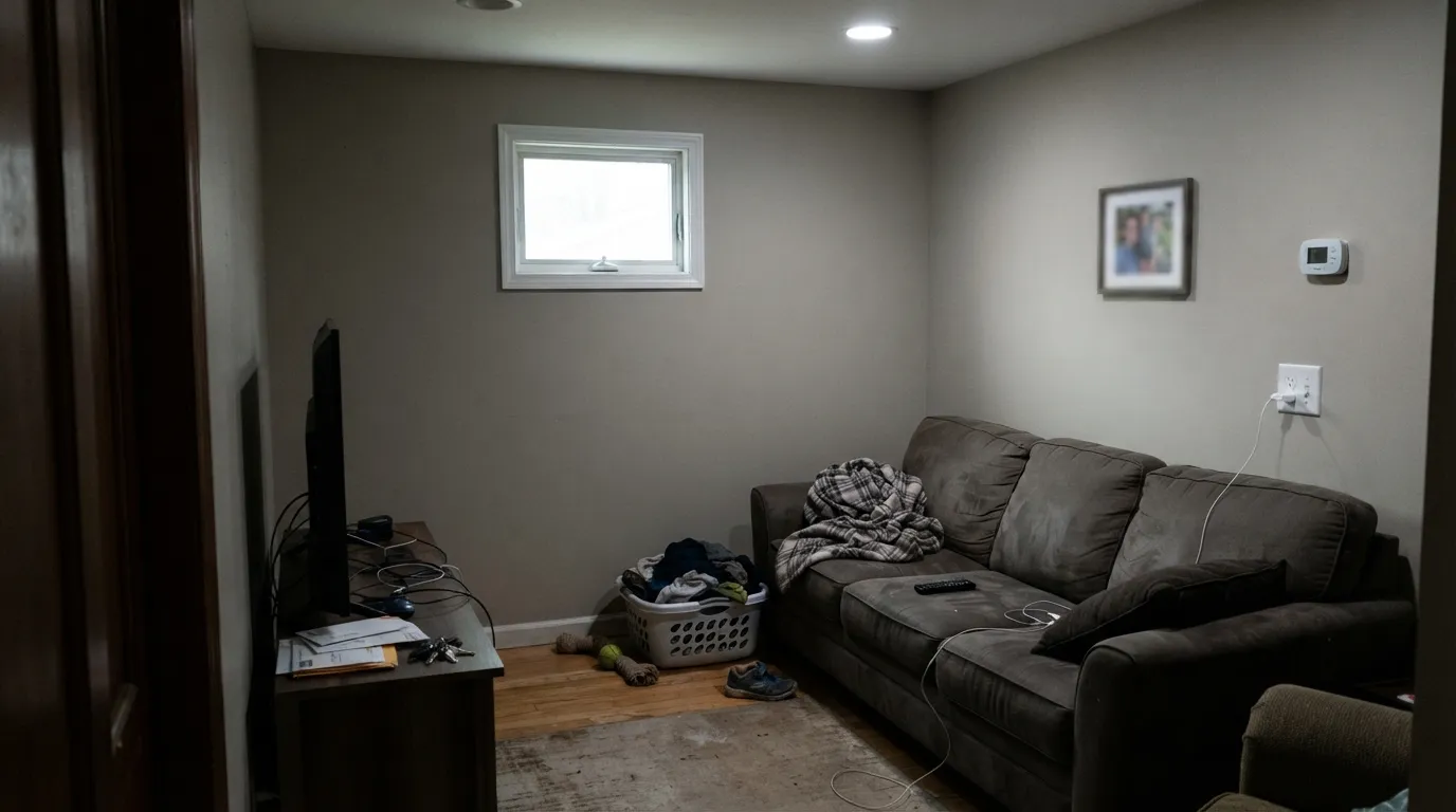
This is the number-one complaint by a wide margin, and the LRV number fools people into ignoring it. A high LRV only reflects light that already exists — with a taupe-gray base and nothing to bounce, Wind's Breath drops to a flat, slightly muddy taupe that readers call dingy. Windowless rooms are not automatically out, but they become a bulb decision, not a paint decision.
The classic pairing mistake. A soft, creamy trim white sits too close to Wind's Breath in depth and pulls in the opposite direction on undertone, so one of them loses — usually the walls, which suddenly look dirty, and sometimes faintly purple next to all that yellow-cream. Trim needs to be genuinely crisp and clean, like Chantilly Lace, or you drench the whole room in Wind's Breath and let sheen do the separating.
In a south-facing room in full sun, the taupe washes out and you get a plain off-white — a nice one, but not the color you fell for on the chip. If your goal is a neutral with visible character in a bright space, step down to Pale Oak at LRV 67 or Edgecomb Gray at LRV 63 and keep the same warm family.
Room by Room
In side daylight it is calm and finished, and it never fights whatever furniture is already there. Eggshell on the walls, crisp white trim. If the room only gets one small north window and no lamps, this is the wrong pick.
Soft in the morning, cozier under 2700K lamps at night, and warm enough that white bedding still reads as white against it. A good choice when you want the room restful rather than styled.
On cabinets it flatters oak, walnut and brass and reads more expensive than a builder white because it has body. Satin cabinet enamel. Keep it away from cream-white countertops or a cream backsplash — same depth, opposite undertone, and both look muddy.
Small baths gain from it: warmer than white, lighter than greige, kind to warm stone and wood vanities. A single cold overhead bulb is the failure mode here, exactly as in a closet — swap the bulb before you blame the paint.
These rooms have no daylight to lose, so nothing gets stripped away; you are simply choosing what the fixture shows. Under a warm 2700K to 3000K LED, Wind's Breath makes a reach-in closet feel like a finished little room instead of a leftover box, and it hides shelf scuffs and hanger marks far better than white. Drench it — walls, shelving and ceiling — and the corners stop reading as edges, which is what actually makes a small closet feel larger. Under one bare cool-white bulb it will look dingy; that is a ten-dollar fix.
Outside, full sun exposes the green side of the undertone, and it tends to argue with warm stone, brick and brown roof shingles rather than settle between them. There are far more predictable exterior off-whites. If you love it outdoors, sample large boards against the stone and the roof before you buy a single gallon.
Your Light Is the Risk
A room with real windows but no direct blast: the taupe stays visible and the warmth stays soft. Its best light by far.
With no daylight to reflect, the base takes over and the walls read flat muddy taupe. Fixable with bulbs, not with more coats.
Beige in morning sun, grayer through flat afternoon light, gently golden at sunset. A real shift — most owners enjoy it.
2700K lamps bring the cream forward and can flash a faint pink-violet. Cool 4000K LEDs strip the warmth and leave gray taupe.
Most complaints about Wind's Breath are a light mismatch. Upload a photo of your actual room and see it on your walls — then ask for the same wall in north light or evening lamps before you buy a single sample.
Need It From Another Brand?
Any paint counter can custom-tint Benjamin Moore 981 directly. If you would rather stay in one brand's own deck, these are the closest stock matches, measured as ΔE2000. Under 2 is a difference you will not see on the wall.
| Brand | Closest color | ΔE | LRV | |
|---|---|---|---|---|
| Sherwin-Williams | Oat MilkSW 9501 · Sherwin-Williams | 0.5 | 70 | Color page → |
| Behr | Silver AshGR-W11 · Behr | 1.4 | 71 | Color page → |
| Valspar | Angora WhisperM342 · Valspar | 1.1 | 71.3 | Color page → |
| PPG / Glidden | Scotch MistPPG14-07 · PPG / Glidden | 1.0 | 70 | Color page → |
| Glidden | Scotch MistPPG14-07 · Glidden | 0.5 | 71 | Color page → |
| Dutch Boy | Pearly Gray442-1DB · Dutch Boy | 3.7 | 70 | Color page → |
Similar Benjamin Moore Colors
The nearest shades to Wind's Breath within Benjamin Moore's own range, ranked by perceptual color distance — useful when you want the same look a touch lighter, darker, or warmer.
WCAG 2.1: AA is 4.5 : 1 for normal text, 3 : 1 for large text, AAA is 7 : 1.
Wind's Breath vs the Colors You're Also Considering
Every Wind's Breath sample board has the same rivals on it. The numbers show the real lightness gap — then it comes down to which risk you would rather live with.
Pick this for the lighter, more forgiving version; Pale Oak gets moody faster when the light drops.
Benjamin Moore OC-20 · LRV 67Pale OakPick this when you want the neutral to stay visible in a bright room — at LRV 67 it holds more body and reads more clearly taupe.
Pick this when the room is bright and Classic Gray would disappear entirely; Wind's Breath keeps a little more warmth on the wall.
Benjamin Moore OC-23 · LRV 74Classic GrayPick this if you want it lighter and cooler — at LRV 74 it reads much closer to a white with a gray whisper.
Pick this for the safer twin at the same LRV 70: Wind's Breath only hints at violet where Balboa Mist commits to it.
Benjamin Moore OC-27 · LRV 70Balboa MistPick this for the same lightness with a cooler, more clearly gray face — as long as you accept a genuine violet flip in cool light.
The nearest Benjamin Moore comparison is Pale Oak OC-20 (#DDD9CE, LRV 69), which is the same brightness but slightly cooler and a shade more gray-purple. Wind's Breath at #DFDBCD holds more yellow, so it reads warmer on a wall. Athena 858 shares Pale Oak's exact value. Morning Dew, sold as 1493 and OC-140 at #DDDCCD and LRV 69, is a touch greener and cooler. Sonnet AF-55 (#E3DBCD, LRV 70) is fractionally warmer and more cream.
Across brands the field is crowded and tight. Clare No Filter PNT100-LT-19 (deltaE 0.45), Sherwin-Williams Oat Milk SW 9501 (0.47), Glidden Scotch Mist PPG14-07 (0.5), and Magnolia Home Locally Sown JG-112 (0.87) are the same color for practical purposes. Saturnia 0369, carried by Kompozit, Hirshfield's, and Diamond Vogel at deltaE 0.96 and 0.97, plus Valspar Angora Whisper M342 (1.07), Farrow and Ball Clunch No. 2009 (1.62), and Behr Sandstone Cove 730C-2 (1.64) are all visually identical in normal room light. Dunn-Edwards Free Spirited DEGR09 (2.21) is very close, so sample first. Dutch Boy Pearly Gray 442-1DB (3.68) is close but visibly different side by side.
Wind's Breath Coordinating Colors
Because it sits between families, Wind's Breath coordinates in two directions: crisp whites above it and warm, grayed colors below it. What it cannot handle is a partner at nearly the same lightness with an opposite undertone — that is where cream trim and beige carpet get it into trouble. Aim for a clear step lighter or a clear step darker, and these are the partners that keep working:
Why Wind's Breath Works in Closets and Other Windowless Rooms
It sounds backwards to recommend a light-dependent color for a room with no windows, so here is the logic. The failure mode everyone reports — dingy walls in a dark room — happens when daylight is expected and does not arrive: you compare the wall to the bright window side of the room, and the dark side looks muddy by contrast. A closet, an interior dressing room or a windowless laundry has no bright side to compare against. There is one light source, you choose it, and the wall simply looks like whatever that bulb shows.
That turns the bulb into the real decision. A warm 2700K to 3000K LED brings out the cream in Wind's Breath and the closet reads soft and finished. A bare 4000K cool-white bulb — the default in most closet fixtures — pulls the warmth out and leaves the flat taupe people complain about. Before you buy paint for a windowless room, buy the bulb; it costs less than a sample pot and it decides more.
The reason to use it instead of white in these rooms is wear. Closets and laundry rooms take constant contact: hangers, baskets, shoulders of coats, the corner of the dryer. At LRV 70 with a taupe base, Wind's Breath absorbs those marks visually in a way a bright white cannot, and touch-ups blend instead of showing as patches. Drench the walls, shelving and ceiling in it and the small room loses its outlines, which is the trick that actually makes a closet feel larger — not lightness alone.
Wind's Breath With Wood Tones, Floors and Stone
Yellow-leaning woods are its natural company: white oak, honey oak, maple, butcher block, rattan. The color's own warmth meets theirs without amplifying the orange, which is why it survives in houses full of builder oak that a cooler greige would sour. Walnut and espresso work too — the contrast is high enough that undertones stop mattering.
The woods to test first are pink and orange-red stains: red oak with a cherry-toned finish, older mahogany-stained trim, some cedar. Against those, the faint violet in Wind's Breath comes forward and the pairing can read slightly dusty. Floors are easier — warm wood, natural sisal and cream carpet all sit fine; a true cool-gray LVP is the one that makes the wall look yellow-green by comparison.
Stone is where the caution belongs, and it is the same caution as the exterior verdict. Warm brick, tan fieldstone and brown roof shingles push Wind's Breath toward its green side, and instead of blending it starts to look like a color that missed. Cool marble and quartz are safer indoors, as long as they are clearly lighter or clearly darker than the wall — matching depths are what create the muddy look.
Three Ready Palettes Built on Wind's Breath
A color is never alone on the wall. These are complete combinations in the 60-30-10 pattern, with the reason each one holds together. Every one opens in the visualizer.
The trim white is the whole decision here. Chantilly Lace is clean and crisp rather than creamy, so it reads as white and lets the walls read as color — the pairing that keeps Wind's Breath from looking dirty. Hale Navy supplies the one dark note a soft scheme needs.
Try this palette in your roomDrenching is what makes a small closet feel bigger: one color on walls, shelving and ceiling erases the contrast lines your eye reads as edges. Satin on the shelving wipes clean where clothes rub. The near-black door turns the closet into a deliberate little room from the hallway side — and warm 2700K to 3000K bulbs are part of this scheme, not an afterthought.
Try this palette in your roomCabinets a shade softer than the walls is the quiet upgrade over an all-white kitchen — the room still reads light, but the boxes stop looking like appliances. Muted green sits opposite the faint pink in Wind's Breath, so a Backwoods island reads calm rather than contrasty, and both love brass and butcher block.
Try this palette in your roomWind's Breath FAQ
Is Wind's Breath warm or cool?
Warm, but only just. It is a warm gray-taupe with the yellow taken out, which is why it can pass for a soft white in bright rooms and for a warm greige in medium light. It never reads icy, and it never reads buttery — that middle position is the reason people pick it.
What trim white goes with Wind's Breath?
A crisp, clean white — Chantilly Lace is the safe default. Avoid creamy off-whites: they sit too close in depth and too far away in undertone, and the result is walls that look dirty and trim that looks yellow. The other good answer is no contrast at all: paint the trim in Wind's Breath too and let semi-gloss separate it from eggshell walls.
Is Wind's Breath a good closet color?
Yes, and it is one of the better ones. A closet has no daylight to lose, so the color's main weakness never comes up; you just need a warm 2700K to 3000K bulb or LED strip instead of a bare cool-white one. Painted on walls, shelving and ceiling at once, it makes the space read as a finished room rather than a box, and at LRV 70 it hides hanger scuffs and handprints that a bright white would show.
Does Wind's Breath look green?
Occasionally, and it is worth testing for. In daylight there is a faint green-gray tell, and it becomes obvious mostly in one situation: next to a cream or pink-beige surface of a similar depth, like a cream backsplash or a beige carpet. Against warm wood, white trim or stone it stays neutral. Outdoors is where the green shows most.
Can I use it on kitchen cabinets?
Yes — it is one of its best uses. It gives cabinets warmth and body without the yellow of a cream, and it flatters oak, walnut and brass. Use a satin urethane-fortified cabinet enamel, and check your counters first: warm stone and butcher block are great, cream-toned quartz at a similar lightness is the one combination that reads muddy.
Wind's Breath or Pale Oak?
Light decides it. In a bright room Wind's Breath thins out toward off-white while Pale Oak at LRV 67 still reads as a color, so bright rooms favor Pale Oak. In an average or slightly dim room the order flips: Wind's Breath keeps its warmth where Pale Oak gets moody. They are close enough that anyone cross-shopping the two should sample both on the same wall.
Have you painted with Wind's Breath?
Rate it — one tap helps the next reader decide.
Ask a Question