Backwoods
Benjamin Moore's blackened forest green, reviewed honestly: the light where the olive warmth shows, the light where it drops toward flat black, and what to pick instead.

Jessica has spec'd whites and neutrals for more than 300 rooms and keeps a sample wall of painted drawdowns in her studio. Every color review is checked against real reader rooms in the comments and re-tested when a formula changes. About the testing process →
- 1Black Emerald1
- 2Essex Green6
- 3Backwoods11
- 4Sage Green22
- 5Evergreen Fog30
The Fast Verdict
Backwoods is a forest green pushed almost to black, then handed a warm olive-moss undertone so it never turns cold. At LRV 11 it sits well above true near-black greens like Essex Green or Hunter Green, and that gap is the whole story: give it real daylight and it reads as a clear, warm forest green, not a shadow. Take the daylight away and it drops fast toward flat black — this is a color that needs light to do its one job.
Kitchen cabinets and islands with wood, brass or copper · exterior siding and board-and-batten in wooded or rural settings · a front door on a light-colored house · a home office or den that gets real daylight
Your room has weak or no natural light · you want an obviously bright, saturated green · you're not ready for it to look near-black at night · your kitchen runs cool stainless with no warm metal anywhere else
- Warm olive-moss undertone that never drifts cold or blue
- Genuinely reads as green in real daylight, not just near-black
- A proven, popular pairing with a warm white trim for exterior board-and-batten
- One of the most-used deep greens for kitchen cabinets and islands
- LRV 11 gives it more daylight forgiveness than true near-black greens like Essex or Hunter
- Drops toward flat black fast in dim or north-facing rooms
- Cool LEDs flatten the warmth out at night
- A whole room with no light relief can feel like a cave
- Still too dark for a typical whole-house interior wall color
What Color Is Backwoods, Really?
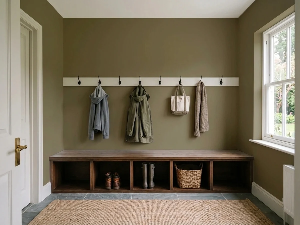
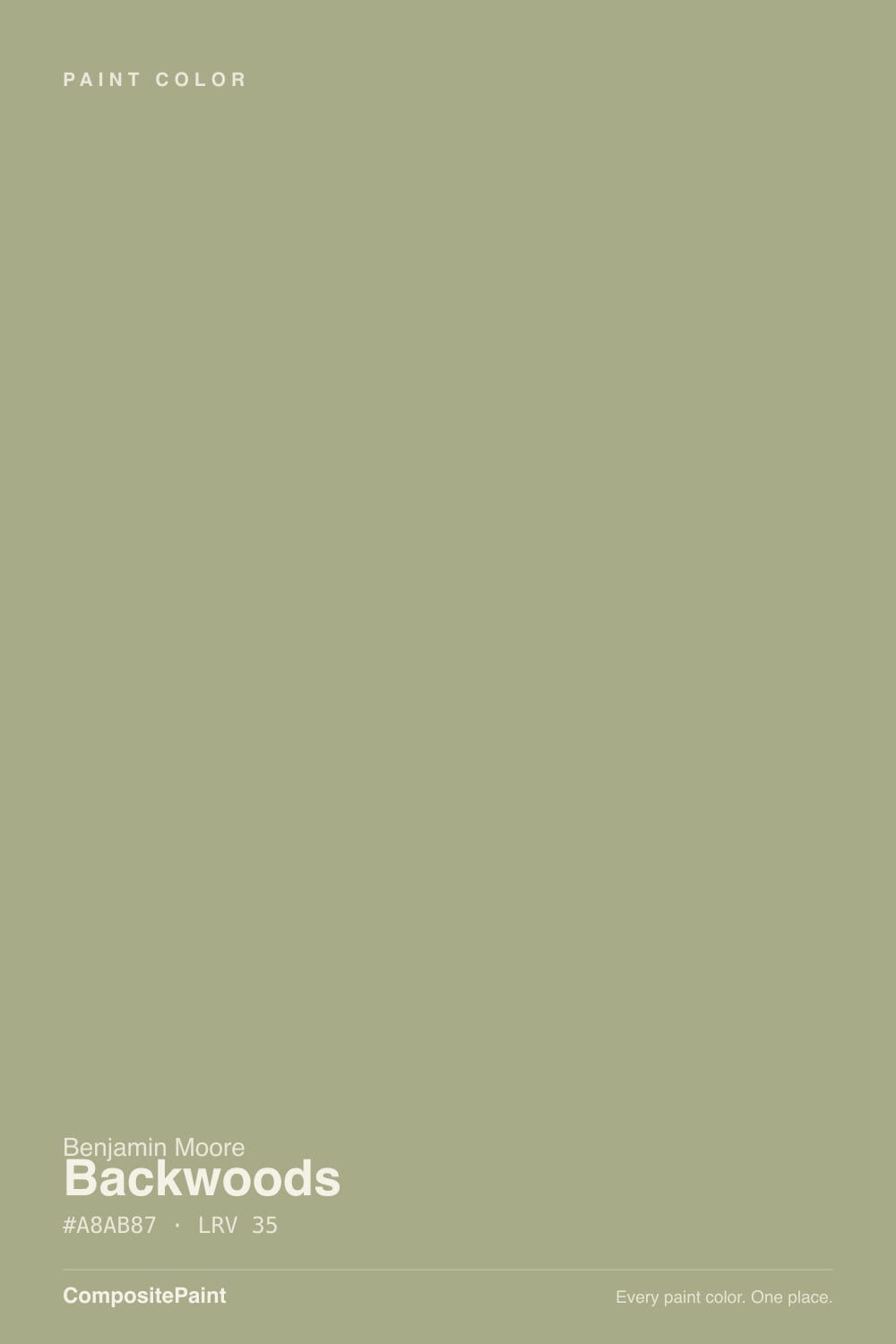
Backwoods is Benjamin Moore's blackened take on forest green, filed in the brand's Designer Classics Collection — the 231-color library of shades the industry keeps coming back to decade after decade. The base is a dark, grayed-down green, but it carries a real dose of warm olive and moss underneath, plus a whisper of golden-brown, so it never slides into the cold blue-black some "forest greens" turn into. That warmth is the entire personality: it reads earthy and welcoming even at its darkest, not moody in the cold, wintery sense.
At LRV 11 it is genuinely dark, but it is not in the same near-black bracket as some of BM's other deep greens. Essex Green sits at LRV 4 and reads almost black indoors; Hunter Green is LRV 5 and needs strong light just to look green rather than navy-black. Backwoods, at roughly double their reflectance, holds its identity as a visible, warm-toned green in ordinary daylight — the color most people picture when they hear "cabin green" or "forest green," rather than the near-black door colors that borrow the same family name.
Undertone in one line: warm olive-moss with a golden-brown lean — never blue, never a cold charcoal-green. If your sample looks flat black, that is weak light, not the paint; if it looks faintly brown in the evening, that is the warm undertone coming forward under lamp light, and it is exactly what the color is supposed to do.
Where It Shines
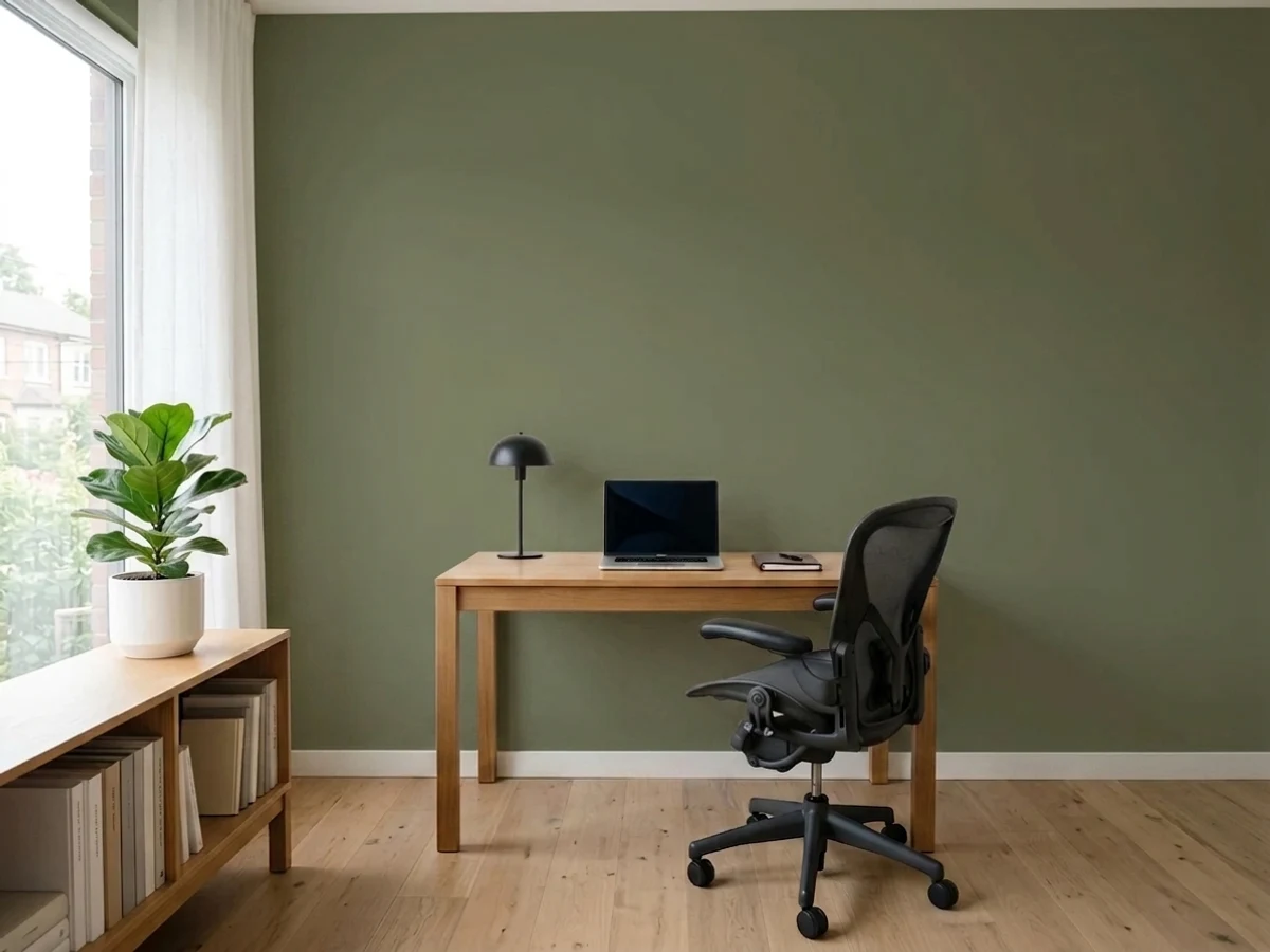
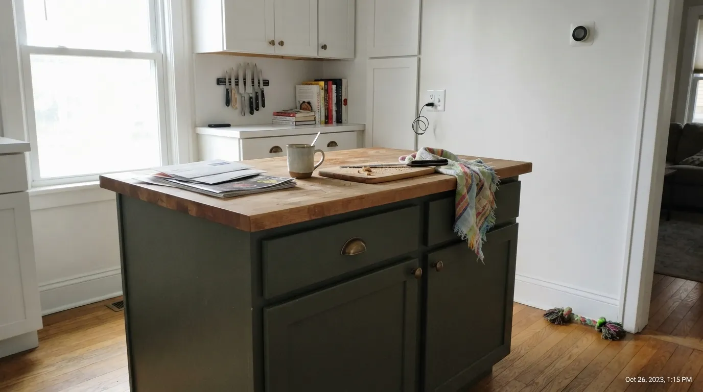
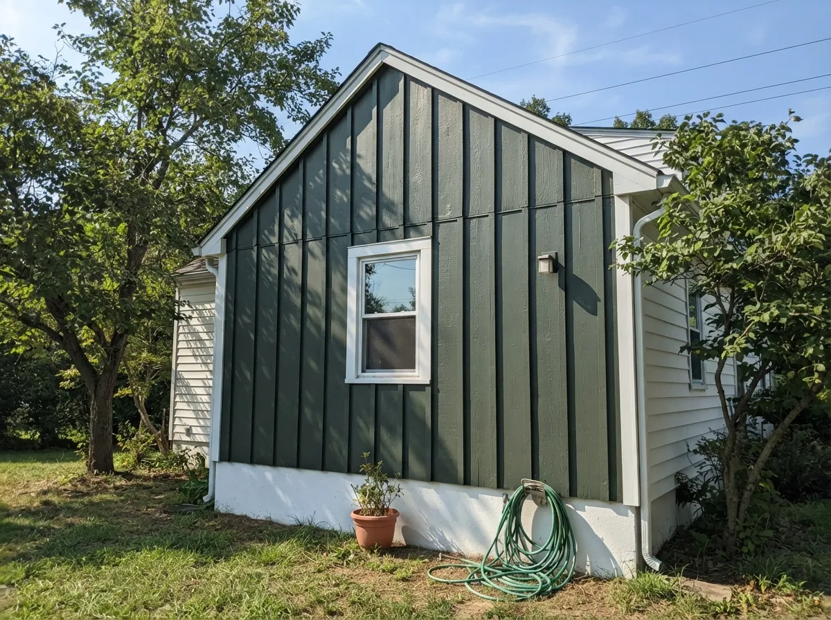
Give it real daylight and natural materials and Backwoods earns its reputation. Kitchens are where it is used most and loved most: on an island or a full run of lower cabinets, against butcher block, brass or copper hardware and stone counters, it reads rich and finished rather than heavy. Outdoors it is one of the more popular deep-green siding and board-and-batten colors, especially paired with white trim — the combination shows up again and again in wooded, rural and mountain-house settings because the warm olive base sits comfortably next to real trees and stone, instead of fighting them the way a colder green would.
Where It Fails
Almost every disappointed story about Backwoods comes down to one of three predictable situations. None of them are the paint failing — they are the color being asked to do a job it was never built for.
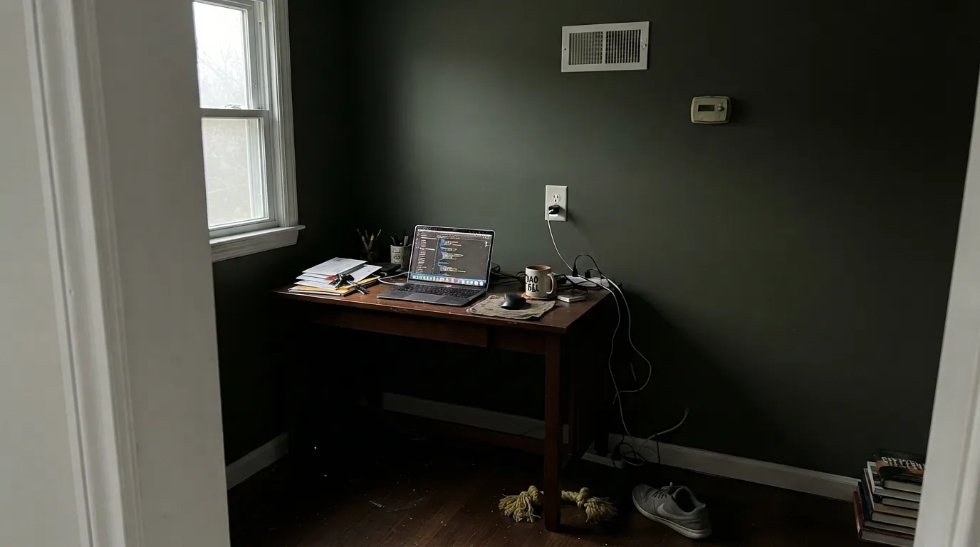
Take away strong natural light and the olive warmth drops out fast — at LRV 11, Backwoods is dark enough that a north-facing room or an interior hallway will read close to flat black. It is not a fix-it-with-more-coats problem; it is a light problem. If the room does not get real daylight, pick something with a higher LRV, or plan on Backwoods reading as a near-black accent rather than a visible green.
Warm 2700K bulbs pull the moss and golden-brown forward at night; cool white LEDs do the opposite and flatten the color toward charcoal-black. Readers who love it under lamplight and then install daylight-toned overheads are describing two different colors without realizing it. Swap the bulbs before you second-guess the paint.
Painted on every wall of a small, enclosed room with no white trim, ceiling break, or window light to bounce off, Backwoods can feel like a cave rather than a cozy den. The color wants a light partner — white trim, a light ceiling, or at least one wall of real daylight — to keep reading as green and not as a box.
Room by Room
On an island or a full lower-cabinet run it is one of the most-recommended deep greens in the BM deck for exactly this job. Butcher block, brass, copper and stone all sit well against it. Satin cabinet enamel; keep the walls or uppers lighter so the kitchen doesn't lose its daylight.
A popular main-siding and accent color in wooded, rural and mountain settings, most often run with a warm white trim for the classic board-and-batten look. Full sun reads it as a clear, deep forest green rather than the near-black some sheltered north walls will show.
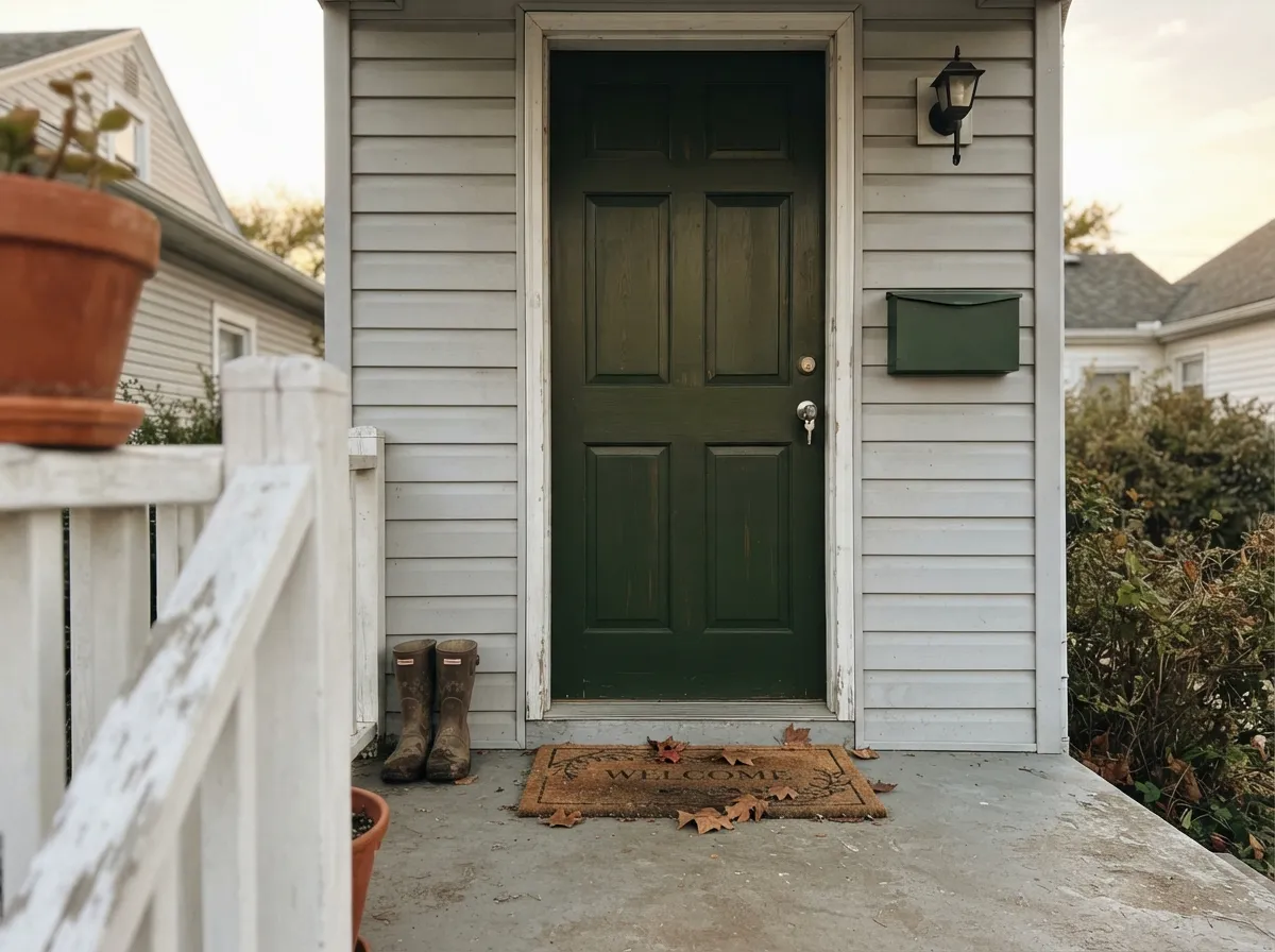
Semi-gloss Backwoods on a door against white, cream or light-gray siding gives a house a grounded, natural front-door color without the starkness of true black. It photographs better in daylight than at dusk, which is worth knowing before committing.
In a room that gets genuine daylight for at least part of the day, Backwoods makes a warm, enveloping backdrop for wood shelving and leather. In a windowless or north-only room it will read closer to black than green most of the day — check the room's actual light before committing to four walls.
Handsome as a full-wall color in a bright, south- or west-facing living room with warm wood furniture. In an open floor plan with mixed light it is safer as one wall or a built-in than the whole room, since the color will read differently depending on which corner you're standing in.
A small, windowless powder room is exactly the low-stakes place to try a color this dark: drench all four walls, add a warm brass fixture and a mirror, and the near-black green reads intentional and jewel-box rather than gloomy, because nobody expects a powder room to be bright.
Your Light Is the Risk
Full sun or a bright south/west room pulls the olive and moss forward — this is the light that makes it read as a clear forest green, not black.
Weak daylight drops it toward flat black fast; the warm undertone needs real light to show up at all.
Warmer and more olive at the sun hours, quieter and closer to black-green the rest of the day. Expect real movement.
2700K lamps keep the moss and brown warmth visible after dark; cool white LEDs flatten it toward charcoal. Bulb choice matters more than usual with this color.
Most complaints about Backwoods are a light mismatch. Upload a photo of your actual room and see it on your walls — then ask for the same wall in north light or evening lamps before you buy a single sample.
Need It From Another Brand?
Any paint counter can custom-tint Benjamin Moore 469 directly. If you would rather stay in one brand's own deck, these are the closest stock matches, measured as ΔE2000. Under 2 is a difference you will not see on the wall.
| Brand | Closest color | ΔE | LRV | |
|---|---|---|---|---|
| Sherwin-Williams | Pewter GreenSW 6208 · Sherwin-Williams | 4.9 | 12 | Color page → |
| Behr | Lakeside PinePPU11-19 · Behr | 1.7 | 12 | Color page → |
| PPG / Glidden | Fresh BasilPPG1127-7 · PPG / Glidden | 3.5 | 11 | Color page → |
| Glidden | Fresh BasilPPG1127-7 · Glidden | 3.5 | 11 | Color page → |
| HGTV Home by Sherwin-Williams | Woodland LichenHGSW 3282 · HGTV Home by Sherwin-Williams | 4.9 | 12 | Color page → |
| Dunn-Edwards | Black ForestDEA175 · Dunn-Edwards | 2.6 | 11 | Color page → |
Similar Benjamin Moore Colors
The nearest shades to Backwoods within Benjamin Moore's own range, ranked by perceptual color distance — useful when you want the same look a touch lighter, darker, or warmer.
WCAG 2.1: AA is 4.5 : 1 for normal text, 3 : 1 for large text, AAA is 7 : 1.
Backwoods vs the Colors You're Also Considering
Every Backwoods sample board has the same rivals on it. The numbers show the real lightness gap — then it comes down to which risk you would rather live with.
Pick this when you actually want the green to stay visible, not just implied.
Benjamin Moore PM-11 · LRV 4Essex GreenPick this if you want it to read almost black — Essex Green sits at LRV 4 and barely shows green indoors.
Pick this for the earthier, warmer, less-saturated version of the same dark-green idea.
Benjamin Moore 2041-10 · LRV 5Hunter GreenPick this for a brighter, more saturated classic green — glossy doors and islands where you want the color obvious from across the room.
Sherwin-Williams Majolica Green SW 13 at #AEB08F and LRV 42 is the nearest cross-brand neighbor, with a deltaE of 1.86. That is visually identical in normal room light, though its higher LRV means it gives back a little more light on a large wall. Behr Mountain Sage PMD-36 at LRV 38 and deltaE 2.42 is very close and worth sampling first, since it is a shade cooler.
Clare Extra Virgin at LRV 35 matches Backwoods exactly on lightness with a deltaE of 2.81, so the difference there is hue rather than depth. Valspar Green Garlands 5007-3C at LRV 40.3 and deltaE 3.11 falls in the same band, close but not interchangeable.
Farther out, Dunn-Edwards Stuffed Olive DE5529 at LRV 37 and deltaE 3.54 and Farrow and Ball Stone White No. 11 at LRV 41 and deltaE 4.06 are close but visibly different side by side, with Stone White reading noticeably lighter and softer.
Backwoods Coordinating Colors
The rule for coordinating with Backwoods is to stay warm and let it be the dark note in the room, not fight it for attention. It pairs cleanly with warm whites, warm wood, and brass or copper — and it looks flattest next to a stark, cool white or anything blue-based. These are the partners that keep showing up in rooms that work:
Backwoods on Exteriors
Outside is where Backwoods earns most of its fans. It's a regularly recommended siding and board-and-batten color for wooded, rural and mountain-house settings, most often run with a warm white trim — the light trim keeps the house from reading as a dark block from the street, while the green settles naturally against real trees and stone.
Full sun brings out the clear forest-green identity; a shaded north elevation will read noticeably darker and closer to black than the sunny side, so walk the house with a large sample before committing the whole exterior. Black or charcoal accents — a metal roof, gutters, window frames — sit comfortably with it since they're already close in depth; avoid a cool blue-gray accent, which will make the green's warmth look slightly off by comparison.
Backwoods With Wood Tones and Metals
This is a genuinely easy pairing decision. Butcher block, walnut, white oak and reclaimed wood all sit comfortably against Backwoods because the paint's own undertone is warm — there is no cool-versus-warm fight to manage the way there is with a blue-leaning dark green.
Metal is just as forgiving: brass, copper and aged bronze all look intentional against it, and even black hardware reads fine since the paint is already near that depth. The one combination worth sampling first is cool stainless steel with no warm metal anywhere else in the room — on its own, stainless can push the green to look slightly flat and gray instead of rich.
Three Ready Palettes Built on Backwoods
A color is never alone on the wall. These are complete combinations in the 60-30-10 pattern, with the reason each one holds together. Every one opens in the visualizer.
White Dove keeps the kitchen bright enough to let the island carry the color; Wrought Iron on the range hood or pendant fixtures ties in a near-black note without adding a second wall color.
Try this palette in your roomThe proven pairing: White Dove siding keeps the house reading light from the street, Backwoods carries the wooded-setting warmth on an accent gable or shutters, and Kendall Charcoal grounds the roofline without going full black.
Try this palette in your roomTwo dark greens at nearly the same depth layer instead of clash, so the built-ins read as a shadow of the wall color rather than a second decision. Swiss Coffee trim and ceiling keep enough light in the room for the olive warmth to stay visible.
Try this palette in your roomBackwoods FAQ
Is Backwoods a warm or cool green?
Warm. It carries a real olive-moss and golden-brown undertone under the black base, which is why it never drifts blue or icy the way some "forest greens" do. In weak light it reads more black than green, but it never reads cold.
Is Backwoods too dark for a whole room?
For most rooms, yes, unless the room gets strong daylight — at LRV 11 it needs real light to keep reading as green rather than near-black. It works best as a bounded commitment: cabinets, an island, an exterior accent, a small powder room, or a bright room with a light trim partner, rather than a dim whole-house wall color.
What's the difference between Backwoods, Essex Green and Hunter Green?
All three are Benjamin Moore deep greens, but they sit at different depths and temperatures. Essex Green (LRV 4) is nearly black and leans cool. Hunter Green (LRV 5) is brighter and more saturated, a classic glossy-door green. Backwoods (LRV 11) is the warmest and most forgiving of the three — it holds its green identity in ordinary daylight where the other two need real sun.
Does Backwoods work on kitchen cabinets?
Yes — it's one of the most recommended deep greens for cabinets and islands in the BM deck. It flatters butcher block, brass, copper and stone counters. Use a satin, urethane-fortified cabinet enamel, and keep the walls or uppers lighter so the kitchen doesn't lose its daylight.
Is Backwoods good for an exterior?
Yes, and it's one of its most popular uses. It's frequently paired with a warm white trim for board-and-batten siding, especially on houses in wooded, rural or mountain settings where the warm olive base sits naturally against real trees and stone. Full sun keeps it reading as a clear forest green rather than near-black.
What trim color goes with Backwoods?
A warm white is the standard pairing, both indoors and out — it keeps the dark green from feeling heavy. Avoid a stark, cool white trim, which will make the green look muddier by contrast than it actually is.
Have you painted with Backwoods?
Rate it — one tap helps the next reader decide.
Ask a Question