Oakmoss
The deep moss green Sherwin-Williams never hyped, reviewed honestly: the light it needs to read green instead of black, and where it earns its keep.

Jessica has spec'd whites and neutrals for more than 300 rooms and keeps a sample wall of painted drawdowns in her studio. Every color review is checked against real reader rooms in the comments and re-tested when a formula changes. About the testing process →
- 1Black Emerald1
- 2Essex Green6
- 3Oakmoss13
- 4Sage Green22
- 5Evergreen Fog30
The Fast Verdict
Oakmoss is a deep, yellow-gray green built to look like forest floor, not a garden. In real daylight it holds a genuine mossy green with real warmth underneath; anywhere the light drops, it slides toward a flat charcoal-brown and the green all but disappears. It never had a Color of the Year moment and nobody is writing trend pieces about it — it is a quiet, capable dark green that designers reach for on cabinets and exteriors precisely because it does not ask for attention.
Kitchen or bath cabinets · a den or accent wall with real daylight · exterior siding with white trim · anyone who wants an actual moss green instead of a pale gray-green sage
You want a bright, obviously green color · the room has one small window or none · you're painting all four walls of a small, dim space · you're set on cool white or cool gray neighbors
- A genuine moss green, not a washed-out sage
- Reads rich and grounding in real daylight
- One of the better dark greens for cabinets and vanities
- Confident, current exterior color with white or cream trim
- Low reflectance hides screen glare and scuffs on cabinetry
- Reads near-black in a small or windowless room
- Cool LEDs at night flatten the green into muddy brown-gray
- Too dark and too muted for a bright, obvious "green accent wall" look
- Four walls in a dim room is a common, avoidable regret
What Color Is Oakmoss, Really?
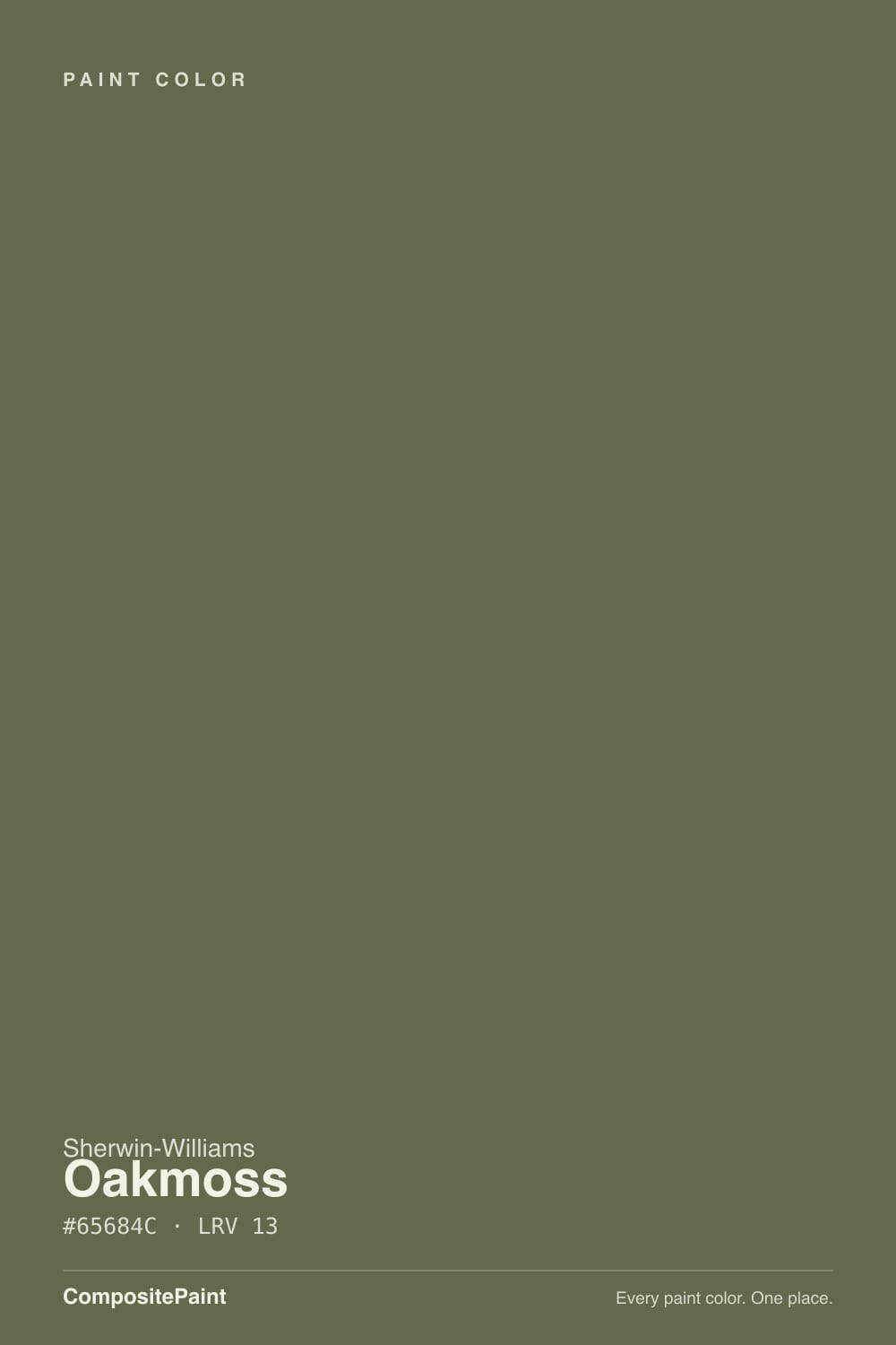
A deep, complex green with a yellow-gray undertone — the kind of green that reads as "earthy" before it reads as "green." Sherwin-Williams' own RGB breakdown (101, 104, 76) tells the story: the red and green channels sit close together and the blue channel drops out entirely, which is what gives Oakmoss its mossy, faintly brown-green cast instead of a clean, saturated color-wheel green. It has never been a Color of the Year and it does not show up in trend round-ups — it has just quietly sat in the SW deck as the deep green painters and cabinet shops reach for when a client wants "moody green," not "mint."
At LRV 13 it is genuinely dark — medium-dark on the reflectance scale, meaning it absorbs most of the light that hits it rather than bouncing it back. That is the whole personality of the color: give it a bright room and full daylight, and the green comes forward, rich and grounding. Take away the light — an overcast day, a north exposure, a lamp instead of a window — and Oakmoss stops behaving like a green and starts behaving like a dark neutral, sliding toward brown-charcoal. This is not a flaw unique to Oakmoss; it is what every LRV-13 color does. Buyers who pick it off a bright screen or a glossy chip are the ones who get surprised.
Undertone in one line: yellow-gray green, never blue-green, never true black. If your sample looks nearly black indoors, that is a light problem, not an undertone problem — move the sample to a window before you decide it's wrong.
Where It Shines
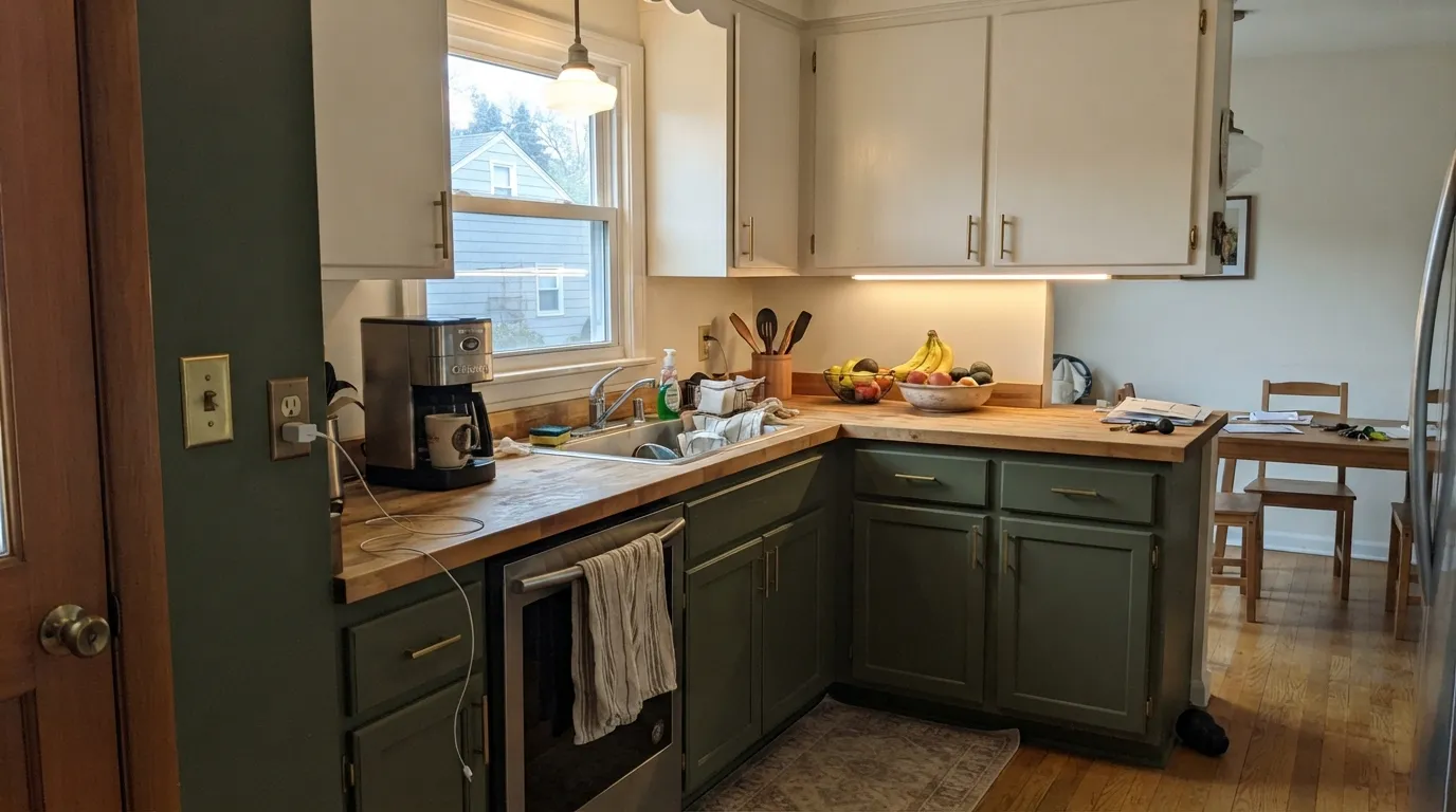
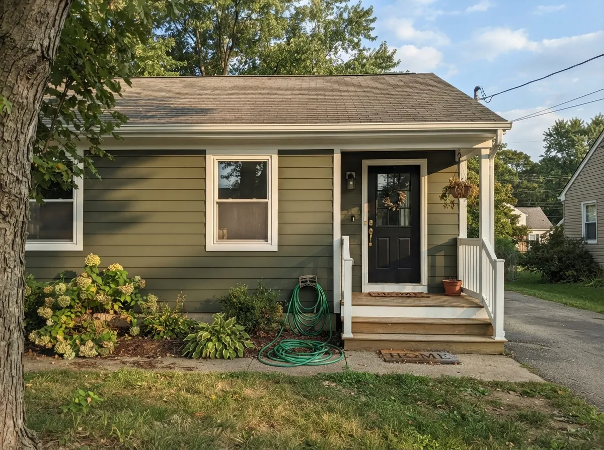
Give it real daylight and it looks expensive and deliberate rather than dark for dark's sake. Its best job is cabinetry — kitchen islands, bathroom vanities, built-ins — where a small, well-lit surface shows the green without asking a whole room to carry the depth. Its second home is the exterior: painted siding, a front door, or shutters against white trim reads as a confident, grounded moss-green house rather than a black one, and full outdoor daylight is exactly the light this color wants.
Where It Fails
Almost every disappointed review of a deep green like this comes from one of three scripts, and all three are predictable before the first coat goes on. None of them are the paint's fault — but if your room matches one, sampling bigger will only confirm the problem, not fix it.
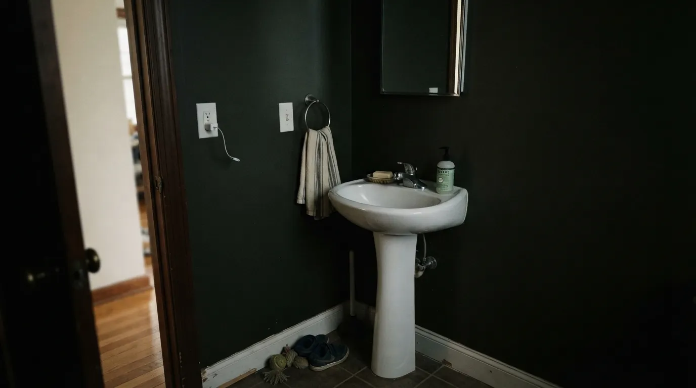
This is the single biggest regret with any LRV-13 color: a windowless powder room, an interior hallway, or a small bedroom that only gets afternoon light reads as near-black most of the day, not green. The color did not go dark — it was always this dark; the room just never gave it enough light to prove it. Save Oakmoss for a room with a real window, or use it on cabinets instead of walls.
Under warm 2700K light the yellow undertone stays visible and the color reads earthy and green. Under cool white LEDs or fluorescent light, the yellow gets cancelled and Oakmoss flattens into a muddy brown-gray with the green mostly gone. If the room runs on overhead cool lighting after dark, budget for warm bulbs as part of the paint job.
The chip and the product photos can look more saturated than the paint on a real wall — depth mutes color the same way it mutes light. If the goal was a clean, garden-green accent wall, Oakmoss will read too gray and too dark; that disappointment is a mismatched expectation, not a bad batch.
Room by Room
Perimeter or island cabinets in Oakmoss under a light wall color is the color's strongest, most reliable use — the depth reads intentional on a defined surface instead of swallowing a whole room. Satin or a cabinet-grade enamel; pair with brass or unlacquered hardware for the full earthy effect.
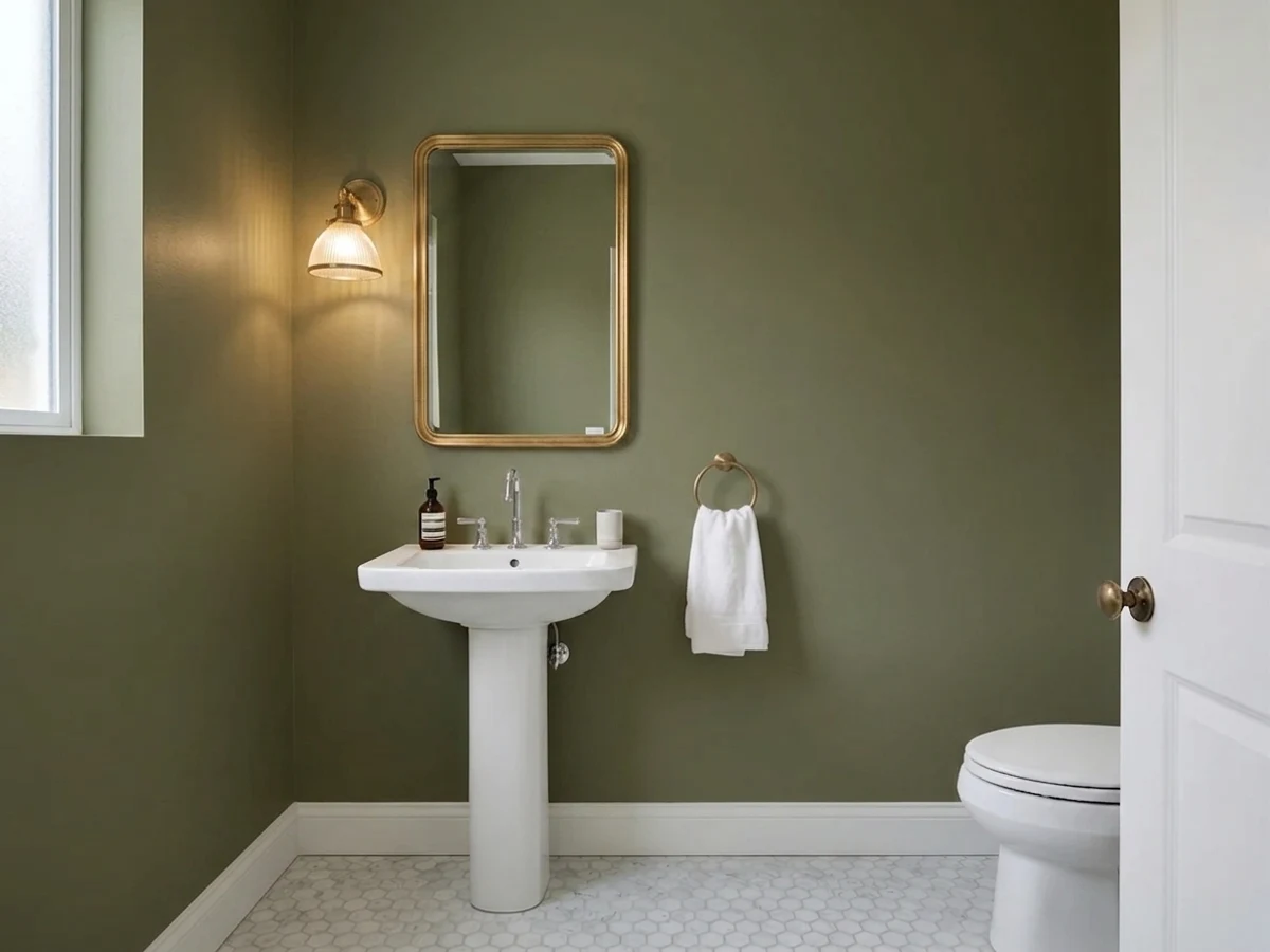
A vanity or a small powder room with a real window can go moody and rich in a way that reads custom. Skip it in a windowless interior bath — that's the room where it reads flat black, not green.
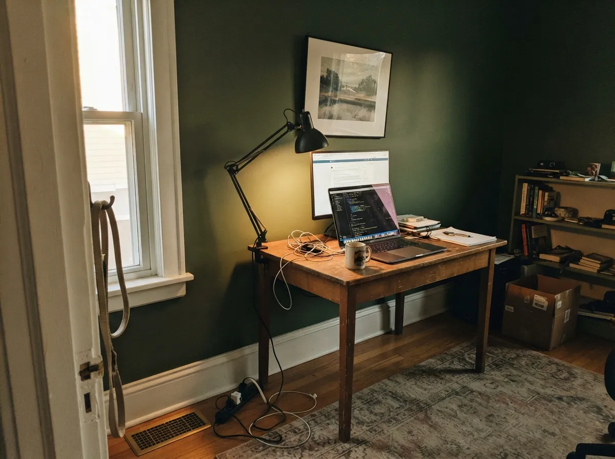
In a room with generous south or west light it grounds the space beautifully against leather, walnut, and brass lamp light. In a north-facing or small den, treat it as an accent wall, not all four.
A single headboard wall in Oakmoss under warm lamps is calm and cocooning. Four walls of it in a bedroom that gets little daylight is the fastest way to end up with the near-black look nobody wanted.
Deep green behind a desk reads focused and expensive on video calls, and the color's low reflectance means screen glare barely bounces off the wall. Give the desk its own task lamp so the color doesn't go muddy after sunset.
Full outdoor daylight is this color's best light. On siding with white trim it reads as a confident, current moss-green house; on shutters and a front door against a lighter body color, it works as a grounded accent. Full pairing notes are in the exterior section below.
Your Light Is the Risk
South or west sun pulls the green forward and keeps the color rich instead of muddy. This is the light Oakmoss needs to look like moss and not like a shadow.
With little daylight the green drops out almost entirely and the wall reads flat near-black. Fine on a small cabinet surface; disappointing across four walls.
Cloud cover and north light both mute the yellow undertone, pushing Oakmoss toward a cooler, flatter charcoal-green through the day.
2700K lamps keep the yellow-green alive after dark. Cool white LEDs cancel it — swap the bulbs before you blame the paint.
Most complaints about Oakmoss are a light mismatch. Upload a photo of your actual room and see it on your walls — then ask for the same wall in north light or evening lamps before you buy a single sample.
Need It From Another Brand?
Any paint counter can custom-tint Sherwin-Williams SW 6180 directly. If you would rather stay in one brand's own deck, these are the closest stock matches, measured as ΔE2000. Under 2 is a difference you will not see on the wall.
| Brand | Closest color | ΔE | LRV | |
|---|---|---|---|---|
| Behr | Coconut Husk730D-6 · Behr | 1.3 | 13 | Color page → |
| Benjamin Moore | Turtle Green2142-20 · Benjamin Moore | 4.1 | 13 | Color page → |
| Valspar | Fresh CilantroV059-6 · Valspar | 2.8 | 13.3 | Color page → |
| PPG / Glidden | Winning TicketPPG1127-6 · PPG / Glidden | 3.3 | 13 | Color page → |
| Glidden | Winning TicketPPG1127-6 · Glidden | 3.3 | 13 | Color page → |
| Dutch Boy | Fresh Moss324-6DB · Dutch Boy | 1.8 | 13 | Color page → |
Similar Sherwin-Williams Colors
The nearest shades to Oakmoss within Sherwin-Williams's own range, ranked by perceptual color distance — useful when you want the same look a touch lighter, darker, or warmer.
WCAG 2.1: AA is 4.5 : 1 for normal text, 3 : 1 for large text, AAA is 7 : 1.
Oakmoss vs the Colors You're Also Considering
Every Oakmoss sample board has the same rivals on it. The numbers show the real lightness gap — then it comes down to which risk you would rather live with.
Pick this for real depth — Evergreen Fog is a lovely color, but on the wall it reads as pale sage next to Oakmoss's actual moss green.
Sherwin-Williams SW 9130 · LRV 30Evergreen FogPick this if you want the same earthy mood two full steps lighter — it handles a whole room and cool light far more forgivingly.
Pick this when you want a green you can actually name from across the room, not a hint of one.
Sherwin-Williams SW 6178 · LRV 41Clary SagePick this for a soft, easy sage that survives most rooms and most light without a second thought.
Pick this for the warmer, more olive read — Dried Thyme leans cooler and flatter next to it.
Sherwin-Williams SW 6186 · LRV 21Dried ThymePick this for a slightly grayer, less yellow cousin at nearly the same cabinet-grade depth.
Pick this if your painter or cabinet shop works in Sherwin-Williams — the closest brand-matched equivalent.
Benjamin Moore 2140-30 · LRV 14Dark OlivePick this if you're already committed to Benjamin Moore — it's nearly the same depth, the same real-light dependence, and the same olive mood.
Within the Sherwin-Williams deck, Rosemary (SW 6187) at LRV 14 sits at nearly the same depth but reads cooler and grayer, with less of the yellow that makes Oakmoss olive. Basil (SW 6194) at LRV 15 is lighter and clearly cooler green. Greenfield (SW 6439) at LRV 15 is a more saturated, truer green, while Cast Iron (SW 6202) at LRV 12 and Eclipse (SW 6166) at LRV 14 drop most of the green and behave like near-blacks. Across brands, HGTV Home by Sherwin-Williams Germinating Green (HGSW 3242) is an exact match at a deltaE of 0. Behr Coconut Husk (730D-6) at 1.33, Farrow and Ball Bancha (No. 298) at 1.73, and Dutch Boy Fresh Moss (324-6DB) at 1.82 are all visually identical in normal room light. Valspar Fresh Cilantro (V059-6) at 2.83 is very close, so sample first. Benjamin Moore Turtle Green (2142-20) at 4.09 is close but visibly different side by side.
Oakmoss Coordinating Colors
The rule for coordinating with Oakmoss is simple: give it a bright warm white to bounce light off of, and keep true black or cool gray in small doses only — both fight its low reflectance instead of lifting it. It pairs naturally with warm neutrals, brass and unlacquered metals, and its own lighter or darker green cousins for tonal layering. These are the partners that keep showing up in rooms that work:
Oakmoss on Exteriors
Outside is where Oakmoss does its best, most confident work. Full sun brings the yellow-gray undertone forward and keeps a whole facade from reading as a black house — which is the real risk with any LRV-13 color at this scale. It has been showing up more on siding as buyers move away from stark white and true black exteriors toward earthy, grounded tones that photograph well against greenery.
The pairing matters more here than almost anywhere else. White or warm cream trim — Westhighland White, Alabaster — gives the eye a bright reference point and keeps the green legible from the street; skip cool blue-white trim, which fights the yellow undertone and can make the siding look muddier by comparison. A near-black door or shutters read as a deliberate, cohesive dark palette rather than a clash, since the depths are close enough to feel chosen. Walk the house before committing: the shaded north or east elevation will read noticeably darker and flatter than the sun-facing side, sometimes enough that they look like two different colors.
Oakmoss With Wood Tones and Floors
This color was practically built for wood: walnut, white oak, cedar, and rattan or wicker texture all read as natural companions, because Oakmoss is already trying to look like something grown outdoors, not mixed in a lab. Warm mid-tone and dark wood floors ground the color further and keep cabinetry or trim in Oakmoss from feeling like the only dark note in the room.
The floor to test carefully is a very pale, cool-toned wood — white-washed or gray-washed oak — which can make Oakmoss look heavier and more black-green by contrast instead of earthy. It isn't a hard no, but it needs a bigger sample and a brighter wall white to balance it than a warm honey or walnut floor would.
Three Ready Palettes Built on Oakmoss
A color is never alone on the wall. These are complete combinations in the 60-30-10 pattern, with the reason each one holds together. Every one opens in the visualizer.
Alabaster keeps the room bright enough to let Oakmoss read green instead of black on the perimeter cabinets, and Peppercorn on the island adds a second dark note without competing for the same hue — the two darks read as a deliberate pair, not a mismatch.
Try this palette in your roomFull outdoor daylight is Oakmoss's best light, and a soft white trim keeps the moss-green body from reading as a black house from the street. A near-black door pulls just enough depth from the siding to look chosen, not accidental.
Try this palette in your roomTwo close-depth olive greens separated by a warm white trim keeps the room layered instead of flat — the built-ins recede into the wall color at a glance instead of competing with it, and White Dove keeps the whole room from reading like a cave.
Try this palette in your roomOakmoss FAQ
Is Oakmoss green, gray, or brown?
Green, at its core — a deep yellow-gray green. In strong daylight the green is unmistakable; in dim or artificial light the gray and brown notes come forward and it can read as a dark neutral. It never reads blue-green and it never reads truly black, even when it looks close to it in a dark room.
Is it good for kitchen cabinets?
Yes — it's one of the better uses for this color. On a defined cabinet surface under kitchen lighting, the depth reads as intentional and expensive rather than swallowing a whole room the way four dark walls can. Use a cabinet-grade satin enamel.
What wall or trim color goes with Oakmoss?
A bright warm white — Alabaster or White Dove — keeps the room lit enough for the green to show and gives the color somewhere to breathe. A cool white or cool gray neighbor fights the yellow undertone and can push Oakmoss toward flat and muddy.
Does it work on exteriors?
Yes, and it's arguably its best large-scale use. Full outdoor daylight is exactly the light this color needs, and against white or cream trim it reads as a deliberate, current moss-green house rather than a black one. Check it on a north-facing or heavily shaded elevation before committing — the shaded side will read noticeably darker than the sunny side.
How dark does it get in a small room at night?
Very dark. At LRV 13 the color already absorbs most incoming light; take away daylight and put it under a cool bulb, and it can read close to black. This is the single most common regret with the color — it is a physics problem, not a defect, and it is entirely avoidable by testing the sample after dark before painting a small room in full.
Oakmoss or Evergreen Fog — which should I pick?
Pick Evergreen Fog if you want a green that behaves well across a whole room in mixed light and don't need much depth. Pick Oakmoss if you specifically want a color that reads as actual moss green — rich and dark — and you're giving it a well-lit room or a defined surface like cabinets rather than four walls of a dim space.
Have you painted with Oakmoss?
Rate it — one tap helps the next reader decide.
Ask a Question