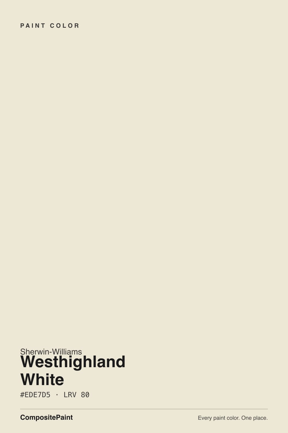
Westhighland White
A quiet warm white nobody writes trend pieces about, reviewed honestly: what it really does in daylight, where it goes flat, and the near-twin color you should know about first.

Jessica has spec'd whites and neutrals for more than 300 rooms and keeps a sample wall of painted drawdowns in her studio. Every color review is checked against real reader rooms in the comments and re-tested when a formula changes. About the testing process →
- 1First Star69
- 2Classic Gray74
- 3Westhighland White86
- 4Chantilly Lace91
- 5Ultra Pure White97
The Fast Verdict
Westhighland White is a warm, grayed-down cream that does its job without asking for credit. It is not a Color of the Year, it has no viral kitchen, and most owners who use it never write a review about it — which is itself the review: this is a dependable, low-drama white for cabinets, trim and exteriors, not a design statement. Judge it on those honest terms and it earns its keep.
Kitchens and cabinets that want warmth without a yellow flash · exteriors that want a soft farmhouse white instead of a stark one · hallways and open floor plans tying several rooms together · anyone who wants one step warmer than builder white without going full cream
You want a true, 85-plus-LRV bright white for a crisp gallery look · your room is dim, north-facing and short on lamps · your counters or floor lean cool blue-grey · you specifically want a famous, magazine-featured color to talk about
- Warm, quiet cream-white that avoids both a yellow flash and an icy edge
- Deep enough (LRV 86) to hide scuffs and handprints better than a brighter white
- Flatters warm wood, brass and warm stone without effort
- Reads as a soft, non-stark white outdoors against dark trim
- Low-drama and dependable — rarely does anything dramatic enough to regret
- Not a true bright white — visibly deeper and creamier next to an 85-plus LRV white
- Goes flat and slightly dull in dim, north-facing light without warm lamps
- Nearly identical to Benjamin Moore's Navajo White, so it offers little that is genuinely distinct
- Undertone reports vary more than usual online, so a wall sample matters more than the chip
What Color Is Westhighland White, Really?
A soft, warm off-white built on a yellow-beige base with a touch of grey mixed in to keep it from tipping buttery. In the deck it sits at LRV 86 — by our own white-family scale, that is soft-white-to-cream territory, not the 85-plus range that reads as a true, bright white. Expect Westhighland White to behave like a quiet cream on the wall: it warms a room instead of brightening it, and it will read visibly deeper than a true white sitting next to it.
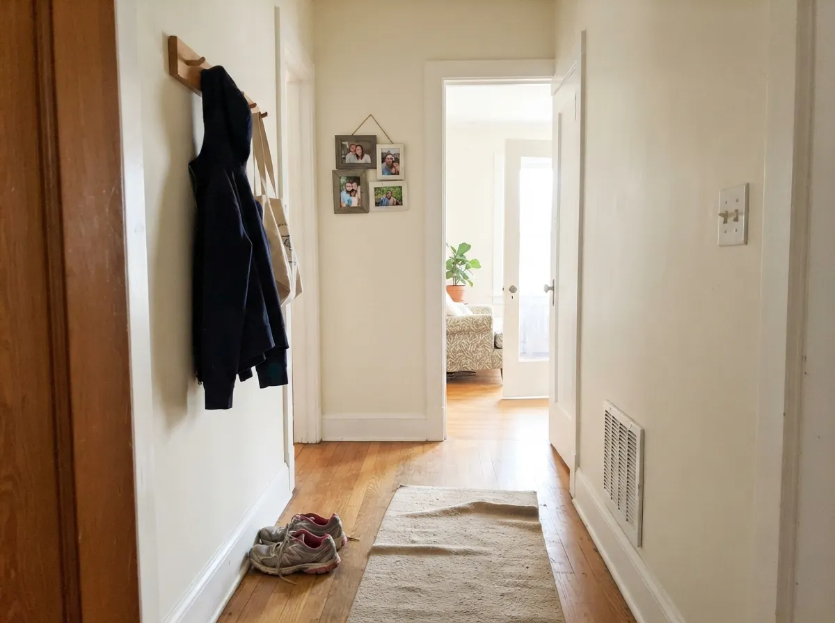
Here is the honest surprise from researching this color: write-ups genuinely disagree on its undertone. Most describe warm yellow with a hint of beige; a few describe delicate cool blue-grey undertones instead. Both are true, just in different light. At this particular pale, grayed cream, the color really does move more than most whites — warming noticeably under sun and incandescent lamps, and flattening toward a cooler, quieter neutral under overcast skies or cool LEDs. That range is the actual character of the color, not a contradiction to resolve.
Position it honestly: Westhighland White is not chasing fame. It has no confirmed Color of the Year run and no viral room behind it, and its hex sits almost on top of Benjamin Moore's Navajo White — two different brands landing on nearly the identical pale cream by coincidence, not by trend. What it does have is steady, unglamorous use in real kitchens and exteriors, the kind of white nobody writes a disaster post about because it rarely does anything dramatic enough to write about.
Where It Shines
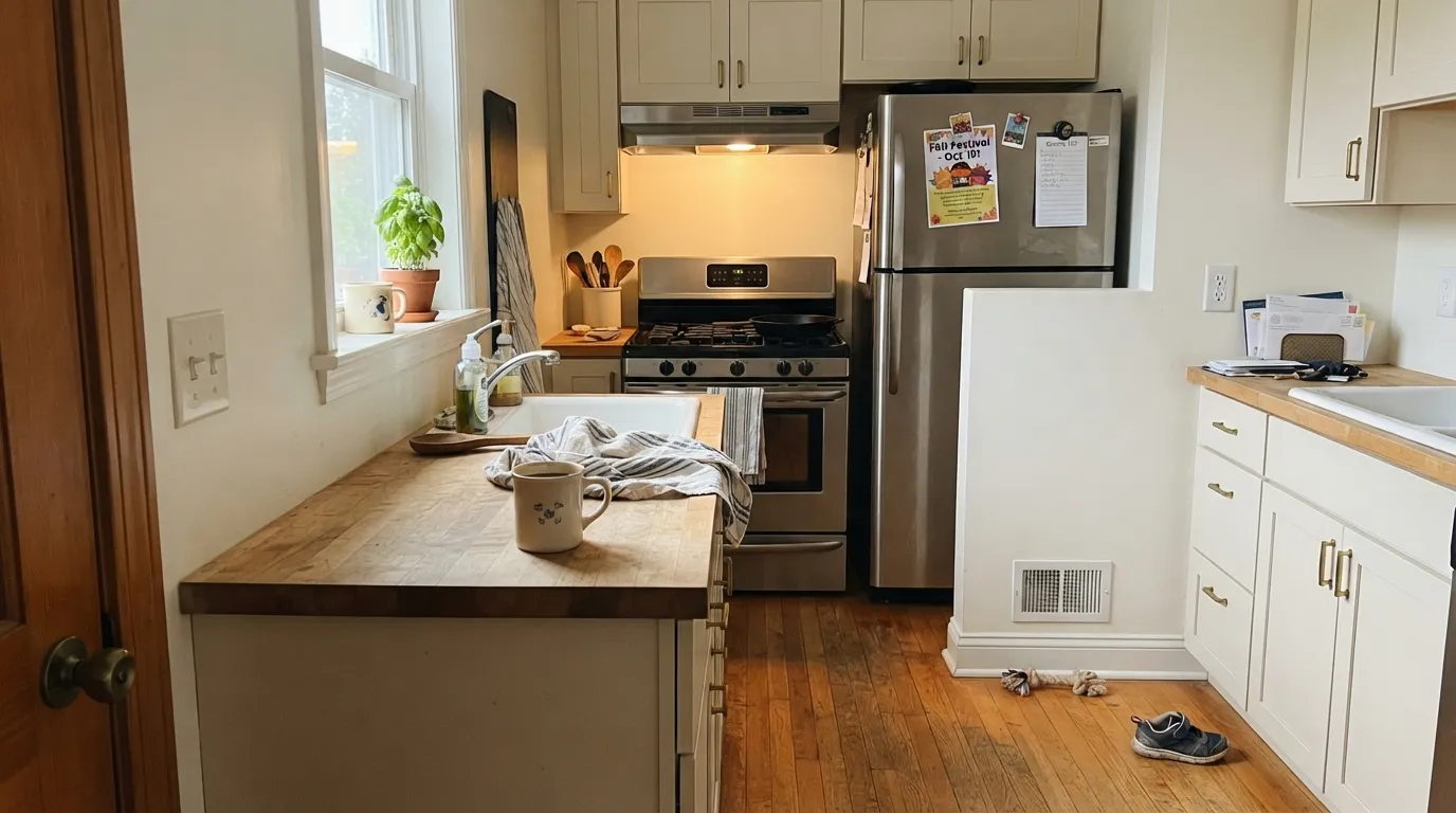
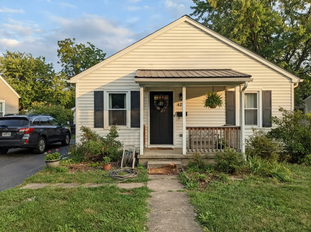
It is best in rooms with real daylight and warm materials to lean on. Kitchens are the strongest case — on cabinets it sits happily next to butcher block, brass and warm quartz without tipping yellow the way a heavier cream would. Outdoors, it reads as a soft farmhouse white rather than a stark one, which is exactly what it is asked to do against dark shutters or a covered porch.
Where It Fails
The complaints about Westhighland White trace back to a small number of predictable mismatches, and all of them show up before the first coat if you know to look. None of them mean the paint is bad — they mean the wrong room picked it.
The name says "white," but LRV 86 puts it in cream territory by our own site's scale. Next to an 85-plus true white like Extra White it will look noticeably deeper and warmer, not brighter. If your goal is a crisp, gallery-white wall, this is the wrong pick before you even open the can.
Cool, indirect daylight drains the warmth out of any cream this pale, and Westhighland White is no exception — it goes flat and slightly dull rather than glowing. This is also where the "cool undertone" reports online come from: in this light it genuinely reads more neutral, less warm.
Set next to a blue-white marble, chrome fixtures or a cooler trim white, the yellow-beige base shows up as a mismatch rather than a warm accent. Keep the temperature consistent — warm stone, warm metals — or pick a cooler white instead.
Room by Room
In a sunny or east/west-facing room it reads as a calm, warm backdrop for wood furniture. In a dim north room, step up to a cream with more built-in warmth.
Warm wood, brass hardware and warm quartz all sit comfortably against it. Satin holds up to daily wiping and hides handprints better than a brighter white would.
Under 2700K bulbs it turns soft and cozy at night. A dim, lampless north bedroom is where it disappoints most.
With warm stone and wood vanities it is quietly good. With cool grey marble or chrome fixtures, the warm base starts to argue with the room.
It works as a soft trim white under mid-tone walls, but for high-contrast, crisp trim a true white like Extra White will read cleaner and cost less doubt.
Full sun reads it brighter and cleaner than it looks indoors, and against dark shutters or a charcoal door it lands squarely in modern-farmhouse territory without the glare of a stark white.
Your Light Is the Risk
Direct warm sun brings the cream forward and the grey stays quiet. This is the light that shows what the color is for.
Cool, indirect daylight flattens the warmth and can push it toward a dull, slightly grey cream. Sample here before committing.
Warmer and creamier at the sun hours, quieter and more neutral once the direct light passes. A normal, gentle shift through the day.
2700K lamps deepen the cream and make it feel cozy. Cool white LEDs flatten it toward plain and slightly grey — swap the bulbs before repainting.
Most complaints about Westhighland White are a light mismatch. Upload a photo of your actual room and see it on your walls — then ask for the same wall in north light or evening lamps before you buy a single sample.
Need It From Another Brand?
Any paint counter can custom-tint Sherwin-Williams SW 7566 directly. If you would rather stay in one brand's own deck, these are the closest stock matches, measured as ΔE2000. Under 2 is a difference you will not see on the wall.
| Brand | Closest color | ΔE | LRV | |
|---|---|---|---|---|
| Behr | Stonewashed PinkECC-61-2 · Behr | 0.8 | 86 | Color page → |
| Benjamin Moore | SteamAF-15 · Benjamin Moore | 1.9 | 84 | Color page → |
| Valspar | Wings of an AngelV153 · Valspar | 0.4 | 85.7 | Color page → |
| PPG / Glidden | Mother Of PearlPPG1100-1 · PPG / Glidden | 1.5 | 85 | Color page → |
| Glidden | Atrium WhitePPG1020-1 · Glidden | 0.9 | 85 | Color page → |
| Dutch Boy | Simplified White020W · Dutch Boy | 1.4 | 86 | Color page → |
Similar Sherwin-Williams Colors
The nearest shades to Westhighland White within Sherwin-Williams's own range, ranked by perceptual color distance — useful when you want the same look a touch lighter, darker, or warmer.
WCAG 2.1: AA is 4.5 : 1 for normal text, 3 : 1 for large text, AAA is 7 : 1.
Westhighland White vs the Colors You're Also Considering
Every Westhighland White sample board has the same rivals on it. The numbers show the real lightness gap — then it comes down to which risk you would rather live with.
Pick this if you already got burned by that green flash and want a warmer, more consistently cream base instead.
Sherwin-Williams SW 7008 · LRV 82AlabasterPick this for the deck's proven, most-recommended cabinet white — just watch for its own green flash in cool north light.
Side-by-side comparison →Pick this for warmth — Extra White can read clinical on walls without a room full of warm materials to soften it.
Sherwin-Williams SW 7006 · LRV 86Extra WhitePick this for a true, crisp bright white on trim or walls — no cream, no warmth to manage.
Pick this for the Sherwin-Williams version of essentially the same warm cream, two LRV points brighter.
Benjamin Moore 947 · LRV 78Navajo WhitePick this if your painter works in Benjamin Moore — the hex is nearly identical, so pick whichever brand your store already stocks.
Pick this if you are already committed to Sherwin-Williams and want a slightly deeper, quieter cream than White Dove's.
Benjamin Moore OC-17 · LRV 85White DovePick this for the single most proven, designer-endorsed warm white available, with less undertone guesswork.
Restful White SW 7563, at LRV 81, is the nearest neighbor in the line. It is a shade lighter and slightly less golden, so it reads a touch cleaner on the same warm base. Ivory Lace SW 7013, LRV 79, goes the other way and is marginally deeper and softer.
Alabaster SW 7008, LRV 82, is the comparison most people actually need. Its hex #EDEAE0 is far less saturated, so Alabaster is the safe, neutral warm white and Westhighland White is the openly creamy one. If Alabaster looked plain on your wall, this is the step up in warmth.
Across brands, Benjamin Moore Navajo White 947 at LRV 78 has a deltaE of 0.49 and Behr Eastern Wind ECC-24-2 at LRV 79 comes in at 0.74, so both are the same color for practical purposes. Farrow and Ball James White No. 2010, LRV 79, measures 1.96, which still looks visually identical in normal room light.
Westhighland White Coordinating Colors
The rule for coordinating with Westhighland White is the same as for any warm cream: stay warm, and let the darks be genuinely dark. It sits comfortably next to warm greiges, warm woods, deep charcoals and navies, and it starts to argue the moment something in the room turns distinctly cool. These are the partners that keep showing up in rooms that work:
Westhighland White on Exteriors
This is the color's strongest, least-discussed job. Full outdoor sun reads it brighter and cleaner than it looks on an interior wall, and because it starts warm rather than stark, it avoids the slightly cold glare a bright true white throws off a facade in direct light. Paired with dark shutters, trim or a covered-porch ceiling, it lands in classic soft-farmhouse territory rather than the harder, more modern contrast a true white gives.
The pairing still decides the outcome. With near-black trim like Kendall Charcoal or Wrought Iron the contrast reads deliberate and current. With a warm greige trim it goes softer and more traditional. What to avoid outdoors is the same rule as indoors: a cool blue-grey stone accent or a cool-toned roof will make the warmth look slightly yellowed by comparison, so walk the sample around the house — the shaded side will read noticeably creamier than the sun-facing side.
Westhighland White With Wood Tones and Floors
Warm wood is the easy, reliable pairing: honey oak, walnut, butcher block and cedar all read comfortably against this color, because the wood's warmth and the paint's warmth meet in the middle rather than fighting. If your floors already lean orange, this cream is gentle enough not to amplify that the way a starker white would.
The one floor that deserves a sample first is cool grey LVP or grey-washed wood. Against a cool floor, Westhighland White's warmth becomes more obvious and can start to look slightly yellow by comparison — not a dealbreaker, since a warm rug or brass fixtures usually settle the argument, but test a real sample above the actual floor before committing a whole room to it.
Three Ready Palettes Built on Westhighland White
A color is never alone on the wall. These are complete combinations in the 60-30-10 pattern, with the reason each one holds together. Every one opens in the visualizer.
Agreeable Gray's own warm base matches Westhighland White's temperature, so the wall-to-cabinet handoff stays seamless instead of arguing. Hale Navy on the island supplies the one dark note the kitchen needs.
Try this palette in your roomA soft warm white against near-black gives the classic modern-farmhouse contrast without the glare a stark white throws in full sun. Both darks are well-behaved, dependable colors — nothing here is a gamble.
Try this palette in your roomPale Oak and Westhighland White share the same warm-neutral lean, so trim and walls flow room to room without a hard line. Evergreen Fog adds one muted color note on an island or built-in without fighting the warm base.
Try this palette in your roomWesthighland White FAQ
Is westhighland white warm or cool?
Warm at its base — a yellow-beige cream with a touch of grey — but it genuinely shifts more than most whites. In direct sun or under warm lamps it reads cream; under overcast north light or cool LEDs it flattens toward a quieter, cooler neutral. Both readings are honest, just different rooms.
Is it a true white or an off-white?
Off-white. At LRV 86 it sits below the 85-plus range that reads as a true bright white, closer to soft-white-to-cream territory. If you want a crisp gallery white, look at a higher-LRV option like Extra White instead.
Is it good for kitchen cabinets?
Yes, and it is arguably the color's best use — it flatters brass, warm wood and warm quartz, and its depth hides handprints better than a brighter white. Use a satin cabinet enamel. Cool grey marble is the one material it fights.
What is the difference between westhighland white and navajo white?
Very little on paper — the two hexes are nearly identical. Navajo White is Benjamin Moore's version of essentially the same warm cream at a slightly lower LRV. If your painter or store already carries one brand, that decides it more than the color itself does.
What trim color goes with westhighland white walls?
The same color in semi-gloss keeps the room quiet, or a true white like Extra White for more contrast. Avoid pairing it with a cooler white — the temperature mismatch is the most common complaint with this color.
Does it work on exteriors?
Yes — this is where it earns its keep. Full sun reads it brighter and cleaner than indoors, and against dark shutters or a charcoal front door it reads as a soft, deliberate farmhouse white rather than a stark one.
Have you painted with Westhighland White?
Rate it — one tap helps the next reader decide.
Ask a Question