Dimity
Farrow & Ball's pale red-based taupe, reviewed honestly: the sunny rooms where it reads cream, the north light that turns it peach, and what to pick instead.

Jessica has spec'd whites and neutrals for more than 300 rooms and keeps a sample wall of painted drawdowns in her studio. Every color review is checked against real reader rooms in the comments and re-tested when a formula changes. About the testing process →

- 1Agreeable Gray60
- 2Pale Oak69
- 3Dimity76
- 4Dover White83
- 5Moonlit Beach88
The Fast Verdict
Dimity is not a white. It is a very pale taupe with a red base that Farrow & Ball sells as a hallway color and designers keep reaching for when they want cream without a yellow wall. In south light it behaves: soft, linen, slightly dusty. In north light or next to a brighter white ceiling, the red comes forward and the room goes peach. Buy it for sun. Sample it hard everywhere else.
Sunny hallways and bedrooms · color-drenched small rooms · cream cabinets in warm kitchens · anyone who wants F&B warmth without committing to Setting Plaster
The room faces north and you hate peach · you want a true white · trim and ceiling stay a brighter white · cool grey marble or blue-grey floors
- Linen-cream in real daylight — taupe, not yellow paint
- Red base keeps hallways from going institutional grey
- Color-drenching looks intentional, not like a missed trim color
- Flattering in bedrooms and baths where skin tone matters
- Quieter than Setting Plaster if you want pink-adjacent, not pink
- Reads peach next to a brighter white ceiling or trim
- North light and cool bulbs pull the red — not the cream you sampled in the store
- Can go slightly brown / bandaid in flat mixed light
- Not a white: anyone hoping for 'just off-white' will see color
What Color Is Dimity, Really?
A very pale taupe with a red base — Farrow & Ball files it in the Warm Neutrals, not the whites, and that filing is the useful fact. Named after dimity, the lightweight cotton once used for bustles and now for bedding, No. 2008 is meant to feel like cloth on the wall: subdued, a little dusty, never bleached. The red is quiet on the chip and loud on four walls. That is why some rooms look like warm linen and others look like a well-lit peach.
At LRV 76 it reflects plenty of light, but it is a full step down from Pointing (LRV 86) and a long way from All White (LRV 92). Put Dimity next to either and it suddenly has a body — taupe, cream, sometimes pink. That gap is the point in a hallway you want to feel finished, and the trap in a room you wanted to stay white. It will never pass for a gallery white, and it should not be asked to.
Undertone in one line: red first, then a warm cream — not yellow oxide, not grey. South sun can still flash a faint yellow cast because cream is what the red sits in. North light and cool bulbs pull the red and it reads peach. If your sample looks like a bandaid, that is mixed, slightly dirty light exposing the brown in the taupe, not a different paint.
Where It Shines
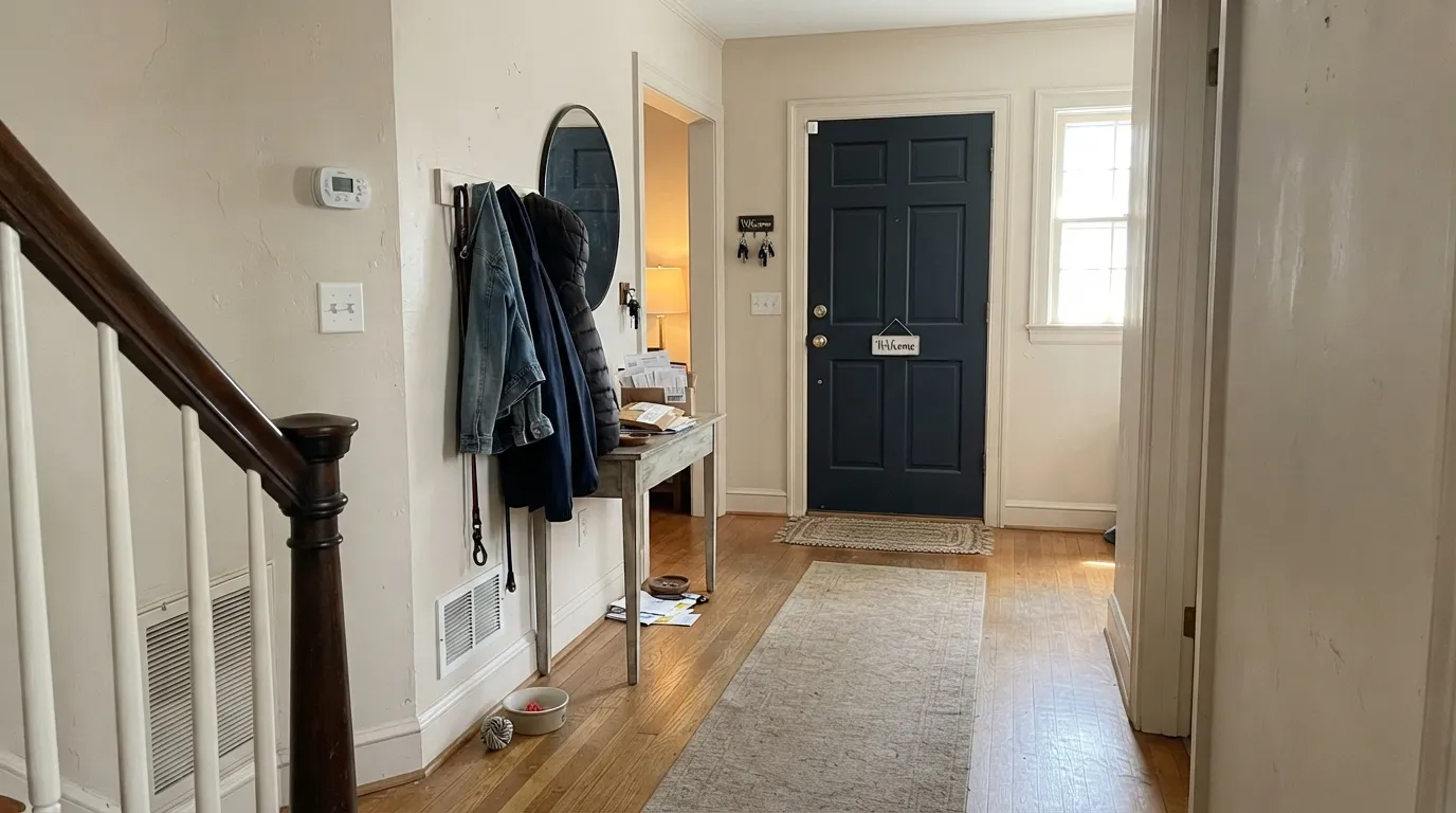
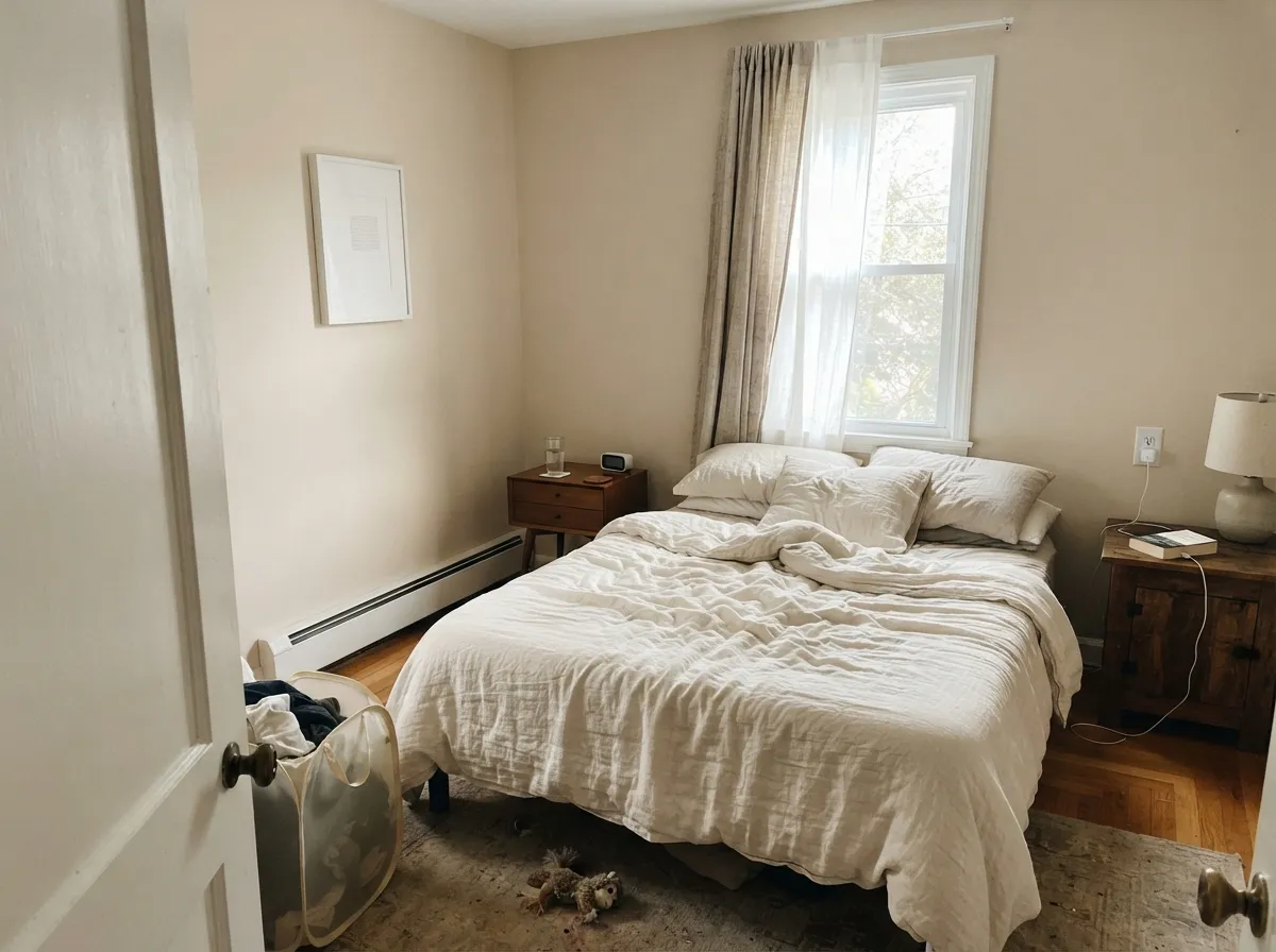
Give it real daylight and keep the trim in the same family and Dimity is one of the more graceful creams in the Farrow & Ball deck. Hallways are the official home: the red keeps a circulation space from going grey without needing a saturated color. Bedrooms with south or west windows are the second home — linen, brass, and oak all sit comfortably against it. Color-drenching (walls, woodwork, even the ceiling in one color, sheen changes only) is how designers stop it from looking peachy, and it is the move that makes a small room feel considered rather than painted.
Where It Fails
Almost every Dimity regret is a light or pairing problem, and both show up before the second coat. The paint is doing what a red-based taupe does. If your room matches one of these, this is not your cream.
The most common designer warning: Dimity walls with a white ceiling or brighter trim stop looking like a neutral and start looking peach. All White (LRV 92) is still a warm white — it is also much brighter, and the contrast makes Dimity's red obvious. The fix is the one-color rule, or a close cream like Pointing, not a crisper white.
Cool daylight strips the cream and leaves the red. Readers call it peach, pink, even cosmetic. Farrow & Ball's own advice that a little red helps poorly lit rooms is technically true — the walls will not go grey — but 'not grey' in a north room often means peach, not linen. If peach is a dealbreaker, pick Slipper Satin or test a greyer cream.
In flat, mixed light — overcast afternoons, rooms with both cool daylight and warm lamps — the taupe can go slightly brown, the color of a plaster or a bandage. It is not dirt; it is the red-brown base with the cream switched off. Big samples on every wall, left up through a grey day, catch this before you buy gallons.
Room by Room
This is the room Farrow & Ball wrote it for. Understated, a little dusty, warm enough that a windowless hall does not feel institutional. Color-drench the woodwork in Dimity eggshell; a brighter white door casing is how the peach shows up. A Railings door gives the one dark note the run of cream needs.
South or west bedrooms are lovely in it: linen-colored walls, skin-flattering at night under 2700K lamps. North bedrooms are the peach trap. Matte on the walls; keep bedding cream or white, not yellow beige, which doubles the warmth.
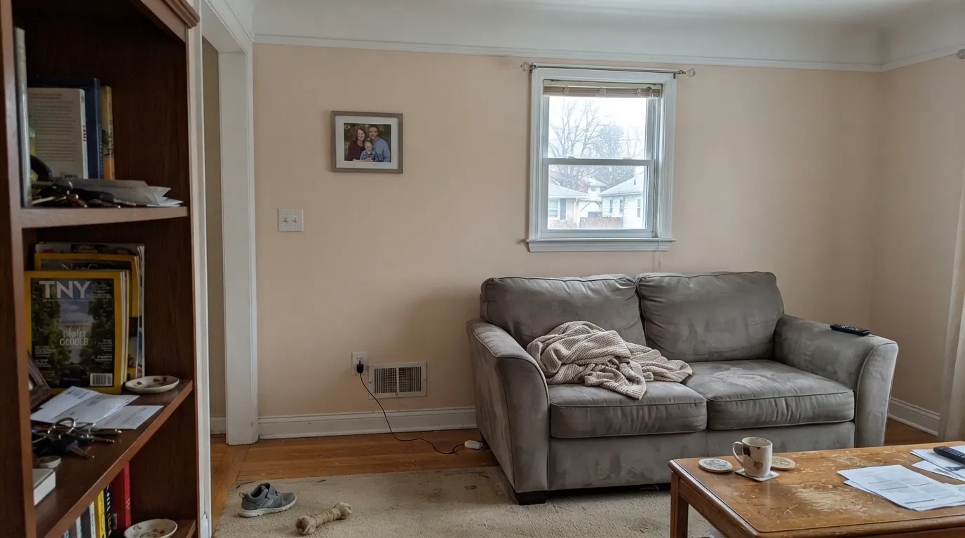
In a south-facing living room with oak floors and brass it reads as expensive cloth. In an open plan it has to negotiate the kitchen stone and the next room's white — sample the handoff. Eggshell for scuff resistance where sofas back up to the wall.
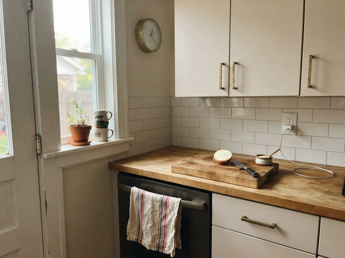
On cabinets in satin it is a softer F&B cream than a true white, and it loves unlacquered brass and butcher block. Cool grey quartz and blue-grey tile will push it peach. If the kitchen faces north, put Dimity on the island only or skip it.
Evening dining is kind to it: lamps wake the cream and the red stays in the background. Daytime north dining rooms are less kind. Pair with walnut or oak, not orange builder stain, and skip a stark white ceiling.
Full sun washes a pale red-taupe toward faded plaster, and the shaded side will read a step peachier than the sunny side. This is an interior cloth color. For a cream facade look at a true exterior white from a brand that tests for UV; do not send Dimity outside and hope.
Your Light Is the Risk
The cream reads as linen all day and the red stays in the background. This is the light the color was made for — sunny rooms, not dim ones.
Cool grey daylight exposes the red base; walls go peach or pink. Fine if you wanted warmth at any cost; disappointing if you wanted a quiet cream.
Morning east light is the palest, most taupe read. West sun and golden hour push it creamier, then faintly peach for an hour. Sample at 8am and 6pm.
2700K lamps keep it creamy and kind. Cool white LEDs strip the cream and leave a dull peach-grey — swap the bulbs before you blame the paint.
Most complaints about Dimity are a light mismatch. Upload a photo of your actual room and see it on your walls — then ask for the same wall in north light or evening lamps before you buy a single sample.
Need It From Another Brand?
Any paint counter can custom-tint Farrow & Ball No. 2008 directly. If you would rather stay in one brand's own deck, these are the closest stock matches, measured as ΔE2000. Under 2 is a difference you will not see on the wall.
| Brand | Closest color | ΔE | LRV | |
|---|---|---|---|---|
| Sherwin-Williams | Panda WhiteSW 6147 · Sherwin-Williams | 0.5 | 77 | Color page → |
| Behr | Elk HornECC-47-2 · Behr | 1.2 | 76 | Color page → |
| Benjamin Moore | French MacaroonCSP-335 · Benjamin Moore | 1.3 | 76 | Color page → |
| Valspar | Quail Egg7002-12 · Valspar | 0.6 | 76.7 | Color page → |
| PPG / Glidden | Onion PowderPPG1084-2 · PPG / Glidden | 0.8 | 76 | Color page → |
| Glidden | Seed Pearl40YY 75/084 · Glidden | 0.0 | 75 | Color page → |
Similar Farrow & Ball Colors
The nearest shades to Dimity within Farrow & Ball's own range, ranked by perceptual color distance — useful when you want the same look a touch lighter, darker, or warmer.
WCAG 2.1: AA is 4.5 : 1 for normal text, 3 : 1 for large text, AAA is 7 : 1.
Dimity vs the Colors You're Also Considering
Every Dimity sample board has the same rivals on it. The numbers show the real lightness gap — then it comes down to which risk you would rather live with.
Pick this if you want the quieter cousin: same warm family, higher LRV, less of a pink-wall announcement.
Farrow & Ball No. 231 · LRV 56Setting PlasterPick this if you want the plaster-pink that started a design trend — deeper, more clearly pink, less likely to be mistaken for cream.
Pick this when you want the red-based warmth and a slightly dustier taupe, not a chalky off-white.
Farrow & Ball No. 2004 · LRV 80Slipper SatinPick this if you want the quieter English off-white and have real daylight — it will not flash peach the way Dimity does.
Pick this when you want more cream, more light bounce, and a hallway that still reads warm rather than stony.
Farrow & Ball No. 241 · LRV 67Skimming StonePick this if you want a stonier, deeper off-white and can live with a pink flash — it is greyer and less creamy than Dimity.
Farrow's Cream (No. 67, LRV 70) is the deeper, more saturated cousin. It reads as an obvious buttery yellow, where Dimity is lighter and more restrained, so choose Farrow's Cream when you actually want a yellow room and Dimity when you want a warm light neutral that only hints at it.
Pale Hound (No. 71, LRV 72) has more of a green-yellow cast, giving it a slightly zesty, sharper feel next to Dimity's softer, pinker warmth. In cool north light Pale Hound can look a little sallow, while Dimity stays gentler.
Lime White (No. 1, LRV 72) is a muted, chalky off-white with a green-gray undertone. It is far more neutral than Dimity and lacks the cream, so pick Lime White for a barely-there quiet backdrop and Dimity when you specifically want that warm, sunny glow on the wall.
Dimity Coordinating Colors
Stay in the warm Farrow & Ball family and keep brighter, cooler whites at arm's length. Dimity wants other creams, dusty taupes, and one dark note — not a gallery white and not a cool grey. These are the partners that keep showing up in rooms that work:
Is Dimity the New Setting Plaster?
House & Garden asked the question in late 2025, after a run of published interiors put Dimity on bedroom walls, hallway plaster, and even on ceilings and woodwork in renovated terraces. The pitch is obvious: Setting Plaster became so visible that a quieter, paler member of the same warm family started to look like the grown-up next step. Designers who used it in several rooms in one house tend to say the same thing — it is timeless if you drench it, peachy if you frame it with white.
It is not a Color of the Year and it is not a viral paint. It is an older Warm Neutral that got rediscovered because pink-plaster fatigue is real. If you loved Setting Plaster in photos and then worried it would date, Dimity is the softer landing — as long as you treat it as a taupe-cream, not as a white, and you give it the daylight the name on the tin cannot promise.
Dimity With Wood Tones and Floors
Warm wood is the easy pairing. Oak — white oak especially — walnut, and aged pine all sit in the same temperature, so the red in Dimity meets the red-brown in the floor halfway. Unlacquered brass, antique bronze, and linen textiles belong here. Honey-orange builder oak is the one to sample: Dimity can either calm it or, in west sun, double the yellow-peach and make the whole room look tanned.
Cool grey LVP, blue-grey tile, and grey-washed floors are the honest no. Grey pulls the red into relief and the walls go peach against the floor even if the daylight is decent. A large rug can buffer it; a whole main floor of grey plank cannot. Chrome and polished nickel lean cold against it — brass is the metal this paint expects.
Three Ready Palettes Built on Dimity
A color is never alone on the wall. These are complete combinations in the 60-30-10 pattern, with the reason each one holds together. Every one opens in the visualizer.
Same color on walls and woodwork is how Dimity stays taupe instead of peach — no brighter white to pick a fight with. Railings is a blue-black that only shows its blue in real light, which is enough contrast for a front door without introducing a second cream.
Try this palette in your roomPointing is close enough in warmth that the trim line stays quiet; a crisper white would peach the walls. Elephant's Breath — beige, grey, or faintly pink depending on the hour — is the deeper relative, so a wardrobe or one wall reads like the same house getting lower, not a new color.
Try this palette in your roomSlipper Satin on the walls is the quieter English off-white, so the Dimity cabinets carry the cream. Hague Blue is a teal-navy that changes all day — the island stays interesting while the creams stay still. Brass hardware and a wood counter finish it; cool grey stone would not.
Try this palette in your roomDimity FAQ
Is Dimity yellow or pink?
Neither, until the light decides. It is a red-based pale taupe. South sun can flash a faint yellow cream; north light and cool bulbs pull peach or pink; flat mixed light can go slightly brown. If you need a color that stays one thing, this is the wrong cream.
Does Dimity work in a north-facing room?
Only if you like peach. The red base will keep the room from going grey, which is why Farrow & Ball recommends it for poorly lit halls — but that warmth reads pink, not linen, in cool daylight. Sample a big board on the actual north wall through an overcast day before you commit.
What trim color goes with Dimity walls?
Dimity itself, in eggshell, is the safe answer — color-drenching is how designers stop the peach. Pointing is the next-closest cream if you want a slight step up. All White is bright enough (LRV 92) that Dimity looks colored beside it. Wevet is the coolest white in the F&B deck and will make the walls look peachier still.
Dimity or Setting Plaster?
Setting Plaster is the plaster-pink that started a design trend: deeper (LRV 56), more clearly pink, a wall people will name. Dimity is the quieter relative — higher LRV, more taupe, easier to live with in a hallway or bedroom if you do not want a pink room. If the Pinterest photo you saved is obviously pink, you want Setting Plaster.
Will Dimity look peachy on kitchen cabinets?
In a sunny kitchen with brass and wood, it reads as a soft F&B cream. Next to cool grey quartz, or under cool LEDs, the red comes forward and the doors look peach. Use satin, keep the bulbs warm, and sample a door panel against the actual counter before spraying a run of cabinets.
Can I color-drench a room in Dimity?
Yes — it is one of the better reasons to buy it. Walls, woodwork, and ceiling in one color (flat or matte overhead, eggshell on trim) keep the red from being framed by a brighter white. Small halls, bedrooms, and powder rooms take the drench well. Add one dark note — a Railings door, a Hague Blue chair — so the cream has an edge.
Have you painted with Dimity?
Rate it — one tap helps the next reader decide.
Ask a Question