Bee
The clean golden yellow, reviewed honestly: the doses where it looks expensive, the four walls where it turns loud, and what to pick instead.

Jessica has spec'd whites and neutrals for more than 300 rooms and keeps a sample wall of painted drawdowns in her studio. Every color review is checked against real reader rooms in the comments and re-tested when a formula changes. About the testing process →
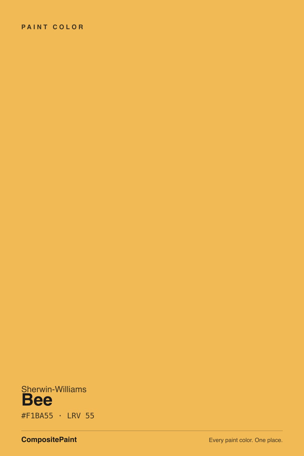
- 1Peristyle Brass30
- 2Chilled Wine41
- 3Bee55
- 4Jackfruit62
- 5Lemon Chiffon79
The Fast Verdict
Bee is a real yellow — not a butter, not a cream, not a beige with ambitions. It is a clear gold with the faintest lean toward orange, and at LRV 55 it has enough body to still read as color after dark. That makes it superb in doses — a front door, an island, mudroom lockers, a ceiling over pale walls — and demanding on four walls, where most people find it a full step louder than the chip promised.
Front doors, islands, hutches and mudroom lockers · a ceiling glow over pale warm-white walls · sunrooms, entries and breakfast nooks · dim north rooms that no neutral can rescue
You wanted a soft, quiet yellow · your trim and ceiling are a cool blue-white · your floors and trim are honey oak · it is a bedroom, or a small bathroom with a mirror
- A clean, clear gold — no mustard murk, no acid green
- Warms a north-facing or windowless room the way no neutral can
- Outstanding in doses: doors, islands, lockers, one ceiling
- Deep enough (LRV 55) to still read as color under evening lamps
- Flatters brass, butcher block, terracotta and dark green cabinetry
- Much stronger on four walls than the chip or the LRV suggests
- Throws a gold cast onto white ceilings, trim and skin
- Saturated yellows hide poorly — expect a tinted primer and an extra coat
- Fades faster than most colors on a sun-beaten exterior door
What Color Is Bee, Really?
A clean golden yellow — more gold than lemon, with the faintest push toward orange and no green in it at all. That clarity is the whole appeal. Most yellows in this depth range go one of two dirty directions: mustard-brown, which reads dated, or acid-green, which reads institutional. Bee stays honest gold, which is why it keeps turning up as a front-door color and a cabinet accent rather than as a compromise wall color.
The number that fools people is LRV 55. On paper that is a mid-tone — Revere Pewter sits at 56, Smokey Taupe at 55 — and neither of those colors would ever be called loud. Bee behaves nothing like them, because loudness comes from chroma, not from LRV, and this hue lands almost exactly where the human eye is most sensitive. A saturated yellow at LRV 55 bounces more light back at you, and more of it registers, than a greige at the same reading. Plan for a wall that is brighter and more present than the chip and the number together suggest.
Undertone in one line: gold with a whisper of orange — never green, never brown. If your sample looks green, something cool is sitting next to it: a blue-white trim, a north window on a gray day, a 4000K bulb. If it looks orange, that is late west sun doing what late west sun does to every warm color.
Where It Shines
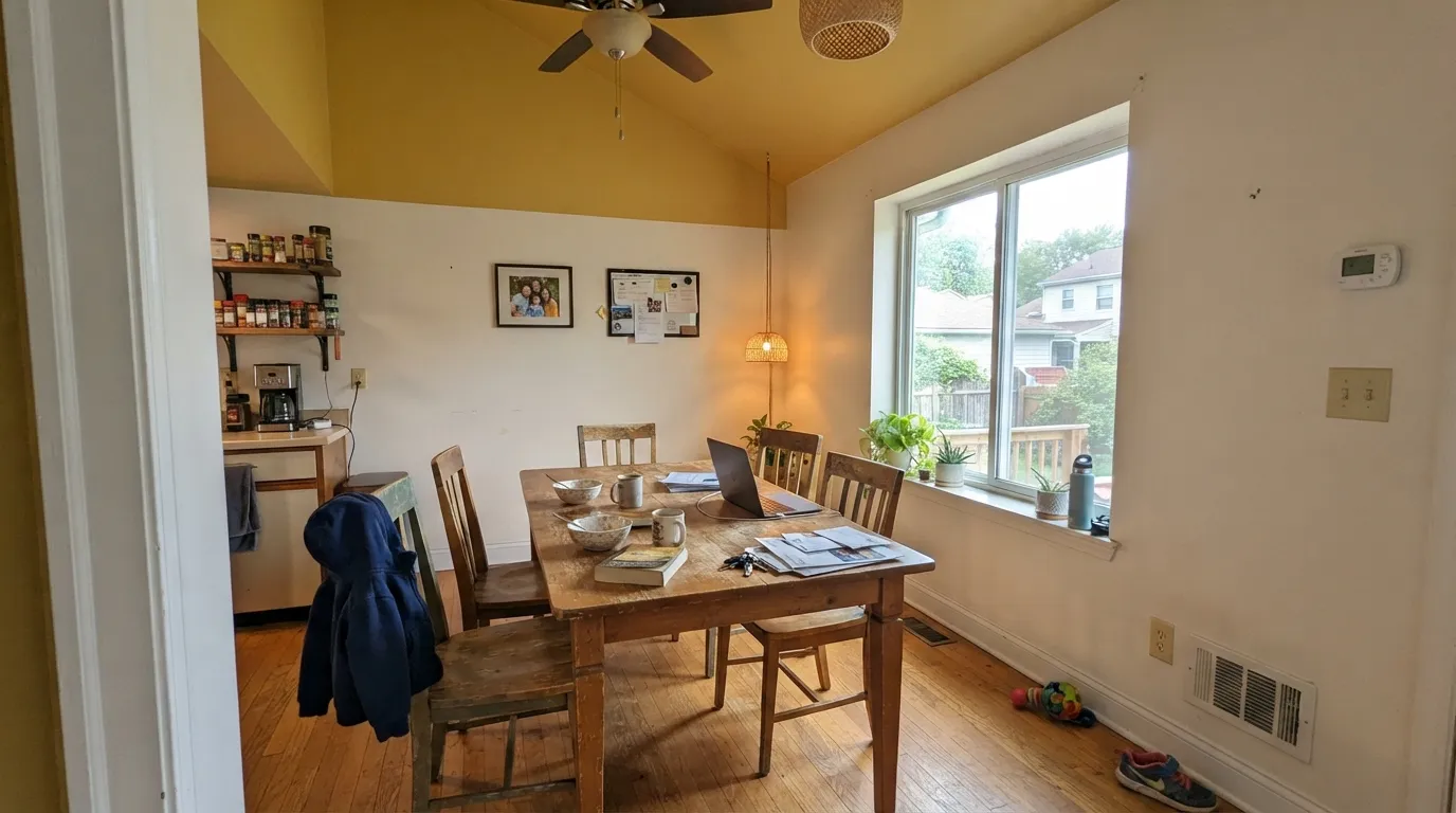
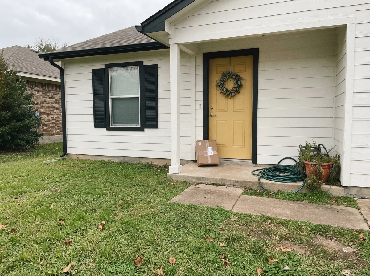
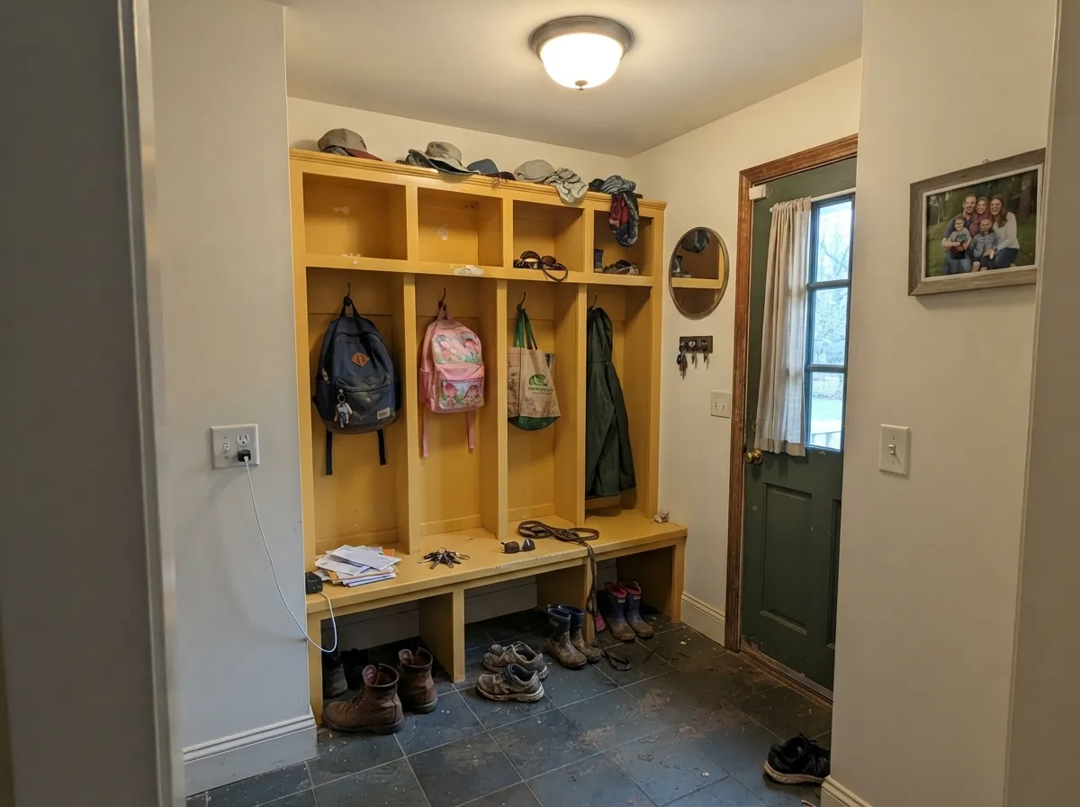
This color is at its best when it has a job and a boundary. On a front door it reads generous rather than loud, because it is framed by siding and shadow. On an island, a hutch or a run of mudroom lockers it does the same work a stain does — gives the built-in an identity — without asking the whole room to commit. And overhead, over pale warm-white walls, it stops being a color you look at and becomes light you stand in: a Bee ceiling throws a soft gold wash down onto everything below. It is also the honest fix for a room that daylight forgot; a north-facing back hall or a windowless mudroom has no warmth for a neutral to borrow, and Bee brings its own.
Where It Fails
Nearly every regret story about a strong yellow follows one of three scripts, and all three are visible before you open the can. None of them are the paint's fault — but if your room matches one, sampling bigger will only confirm it faster.
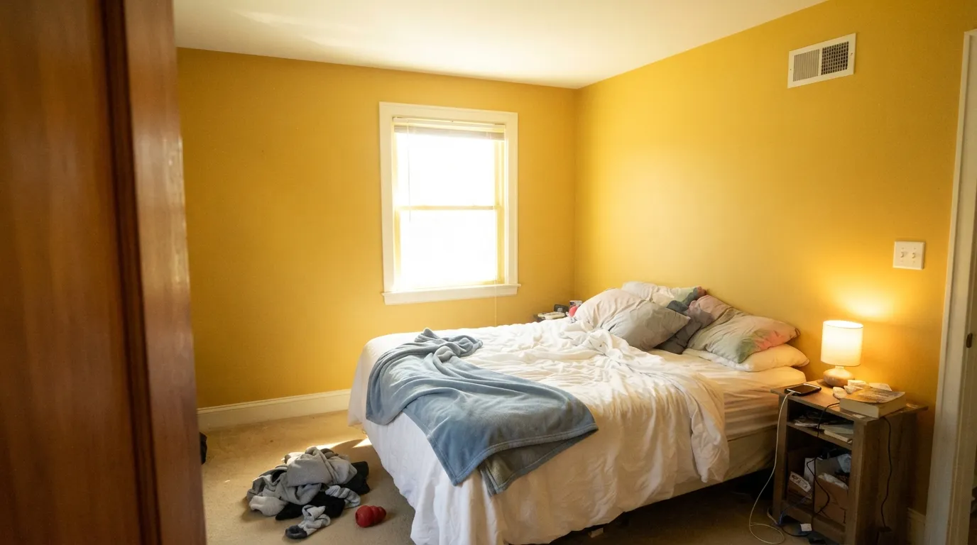
A two-inch chip of Bee looks cheerful. Four walls of it is a different color experience — saturated yellow is the one hue that gains the most strength when you scale it up, and the number-one complaint about yellow rooms is that they went from sunny to shouting somewhere around the second wall. Sample a full poster board on two different walls and live with it for three days, or keep the color to one plane.
Put a blue-based bright white next to a warm yellow and both lose: the yellow picks up a green edge by contrast, and the white starts to look faintly dingy and blue. This is the single most common bad pairing with Bee. Warm whites are the fix — Greek Villa, Alabaster, Dover White — and they cost the same as the cool one.
Yellow reflects yellow. In a bright room, Bee walls throw a visible gold cast onto the white ceiling, the trim, and the countertops — and onto faces, which is why it is a poor choice for a mirrored bathroom or a room where anyone films or takes photos. If the wash is the effect you want, put the color overhead and let it fall on neutrals. If it is not, keep Bee off the biggest surfaces.
Room by Room
A yellow door is a small bet with a big payoff, and Bee is the right kind of yellow for it: clear rather than mustard, warm enough to read welcoming against white, gray or green siding. Semi-gloss, and frame it with a dark trim so the color has an edge. One honest warning — yellow pigments are among the first to fade in full southern sun, so a west- or south-facing door is a repaint-every-few-years commitment. A shaded or covered entry holds much longer.
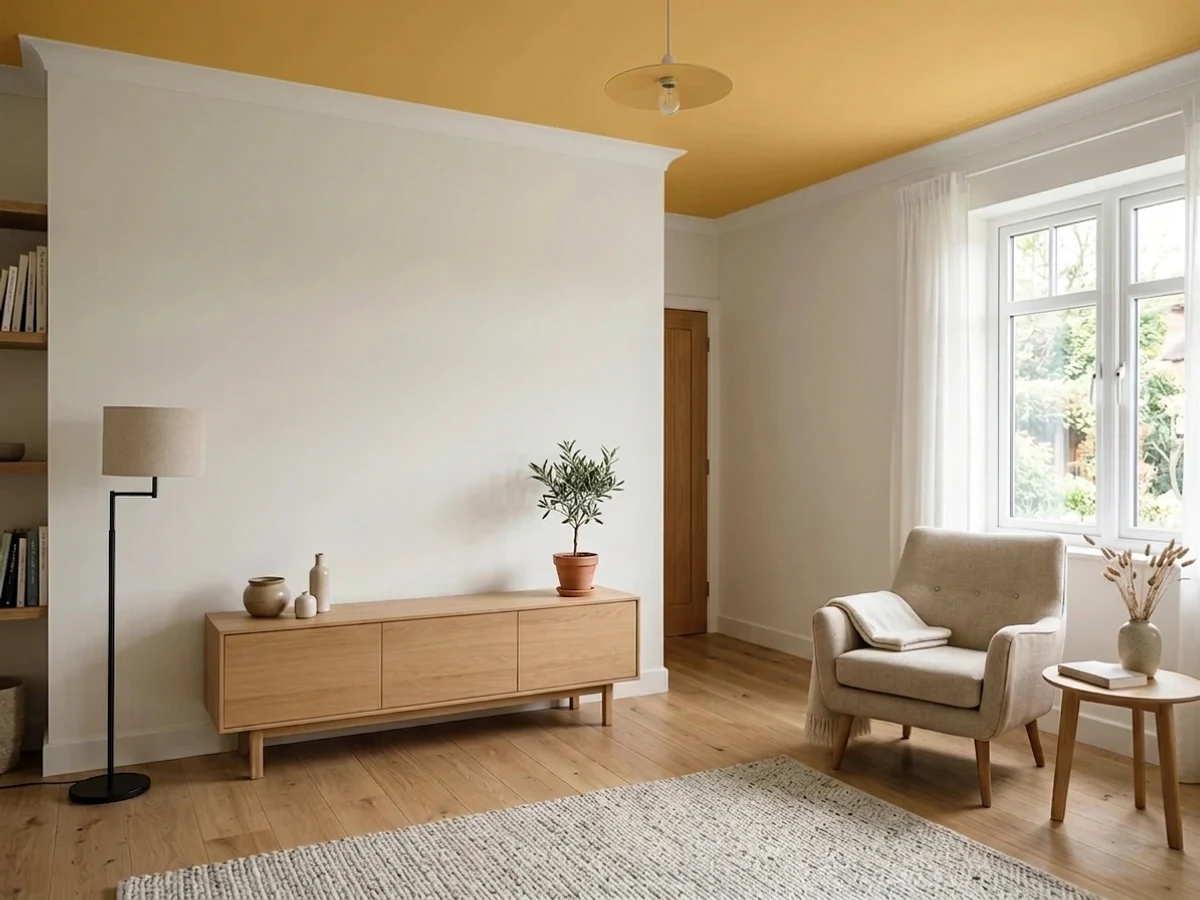
This is the use most people never consider and the one that flatters it most. Keep the walls a warm white, put Bee flat on the ceiling, and the room fills with soft gold light instead of a gold surface. It needs two things to work: some ceiling height or a skylight, and walls quiet enough to take the wash. Over yellow or beige walls, or under an eight-foot ceiling in a small dark room, it closes in fast. Full details in the ceiling section below.
The two rooms where a strong color has nothing to fight. Lockers, a bench, or the cabinet run in Bee turns a utility space into the most cheerful part of the house, and these rooms are usually short on daylight, which takes the glare off. Satin, so wet coats and detergent drips wipe off.
Short-stay rooms are where a burst of yellow is a pleasure rather than a commitment: you pass through, you get the lift, you move on. An entry with Bee on the inside of the door or on wainscot, a breakfast nook with one gold wall, a sunroom ceiling — all work. Four walls of a sunroom in Bee plus full southern glass is the version that gets repainted.
On an island under warm white cabinets it looks like a decision somebody made on purpose, and it flatters brass, butcher block and terracotta tile. A whole kitchen of yellow cabinets is a much larger bet, and it is a losing one over honey-oak floors. Satin urethane-fortified cabinet enamel either way, over a tinted primer.
A saturated yellow is stimulating, which is the opposite of a bedroom's job, and the gold bounce in a small mirrored bathroom is genuinely unflattering to skin. If you want yellow in either room, take it down to a pale one — Butter Up or Lemon Chiffon — or keep Bee to the inside of a closet door or a single piece of furniture.
Your Light Is the Risk
The one exposure that improves it. Cool gray daylight takes the glare off the gold and leaves warmth — yellow is the rare color that gains in the light that ruins everything else.
Direct sun on a big yellow wall is close to glare: it blows out, loses its depth, and bounces gold onto everything facing it. Sample here before you commit anything larger than a door.
Crisp and clear at breakfast, distinctly amber-orange for an hour at golden hour. The evening shift is the biggest of any light in this review — test at 6pm.
2700K bulbs deepen it to honey and it looks expensive. Cool 4000K LEDs push it toward acid green-yellow — the cheapest mistake to fix in the whole project.
Most complaints about Bee are a light mismatch. Upload a photo of your actual room and see it on your walls — then ask for the same wall in north light or evening lamps before you buy a single sample.
Need It From Another Brand?
Any paint counter can custom-tint Sherwin-Williams SW 6683 directly. If you would rather stay in one brand's own deck, these are the closest stock matches, measured as ΔE2000. Under 2 is a difference you will not see on the wall.
| Brand | Closest color | ΔE | LRV | |
|---|---|---|---|---|
| Behr | Bling BlingP280-6 · Behr | 2.2 | 55 | Color page → |
| Benjamin Moore | Luminous Days300 · Benjamin Moore | 1.8 | 55 | Color page → |
| Valspar | Mustard Glaze3006-3A · Valspar | 2.8 | 51.7 | Color page → |
| PPG / Glidden | Yellow ConeflowerPPG1209-5 · PPG / Glidden | 0.8 | 53 | Color page → |
| Glidden | Yellow ConeflowerPPG1209-5 · Glidden | 0.8 | 53 | Color page → |
| Dutch Boy | Warmed Yellow115-5DB · Dutch Boy | 0.0 | 55 | Color page → |
Similar Sherwin-Williams Colors
The nearest shades to Bee within Sherwin-Williams's own range, ranked by perceptual color distance — useful when you want the same look a touch lighter, darker, or warmer.
WCAG 2.1: AA is 4.5 : 1 for normal text, 3 : 1 for large text, AAA is 7 : 1.
Bee vs the Colors You're Also Considering
Every Bee sample board has the same rivals on it. The numbers show the real lightness gap — then it comes down to which risk you would rather live with.
Pick this when you want the color to actually register as color, especially on a door or an island.
Sherwin-Williams SW 6682 · LRV 63June DayPick this if Bee tested a step too strong — it is the same gold family one rung lighter, and it survives four walls better.
Pick this when soft is the problem, not the goal; Bee is the one that reads as a choice from across the room.
Benjamin Moore HC-4 · LRV 71Hawthorne YellowPick this for the traditional, whole-room yellow — soft enough for a dining room or a full hallway.
Pick this for clarity and cheer; Bee is the clean version of this depth, Hay is the muted one.
Farrow & Ball No. 37 · LRV 50HayPick this for the same depth with the sunshine dialed out — a dustier, older-house gold that sits back on a wall.
Pick this when you want the gold to be visible, not just felt; Lemon Chiffon disappears in bright light where Bee holds.
Sherwin-Williams SW 6686 · LRV 79Lemon ChiffonPick this for a ceiling or a room where you want the warmth without the commitment — it is the pale, low-risk take.
Bee Coordinating Colors
The rule with Bee is that everything around it should be either warm-white or genuinely dark. Warm whites let the gold look deliberate; darks give it an edge so it reads as a decision. What does not work is the middle: mid-tone beiges and warm grays sit too close in value and turn the whole room into one hazy amber block, and cool blue-whites fight it outright. These are the partners that keep showing up in rooms where a strong yellow works:
Where a Yellow Ceiling Actually Works
Painting a ceiling yellow sounds like a dare until you understand what it does. Color overhead is not read as a surface the way a wall is — it is read as light. A gold ceiling reflects warm light down onto pale walls, wood floors and faces, so the room feels sunlit even on a gray afternoon, and the ceiling itself mostly registers as a glow above your eye line. This is why designers reach for it in the rooms that are supposed to feel generous: entries, stair halls, breakfast rooms, sunrooms, and anywhere there is a skylight to frame.
Bee is the confident version of that move. It has real saturation, so the wash it throws is unmistakable — which also means it needs the room to earn it. Three conditions decide the outcome. First, the walls must be a pale warm white; a mid-tone or already-warm wall gives the gold nothing to land on and the room reads amber and heavy. Second, the ceiling needs some distance — nine feet, a vault, a stairwell, or a skylight well. At eight feet in a small room it presses down rather than glows. Third, flat sheen only: any shine on a ceiling turns the color into glare and shows every roller mark and every drywall seam.
If your room fails one of those tests, drop down the yellow ladder instead of giving up on the idea. Lemon Chiffon at LRV 79 gives the same effect at a fraction of the intensity and is the safe pick for a standard-height room; Butter Yellow is paler still, close enough to a warm white that most people read it as one until the light hits. Reserve Bee for the room where you want people to look up.
Bee With Wood Tones, Metals and Floors
The floor decides more than the paint does here. Walnut, espresso and painted-black furniture are Bee's best company — dark wood gives the gold a boundary and both look richer for it. Pale white oak and cool gray LVP are also good, for the opposite reason: they are quiet enough that the yellow is clearly the only color in the room. Butcher block and terracotta tile are a natural match, which is part of why it works so well on a kitchen island.
The one genuine clash is honey oak: orange-toned floors, oak trim and golden builder-beige carpet all sit in the same neighborhood as Bee, so nothing separates. The floor and the wall blur into one continuous amber field and the room reads dated rather than sunny. This is not a fixable-with-rugs problem when the trim is also orange oak — either paint the trim a warm white first, or pick a color from a different family entirely.
Metals are easy: unlacquered brass and antique bronze belong with it, and matte black is the reliable modern answer. Polished chrome and brushed nickel are the two that read a little cold and clinical next to a clear gold — not wrong, just unhelpful. Fabrics follow the same logic: cream, natural linen, jute and rattan all work; bright white cotton next to Bee will look blue by comparison.
Three Ready Palettes Built on Bee
A color is never alone on the wall. These are complete combinations in the 60-30-10 pattern, with the reason each one holds together. Every one opens in the visualizer.
The walls have to stay quiet and warm for the ceiling wash to read as light rather than as a second color — Greek Villa is warm enough that the gold falling on it looks natural, not like a stain. Urbane Bronze on the frames gives the eye one dark anchor so the room does not float.
Try this palette in your roomA yellow door needs a dark frame or it reads accidental. Iron Ore around the opening turns Bee into a deliberate focal point, and the soft white siding keeps the whole thing friendly instead of graphic. Budget for a refresh coat sooner than you would on a navy door — yellow is the pigment the sun goes after first.
Try this palette in your roomDeep muted green is the partner a clear gold has been waiting for — close enough to yellow's opposite side of the wheel to make both look richer, muted enough not to turn the room into a sports logo. Shoji White keeps the walls in the warm family so nothing here reads cold, and dirt shows less on all three than it would on a bright white.
Try this palette in your roomBee FAQ
Is Bee too bright for a whole room?
For most rooms, yes — and that is the honest headline. At LRV 55 with this much saturation it is a statement on four walls, and the usual outcome is a room that feels energetic for a week and loud after a month. It is genuinely good on all four walls of a small utility space — a mudroom, a laundry, a back hall with no daylight — where there is nothing else competing. Everywhere else, treat it as a one-plane color.
What white goes with Bee?
A warm one. Greek Villa, Alabaster or Dover White all sit on the same warm side of the fence and let the yellow look intentional. A cool blue-based bright white next to it is the most common mistake with this color: the trim goes faintly dingy and the yellow picks up a green edge. If you already have cool white trim and cannot repaint it, choose a paler yellow instead.
Does Bee work on a ceiling?
Yes, with two conditions: the walls need to be a pale warm white, and the room needs some height or a skylight. Done that way, a flat Bee ceiling reads as warm light falling into the room rather than as a yellow surface, and it is one of the more convincing ways to use a strong color. Under a low ceiling in a small dark room, or over walls that are already warm and mid-tone, it presses down instead of glowing.
Is Bee good for a front door?
It is arguably its best job. Clear gold reads welcoming against white, gray and green siding, and a dark trim around the opening frames it properly. The one caveat is durability of color rather than of film: yellow pigments fade faster in strong sun than almost anything else, so a south- or west-facing door will need a refresh sooner than a navy or black one would. A covered porch or a north-facing entry holds its color much longer.
How many coats does Bee need?
Plan on a gray- or yellow-tinted primer plus two finish coats, and do not be surprised by a third on a door or a cabinet. Saturated yellows are among the least opaque colors in any deck — the pigments simply do not hide the way an oxide-loaded neutral does — so painting it straight over white drywall with two coats is how people end up with a patchy, streaky wall and blame the paint.
Will Bee look orange or mustard?
Not on its own — it is a clear gold with only a hint of orange in it, and it has none of the brown that makes a mustard read dated. It can look orange for about an hour in low west sun, and it will look warmer than the chip next to honey-oak floors or orange-stained trim, which push it that way by association. Against walnut, painted trim or a cool floor it stays gold.
Have you painted with Bee?
Rate it — one tap helps the next reader decide.
Ask a Question