Chilled Wine
The Behr color named for wine that isn't wine-colored, reviewed honestly: the amber-gold it actually is, the light that turns it mustard, and what to pick instead.

Jessica has spec'd whites and neutrals for more than 300 rooms and keeps a sample wall of painted drawdowns in her studio. Every color review is checked against real reader rooms in the comments and re-tested when a formula changes. About the testing process →
- 1Thai Curry21
- 2Peristyle Brass30
- 3Chilled Wine41
- 4Honey Tea52
- 5Jackfruit62
The Fast Verdict
Chilled Wine sounds like a burgundy accent wall and paints like a chardonnay label — Behr's own description says so outright. It is a warm, olive-leaning amber-gold at a workable mid-depth (LRV 41), closer to honey or brass than to anything you'd call wine. Buy it for the color it is, not the color the name implies, and it is a genuinely good warm gold; buy it expecting merlot and you will be disappointed on the first coat.
Kitchens that want buttery warmth without going full yellow · dining rooms with brass and walnut · bedrooms that want amber instead of another beige · anyone bored of gray who still wants something livable
You actually want a wine-red or burgundy wall · your room runs on cool LEDs and stays dim most of the day · your floors or cabinets are already honey oak · you want a clean, crisp gold with no olive in it
- A genuine warm amber-gold, not just another beige or greige
- Buttery, inviting warmth in kitchens with wood and brass
- Mid LRV (41) holds real color without darkening a room
- Deepens nicely and stays warm under evening lamplight
- A refreshing option for buyers tired of the gray-and-greige decade
- The name promises a wine-red color it does not deliver
- Cool light and cool LEDs push it toward mustard-olive
- Too close in tone to honey oak floors and cabinets to add contrast
- Needs a big sample tested in your actual light before committing
What Color Is Chilled Wine, Really?
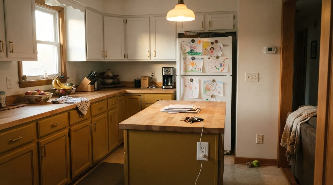
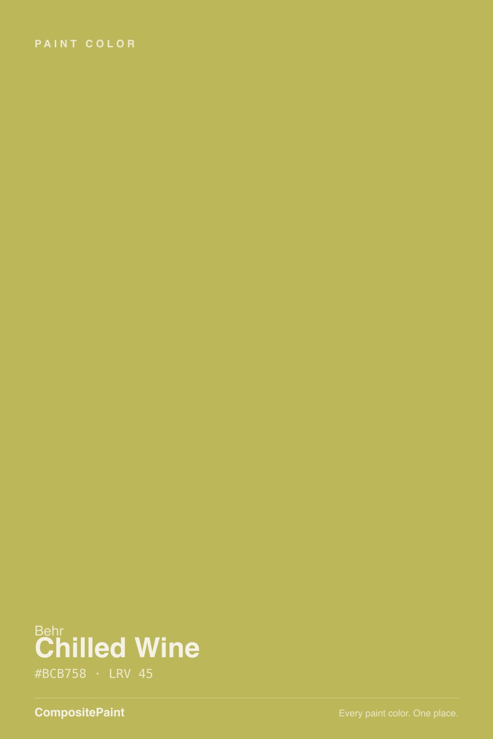
Chilled Wine is a warm amber-gold with a distinct olive lean — at hex #C0AB6E it sits closer to aged brass or dry honey than to any shade of red. Behr's own copy calls it "the crisp amber-gold of a cool and refreshing chardonnay," which is the whole story in one sentence: this color is named for a glass of white wine, not red. It ships in Behr's Sip and Savor collection alongside actual wine reds like Divine Wine, and the two colors could not look less alike — Chilled Wine is the chardonnay in that lineup, and the name only makes sense once you know that.
At LRV 41 it is a genuine mid-tone: light enough to still function as a wall color without needing designer bravado, dark enough to hold real color and not wash out to cream. That depth is also where the olive comes from. Push a warm gold past LRV 50 or so and it reads mostly yellow; hold it at 41 with a muted, grayed-down base and the yellow starts to argue with green, which is why more than one color-matching database logs Chilled Wine as "olive-leaning" rather than simply golden.
Undertone in one line: yellow-gold first, olive second, never red. If a sample looks mustard or greenish on your wall, that is cool light exposing the olive base — not a bad can of paint. If you were hoping for anything resembling merlot, this was never going to be that color; Behr's own site will tell you the same thing.
Where It Shines
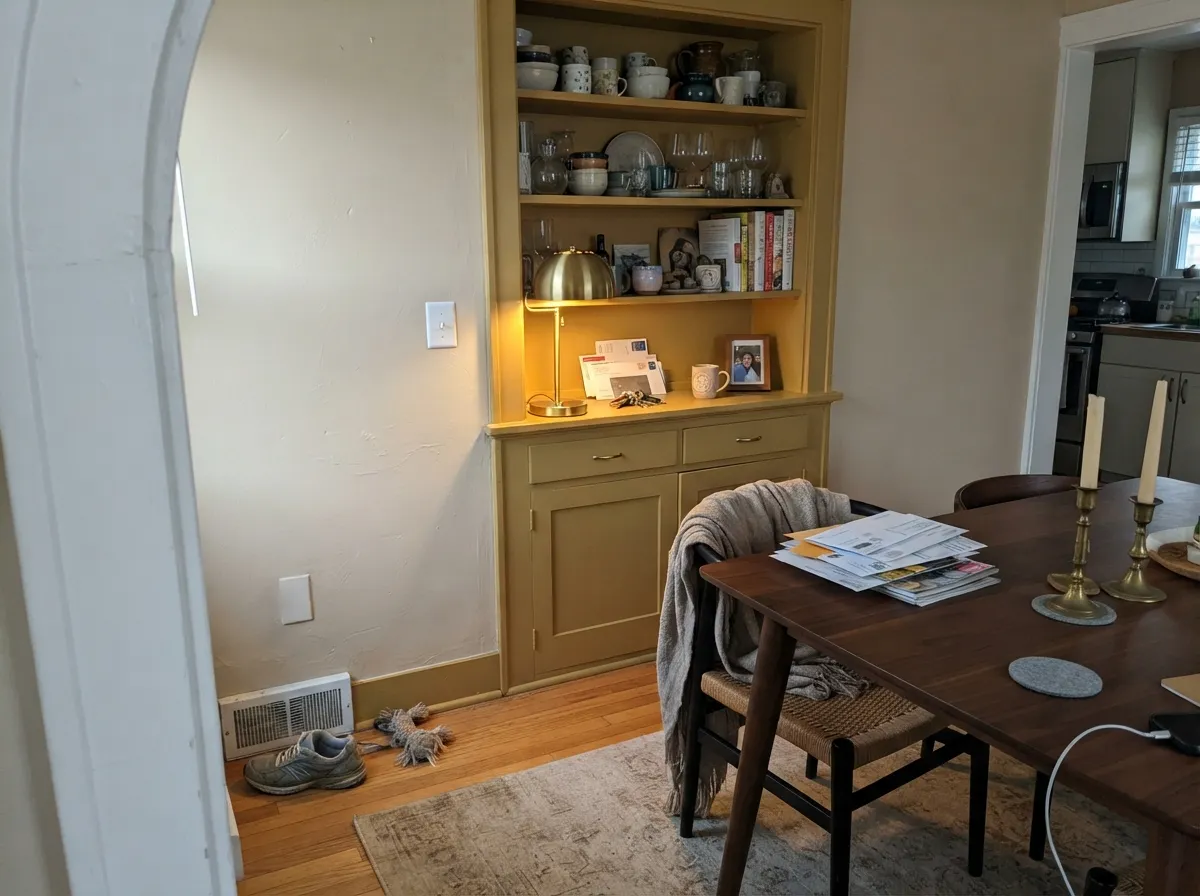
Give it warm afternoon or west light and honest wood tones, and Chilled Wine looks like a glass of good chardonnay caught the sun — genuinely golden, not yellow-highlighter, not muddy. It is Behr's own pick for kitchens: the buttery warmth flatters butcher block and brass, and it reads considerably more expensive than a builder-beige without tipping into a full "yellow kitchen." Its second home is a dining room with walnut and warm metals, where the amber deepens at night under lamplight instead of going flat.
Where It Fails
Almost every disappointed review of Chilled Wine traces back to one of three predictable setups, and none of them are the paint's fault — but if your room or your expectations match one of these, this is not your color.
This is the single most common letdown, and it is baked into the name. Chilled Wine is Behr's chardonnay entry, not a red — the actual wine-red in the same Sip and Savor collection is called Divine Wine. If you searched "wine paint colors" and landed here expecting burgundy or merlot on your walls, you will open the can to a golden amber and feel misled. Read the color, not the label, before you buy.
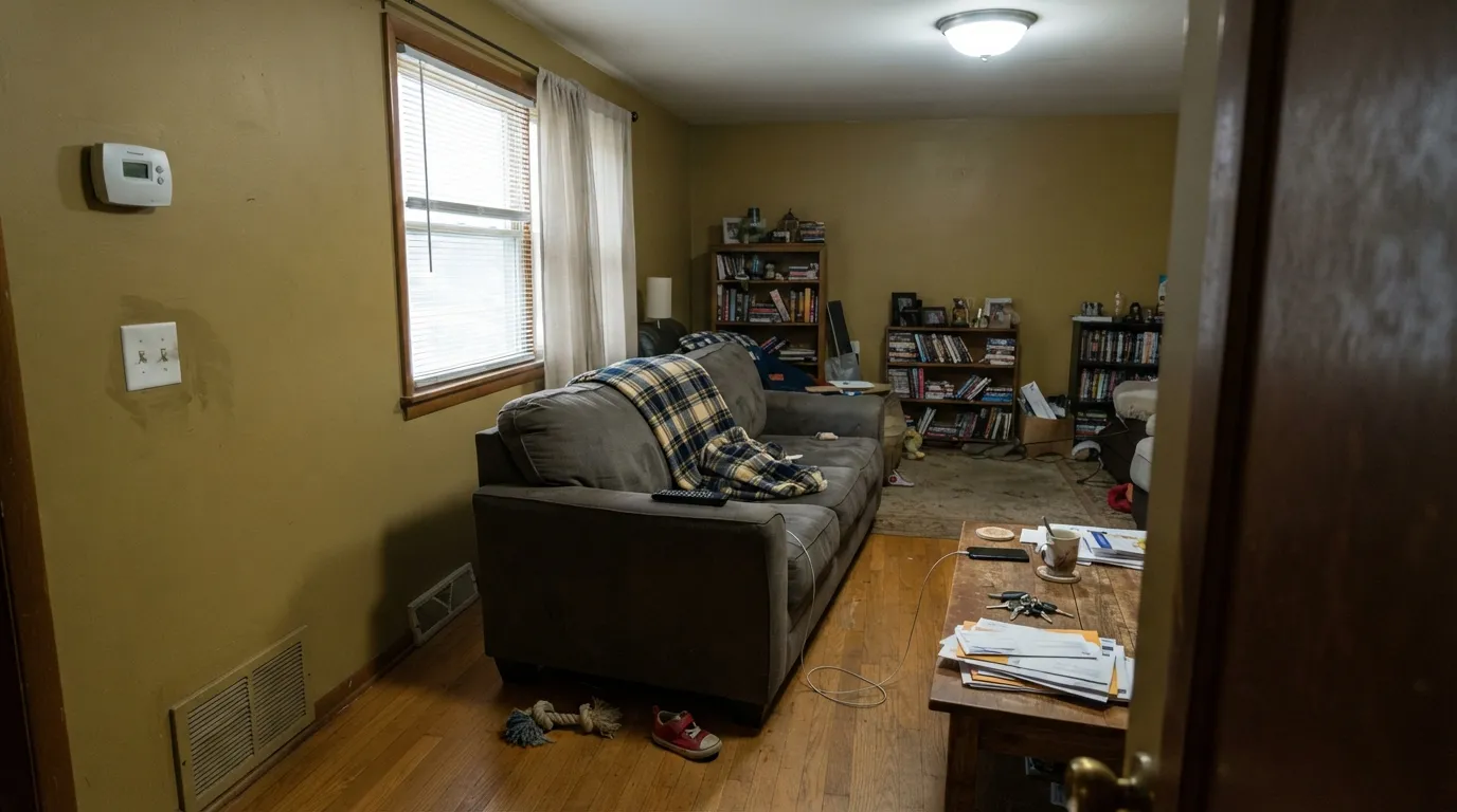
The olive base under the gold is subtle in warm light and obvious in cool light. North-facing rooms, overcast days, and cool 4000K+ LEDs all push it away from honey-amber and toward mustard or dull olive. Readers who sampled it under a warm bulb in the store and painted a north bedroom are the ones reporting a color that "looked nothing like the chip."
Chilled Wine and honey oak are close relatives on the color wheel — both warm, both yellow-leaning — and putting them together doesn't create contrast, it creates a wash of same-same gold-brown with no definition. The room reads muddy instead of rich. It needs a cooler or much darker wood partner, not a matching one.
Room by Room
This is the room Behr itself points to, and it earns the recommendation. With butcher block, brass hardware and white or cream cabinets, the buttery warmth makes the space feel finished and inviting instead of sterile. Eggshell on walls, satin on any painted millwork.
Under evening lamplight the amber deepens and warms further, which is exactly what a dining room wants after dark. Pair it with a walnut table and brass fixtures rather than anything gray or chrome, which fights the warmth.
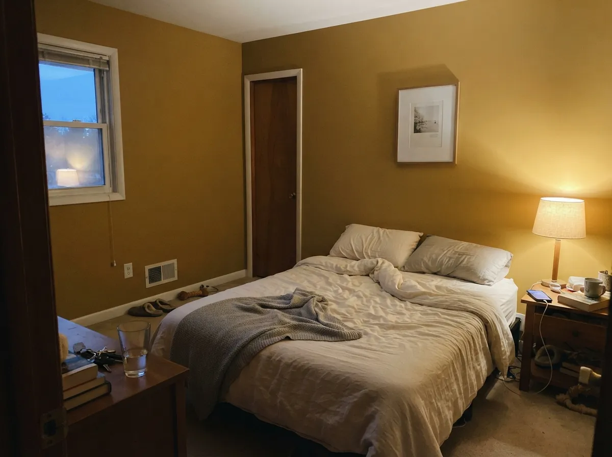
A genuinely cozy alternative to another beige, as long as the room gets some daylight or warm 2700K lamps at night. A north-facing bedroom with cool overheads is the one place this color disappoints — see the fails section.
Works well in a closed room with warm wood furniture and soft lighting. In an open floor plan it has to negotiate with the kitchen and hallway colors around it, and a cooler neighbor color will make it look more olive than it is — keep the whole run warm.
A den or study takes this color well, especially with leather and dark wood, but skip a bright cool-white trim next to it — the contrast pushes the wall toward mustard. A soft warm white or a stained wood trim reads far better.
Full outdoor sun and cool sky-light are a rough combination for an olive-leaning gold; it tends to read dated or slightly sickly on a whole facade. It can work as a single warm accent — a door or shutters on a white or cream house — but committing a full exterior to it is a real risk.
Your Light Is the Risk
The gold comes forward and reads genuinely amber, closest to the chardonnay Behr describes. Best light for this color, hands down.
Cool, gray daylight exposes the olive base and the color drifts toward mustard. Sample here first if your room is north-facing.
Bright and honestly golden at midday, warmer and richer as the light lowers toward evening. A fairly stable color through the day compared to cooler mid-tones.
2700K warm bulbs deepen it toward true amber-honey. Cool 4000K+ LEDs flatten it and bring the olive forward — swap the bulbs before you swap the paint.
Most complaints about Chilled Wine are a light mismatch. Upload a photo of your actual room and see it on your walls — then ask for the same wall in north light or evening lamps before you buy a single sample.
Need It From Another Brand?
Any paint counter can custom-tint Behr M310-5 directly. If you would rather stay in one brand's own deck, these are the closest stock matches, measured as ΔE2000. Under 2 is a difference you will not see on the wall.
| Brand | Closest color | ΔE | LRV | |
|---|---|---|---|---|
| Sherwin-Williams | Sassy GreenSW 6416 · Sherwin-Williams | 1.2 | 40 | Color page → |
| Benjamin Moore | Princeton GoldHC-14 · Benjamin Moore | 1.0 | 39 | Color page → |
| Valspar | Desert Grass3008-7C · Valspar | 2.0 | 40.5 | Color page → |
| PPG / Glidden | Secret ScribblesPPG11-12 · PPG / Glidden | 4.0 | 41 | Color page → |
| Glidden | Deep Golden Straw40YY 41/384 · Glidden | 2.2 | 41 | Color page → |
| Dutch Boy | Snapping Turtle220-5DB · Dutch Boy | 3.9 | 40 | Color page → |
Similar Behr Colors
The nearest shades to Chilled Wine within Behr's own range, ranked by perceptual color distance — useful when you want the same look a touch lighter, darker, or warmer.
WCAG 2.1: AA is 4.5 : 1 for normal text, 3 : 1 for large text, AAA is 7 : 1.
Chilled Wine vs the Colors You're Also Considering
Every Chilled Wine sample board has the same rivals on it. The numbers show the real lightness gap — then it comes down to which risk you would rather live with.
Pick this for more color and a lower LRV — Manchester Tan is the paler, safer cousin.
Benjamin Moore HC-81 · LRV 53Manchester TanPick this if you want the same warm-classic gold-tan lane with a bit less risk — it shares the green-flash trap but sits lighter.
Pick this if you specifically want the olive-yellow lean rather than a copper one.
Behr MQ4-10 · LRV 40Amber BrewPick this for more copper and less olive at almost the same depth — a warmer, more orange-leaning gold.
Chilled Wine Coordinating Colors
The rule for coordinating with Chilled Wine: keep everything else either soft and warm, or deliberately cool and dark for contrast — avoid anything else in the same golden-yellow lane, which just flattens into mud next to it. These are the partners that actually work:
Wine In the Name, Chardonnay In the Can
The name is the whole marketing story here, and it is worth untangling. Chilled Wine is part of Behr's Sip and Savor collection, a lineup built around the idea of wine-tasting at home — deep reds, earthy greens, and this one buttery gold. Behr's own copy is explicit that Chilled Wine represents a chilled glass of chardonnay, not a red: it is describing color by association with a drink, the same way a paint chip might be named after a dessert or a season.
That is a clever naming idea and a genuine trap for search-driven shoppers. Anyone typing "wine colored paint" into a search bar and clicking the first Behr result expecting merlot on their dining room wall will open a can of golden-amber instead. The collection's actual red — Divine Wine — sits right next to Chilled Wine in Behr's own materials for exactly this reason. If red wine is the goal, that is the can to buy; Chilled Wine was never going to be it.
Chilled Wine With Wood Tones and Floors
This color makes its floor decision early. Honey oak, golden pine, and any warm-yellow stained wood sit too close to the paint's own undertone — instead of the floor and wall complementing each other, they blend into one flat gold-brown field with no visual break. It is the single most common styling mistake with this color.
The better partners are either cooler or considerably darker: white oak, gray-washed wood, or a deep walnut or ebony stain all give the amber wall something to contrast against instead of matching. Brass and unlacquered metal hardware are the easy win either way — they share the warmth without competing for the same yellow-gold territory the paint already owns.
Three Ready Palettes Built on Chilled Wine
A color is never alone on the wall. These are complete combinations in the 60-30-10 pattern, with the reason each one holds together. Every one opens in the visualizer.
White Dove keeps the room bright and lets the amber island carry all the color; Wrought Iron gives it one near-black note so the gold reads intentional and rich rather than accidental.
Try this palette in your roomBehr itself suggests pairing Chilled Wine with a cool neutral and a muted blue for contrast — Alabaster keeps the trim soft and warm-adjacent while Hale Navy supplies the one cool, dark note that keeps the gold from feeling one-note.
Try this palette in your roomEven Better Beige is a real beige without the yellow, so it lets the amber hutch and the terracotta accent do the color work. Cavern Clay adds warm depth without competing with the gold — both stay in the same tonal family instead of fighting.
Try this palette in your roomChilled Wine FAQ
Is Chilled Wine actually a wine or burgundy color?
No — this is the single most common confusion about it. Behr describes Chilled Wine as "the crisp amber-gold of a cool and refreshing chardonnay," meaning it is named for a white wine, not a red one. It belongs to Behr's Sip and Savor collection alongside an actual wine-red called Divine Wine — if you want burgundy on your wall, that is the color you want, not this one.
Is Chilled Wine yellow, gold, or olive?
All three, depending on the light. The base is a warm yellow-gold, but at LRV 41 with a grayed-down mix, an olive undertone shows through — more visible in cool light, less visible in warm light. Expect honey-amber in the afternoon and something closer to mustard on an overcast morning.
Does Chilled Wine work with honey oak floors?
Not well. Both the paint and honey oak sit in the same warm-yellow family, so instead of contrast you get a room that reads as one muddy gold-brown wash. It pairs far better with cooler or much darker wood — white oak, walnut, or ebonized floors.
What trim color goes with Chilled Wine walls?
A soft warm white, not a stark cool white. A bright blue-white trim exaggerates the olive in the wall and can push it toward mustard by contrast. If you want more definition, a dark trim like Wrought Iron or a navy door reads far better than crisp white.
Is it a good kitchen color?
Yes — it is Behr's own suggested use for it. The buttery warmth flatters brass hardware, butcher block, and white or cream cabinetry, and at LRV 41 it holds real color on an island or a full wall without eating too much light out of the room.
Does it look different under LED lighting?
Noticeably. Warm 2700K bulbs push it toward true amber-honey, close to its best daylight look. Cool 4000K-and-up LEDs flatten the gold and bring the olive undertone forward, which is the fastest way to get a mustard-looking wall without repainting anything.
Have you painted with Chilled Wine?
Rate it — one tap helps the next reader decide.
Ask a Question