Amber Brew
A saturated amber-gold reviewed honestly: where its warmth glows, the exact rooms where it turns mustard, and what to pick instead.

Jessica has spec'd whites and neutrals for more than 300 rooms and keeps a sample wall of painted drawdowns in her studio. Every color review is checked against real reader rooms in the comments and re-tested when a formula changes. About the testing process →
- 1Determined Orange22
- 2Caramelized35
- 3Amber Brew40
- 4Osage Orange45
- 5Colonial Yellow59
The Fast Verdict
Amber Brew is a real gold, not a beige wearing a tan. Warm, saturated, with a red undercurrent that keeps it from tipping into mustard when the light is right — and a mustard cast waiting for it the moment the light isn't. It is not a whole-house color; it is a dining room, a den, an island, a front door. Treat it as a focal point and it earns its keep.
Dining rooms and dens that see warm evening light · kitchen islands and cabinetry next to white or cream counters · entryways and powder rooms that can carry a bold color in a small dose · front doors on warm-toned houses
You actually wanted a soft neutral tan · your room is small, dim, and north-facing · your countertops, tile, or floor lean cool gray · you're painting an entire open-concept space wall to wall
- A genuine warm gold-amber with a red undercurrent — not a washed-out beige pretending to be neutral
- LRV 40 holds real, visible color without going near-black
- Sold in a true interior/exterior enamel, so cabinets, trim, and even a front door are fair game
- Gorgeous with brass hardware, walnut, and cream trim
- A genuinely different depth from Behr's paler honey-golds, so it earns its own place instead of duplicating them
- Cool north light and cool-white LEDs flatten the red and can push it toward a dated mustard
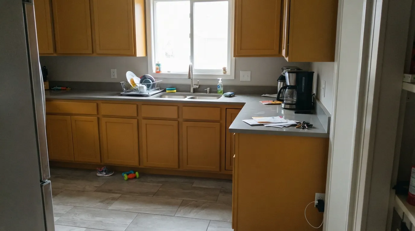
- Fights cool gray counters, floors, or quartz — the complement clash is real
- Too saturated to run across an entire open-concept space without a plan
- Behr calls it a "yellow" on its own site; most people will read it as amber-orange on the wall, which can surprise shoppers going by name alone
What Color Is Amber Brew, Really?
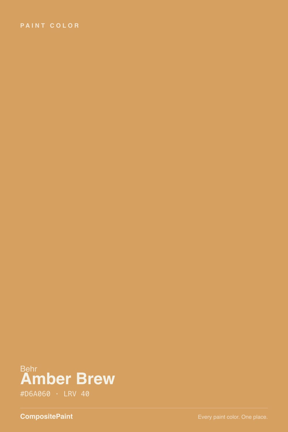
Amber Brew is a warm gold with a red undercurrent — not a straight yellow, not a straight orange, but sitting right between the two with just enough red mixed in to keep it from reading candy-corn. Behr files it in the yellow color family on its own site, but a paint chip is one thing and four walls are another: in real light most people call this amber, honey, or straight-up orange before they call it yellow. It lives in Behr's core Premium and Marquee lineups rather than a limited trend collection, so it isn't a color you have to catch before it disappears.
At LRV 40 it is a genuine mid-depth color — noticeably lighter than a true terracotta like Cavern Clay (LRV 24) or a caramel like Butterscotch (LRV 25), and noticeably heavier than a pale honey like Charismatic (LRV 57). That puts it in the zone where the color reads clearly in daylight without swallowing a room the way a near-black amber would. It needs a plan for exactly that reason: enough depth to dominate a wall, not enough to disappear in a busy one.
Undertone in one line: gold first, a whisper of red second, never cool. Cheap cool-white LED bulbs and flat north daylight strip that red whisper out, and can leave the color looking closer to a dated mustard than the rich amber the chip promises — the single most common surprise with a saturated gold like this.
Where It Shines
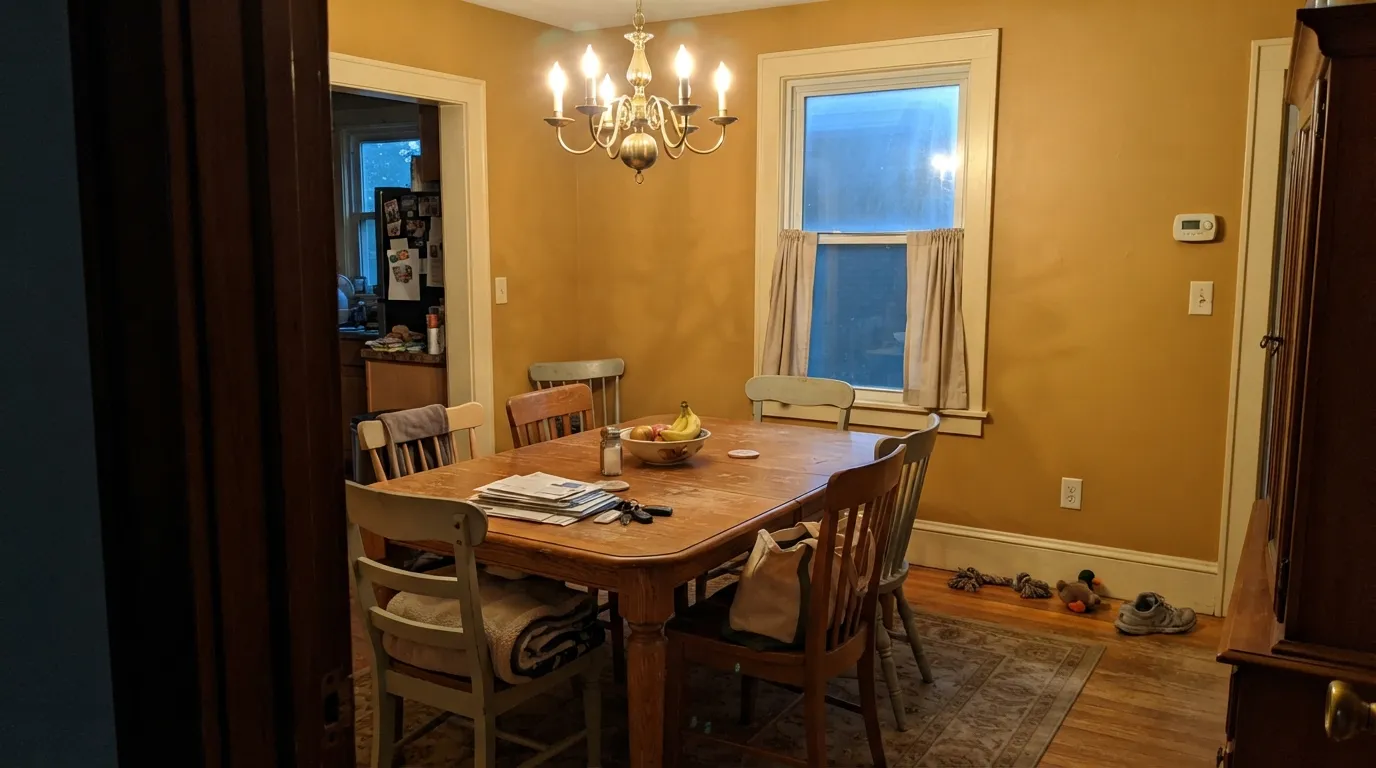
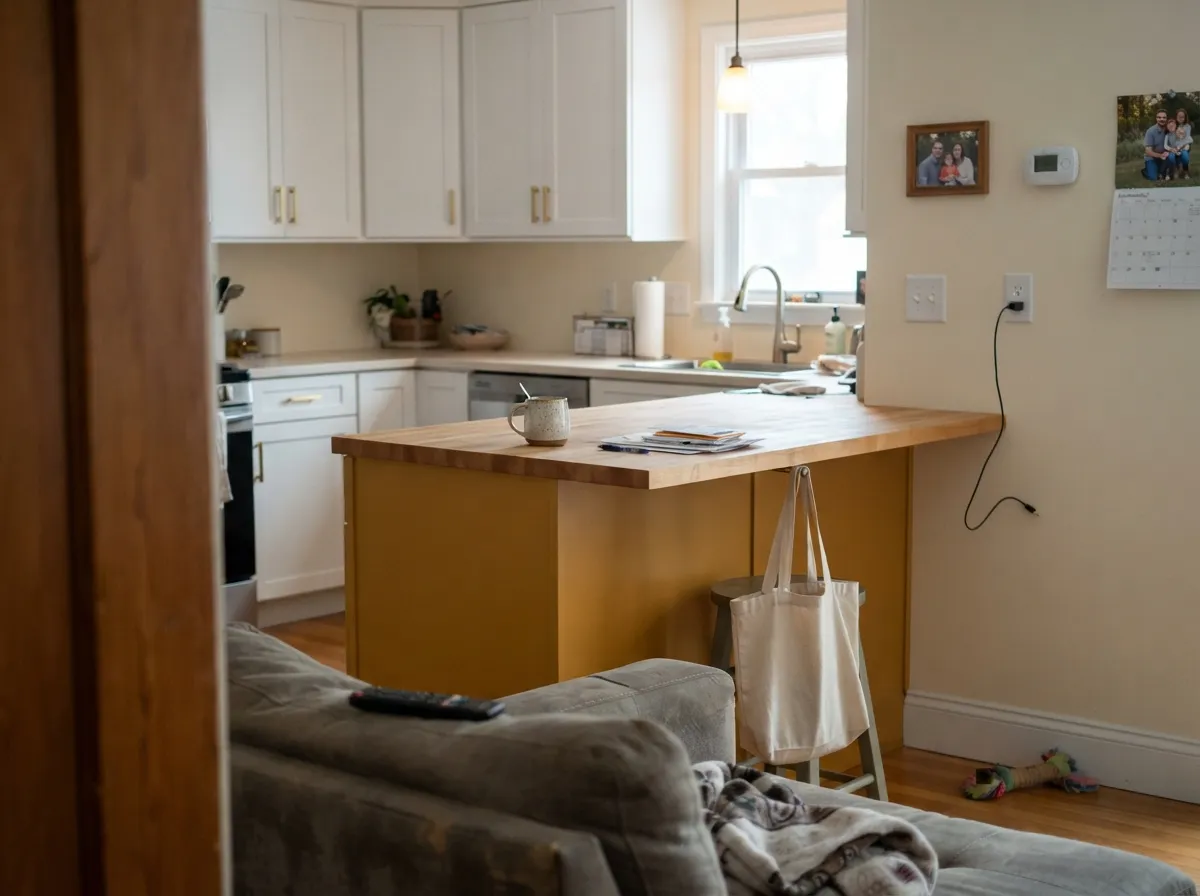
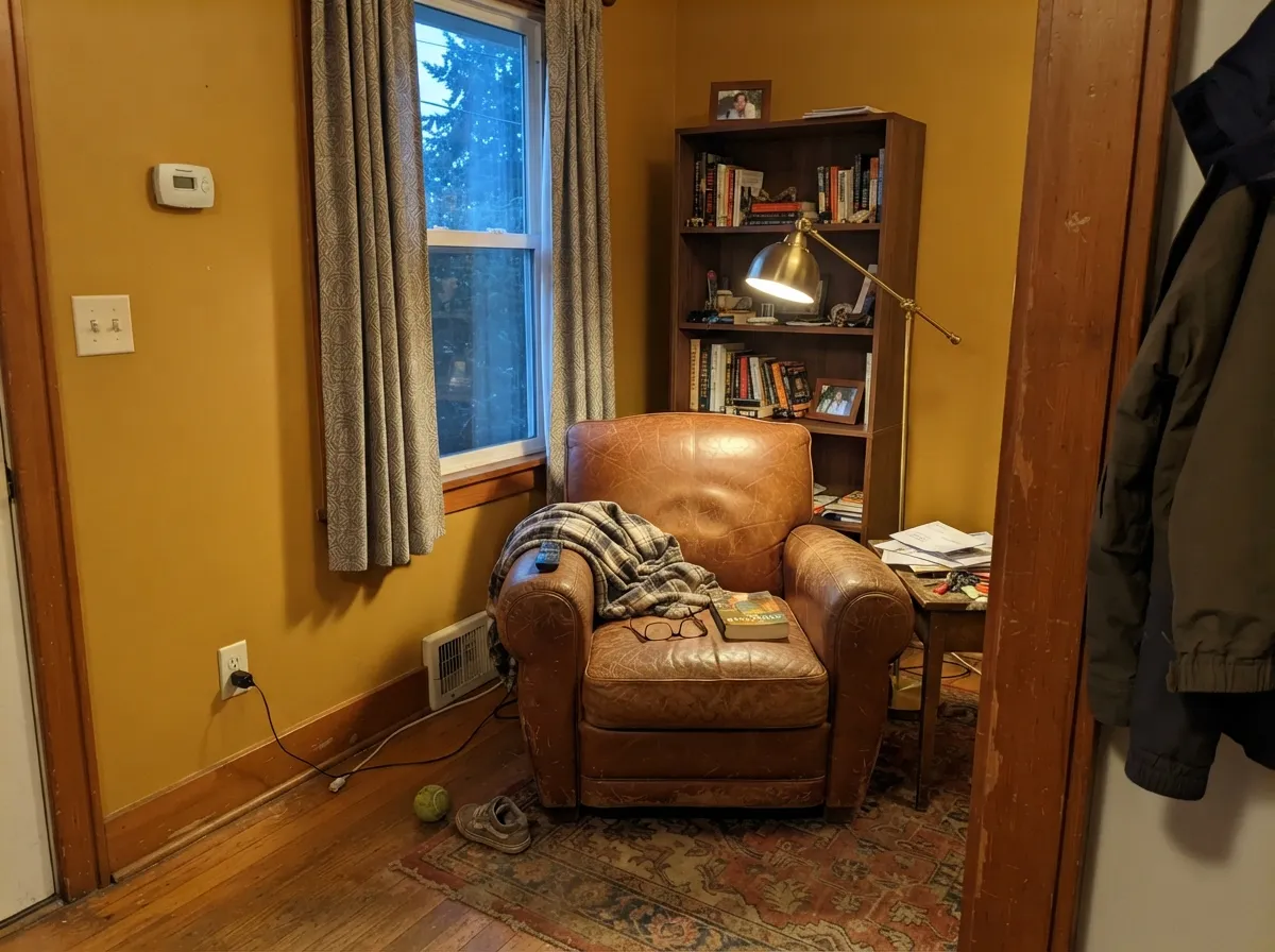
Give it warm 2700K light and real wood and this is a genuinely rich, cozy color — the reason autumn-toned golds like this keep coming back into fashion. It is at its best in smaller-dose rooms used at night: a dining room lit by a dimmed chandelier, a den with leather and walnut, a powder room that only needs to impress for five minutes. On cabinetry or an island, next to white counters and brass hardware, it reads expensive rather than loud.
Where It Fails
Most regret stories with a saturated amber-gold like this trace back to one of three mismatches, and none of them are the paint's fault. If your situation matches one of these, sample a large board before you commit.
On a small chip, Amber Brew can look like a soft caramel-tan neutral. On four walls it is unmistakably a color — real gold, not a beige with a suntan. If you wanted something you'd forget was even painted, this reads as a decision every time you walk into the room.
Amber-gold and cool gray sit on opposite sides of the color wheel, and neither one wins that argument gracefully — the counters look colder, the walls look muddier. This color wants wood, cream, or warm stone in the room with it, not cool gray quartz or gray-washed LVP.
This is a color for one room or one surface, not a whole downstairs. Painted wall to wall across a big open plan, the gold stops feeling warm and starts feeling relentless. Contain it to a dining room, a den, an island, or a single accent wall instead.
Room by Room
Warm evening light, a wood table, brass or bronze fixtures — a dining room is basically built for this color. It photographs beautifully under a dimmed chandelier and holds its gold instead of drifting toward orange the way it can elsewhere.
On an island or a full run of cabinets against white or cream walls, Amber Brew is a strong, confident choice — Behr sells it in a semi-gloss enamel built for exactly this job. Painting all four kitchen walls this saturated is a bigger bet, especially with cool stone counters.
Leather, walnut, brass lamp light: this is the same recipe that makes a library feel expensive, and Amber Brew slots right in. Skip it if the room runs on overhead cool LED panels with no lamps.
A small room you pass through rather than live in all day is the easiest place to try a color this saturated. It makes a strong first impression at the front door without asking you to sit inside the color for hours.
One accent wall or a single built-in reads intentional. Four walls of Amber Brew in a room where people watch TV under cool ambient light for hours is where the fatigue sets in fastest.
Behr sells Amber Brew in an interior/exterior cabinet-door-trim enamel, so a front door is a legitimate use. It reads best against cream, tan, or brick siding; on a cool gray or blue-gray house it looks like it wandered in from another color scheme.
Your Light Is the Risk
2700K bulbs bring the red forward and the gold turns rich and glowing — the color's best hour.
Cool, flat daylight strips the red out and can leave the gold looking closer to mustard than amber. Test first if your room faces north.
Morning east light keeps it a gentle amber; afternoon west sun pushes it more orange for an hour or two. Both are honest, not a defect.
Warm 2700K keeps it glowing gold at night; switch to a cool 4000K LED and the same wall reads flatter and more yellow-green. Bulbs, not paint, fix this.
Most complaints about Amber Brew are a light mismatch. Upload a photo of your actual room and see it on your walls — then ask for the same wall in north light or evening lamps before you buy a single sample.
Need It From Another Brand?
Any paint counter can custom-tint Behr MQ4-10 directly. If you would rather stay in one brand's own deck, these are the closest stock matches, measured as ΔE2000. Under 2 is a difference you will not see on the wall.
| Brand | Closest color | ΔE | LRV | |
|---|---|---|---|---|
| Sherwin-Williams | Ceremonial GoldSW 6382 · Sherwin-Williams | 1.1 | 39 | Color page → |
| Benjamin Moore | Morgan Hill Gold189 · Benjamin Moore | 2.4 | 38 | Color page → |
| Valspar | Lewis Gold3005-7C · Valspar | 2.6 | 38.8 | Color page → |
| PPG / Glidden | Wright GoldFLLW568 · PPG / Glidden | 4.3 | 43 | Color page → |
| Glidden | Burnt IvoryPPG15-08 · Glidden | 4.2 | 41 | Color page → |
| Dutch Boy | Butterscotch Drop214-4DB · Dutch Boy | 2.6 | 39 | Color page → |
Similar Behr Colors
The nearest shades to Amber Brew within Behr's own range, ranked by perceptual color distance — useful when you want the same look a touch lighter, darker, or warmer.
WCAG 2.1: AA is 4.5 : 1 for normal text, 3 : 1 for large text, AAA is 7 : 1.
Amber Brew vs the Colors You're Also Considering
Every Amber Brew sample board has the same rivals on it. The numbers show the real lightness gap — then it comes down to which risk you would rather live with.
Pick this if you want the color to read gold first, not clay-red.
Sherwin-Williams SW 7701 · LRV 24Cavern ClayPick this if you want the same warm-earth mood pushed a full shade darker, toward terracotta.
Pick this for a lighter, easier-to-live-with version of the same gold.
Sherwin-Williams SW 6377 · LRV 25ButterscotchPick this for a deeper, more saturated caramel-gold — Amber Brew's darker sibling.
Amber Brew Coordinating Colors
The rule for coordinating with Amber Brew: warm creams for trim, wood tones everywhere you can get them, and cool grays kept out of the room entirely. It layers beautifully with deeper earth tones and holds its own next to a genuine complementary blue. These are the partners that keep it looking intentional:
Amber Brew on Doors and Trim
Behr sells Amber Brew in a Premium interior/exterior enamel built specifically for cabinets, doors, and trim, which makes a front door a legitimate use rather than a stretch. The color reads best against warm siding — cream, tan, brick — where it feels like a deliberate accent instead of an outlier.
On a cool gray or blue-gray house it fights the siding the same way it fights gray countertops indoors. If your exterior palette already leans cool, this is not the amber for your door; look at a cooler-toned accent instead and save Amber Brew for the inside of the house.
Amber Brew With Wood Tones and Floors
Warm wood is this color's best friend. Walnut, honey oak, cedar, butcher block — all of it sits comfortably against Amber Brew because the warmth on both sides matches instead of competing. Brass and aged bronze hardware read expensive next to it; polished chrome and nickel are fine but slightly cooler company.
The floor that fights it is cool gray: gray-washed LVP, gray-toned porcelain tile, or cool white oak with a gray stain. Those floors pull the amber toward mustard the same way cool countertops do. If a gray floor is staying, keep Amber Brew to a small dose — an island, a door, a single wall — rather than the whole room.
Three Ready Palettes Built on Amber Brew
A color is never alone on the wall. These are complete combinations in the 60-30-10 pattern, with the reason each one holds together. Every one opens in the visualizer.
A warm cream trim keeps the amber from feeling heavy, and one piece of furniture in the deeper terracotta doubles down on the autumn mood without saturating the whole room.
Try this palette in your roomMost of the kitchen stays warm and neutral so the island can carry the color alone. Dolphin Fin's balanced warm-cool undertone keeps both brass and nickel hardware looking intentional next to the gold.
Try this palette in your roomAmber-gold and slate-blue are near-complements, so the pairing reads deliberate instead of clashing — both sit at a similar mid-depth, which keeps the contrast calm rather than jarring. Cream trim stops the room from feeling like a color experiment.
Try this palette in your roomAmber Brew FAQ
Is amber brew yellow or orange?
Behr files it under its yellow family on the official site, but on the wall most people call it amber-gold, honey, or even orange before they call it yellow. The hex leans toward a golden tan with real warmth — expect a color that reads richer and more amber than the family label suggests.
Is it good for kitchen cabinets?
Yes — Behr sells Amber Brew in a semi-gloss enamel built for cabinets, doors, and trim, indoors or out. It pairs well with white or cream counters and brass hardware; be cautious if your counters or backsplash lean cool gray.
What trim white goes with amber brew?
A warm cream, not a stark cool white. Behr's own warm whites — the kind you'd use on a Swiss Coffee-type trim — keep the gold looking rich instead of fighting it. A blue-white trim will make the walls look dingy by contrast.
Will it look too dark or too bold on four walls?
LRV 40 is real, visible color but not deep-dark. For most homes it works best as one focal room — a dining room, a den, a powder room — or a single accent wall rather than a whole-house color.
Does it work with gray floors or countertops?
Not comfortably. Cool gray and warm amber-gold sit on opposite sides of the color wheel and both look worse next to each other. It is much happier with wood floors, warm quartz, or cream tile. If gray is fixed in your room, test a large sample before committing.
Can I use it on an exterior door?
Yes — Behr sells Amber Brew in an interior/exterior cabinet-door-trim enamel rated for exactly that. It reads best against cream, tan, or brick siding; skip it if your house siding is cool gray or blue-gray.
Have you painted with Amber Brew?
Rate it — one tap helps the next reader decide.
Ask a Question