Topaz
The burnished amber-orange Benjamin Moore quietly keeps popular, reviewed honestly: the small rooms where it glows like an old book, the light that flattens it to mud, and what to pick instead.

Jessica has spec'd whites and neutrals for more than 300 rooms and keeps a sample wall of painted drawdowns in her studio. Every color review is checked against real reader rooms in the comments and re-tested when a formula changes. About the testing process →
- 1Burnt Cinnamon9
- 2Rookwood Terra Cotta14
- 3Topaz22
- 4Caramelized35
- 5Venetian Plaster42
The Fast Verdict
Topaz is terracotta with the volume up — a deep amber-orange grayed just enough by brown to read antique instead of traffic-cone. It is genuinely one of Benjamin Moore's quietly popular numbers, not a Color-of-the-Year marketing push, and it earns that loyalty in the right room: a study, a kitchen island, a powder room. Ask it to cover a bright open-plan great room and the same saturation that looks rich in a den starts to feel like a lot.
Kitchen islands and cabinets · studies, dens, and home libraries · powder rooms and other small bold spaces · accent walls and built-ins near real wood and leather
You want it across a big open-plan wall · your room is north-facing with no warm lamps · your décor leans cool gray, chrome, or blue · you were hoping to use it outside
- A genuine antique amber-orange, not a fire-engine or pumpkin orange
- LRV 22 means it holds its color in bright daylight instead of washing out
- Flatters walnut, leather, brass, and butcher block
- Makes a small room — den, powder room, island — feel custom and finished
- A quietly popular BM standard, not a trend color that will scream a decade
- Too saturated for a full bright, open-plan room
- Drains to flat, muddy brown in cool or north-facing light with no lamps
- Fights cool gray stone, blue decor, and chrome
- Not recommended for exteriors or front doors
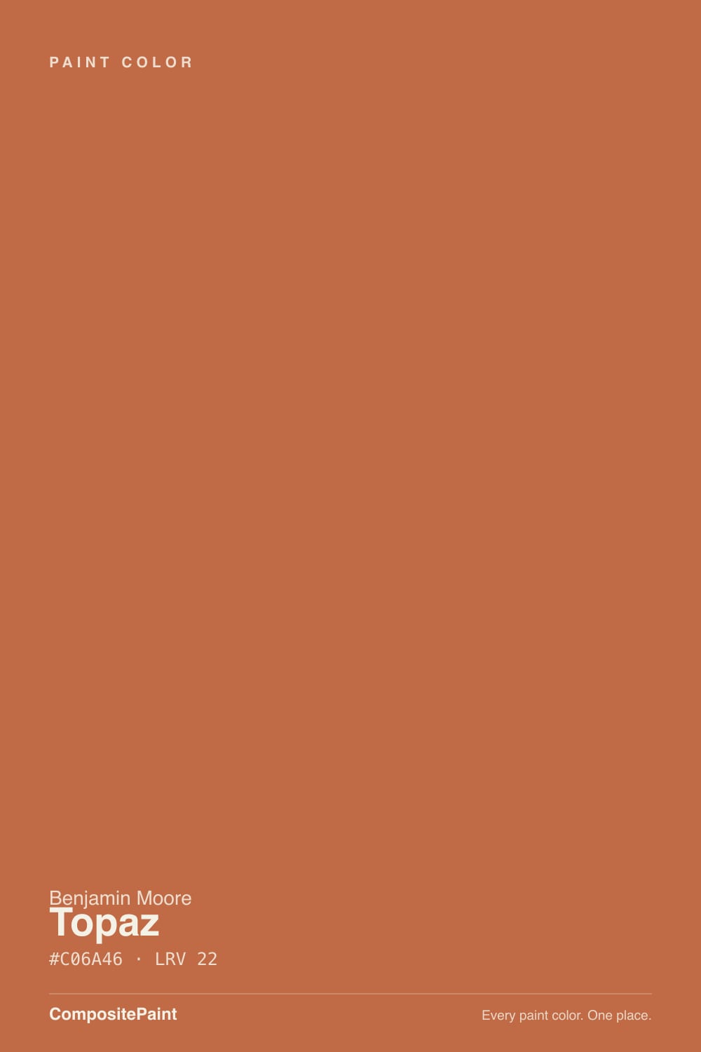
What Color Is Topaz, Really?
Topaz is a deep amber-orange with real brown weight behind it — the color equivalent of a terracotta pot or an old leather book cover, not a fresh-cut pumpkin. The brown base is what keeps it from reading as pure Halloween orange: it's warm and saturated, but grounded, which is why it shows up again and again on "most popular" lists for a color that never got a splashy trend campaign. It carries a plain, old-style three-digit code rather than a curated Color Trends number — the kind of standing Benjamin Moore shade that was quietly good long before terracotta became a design-blog word.
At LRV 22 it is a genuine mid-to-deep color, not a pastel accent you can sneak in anywhere. It absorbs most of the light that hits it, which means it holds its saturation in bright daylight rather than washing out — but it also means four full walls of it is a real commitment, not a light gesture. That depth is exactly why it earns its keep on an island, a vanity, or a den rather than an entire open floor plan: contained, it reads rich; spread thin across a big bright room, the same saturation can start to feel like a lot of orange.
Undertone in one line: warm amber-orange with a brown base, leaning toward terracotta and rust — never pink, never a clean citrus yellow. On the chip it can look more brown than orange; on four walls in real daylight the orange comes forward. If your sample looks muddy and flat instead of warm, that's the light doing it, not the paint.
Where It Shines
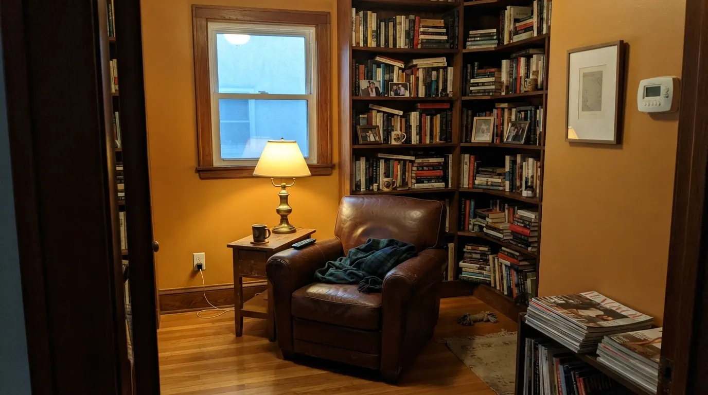
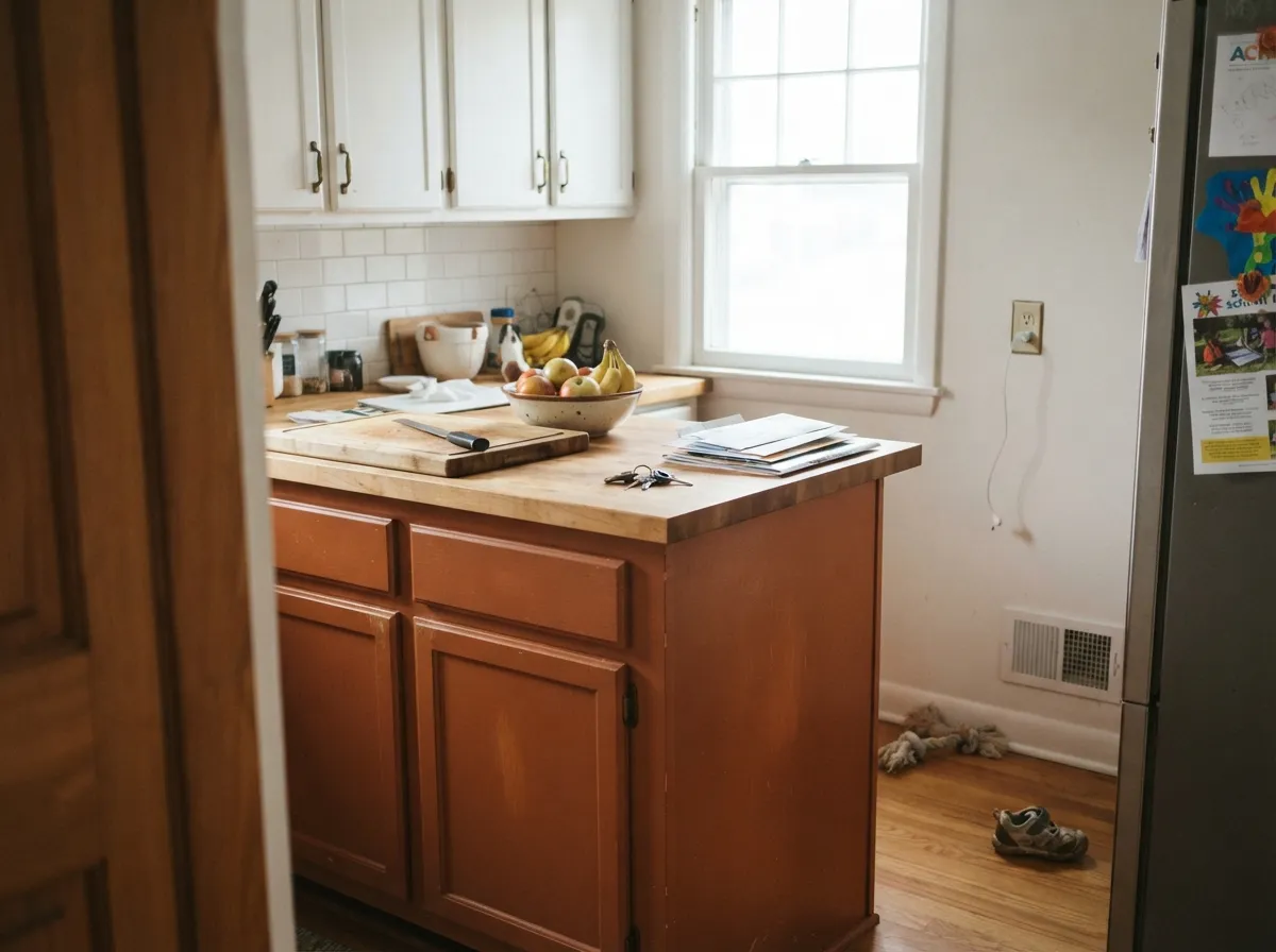
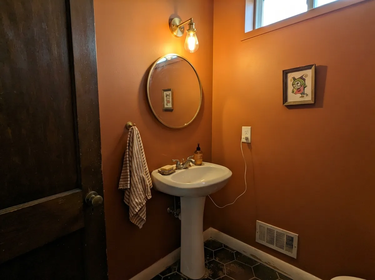
Give it a contained room and warm light and Topaz does exactly what a good accent color should: it makes the space feel finished and a little expensive without shouting. Studies, libraries, and dens are its natural home — walnut shelving, leather, brass reading lamps all read like they were chosen to match. Its second job is the kitchen island or a powder-room vanity, where the color gets to be the whole personality of one surface instead of negotiating with four walls of daylight.
Where It Fails
Almost every disappointing Topaz story comes from one of three predictable mismatches, and none of them are the paint failing — they're the room asking the wrong question of the color.
Cold daylight drains the amber out of Topaz and leaves a flat, muddy rust-brown with none of the glow that makes it worth choosing. The fix costs nothing extra: 2700K bulbs are part of this paint job, especially in a room that doesn't get direct sun.
Topaz was built to be rich in a contained space. Run it across an entire sunlit great room and the same saturation that looks like an antique study starts to read like a traffic-cone accent wall. Reserve it for a den, an island, or a powder room and let a quieter neutral carry the open plan.
This is a warm-side color through and through. Next to cool gray stone, blue-based decor, or polished chrome, the orange looks harsh and out of place instead of antique. Give it warm wood, brass, and leather and the same color reads deliberate.
Room by Room
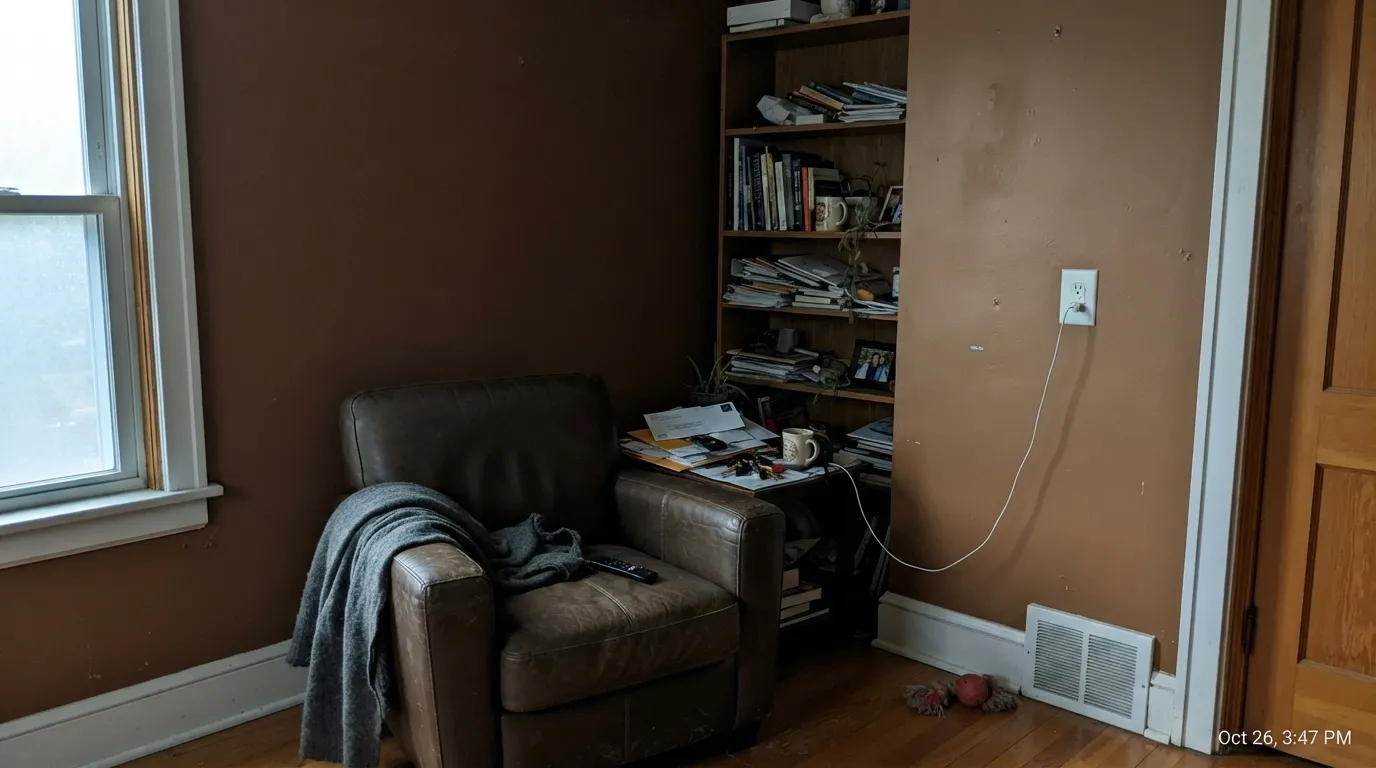
Low, warm light and real wood shelving are exactly what Topaz wants. Eggshell on the walls, White Dove on trim, and it looks like it has always been there.
On an island under white or cream upper cabinets it's a genuine showstopper, especially with brass hardware and butcher block. A full kitchen of Topaz cabinetry in a small galley with little daylight is a much bigger bet — sample it big first.
Small rooms take deep, saturated color well. Drenching a powder room in Topaz with a warm sconce and brass fixtures reads custom, not risky, precisely because there's no big open wall for it to overwhelm.
A closed dining room with a walnut table, brass chandelier, and evening candlelight is Topaz at its most flattering. In a bright, glassed-in dining nook it can feel like more orange than the meal needs.
One wall behind a bookcase, or a set of built-ins, lets the color do its job without asking every piece of furniture to negotiate with it. Whole-room Topaz in an open living space is the riskiest bet in the house.
This is an interior color. Full outdoor sun and weather don't do it any favors, and it isn't one of Benjamin Moore's recommended exterior shades — keep it inside.
Your Light Is the Risk
The amber comes fully forward and the brown base stays grounded, not muddy. The color's best, most honest light.
Cool daylight strips the glow out and leaves a flat, drab rust-brown. Test with a lamp on before you judge it in this room.
Bright and almost fiery at the sun hours, quieter and browner the rest of the day. The swing is real — sample at more than one time of day.
2700K lamps push it toward glowing amber. Cool white LEDs flatten it toward plain brown — swap the bulb before you swap the paint.
Most complaints about Topaz are a light mismatch. Upload a photo of your actual room and see it on your walls — then ask for the same wall in north light or evening lamps before you buy a single sample.
Need It From Another Brand?
Any paint counter can custom-tint Benjamin Moore 070 directly. If you would rather stay in one brand's own deck, these are the closest stock matches, measured as ΔE2000. Under 2 is a difference you will not see on the wall.
| Brand | Closest color | ΔE | LRV | |
|---|---|---|---|---|
| Sherwin-Williams | Determined OrangeSW 6635 · Sherwin-Williams | 2.6 | 22 | Color page → |
| Behr | Pumpkin DrizzleHDC-FL15-01 · Behr | 1.6 | 21 | Color page → |
| Valspar | Cattle Drive2007-5A · Valspar | 2.4 | 21.8 | Color page → |
| PPG / Glidden | Sesame CrunchPPG1198-7 · PPG / Glidden | 4.8 | 22 | Color page → |
| Glidden | Sesame CrunchPPG1198-7 · Glidden | 4.4 | 22 | Color page → |
| Dutch Boy | Lava Flow209-7DB · Dutch Boy | 2.9 | 22 | Color page → |
Similar Benjamin Moore Colors
The nearest shades to Topaz within Benjamin Moore's own range, ranked by perceptual color distance — useful when you want the same look a touch lighter, darker, or warmer.
WCAG 2.1: AA is 4.5 : 1 for normal text, 3 : 1 for large text, AAA is 7 : 1.
Topaz vs the Colors You're Also Considering
Every Topaz sample board has the same rivals on it. The numbers show the real lightness gap — then it comes down to which risk you would rather live with.
Pick this for the punchier, more clearly amber-orange version of the same terracotta mood.
Sherwin-Williams SW 7701 · LRV 24Cavern ClayPick this if you want the softer, more muted terracotta — SW's version that only really glows in the right light.
Pick this when you want real depth and real orange, not a pastel suggestion of it.
Sherwin-Williams SW 9081 · LRV 27Redend PointPick this for a lighter, pinker clay that's an easier sell in an open room.
Topaz Coordinating Colors
The rule for coordinating with Topaz: stay warm, and give it something quiet to sit against. It leans on creamy whites for trim, other golds and honeys for a layered warm scheme, and one cool or dark note — a sage, a charcoal, a navy — to keep the room from reading as one long orange note.
Topaz and the Terracotta Revival
Deep clay and terracotta tones have had a real design moment, and Topaz reads to a lot of shoppers as a Benjamin Moore answer to that trend. But it carries a plain, old-style three-digit code rather than a marketed Color Trends number — the kind of standing shade that was already quietly popular before rust and clay tones started showing up on every mood board.
That history is the practical argument for choosing it over a brand-new trend color: it's earned its popularity the slow way, on cabinets and studies and powder rooms, rather than through a single splashy year. If the current clay-and-terracotta wave fades, a genuinely warm amber-brown like this one has more room to age quietly than a color introduced specifically to catch a trend.
Topaz With Wood Tones and Metals
Warm wood is this color's best friend. Walnut shelving, butcher block, and aged leather all deepen the amber and make it read intentional rather than loud. Brass and aged bronze hardware are the natural metal pairing — they pick up the gold in the color instead of fighting it.
The pairings to avoid are cool ones: gray-washed or whitewashed floors, cool marble or quartz with blue-gray veining, and polished chrome all put Topaz at the opposite end of the temperature scale, and the contrast reads as clashing rather than intentional. If those cool materials are already in the room, treat Topaz as a small accent — a vanity, a door, a nook — rather than the main event.
Three Ready Palettes Built on Topaz
A color is never alone on the wall. These are complete combinations in the 60-30-10 pattern, with the reason each one holds together. Every one opens in the visualizer.
Topaz needs a quiet frame — White Dove trim keeps the room from tipping into an all-orange box, and the charcoal shelving gives one grounding dark note that reads library, not living room.
Try this palette in your roomTwo Benjamin Moore golds from the same warm family: Topaz on the island grounds the kitchen while creamy White Dove keeps the counters and uppers light, and the honeyed Golden Straw repeats the warmth in a nook without repeating the same color twice.
Try this palette in your roomA small, drenched room takes deep color well. The sage vanity gives one cool, grounding contrast against all that amber, and White Dove trim keeps the edges crisp instead of muddy.
Try this palette in your roomTopaz FAQ
Is Topaz an orange or a brown?
Both, in the right proportion — it's a genuine amber-orange with enough brown weight to read as terracotta rather than pure orange. On the paint chip it can look more brown; on a full wall in daylight the orange comes forward clearly.
Is Benjamin Moore Topaz good for kitchen cabinets?
Yes, especially on an island under white or cream upper cabinets — brass hardware and butcher block both flatter it. Use a satin cabinet enamel, and sample a large board before committing an entire small, dim kitchen to it.
Can I use Topaz on an exterior or front door?
It isn't recommended for exterior use. Keep this one indoors, where the warm light and wood pairings it needs are easier to control.
What trim white goes with Topaz walls?
White Dove — a warm, soft white keeps the orange from looking stark next to it. A bright, cool white trim can make the same wall color look harsher by contrast.
Does Topaz work in a small room like a powder room?
This is one of its best jobs. Small, saturated rooms take deep warm color well, and there's no big open wall for the orange to overwhelm the way it can in a great room.
Is Topaz's undertone warm or cool?
Entirely warm — amber-orange over a brown base, with no pink or gray in it. In cool north light it can look drained and muddy, but it never actually shifts cool the way some grays and whites do.
Have you painted with Topaz?
Rate it — one tap helps the next reader decide.
Ask a Question