Osage Orange
The sunny golden orange in the Sherwin-Williams deck, reviewed honestly: the rooms it lifts, the rooms it swallows, and how many coats it really takes.

Jessica has spec'd whites and neutrals for more than 300 rooms and keeps a sample wall of painted drawdowns in her studio. Every color review is checked against real reader rooms in the comments and re-tested when a formula changes. About the testing process →
- 1Determined Orange22
- 2Caramelized35
- 3Osage Orange45
- 4Beehive51
- 5Colonial Yellow59
The Fast Verdict
Osage Orange is the likeable end of orange: a clean, golden, sunlit color that never tips into rust or neon. LRV 45 makes it sound like a mid-tone, but lightness is not what you feel here — saturation is. On one wall, a door, or a wall of built-in cubbies it is genuinely cheerful and looks far more considered than a primary-color kids' scheme. On four walls of a dim room it stops being a color and becomes the weather. Budget for a tinted primer and three coats either way.
Children's rooms and playrooms · one accent wall or a run of built-ins · front doors on white, gray or navy houses · sunrooms and entries that already have real daylight
You want all four walls of a small, dim room in it · your floors and trim are already honey oak and orange-toned · the room runs on 4000K LEDs · you change wall colors often and hate priming
- Cheerful without going neon — the gold in it keeps it friendly
- Reads clean and sunny in daylight where most oranges go rusty
- A natural dose color: one wall, a door, a run of built-ins
- Kids' rooms and playrooms that skip the primary-color cliche
- Pairs cleanly with soft historic blues and grounded greens
- Poor hide — plan on a gray-tinted primer and three coats
- Takes over a room fast and bounces warm light onto ceilings and faces
- Goes muddy in dim rooms and plasticky under cool LEDs
- Expensive to undo: burying it later needs primer plus two coats
What Color Is Osage Orange, Really?
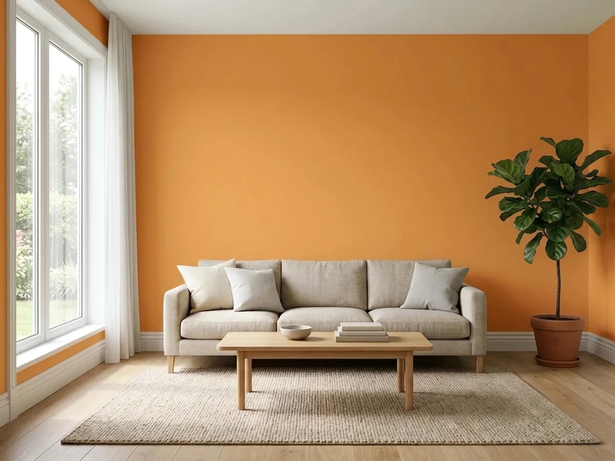
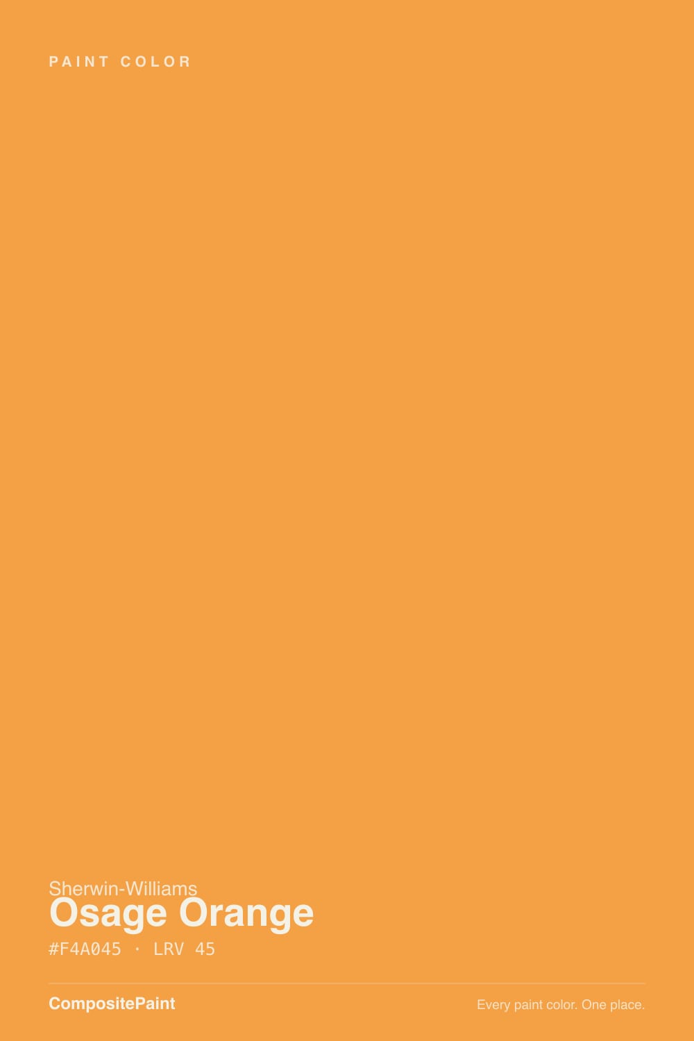
A clean golden orange that sits on the yellow side of the family — think fresh apricot and marigold rather than terracotta, rust or pumpkin. Sherwin-Williams files it with the oranges, and the name is literal: the Osage orange tree, the bois d'arc the Osage Nation made bows from, has heartwood that comes off the saw exactly this bright yellow-orange before it weathers darker. That is the color you are buying — the fresh-cut version, not the aged one. Next to Navel (LRV 35) it is the lighter, sunnier, less red one; next to Bee (LRV 55) it is clearly orange rather than yellow.
The LRV number is the trap. At 45 it is technically mid-range, and people read that as "medium, so it will behave like a medium color." It will not. A greige at LRV 45 is background; a saturated orange at LRV 45 is the subject of the room, because what your eye reacts to is chroma, not lightness. It also bounces: a big plane of this throws warm light back onto the ceiling, onto white trim, and onto faces, which is charming in a playroom and unnerving in a bathroom mirror. Plan the quantity before you plan the sheen.
Undertone in one line: gold first, orange second — no red, no brown. If your sample looks brown or rusty on the wall, the room is dim or the bulbs are cool; if it looks nearly yellow, that is strong afternoon sun exaggerating the gold. Both are the same paint reporting on your light.
Where It Shines
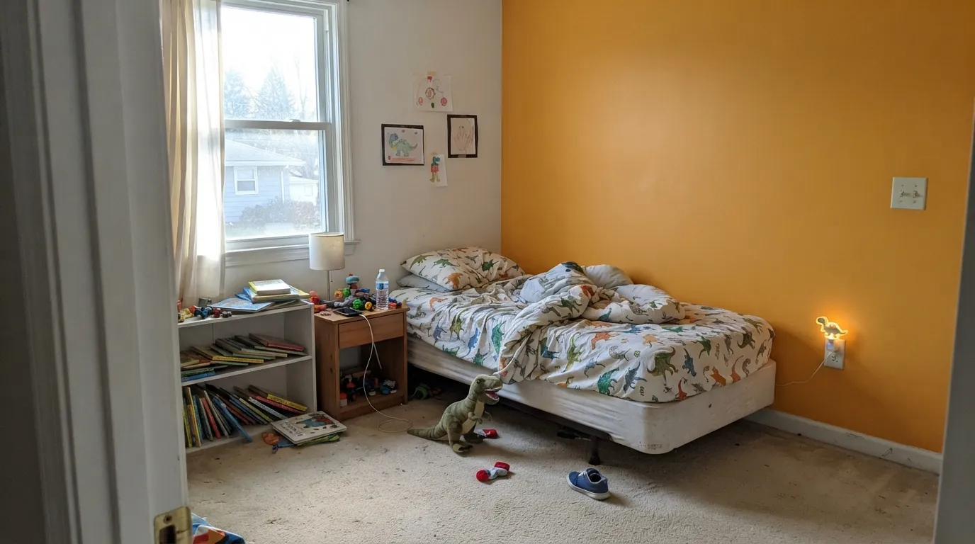
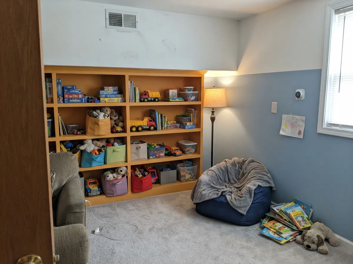
This color is at its best where energy is the point and the room already has daylight. Children's rooms and playrooms are its home turf — it reads happy without the Crayola-box look that dates a kid's room in two years, and it pairs with soft blues and grounded greens instead of primary red and yellow. Its second home is the small commitment: an entry wall, a front door, the backs of open shelves, a run of cubbies in a mudroom-style bench. Give it plenty of clean white to breathe against and one dark or blue note to push back, and it looks deliberate rather than loud.
Where It Fails
Almost every regret story about a color like this follows one of three scripts, and all three are visible before you open the can. None of them are the paint's fault — but if your room matches one, sampling a bigger square will only confirm it faster.
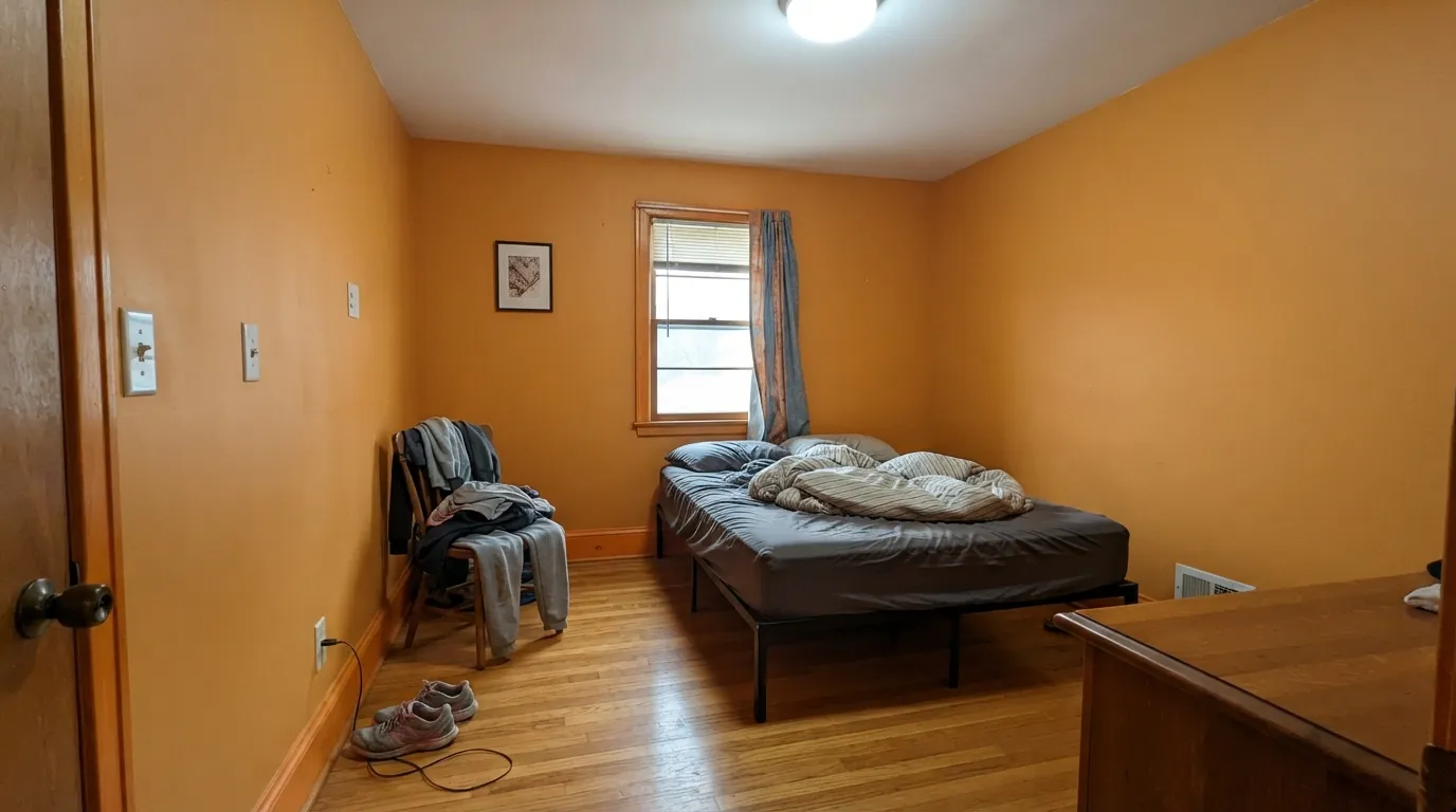
This is the number-one mistake. At full saturation the color fills the room with reflected warm light, the ceiling picks up an orange cast, and after a week people describe the room as tiring rather than cheerful. It is not that orange cannot cover a room — it is that this much chroma needs a big, bright room and a lot of white to survive. One wall, or wainscot height, or the built-ins. Then it stays a color you chose instead of a color you live inside.
Golden oak, orange-toned laminate and yellow-beige carpet sit in the same lane as this paint, so nothing separates them. The wall stops reading as a decision and starts reading as a very large stain, and the floor looks more orange than it did yesterday. This color needs a contrast partner in the room: white trim, a blue or green textile, a dark floor, or a big neutral rug between it and the boards.
4000K and 5000K bulbs strip the gold and leave a flat, plasticky apricot; a dim north room takes it the other way, toward muddy brown-orange. Both are the same complaint — the light has nothing warm for the color to work with. Warm 2700K bulbs are part of this paint job, not an optional upgrade, and a windowless room is the wrong room for it.
Room by Room
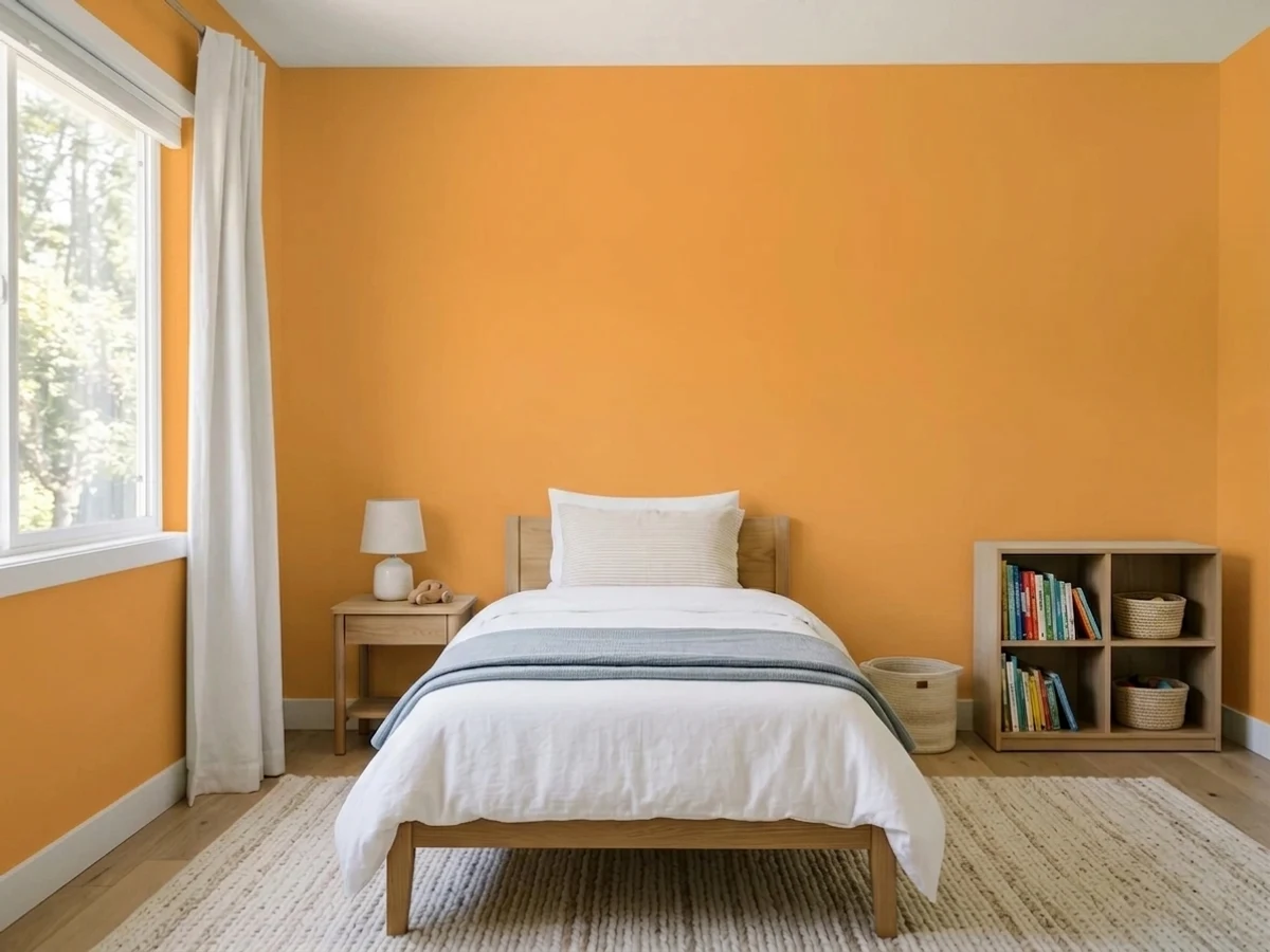
One orange wall behind the bed, everything else clean white, and the room is done. It photographs happy, it survives the kid growing older better than a themed color does, and it gives soft blue and green bedding something to sit against. Eggshell or satin so fingerprints and crayon wipe off.
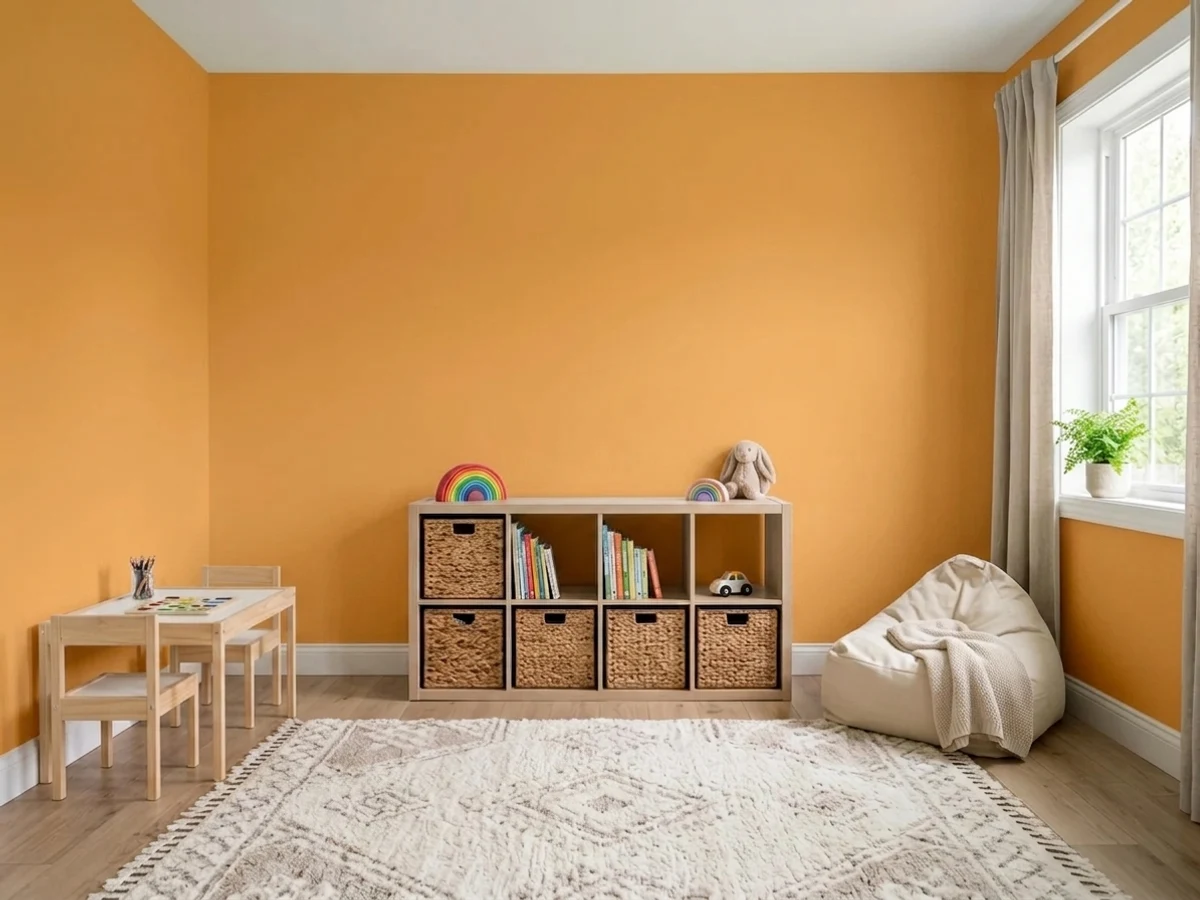
Rooms meant for noise and mess are exactly where this much energy earns its keep. It is especially good on the built-ins: cubbies, toy shelves, the inside back of open shelving, a play-table base. White walls plus orange storage is the version that still looks good when the toys go.
An entry is a room you pass through, which is the perfect dose for a color that gets tiring to sit in. One wall, the inside face of the front door, or a bench-and-hook wall reads confident and welcoming. Keep the trim white and let the color stop at the doorway rather than following you into the living room.
Sunrooms are the one everyday room with light to spare, and this color drinks light. It works on a lower wall, a shelf run or painted furniture with white above and around it. What it cannot do is a sunroom in full southern glare with orange-toned floors — that is a greenhouse, not a room.
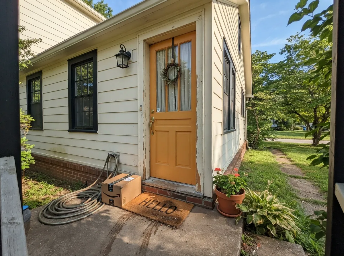
A golden-orange door on a white, light-gray or navy house is one of the few genuinely cheerful curb-appeal moves left. Use exterior-grade door and trim enamel, and know that bright organic orange pigments are the fastest-fading part of any exterior scheme, especially on a south- or west-facing door in full sun. Treat it as a color you refresh, not one you paint once.
These are the rooms you sit still in, and a saturated orange keeps talking. Adult bedrooms in particular are the most common repaint story for bright oranges. If you love the color and want it in a living space, put it on one piece — a cabinet, a door, a bookcase back — and keep the walls quiet.
Your Light Is the Risk
Full south or midday light is where it looks like the chip: clean gold-orange, sunny, no rust. The color needs light more than most — give it a real window.
Cool gray daylight cancels the gold and leaves a heavy brown-orange that reads dated. This is the light behind almost every "it looked nothing like the chip" complaint.
Sharp and almost yellow in morning east light; at western golden hour the sunlit wall glows near-neon for an hour, then settles deeper and warmer after sundown.
2700K warm bulbs deepen it toward amber and make it cozy — the version most owners like best. 4000K and cooler LEDs flatten the gold into a hard apricot plastic.
Most complaints about Osage Orange are a light mismatch. Upload a photo of your actual room and see it on your walls — then ask for the same wall in north light or evening lamps before you buy a single sample.
Need It From Another Brand?
Any paint counter can custom-tint Sherwin-Williams SW 6890 directly. If you would rather stay in one brand's own deck, these are the closest stock matches, measured as ΔE2000. Under 2 is a difference you will not see on the wall.
| Brand | Closest color | ΔE | LRV | |
|---|---|---|---|---|
| Behr | Squash290B-6 · Behr | 2.3 | 46 | Color page → |
| Benjamin Moore | Fruity Cocktail147 · Benjamin Moore | 2.5 | 45 | Color page → |
| Valspar | Off-the-Leash OrangeV011-2 · Valspar | 3.4 | 46 | Color page → |
| PPG / Glidden | CornucopiaPPG1203-7 · PPG / Glidden | 1.4 | 42 | Color page → |
| Glidden | Carotene97YR 44/642 · Glidden | 0.8 | 44 | Color page → |
| Dutch Boy | Sun Filled Day110-5DB · Dutch Boy | 1.8 | 44 | Color page → |
Similar Sherwin-Williams Colors
The nearest shades to Osage Orange within Sherwin-Williams's own range, ranked by perceptual color distance — useful when you want the same look a touch lighter, darker, or warmer.
WCAG 2.1: AA is 4.5 : 1 for normal text, 3 : 1 for large text, AAA is 7 : 1.
Osage Orange vs the Colors You're Also Considering
Every Osage Orange sample board has the same rivals on it. The numbers show the real lightness gap — then it comes down to which risk you would rather live with.
Pick this for the lighter, sunnier version that a whole kid's wall can live with.
Sherwin-Williams SW 6887 · LRV 35NavelPick this if you want a deeper, truer orange with more punch and less yellow in it.
Pick this when you actually want the color to be seen, not just felt.
Benjamin Moore 2166-40 · LRV 42Soft PumpkinPick this for nearly the same lightness with the volume turned down — dustier, closer to a warm neutral, easier on four walls.
Osage Orange Coordinating Colors
The rule for coordinating with this color: give it whites to stop against, one cool partner to balance it, and one dark note to anchor it — and keep every other warm, golden color out of the room. These are the partners that keep showing up in schemes that actually work:
The Tree Behind the Name
Osage orange is a real and slightly absurd American tree — Maclura pomifera, the one that drops those green, brain-textured hedge apples nobody wants on their lawn. French traders called it bois d'arc, wood of the bow, because the Osage Nation made bows from it and traded them widely; English speakers kept the tribe's name and stuck an orange on the end. Its heartwood comes off the saw a startling bright yellow-orange and then weathers darker over the years, and the wood is so hard and rot-resistant that settlers used it for wagon wheels, boundary markers and fence posts.
The paint is named for the fresh-cut version, and that is a fair description of the color: bright, golden, a little unexpected. There is a second bit of history in the name worth knowing, because it explains why the color feels familiar even if you have never seen the tree. Before barbed wire, farmers planted Osage orange as living fence — roughly 60,000 miles of it across the Midwest and South by 1869. It is one of the most quietly American names in the deck, which is part of why it works in a room that wants to feel warm and unfussy rather than trendy.
Living With Orange: Coverage, Bounce, and How Much Is Too Much
Coverage is the practical surprise. The pigments that make a color this clean and bright are transparent by nature, and the base they are tinted into carries far less titanium dioxide than a standard white or greige, so the first coat over drywall looks patchy in a way that makes people think they bought bad paint. They did not. The fix is a gray-tinted primer in the shade the paint counter recommends for this color, then two finish coats. Skipping the primer usually costs you a third and sometimes a fourth coat, which is more expensive than the primer was.
Bounce is the surprise nobody warns you about. A large plane of saturated warm color reflects that warmth onto everything near it — the ceiling picks up a faint orange cast, white trim next to it stops looking white, and in a bathroom it will change how your face looks in the mirror. This is physics, not a defect, and it is exactly why the color behaves so much better on one wall or a run of built-ins than on all four walls of a small room.
The dose rule that works: let this be the 10 percent of a room, not the 60. Whites and neutrals carry the room, one cool or dark partner does the balancing, and the orange shows up in a concentrated place where you want your eye to land. Paint it on the surfaces that are already fun — cubbies, a play table, a door, a bookcase back — and the color reads generous instead of overwhelming. And plan the exit before you start: covering it later takes a primer coat plus two, so it is not a color to try out on a whim in a rental.
Three Ready Palettes Built on Osage Orange
A color is never alone on the wall. These are complete combinations in the 60-30-10 pattern, with the reason each one holds together. Every one opens in the visualizer.
Orange and blue sit opposite each other, so this is the pairing that stops the room going one-note — but the blue here is a soft historic one at LRV 39, not a primary, which keeps it from turning into a sports-team scheme. Pure White on the other three walls is what gives the orange somewhere to stop.
Try this palette in your roomA warm white house at LRV 85 and a near-black frame at LRV 6 give the door the biggest possible contrast gap, which is what makes a bright door read as a decision rather than an accident. The charcoal also keeps the scheme from going beachy — without it, white plus orange drifts toward a sherbet stand.
Try this palette in your roomGreen is the quiet way to balance orange: at LRV 21 Dried Thyme is dark enough to anchor the bottom of the room while the orange sits at eye level. Alabaster is a soft warm white, so the transition from white wall to orange shelf has no cold edge in it — a stark blue-white trim would make the orange look like a highlighter.
Try this palette in your roomOsage Orange FAQ
Is Osage Orange too bright for a children's room?
Not on one wall. It is bright, but the gold in it keeps it friendly rather than shrill, and it looks far less dated than a primary red-yellow-blue scheme. What does go wrong is quantity: all four walls of a small bedroom is too much for a room a child also sleeps in. One wall behind the bed, or the built-in storage, plus clean white everywhere else, is the version parents keep.
How many coats does Osage Orange need?
Realistically three, and start with a gray-tinted primer. Bright oranges and yellows are built on a clear or deep base with very little titanium dioxide, which is the pigment that does the hiding, so straight over white drywall the first coat looks alarmingly streaky. Sherwin-Williams sells tinted primer in graded gray shades for exactly this reason — ask the counter which gray goes under SW 6890 and you will likely save a coat.
What colors go with Osage Orange?
Three groups do the work. Clean whites give it somewhere to stop. Soft, slightly grayed blues sit opposite it on the wheel and calm it without fighting. Grounded greens and near-blacks anchor the bottom of the room so the orange does not float. What to avoid is more warmth of the same temperature — golden beige, honey oak tones and yellow-cream all blur into it.
Can I use it on all four walls?
Only in a big, bright room you pass through rather than sit in, and only with a lot of white trim. In a normal bedroom or office the reflected warm light builds up, the ceiling picks up an orange cast, and the room feels loud within a week. If you want a whole room in a warm color, step down to something dustier like Soft Pumpkin (LRV 42) or earthier like Cavern Clay (LRV 24).
Will it look orange, yellow or brown on my wall?
All three, depending on the light — but the paint is a gold-leaning orange with no red or brown in it. Strong afternoon sun pushes it toward yellow; dim north light or cool LEDs drag it toward a muddy brown-orange that owners describe as looking nothing like the sample. Tape a big sample to the wall you actually plan to paint and look at it at 10am, 4pm and after dark with the lamps on.
Does it hold up outside on a front door?
It looks great and it fades. Bright orange relies on organic pigments that are the least lightfast part of any exterior palette, so a south- or west-facing door in full sun will lose some punch faster than the black trim beside it. Use a proper exterior door-and-trim enamel, and treat a bright door as a two-hour refresh every few years rather than a permanent finish.
Have you painted with Osage Orange?
Rate it — one tap helps the next reader decide.
Ask a Question