Soft Pumpkin
The soft apricot orange from Benjamin Moore's Orange family, reviewed honestly: the rooms where it reads friendly, the light that turns it hot, and what to pick instead.

Jessica has spec'd whites and neutrals for more than 300 rooms and keeps a sample wall of painted drawdowns in her studio. Every color review is checked against real reader rooms in the comments and re-tested when a formula changes. About the testing process →
- 1Determined Orange22
- 2Caramelized35
- 3Soft Pumpkin42
- 4Beehive51
- 5Colonial Yellow59
The Fast Verdict
Soft Pumpkin is orange with the volume turned down: a medium apricot with a creamy softness that keeps it from ever reading neon. At LRV 42 it holds real color without darkening a room, which is exactly why it works as the one strong wall in a child's room, a warm entry, or a dining room that comes alive at night. What it is not is a warm neutral. On four walls, in west sun, it is unmistakably orange — and half the bad reviews of colors like this are people who bought the chip expecting beige.
One wall in a child's room or playroom · entries and hallways with no hard west sun · dining rooms that live at night · powder rooms · anyone who wants warmth a beige cannot give
You actually wanted a warm neutral · the room takes hard west afternoon sun · your floors and trim are honey oak · you plan to drench four walls of an open plan
- Orange with the volume down — friendly and warm, never neon
- LRV 42 keeps the room bright while still carrying real color
- North-facing rooms actually improve it, which almost no warm color can say
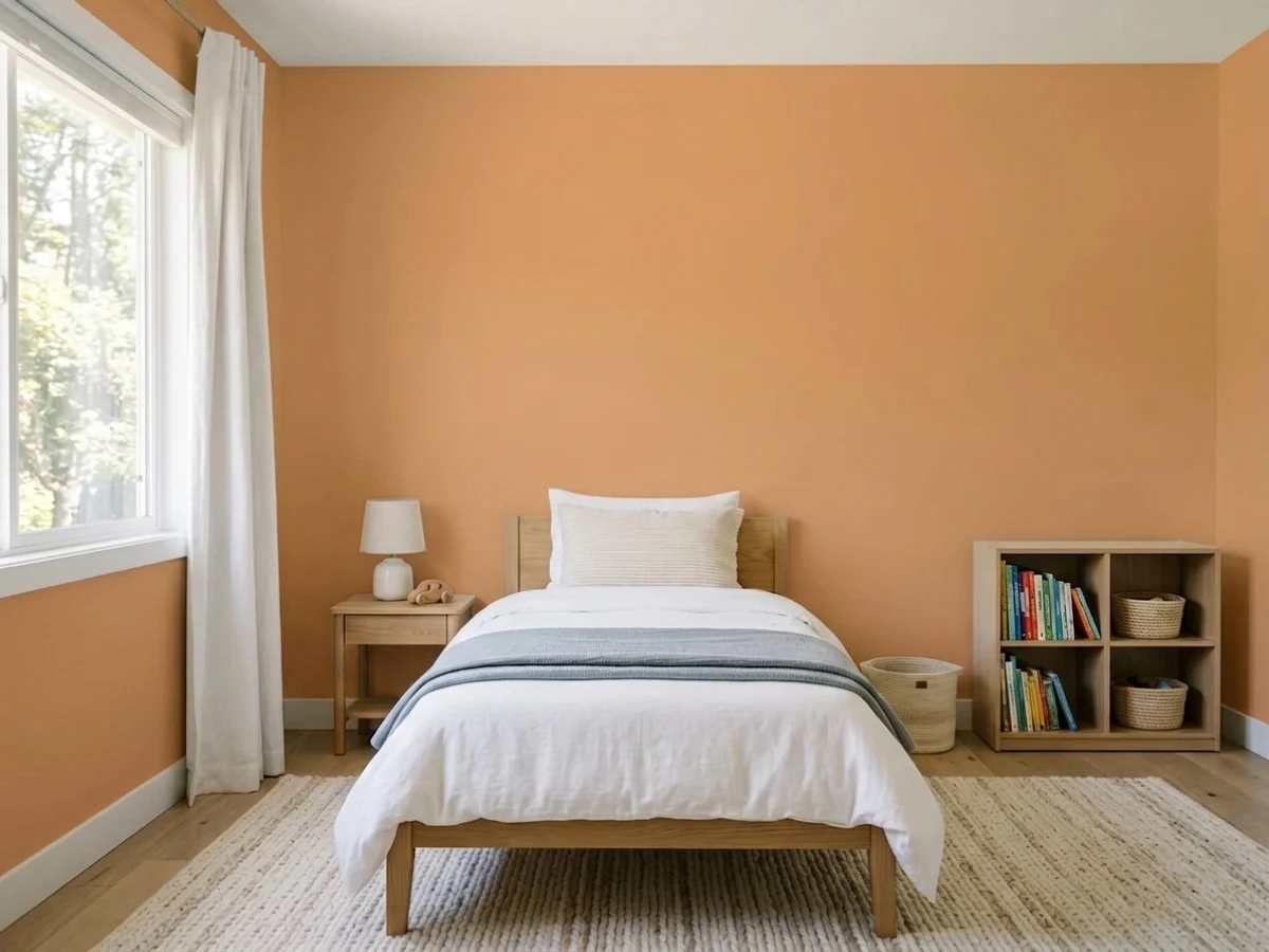
- Makes a kid's room look designed instead of themed, and outlasts the theme
- Rides the 2026 warm-earth revival without committing to full terracotta
- Reads clearly orange on four walls no matter what the chip suggested
- Hard west sun flares it two steps hotter and brighter
- Fights honey oak, orange brick and golden builder trim
- Orange is a weak-hiding pigment family — expect a tinted primer and three coats
What Color Is Soft Pumpkin, Really?
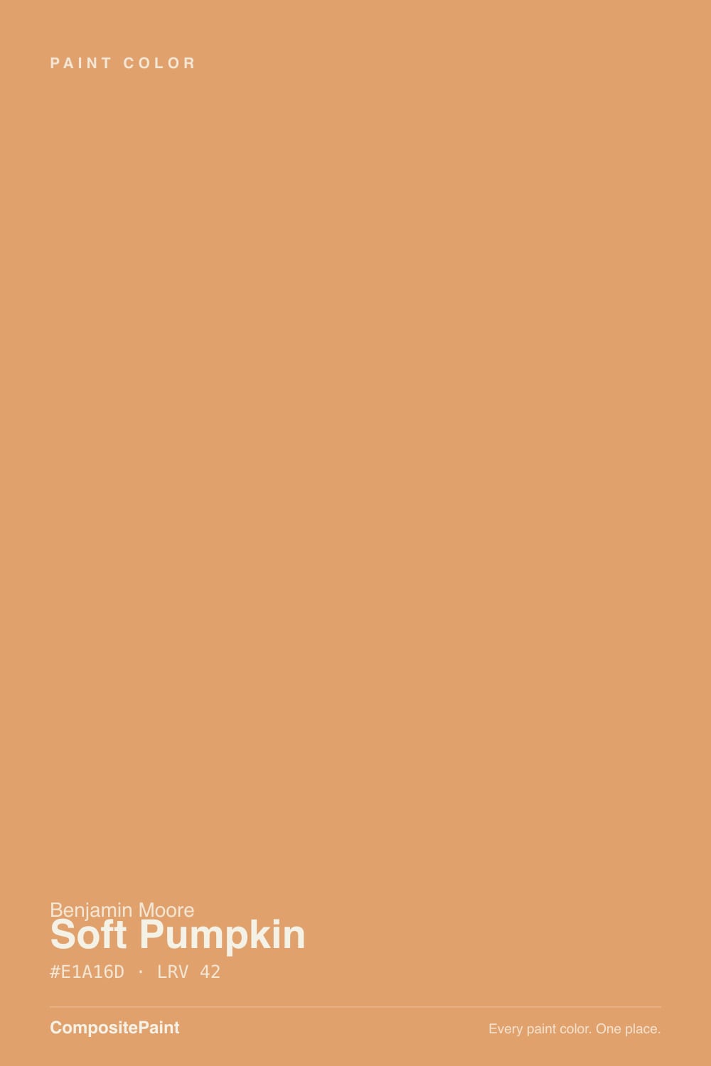
A medium apricot orange with a creamy softness built into it — that softness is the whole reason this color is usable indoors. Straight oranges go traffic-cone on a wall the second daylight hits them; Soft Pumpkin is pulled back toward apricot and clay, so it reads warm and fruity instead of loud. Benjamin Moore files it in Color Preview, the big numbered collection, under the Orange family, and the name is closer to honest than most: it is pumpkin flesh, not pumpkin skin — lighter, softer, less red.
At LRV 42 it sits right at the midpoint: bright enough that a small room does not close in, deep enough that it never fades into the trim. The number that matters more than LRV here is chroma. Soft Pumpkin carries noticeably more saturation than the caramel-tan neutrals people compare it to — put it beside Sherwin-Williams Caramelized (LRV 35) and Caramelized reads as a quiet caramel neutral while Soft Pumpkin reads as a color. Plan for the painted wall to read a step more orange and a step more saturated than the chip, because chroma multiplies across a large surface.
Undertone in one line: orange first, a whisper of apricot-pink second, never brown. If your sample looks tan, you are seeing it in cold flat light; if it looks hot and peachy, that is west sun or a warm bulb. Both are the same paint telling the truth about your room.
Where It Shines
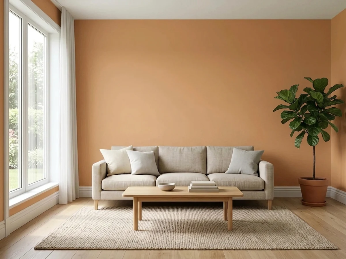
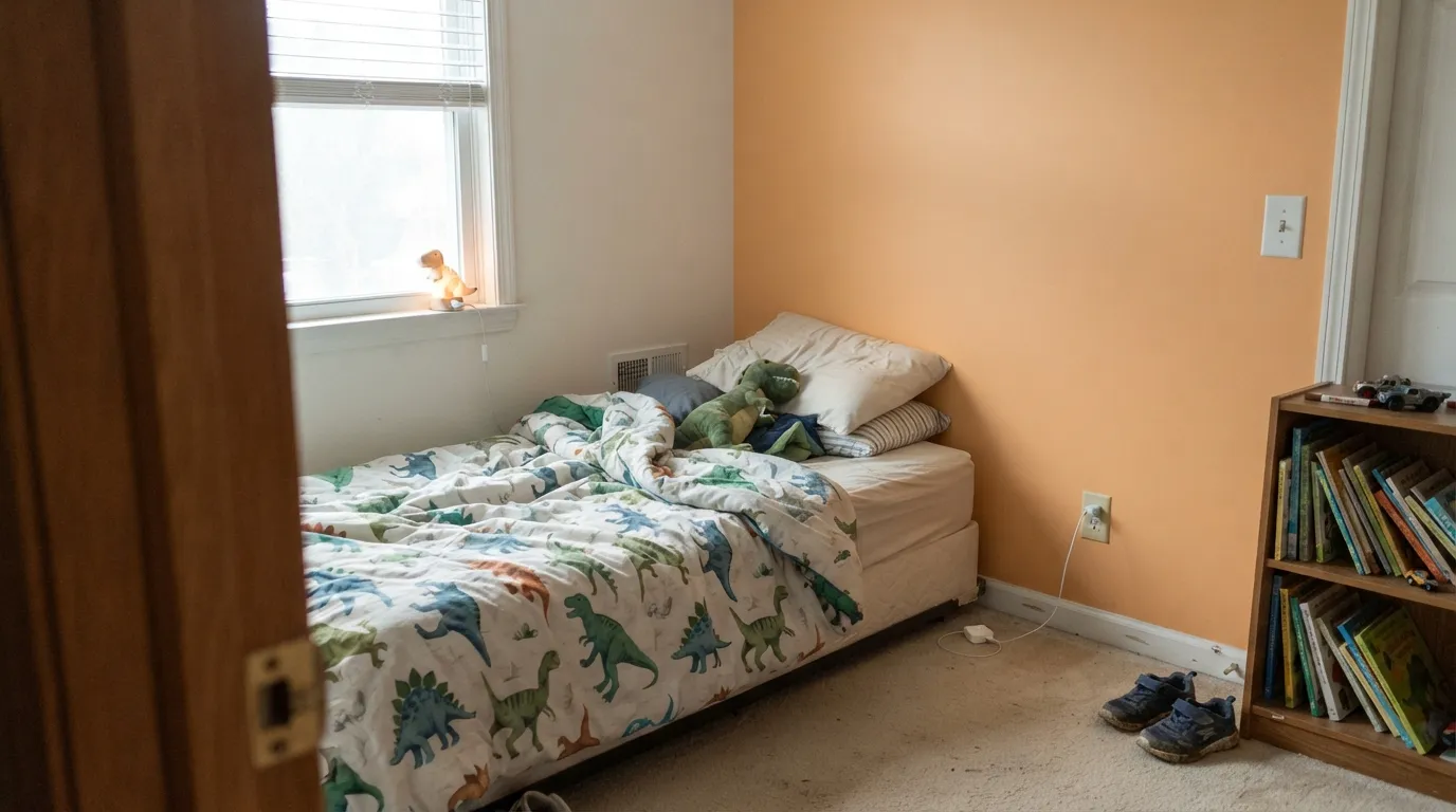
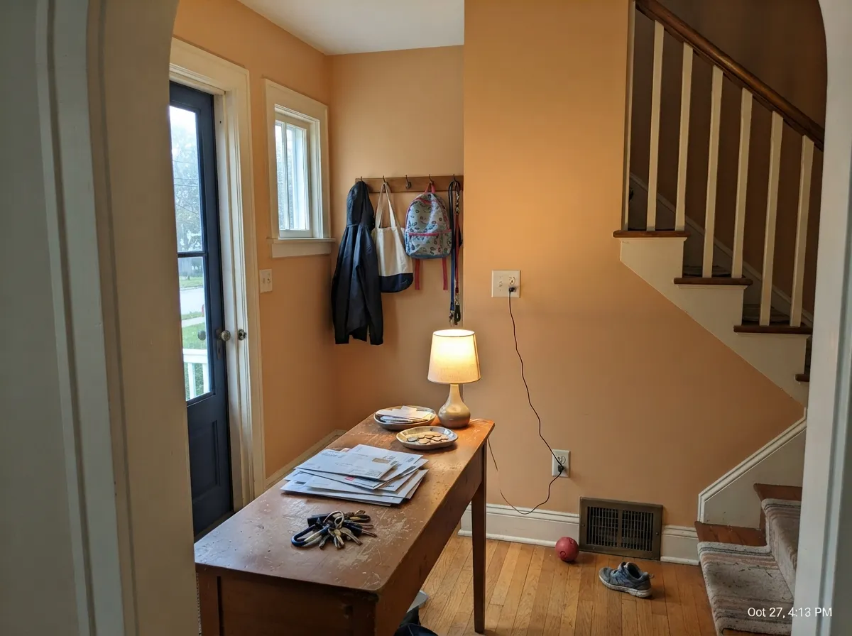
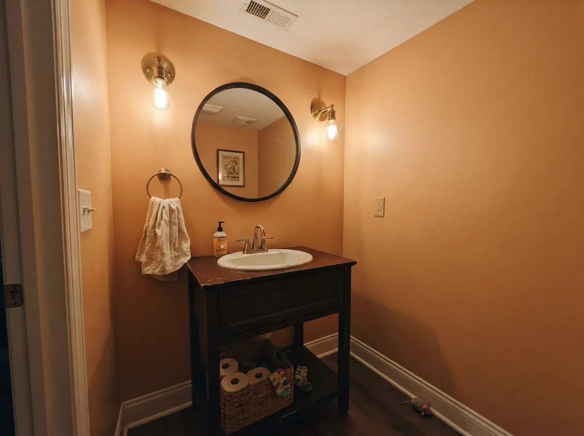
This color earns its keep as the strong note in a room, not as the whole room. In a child's bedroom, one Soft Pumpkin wall behind the bed does what a themed mural tries to do and fails — it gives the room energy and a point of view without dating in eighteen months. It is genuinely good in the spaces that have no furniture to argue with: entries, stair halls, powder rooms. And it is at its most flattering after dark, when warm lamplight pushes it toward amber and a dining room or hallway suddenly feels like somewhere you want to stand.
Where It Fails
Almost every regret with a color like this follows one of three scripts, and all three are visible before you open the can. None of them are the paint's fault — but if your room matches one, sampling a bigger square will only confirm the bad news faster.
On a two-inch chip Soft Pumpkin can pass for a warm tan. On four walls it is orange and everyone in the house will say so. Depth plus chroma is what does it — LRV 42 is enough surface area for the saturation to accumulate. If what you actually wanted was warmth without a color name attached, Behr Mushroom Bisque (LRV 47) sits at nearly the same brightness with none of the orange.
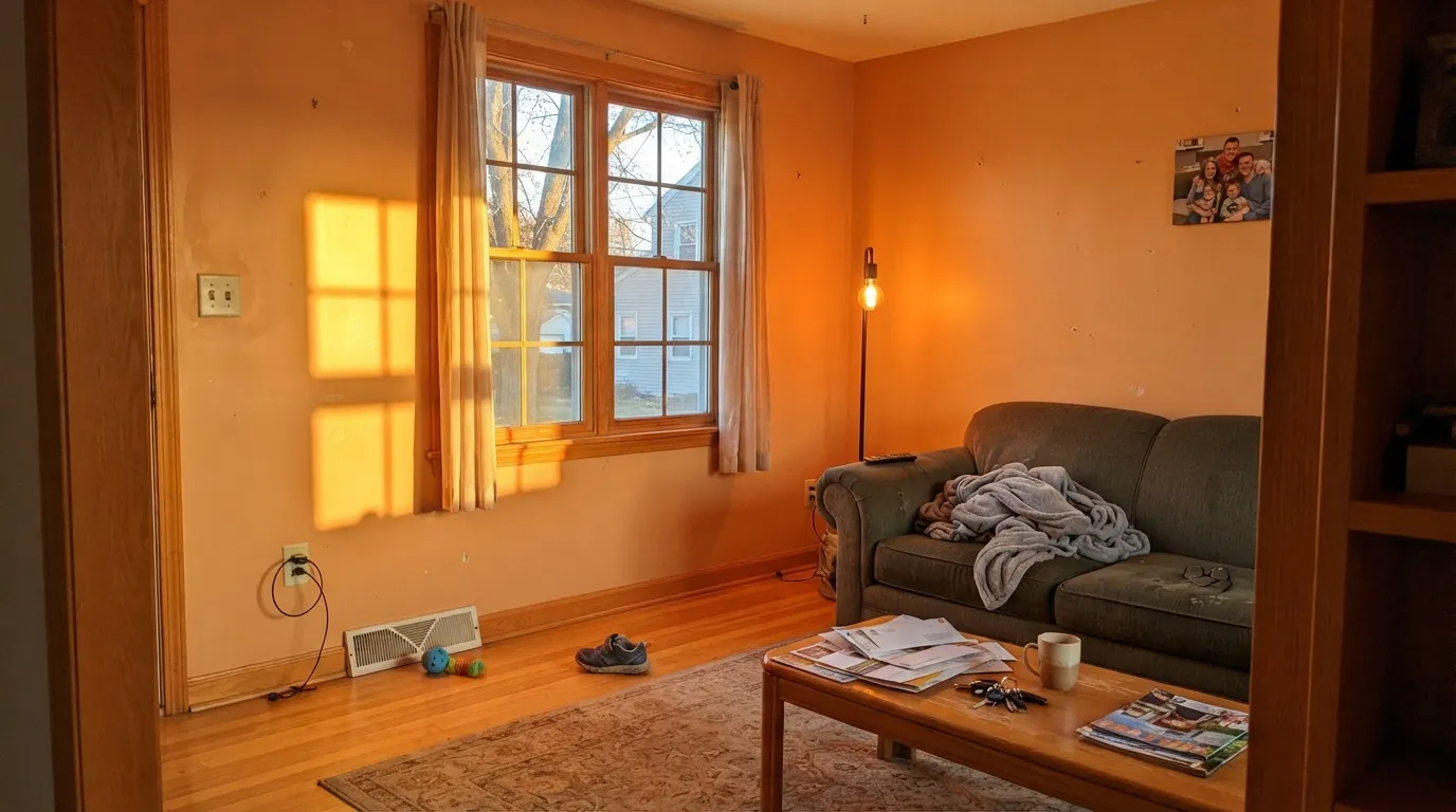
Late-day sun is the single worst light for this color. It adds warmth to a wall that already has plenty, and a soft apricot flares into a hot, glowing pumpkin two steps brighter than the chip — the room stops feeling cozy and starts feeling lit from inside. A west-facing living room or a bright sunroom is the wrong address. North and east rooms are where it behaves.
This is not a complement clash, it is a sameness clash: golden oak floors, orange-stained trim, a red-orange brick fireplace and pink-beige carpet are all in the same neighborhood as the wall, so nothing has an edge and the whole room reads as one muddy orange soup. Soft Pumpkin needs a clean white trim line and a floor that is either genuinely dark (walnut, espresso) or genuinely pale (white oak) to push against.
Room by Room
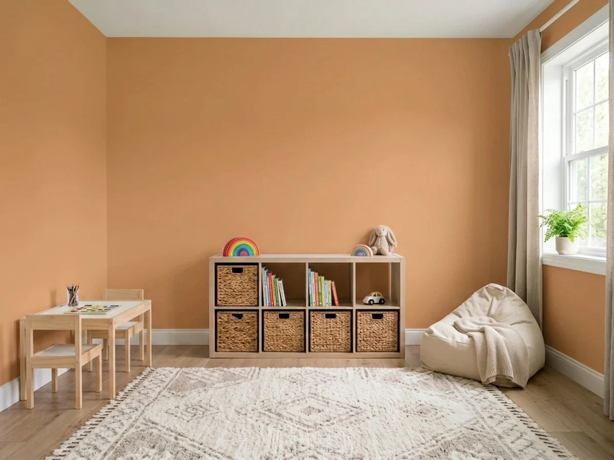
This is the one place to use it everywhere. Orange is the social, chatty color — the reason designers reach for it in rooms built for playing together — and Soft Pumpkin is muted enough that a whole room of it energizes without tipping into overstimulation. Scrubbable matte or eggshell, because this room takes fingerprints.
Behind the bed or on the closet wall it makes the room feel considered instead of themed, and it survives a kid outgrowing dinosaurs. A full drench in a bedroom is where orange's reputation for winding kids up becomes real, and it fights the job of the room. Keep the other walls a warm white and let the one wall do the work.
Benjamin Moore's own suggested uses put it on entry and hallway walls and they are right: these are the rooms with no sofa, no counter and no big window to fight, so a warm mid-tone just reads as welcome. Eggshell so scuffs wipe. Watch for a west-facing front window, which changes everything after 4pm.
Warm oranges have always been dining-room colors for a reason: under 2700K bulbs the walls go amber and skin tones look good, which is most of what a dining room is asked to do. It behaves better here than in a living room because you mostly see it at night, at its best.
Small, windowless, lamp-lit and cheap to redo: everything a saturated warm color wants. Four walls of Soft Pumpkin under warm sconces reads jewel-box rather than juvenile, especially with brass and a dark mirror frame. This is the safest way to find out if you like living with the color.
In a closed, north-facing living room with dark wood it can be lovely. In an open plan it has to negotiate with kitchen cabinets, flooring and the next three rooms, and mid-tone orange loses most of those negotiations. Outside, full sun bleaches it toward a chalky peach that reads as faded stucco from the street — there are better exterior warms.
Your Light Is the Risk
The inversion that surprises people: cool north daylight takes the heat off a warm orange and leaves it soft, dusty and apricot. The light that ruins beiges is the light that makes this one behave.
Low warm sun stacks warmth on warmth and the wall flares hot, glowing pumpkin for a couple of hours. If your only sample time is midday, come back at 5pm before you commit.
Peachy and gentle in morning east light, most honest and most clearly orange at midday, then sinking toward a soft caramel as the light drops. It is a color that moves — most people like the range.
2700K warm bulbs push it toward amber and terracotta, which is its most flattering version. Cool 4000K LEDs strip the warmth out and leave a flat, slightly dull tan — swap bulbs before you blame the paint.
Most complaints about Soft Pumpkin are a light mismatch. Upload a photo of your actual room and see it on your walls — then ask for the same wall in north light or evening lamps before you buy a single sample.
Need It From Another Brand?
Any paint counter can custom-tint Benjamin Moore 2166-40 directly. If you would rather stay in one brand's own deck, these are the closest stock matches, measured as ΔE2000. Under 2 is a difference you will not see on the wall.
| Brand | Closest color | ΔE | LRV | |
|---|---|---|---|---|
| Sherwin-Williams | Harvest GoldSW 2858 · Sherwin-Williams | 2.3 | 41 | Color page → |
| Behr | Caramel Sundae280D-4 · Behr | 2.0 | 42 | Color page → |
| Valspar | Frankincense3002-5C · Valspar | 2.4 | 42.8 | Color page → |
| PPG / Glidden | Orange ClayPPG1200-4 · PPG / Glidden | 4.6 | 45 | Color page → |
| Glidden | Caramelized Orange80YR 39/347 · Glidden | 2.7 | 39 | Color page → |
| Dutch Boy | Harvested Moon210-5DB · Dutch Boy | 2.9 | 39 | Color page → |
Similar Benjamin Moore Colors
The nearest shades to Soft Pumpkin within Benjamin Moore's own range, ranked by perceptual color distance — useful when you want the same look a touch lighter, darker, or warmer.
WCAG 2.1: AA is 4.5 : 1 for normal text, 3 : 1 for large text, AAA is 7 : 1.
Soft Pumpkin vs the Colors You're Also Considering
Every Soft Pumpkin sample board has the same rivals on it. The numbers show the real lightness gap — then it comes down to which risk you would rather live with.
Pick this when you want the wall to actually read as a color, not as a warmer beige.
Sherwin-Williams SW 9186 · LRV 35CaramelizedPick this for the same warm hue with roughly half the saturation — a caramel-tan that can carry four walls as a neutral, as long as the room has real light.
Pick this when the room needs to stay bright: LRV 42 against Cavern Clay's 24 is the difference between airy and enclosed.
Sherwin-Williams SW 7701 · LRV 24Cavern ClayPick this for the deeper adobe terracotta — earthier and dustier, and better in a moody, lamplit room.
Soft Pumpkin Coordinating Colors
The rule for coordinating with Soft Pumpkin is to pick partners that are either clearly cooler or clearly deeper, and to keep everything golden at arm's length. Warm whites soften it, muted blues balance it, olives and navies ground it. What breaks it is anything that shares its warmth without matching its depth — honey oak, golden beige, builder brass. These are the partners that keep turning up in rooms that work:
Orange Is Coming Back — This Is the Version That Behaves
Orange spent two decades as the color nobody would admit to liking, and 2026 is the year that flipped. The versions designers are actually using are the nuanced ones — faded terracotta, burnt rust, pale apricot — precisely because they behave like warm neutrals with a pulse instead of like a statement. Soft Pumpkin sits in the middle of that group: too soft to shout, too saturated to disappear.
The brand's own direction backs it up from a different angle. Benjamin Moore's 2026 Color of the Year is a deep espresso brown, and the trend palette around it leans warm, earthy and layered rather than gray. A muted orange is the lighter end of that same conversation, which is a useful thing to know if you are worried about buying into a color that will look strange in five years. The safer bet is still to spend it on one wall, a hallway or a piece of cabinetry rather than an entire floor plan.
One caution about the trend framing: soft apricot is genuinely easier to live with than a true orange, but it is still a color with a name people will use out loud. If you need the room to be uncontroversial — a house going on the market, a rental, a whole open plan — a warm neutral does that job and this does not.
Soft Pumpkin With Wood Tones, Brick and Floors
This color is decided at the floor more than at the paint counter. Dark wood is its best company: walnut, espresso and dark-stained oak give the apricot something to push against, so the wall reads as a deliberate color rather than as part of the wood. Pale white oak and light natural floors are equally safe from the other direction — they are bright enough not to compete. Cream carpet is fine. True gray floors are workable but make the orange louder by contrast, so sample against the actual floor.
The genuine no is golden. Honey oak floors, orange-stained trim, yellow-beige carpet and a red-orange brick fireplace all sit in the same hue neighborhood as the wall, and when nothing has an edge the whole room turns into one indistinct warm blur. This is the 1990s look people are actually remembering when they say a color is dated. If the golden floor is staying, either put a large low-contrast rug between it and the wall or step back to a warm neutral and let the color live in the furniture.
Metals are easy: brass, bronze and matte black all work, and black is the most useful because a dark line gives the eye somewhere to rest. Polished chrome and cool nickel are the two that look accidental against it.
Three Ready Palettes Built on Soft Pumpkin
A color is never alone on the wall. These are complete combinations in the 60-30-10 pattern, with the reason each one holds together. Every one opens in the visualizer.
Blue sits opposite orange on the wheel, and the trick is picking a blue at the same softness so neither one shouts — Yarmouth Blue is muted and almost exactly the same depth, so the pair reads considered rather than like a sports team. White Dove between them keeps the room from feeling boxed in, and none of the three is a color a nine-year-old will be embarrassed by.
Try this palette in your roomNavy is just the complement with the lights off, so it grounds the orange instead of competing with it. Cloud White matters more than it looks — a cold, blue-leaning trim white would make these walls read dirty, while a warm white keeps the whole entry on one side of the temperature line.
Try this palette in your roomApricot and olive come out of the same earth-pigment drawer, which is why they look like a scheme instead of two decisions — this is the pairing behind most of the warm 2026 rooms people are saving. Swiss Coffee is the cream that stops it from getting heavy; a bright white here would snap the room back to modern and lose the point.
Try this palette in your roomSoft Pumpkin FAQ
Is Soft Pumpkin too orange for a wall?
It depends entirely on how much wall. On one wall or in a small room it reads warm and apricot, closer to clay than to citrus. On all four walls of a bright room it is plainly orange, and that surprises people who read the chip as a tan. If the phrase you keep using is warm neutral, this is not your color.
Is it a good color for a kid's room?
Yes, in doses. Orange is the color designers reach for when a room is built for playing and talking, and a muted one like this gives that energy without the headache of a saturated orange. Use it on one wall in a bedroom where sleep is the job, and feel free to run it around a whole playroom or craft room.
What trim white goes with Soft Pumpkin?
A warm white, not a bright cold one. White Dove is the safe default and Cloud White is the warmer version if the room already leans cream. A crisp blue-leaning white makes an apricot wall look dusty and slightly dirty by comparison — the same mistake people make with terracotta.
What colors go with Soft Pumpkin?
Three directions work. Muted blues at the same depth, like Yarmouth Blue, for the complement without the clash. Olives and earth greens, like Tate Olive, for a tonal earthy scheme. And deep navy or near-black for one grounding note. Keep it away from true reds, which flatten it to brown, and from cold grays, which make it look like it is trying too hard.
Will this date like 1990s peach?
The honest answer is that 1990s peach was pale, pink and paired with honey oak everywhere, and it is the pairing that dated more than the color. Soft Pumpkin is deeper and clearly orange rather than pink, and warm earthy oranges are on the way up in 2026 rather than on the way out. Put it against white trim and a floor that is not golden and it reads current.
How many coats does it take?
Plan on three over a white or pale wall, or two over a gray-tinted primer. Oranges sit in one of the weaker-hiding pigment families, and a mid-tone orange rolled straight over builder white will look streaky and patchy through coat two. Tinting the primer toward the color is the cheap fix and it saves a gallon.
Have you painted with Soft Pumpkin?
Rate it — one tap helps the next reader decide.
Ask a Question