Mushroom Bisque
Behr's quiet earthy tan-brown, reviewed honestly: the golden glow it gets in real sun, the peachy-pink flash it gets in cold light, and why you'll barely find another review of it online.

Jessica has spec'd whites and neutrals for more than 300 rooms and keeps a sample wall of painted drawdowns in her studio. Every color review is checked against real reader rooms in the comments and re-tested when a formula changes. About the testing process →
- 1Anonymous20
- 2Dorian Gray39
- 3Mushroom Bisque47
- 4Agreeable Gray60
- 5Pale Oak69
The Fast Verdict
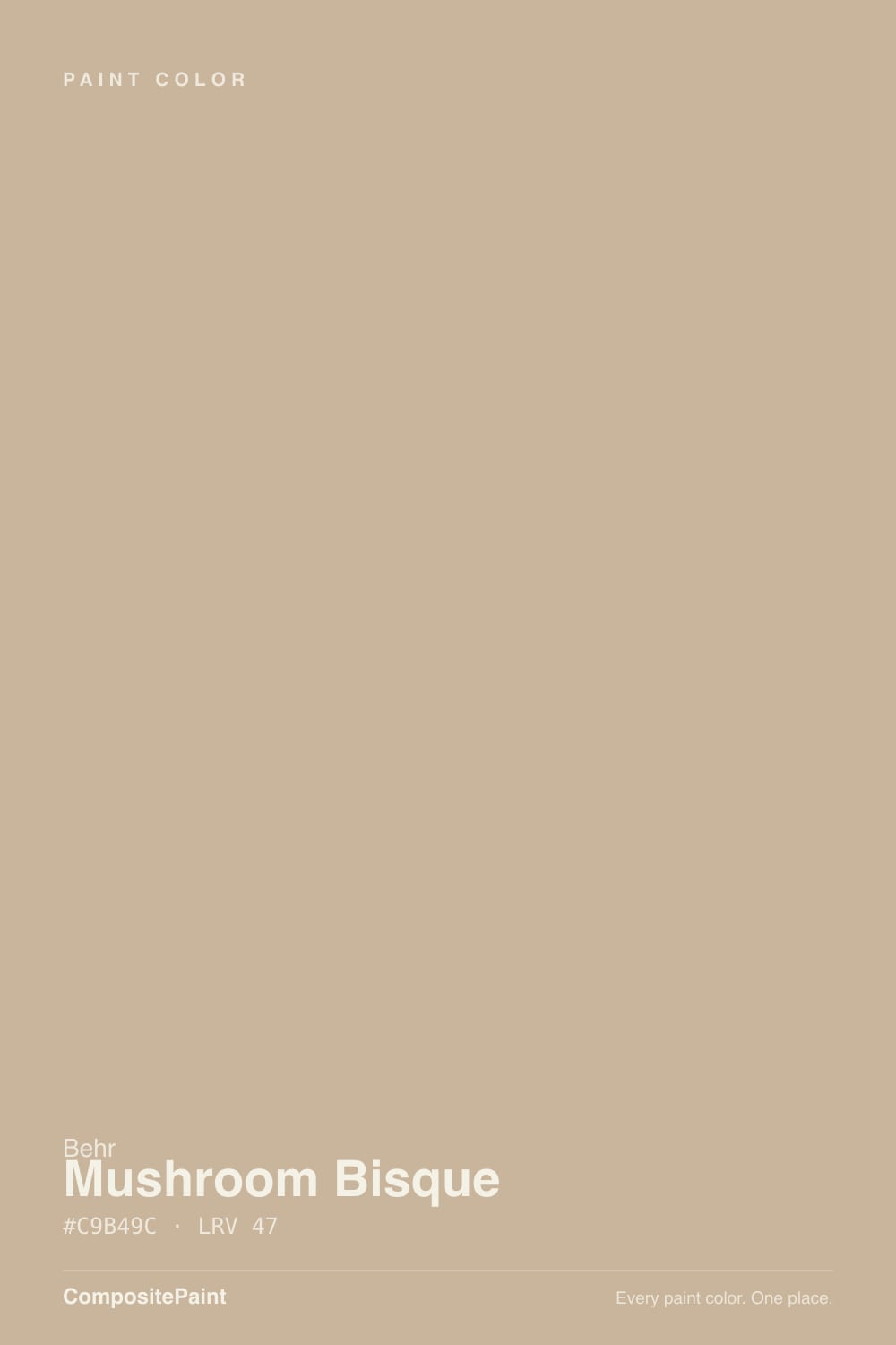
Mushroom Bisque is exactly what Behr calls it: a light-medium earthy brown built for a comfortable, grounding room, not a design statement. In real daylight it reads warm tan with a golden cast — closer to a soft caramel than a beige. Turn the light cold, though, and the same wall drifts toward a dusty peachy-pink, which is the one thing every buyer should know going in. It is not famous, not trending, and barely reviewed online — an honest workhorse color, not a headline.
Living rooms and dens with real south or west daylight · kitchens with warm wood, brass, and gold-veined stone · exteriors and siding in a warm modern-farmhouse mood · anyone who wants a genuine tan-brown, not another gray-beige
Your room stays dim and north-facing all day · you actually want a cool gray or true greige · your countertops or floors lean cool gray · you're hoping for a color with a trend story to tell
- A genuine warm tan-brown, not another gray-beige pretending to be interesting
- Turns rich, golden and grounding in real south or west daylight
- Flatters brass, walnut, white oak, and gold-veined stone
- Mid-depth (LRV 47) holds real color without going dark or busy
- A legitimate exterior and siding color, not just an interior afterthought
- Flashes dusty peachy-pink in cold north light or under cool LEDs
- Reads brown, not gray — disappoints anyone shopping for a true greige
- Clashes with cool gray countertops, tile, or washed floors
- So obscure online that there is almost no owner track record to check it against
What Color Is Mushroom Bisque, Really?
A warm, mid-depth tan with an honest orange base — Behr's own copy calls it "a light earthy brown," and that description holds up better than most brand copy does. Under the tan sits a real hidden peach and a touch of yellow, the same family of undertones that push a color toward blush the moment the light turns cold. That is the whole personality of this paint: warm-blooded and grounding in the right light, and quietly pink-adjacent in the wrong one.
At LRV 47 it sits squarely in mid-depth territory — deep enough to read as a genuine color rather than a whisper of one, light enough to still bounce real daylight around a room. That puts it a full step darker than the popular warm-greige crowd (Accessible Beige and Agreeable Gray both sit near LRV 58 to 60) and closer in weight to a true tan-brown wall than a light neutral. Rooms with only one small window will read it dim; rooms with real exposure will read it rich.
Undertone in one line: orange-tan first, a whisper of hidden peach and yellow second — never actually gray. If your sample looks dusty pink, that is cold light doing exactly what cold light does to this undertone family; if it looks golden caramel-brown, that is real sun, and that is the color behaving.
Where It Shines
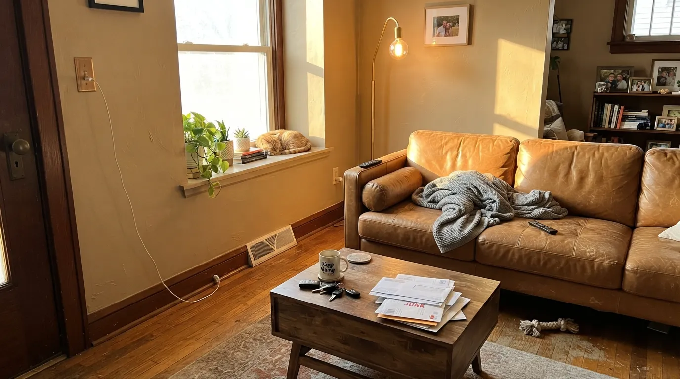
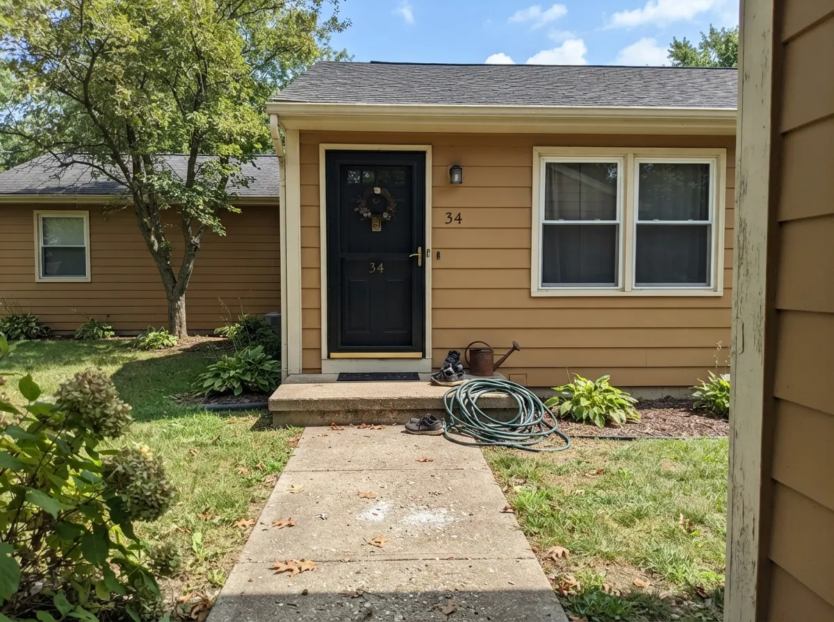
Give it real south or west sun and Mushroom Bisque does exactly the job Behr built it for: a warm, grounding, golden-tan wall that makes a room feel lived-in rather than styled. It is genuinely good with brass, walnut, white oak, and any stone with gold or brown veining — the earthy palette this color was clearly formulated for. On exteriors it is one of Behr's real sleeper picks: full sun reads it as a rich caramel-tan siding color that pairs cleanly with black trim, without the cold cast a true gray-beige gets on a facade.
Where It Fails
There is almost no public track record for this color to check complaints against — it has not gone viral, and it has no real owner-review trail on Reddit or Houzz. That silence is itself useful data: this is not a color people regret loudly. The failure modes below come from how its own undertone behaves, not from a pattern of bad reviews, and they are predictable before the first coat.
Cold daylight strips the gold cast out and lets the hidden peach come forward on its own — the wall reads dusty, muddy pink-beige rather than earthy brown. This is the single biggest risk with this color, and it has nothing to do with the paint failing; it is the undertone doing exactly what it does without warm light to counter it.
This is a tan-brown, not a greige, and at LRV 47 it reads with real color on the wall. Buyers browsing for "a warm gray-beige" and landing here by hex-code similarity are usually disappointed — the brown is unmistakable in person. If gray is the goal, a genuine greige like Revere Pewter sits closer to true neutral.
Cool stone and gray-washed wood sit at the opposite temperature and pull the peach undertone forward by contrast, the same way any cool anchor amplifies a warm wall's undertone. Pair it with warm stone (gold-veined marble, Taj Mahal quartzite) and real wood tones instead.
Room by Room
A south- or west-facing living room is this color's best case: the tan reads golden and grounding, and it flatters worn leather, walnut furniture, and brass lamps without trying. In a dim or north-facing room, expect it to read flatter and pinker than the chip promised.
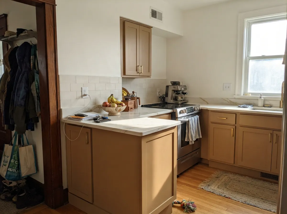
On lower cabinets or an island under a warm white wall, it is a real change of pace from the sea of gray-beige kitchens — pairs cleanly with brass hardware and gold-veined stone. Skip it with cool white or gray quartz, which fight the undertone instead of complementing it.
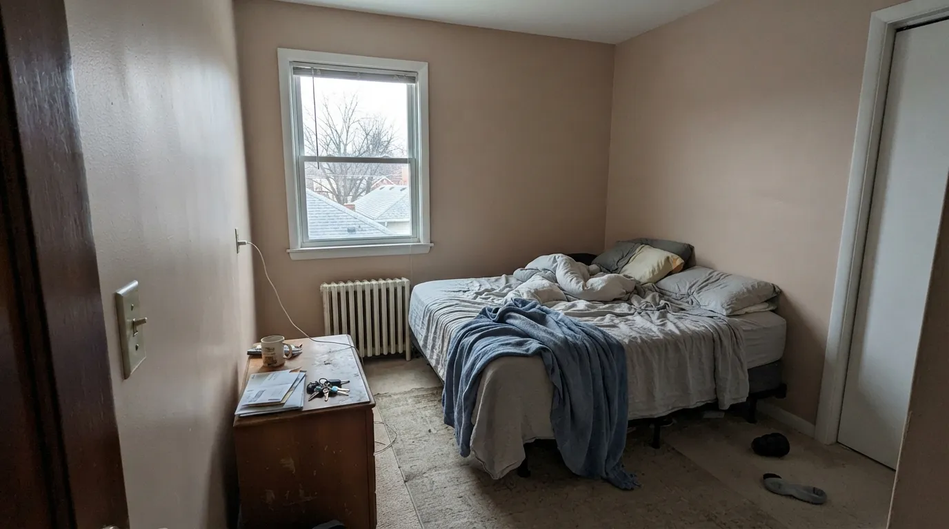
Warm 2700K lamps push it toward a rich amber-brown that reads calm and enveloping. A north-facing bedroom with no lamp plan will read dingier and pinker than most people want to wake up to.
Formal dining rooms tend to run warmer light and lower daylight anyway, which plays to this color's strengths; with a walnut table and brass fixture it looks intentional rather than accidental.
Fine with warm marble, wood vanities, and brass fixtures. With cool gray tile or chrome it reads muddy and dated fast — this is one of the least forgiving rooms for the wrong stone pairing.
This is arguably the color's best job: full sun reads it as a rich caramel-tan facade, especially against black or dark bronze trim. The shaded side of the house will read noticeably pinker than the sunny side — walk the whole exterior with a sample before committing.
Your Light Is the Risk
Full warm sun turns it a rich golden caramel-tan — Behr's own "grounding" pitch, actually delivered.
Cold daylight drains the gold and lets the hidden peach undertone come forward; can read dingy pink-beige rather than earthy brown.
Warm and golden at the sun hours, quieter and more neutral tan the rest of the day — a gentle shift, not a personality change.
2700K bulbs push it toward a cozy amber-brown. Cool white LEDs flatten it and let the pink edge show — keep the bulbs warm.
Most complaints about Mushroom Bisque are a light mismatch. Upload a photo of your actual room and see it on your walls — then ask for the same wall in north light or evening lamps before you buy a single sample.
Need It From Another Brand?
Any paint counter can custom-tint Behr PPU4-07 directly. If you would rather stay in one brand's own deck, these are the closest stock matches, measured as ΔE2000. Under 2 is a difference you will not see on the wall.
| Brand | Closest color | ΔE | LRV | |
|---|---|---|---|---|
| Sherwin-Williams | Bittersweet StemSW 7536 · Sherwin-Williams | 0.8 | 48 | Color page → |
| Benjamin Moore | Warm SandCSP-280 · Benjamin Moore | 1.6 | 47 | Color page → |
| Valspar | Sandy TrailV134-3 · Valspar | 0.9 | 47.7 | Color page → |
| PPG / Glidden | Best BeigePPG1085-4 · PPG / Glidden | 1.3 | 47 | Color page → |
| Glidden | Best BeigePPG1085-4 · Glidden | 1.4 | 47 | Color page → |
| Dutch Boy | Ball of Twine412-3DB · Dutch Boy | 2.6 | 47 | Color page → |
Similar Behr Colors
The nearest shades to Mushroom Bisque within Behr's own range, ranked by perceptual color distance — useful when you want the same look a touch lighter, darker, or warmer.
WCAG 2.1: AA is 4.5 : 1 for normal text, 3 : 1 for large text, AAA is 7 : 1.
Mushroom Bisque vs the Colors You're Also Considering
Every Mushroom Bisque sample board has the same rivals on it. The numbers show the real lightness gap — then it comes down to which risk you would rather live with.
Pick this for the deeper, more caramel-brown version with more actual color on the wall.
Behr PPU5-13 · LRV 52Creamy MushroomPick this if you want the same Behr earthy-tan family lighter and taupier — it carries its own pink risk, just paler.
Pick this if you're already committed to Behr, or just prefer the brand.
Sherwin-Williams SW 7037 · LRV 47Balanced BeigePick this if your painter works in Sherwin-Williams — it lands at nearly the same hex and the same LRV.
Inside Behr, Elemental Tan MQ2-21 (#C8B59C, LRV 48) is the closest and reads a hair lighter. Sepia Filter T17-03 (#CBB499, LRV 48) and Polo Tan N260-3 (#C8B597, LRV 48) both trade some of the pink for yellow, so they look more like a straight tan. Ranch Tan QE-28 (#C6B5A2, LRV 48) is the grayest of the group, and Toasted Wheat 280E-3 (#C6B198, LRV 46) is the darkest and slightly more olive.
Across brands, Whole Grain CA099 (deltaE 0.67), Bittersweet Stem SW 7536 (deltaE 0.85) and Sandy Trail V134-3 (deltaE 0.92) are the same color for practical purposes. Best Beige PPG1085-4 (LRV 47, deltaE 1.29), Kalahari C2-828 (LRV 46, deltaE 1.46) and Warm Sand CSP-280 (deltaE 1.59) are visually identical in normal room light. Wicker Basket 0280 by Diamond Vogel (LRV 49, deltaE 3.19) is very close and worth sampling, while Templeton Pink No. 303 by Farrow and Ball (LRV 47, deltaE 4.05) is close but visibly different, with more obvious pink.
Mushroom Bisque Coordinating Colors
The rule for coordinating with Mushroom Bisque is simple: stay warm, stay earthy, and keep cool grays away from it. It pairs best with creamy warm whites, deeper tan-brown cousins, and one confident near-black — these are the partners that keep the color reading intentional instead of accidental:
Mushroom Bisque's Story: A Genuinely Quiet Behr Neutral
Some colors get a Netflix show, a Pantone press release, or a viral Reddit thread; Mushroom Bisque got none of that. It has no Color of the Year moment and no designer-blog fame — search for owner reviews and you mostly find color-matching tools comparing it to other brands' tans, not people talking about their actual walls. Behr's own copy calls it "a light earthy brown ideal for anywhere you want to create a comfortable, grounding ambiance," which is honest, unglamorous marketing for an honest, unglamorous color.
That quiet reputation is arguably the most useful thing to know about it. This is not a color riding a trend that will look dated in five years, and it has no documented history of complaints to weigh. It is a working neutral that Behr also positions for exteriors and facades — genuinely one of its better jobs, since full sun brings out a rich caramel-tan that a cooler gray-beige simply cannot match on a sunlit wall.
Mushroom Bisque With Wood Tones and Floors
Warm wood is this color's best friend. Wide-plank white oak, honey oak, and walnut all sit comfortably against it because their warmth meets the paint's warmth instead of fighting it — the same logic that makes it a strong pick over gold-veined stone counters like Taj Mahal quartzite.
The floor that needs a sample first is anything cool: gray-washed wood, gray LVP, or gray-toned tile. Cool flooring pulls the hidden peach undertone into relief the same way a cool countertop does, and the wall can read noticeably pinker above a gray floor than it does above warm oak. It is not automatically a dealbreaker — a warm rug between the two helps — but test a large sample above the actual floor before committing to a full room.
Three Ready Palettes Built on Mushroom Bisque
A color is never alone on the wall. These are complete combinations in the 60-30-10 pattern, with the reason each one holds together. Every one opens in the visualizer.
A warm cream trim keeps the tan walls from looking dirty the way a stark, cool white would; Wrought Iron supplies the one near-black note the room needs without introducing any gray to compete with the tan.
Try this palette in your roomAlabaster keeps the walls a safe warm white so the color budget goes to the cabinets; Kendall Charcoal on the hood gives the kitchen one dark, confident note so the warm tan reads deliberate instead of just brown.
Try this palette in your roomPolar Bear trim stays warm enough not to fight the tan siding the way a blue-white would; Tricorn Black on the door is the one true-black note this earthy exterior palette wants, with zero gray in the mix to compete with the warmth.
Try this palette in your roomMushroom Bisque FAQ
Is Mushroom Bisque warm or cool?
Warm, genuinely — an orange-tan base with hidden peach and yellow underneath. It never reads cool; the risk runs the other way, toward dusty pink in cold daylight, not toward gray or blue.
Is it more brown or gray?
Brown. Despite sitting in the same LRV range as a lot of popular greiges, Mushroom Bisque reads as a genuine light-medium tan-brown on the wall, not a gray with a warm cast. If you're shopping by hex code for a greige stand-in, sample it first — the color in person is warmer than most gray-beige searches expect.
What trim color goes with Mushroom Bisque?
A warm cream, not a stark cool white — Behr's own Swiss Coffee is the brand-matched pairing, and it keeps the trim from looking blue-white against the tan. A bright, cool white trim will make the walls look dirtier than they are.
Does it work with gray countertops or floors?
Not comfortably. Cool gray quartz, marble, or gray-washed wood pull the color's hidden peach undertone forward by contrast. It wants warm stone with gold or brown veining and real wood tones — walnut, white oak, honey oak all work.
Can I use it outside, on siding?
Yes — this is arguably its best job. Behr markets it for exteriors and facades, and full sun reads it as a rich caramel-tan that pairs well with black or dark bronze trim. Check the shaded side of the house before committing; it reads noticeably pinker out of direct sun.
Why can't I find more reviews of this color?
Because there genuinely aren't many. Mushroom Bisque has no Color of the Year moment, no viral room, and almost no owner threads on Reddit or Houzz to check it against — it is a quiet, working Behr neutral, not a headline color. That is not a red flag; it just means you're one of the earlier people testing it, so sample it generously before committing to a whole room.
Have you painted with Mushroom Bisque?
Rate it — one tap helps the next reader decide.
Ask a Question